
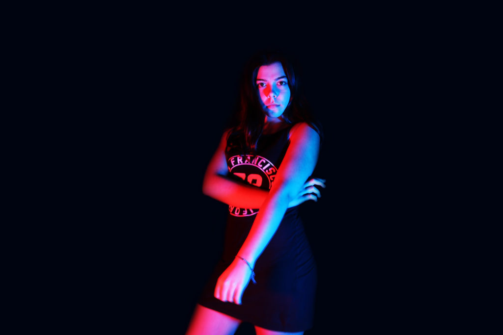
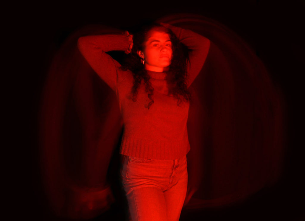
These were my favourite images from my Studio Project. In this photoshoot I used two point lighting. In the first image I used Red and Blue gels on top of the LED lights and in the second photo I used Black and Red gels. To make the colours more vivid I layered multiple gels of the same colour or similar colours together, to create a stronger final colour, this worked effectively as I needed a strong gel to work with the black background. Here I used long exposures as I kept the camera steady on a tripod and used a clicker to take the photos so that I wouldn’t need to physically touch the camera and effect the sharpness of the image.
I think these images relate to Hicks work due to the bold colours used which makes the image look vivid and more interesting; I also tried to evoke confidence onto the models in a similar to Hicks work; I experimented with long exposures to make the photographs look more extraordinary and tried to create the best quality image “in camera” so that I wouldn’t have to edit and manipulate much when finishing the photoshoot.
I quite like the first image due to the outcome looking very professional and at a high standard. I ended up changing the colour of the background from black to navy as I thought that the black contrasting against the model was too harsh and made the image look more manipulated and fake. I think this image worked well as the model looks confident and professional which helps to create a more high quality photograph.
With the second image I love the effect created by the motion blur (which was created due to using long exposures), I think it adds power to the model; making her therefore looking more powerful. The red creates a “devil” illusion which makes the model look attractive. Here I was quite happy with the ratios of the image itself as it fits faultlessly with the rule of thirds concept.