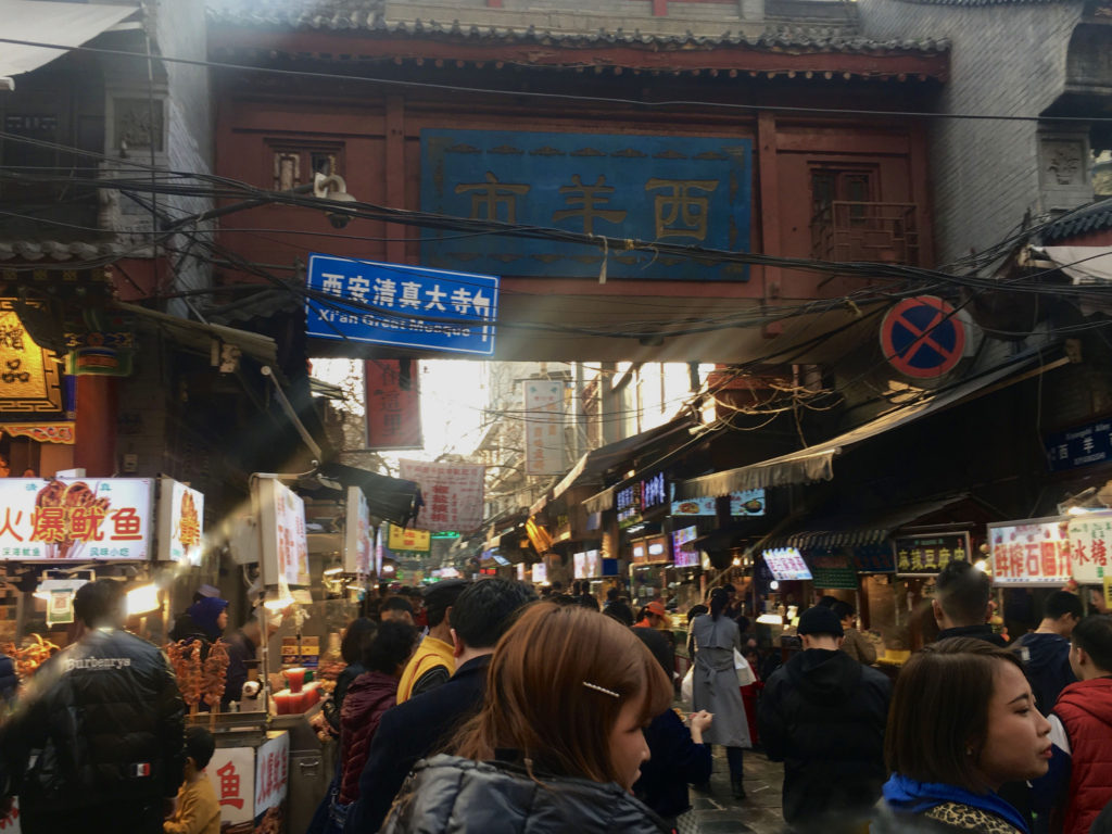
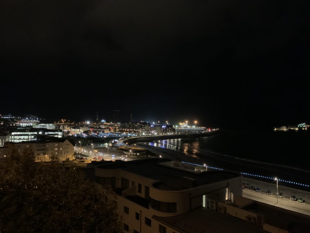
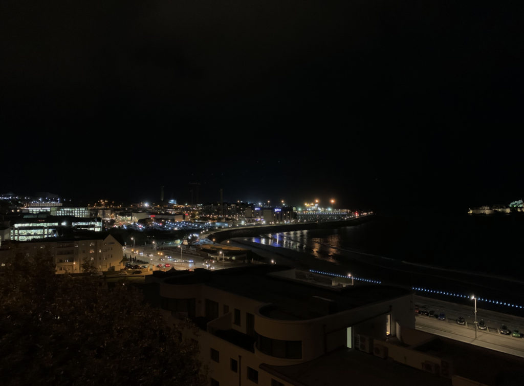
Previous shoot:
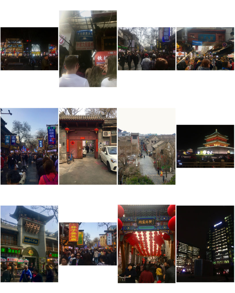
Shoot 1– Jersey
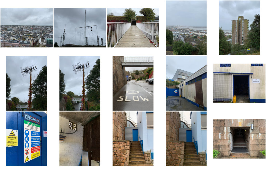
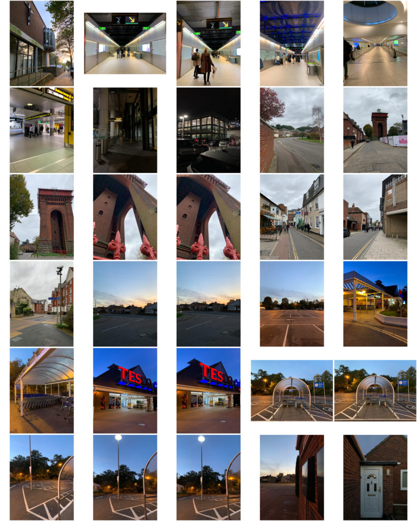
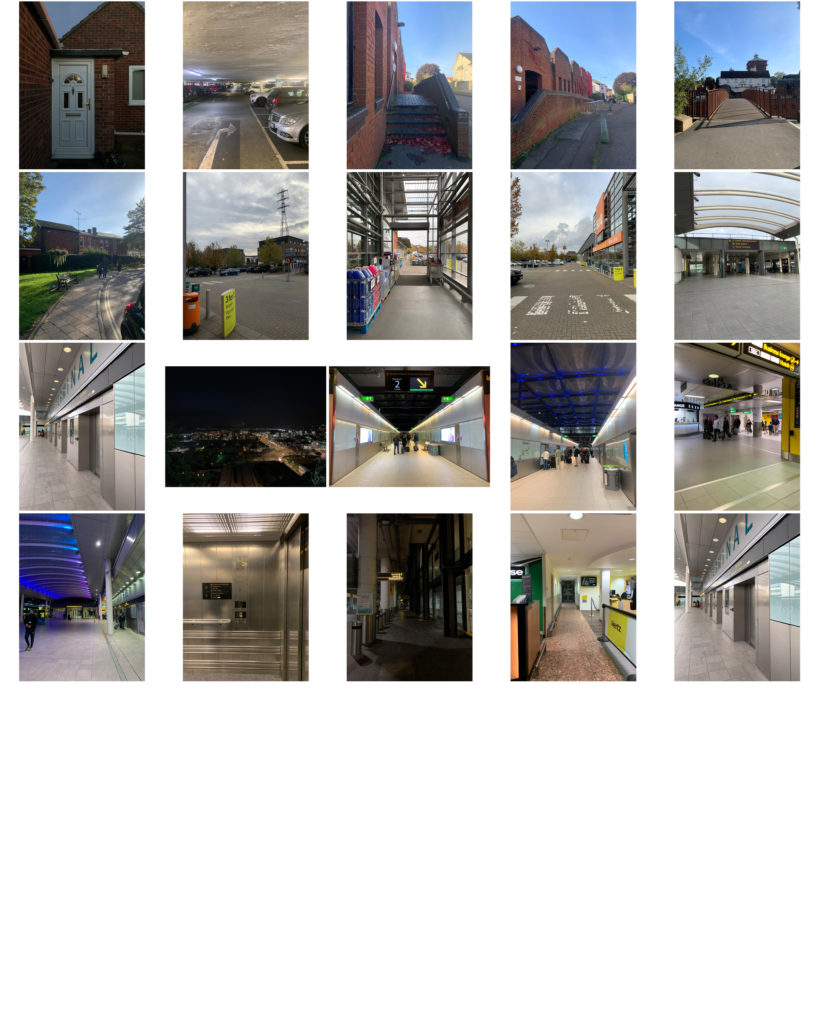
Shoot 2– Colchester
Lewis Baltz styled images.
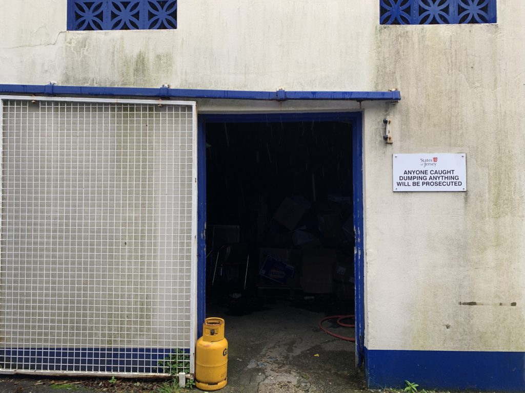
I produced these images during the shoot in the style of one of Baltz’s images from my previous case study (as pictured below). I aimed to produce a ‘frame within a frame’, adding depth to the image.
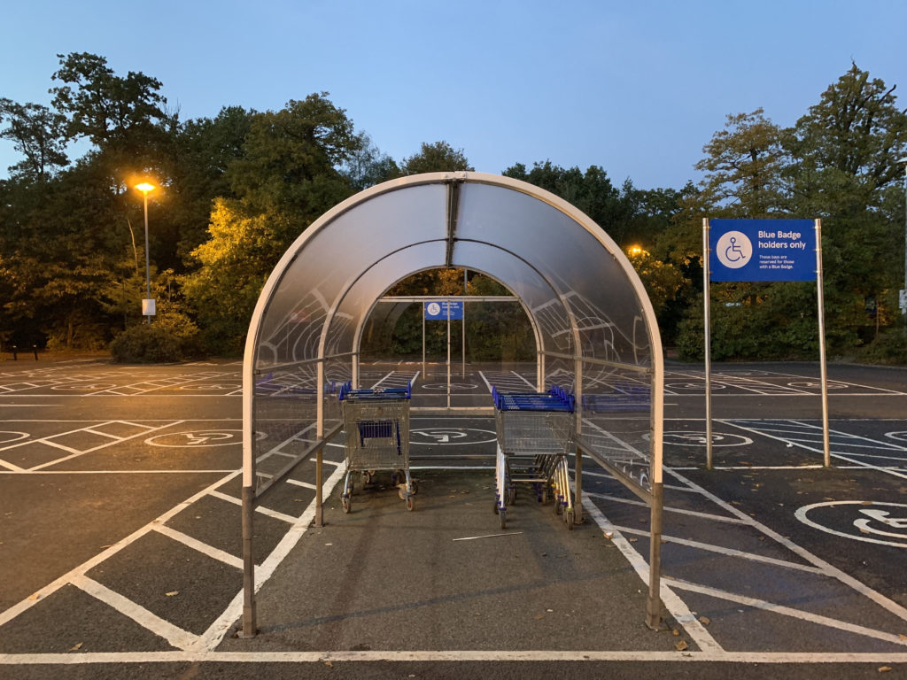
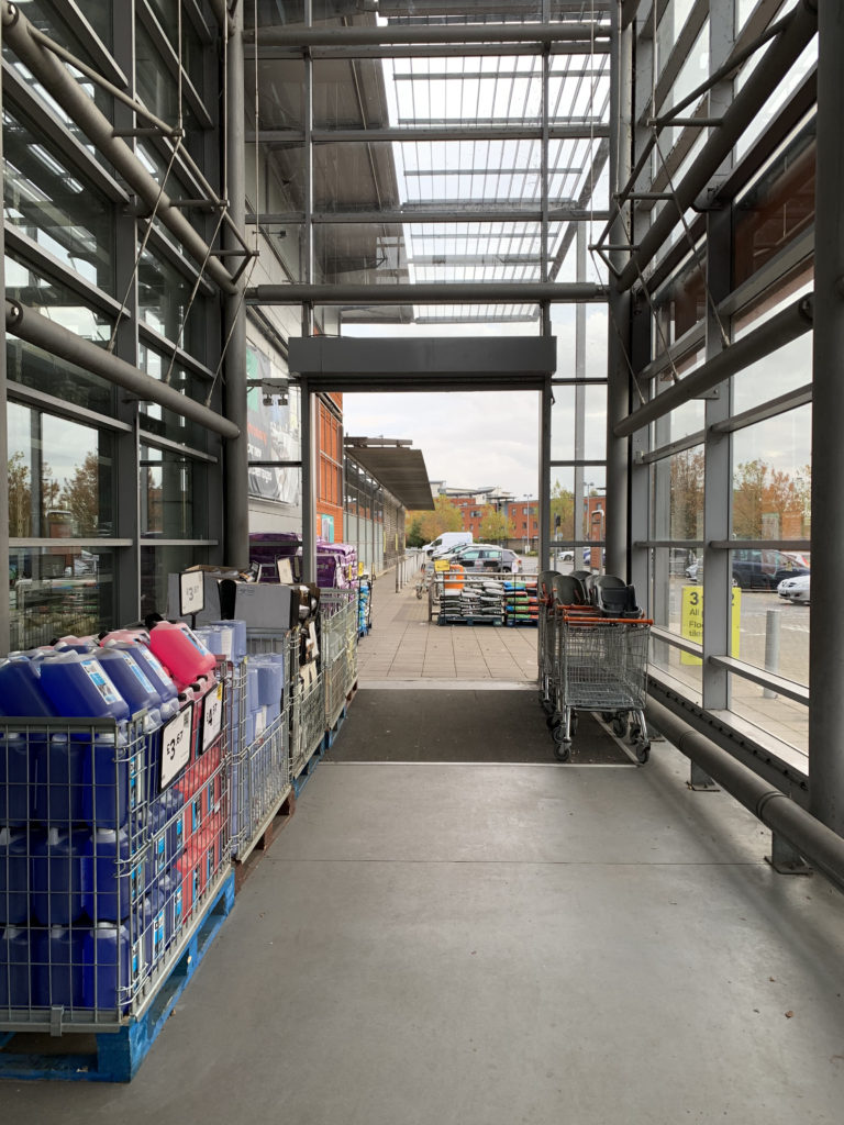
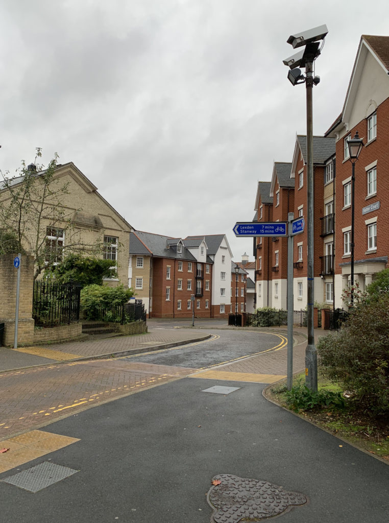
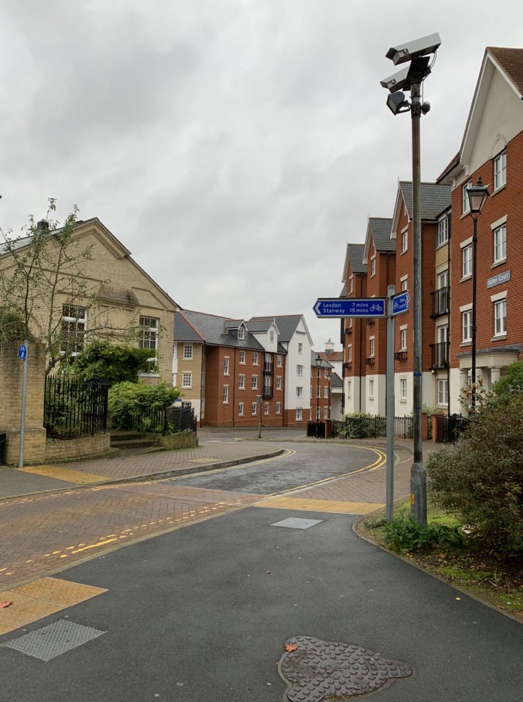
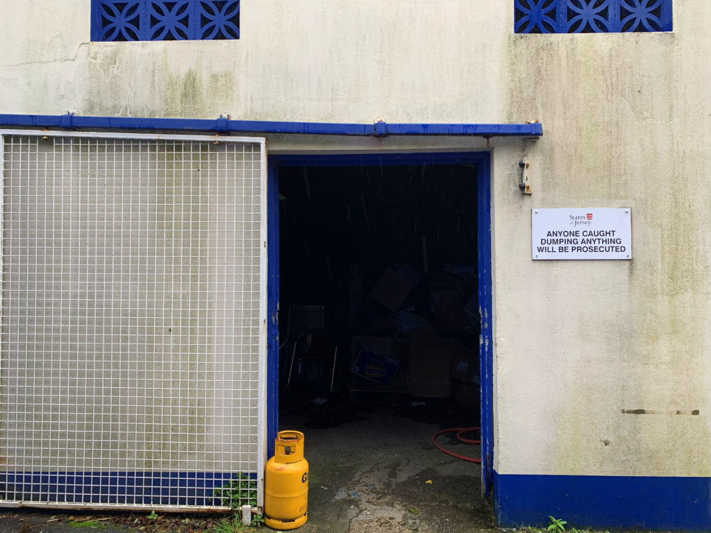
Both images have a ‘spot‘, which helps to dissect the images as Baltz did. The canister on the left image diverts the focus as the yellow colour catches the eye of those looking at it, resulting in the viewer revisiting different parts of the image multiple times. The green potted plants and white light act as the ‘spot’ for the image on the right.

Best images:
Editing process:
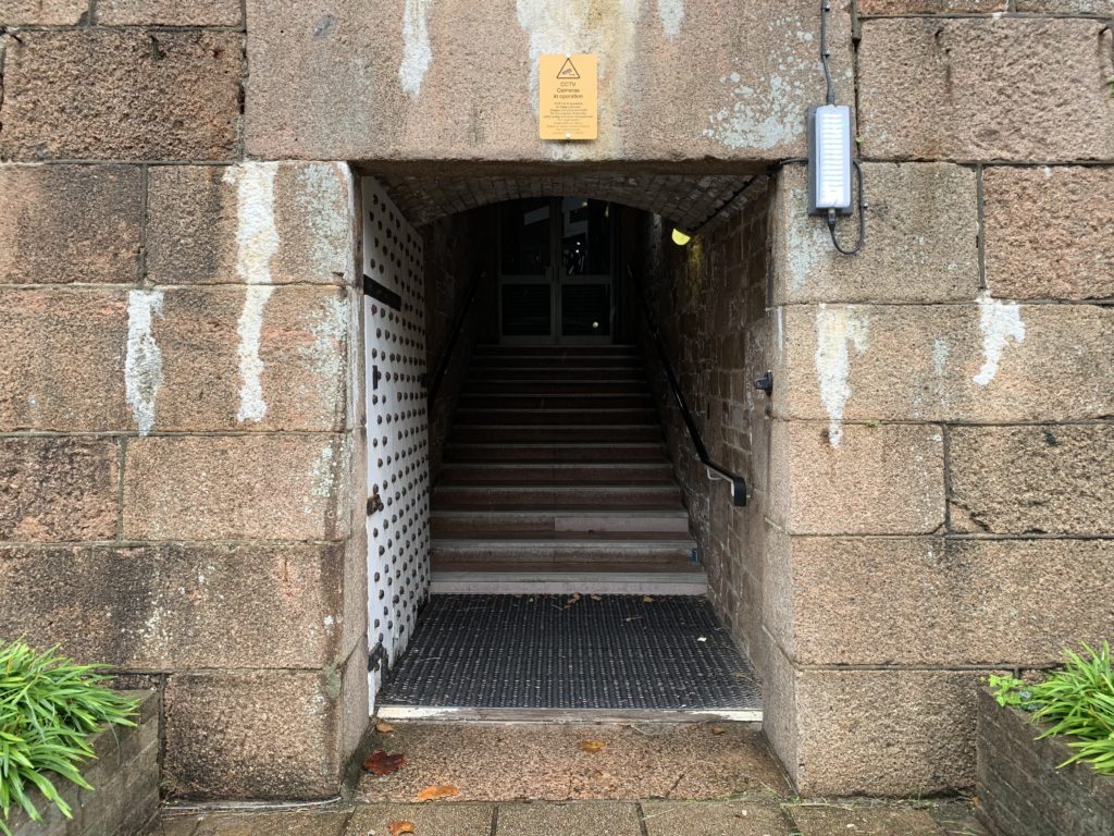
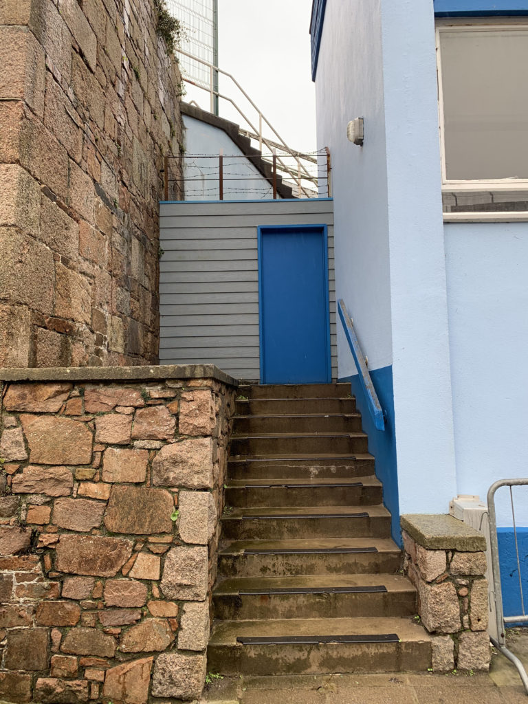
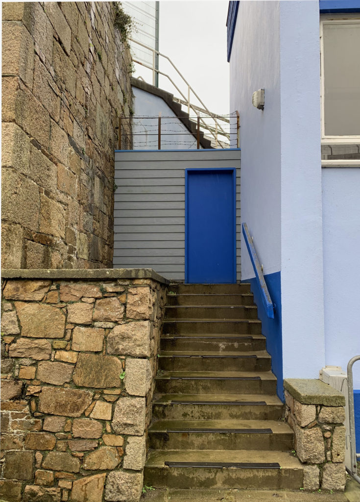
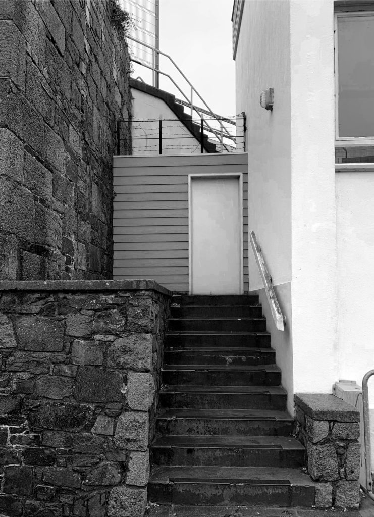
Using the perspective cropping tool on photoshop, I straightened the image out, making the sides of the wall parallel to the frame of the image. I decreased the saturation of red hues within the granite and highlighted the bluer hues of the image. I then experimented with black and white filters, making the blues completely white whilst contrasting it with a range of tones throughout the wall and stairs.
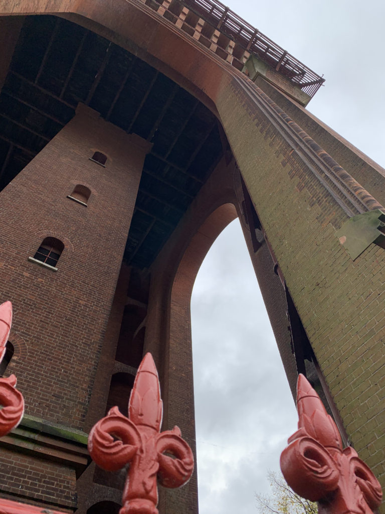
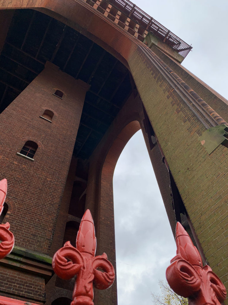
For this image, I decreased the exposure for the background behind the structure and edited the levels of RGB and Red tones within the image to make it more vibrant.
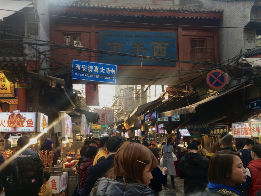
I didn’t change much with this image apart from enhancing the reddish hues in the road and buildings behind which is contrasted by the yellow marks in the pavement.
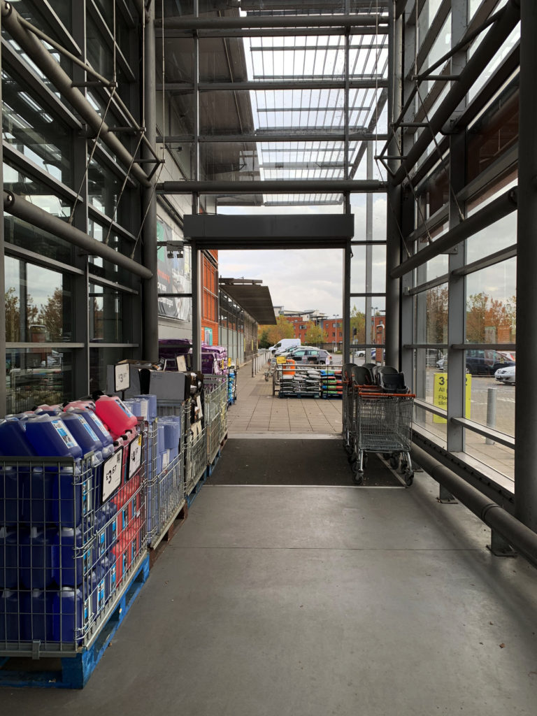
I decreased the brightness to -29 and increased the contrast to 39 to make the view through the doors more defined, allowing it to become more of a main focus within the frame.
I increased the green hues using the colour balance tool on photoshop.
I increased the saturation to bring out the yellow of the gas canister to increase the contrast against the blue trimmings of the door.
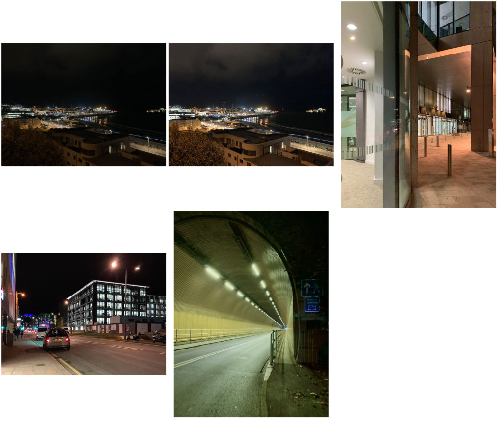
Firstly I increased the contrast, I then used the healing brush tool to decrease the harshness of the street lighting.
I rotated and cropped the image to straighten out the horizon, decreased the brightness of the image to -38 and finally set the contrast to 28 to isolate the artificial lighting of the landscape.
Project evaluation
Personally I struggled with the elements within this urban landscape project. Whether to involve members of the public in my images or to avoid them proved difficult for me. I mainly focused on different shapes made by the architecture I came across, such as the rounded appearance of the bell tower and the shopping trolley section in a local car park.
Looking back at the project I would further expand the range of my images by photographing more urban scenes in the dusk and evening , capturing artificial lights from neon signs as an example or exploring the same scenes I’d previously visited during the day to see how the lighting at night altered the overall mood and atmosphere produced by the images.
Final image

My chosen image has a wide tonal range, produced by the use of natural lighting the photo was taken in. The stairs and granite have darker tones in comparison to the walls and door. The overcast sky helps to form lighter tones in the background that can be contradicted by these elements. The darkest point in the image is apparent in the top third: a fence with barbed wire wrapped around it. This dark fence further contrasts the white door and beneath it. This begins to create a narrative, making the viewer question what’s beyond the fence and whose actions have led to its placement.
There is a main focus on the structure in the middle third; on the small building like structure, the wooden banister and stairs act as a sort of leading line towards the door, drawing the viewer’s eyes and focus to the center of the frame. The flat wall next to the stairs help to create depth within the image.
There are three main textures within my image that help with its success. The most prominent texture within the composition is the cladding surrounding the door. The vertical lines on the door add tot he contrast apparent in the photo. A second, more subservient texture is the smoothness of the walls which compliments the rough texture of the granite as they differ a great deal.
Dynamic tension can be seen by the different directions of components within the image. The stairs in the background of the image and the direction of the steps up to the door aid in this, drawing the viewer’s eye out of the photograph, in contrasting directions.
There is a sense of ambiguity within my image. As well as the barbed wire fence, the slightness of the structure in the center of the image is amplified by the features of a larger building beside it. This begins to make the viewer question the function of the building. The lack of detail on the door also adds to this, as it questions whether the building have a practical purpose or not.
I felt this image proved most successful due to the simplicity yet curiosity it arouses. The small area could have easily been overlooked but having photographed it, the building itself is intriguing.

