Robert Adams was born 8th May 1937 and is an iconic American photographer whose work mainly focused on the rapidly changing American West during the mid-1970s. He first became known through his book, The New West (1974), and through his participation in the urban landscape exhibition The New Topographics in 1975.

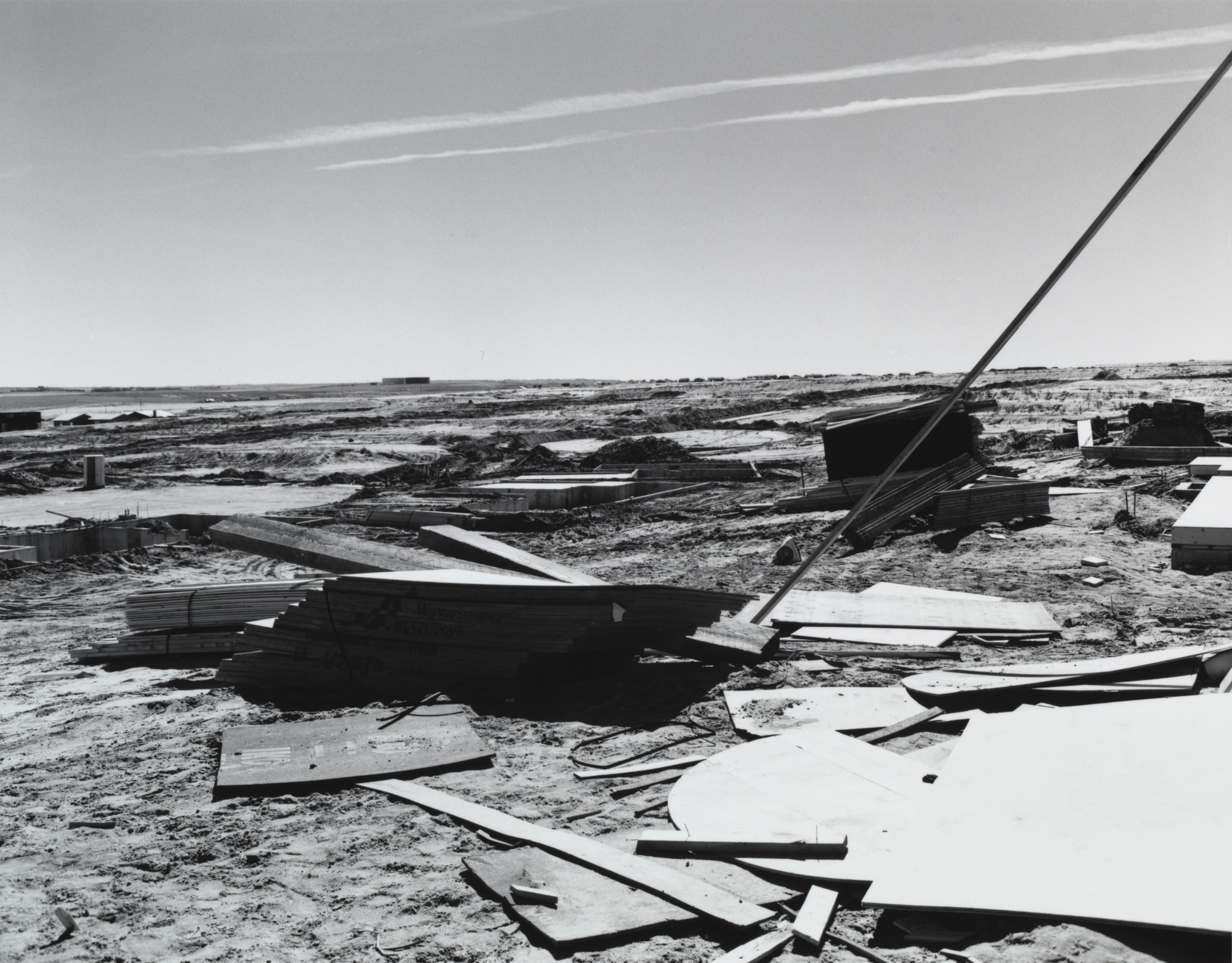
This image captures the spirit of Adams’ style very well, as it demonstrates how normally ugly or unseen scenes of everyday life can be transformed into art and given meaning. It shows his well-known use of black and white and high contrast, as well as the sky not being entirely whited out.

I particularly like this image as it combines two ideas, that of heaven and religious beauty and that of the dull and simple human world. I especially like Adams’ use of contrast to ensure that the small clouds in the background stay visible and not completely faded into the sky

It was fairly rare to see a night-time image in the New Topographics exhibition which is why this image in particular stands out. It stays with the theme of using contrast to keep the sky in focus and the image itself focuses on a familiar scene for Americans: a fair. I very much like how the electric lights are the brightest light sources in the image as well.

This image portrays how many Western Americans lived in that era, and it shows the average city sprawling across the plains, which makes it seem interesting and brings beauty to the banal, which was the whole point of the New Topographics exhibition.
My Images-
I decided to try and keep with several recurring themes that I noticed during this study of Robert Adams and the New Topographics: keeping the sky and clouds defined and visible, black and white images, and using contrast but not too over-the-top.
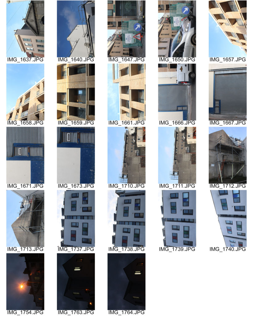
I took a sample of images from my urban photography shoot that I felt would fit within the style showed from my research and chose which images to use for my final product from there.

From there I selected my final four images and edited them how I felt was appropriate and suited the image.


With this image I attempted to keep as much of the detail on the stone building as possible as I felt that it makes a nice difference to the plain and simple building directly next door. I also like the strong lines of this image brought on by the electric wires crossing above from the foreground to the background, I fell like they really draw the eye into the image.


To edit this image, I had to adjust the black and white levels to ensure the details of the balconies stayed in focus and that the structure of the image remained. I particularly like how the light highlights on the balcony rails showed up so nicely in black and white.


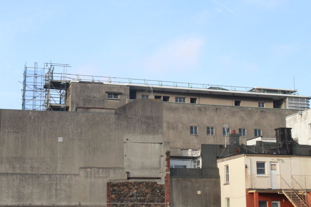
As you can see I kept the clouds in the background clearly visible and increased the contrast of black and white, but not overly so. This is one of my favourite images as I really like the composition and shape of the buildings, as well as how it turned out in black and white.


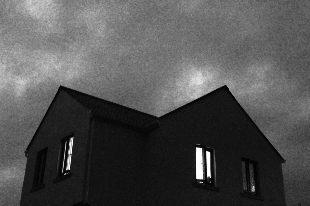
I quite liked the odd angle I took this image at, focusing more on the sky than on the house, and also how my editing caused the lights inside to become very bright, which makes the house feel inhabited. In fact it is not, it’s a building site currently, but I felt that the architecture felt very urban and stuck with the same style as the other images in the final selection.
