Photobook evaluation

Link: 3 DAY BREDA

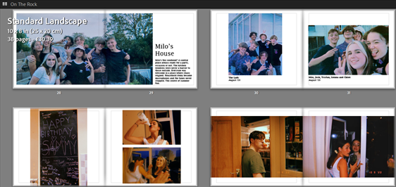
Overall I am very pleased with the outcome of my photo book. I have used ideas, themes and techniques from both Alex Webb and Paul M Smith which was part of my original plan. However, my initial idea to remove any Covid related objects or themes from the book did not work perfectly, with a couple of the images showing people with masks on. Despite this I believe that my work captures a few simple moments of pure freedom which was my overall goal. This can be seen through the vibrant editing of colour and the amusing / random staging and framing of the pictures. I’ve used B&W images in certain areas and less saturated ones in others to change the flow of the book a little bit as not all the images worked with high saturation. The comparison between day and night, boys and girls and drunk and sober images came out better than I could have ever imagined with some very similar images produced by the boys and girls and some that are very different. I had originally planned to have a complete full bleed book, however, I eventually readjusted the layout of certain images to fit the page differently which helped to further increase the flow of the book and create juxtaposition between specific photos. I feel like my book gives an insight into the life of an 18 year old and what they do with the freedom they are provided. This was one of the main reasons for making the photo book so I am pleased with the way it came out. In the end I am happy with the changes that have occurred since my initial statement of intent and also the aspects I have managed to keep the same. I enjoyed making this book as the entire process was intended to be fun, exciting and free of limitations.

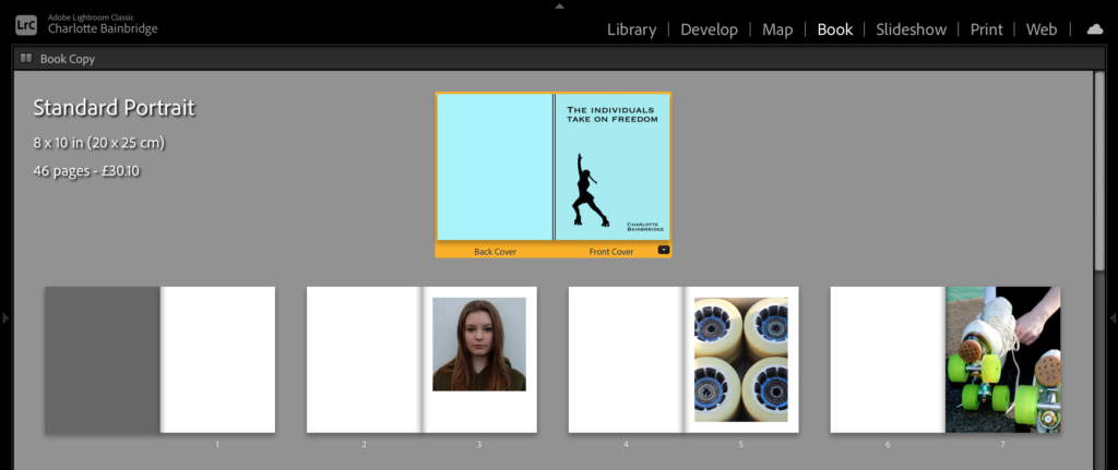
Design process

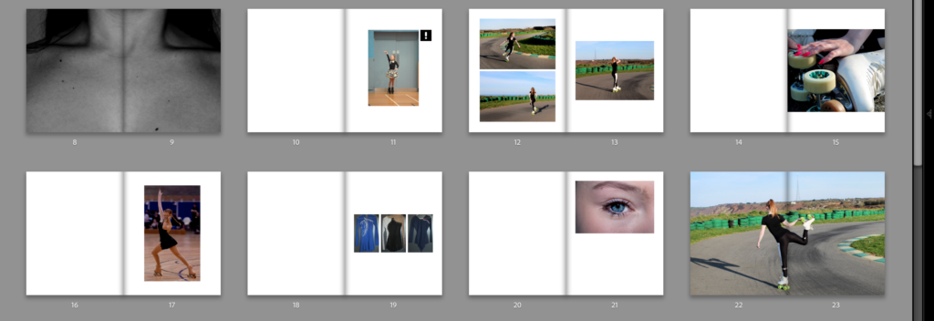
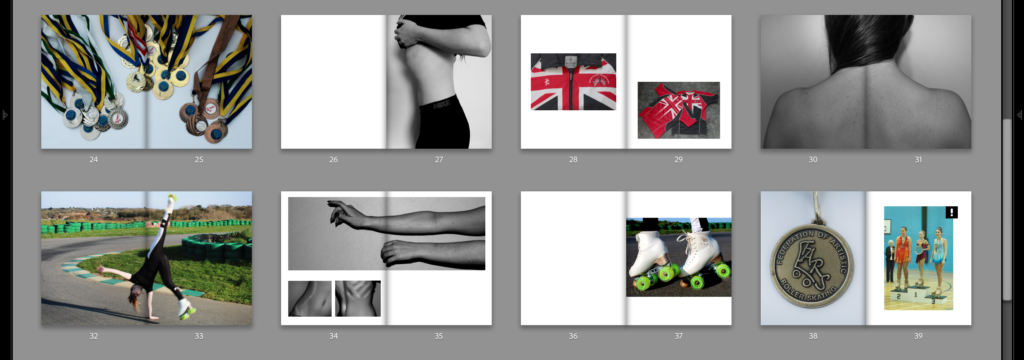
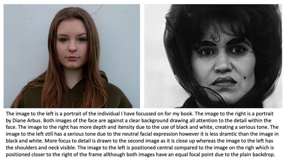
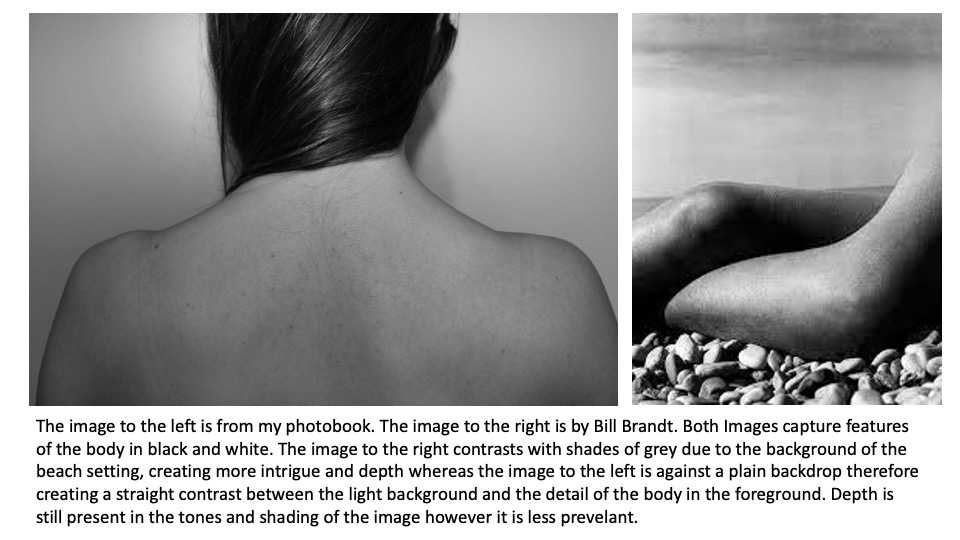
I have sequenced this book demonstrating the elements of artistic roller skating presenting what goes into it and how long it takes to learn and the commitment it takes to compete and achieve awards. The portrait at the beginning of the book presents who it is about and creates a nice start and representation of whats to come. It links to the title as we are shown who the individual is. I will use the abstract black and white images of the individuals body parts to break up the book, creating contrast between the bright images keeping the viewer engaged. The title: The Individuals Take on Freedom sets the tone and idea that skating is a form of freedom and escape for this individual. It shows that doing what you love can be the individuals form of freedom no matter what it is. The mix of colour and black and white images create an engaging contrast keeping interest throughout the book. Each image represents a different feature of skating, providing informative images. The cover is engaging due to the bright blue and the silhouette of the skater represents the individual photographed in the images to follow.

Evaluation

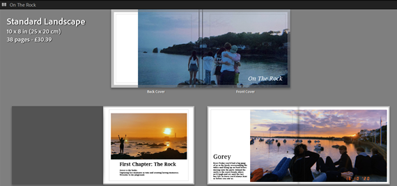
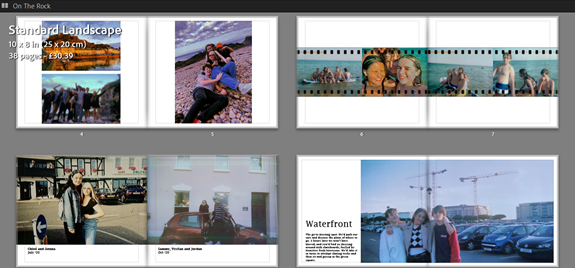
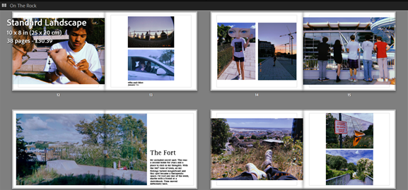
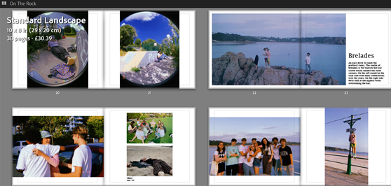
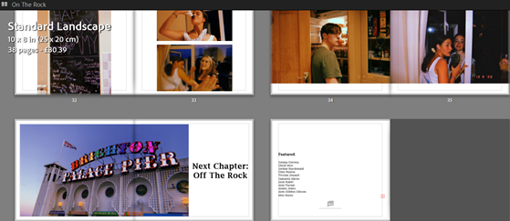
The exam brief was to create a project representing the theme of transition, and as i explaining in my statement of intent, i wanted to show this through exploring jersey life, and detailing pivotal memories and places on the island. I explored this in my book as two visible chapters, the first of summer life with my friends on the island, and at the end presenting the second chapter, as a nod to Brighton, leaving island life for university in the UK. For each location i began with a double page spread image, using the slang term our friendship group would use for that place as the title; however i left that as the only text for those title pages, as in my statement i was going to also caption those images, but once i started to layout my photobook, i thought more text took away from the displayed image. and then a few pages of images from notable memories made there, some captioning whose in the image, and some had a time stamp of the date. I then decided to only use one image of Brighton at the end, the Brighton pier with its iconic neon sign saying as such, as to show the transition to where the next chapter of my life is taking me.

My entire book is mixed between group images and landscapes, showing us in each sentimental location. These images were archived, taken mostly from last summer, and followed the vernacular style of Martin Parr, who also used candid, imperfect imagery, mostly seaside capturing peoples daily experiences, which ideas i followed when choosing the images for my photobook. At the beginning of Parr’s book ‘The Last Resort’ he shows an old-timey image of Brighton (the chosen location of all the books images) and at the end uses another titled ‘New Brighton’ which unintentionally matched with where i’m moving to university, but follows the same idea of a ‘new chapter’.

My final product, the photobook, contains 40 images, including the cover image, curated to tell the narrative of a group of teenagers going through island life. Overall I am very happy with my final book and the way it looks together as a whole. I think the casual and candid style of my images tell a personal story of my adolescent life, along with the bursts of text which gave a further insight into my island memories. If i were to add to or re-style my book i would probably mix in some more large landscape shots, to capture more of the beauty of each location. However i am very happy with the outcome of my project, and due to it highlighting my personal experiences, it will be nice to have this book and be able to look back on my teenage life in the years to come.

transition- photobook project evaluation

The exam brief was to create a project portraying a transition of some sort. In my statement of intent, I explained how I interpreted it to mean a transition between the winter season to the summer months, from cold, dark weather to warm and brighter weather. I also planned on including some portraits among these images to show how humans also change and transition and age over time. I did both of these things as well as I could have, I think. My process of image selection was quite time-consuming, because of the sheer amount of images I took in order to have the best possible selection of images, but I think it was time well spent to be able to produce the best version of my photobook. In my statement of intent I set out that i wanted my photobook to be in colour, to properly showcase the transitioning seasons, and i kept to this and had all of my images in colour. In my statement of intent I also said that I wanted to insert some quotes or some form of writing alongside my images as well, but I reviewed this idea and decided it wasn’t important and would take away from the final project as a home, so I didn’t do it.

I had a few artist references: Eliot Porter, Robbie Lawrence, Katrien de Blauwer, and I also analysed Rinko Kawauchi’s photobook “Illuminance” to inspire my photobook layout and design. I was inspired by how Porter captured nature with such vibrant colour but still stayed true to it’s original essence, how Lawrence used soft light and how he photographed plants, and also how de Blauwer connected images through their shape and form to create a narrative. I used all of these elements in my own work, as well as including my own personal style.

My final product, the photobook, contains 58 images (not including the cover image, which is also one of my own images) in a carefully curated order specifically planned out to tell a narrative of the changing seasons. Overall I am pleased with the final book and the way it came together as a whole. I think my images were successful technique-wise and in how they contributed to the narrative. In my opinion, my overall photographic technique and skill level has improved through the course of this exam project. If i had to make any changes, or if i had to re-do this project, I would probably try to take more focused portraits and maybe try for more in-depth close-ups. Other than that I’m fairly happy with the project as a whole and I think I accurately fulfilled the exam brief to the best of my abilities.

evaluation of project

I believe that I accomplished what the EXAM brief stated quite successfully with the THEME being TRANSITION.

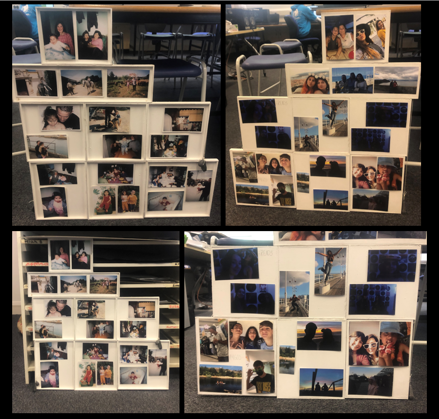
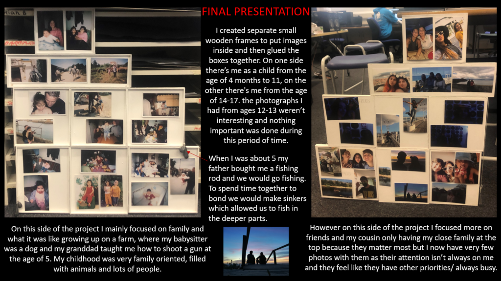
I’m planed to use the elements of water, earth and fire to display the transition of myself and how I have changed over time. However I didn’t use fire because I couldn’t find any images worth putting on display. I mainly had water in the background but in similar locations.

Unfortunately I couldn’t use any camping photographs because they were low resolution and they were meant to be my more earth based ideas. Although I adapted and used the farm photographs I have of me as a child on the horse and the dogs to represent the fauna side of nature.

Transition it’s a passage from one state, stage, subject, or place to another, like ‘The Brown Sisters’ who showcased themselves yearly I think I might have succeeded to imitate Nixon, but add my own twist to the project as I have photos from 2003-2021 only missing a year from the age of 13-14.