Monthly Archives: May 2021
Filters
Final Film
Final film: Absence
Evaluation
Overall, I think my film went well although I would change a lot of features. For example, if I had more time I would’ve filmed more for the middle section tor make it more uplifting and empowering. I would’ve also made the music more dramatic towards the end in order to make the viewer’s heart beat quicker. I would’ve also filmed on my macro lens if I had the chance to and filmed close up surroundings to show more than just me in the film and have more variety. I’d like to imagine that I linked the artist references quite well e.g. Duane Michals, KangHee Kim and Zhang Huan. I specifically like the ending scenes where I linked these artists shadowy effects to my own film and have a creepy element to it. As for the more colourful side of the film I was more inspired by Kim as their work if very bright and catches the viewer’s eye. I would’ve loved to experiment more with different movements of the camera in order to create nicer transitions although my hands were far too shaky to do this myself so I would most likely try to get other equipment to help to do this. Hopefully, I can do this next time as well as learn more about editing on Premiere Pro as I go. I learned a lo more already whilst editing this film e.g. the adjustment layer to edit all clips at the same time. I think that the overall film could’ve been executed better if I had more time so the story line could’ve show a bit better. I would’ve also edited the footage on the beat of the music if I had more footage but I couldn’t do this as I didn’t have enough clips to cuts up to do this effectively.
GREY DUNE PHOTOSHOOT
My last photoshoot is in the grey dunes, further up the transitioning sand dunes. I set up my camera on a tripod to make sure all of my images where in focus. I would also use the self timer tool on the camera as I would be the model in the images. I planned on wearing a black dress and continuing that outfit throughout all of my images, again using myself as the model. The camera setting were very difficult to set up due to the movement of myself and the marram grass, so I had to use the autofocus tool in order to make sure all of my images came out clear with myself as the focus. Within my images, I had some of myself crouching down in the grass, mimicking the images at the beginning of the book where I was crawling out the sea. I think this would be a interesting concept as I am crawling my way through dunes.
After taking all of my images onto Lightroom, I was able to start picking and rejecting images using the P and X keys. Many of the images wherent up to scratch as it was extremely difficult to take images of myself as the model. I think that the images that came out good where extremely beautiful and really exaggerated the movement of the grass and wind. I think that the black dress contrased will to the yellow grass and sky as the darkness of it brought attention to me as well as the landscape around.
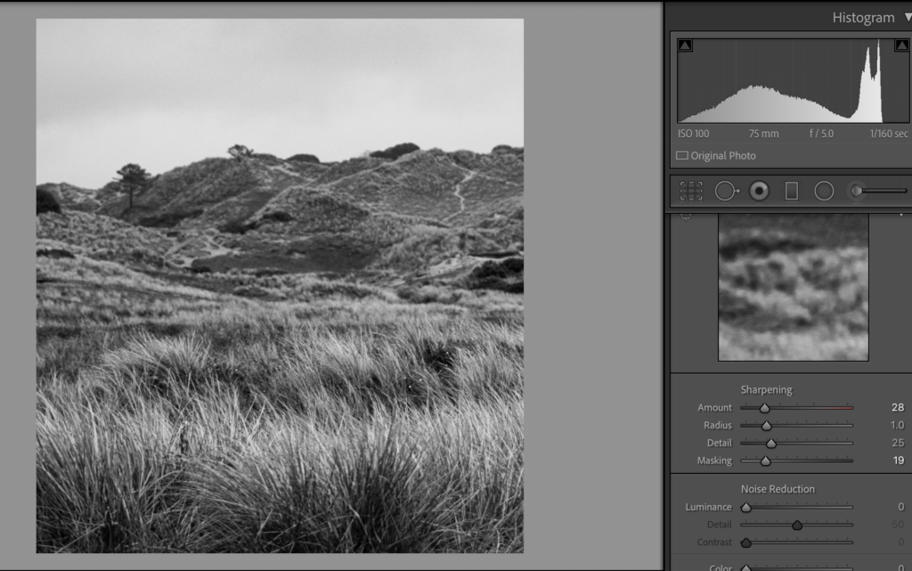
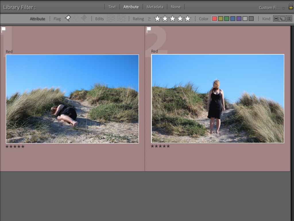
After flagging and rejecting my images, I went through and rated all of them out of 5 in order to start refining my decisions and options. I also used the compare tool ( shown in the image below) on Lightroom so that I was able to look at two similar images to decide which one had better composition and focus. I later decided on the two images below to end the pages of my photobook. I think that their symmetry and focal points where the best and that they made very interesting and elegant images. I gave them 5/5 stars and used the filter tool on Lightroom so that I could only view them, which would make the editing process much easier to do.
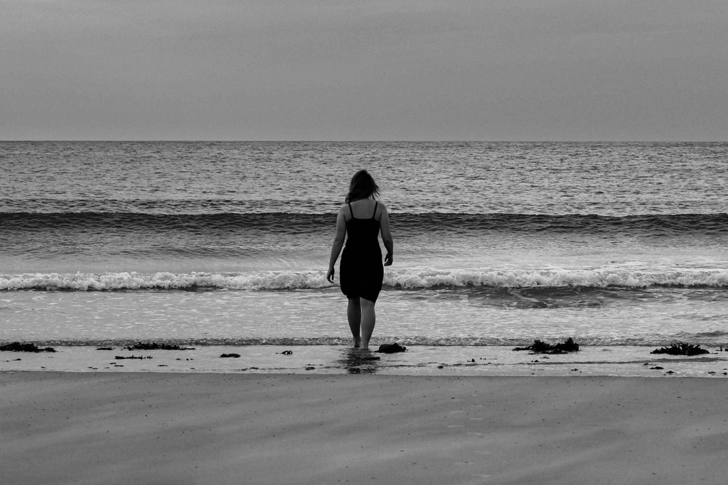
Out of the two images below, I decided on the image on the right. It was more in focused however, I took the photo into photoshop in order to fix the straps on the dress. This was a quick fix using the smudge tool. After this process I took the image back into lightroom in order to colour correct the images to black and white. I also chose one of the photo that didn’t include myself as the model in.
EDITING
During the editing process I decided to make the images Black and white like I specified in my planning. I cropped the images to my desired proportions and angled the images so that the horizon line was exactly horizontal. I started by editing the image on the left by increasing the exposure and contrast to accentuate the highlights and shadows in the black and white. In the image on the right, I centresd myself directly in the middle, bringing focus to the model. I also increased the black so that the dress I was wearing was more visible. I copied and pasted the editing process onto the image on the right to keep the tones consistent within each photograph, I plan to to this to the rest of my images.
ALL FINAL IMAGES
I think that this photoshoot was very successful. I am very happy with the images that I produced from the shoot were very unique and well-edited. I think that all of the compositions of the photographs are very centered and symmetrical so create an interesting image to look at. Although, next time I would definitely make sure that the editing process is more interesting. I would have liked to have experimented more with day/night time, weathers, coloured lights and outfits possibly. Even though the images are interesting, I would have definitely have liked to take more inspiration from artists and photographers.
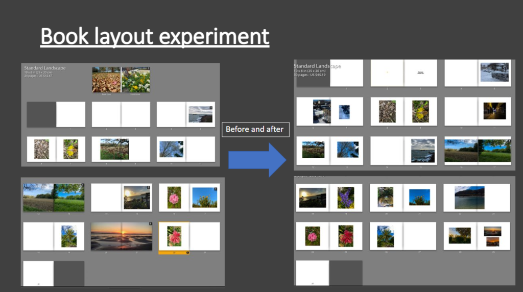
photobook experiments
film evaluation
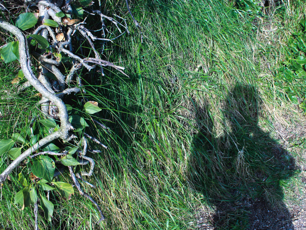
In my film, I didn’t show myself at all, except for a shadow, when I mentioned, in the audio, that I myself am my own limitation. I think this worked out really well, because when starting my project I didn’t intentionally go in and want it to all be about me. I wanted to explore and document what limited and made others feel free. However I did want to include myself because it adds a personal and emotional touch to the film. 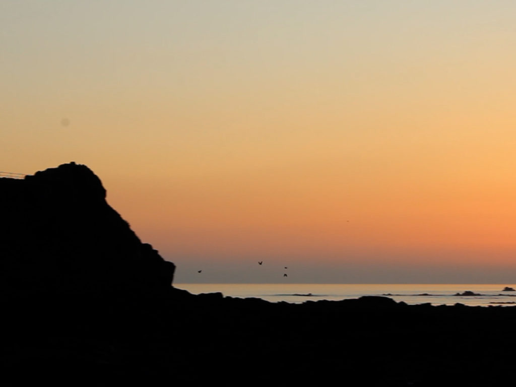
When thinking of shots to take for the film, I thought of sunrises, sunsets, water, waves, horses, and all things that made me free. I really feel I have achieved this and throughout the whole film I feel a sense calmness and tranquility. 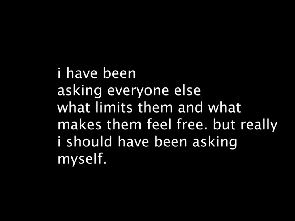
I felt it was necessary for me to add captions to various parts of the film. I did this in 3 places. I feel these captions have allowed for 3 things to be highlighted, ‘what makes you feel free?’ , ‘what limits you?’ and my own personal touch of the film. I wanted the above to be on a black background because like I said before I personally didn’t want to be featured in the film, but I feel the black background represents me, in a way. 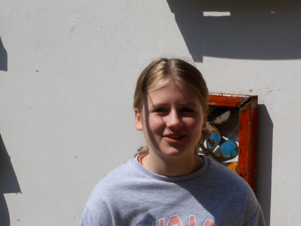
I included some snippets of the interviews I had with people. For the interviews I just wanted to have their head and upper body in the shot. I feel the interview sections look quite good and work nicely to bring that documentary feel to the film.
audio
For the audio I layered up lots of different things to have quite a chaotic and busy audio. I feel this has worked really well and adds to the film as a whole.
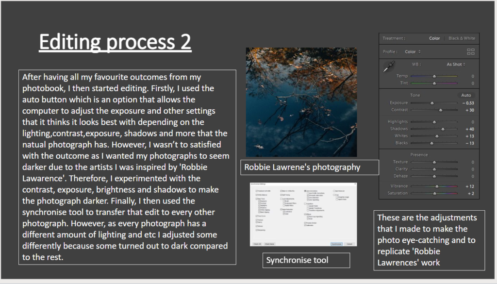
final film link
here is the link to my film, limitation/freedom https://web.microsoftstream.com/video/ac73db60-b58c-4734-a985-fb0853f5fe8d
EMBRYO DUNE PHOTOSHOOT
FINDING A COVER IMAGE
During this shoot, I planned to find and edit and image for the cover of my book, psammosere. I think the images from this shoot of the embryo dunes are extremely beautiful and clearly outline and represent the sand dunes. Similarly to my last photoshoot, I set up my tripod, set my iso to 100 on the manual setting and aperture to f/16, as well as the shutter to 1/100 second. This allowed me to get well exposed images that where in focus. These smaller dunes where directly above the beach so follow the pattern of the succession of the sand dunes.
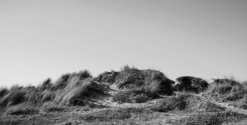
I started off by colour labelling all this images from this particular photoshoot in red so that I was able to view the images better. I went through each image one by one and X to reject/ P to pick each image, depending on whether I liked the image or not. After this process I filtered the images so I could only see the picked ones, this then allowed me to start rating the images, aided by the compare tool to see which image is better focused out of two similar photos. At the end of these processes I was left with 4 images at the end of this; two that had myself the model in, and two I was hoping to use as my cover image (image shown at the bottom).
COVER IMAGE
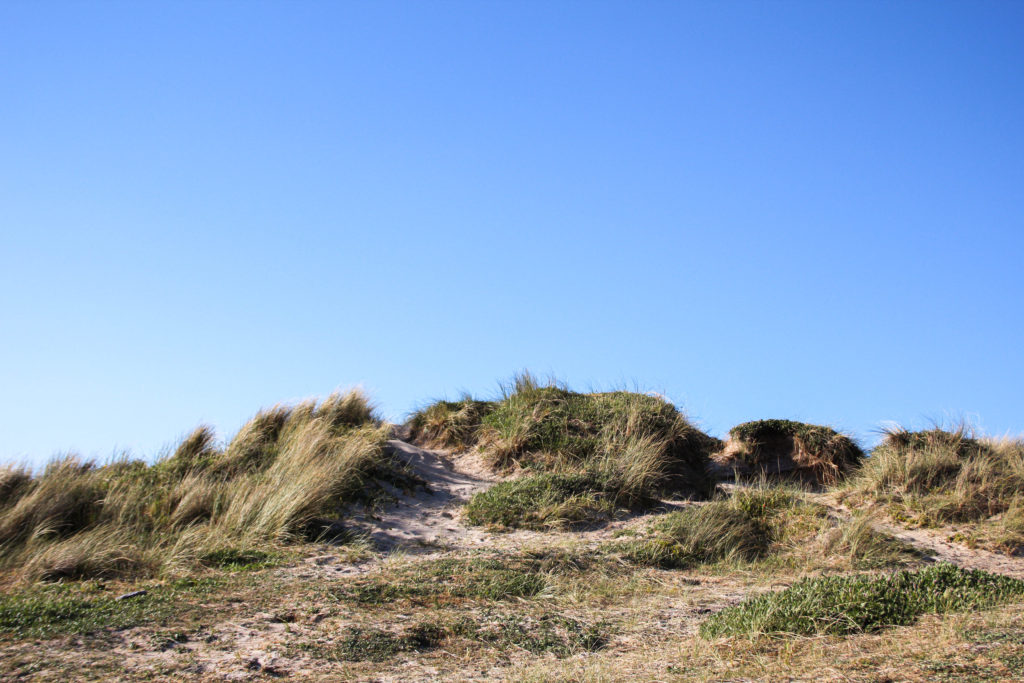
Within my photoshoot, I couldn’t decide between these two images to span across the front and back of the cover pages. I decided that no matter what image went on the cover, it would be in colour. So I look both images into develop to start playing with colours. I firstly enhanced some of the warmer tones in the images to bring out the yellow colours of the sand, so that it would better contrast the bright blue sky. I also increased the exposure and contrast to create better distinction between highlights and shadows. As well as this I lightly increased black and highlights, while keeping shadows the same. I completed the same editing process with both images
I decided to see what image would look better on the cover by taking them into bookwright and comparing them. The images below show what each image looks like on the cover. I made the title of my book Psammosere and further wrote my name on the spine with the title. Even though both of these images are really stunning and elegantly represent how the sand dunes look, I prefer the colours and bright strands of marram grass in the bottom image. Although, I’d really like to use the top image within my book, and its inspired me to not just use images of myself in the black dress in all my images, but of the landscape by its self too.

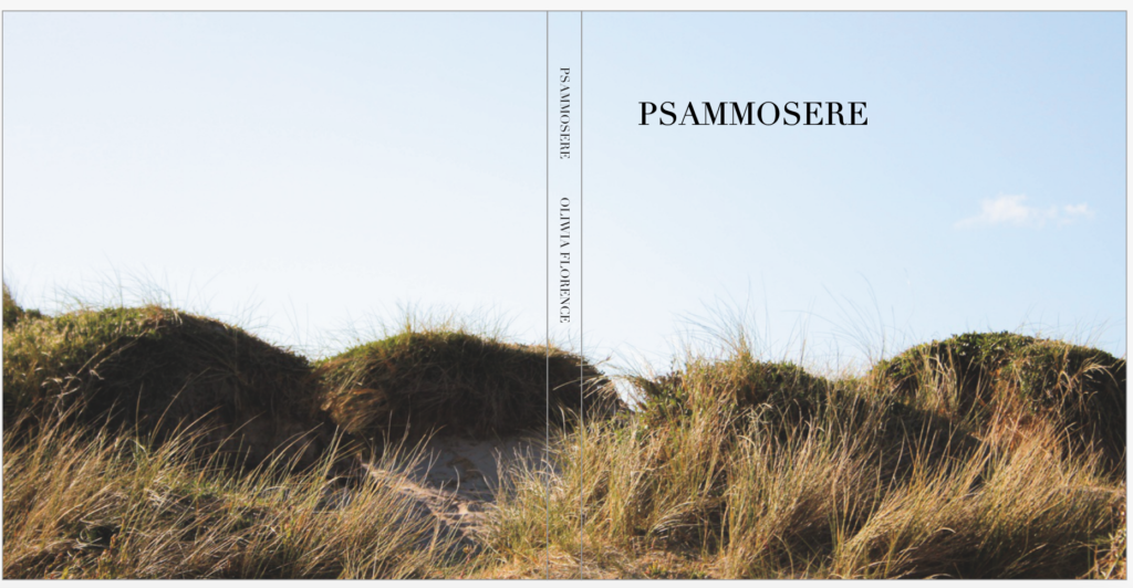
final image for the cover page
EDITING MY BOOK IMAGES
These are the two images that I was hoping to use inside the pages of my book. I really love the composition of these images and how the grass flows with the direction of the wind. I really enjoy how the marram grass flows over me in the image on the left, I also this that my positioning, which is similar to one in the initial sea photoshoot, is a gentle and calming pose. It can be seen that I am possibly intimidated by the growing grass. I edited these images similarly to the others in previous shoots to keep consistency.
FINAL IMAGES
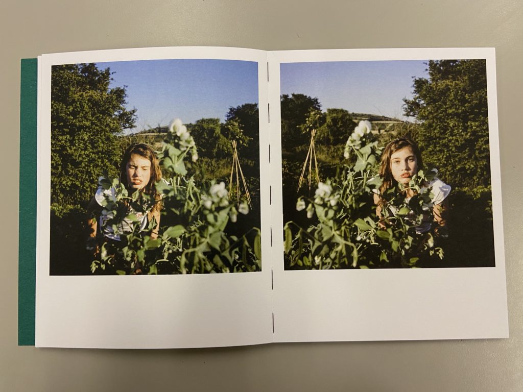
when looking at this photo book in class, I was very inspired by its layout, particularly this spread on the left. They look as if they are the same image mirrored but in fact, it’s a different shot but still mirrored. I thought I would try this with my square image just below. I will similarly have it on a double page spread, adding diversity to the images in my book. I particularly like the way my hair mimics the way the wind moves the grass. These 3 images will form the middle of my book, being in the embryo dunes.
EVALUATION
I think that this photoshoot was very successful. I am very happy with the images that I produced from the shoot were very unique and well-edited. I think that all of the compositions of the photographs are very centered and symmetrical so create an interesting image to look at. Although, next time I would definitely make sure that the editing process is more interesting. I would have liked to have experimented more with day/night time, weathers, coloured lights and outfits possibly. Even though the images are interesting, I would have definitely have liked to take more inspiration from artists and photographers.
1950’S JERSEY TRANSITION – SHOOTING, EDITING PROCESS and evaluation
The photos I used in my project from an archive of imagery dating back from the 1950’s available on the ‘Jerrepedia‘ website. These superb quality colour photographs of Jersey n the 1950s were taken on Selochrome – a transparency film first introduced in the 1930s. These photos allow me to explore the theme of transition, by comparing and contrasting the differences between the photos through time, similar to Iglesias Maurer.
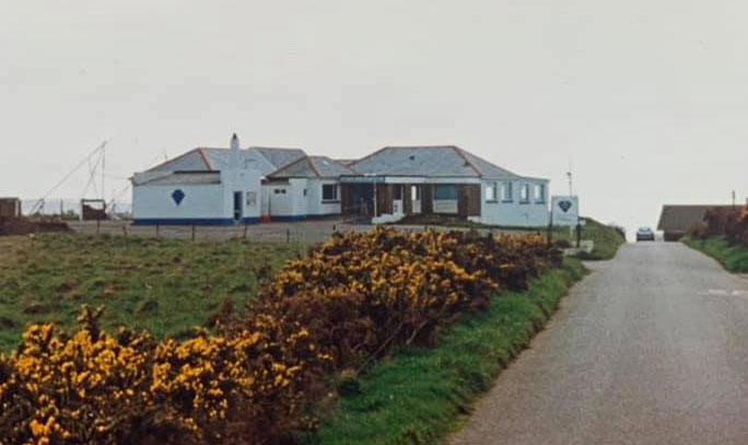
Firstly i took photos of the same locations as from the archives, trying as best as possible to imitate the photo as similarly as possible by positioning myself in the exact same location, and taking the photos from the same angle/zoom. This was difficult as I had to try and position myself in the exact same spot as best to my knowledge, as I had no prior information to wear the original photographer stood, thus I had to look, analyse and interpret the photos so I could best replicate them. The photos in the archive also lacked information on their original whereabouts, which meant that I had to observe and locate the exact location. Eventually though, I located each spot to the best of my ability which in my opinion allowed for satisfactory results, as when the images were stitched together, they blended seamlessly.
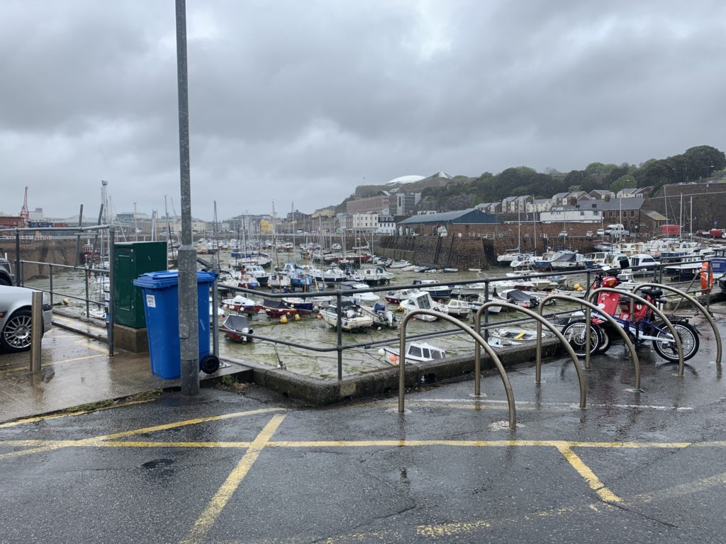
I took the photos with my camera using a stock lense. No tripod was used as the photos came out really well with a good, strong focus all round and minimal blur. The photos had a landscape aspect ratio which allowed me to divide the photos into thirds. This meant I could stitch the photos from the archive and contrast them with my modern day interpretations seamlessly to highlight any differences through the years.
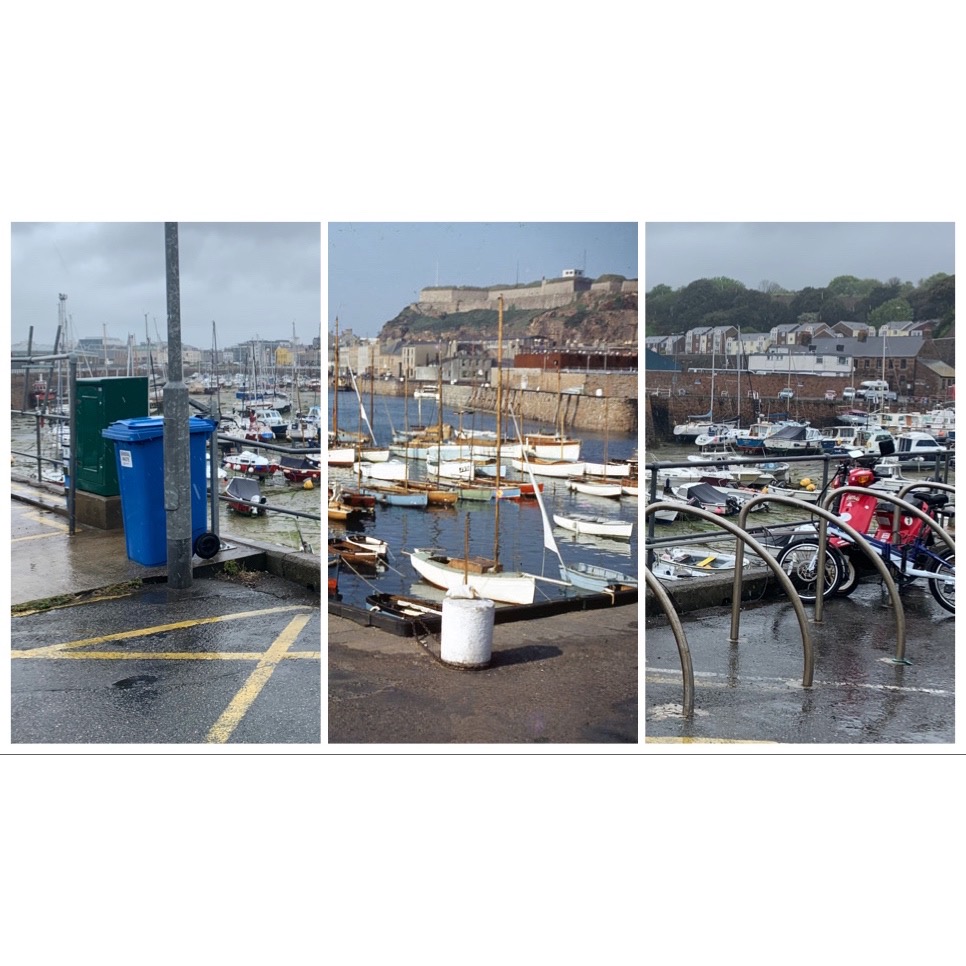
I would then proceed to stitch the photos manually on Photoshop CC, by simply downloading the photos off of an SD card and dragging and dropping on Photoshop CC, manually resizing them to make sure all the angles and buildings/roads fit together seamlessly, which was quite tedious, then flattened the images to create one image split into thirds.
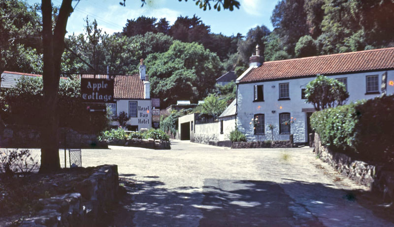
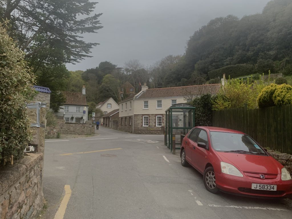
As you can see, the photos I captured looked quiet dull as a result of the weather on the day the photos were taken, unlike the original photos which were evidently taken on clearer, sunnier, summer days. This could’ve been changed if I had decided to take the photos simply another day, however the weather wasn’t very fortunate for a few weeks when my shoots had occurred, so there wasn’t much in my power that I could do. What I did was I edited the photos ever so slightly as I didn’t want the photos looking too artificial with too much contrast/highlights or hue/saturation as it would deviate away from the original aim of this project, but also look vastly dissimilar from the original photos, which wouldn’t be ideal as I wanted them to look rather similar, however not too similar as I still wanted change/transition to be visible. I increased all my photo’s contrasts, exposures and highlights, but made sure it was subtle so it wasn’t too noticeable. However, once edited, the photo allowed for a good final product, especially when embedded within the other photos from the archive.
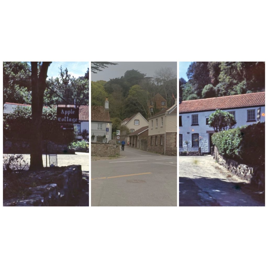
The photos included locations from St Helier harbour, most notably the old harbour, as well as Greve De Lecq, Bouley Bay, L’Etacq and Rozel. Some of the locations have more than one photo in the archive that I have tried replicating. Each of the photos included has two versions, one with both archival images either side, and one modern photo taken by me in the centre, and the other version being the simply being opposite to add variety and show more transition, with one archival image in the centre, and my modern replica photo either side. This makes a nice picture frame style with all the buildings, roads etc. blending in to one another even though they are different photos taken at different times. This helps highlight the differences/transition through time of places but also helps identify the similarities as you can see common things such as houses extending from archival to modern photos with minimal change. This is very significant and opens up many deep thoughts such as are things eternal?
Evaluation
Overall, I am quite happy with my images. I feel as if I used my time before creation well and I managed to make great use of my research into Paul Iglesias Maurer and also of my general photographic research over the past years. I feel like my research allowed me to be more free with my ideas and not be scared to try something different. I like how some of the photos in particular really well demonstrate the changes through time, and have the images blend seamlessly together. I also love the theme behind the photos, the thoughts it conjures up, how things change always and nothing is forever, which is a stark, yet awakening thought, which gives the photos a lot more meaning behind them On the other hand, the main thing that i feel like i could have improved on is the quality of images and maybe the contrast of images. I feel I could’ve improved the overall quality of my book by integrating some possibly higher resolution photos, but also taking more in the first place, although the archive in which I was using photos from had a very narrow selection, almost all of which I had used. Lastly, some of the photos could have done with better adjusting when combining the photos. As the photographer/editor, I cannot help but notice tiny imperfections in some of my photo pieces, where a small building or road didn’t line up or anything.
pLEMONT BUNKER SHOOT
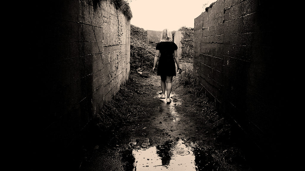
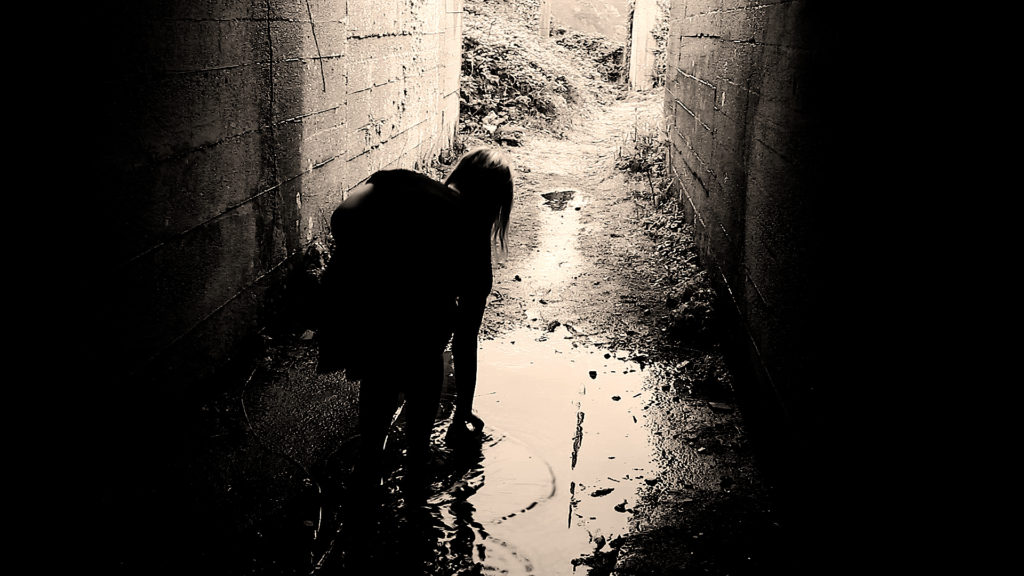
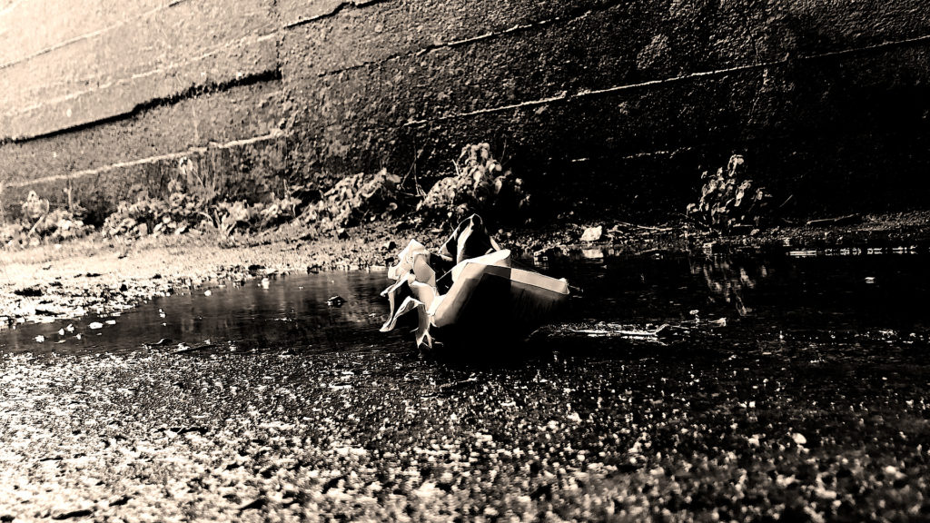
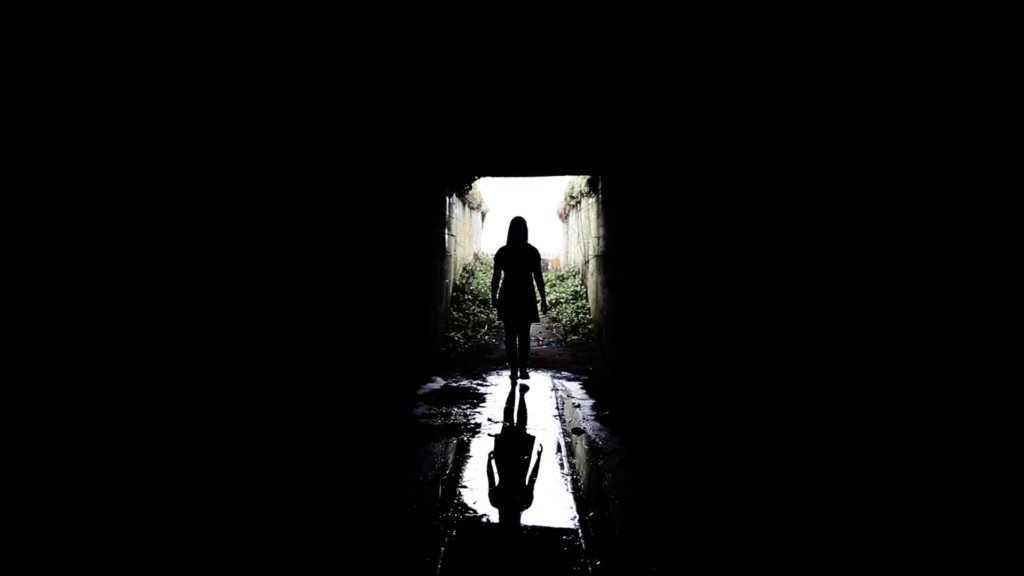
When I went to the large bunker at the bottom of Plemont, the weather became a damaging factor and I was worried that the rain and the wind would make the tripod fall over as well as break the camera. Although I managed to deal with the weather and if anything it added to effect of the film by making me look more exhausted resulting in a creepier look to the film. I also liked the way that the rain dripped and echoed inside of the bunker as it made my film more ominous when editing the audio although I struggled to single out this one sound as the wind was very strong.
This part of the film related to the them of freedoms and limitations the most and expressed it better than any other part. The drastic contrast between light and dark adds to the thought of oppositions. Being in the dark means lack of knowledge or being hidden from the truth whereas putting light on the situation adds meaning and truth just the same with freedoms and limitations.
My specific inspiration for these scene was Duane Michals. Duane Michals first made significant, creative strides in the field of photography during the 1960s. In an era heavily influenced by photojournalism, Michals manipulated the medium to communicate narratives. The sequences, for which he is widely known, appropriate cinema’s frame-by-frame format. Michals has also incorporated text as a key component in his works. I like the way that Michals presents his work as dark and ominous as that’s the way I like to go about presenting my work also. I like the theme of black white where shadow and light appears to be a lot more dramatic than it would be if the photograph or film was in colour. Whether the spirit/ghost is visible in the photo or if there is a feeling of the supernatural lurking around the photo, I think Michals work represents the unsettling feeling of uncertainty. His work links to my theme of Freedoms and Limitations as there’s the idea that the angel/devil near the bed had the freedom to do what they want without consequences but as had the limitations of not having a normal human life.
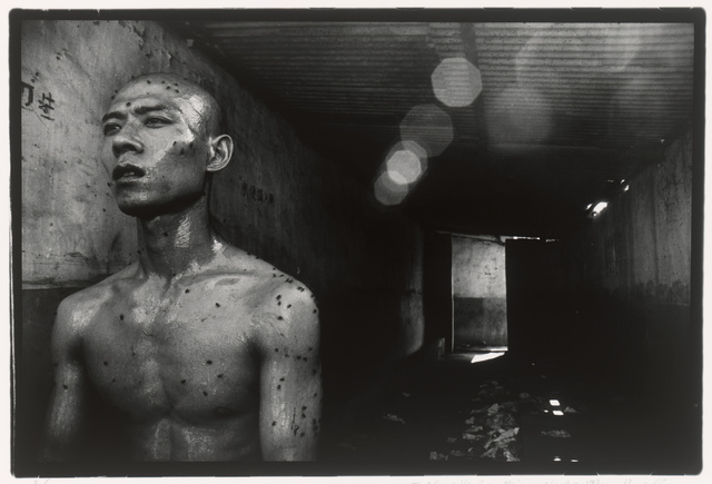
My other inspiration was Zhang Huan. Zhang Huan is a Chinese artist based in Shanghai and New York City. He began his career as a painter and then transitioned to performance art before making a comeback to painting. He is primarily known for his performance work, but also makes photographs and sculpture. He is usually photographed by the photographer Rong Rong. Both of the artists work combined creates an inspirational flow for which I will consider incorporating into my film. In relation to Freedoms and Limitation it is clear that the photographs below connect greatly to the theme. The photography is clearly showing some people being completely trapped and chained by the society in which they live in. Whereas some of the photos show the complete exposure to the real world and freedom to explore nature and the imagination. I like the amount of depth the photos explore and the rawness; it has an unsettling element to it which I’d like to display within my own work. I also like the way the photographs are displayed as worn out photographs; it makes the viewer feel as if that they are viewing has some historical importance or that the photograph is deemed as special or one of a kind. The photograph above has also given me some inspiration for my film. I was thinking that if I wasn’t to present there beginning or the end of my film in my bedroom, I was going to use a bunker to have an element of darkness as well as to show one of the girls in my film to have a life which isn’t glamorous compared to the other character. I think the image has a lot of depth to it as the door towards the background shows the light coming through indicating that there’s a way out from the bunker which could be seen as metaphorical for a way to escape the darkness and move towards something to improve a persons life. Which all links to freedoms and limitations.
My other inspiration is Michael Chaves, specially the music video he helped Billie Eilish make called Bury A Friend and the movie The Conjuring 3. When looking at Bury A Friend, from the album “When We All Fall Asleep Where Do We Go?”, I think the concept of nightmares and horror links in nicely as well as the title pf the song quite literally linking to death; intertwining with graves, spirits and ghosts. My idea of making peoples spirits/alter self come to life makes me think of the demonic character Billie Eilish is trying to portray. I was thinking of having two main people in the film like the music video where the man on the bed is unconscious but talking whilst dreaming in this dimly lit building and Billie Eilish being the monster in his bedroom watching him, under his bed and lurking around the hallways of his building. I also think the lyrics in the song itself have a lot of meaning and would help me to move forward with the theme of Freedoms and Limitations. The freedom to express your darkest thoughts and make them come to life but the limitations of how far you can express what you’re thinking without making your ideas too dark as well as the limitations of not having full control of what your thinking or feeling.
Editing and Experimenting
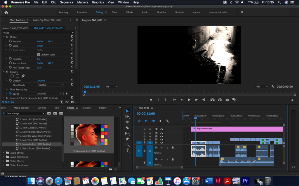
Whilst editing, I found myself experimenting a lot with the shadows and the black of the footage. I did this to make the footage look creepier than it usually would. I thought the effect of heightening the shadows was an important effect when it comes to the final film. The drastic contrast between light and dark adds to the thought of oppositions. Being in the dark means lack of knowledge or being hidden from the truth whereas putting light on the situation adds meaning and truth just the same with freedoms and limitations. I also put an adjustment layer to make sure the footage lined up properly when it came to the different tones being affected by the light. As for the audio I spliced it up carefully and layered the sound for a spookier effect.
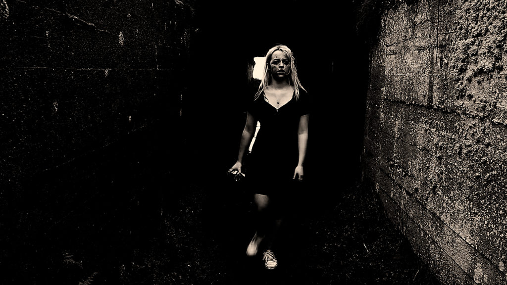
darkening the shadows for a creepier affect 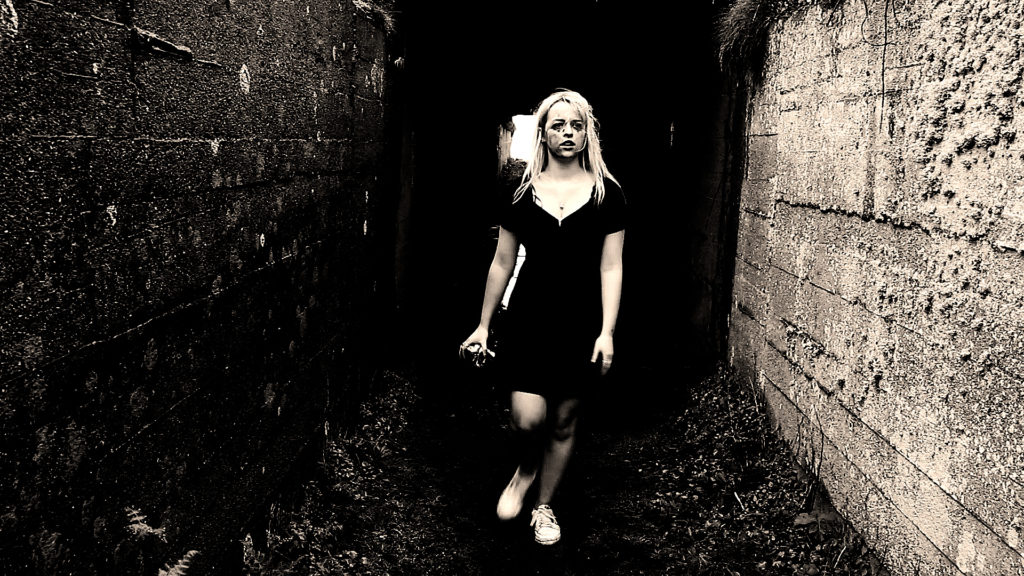
adding more highlights to make the face more visible
Filters 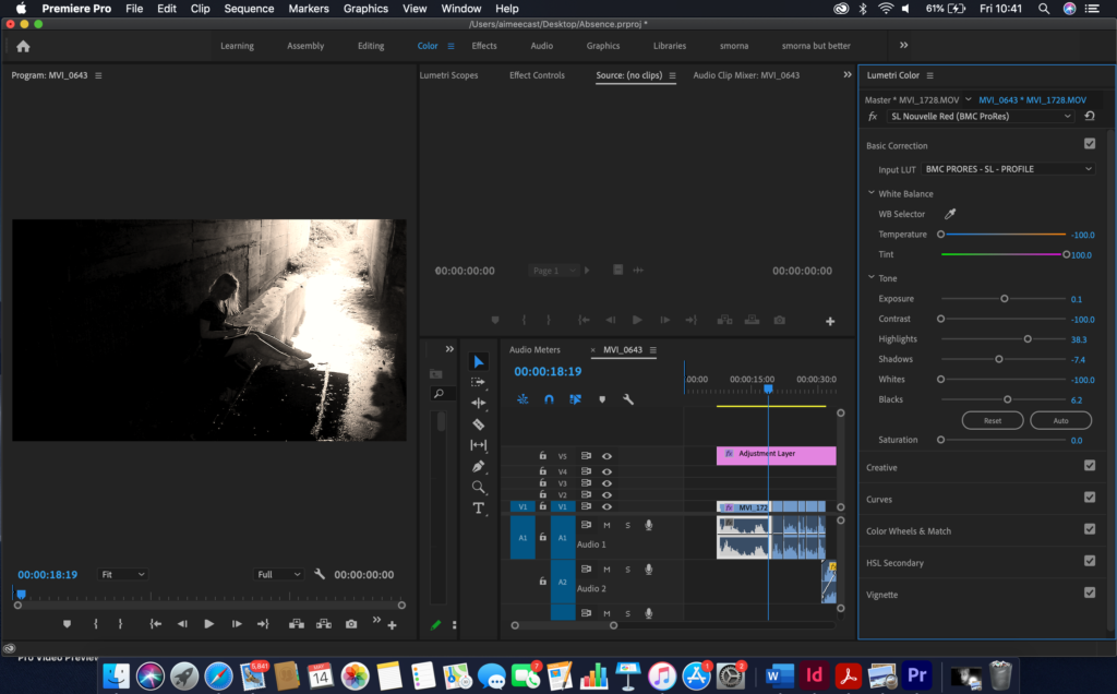
fading audio
Evaluating
Although this was by far the most difficult shoot to do, it came out the best and it was my favourite one to film. I loved the look of all the shots and how shadowed all of the bunker was. Whilst trying to find a bunker that I could actually go in it started raining and the wind started picking up. I went to a total of five bunkers until I found one that had an area that I could venture into. The slope to the bottom of Plemont was extremely steep and muddy and I nearly slipped multiple times whilst get drenched and getting pushed by the wind but I managed to get down there eventually. I tried to film with multiple cameras to get different angles of what I was doing. This turned out well mostly but some of the footage got corrupted as well as the card becoming full whilst I was in the middle of filming. But, overall, I’m very happy with the results.


