MY FINAL BOOK – PSAMMOSERE
For my project I have decided to use Bookwright as it is a relatively easy and well made program to make my photo-book. I created an account with blurb and downloaded bookwright. I chose a small square layout ( 18cm x 18cm ) with premium matte paper and a hardcover design.
COVER DESIGN:
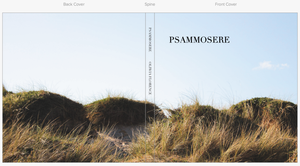
Above is my final edited cover image that I will use to wrap my photo-book cover with. Within my photoshoot, I couldn’t decide between two images to span across the front and back of the cover pages. I decided that no matter what image went on the cover, it would be in colour. The image above is the photo I used to cover my page. I firstly enhanced some of the warmer tones in the images to bring out the yellow colours of the sand and grass , so that it would better contrast the bright blue sky. I also increased the exposure and contrast to create better distinction between highlights and shadows. As well as this I lightly increased black and highlights, while keeping shadows the same.
MY FINAL COVER DESIGN:
MY PAGE DESIGN:
I decided to set up all my image sizes and orientations on my page. I chose to use a random arangement of image size and layout so create diversity in the book. as well as this, I’ve included gaps on pages between photographs to keep the images separated and bring more attention to the photos that are there. I wanted the book to be simple and elegant, and showcase the beauty in the minimal images that represent so much about the dune succession.
- I have also decided to keep the pages white to contrast the images.
- all images are different dimentions
- all images are a different place on the page.
- text will not go underneath the images
- all images apart from the cover are in black and white
FINAL BOOK LAYOUT:
EVALUATION
I think that the book is very successful. I am very happy with the images that I produced for the photo book were very unique and well-edited. I think that all of the compositions of the photographs are very centered and symmetrical so create an interesting image to look at. I like how I’ve used different compositions and photo sizes to create diversity and change Although, next time I would definitely make sure that the editing process is more interesting. I would have liked to have experimented more with day/night time, weathers, coloured lights and outfits possibly. Even though the images are interesting, I would have definitely have liked to take more inspiration from artists and photographers.


