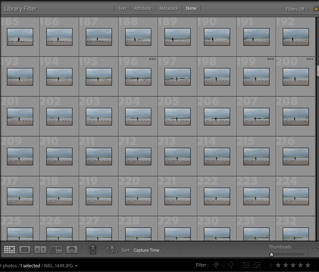
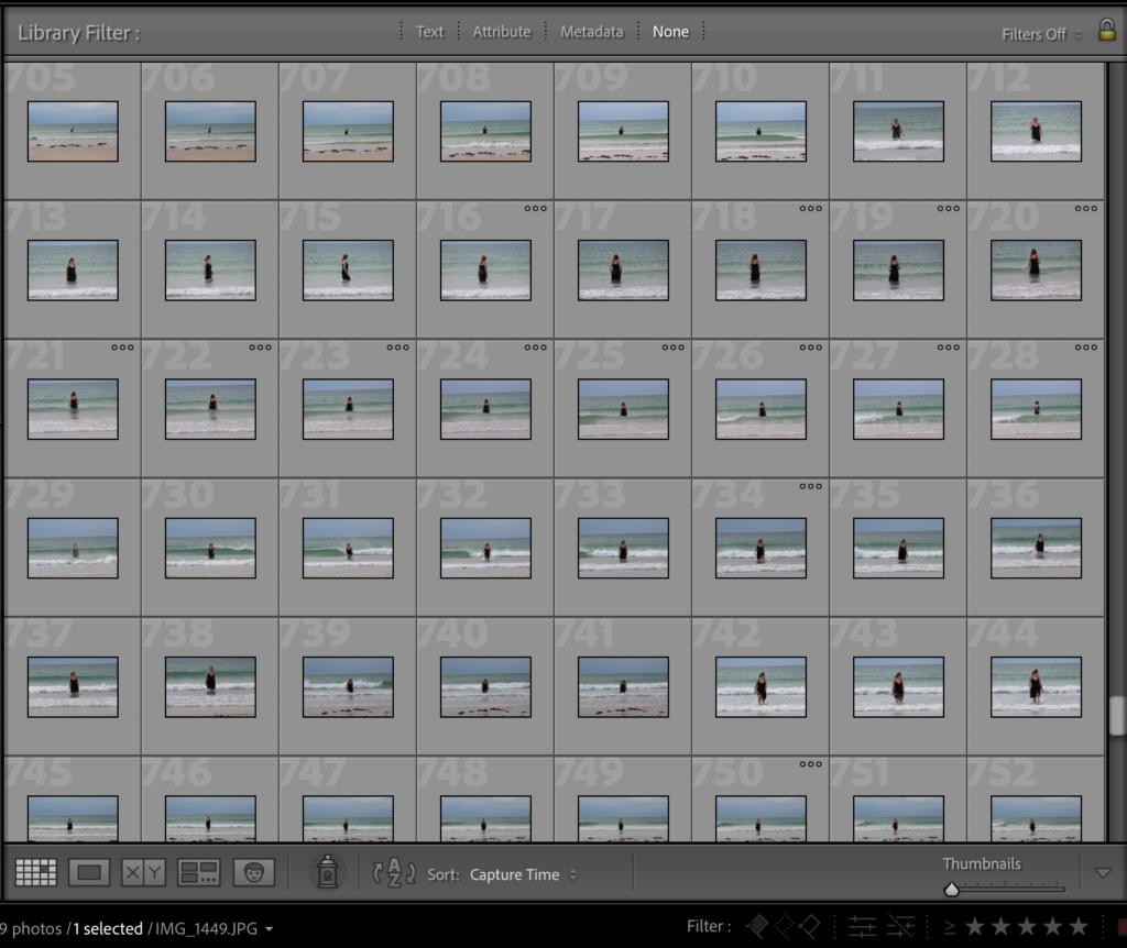
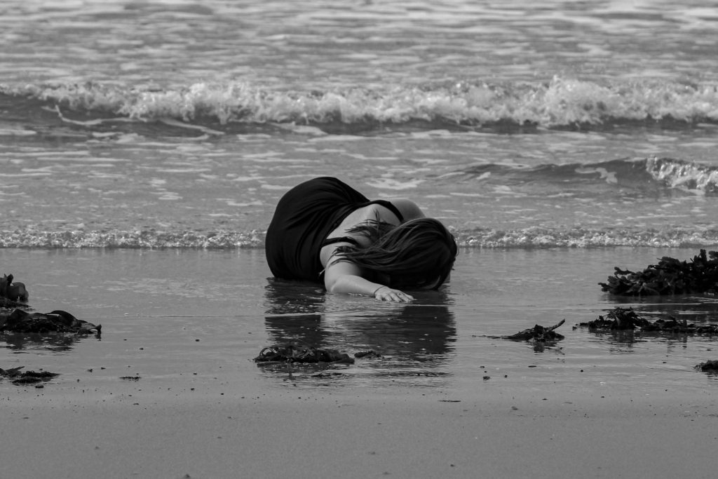
I started my photo book development by starting with a Michael Marten inspired photoshoot. I based my photoshoot at Le Braye beach where the waves are smaller and more calm. I was initially inspired by the image below and its powerful tidal message. My main idea was to start my photoshoot at the bottom of the sand dune succession transition; the sea. Images from this shoot will begin the story line of my book. I would similarly like to use a model (myself) to act as the sculpture of the figure in Michael Martens image below.
CAMERA SETTINGS
I set up my camera on a tripod to make sure all of my images where in focus. I would also use the self timer tool on the camera as I would be the model in the images. I planned on wearing a black dress and continuing that outfit throughout all of my images, again using myself as the model. The camera setting were very difficult to set up due to the movement of myself and the waves, so I had to use the autofocus tool in order to make sure all of my images came out clear with myself as the focus. Within my images, I had some of my lying down in the sand as if I was dragging myself out of the water. I think this would be a interesting concept as I am crawling my way through dunes. I also took some of myself in the sea, similar to the Michael Martens image below.
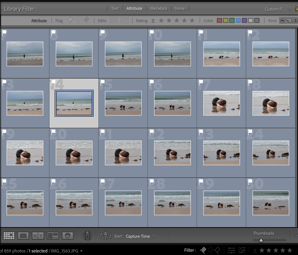
After taking all of my images onto Lightroom, I was able to start picking and rejecting images using the P and X keys. Many of the images wherent up to scratch as it was extremely difficult to take images of myself as the model. I think that the images that came out good where extremely beautiful and really exaggerated the movement of the tides. I think that the black dress contrased will to the sand and sea as the darkness of it brought attention to me as well as the landscape around.
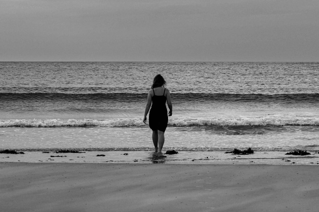
After flagging and rejecting my images, I went through and rated all of them out of 5 in order to start refining my decisions and options. I also used the compare tool ( shown in the image below) on Lightroom so that I was able to look at two similar images to decide which one had better composition and focus. I later decided on te two images below to start the first pages of my photobook. I think that their symmetry and focal points where the best and that they made very interesting and elegant images. I gave them 5/5 stars and used the filter tool on Lightrrom so that I could only view them, which would make the editing process much easier to do.
During the editing process I decided to make the images Black and white like I specified in my planning. I cropped the images to my desired proportions and angled the images so that the horizon line was exactly horizontal (image on the left). I started by editing the image on the left by increasing the exposure and contrast to accentuate the highlights and shadows in the black and white. In both images I centres myself directly in the middle, bringing focus to the model. I also increased the black so that the dress I was wearing was more visible. I copied and pasted the editing process onto the image on the right to keep the tones consistent within each photograph, I plan to to this to the rest of my images.


