FINDING A COVER IMAGE
During this shoot, I planned to find and edit and image for the cover of my book, psammosere. I think the images from this shoot of the embryo dunes are extremely beautiful and clearly outline and represent the sand dunes. Similarly to my last photoshoot, I set up my tripod, set my iso to 100 on the manual setting and aperture to f/16, as well as the shutter to 1/100 second. This allowed me to get well exposed images that where in focus. These smaller dunes where directly above the beach so follow the pattern of the succession of the sand dunes.
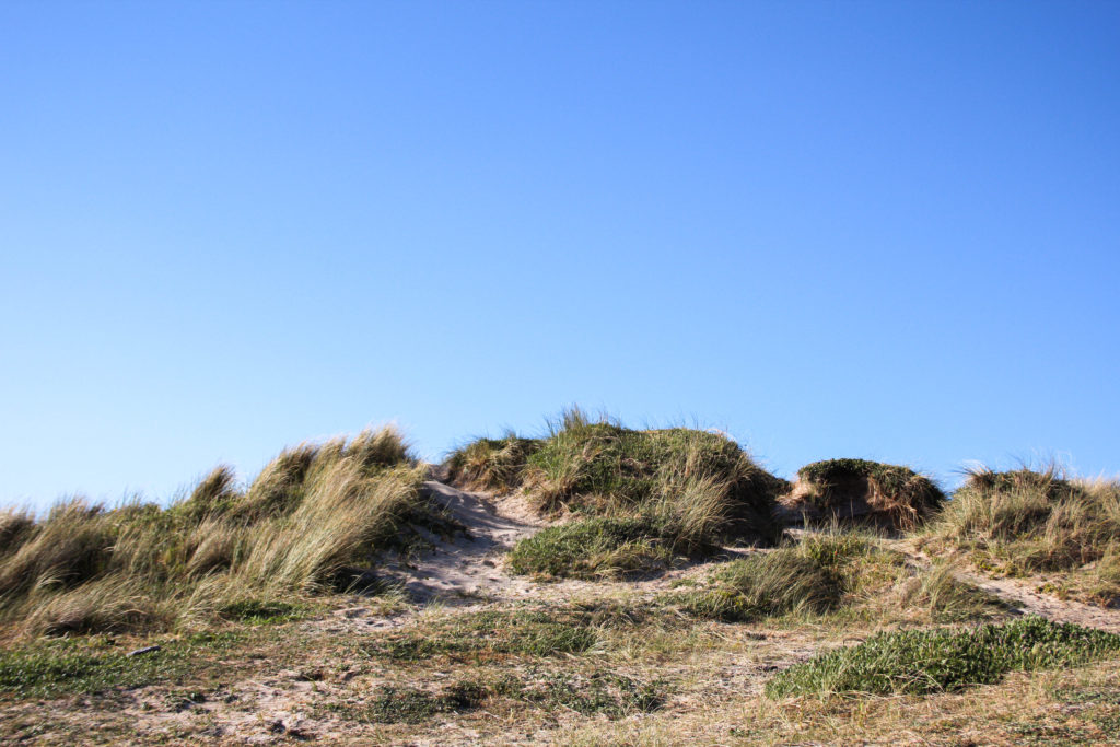
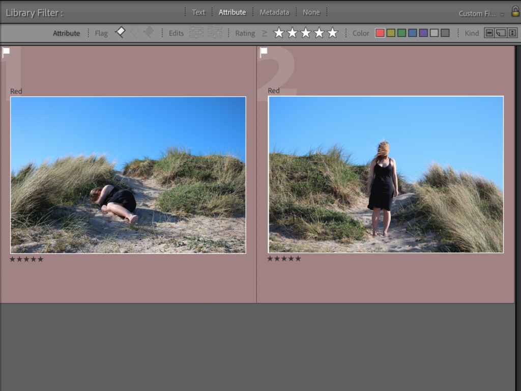
I started off by colour labelling all this images from this particular photoshoot in red so that I was able to view the images better. I went through each image one by one and X to reject/ P to pick each image, depending on whether I liked the image or not. After this process I filtered the images so I could only see the picked ones, this then allowed me to start rating the images, aided by the compare tool to see which image is better focused out of two similar photos. At the end of these processes I was left with 4 images at the end of this; two that had myself the model in, and two I was hoping to use as my cover image (image shown at the bottom).
COVER IMAGE
Within my photoshoot, I couldn’t decide between these two images to span across the front and back of the cover pages. I decided that no matter what image went on the cover, it would be in colour. So I look both images into develop to start playing with colours. I firstly enhanced some of the warmer tones in the images to bring out the yellow colours of the sand, so that it would better contrast the bright blue sky. I also increased the exposure and contrast to create better distinction between highlights and shadows. As well as this I lightly increased black and highlights, while keeping shadows the same. I completed the same editing process with both images
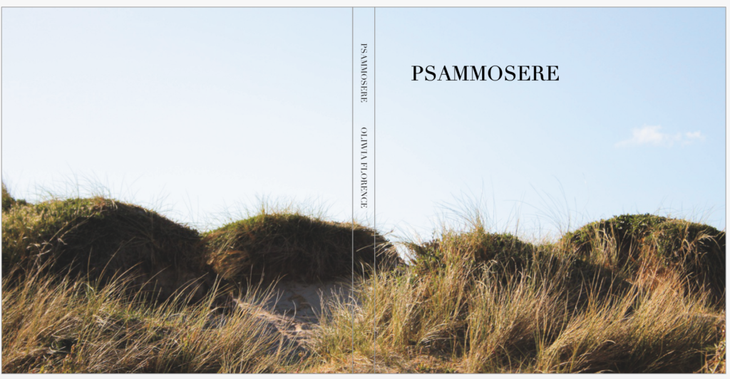
I decided to see what image would look better on the cover by taking them into bookwright and comparing them. The images below show what each image looks like on the cover. I made the title of my book Psammosere and further wrote my name on the spine with the title. Even though both of these images are really stunning and elegantly represent how the sand dunes look, I prefer the colours and bright strands of marram grass in the bottom image. Although, I’d really like to use the top image within my book, and its inspired me to not just use images of myself in the black dress in all my images, but of the landscape by its self too.


final image for the cover page
EDITING MY BOOK IMAGES
These are the two images that I was hoping to use inside the pages of my book. I really love the composition of these images and how the grass flows with the direction of the wind. I really enjoy how the marram grass flows over me in the image on the left, I also this that my positioning, which is similar to one in the initial sea photoshoot, is a gentle and calming pose. It can be seen that I am possibly intimidated by the growing grass. I edited these images similarly to the others in previous shoots to keep consistency.
FINAL IMAGES

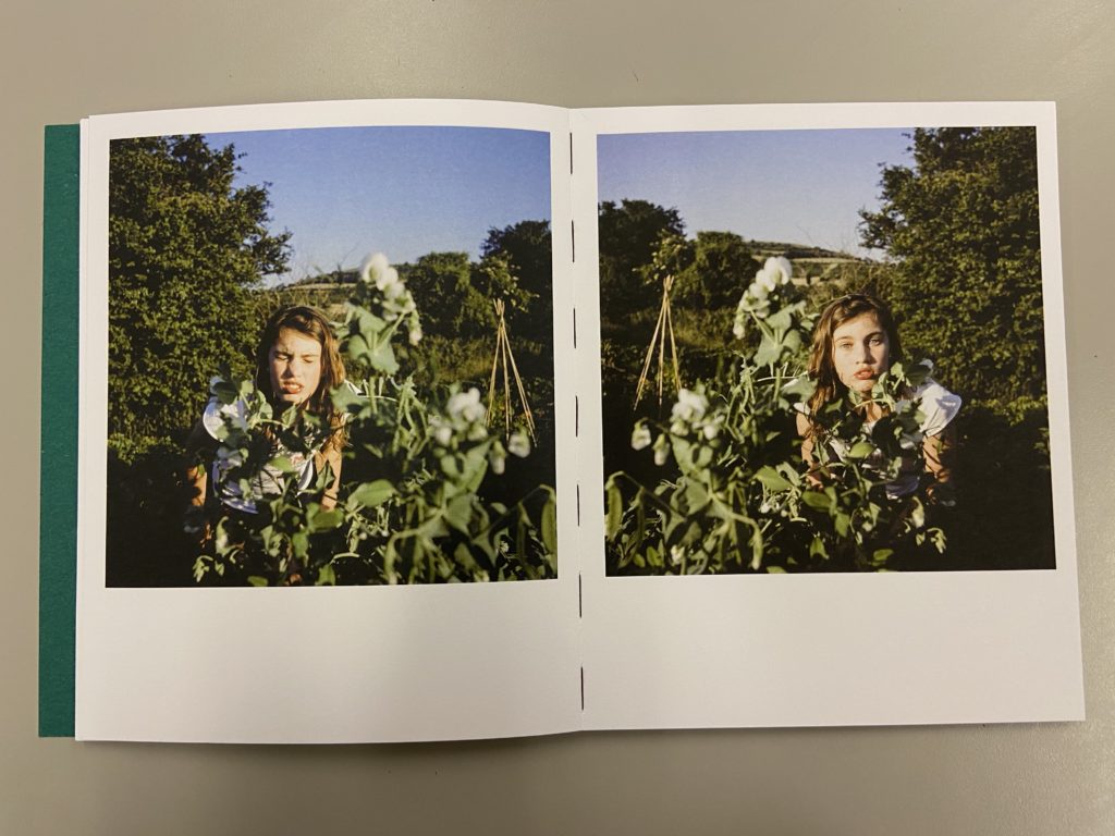
when looking at this photo book in class, I was very inspired by its layout, particularly this spread on the left. They look as if they are the same image mirrored but in fact, it’s a different shot but still mirrored. I thought I would try this with my square image just below. I will similarly have it on a double page spread, adding diversity to the images in my book. I particularly like the way my hair mimics the way the wind moves the grass. These 3 images will form the middle of my book, being in the embryo dunes.
EVALUATION
I think that this photoshoot was very successful. I am very happy with the images that I produced from the shoot were very unique and well-edited. I think that all of the compositions of the photographs are very centered and symmetrical so create an interesting image to look at. Although, next time I would definitely make sure that the editing process is more interesting. I would have liked to have experimented more with day/night time, weathers, coloured lights and outfits possibly. Even though the images are interesting, I would have definitely have liked to take more inspiration from artists and photographers.


