
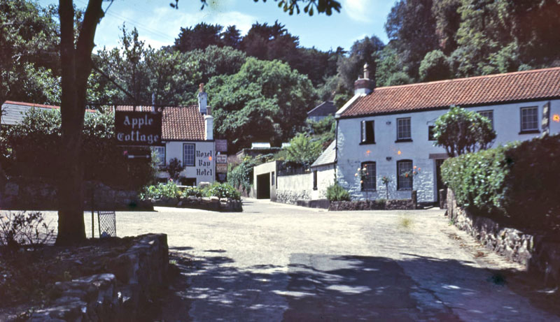
The photos I used in my project from an archive of imagery dating back from the 1950’s available on the ‘Jerrepedia‘ website. These superb quality colour photographs of Jersey n the 1950s were taken on Selochrome – a transparency film first introduced in the 1930s. These photos allow me to explore the theme of transition, by comparing and contrasting the differences between the photos through time, similar to Iglesias Maurer.
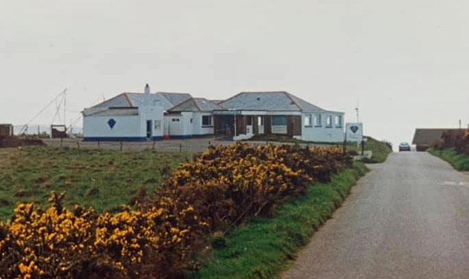
Firstly i took photos of the same locations as from the archives, trying as best as possible to imitate the photo as similarly as possible by positioning myself in the exact same location, and taking the photos from the same angle/zoom. This was difficult as I had to try and position myself in the exact same spot as best to my knowledge, as I had no prior information to wear the original photographer stood, thus I had to look, analyse and interpret the photos so I could best replicate them. The photos in the archive also lacked information on their original whereabouts, which meant that I had to observe and locate the exact location. Eventually though, I located each spot to the best of my ability which in my opinion allowed for satisfactory results, as when the images were stitched together, they blended seamlessly.
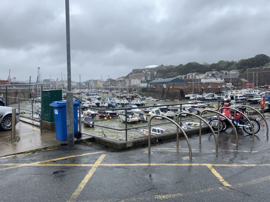
I took the photos with my camera using a stock lense. No tripod was used as the photos came out really well with a good, strong focus all round and minimal blur. The photos had a landscape aspect ratio which allowed me to divide the photos into thirds. This meant I could stitch the photos from the archive and contrast them with my modern day interpretations seamlessly to highlight any differences through the years.
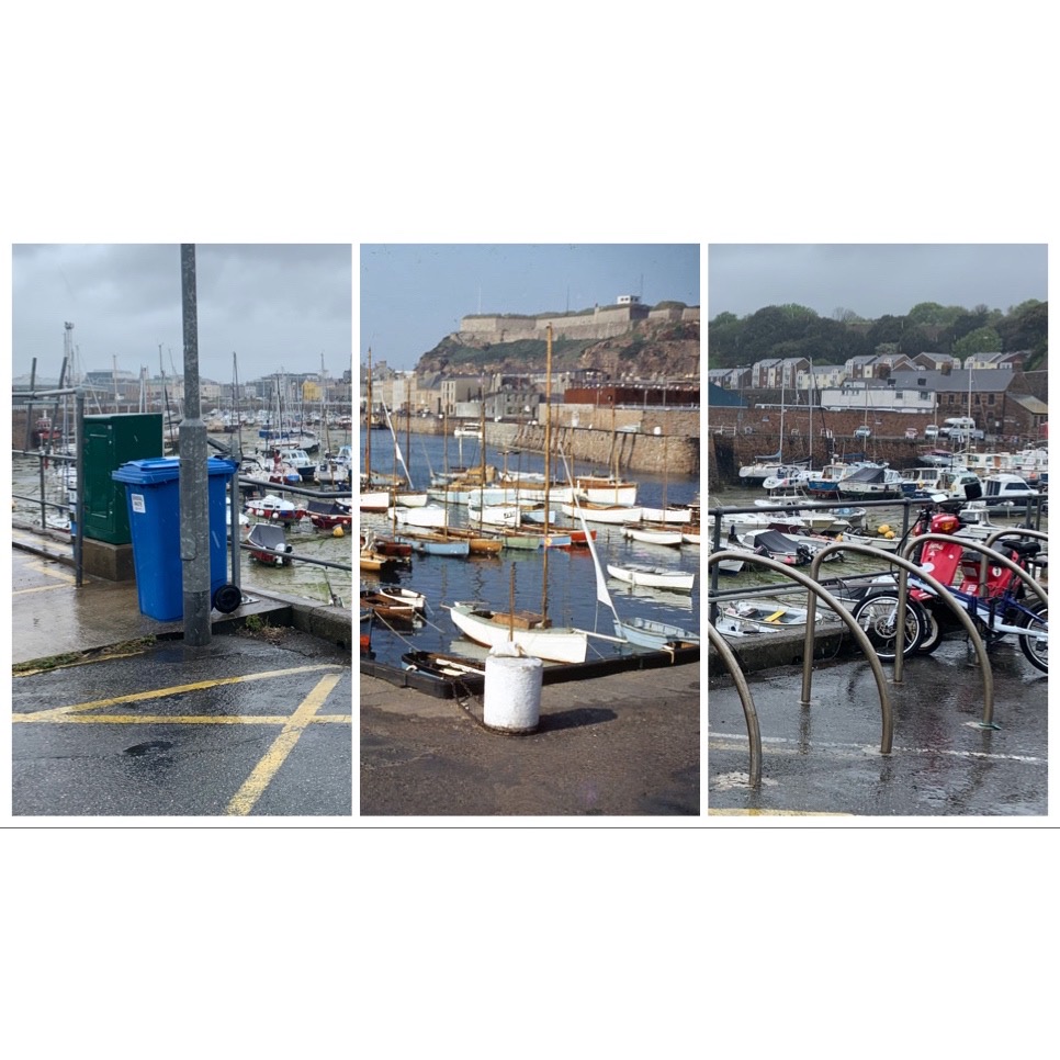
I would then proceed to stitch the photos manually on Photoshop CC, by simply downloading the photos off of an SD card and dragging and dropping on Photoshop CC, manually resizing them to make sure all the angles and buildings/roads fit together seamlessly, which was quite tedious, then flattened the images to create one image split into thirds.
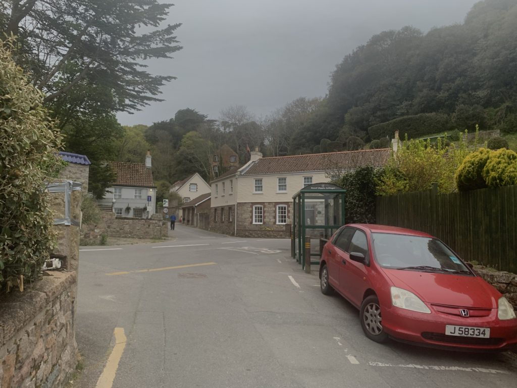
As you can see, the photos I captured looked quiet dull as a result of the weather on the day the photos were taken, unlike the original photos which were evidently taken on clearer, sunnier, summer days. This could’ve been changed if I had decided to take the photos simply another day, however the weather wasn’t very fortunate for a few weeks when my shoots had occurred, so there wasn’t much in my power that I could do. What I did was I edited the photos ever so slightly as I didn’t want the photos looking too artificial with too much contrast/highlights or hue/saturation as it would deviate away from the original aim of this project, but also look vastly dissimilar from the original photos, which wouldn’t be ideal as I wanted them to look rather similar, however not too similar as I still wanted change/transition to be visible. I increased all my photo’s contrasts, exposures and highlights, but made sure it was subtle so it wasn’t too noticeable. However, once edited, the photo allowed for a good final product, especially when embedded within the other photos from the archive.
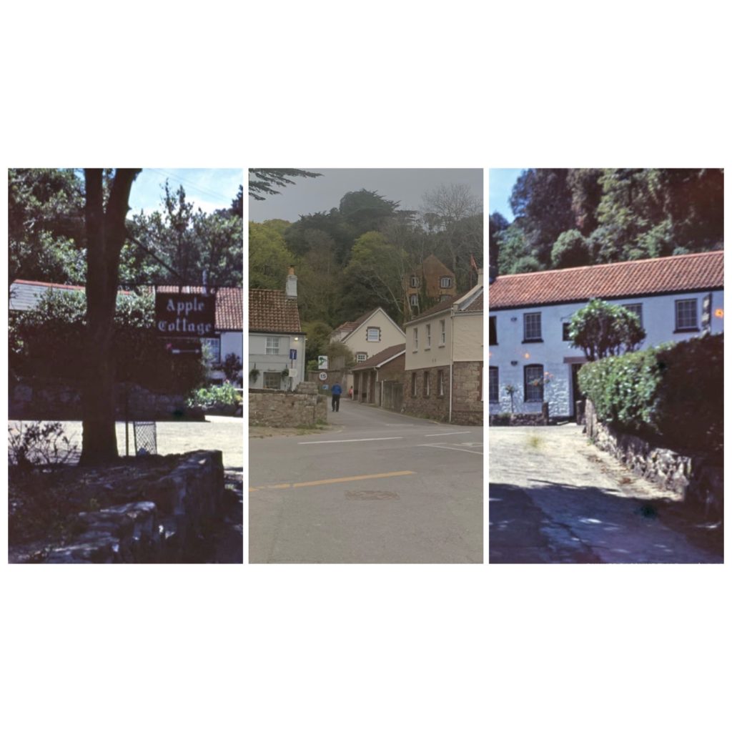
The photos included locations from St Helier harbour, most notably the old harbour, as well as Greve De Lecq, Bouley Bay, L’Etacq and Rozel. Some of the locations have more than one photo in the archive that I have tried replicating. Each of the photos included has two versions, one with both archival images either side, and one modern photo taken by me in the centre, and the other version being the simply being opposite to add variety and show more transition, with one archival image in the centre, and my modern replica photo either side. This makes a nice picture frame style with all the buildings, roads etc. blending in to one another even though they are different photos taken at different times. This helps highlight the differences/transition through time of places but also helps identify the similarities as you can see common things such as houses extending from archival to modern photos with minimal change. This is very significant and opens up many deep thoughts such as are things eternal?
Evaluation
Overall, I am quite happy with my images. I feel as if I used my time before creation well and I managed to make great use of my research into Paul Iglesias Maurer and also of my general photographic research over the past years. I feel like my research allowed me to be more free with my ideas and not be scared to try something different. I like how some of the photos in particular really well demonstrate the changes through time, and have the images blend seamlessly together. I also love the theme behind the photos, the thoughts it conjures up, how things change always and nothing is forever, which is a stark, yet awakening thought, which gives the photos a lot more meaning behind them On the other hand, the main thing that i feel like i could have improved on is the quality of images and maybe the contrast of images. I feel I could’ve improved the overall quality of my book by integrating some possibly higher resolution photos, but also taking more in the first place, although the archive in which I was using photos from had a very narrow selection, almost all of which I had used. Lastly, some of the photos could have done with better adjusting when combining the photos. As the photographer/editor, I cannot help but notice tiny imperfections in some of my photo pieces, where a small building or road didn’t line up or anything.