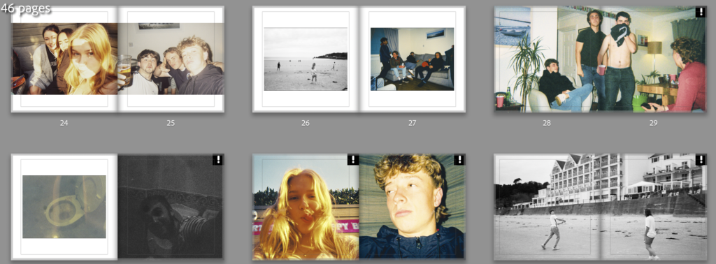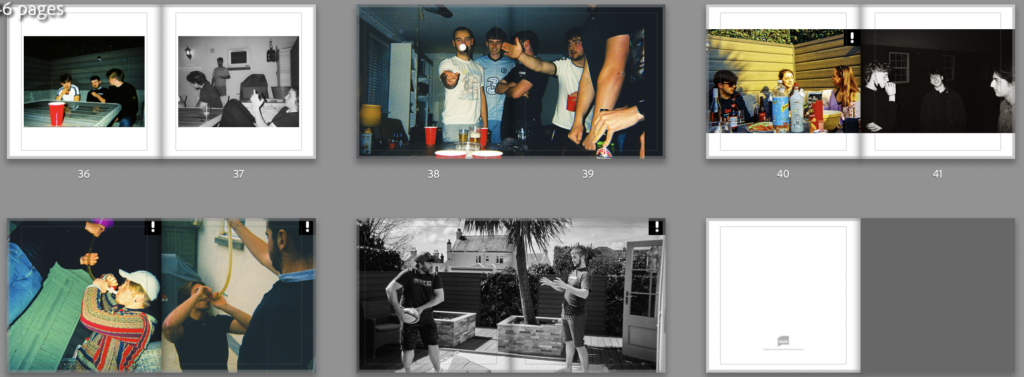


I’ve compared images in the three categories that I planned in my statement of intent. The first was girls and boys where I conceitedly got images that looked very similar between the boys and girls and some that looked different. For example, on page 24/25 there or two triple people selfies taken at a similar angel the difference being that the girls are pulling serious faces and the boys are messing around. Another example is found on pages 10/11 where there’s a two person portrait from each parties but again, the girls are posing and the boys are being stupid. Then there are instances like pages 32/33 and 40/41 where both pictures are silly or both are more serious.
The Day and Night comparisons have worked well and some have come hand in hand with the drunk and sober comparison or the boys and girls one. Overall I think my photos and the way that they’re laid out says a lot about the different ways in which a group of lads and a group of girls use their freedom and the similarities too.
I have also used double page spreads for certain images that didn’t print correctly due to the photos being taken on a disposable camera. Although it may be a stretch, I believe that these photos represent that things can definitely go wrong without certain limitations and maybe 100% freedom isn’t the best option
