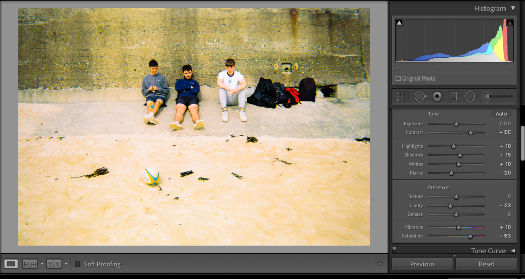
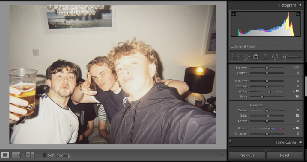
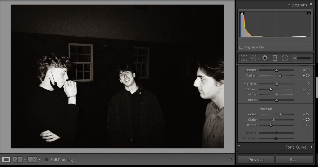
There were many images where I had to chose between high saturation or B&W. I made many of the beach images B&W as the beige sand didn’t look right when the saturation was lifted. Creating a mix of vibrant photos and B&W ones helps with the flow of the book and creates more contrast between images.
This photo is a good example of my influence from Alex Webb through increased saturation, texture and contrast. There is an immediate improvement to the image and the vibrant and ‘happy’ colours help to emphasise a sense of freedom.
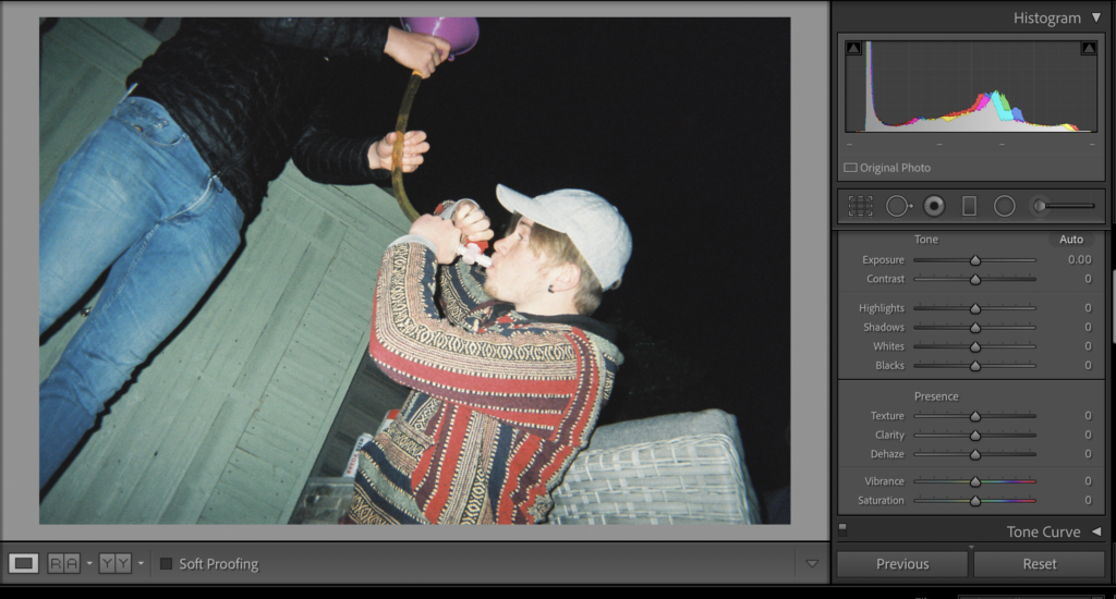
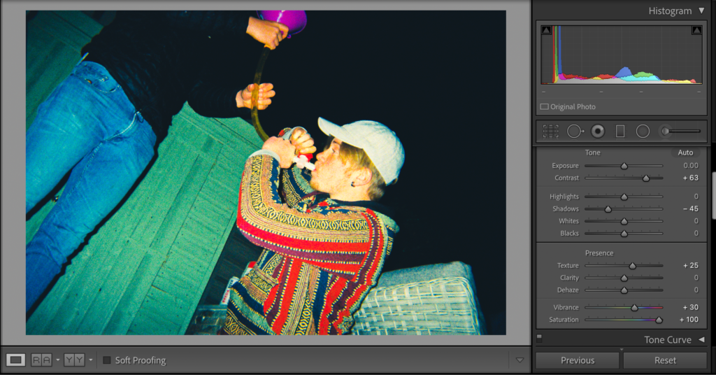
There are instances where I’ve decided to make the images darker and use a different editing style. Although the saturation is still increased, I’ve reduced the shadows, blacks and whites in order for these two images to appear as if they are one when placed side by side.
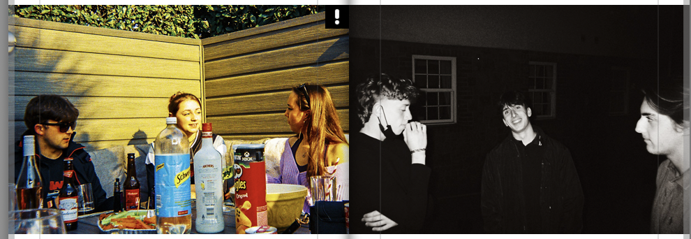
Another example of different editing style to connect images and show their similarities.
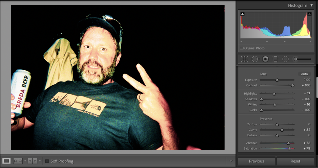
Finally, I’ve compared similar images with drastically different editing techniques to amplify the difference between these scenarios. The sharp colour contrast should emphasise the contrast between these images.
Overall I want my book to have high saturation and B&W images and photos compared with similar editing styles and different ones. This will create a chaotic book that isn’t held back by any limitations, therefore the layout and flow of the book itself will be apart of my freedom theme.


