photobook Layout

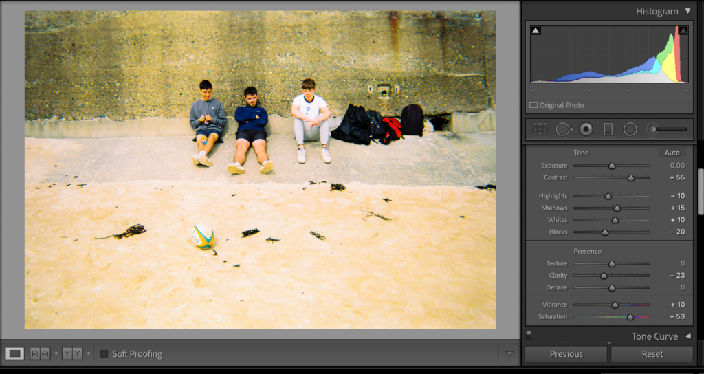
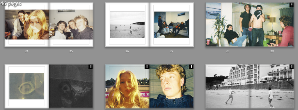
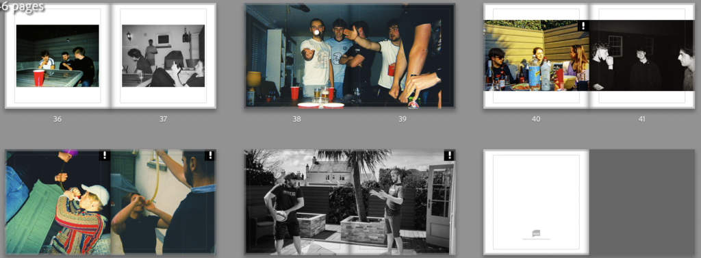
I’ve compared images in the three categories that I planned in my statement of intent. The first was girls and boys where I conceitedly got images that looked very similar between the boys and girls and some that looked different. For example, on page 24/25 there or two triple people selfies taken at a similar angel the difference being that the girls are pulling serious faces and the boys are messing around. Another example is found on pages 10/11 where there’s a two person portrait from each parties but again, the girls are posing and the boys are being stupid. Then there are instances like pages 32/33 and 40/41 where both pictures are silly or both are more serious.

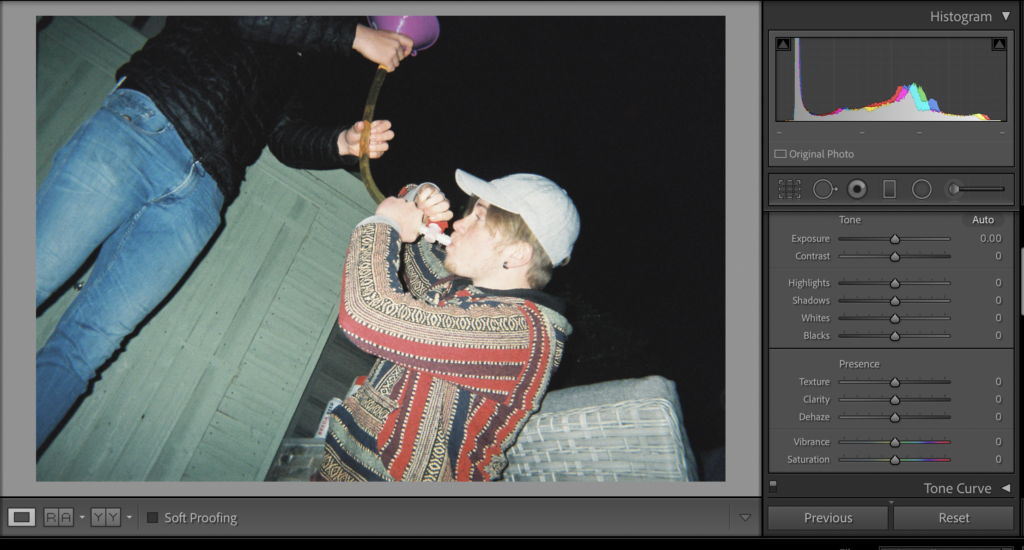
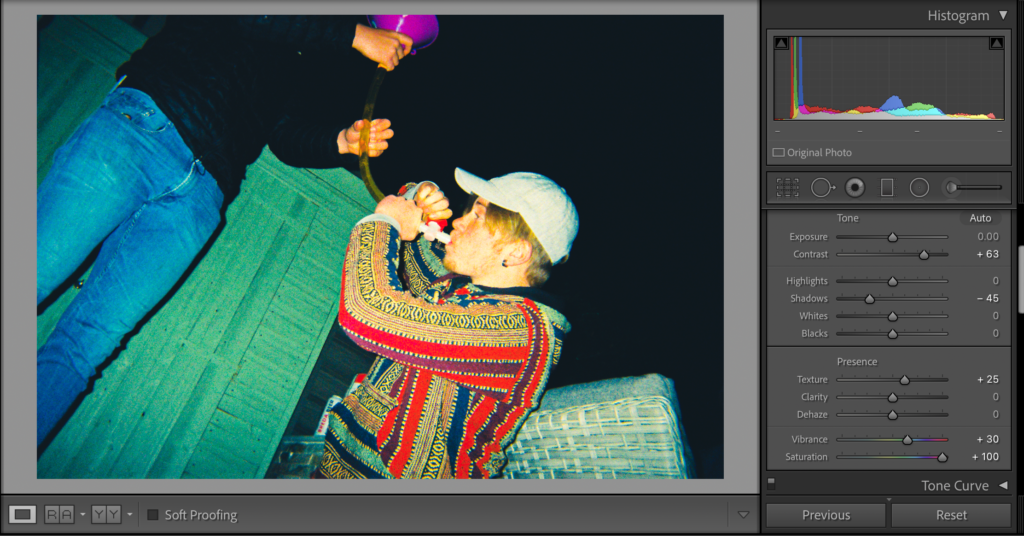
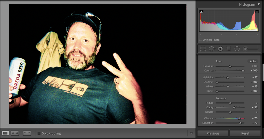
The Day and Night comparisons have worked well and some have come hand in hand with the drunk and sober comparison or the boys and girls one. Overall I think my photos and the way that they’re laid out says a lot about the different ways in which a group of lads and a group of girls use their freedom and the similarities too.

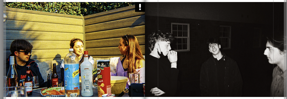
I have also used double page spreads for certain images that didn’t print correctly due to the photos being taken on a disposable camera. Although it may be a stretch, I believe that these photos represent that things can definitely go wrong without certain limitations and maybe 100% freedom isn’t the best option

Experimentation

There were many images where I had to chose between high saturation or B&W. I made many of the beach images B&W as the beige sand didn’t look right when the saturation was lifted. Creating a mix of vibrant photos and B&W ones helps with the flow of the book and creates more contrast between images.

This photo is a good example of my influence from Alex Webb through increased saturation, texture and contrast. There is an immediate improvement to the image and the vibrant and ‘happy’ colours help to emphasise a sense of freedom.

There are instances where I’ve decided to make the images darker and use a different editing style. Although the saturation is still increased, I’ve reduced the shadows, blacks and whites in order for these two images to appear as if they are one when placed side by side.

Another example of different editing style to connect images and show their similarities.

Finally, I’ve compared similar images with drastically different editing techniques to amplify the difference between these scenarios. The sharp colour contrast should emphasise the contrast between these images.

Overall I want my book to have high saturation and B&W images and photos compared with similar editing styles and different ones. This will create a chaotic book that isn’t held back by any limitations, therefore the layout and flow of the book itself will be apart of my freedom theme.

Title: seasonal Change

Theme: Landscapes/Weather/Seasons

Intentions: My intentions of my photobook is to explore the change of seasons throughout the year. This includes spring, autumn and summer. my photobook will have roughly 20 pages of landscapes and portraits on the environment edited in the same sort of style that the two photographers I have focused and looked in depth to which are Robbie Lawrence and Elliot Porter. i will be using plants to show the change in season due to the change of colour they go through before summer when everything is green and grown. I will be editing all my photographs on Lightroom to allow my photos to stand out and grab the attention of the audience.

Subjects: sunsets/ plants/ flowers/cliffs/ocean/fields

Techniques: I will be using my phone to take my photographs as it has different settings such as wide lens and more. i could also use a phone tripod to allow my photographs to be straight and in better focus to improve my photography.

Inspirations: my two inspirations for this photography task is Elliot porter and Robbie Lawrence, i will be creating similar outcomes to there’s as I think there work stands out and shows a lot of detail.Eliot Porter was an American photographer known for his richly colored images of the natural world. “Every photograph that is made whether by one who considers himself a professional, or by the tourist who points his snapshot camera and pushes a button, is a response to the exterior world,” the artist mused. “To something perceived outside himself by the person who operates the camera.” Born on December 6, 1901 in Winnetka, IL, his interest in nature was fostered by his family from a young age. He began photographing his family’s island property as a youth in Maine, before going on to study chemical engineering at Harvard University. Robbie Lawrence is acutely attentive to the way images tell a story. Working with a painterly softness and sensitivity to his subjects, the Scottish photographer deals in detail and nuance. From portraiture, travel and documentary to editorial work, he places the human experience front and centre to create thoughtful, abstract images, with an emphasis on narrative.

Photobook Layout

The following images shows how I decided to layout my images in my photobook

For my front cover I decided I wanted to keep it simple with a Emerald coloured cover and the word Greenhouse in portuguese.

I then have Greenhouse written in English on this page however to plan to place a real photograph here of me and my parents next to the greenhouse when I was younger; I think this give the book a more personal touch.

On these two pages I wanted to write in Portuguese and English to link the idea to link their language and the language they learnt in Jersey. I made this image monochromatic to give the idea that its an older memory.

These images show where they used to live and where they worked at the beginning of their lives in Jersey

I used these images to show the transition into the tomato greenhouse in which we call “the tunnel”; I think these images work well due to the old photograph as it reminds them of how long they lave been working here.

These images I thought worked well as it shows the outside and the inside of the Greenhouse.

I then used a double page spread to show the transition into the other greenhouse they they also work in.

I love the use of contrast between the green and the red in the images as it makes the green beans stand out.

I used these images for again, the use of contrasting colours which make the images stand out. The car also holds memories me and my mother.

I love this image for its symmetry and the nice balance between green and white.

I used this divide to show the new the greenhouse; again in portuguese and english.

I created a divide again by the use of two plain pages and showing an image of my parents to nicely finish off the book.