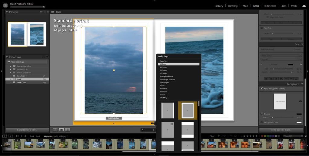
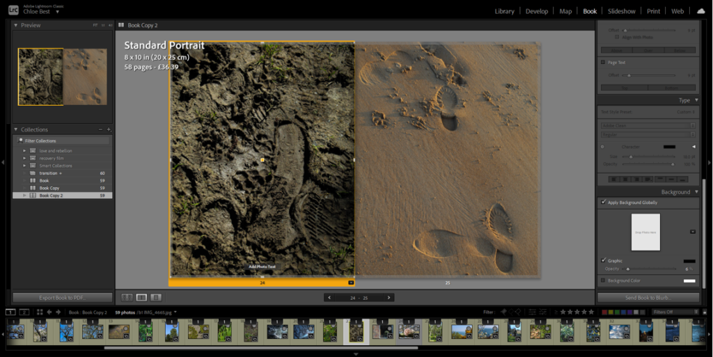
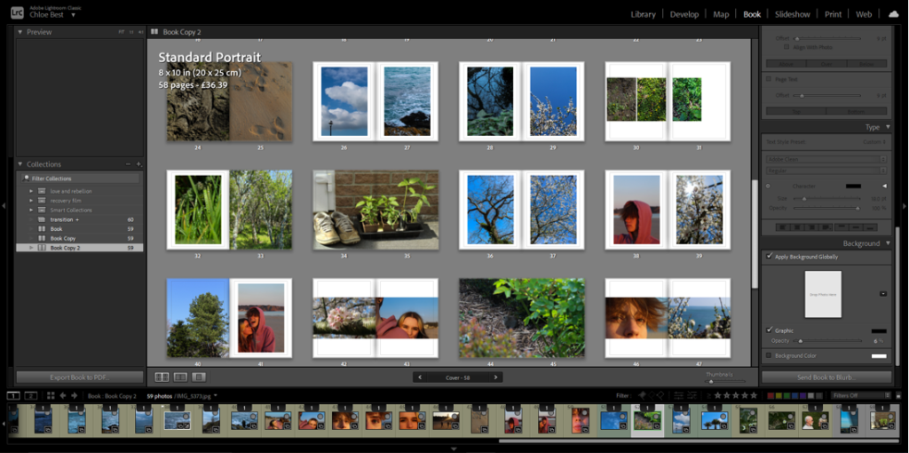
Now that i’ve gone through all my images and put together a rough layout of how I want them to be in the book, I have to actually put the book together. I’m doing this in Lightroom to make it easier to navigate before moving it into Blurb.
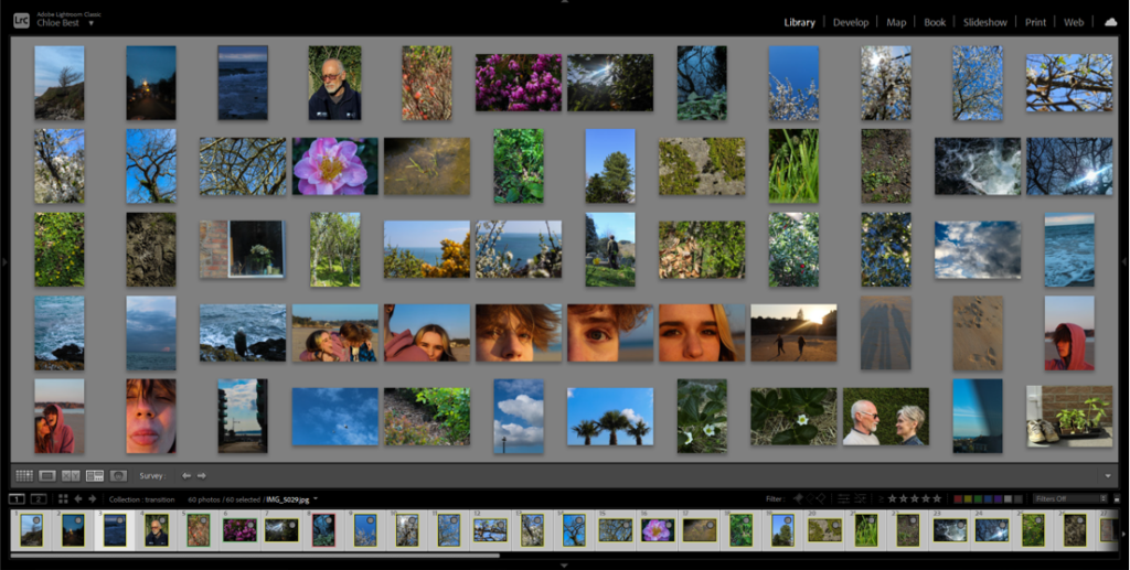
I used survey view to rearrange the images into the pre-planned layout then carried on rearranging it through trial and error, as the way they were before in the rough plan didn’t entirely work out.
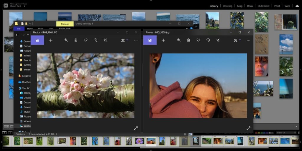
This rearranging process involved reviewing how certain images fit in with the project as a whole. For example, the image above on the right was previously paired with a different image, but on consideration it didn’t look too good with the others so i switched it out for another image from a different shoot. I also removed about three other images because they just didn’t fit in.
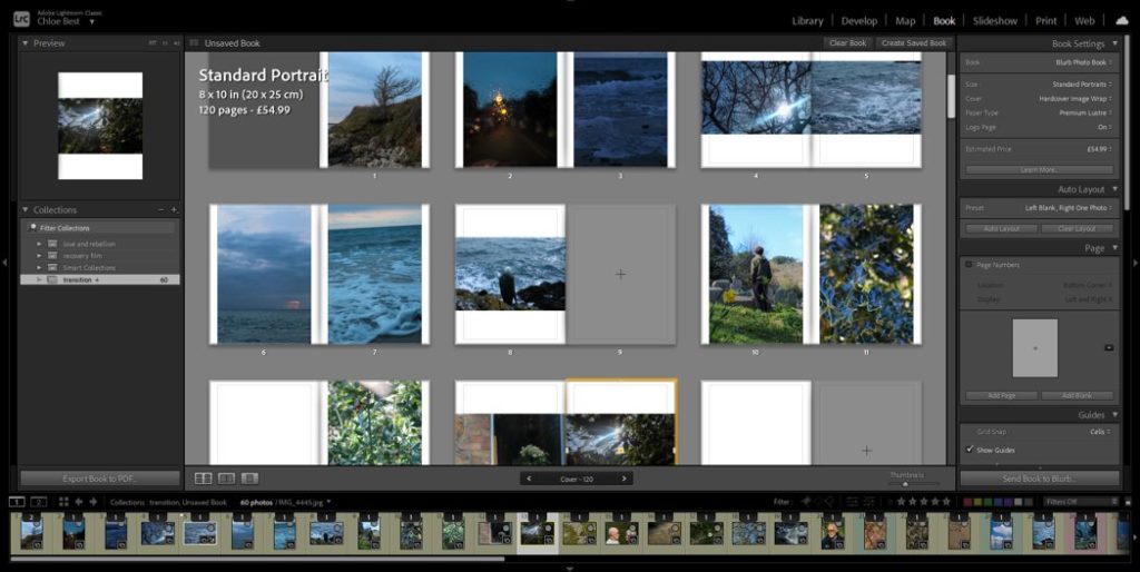
After I had completely worked out the layout I used the “book” tab in Lightroom to begin actually putting together the photobook, and because I had rearranged them before doing this they were already in the correct order.
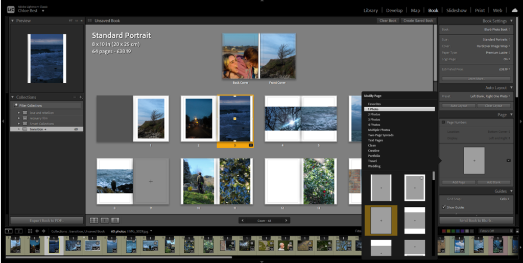
I decided to modify the layout of the portrait images and add a small border, essentially creating a frame within the page for each portrait image. I tried this with the landscape images, but it didn’t have the same effect, so I kept them the same as they were before.
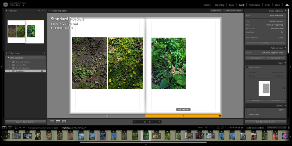
The images above are the only example i have in the photobook of a triptych-style layout. I experimented with a couple different layouts, for example: all three small on the same page, the first two on one side, the second two on the other side, different sizes and orientations. Eventually I went with having the first two images on the same page and the third as close to them as possible on the other page.
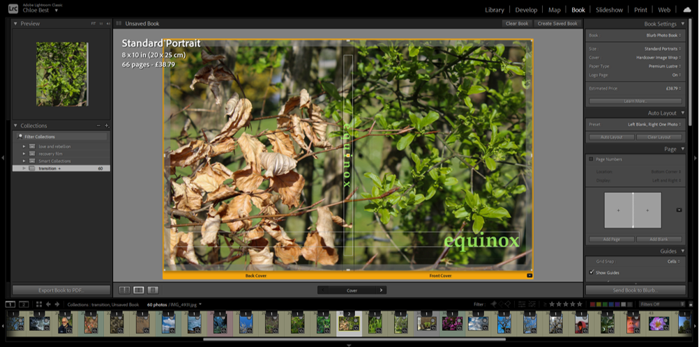
At this point i thought i should probably have a title and cover page. I immediately knew what image would work best to represent the narrative of the photobook; it features dead leaves from winter on the back cover and the new, fresh green leaves of spring on the front cover. I went through a couple of variations on the title, for example “rejuvenation” and “vernal equinox” which is the proper name for the spring equinox. I liked the look/sound of the word “equinox” though. so i just dropped the “vernal”. I wanted to have the title in clear view on both the front cover and the spine of the book, and in the beginning I had them in the colour white. However i thought this look had too harsh of a contrast and although I tried experimenting with the opacity, that just made the writing look grey in the end. I thought a pale green would be a good colour as it is often associated with spring and the season of transition, as well as the fact that there is already green on the cover so it looks more cohesive.
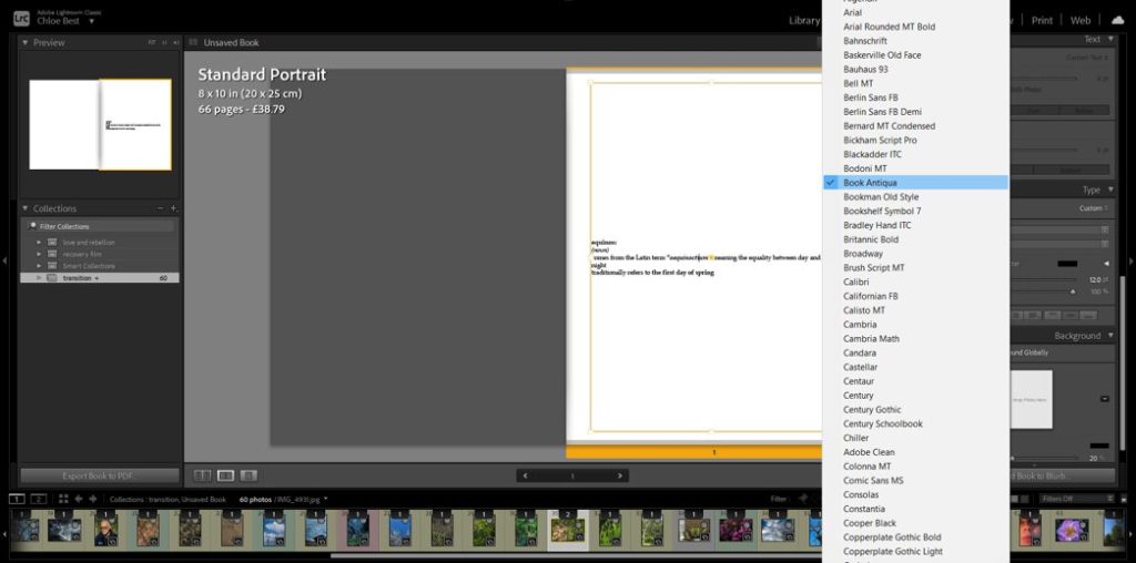
In the beginning i intended to have a few words here and there throughout the book, possibly about people’s perceptions of spring and the changing of the seasons, or even some more formal famous poetry of some sort about the same thing. However after working with the images on their own I felt that having words would be too distracting to the overall effect. But i thought it would make sense to have some sort of text at the beginning to clarify the link between the title and the photobook narrative, as well as add some explanation about the narrative itself. So i created a couple lines mimicking a dictionary entry, just before the photos begin.
EXPERIMENTATION IN THE LAYOUT-
I chose to mix up the layout of some of my images so make it more interesting; I did this by making some images full bleed instead of having that same white border. Some I had only one image in the pair be full bleed, but i also had one where both were full bleed. I also made a couple of the singular images into a full bleed two-page spread for further effect. Above you can see examples of some of the changes.
Blurb-
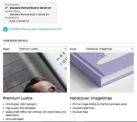
Finally, I uploaded the book from Lightroom to Blurb and adjusted how I wanted it to be produced. I decided to have it portrait because most of my images are portrait orientation so it would make the most sense. I chose the paper to best show the photographs, and I chose hardcover because I like it the most. Then I finalised the upload to Blurb so that the photobook is able to be ordered and bought.

