transition- putting the photobook together

Now that i’ve gone through all my images and put together a rough layout of how I want them to be in the book, I have to actually put the book together. I’m doing this in Lightroom to make it easier to navigate before moving it into Blurb.

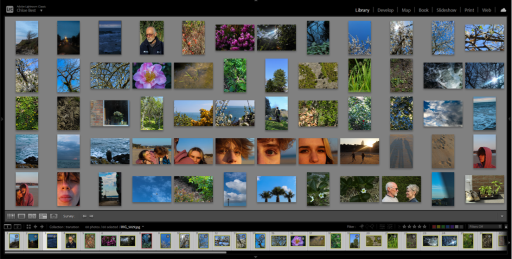
I used survey view to rearrange the images into the pre-planned layout then carried on rearranging it through trial and error, as the way they were before in the rough plan didn’t entirely work out.

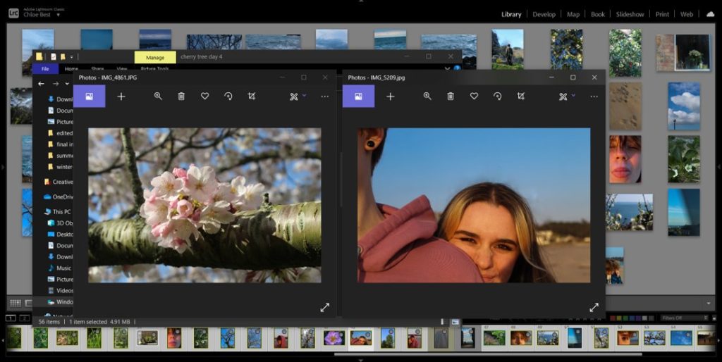
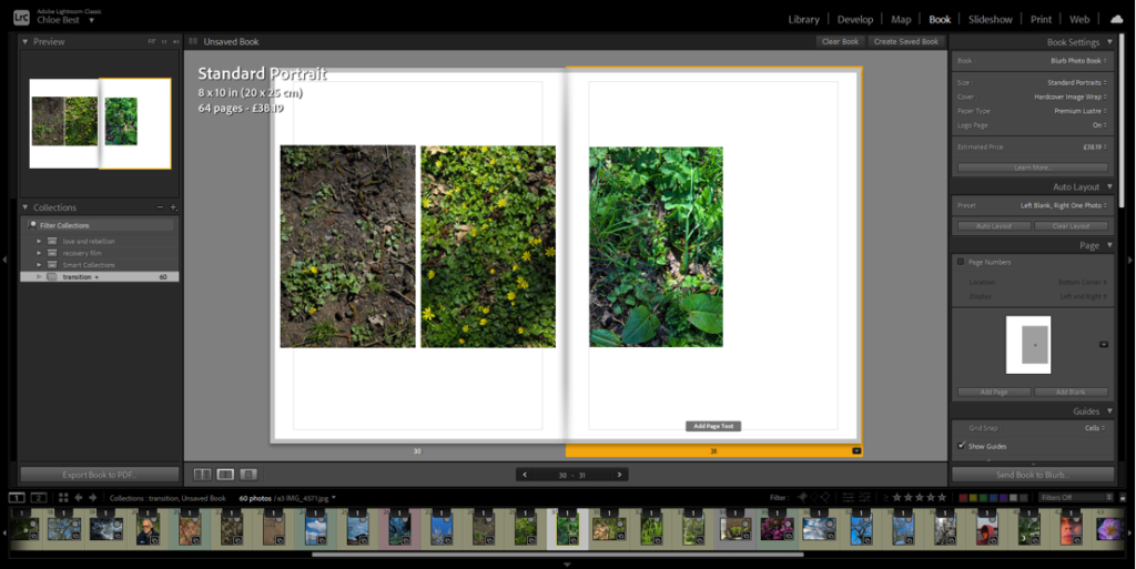
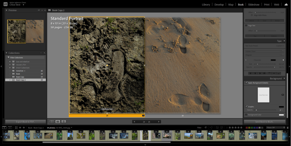
This rearranging process involved reviewing how certain images fit in with the project as a whole. For example, the image above on the right was previously paired with a different image, but on consideration it didn’t look too good with the others so i switched it out for another image from a different shoot. I also removed about three other images because they just didn’t fit in.

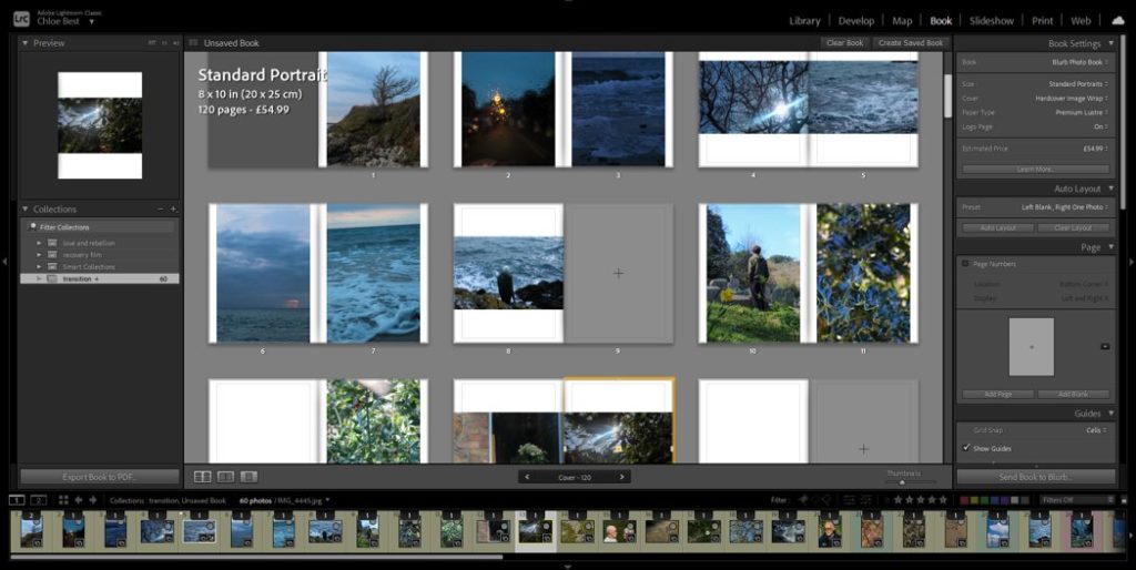
After I had completely worked out the layout I used the “book” tab in Lightroom to begin actually putting together the photobook, and because I had rearranged them before doing this they were already in the correct order.

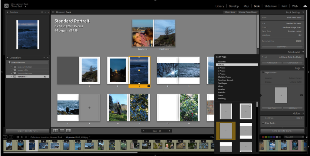
I decided to modify the layout of the portrait images and add a small border, essentially creating a frame within the page for each portrait image. I tried this with the landscape images, but it didn’t have the same effect, so I kept them the same as they were before.

The images above are the only example i have in the photobook of a triptych-style layout. I experimented with a couple different layouts, for example: all three small on the same page, the first two on one side, the second two on the other side, different sizes and orientations. Eventually I went with having the first two images on the same page and the third as close to them as possible on the other page.

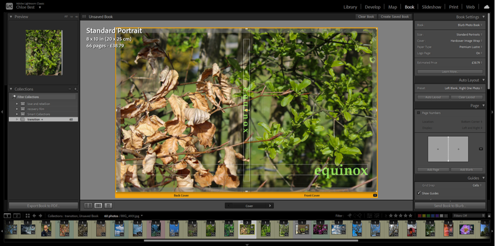
At this point i thought i should probably have a title and cover page. I immediately knew what image would work best to represent the narrative of the photobook; it features dead leaves from winter on the back cover and the new, fresh green leaves of spring on the front cover. I went through a couple of variations on the title, for example “rejuvenation” and “vernal equinox” which is the proper name for the spring equinox. I liked the look/sound of the word “equinox” though. so i just dropped the “vernal”. I wanted to have the title in clear view on both the front cover and the spine of the book, and in the beginning I had them in the colour white. However i thought this look had too harsh of a contrast and although I tried experimenting with the opacity, that just made the writing look grey in the end. I thought a pale green would be a good colour as it is often associated with spring and the season of transition, as well as the fact that there is already green on the cover so it looks more cohesive.

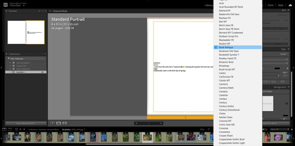
In the beginning i intended to have a few words here and there throughout the book, possibly about people’s perceptions of spring and the changing of the seasons, or even some more formal famous poetry of some sort about the same thing. However after working with the images on their own I felt that having words would be too distracting to the overall effect. But i thought it would make sense to have some sort of text at the beginning to clarify the link between the title and the photobook narrative, as well as add some explanation about the narrative itself. So i created a couple lines mimicking a dictionary entry, just before the photos begin.

EXPERIMENTATION IN THE LAYOUT-

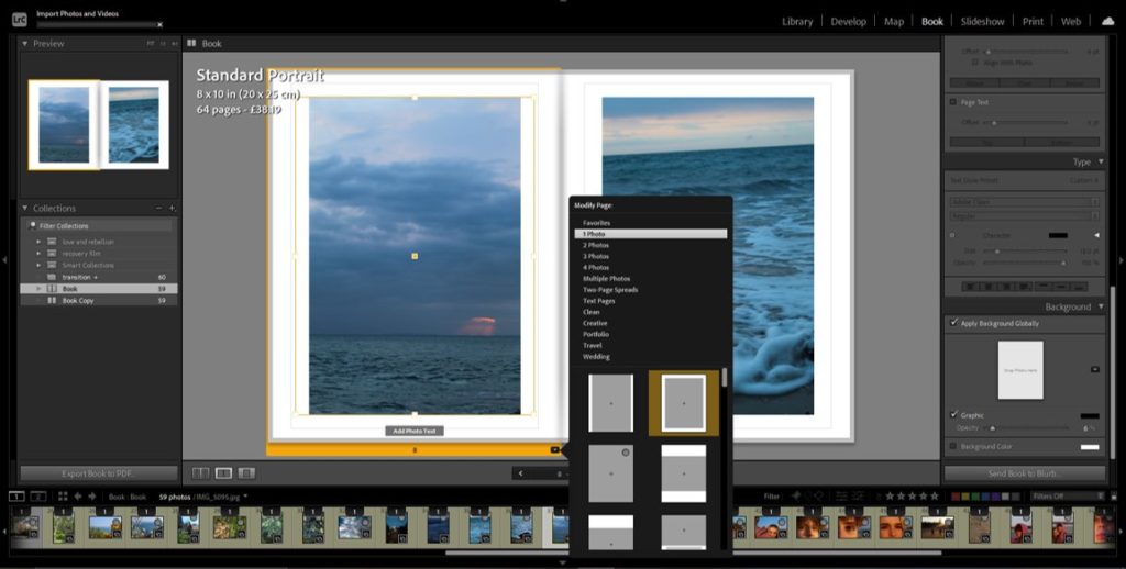
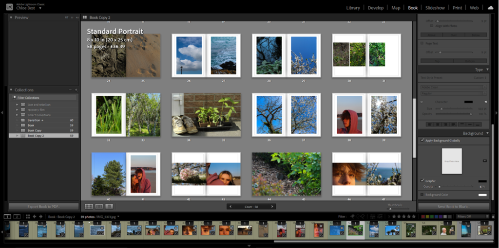
I chose to mix up the layout of some of my images so make it more interesting; I did this by making some images full bleed instead of having that same white border. Some I had only one image in the pair be full bleed, but i also had one where both were full bleed. I also made a couple of the singular images into a full bleed two-page spread for further effect. Above you can see examples of some of the changes.

Blurb-

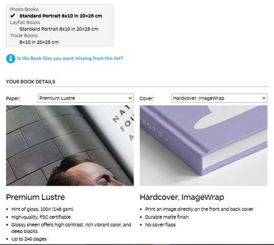
Finally, I uploaded the book from Lightroom to Blurb and adjusted how I wanted it to be produced. I decided to have it portrait because most of my images are portrait orientation so it would make the most sense. I chose the paper to best show the photographs, and I chose hardcover because I like it the most. Then I finalised the upload to Blurb so that the photobook is able to be ordered and bought.

Film Editing

After gathering my footage, I took to the software Premiere, a software that I have used previously, to put all of my footage together and edit it. Due to using this software in the past, I felt comfortable and at ease when using it and made my editing process that much easier.

To begin with, I started by importing my footage intro Premiere. The screenshot above shows the library in which the footage sits in when editing. I normally import all of my footage (from my SD card) so that I can look through them all and select the footage that is most suitable and that I like the most.

After importing and selecting the footage that I like best, I then take the footage from the library and drag it into the bar shown above. This allows you to see how the video plays and also puts it into different sections such as V1 (video 1) and A1 (audio 1). This allows you to maneuver around the different sections of audio/video without any confusion. This bar is where all your sections of video and audio lies, creating your film.

When adding my footage to the bar, the audio will come with it and appear in the A1 section. To get rid of the background audio (because I will be adding a different audio over the top), I lock the V1 section and then delete the A1 section. Locking the V1 section will allow no footage to be deleted when I’m deleting the audio from it.

After uploading all of my footage that I am happy with, I then play around with the order of the videos. Sometimes certain videos don’t go well next to each other so I experiment by shifting the footage around to create a sequence that I am happy with. You can do this by unlocking the V1 area and simply dragging the different sections of footage to other areas. I feel as though experimentation is key to making a film or a photo book because you never know what you could create through experimentation, additionally you can point out the weaknesses of your film through this process. If I didn’t think that a piece of footage was suitable for my film anymore, I would simply delete it and insert another video that I feel would be more appropriate to my film.

Also, after adding all of my footage, I would render my clips so that it ran smoothly and there were no sign of any glitches/jumps etc. This also allows the video to be exported easily and increases the quality of the video when it comes to exporting.

I wanted my film to be lacking in colour, with a lack of contrast etc to create a dull, sad and mundane atmosphere to my work. Therefore, I clicked the color tab at the top of the screen in the Premiere software and used the basic correction and the creative tab (as seen above). I experimented first with the saturation/vibrance/fade/brightness/exposure etc and eventually got to a colour that suited the overall vibe that I was looking for. The exposure varied in every clip depending on how dark it was, for example, if my clip was filmed in the dark I would increase the exposure more than usual. My saturation, sharpness and fade was all standardised however. In every clip I desaturated it to 51.9, I then increased the sharpness to 30.9 and then increased the fade of the clips to 42. I did this to every clip so that my whole film looked the same. When adding the effects, I made sure to also render the effects in and out so that again, there were no glitches and everything would run smoothly.

After I was happy with how my footage looked and ran, I then began focusing on my audio. My audio was filmed via video so that it would be easy to import, the importing process was the same as the videos. When adding my audio though, I made sure to lock my V1 so that no footage would be overlapped by the audio footage. After placing my audio in the A1 area, I then deleted the video footage so that the audio was the only thing left. I had around 10 minutes of audio so editing it was a long and time consuming process. I had to listen to the audio a various amount of times and cut out sections I thought were the most important.

This tool was very helpful when it came to editing the audio. Since I had so much audio to listen to and edit, this cutting tool made it easy to quickly eliminate any sections of audio that I didn’t wish to keep. After chopping the audio and keeping the bits that I liked and that were relevant to the film, I was done with making my film. In addition to the audio of my Mum speaking, I also went to Sound.org – a website that provides a range of audios available to download. I felt as though some background noise was needed to provoke some emotion and to make the film more hard-hitting. So, I went to the website and found a slow heart beat sound, downloaded it and placed this into A2 (audio 2) – making sure to keep the video 1 and audio 1 locked just in case anything gets mixed up.

After all the video and audio editing was done, I wanted to make an outro that revealed the title of the video – ‘A Slow Progression’. I was looking at using the graphics that are available in premiere however nothing really grabbed my attention and there was nothing I really wanted. So, when the video became blank at the end, I selected the text tool (the ‘T’ above) and typed the title and placed it in the middle of the black screen creating an effect. I adjusted the text and size in the effect control panel.