Mini Project

I wanted to create a mini project surrounding Femininity and the reality of being a women.

Feminism is a movement which is about of trying to get equal rights for women.

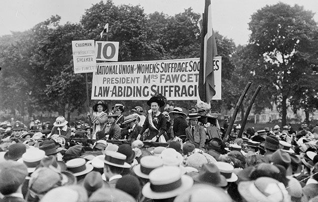
The wave started in the 19th to 20th century with the Women’s suffragette movement where their main focus surrounded getting women the right to vote.
Suffragettes facts

These were my two artist inspirations:

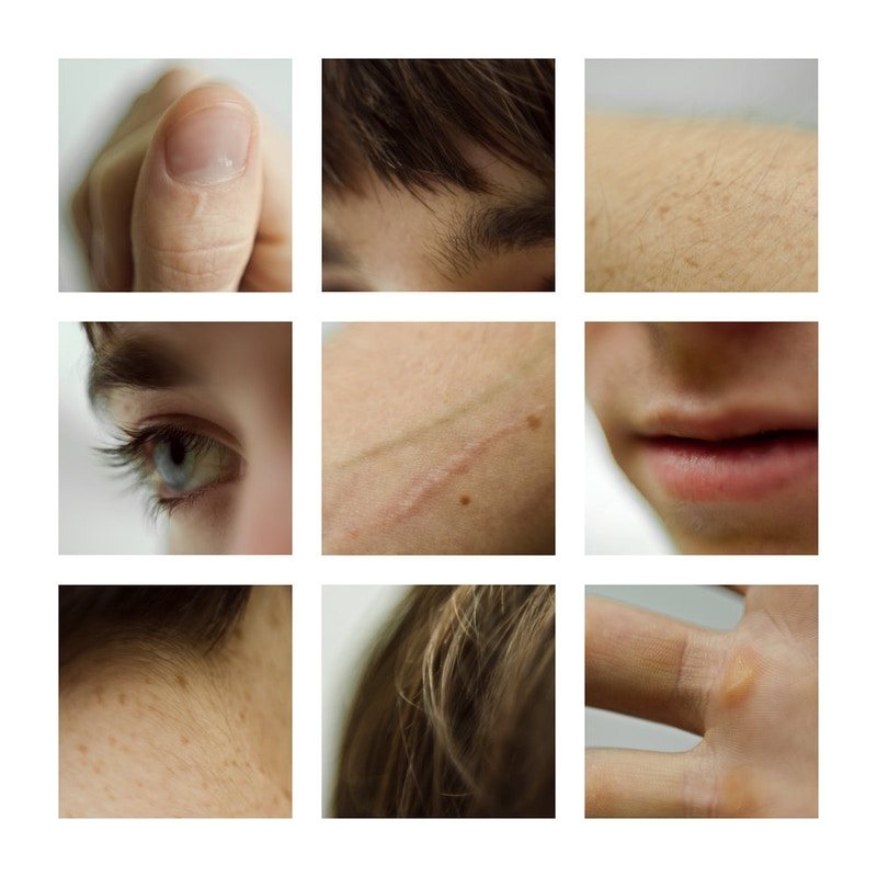
Lauren Marek

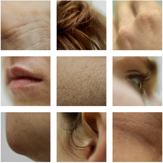
I chose Marek in order to photograph insecurities that many people have such as wrinkles, rosacea, hair and skin texture; I chose this as due to social media many of us constantly see airbrushed and photoshoped images which hide skin texture which can make many people insecure that they do not match the influencers body/skin. I wanted to enhance my skin texture and and “blemishes” in order to show the beauty and naturality of texture as everyone has it and it shouldn’t be something to be ashamed about.

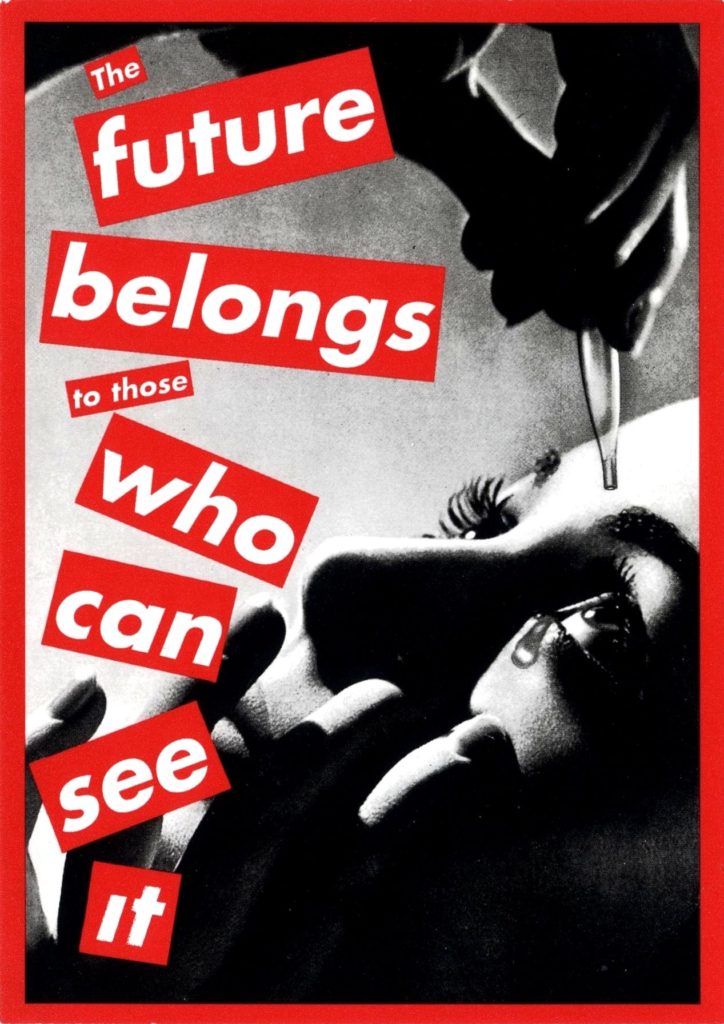
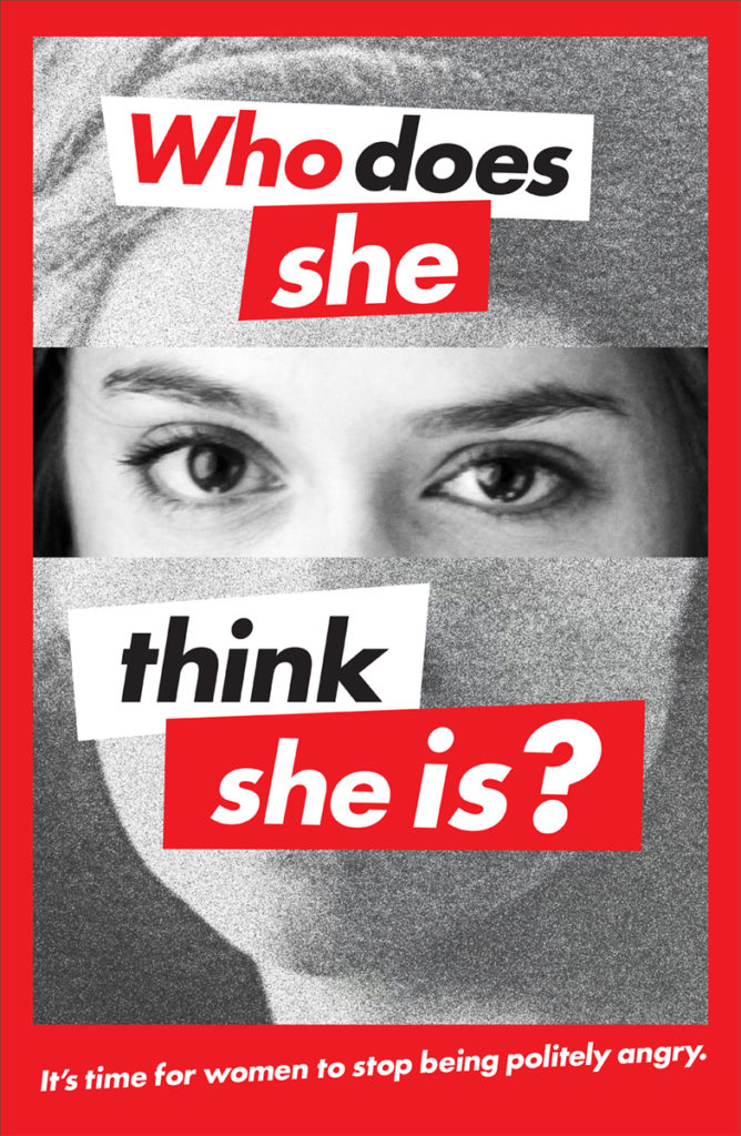
Babara Kruger

I choose Kruger due to her feminist influences ans the idea of giving people power. Her use of red and white lettering against monochromatic images really stood out for me as it helps get Kruger’s message across. I wanted my photo shoot to be empowering yet still show the struggles that women face in their every day to day.

Other influences:
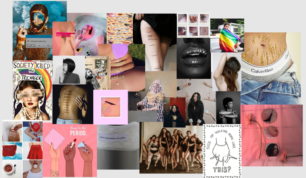
Favourite Images Inspired by Lauren Marek:
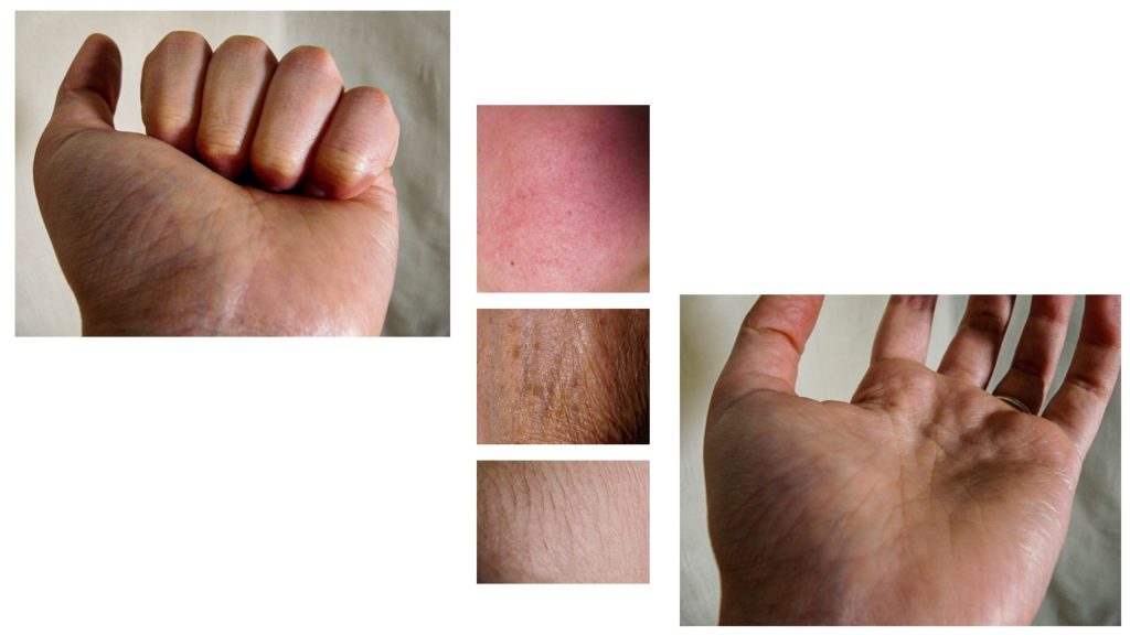
I think these images help to highlight the reality of skin and its different natures. I really liked these images as they help to show different elements of the human body and show “insecurities” which I find that with enough coverage people settle with reality and understand that not everyone does fit with societies standards but can still love their skin for everything that it does for them.

Favourite photos Influenced by Babara Kruger:
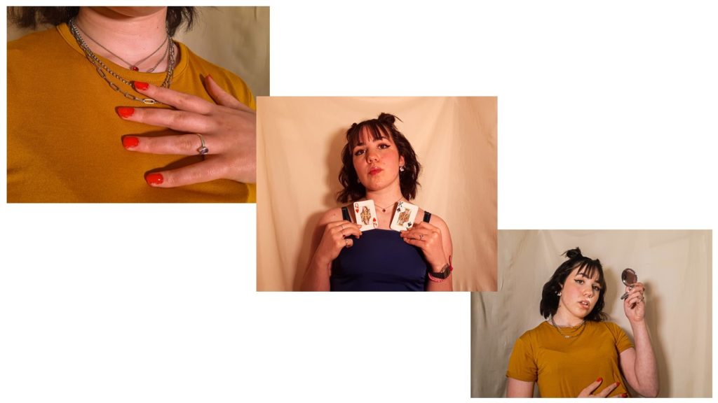
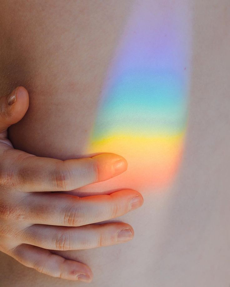
These were my portraits which have more subtle meanings. In the first image during the shoot i placed the nail varnish messily and wanted to photograph that to symbolise that not everything has to be or is perfect. I thought that the colour red was important to show power and confidence as people can create their own version of perfect. The second image shows A Queen and a King playing cards; this image helps to symbolise the patriarchal society and the divide their is between men and women; whether that be the pay gap or simply the way society treats people differently depending on their sex. The third image makes references to social media and society as in more ways than not many people find themselves obsessed with the way they look due to insecurities and the desire to fit in. I feel that as a women I need to check and make sure I look presentable so that I don’t get called out for “letting myself go” or “dressing inappropriately”.
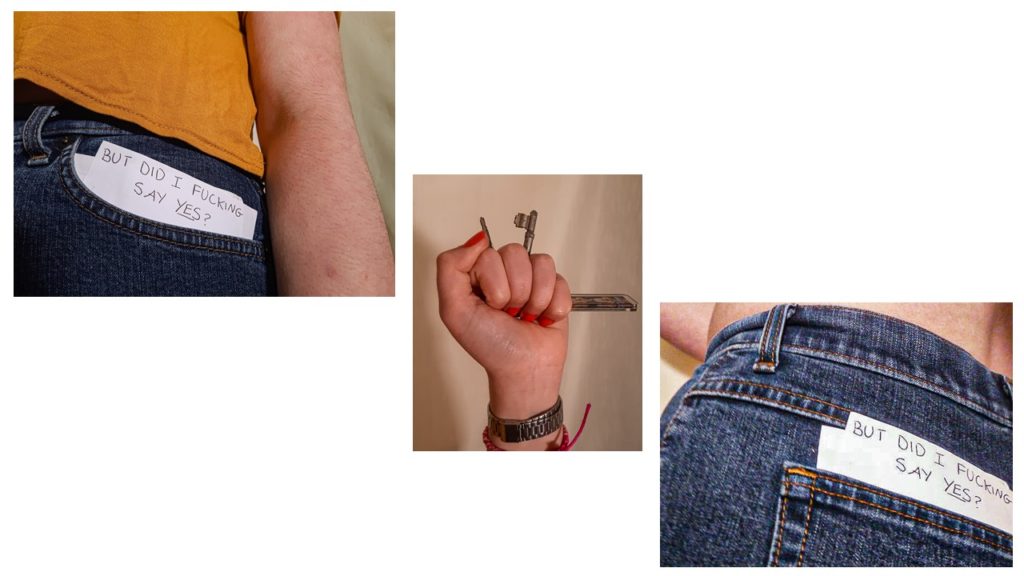
These final images have more of a powerful and clear meaning. The first and third images are references to sexual harassment and the rape culture that society has brought up. with the news showing that at least 97% of women have experienced sexual harassment I thought that these were important images. Society still tends to condone women for getting sexually harassed and abused with constant questions of “well what were you wearing?” and “what time where you out?”; whereas they were asking the wrong questions as it does not matter the piece of cloth in which people decide to wrap themselves in but rather the people who rape and abuse others and their rewarded attitudes. The use of the keys relates to the fear that many women face when walking alone, as they feel the need to carry around with them something to protect themselves so that men will not abuse them.

Overall, I am quite happy with my outcomes and the way they turned out as I think I have managed to touch on many important subjects through the use of experimentation with different objects and poses. I hope that this project inspires future projects in hopes to speak up about important topics and raise awareness of normal and natural bodies and skin and the issues that still apply to women in this patriarchal society.

transition photoshoot #5-

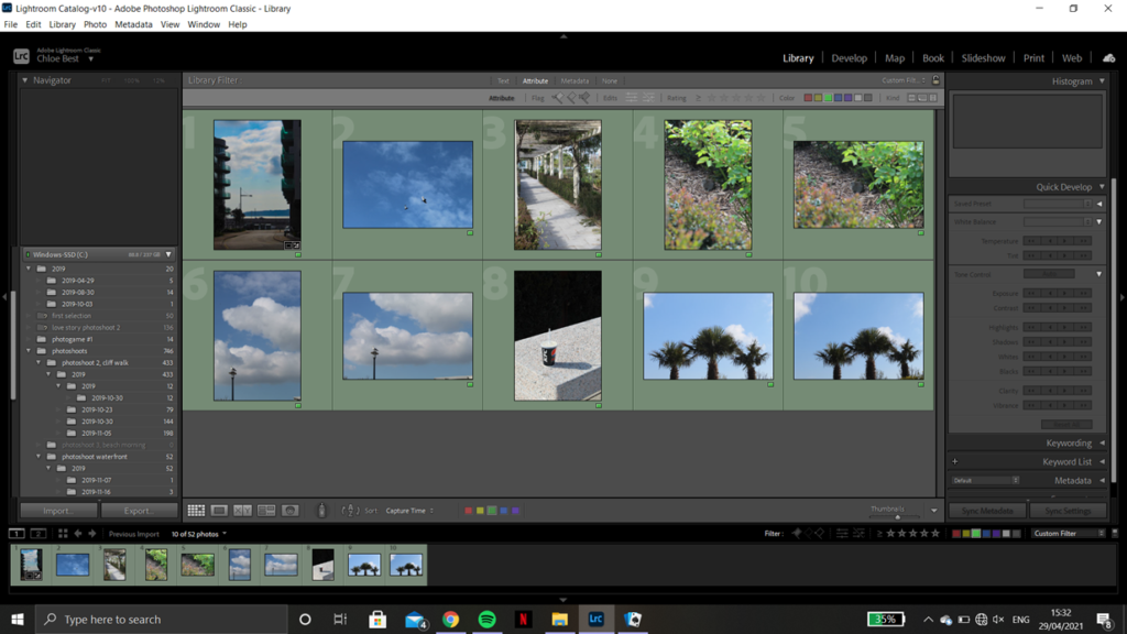
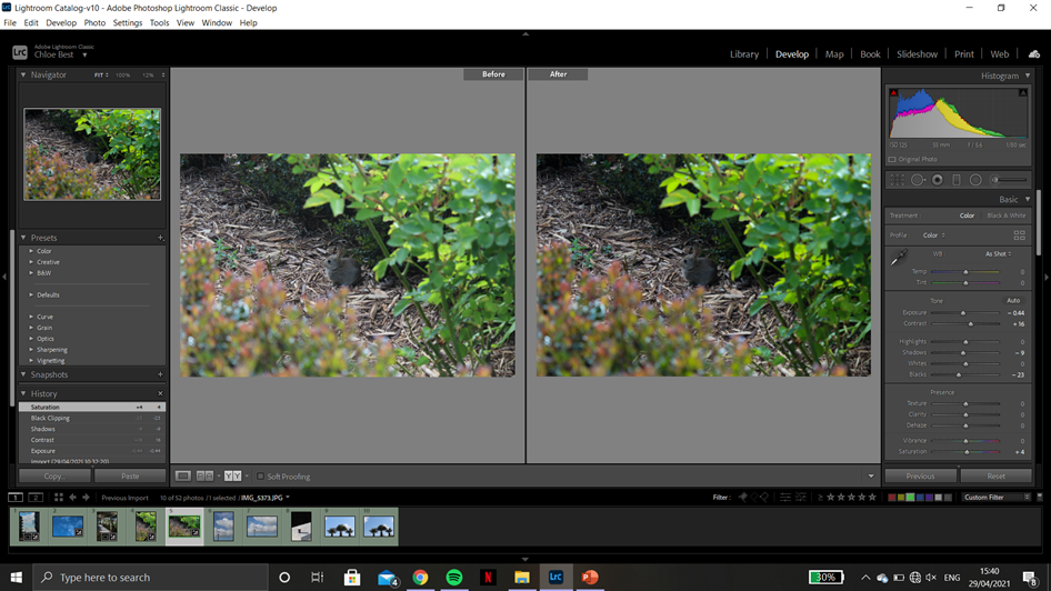
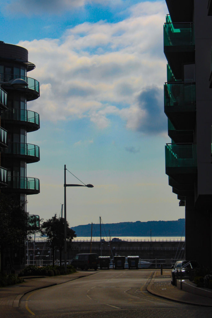
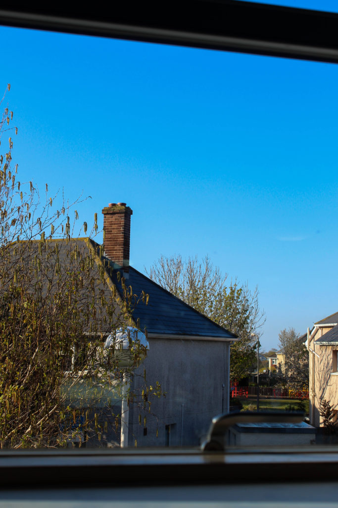
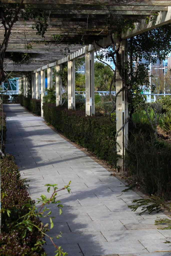
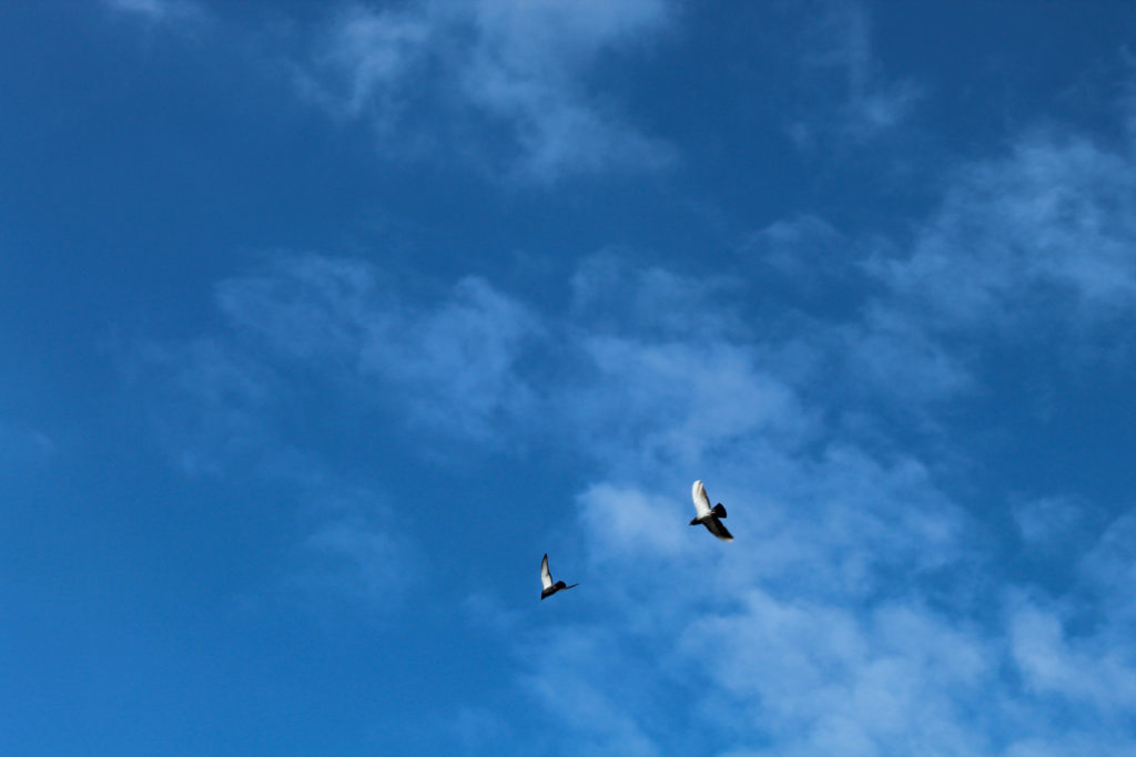
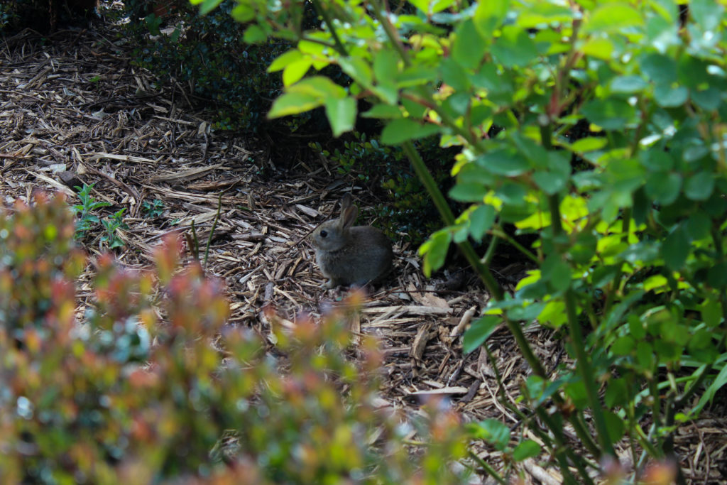
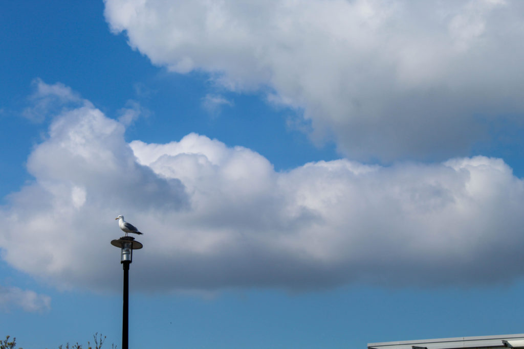
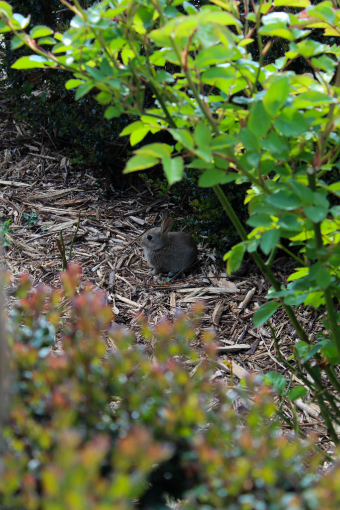
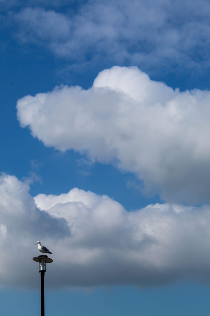
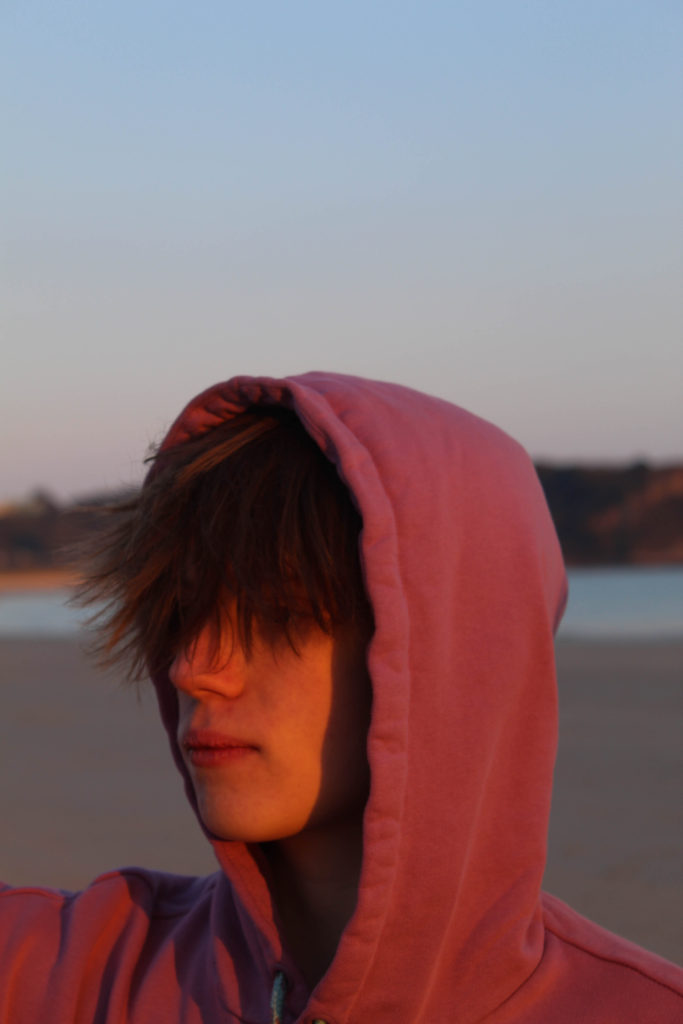
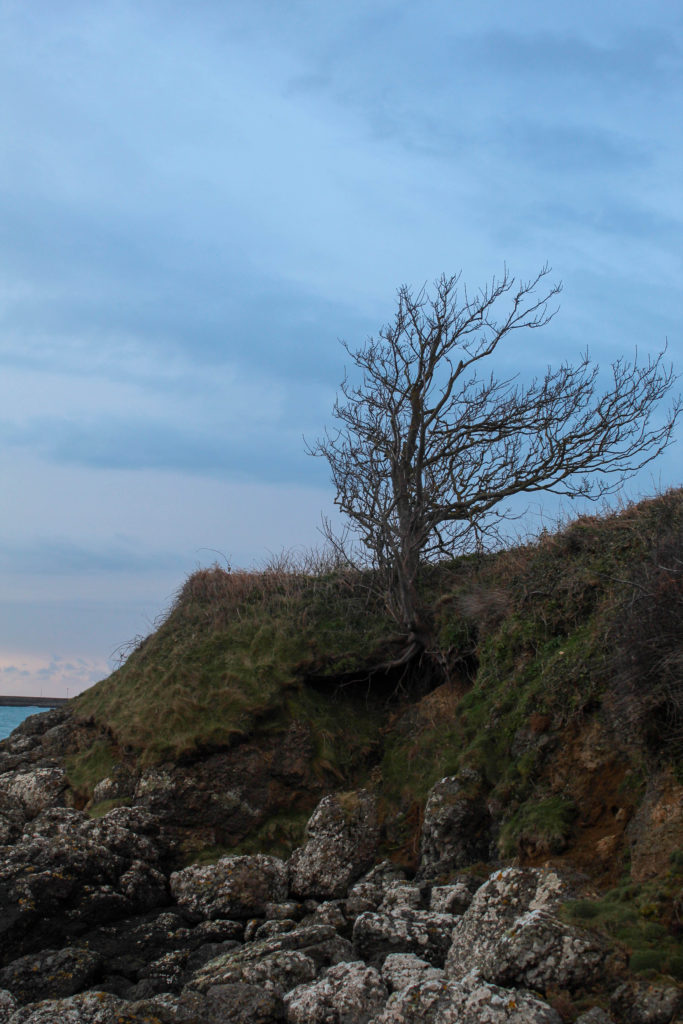
This shoot was pretty short because I only wanted to fill in the gaps of some necessary images. I went down to the Waterfront green while it was sunny because the gaps i needed to fill in are in the “summer” part of the project, and i ended up with about 20-30 images to sort through in Lightroom.

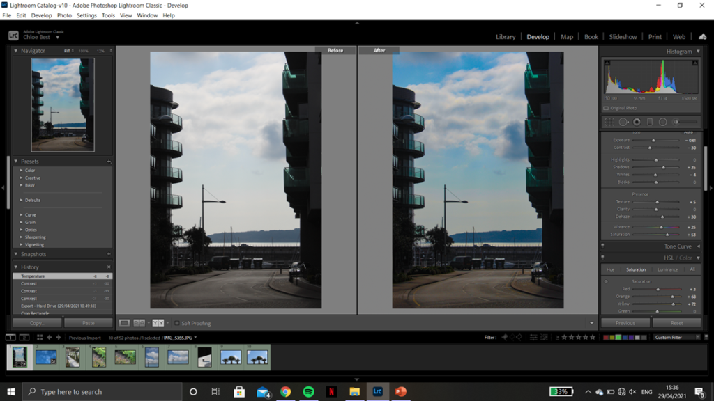
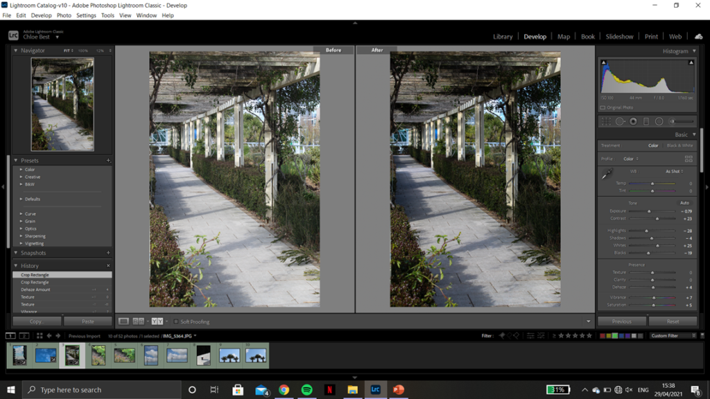
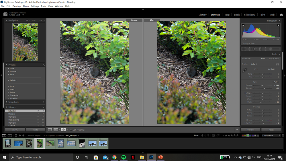
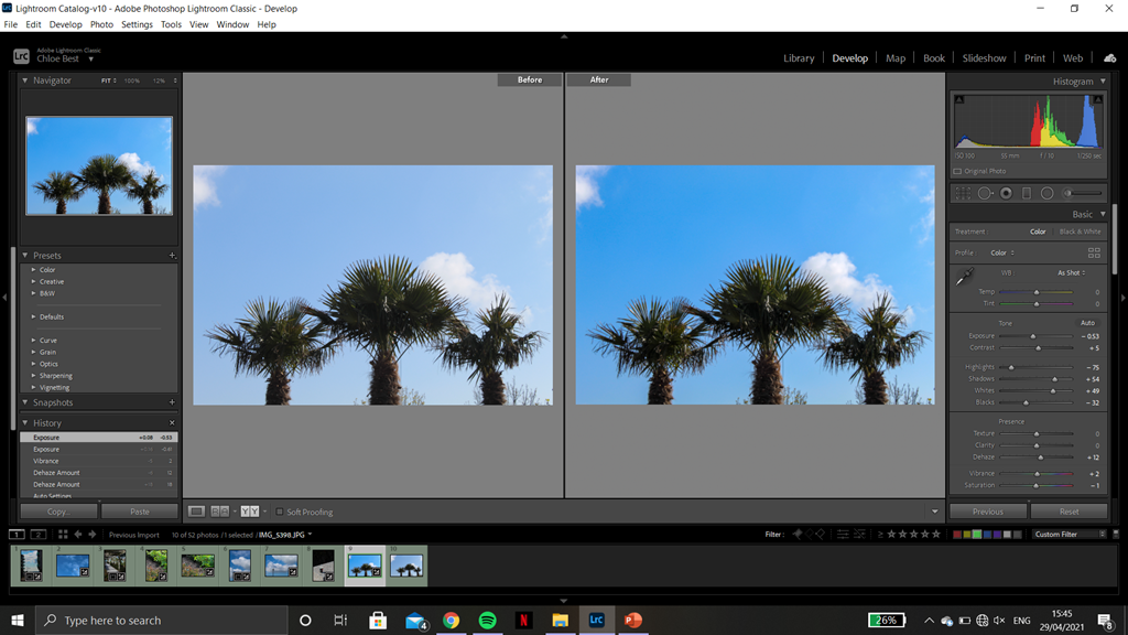
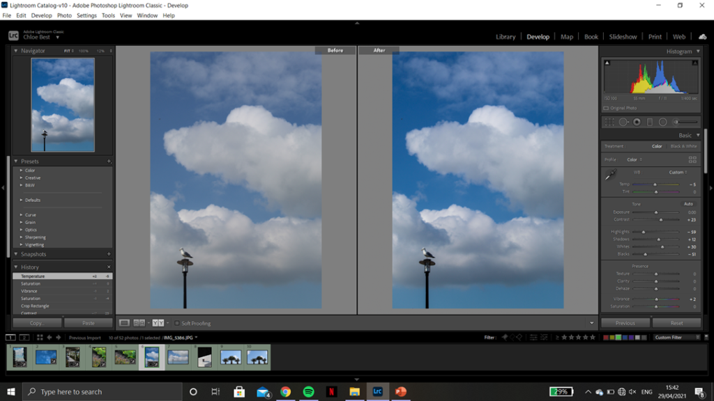
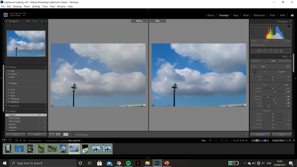
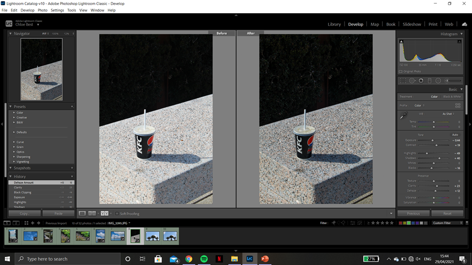
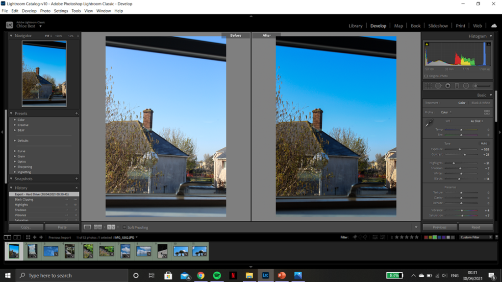
After going through them I ended up with 10 images to move on with. A couple are the same image in both portrait and landscape because I’m not sure which orientation fit best with the rest of the book layout, but I’ll decide which to keep after some experimentation. Below are the before and after screenshots from the editing process showcasing what adjustments I made and how they improved the image as a whole.

FINAL IMAGE SELECTION-

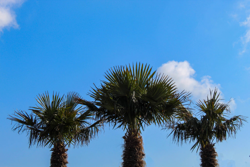
With the last image, I imported it into Photoshop t remove a few stray branches coming up from the bottom form surrounding trees. This was done using the spot healing and the healing tool to remove any distractions and keep the three trees as the main focus of the image.

transition layout review-

CURRENT LAYOUT-

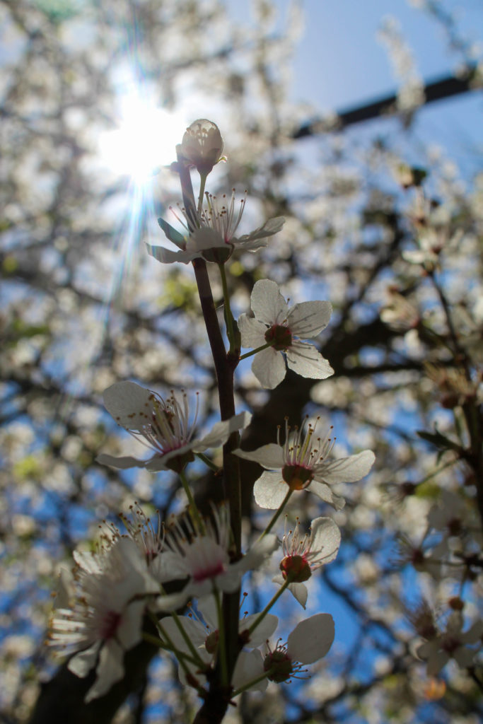
I liked this layout because it both images are similar in that the main focal point in the singular stem of a plant with a more crowded background, and also because it showed the transition from winter-type plants to more spring/summer flowers.

ALTERNATE LAYOUT-

I think i prefer this layout because both images have similar colours and they are still the same sort of image in that they have the main focal point front and centre. However, they are both summer/spring feeling images and the left has a much more simple background, providing some contrast. Overall these two images together feels more cohesive and artistic than the previous pairing.

I think I’m going to use the other image from the old pairing as an individual image in the book, because I do quite like it.

CURRENT LAYOUT-

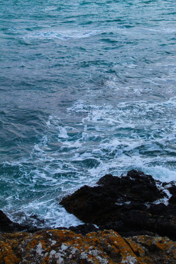
I paired these images together because they both had a sort of circular shape in the bottom corners, and they were both wintery and cold in feeling. However I don’t love how they work together which is why I’ll be trying out a couple other images instead.

ALTERNATE LAYOUTS-

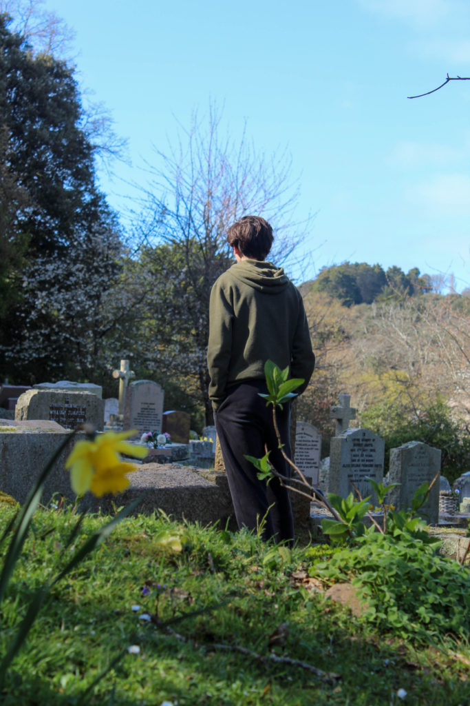
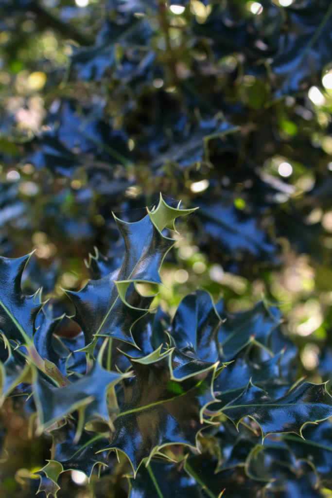
I wanted to keep the image on the left from the previous layout because I think i have too many plant-based images otherwise, but it proved difficult to work with and I don’t think it would have worked well as a standalone image in the photobook. In the end I put it with the dark-clouds image but I don’t think it worked.

What i like about the image on the left is how the light reflected off the dark green leaves looks almost blue. I chose to try it with the image on the left because i felt there was a lot going on, particularly in the background, and the image on the left is fairly simple. Also, I class them both as winter photos as the right features the holly plant and the left is at a cemetery, symbolising how winter is traditionally thought of as a season of “death”.

CURRENT LAYOUT-

I kept this image as a standalone photo because I thought it would be a good opener to the book, but after working with some of the newer images I thought I should probably see how it looks with a pair.

ALTERNATIVE LAYOUT-

I chose this image because they both have a similar “wintery” vibe to them, meaning they are both cool-toned, as well as the fact they are both fairly simple images with no crowding in the background or the foreground. However I think I’m going to keep this image as it is (standalone) because I still think it works well as an opener and I prefer it this way.
Selection Process

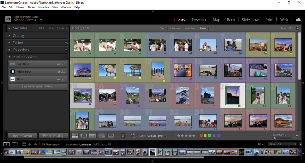
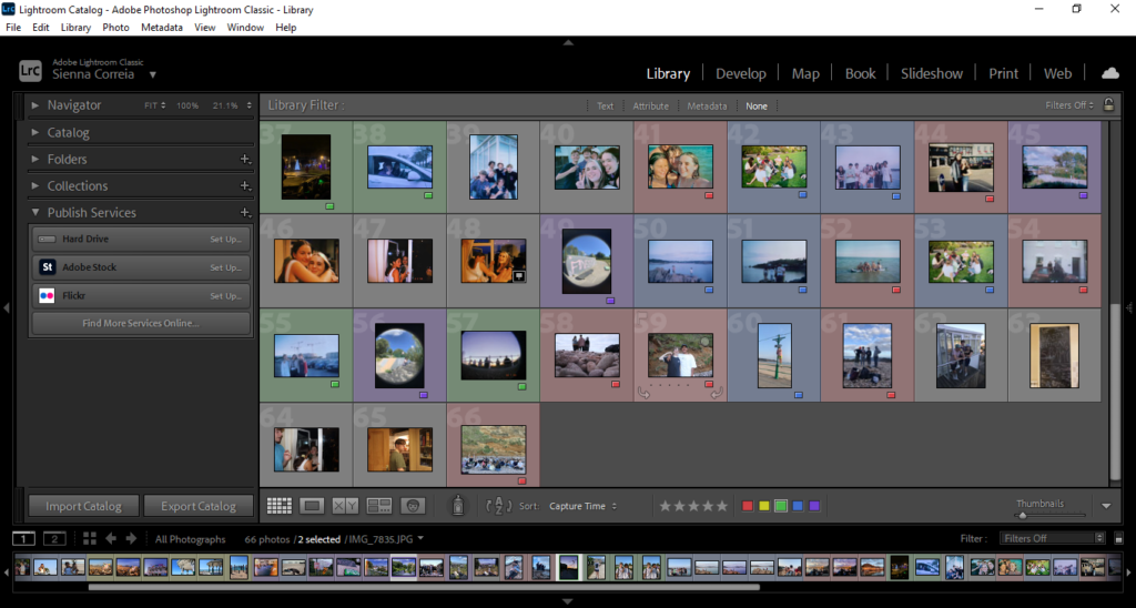
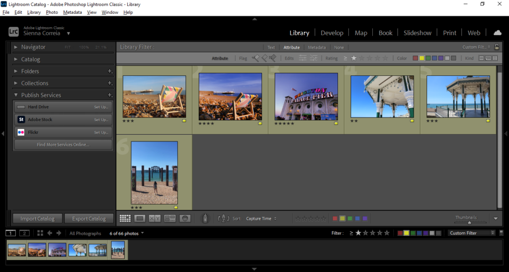
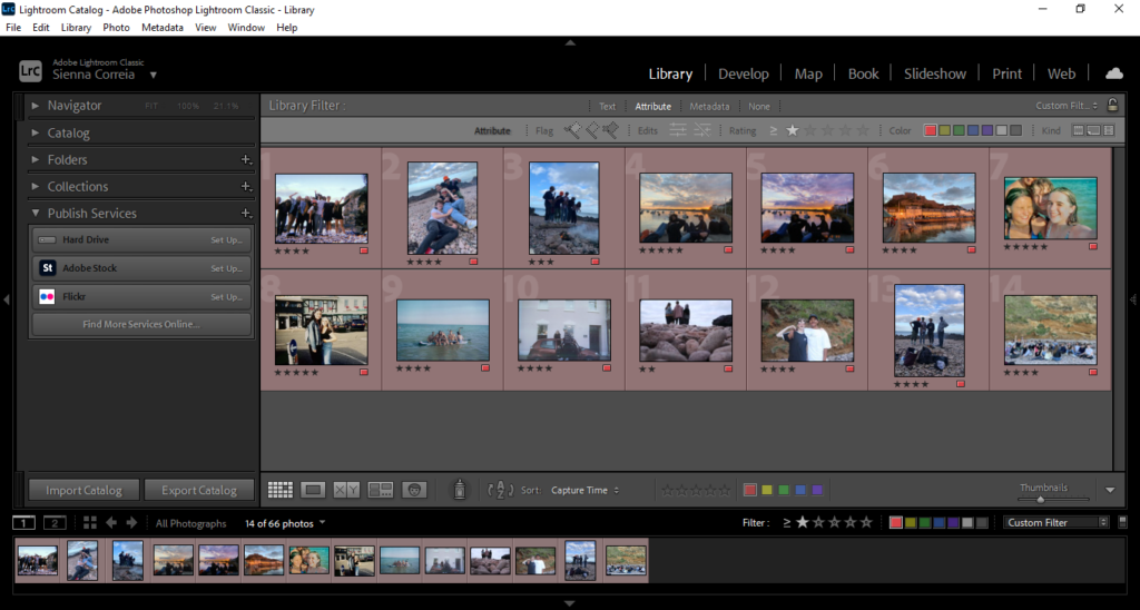
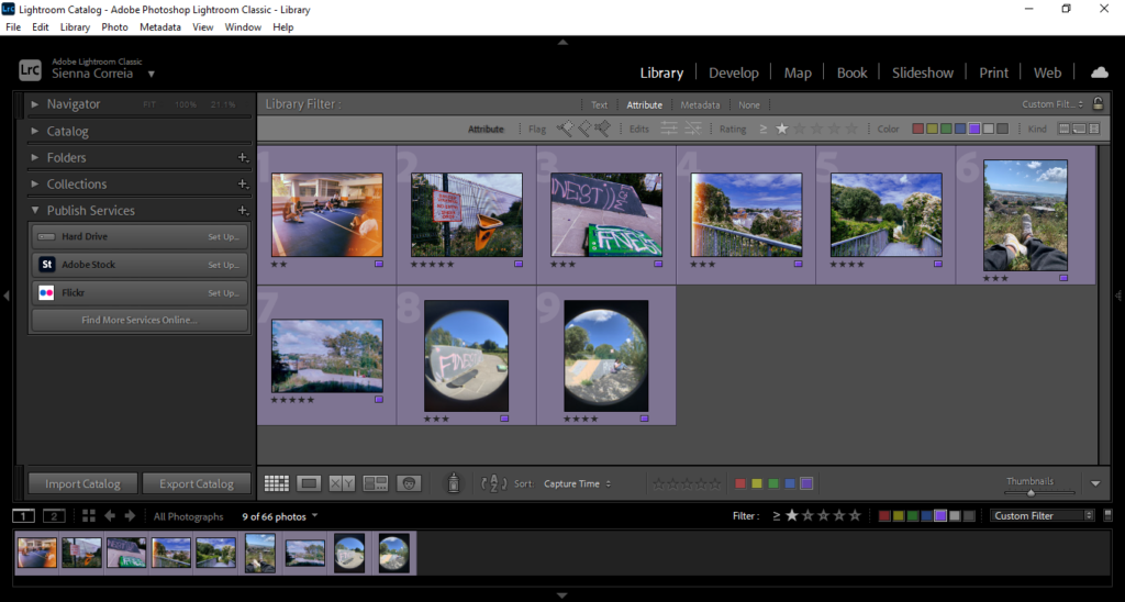
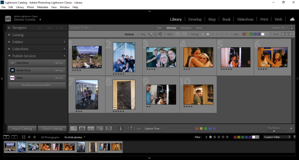
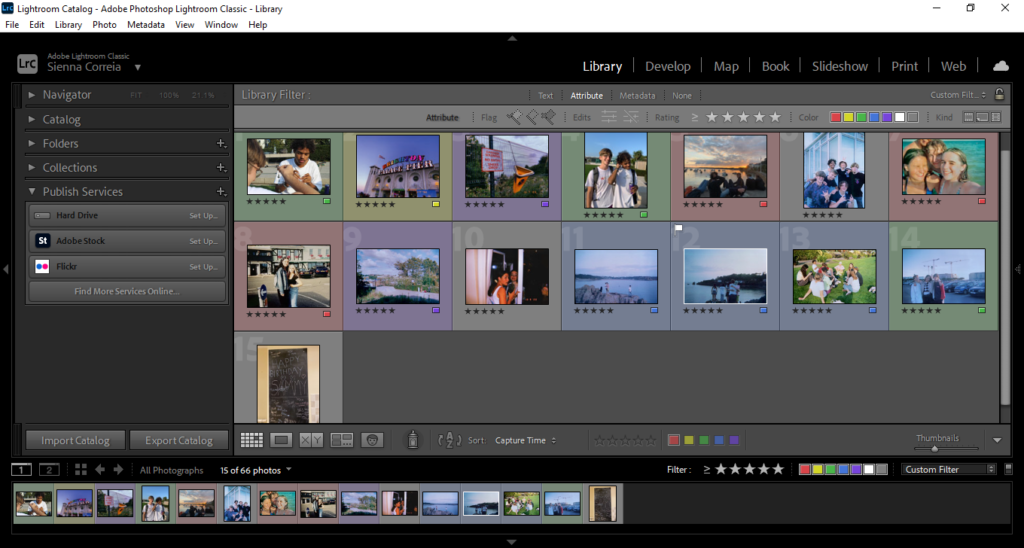
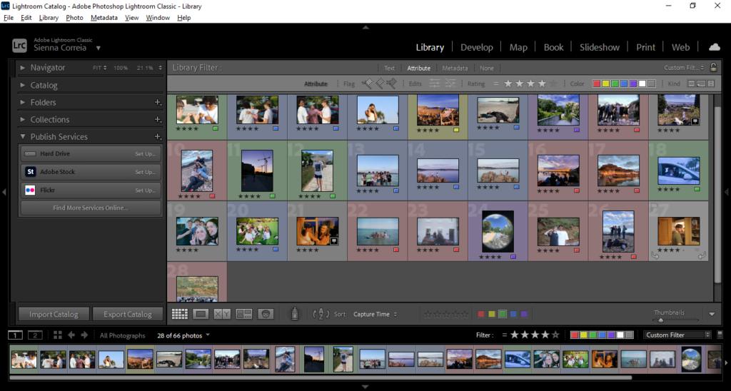
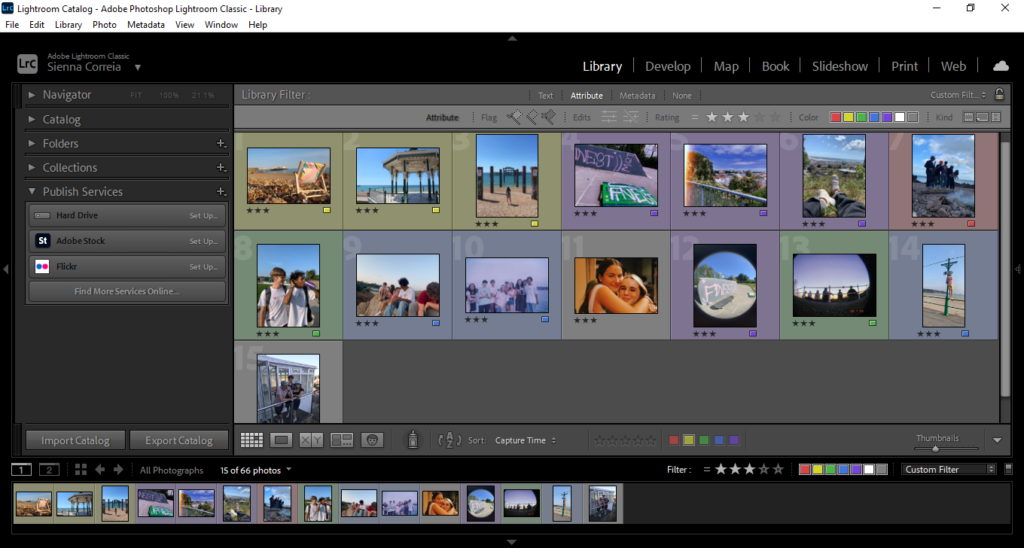
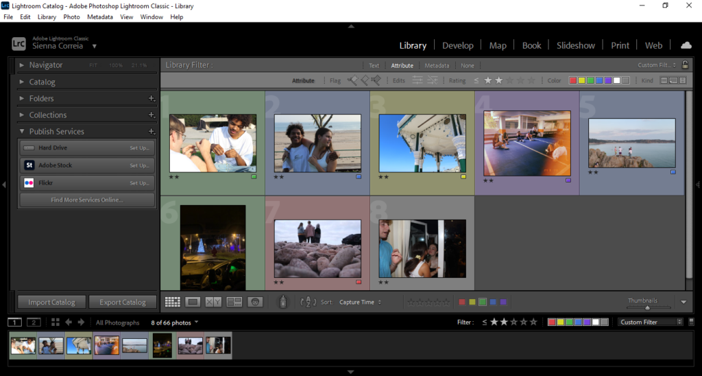
I imported all my images into lightroom and gave them all a colour to create a key for which setting each are

Green = Waterfront

Blue = St. Brelades

Yellow = Brighton

Red = Gorey

Purple = Fort

None = Milos House

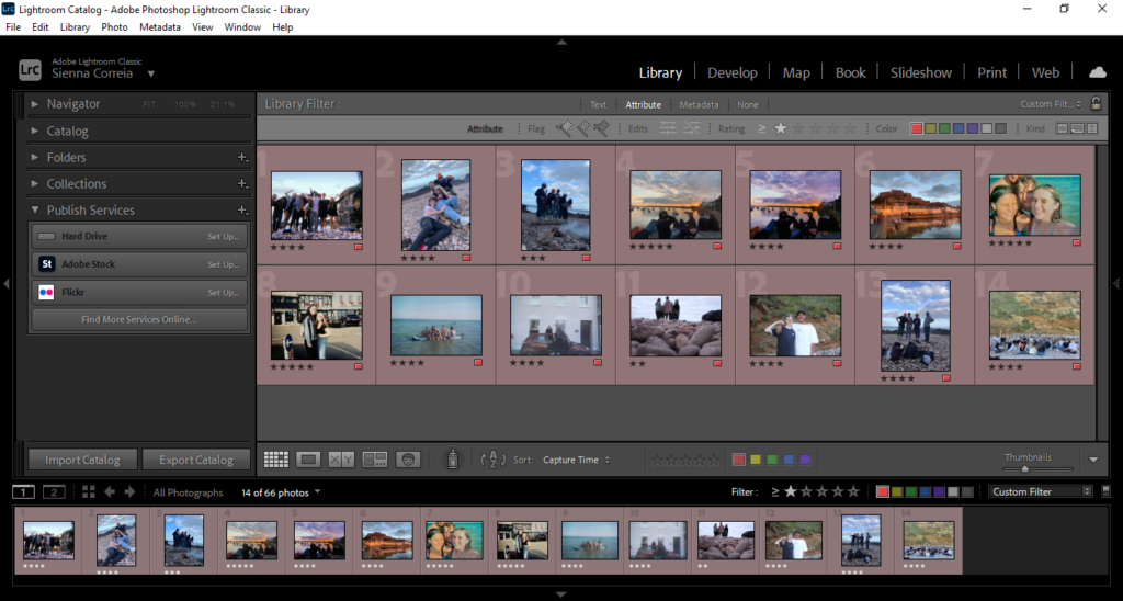
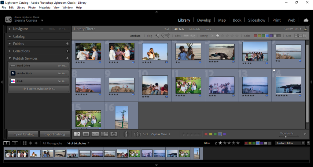
I then ranked all the images using the star rating, with 5 meaning i intend to use, 4 i may use, 3 could use, 2 or below most likely not using. I also flagged one image that i think i will use for my cover

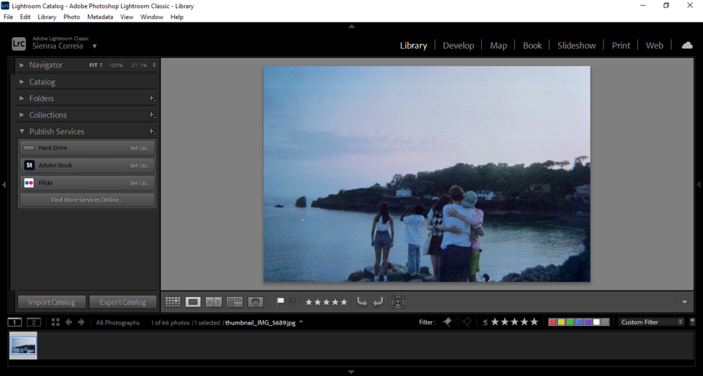
Flagged

5 stars

4 stars

3 stars

2 or less stars