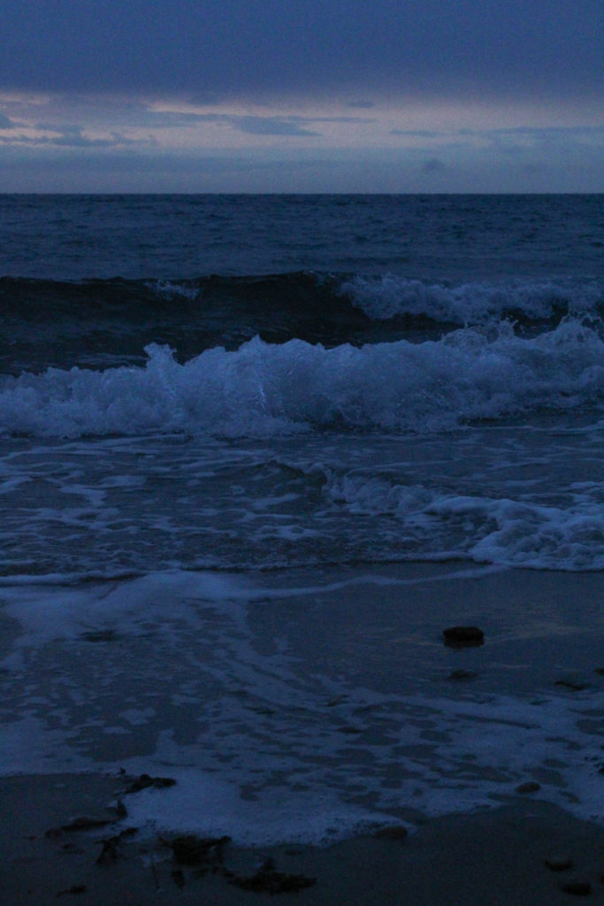
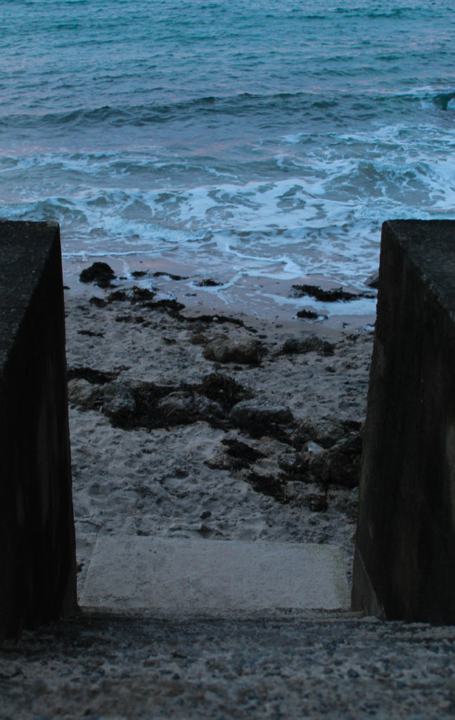
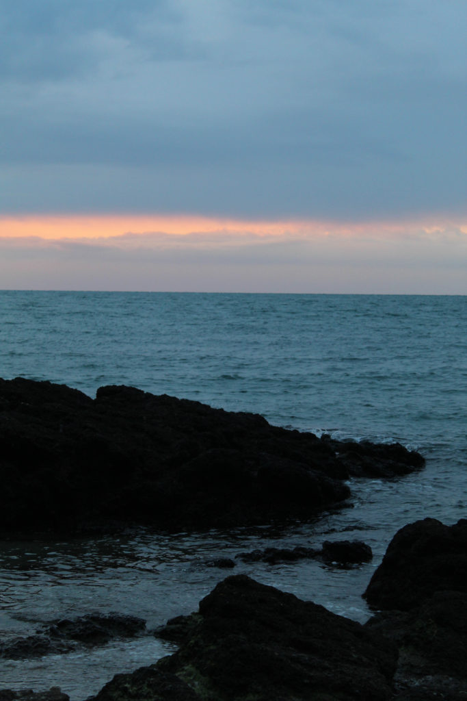
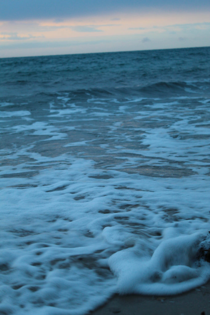
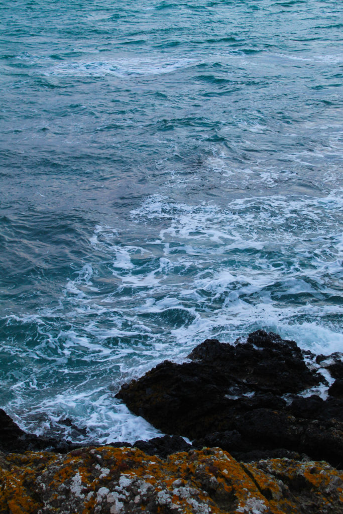
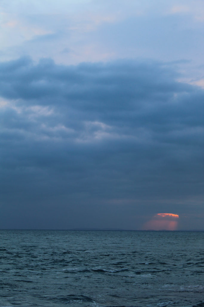
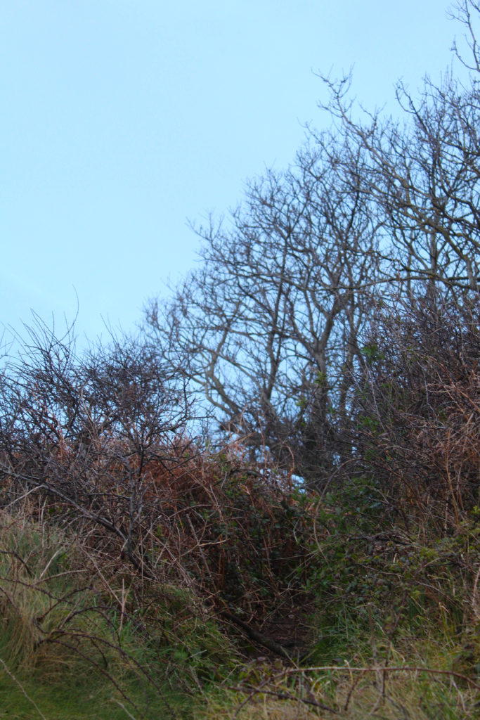
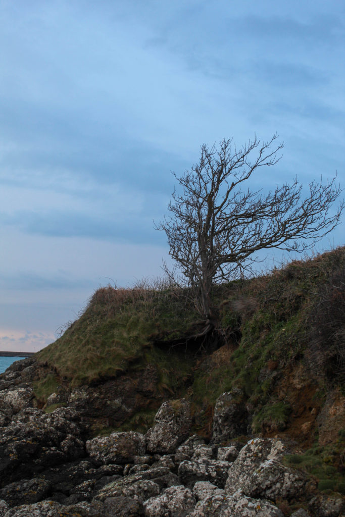
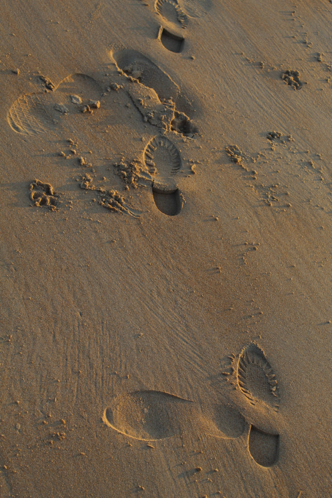
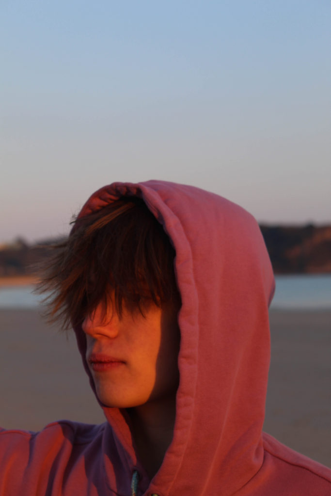
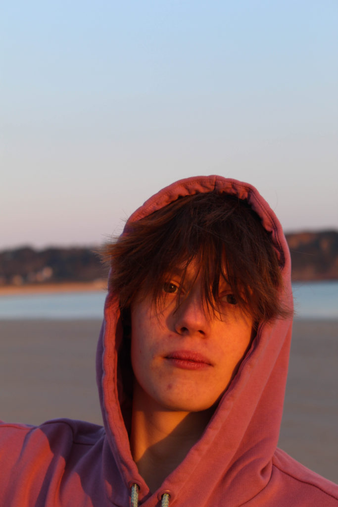
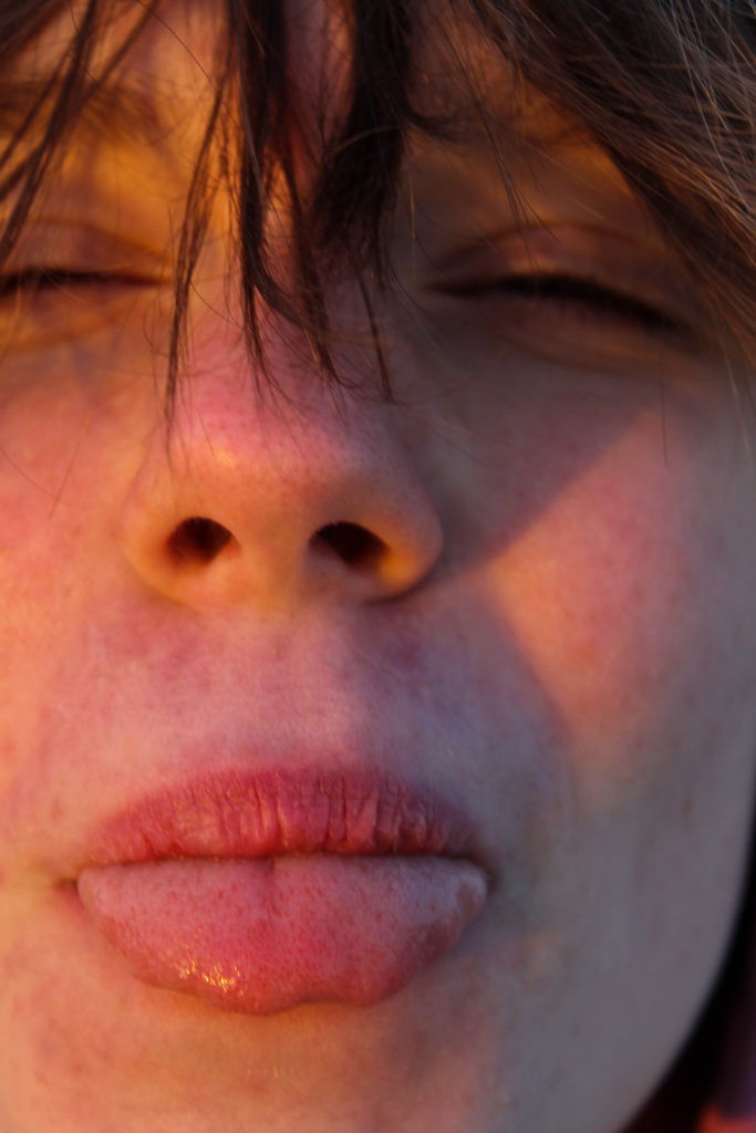
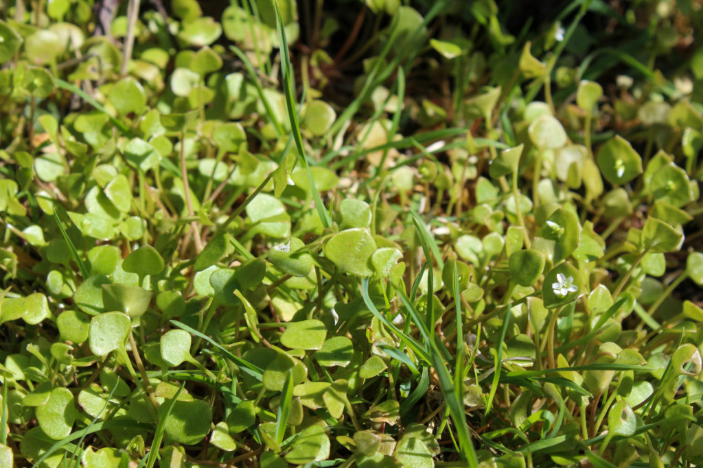
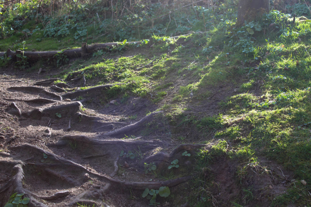
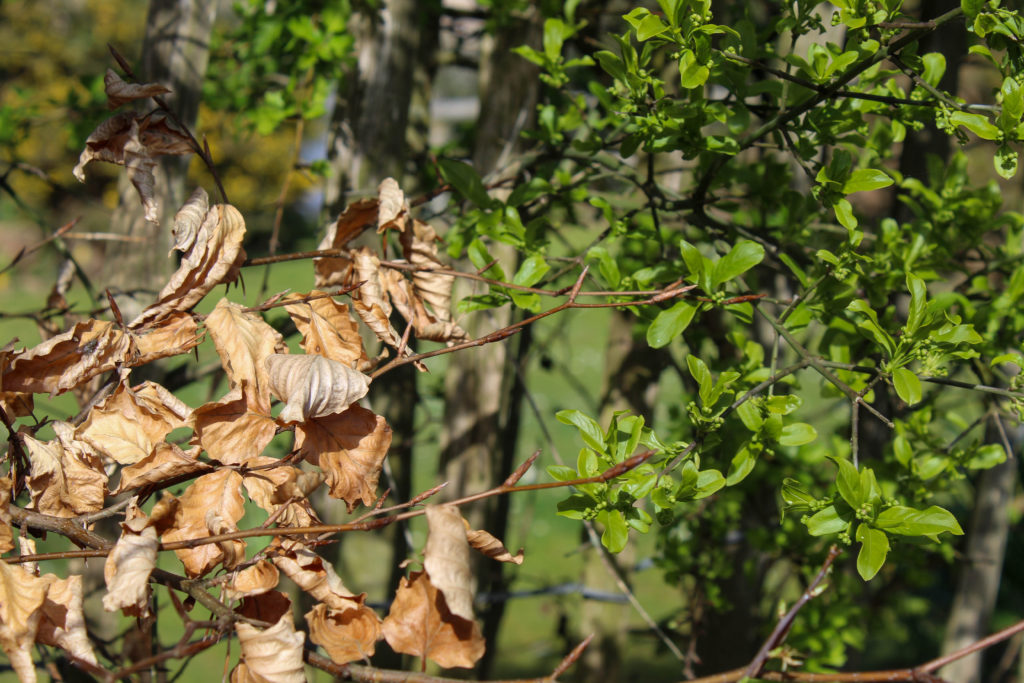
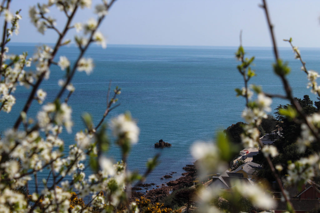
transition shoot #4- beach at sunrise

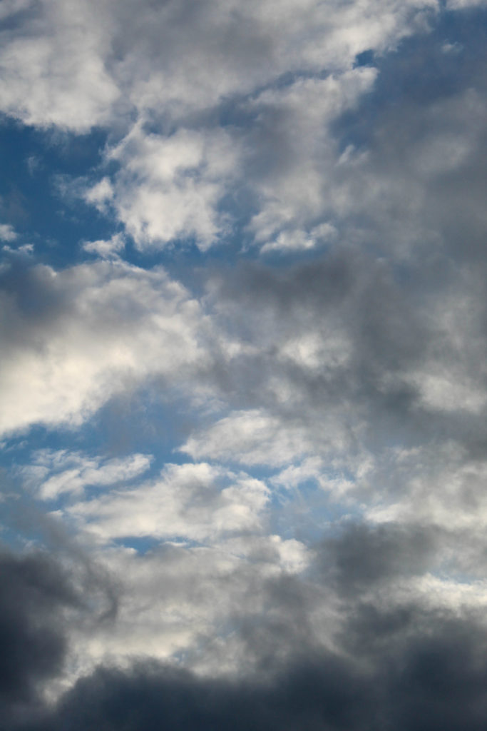
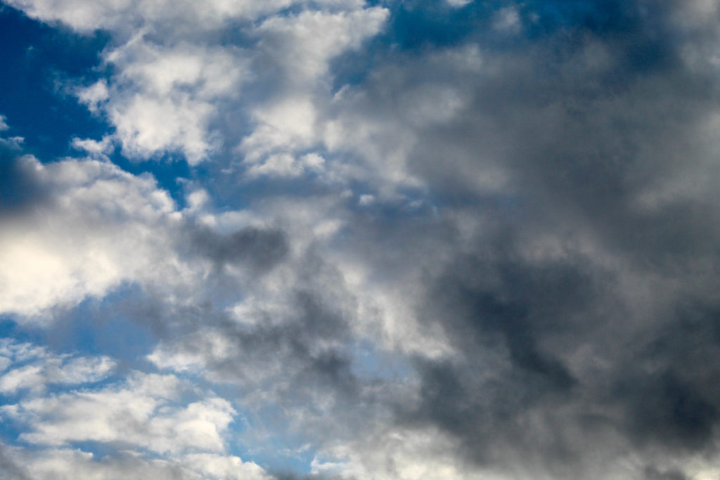
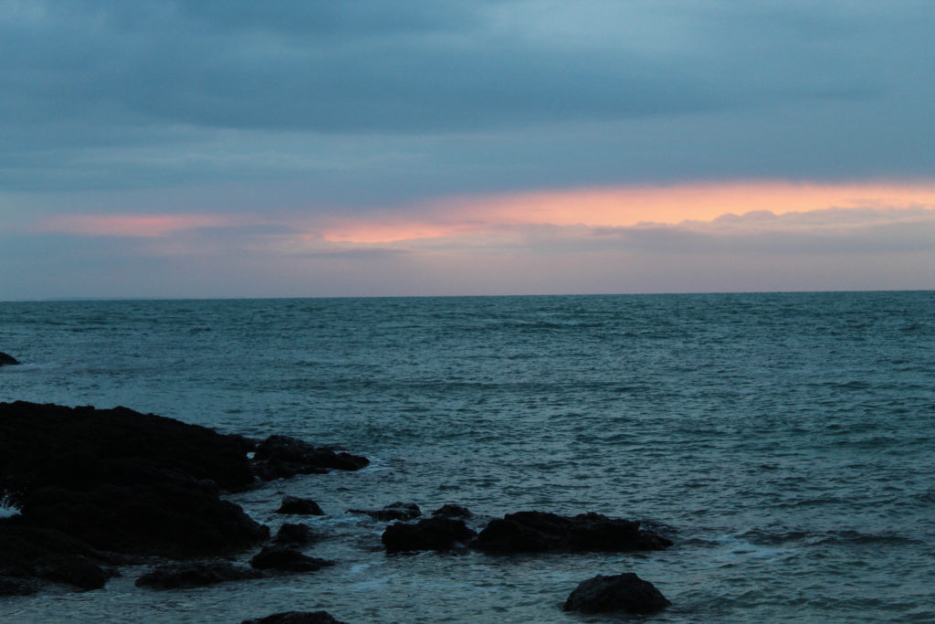
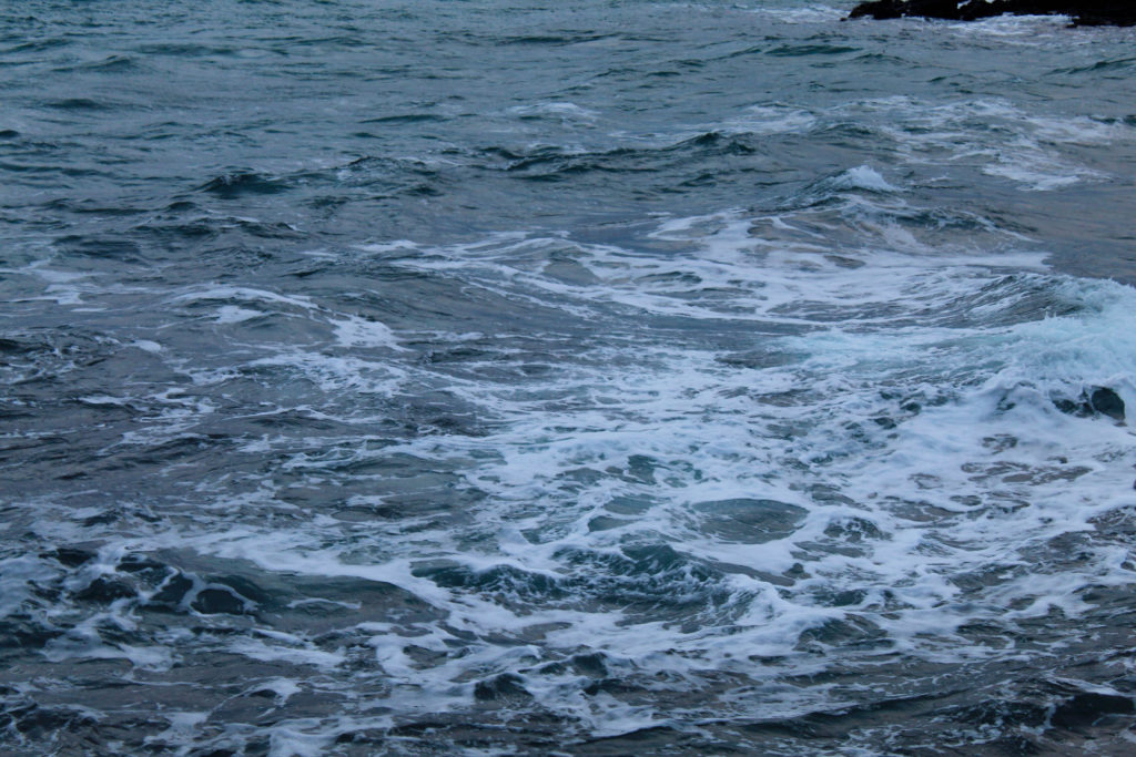
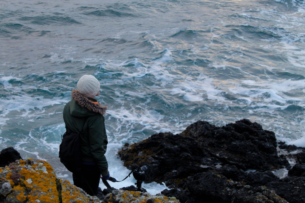
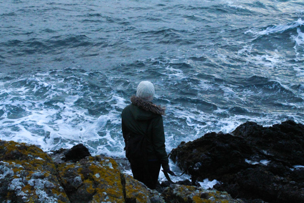
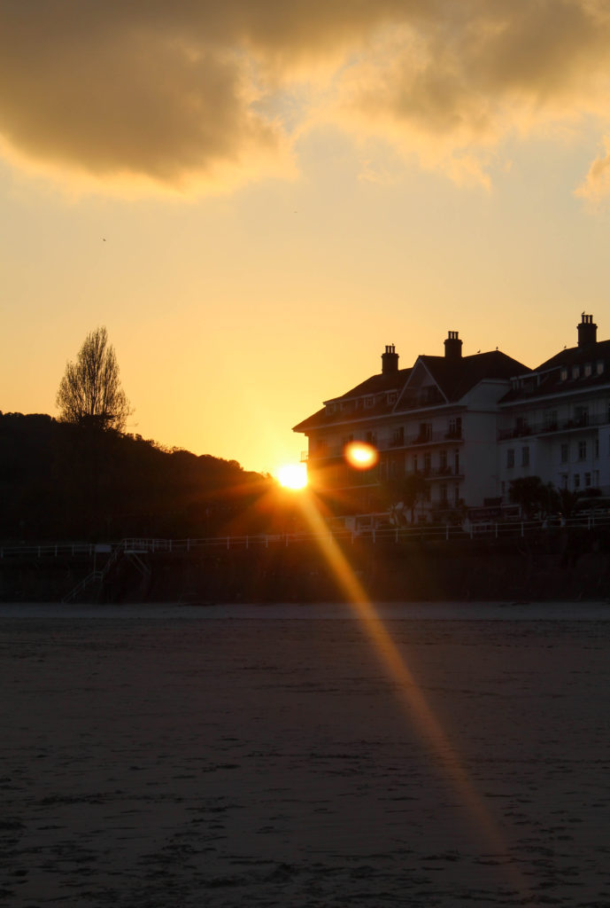
This shoot required a little more planning, as I knew that i needed more “winter” type images but as the weather kept getting warmer I wasn’t sure how to go about it, until I realised I could use the early morning light to show coldness in the same way I used the light at sunset to show warmth and summer. SO to achieve this I woke up before sunrise and went out to a secluded beach, La Coupe, where there should be a good view of the sunrise. Unfortunately there was quite a lot of cloud cover that morning, but I think it had the intended effect and overall I think it payed off.

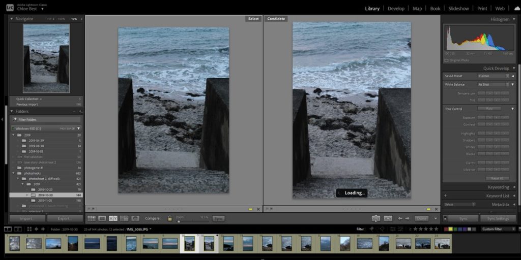
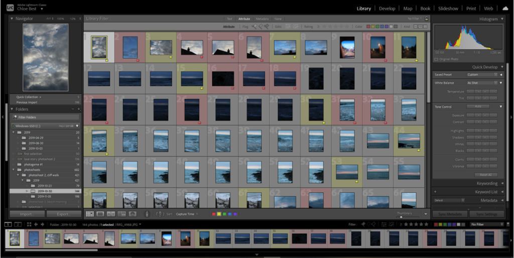
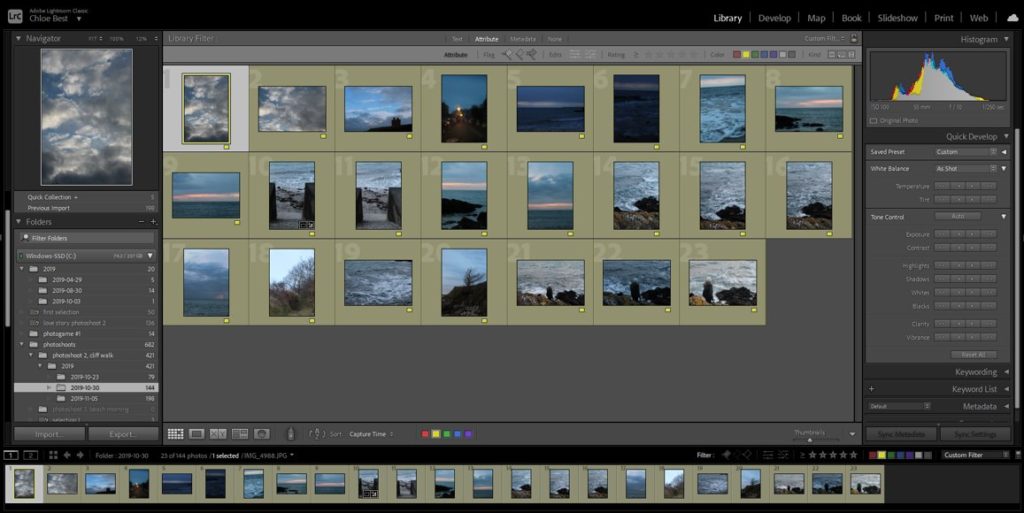
Initially i had about a hundred and fifty images, but a lot of them could be discarded because they were either too dark or too bright, so I ended up with 23 images going into the next stage.

Then I went through and cut out the duplicate images using the “compare” function below to choose which image worked best out of all that were similar.

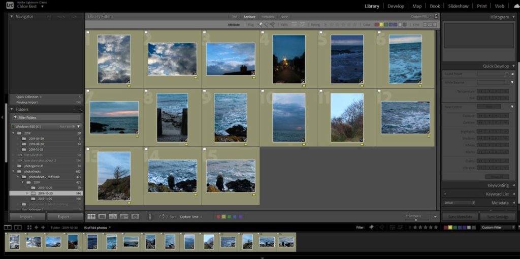
Finally I had fifteen images from this shoot (plus a couple taken the evening before that fit in with the rest of them) which I felt properly conveyed the sort of cold, wintery vibe I set out to produce, so I’m glad it worked out.

FINAL IMAGE SELECTION

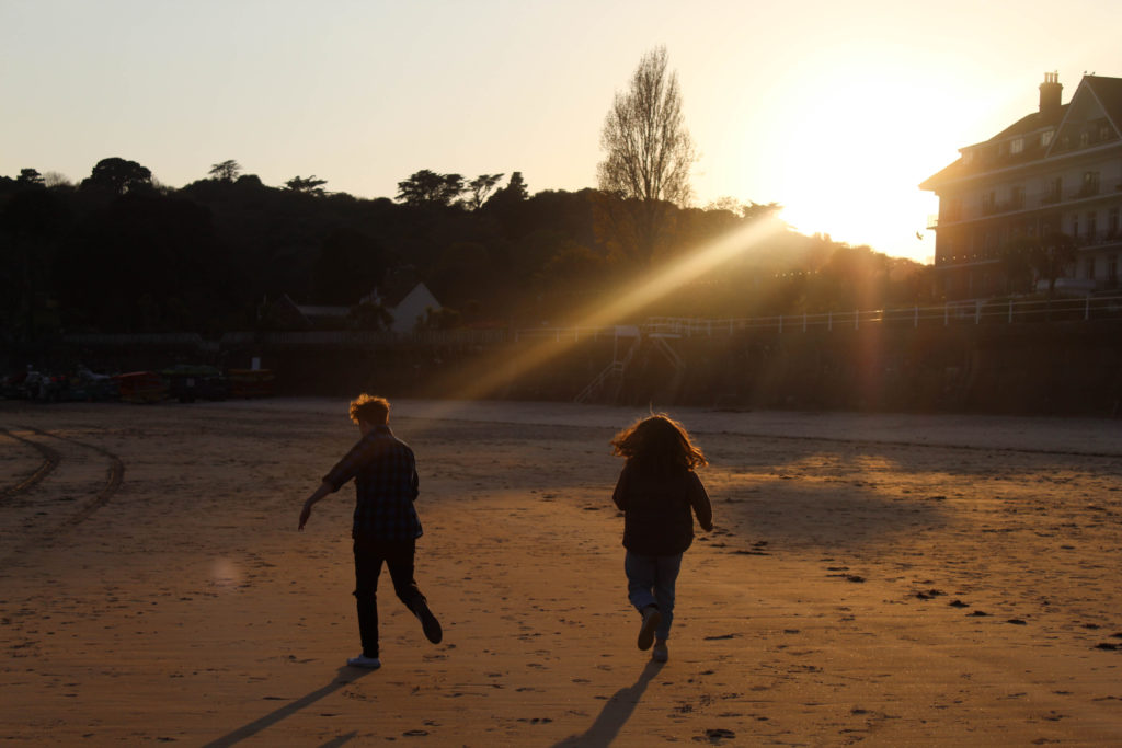
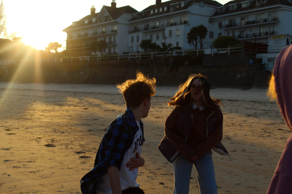
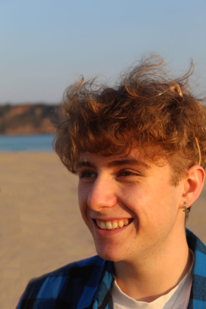
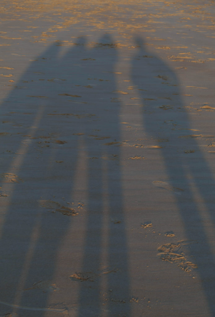
transition shoot #3- sunset beach portraits

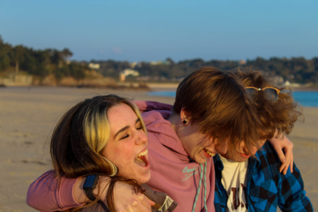
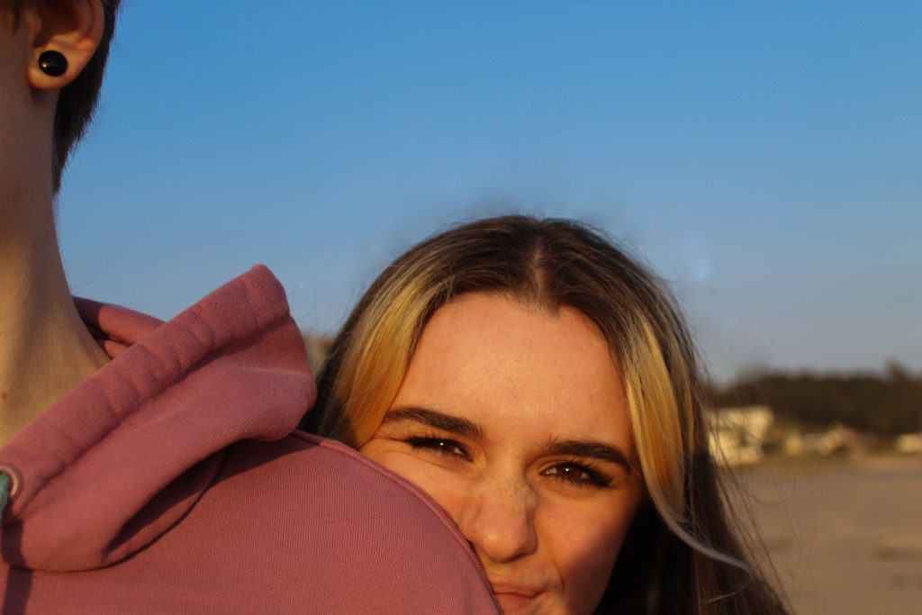
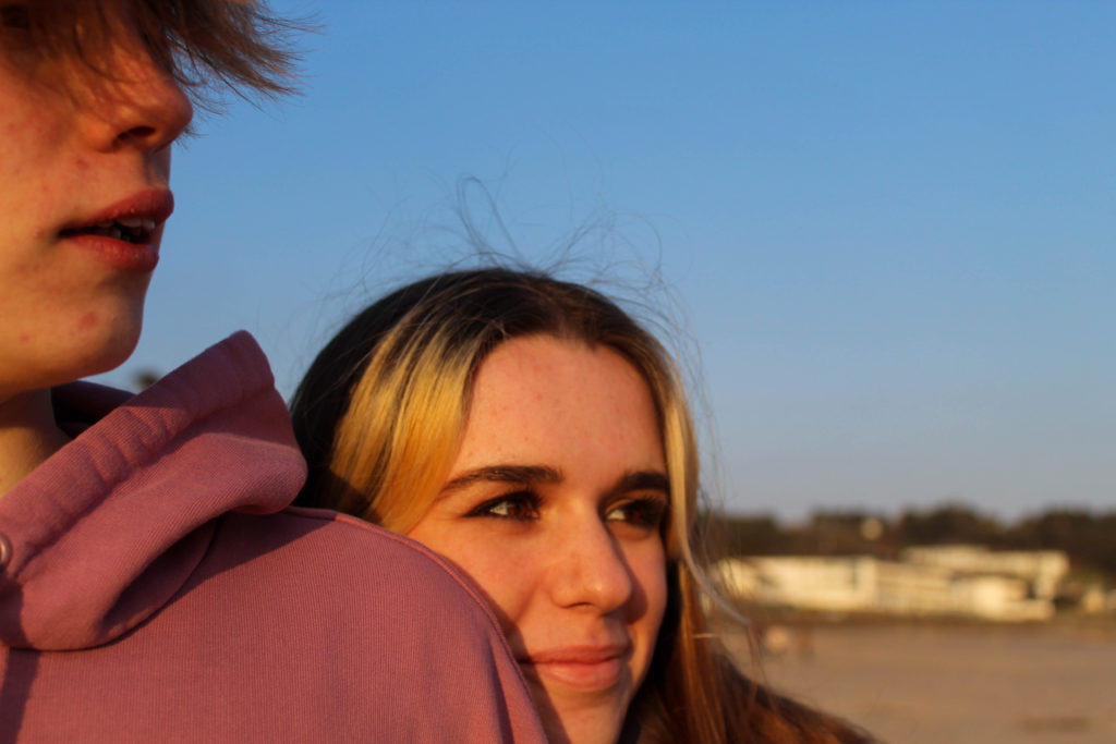
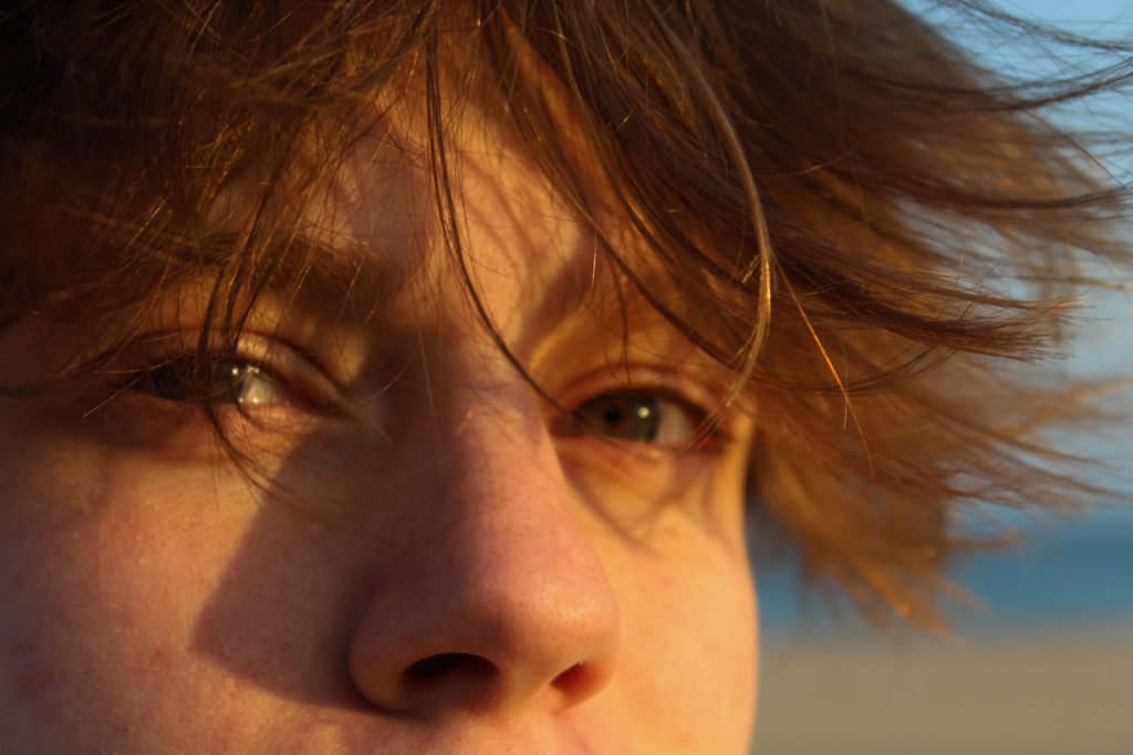
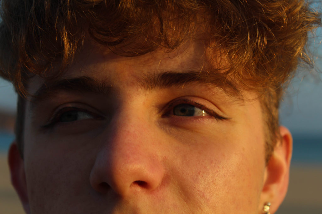
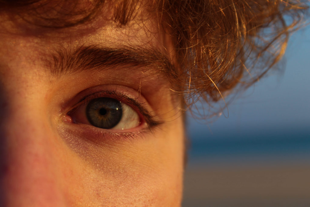
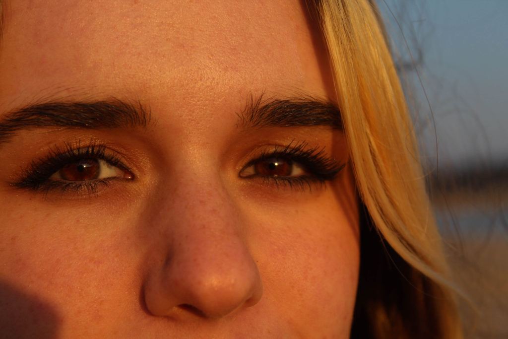
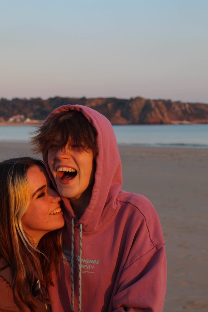
For this shoot I knew I needed to focus more on portraits, specifically of young people, and I wanted to take advantage of the good weather and the particular light during the few hours before sunset. I used a few of my friends and we went down to St Brelade’s in the evening.

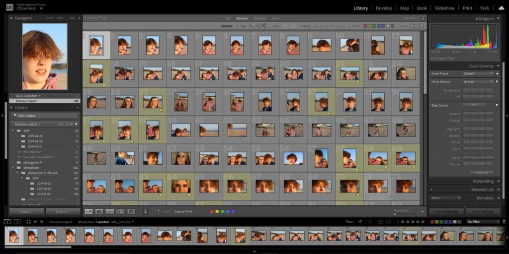
The bulk of the images totaled about two hundred images, so the process of going through them took a little more time. I used the same process as before, starting off my colour coding the images I wanted to carry on with in yellow, and then going through them at the next step and flagging them as “pick” or “reject”.

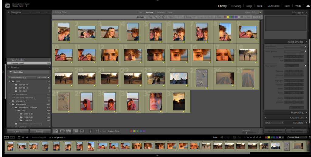
After filtering out the yellow images, I went through and flagged them as “pick” if i wanted to keep them. I based this on whether they were the best of two duplicates/similar looking images, whether they fit in with the idea of my final photobook in my head, and whether they used the same sort of technique and style as the artists I studied.

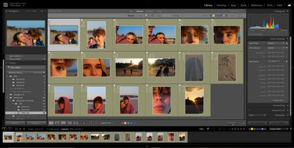
This left me with 16 final images to move on and begin editing.

During the editing process I didn’t change much, only minor corrections which were easily made in Lightroom, then exported the images in with the rest of my final images from other shoots.

In the end, I think it was a good idea to take portraits with this light and in this location, and the candid nature of the images make them feel natural and conveys the emotions felt at the time pretty well, in my opinion. If I had to change anything I would probably have tried to do some more traditional, posed portraits, but I have more time to do this so it’s not a big issue.

FINAL IMAGES-

transition shoot #2- cliff walk

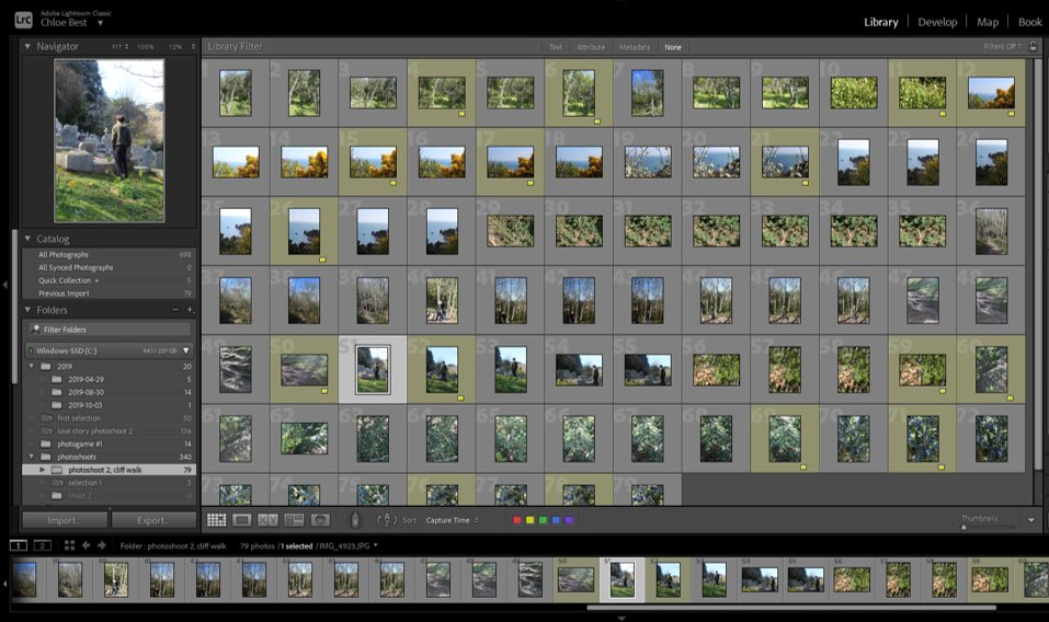
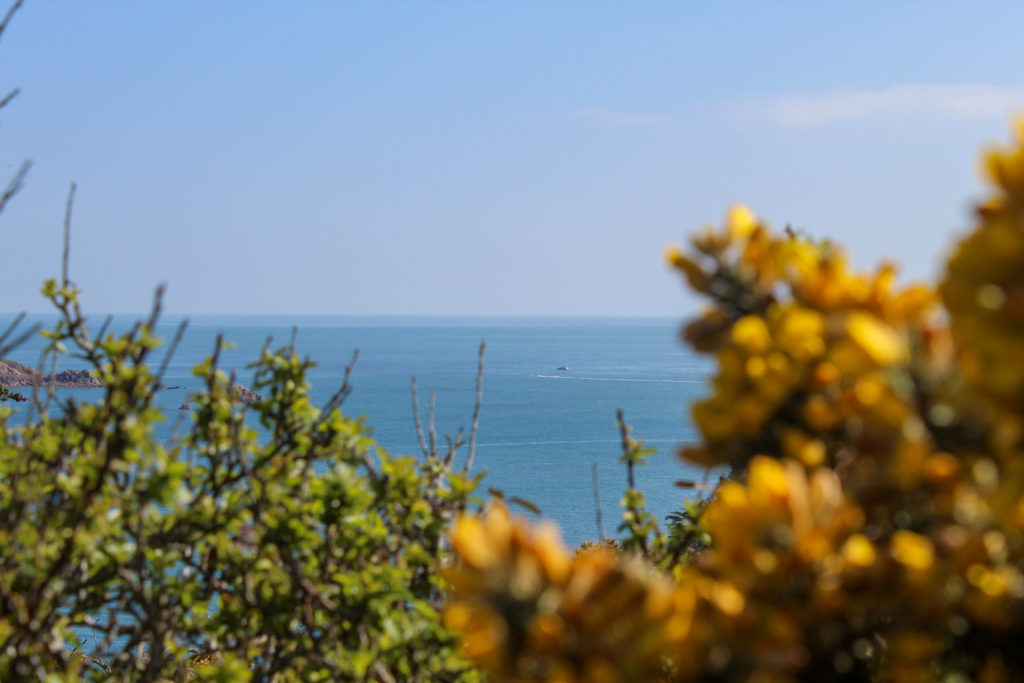
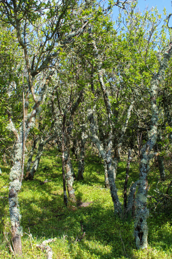
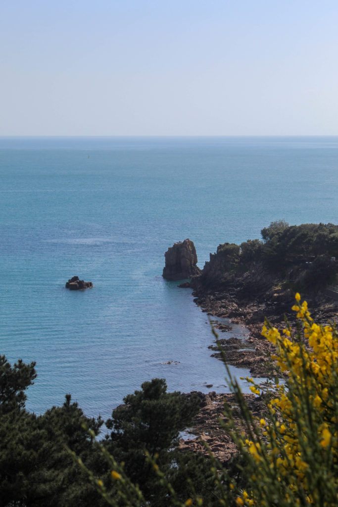
I went on a walk from Beauport to St Brelade’s and around the surrounding area, just after midday, in an attempt to take more landscape photos, as opposed to close-ups like I did in the previous shoot. I finished with about 80 photographs, which is less than I would have normally but I tried to focus on the images fitting in with the rest of my idea. Because of the weather and the time of day, these images will probably be used in the “summer” part of the book, nearer to the end.

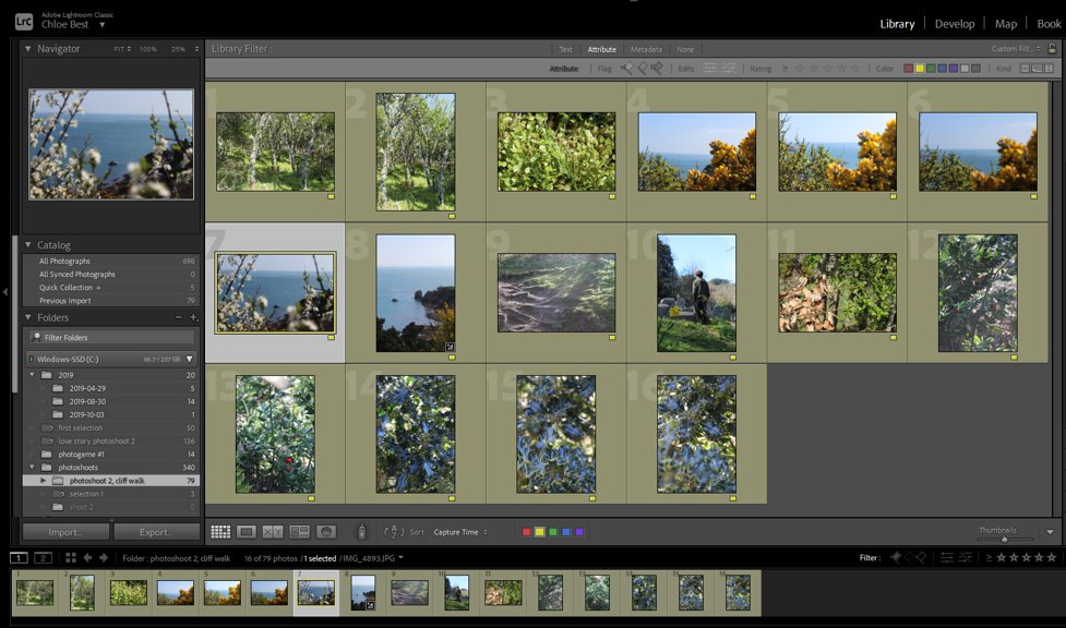
I went through and selected the pictures I immediately liked, leaving me with about sixteen. I chose them on the basis of whether they were technically good images, and also if i liked them personally, but I didn’t analyse them in too much detail.

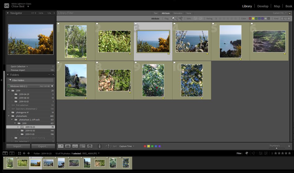
Next, i cut down on any duplicate images by using the “compare view” function in Lightroom, and thinking of how I would have to edit each image in the future. Like this I managed to end up with about ten images, shown below, to make whatever edits necessary and move to the group of final images from the other shoot(s).

Overall I liked this shoot, I think it resulted in a fair amount of good quality images and I think it was successful as a whole.

FINAL IMAGE SELECTION-

EXHIBITION info

Our exhibition; LOVE & REBELLION is happening soon and we need your help to make it happen! It is vital that you submit the work we need, as follows

PRINTS: Check that you have made a folder in your name with your prints and included the mock layout of how the images needs to be displayed. Once complete put folder in box on the table

IF you are missing prints, please submit images for final printing again here, making sure you have formatted each image to the correct size, ie. A2, A3, A4, A5 either in format landscape or portrait. If confused see your teacher!

M:\Departments\Photography\Students\Image Transfer\PRINTING\Final Prints – Exhibition

FILMS: We need your original MP4 file that you exported from Premiere from your film projects, both the film on Rebellion that you made in small group and any other films you made as an individual student. If you can’t find your MP4 file, then open up your film project in Premiere again and re-export. Follow these instructions here:

  1. In Premier: Click on Sequence > Render IN/OUT
  2. File > Export > Media
  3. Export Settings: Format H.264
  4. Output Name: use title of your film and save to V:Data drive
  5. Click Export at bottom

Save your MP4 file here with tittle of film and who made as follows: title_your name.mp4

M:\Departments\Photography\Students\Image Transfer\LOVE & REBELLION\FILM

BOOKS: We need to exhibit your books so if you haven’t ordered it or handed in yet for final assessment, you MUST DO SO ASAP!

ZINE: We would also like to exhibit your zines that you made in the beginning of the academic year based on a LOVE STORY. Check the box on the table that you printed, folded and stapled a copy. If not, complete zine now and put in the box!

STATEMENTS: We need a 100 word statement from you about the work that you are exhibiting as prints and films. You should have written one when you submitted work for the Guernsey Photography Festival competition earlier. If not, you need to re-write: See example below for how to format it below

Thomas Le Maistre, XY
My photobook ‘XY’ is a brief delve into the life of a close-knit group of young adults, exploring the way in which boys become men, changing physically and mentally during this strange yet energetic period of adolescence. Inspired by the works on male photography and the maze gaze by Robert Mapplethorpe and Karlheinz Weinberger, my similar style of images aims to capture the lives of us as young adults during what could be considered the most important period of our lives.

Save your statement here:
M:\Departments\Photography\Students\Image Transfer\LOVE & REBELLION\Statements

LOVE & REBELLION Exhibition dates: 24 May – 13 June
Berni Gallery. Jersey Arts Centre
Official opening Mon 24 May 5:30 – 7:00 by the Bailiff of Jersey
Make sure you attend opening and invite family friends – will check how many people are allowed to gather first.

HANGING EXHIBITION: We need assistance with students who wish to help installing the exhibition on Sun 23 May 10:00 am

PUBLICITY – MEDIA: We need 3-4 students who are willing to speak with local media about their work and the exhibition. Normally this involves live interview on radio with BBC Radio Jersey, Channel 103FM and ITV Channel TV.

PROMOTION – SOCIAL MEDIA. We need a small team of 2-3 students who would like to promote the exhibition on our Hautlieu Creative Twitter and Instagram feed. We need to come up with a good hashtag eg. #love&rebellion #hautlieuphotography
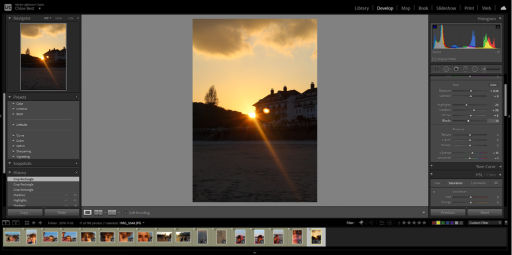
Editing Process for all shoots

For all my photos I followed the same steps but just slightly adjusted it to best fit the image and lighting.
On Lightroom I began by selecting the photos that I wanted by giving them a 3 star rating if I wanted to use them then editing the best photos.

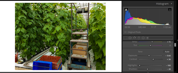
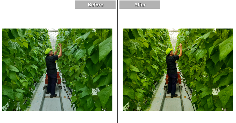
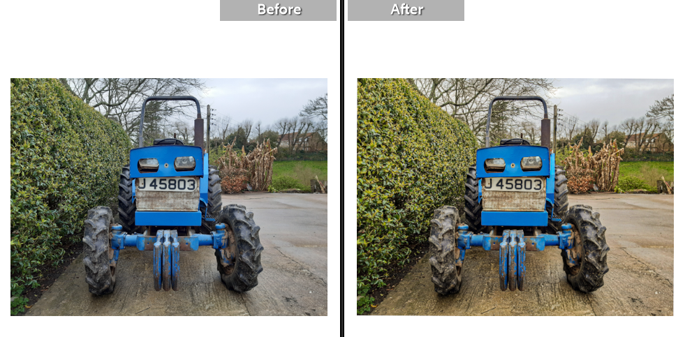
I started by increasing the temperature in the images to add to the memorable idea of the image. I then adjusted the exposure to work best with the contrast to help add more dimension to the photos. I also decreased the highlights to avoid making the photo too bright

I then similarly played around with the whites and the blacks and adjusted them to best fit the image; this differed from image to image. I increased the texture to bring out the detailing in the leaves and the rust in the car and increased the dehaze to make the photos more clear. I added vibrance to make the other coloursz of my images pop out such as the red and the blues

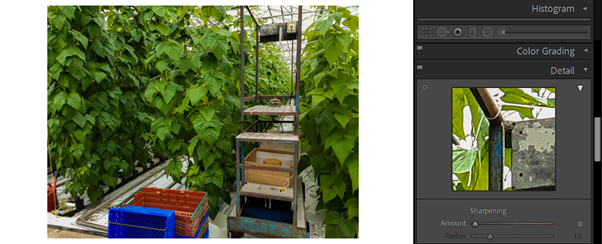
I finally added the slightest bit of sharpening to the images to again bring up the quality of the photo.

Before and Afters