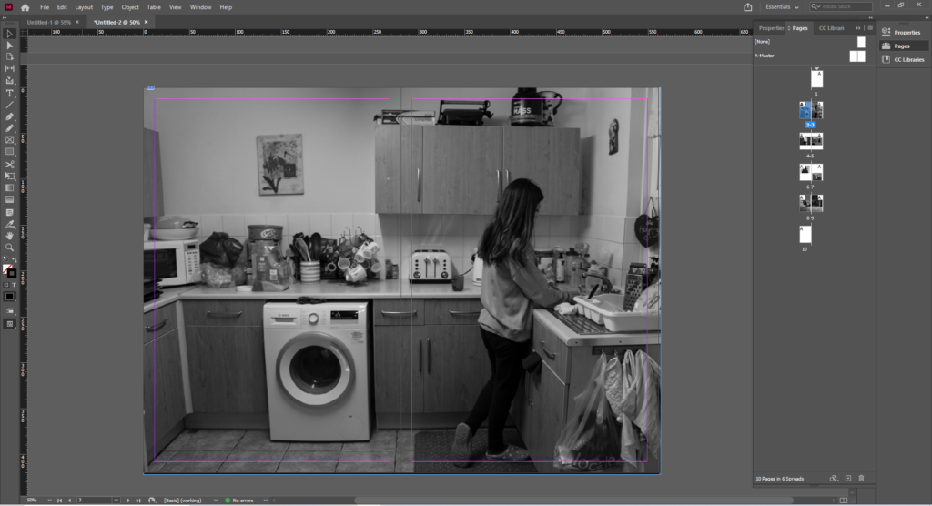
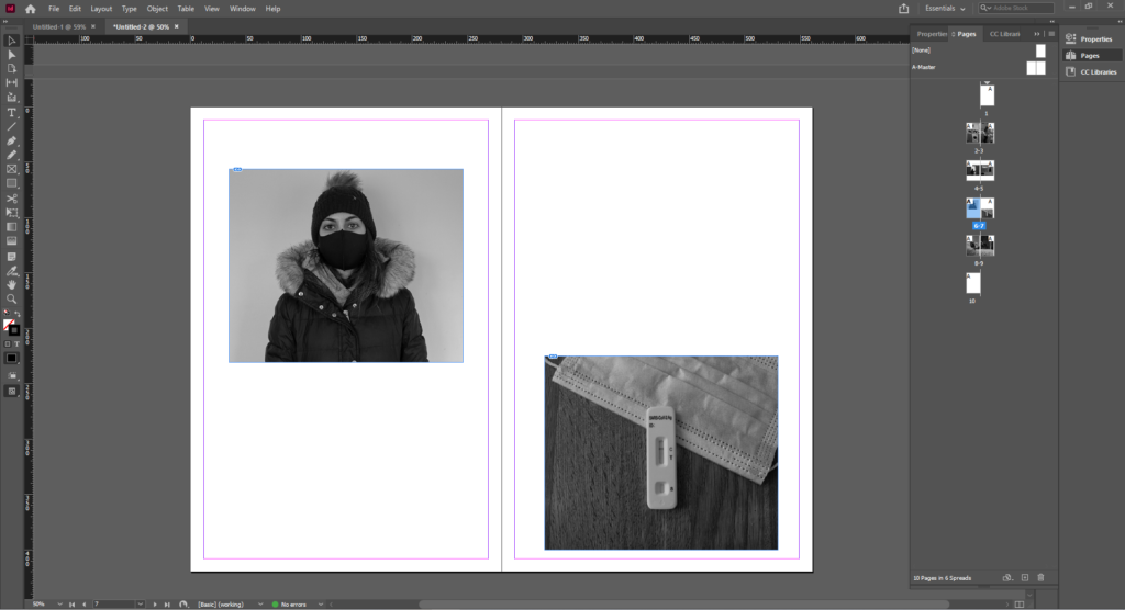
The definition of juxtaposition is placing two things together to show contrast or similarities. In photography, we use composition, forced perspectives or props to convey the contrasts in the picture. Photographs can also rely on cultural ideas and identities of the viewers. i have placed these 2 photograph together to show the viewers the affect of Covid 19.
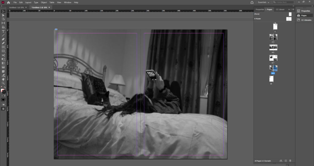
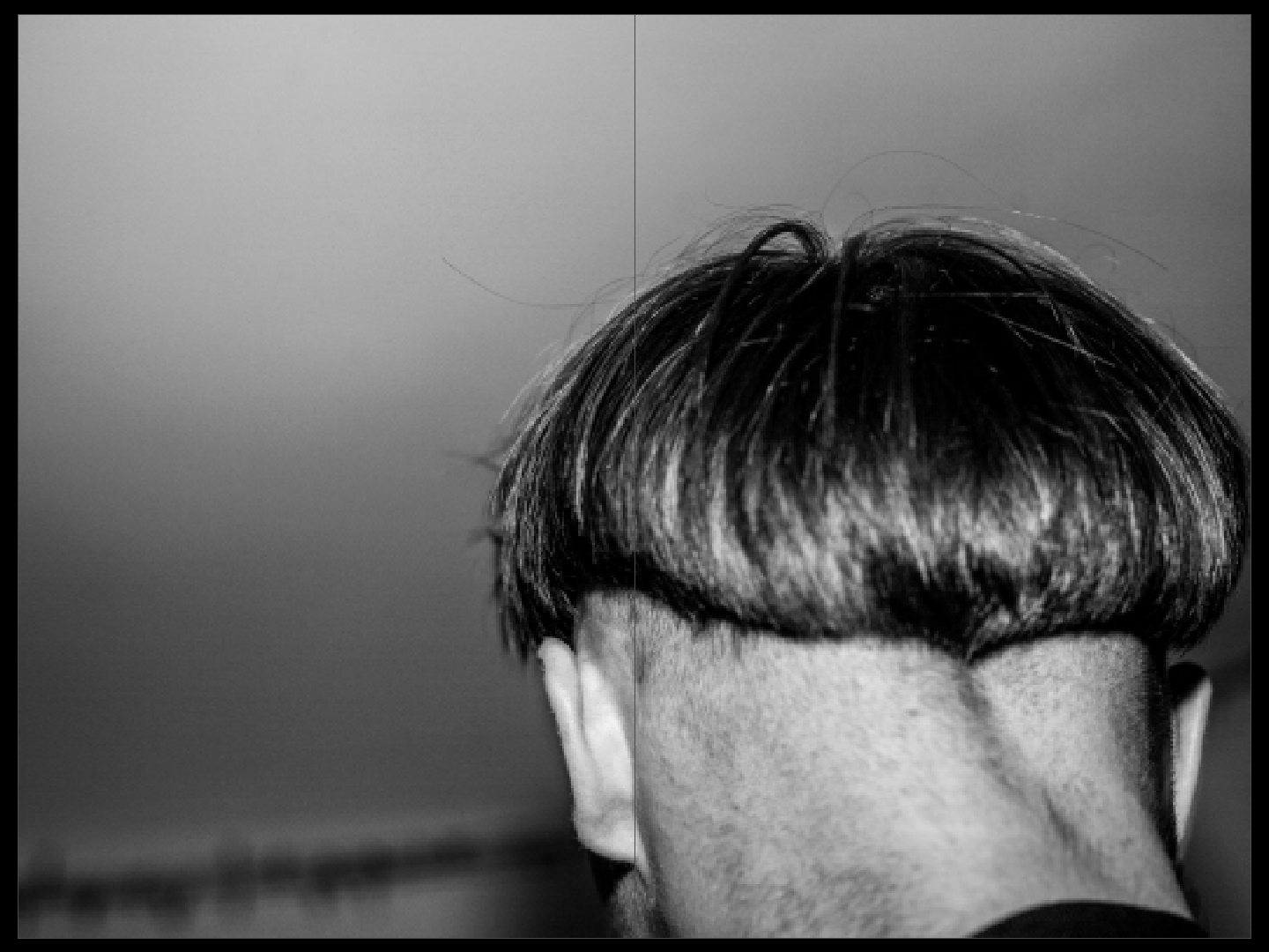
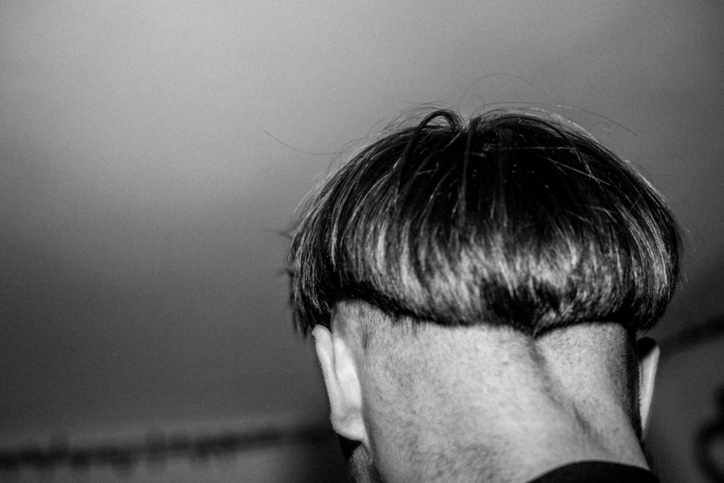
Similarly to my photobook, I chose this image as a full-bleed spread as It’s highly ambiguous. The image doesn’t reveal any one identity but represents the actions and shared experience of much of the modern youth- D.I.Y haircuts and a lack of concern for ones appearance, as they continue to develop their identities and experiment with different experiences.
JUXTAPOSITION:
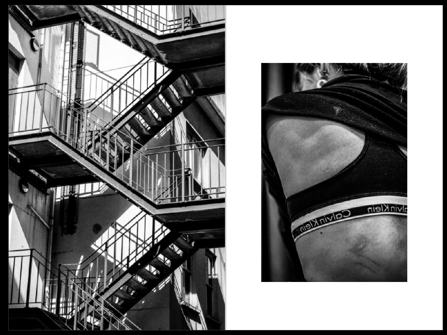
Using another pair of images from my photobook, I juxtaposed an abstract image of a staircase alongside an image of my back. The images are both presented in black and white, so as to focus on the structure and form of the photos. The regularity and structured nature of the stairwell mirrors that of the bone structure and anatomy of the human body. This is a strong juxtaposition as, despite the different experiences we go through as people, we’re all connected via our function- just as the function of a stairwell is the same no matter how it is designed or where it is located.
SEQUENCE:
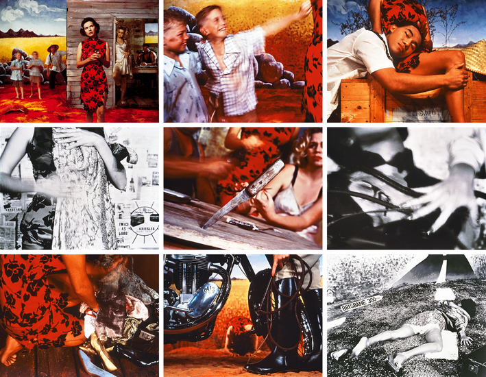
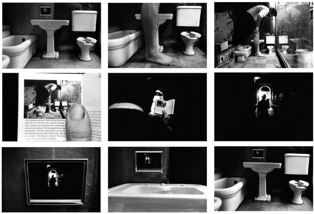
My initial inspiration for my sequence piece was from the nine images from Tracy Moffatt‘s ‘Something more’. The sequence tells a somewhat ambiguous story of a young woman who, from the title of the piece, is searching for something more- bringing in themes of lost innocence and the sense that this woman has outgrown the security and comfort within her life.
The set of images are highly theatrical. Each of these ‘scenes’ can be displayed in pairs, threes, rows or in a grid to manipulate the storyline. There is a clear arc, however, from naïve country girl to fallen woman abandoned on the roadside no matter how the images are arranged.
Moffatt piece focuses on the device of montage, mixing together a continuous narrative, flashbacks, cutaways, close-ups and memory or dream sequences, to structure the series.
My response:
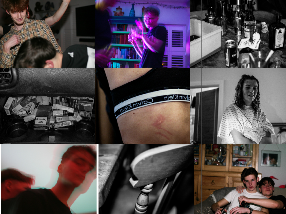
For this particular sequence I used a mixture of high clarity images and low shutter speed images. The images with clarity were placed in black and white to amplify the objectivity of them. In contrast to this, the images showing bright colours and fast movement allowed for a depiction of altered states, if not caused by then at least related to the images with high detail.
MONTAGE:
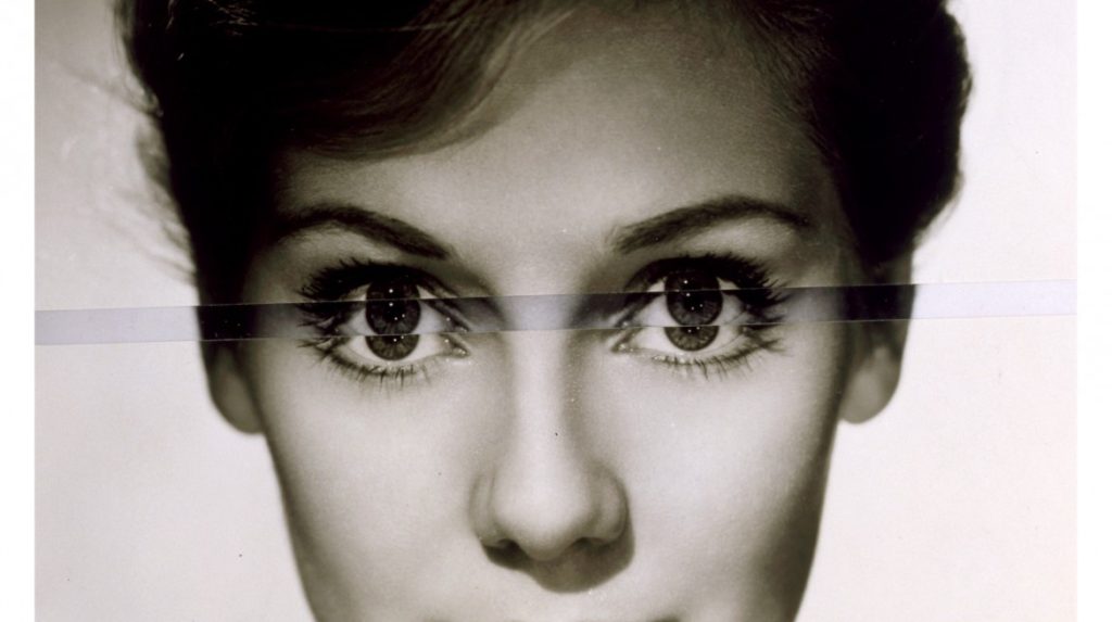
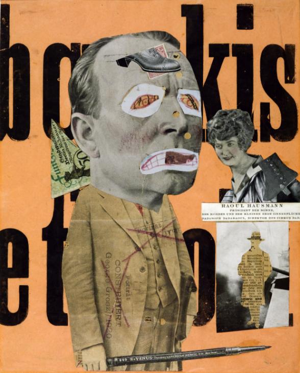
Finally, to create my montaged images, I focused on John Stezaker, a British artist who is fascinated by the lure of images. Stezaker’s work is produced by taking classic movie stills, vintage postcards and book illustrations and making collages to give old images a new meaning.
The different adjustments (inverting and slicing) of these separate pictures together allows Stezaker to explore the subversive potential of found images.
My Response:
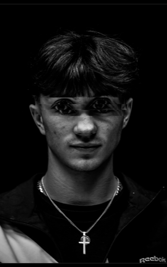
To carry through this depiction of altered states, I took a formal portrait I created and placed it on multiple layers in photo-shop. Having done this, I cropped the eyes of the layered images and placed them unevenly above or below the eyes of the original photo. This allowed me to create a portrait depicted the possible feeling of being in an altered state, to which the audience can take inference from.
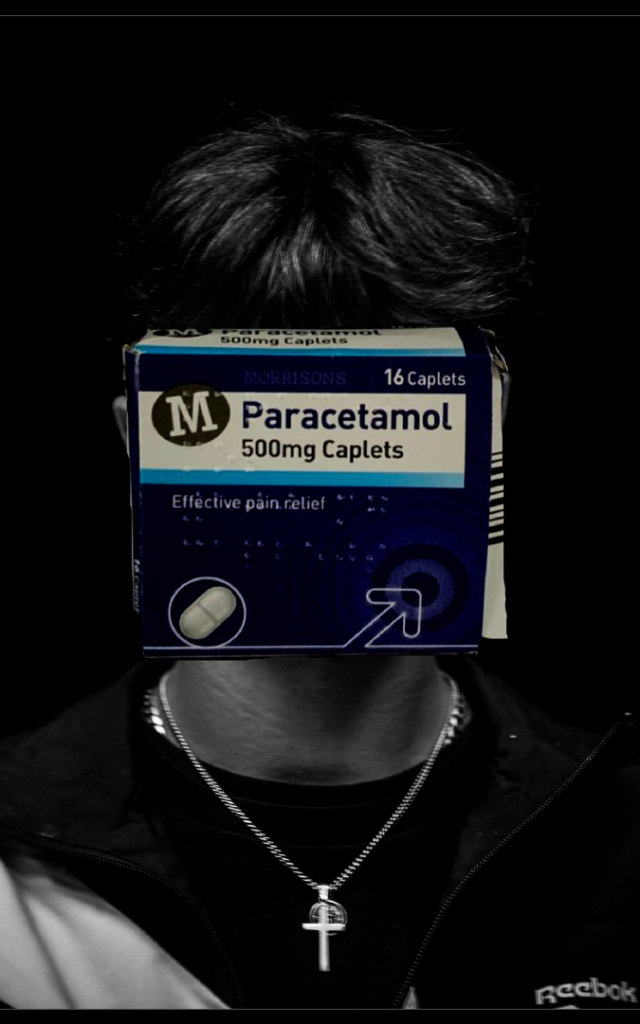
Additionally, I superimposed a pack of paracetamol (commonly mixed or overdosed with) on top of the same formal portrait. Like previously, this removed the identity of my subject and resulted in an image that represents the social issue of drug use throughout the modern youth.
During the Love and Rebellion project, there has been a possibility of producing a newspaper based on the themes of love and rebellion. I have decided to focus on designing 4 versions of a newspaper spreads using images from my photo book; dear Liw, and from my film, multiple identities. Shannon O’Donnell uses the technique of selecting key frames from the timeline in Premier and presenting them as still-images. I will also print my spreads as final outcomes for mounting.
INSPIRATIONS:
Death Comes to the Old Lady, 1969
Things Are Queer, 1973
The Art Critic 1919-20 Raoul Hausmann 1886-1971
Claude Cahun
EXPERIMENTING WITH FILM STILLS:
SEQUENCE / STORY BOARD:
Here are 9 images from my film, Multiple Identities, which display the major/ key frames in my short film. The first 4 represent the stereotypical women identity, the 5th and 6th represents coming back to a neutral identity, and the last 3 represent the stereotypes of being a man. Here is also 9 images from my photo book what compliment each other the best to create a story board.
MONTAGE:
These two montages are what I enjoyed putting together the most, as I am able to show my creativity through them. Foe the two collages I’ve tries to mix the female and male scenes together. The one of the left is my model earring the suit but I have edited in the fur coat instead. Her hair is tied back however I’ve places earring and lips with lipstick on her. On the right is the opposite, with her completely wearing the suit but with er hair down, being more feminine.
The montage underneath was created from images from by photo book; dear, Liw. I’ve used different textured from a couple of my images to create an interesting monatge.
JUXTAPOSITION:
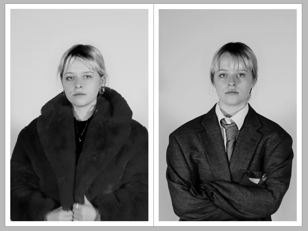
This juxtaposition is one of the most important spreads in my piece. It shows the two identities that my model has expressed in the film. The first image on the left shows the stereotypical women’s identity, with ‘girly’ clothing, makeup and jewellery, while the contrasting photo on the right shows the stereotypical identity of a man, with a suit and tie, no makeup or jewellery. I think these two images contrast each other very well because they explain how one gender can express their personality and individuality in different ways, no matter what the stereotypes are. I like how their facial expressions are the same as it continues to show that they are the same person being revealed in different ways.
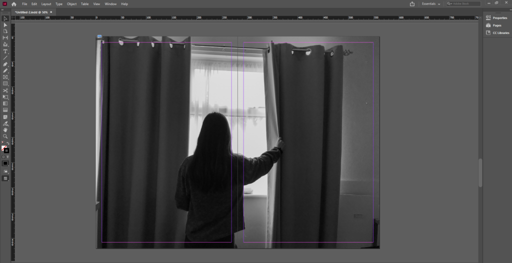
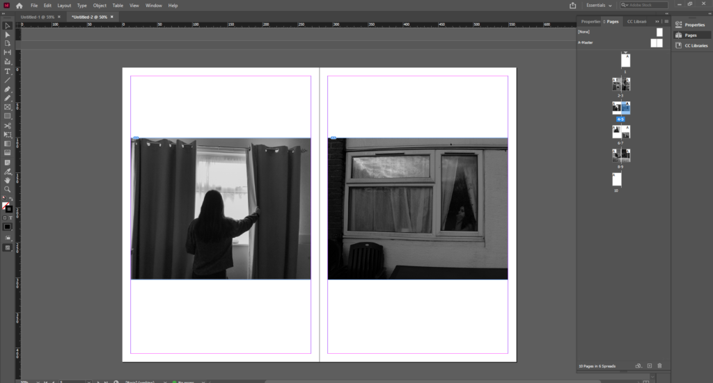
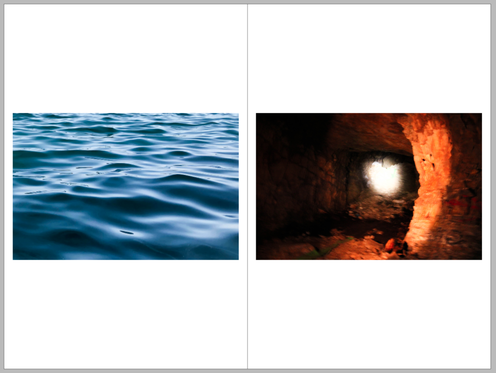
The images below are from my photo book. I think that the orange and the blue contrast very nicely to create a juxtaposition
FULL-BLEED:
I really enjoyed the composition of this still image from my short film and I have decided to use it as a full bleed for my newspaper spread. The image shows my model putting on a tie for the ‘mens’ outfit, however the positioning of her hands and the soft glare feels very feminine and gentle to me, and is somewhat a juxtaposition in one image itself. I love how the shadows from the model fill the backdrop and leave a halo of light around her head, centring face as the focal point. I really enjoy how the image is mid motion, and seems very candid and relaxed. I also made sure that the models face was not in the middle of the speed to ensue the fold of the page would not distort the focus.
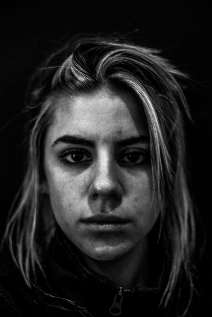
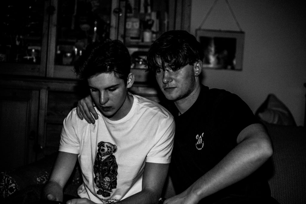
To create this selection of images, I chose the ones that best represented, to me, the aspects of youth culture. By including a portrait of myself making direct eye contact with the camera, I can personally address the audience. By having the remainder of my subjects facing away from the camera, it is clear that the project shows the characters within my life rather than depicting their own lives.
I converted all the images into black and white to give a timeless and archival feel to the images. The lack of colour allows the focus of the images to be on the concepts behind it. For example, the portrait depicting the back of my subjects head (when in black and white) shows the nature of his haircut- impulsive, choppy and d-i-y.
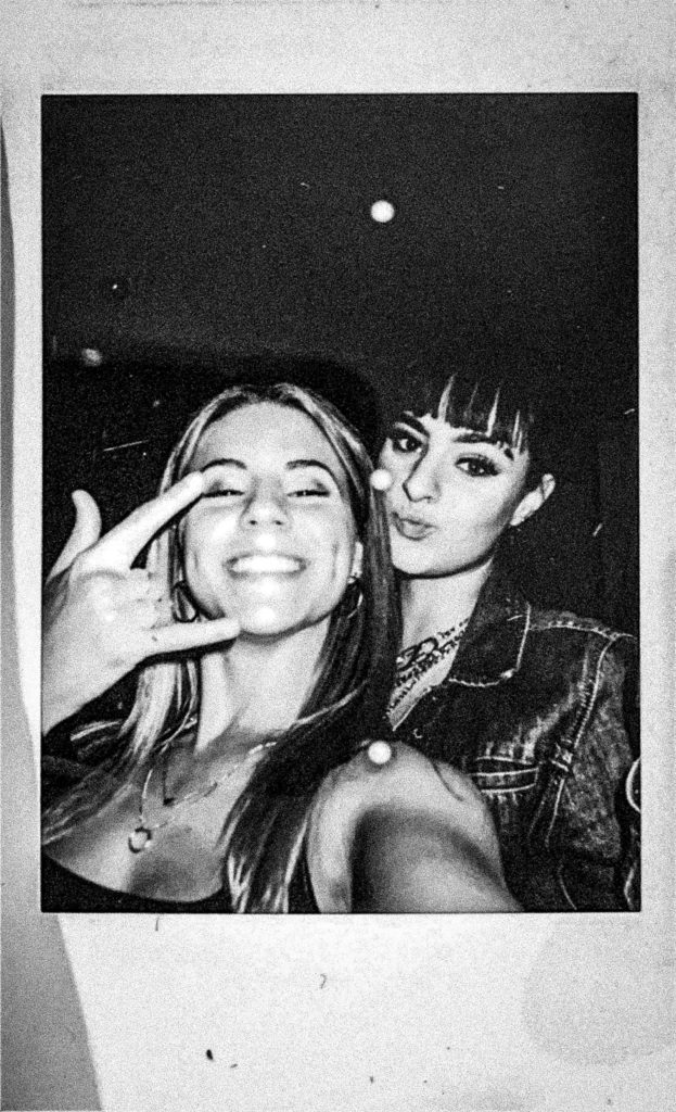
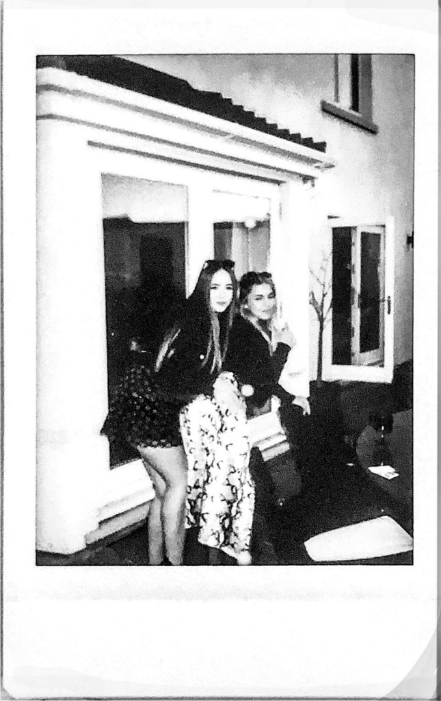
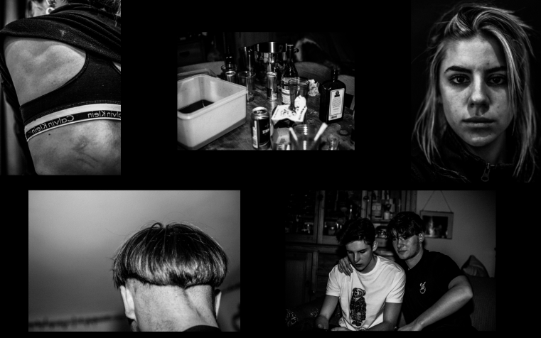
I felt that this selection of images presented themselves quite randomly and didn’t link together the way I had aimed them to. To rectify this, I decided to include the use of Polaroid images so as to amplify the archival feel of the set. Not only did this show the personal aspect of the images, providing an insight into the creation of the images and the nature of the project. An additional advantage of adding these images to the set is that it allowed me to place the images in a closer proximity to one another, which, in turn, amplified the link between the images. The lack of space from one image to another implies a sense of immediacy which shows the chaotic and frenzy-like nature of youth.
Selection 2:
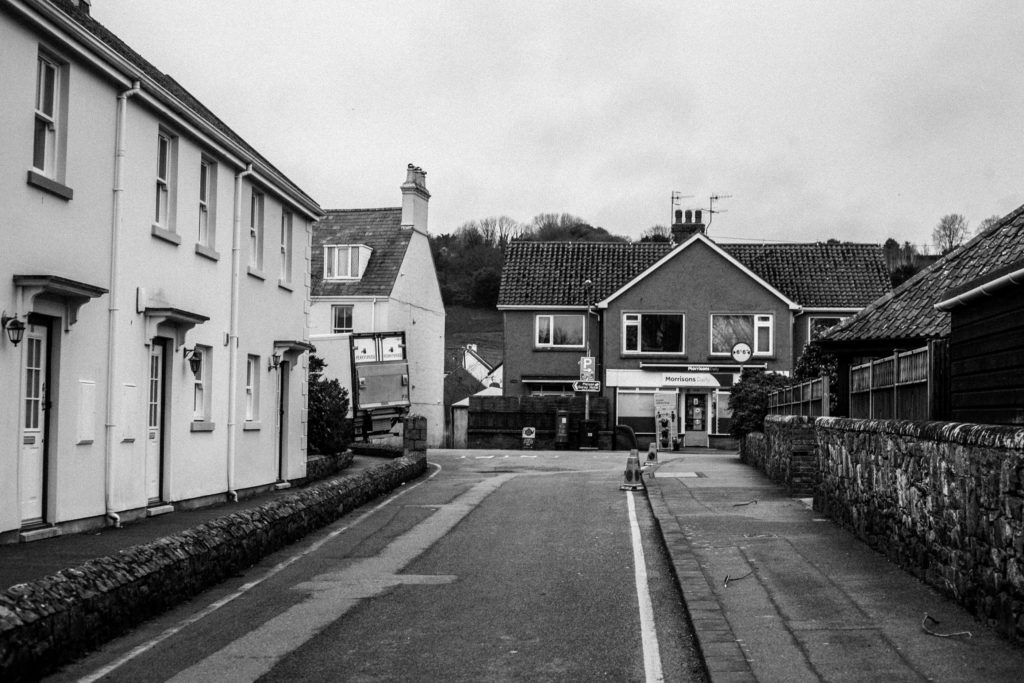
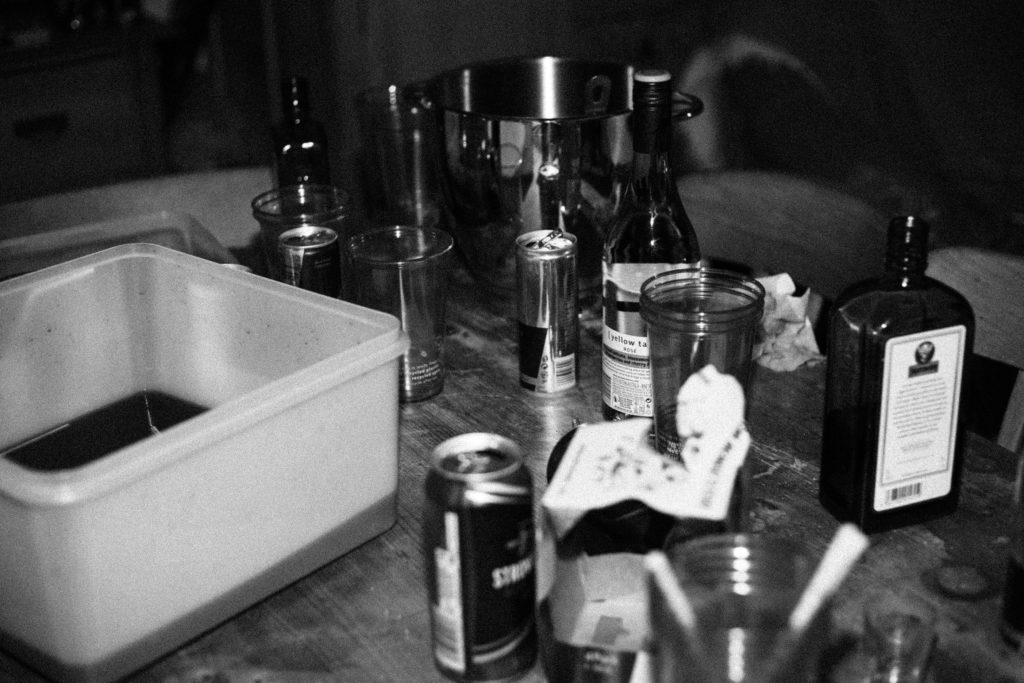
For the second selection, I aimed to shift the narrative of the images from youth as a group to the life on one individual. Filler images, such as location and alcohol use, provides an account of the subject’s life and aids in giving insight into the lifestyle of the individual pictured.
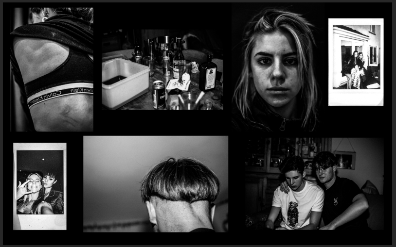
When creating the layout of the images, I decided to maintain a sense of anonymity about the individual, by keeping the portrait taken of their back and removing the portrait where their face can be seen. My reasoning for this is to provide a sense of intimacy, as the person can only be recognised by others if they have been seen first-hand with this same intimacy. However, paired alongside my photo-book, the audience will already have knowledge of the identity of the subject and so the collection of images provides a new perspective as well as the possibility of a new narrative.
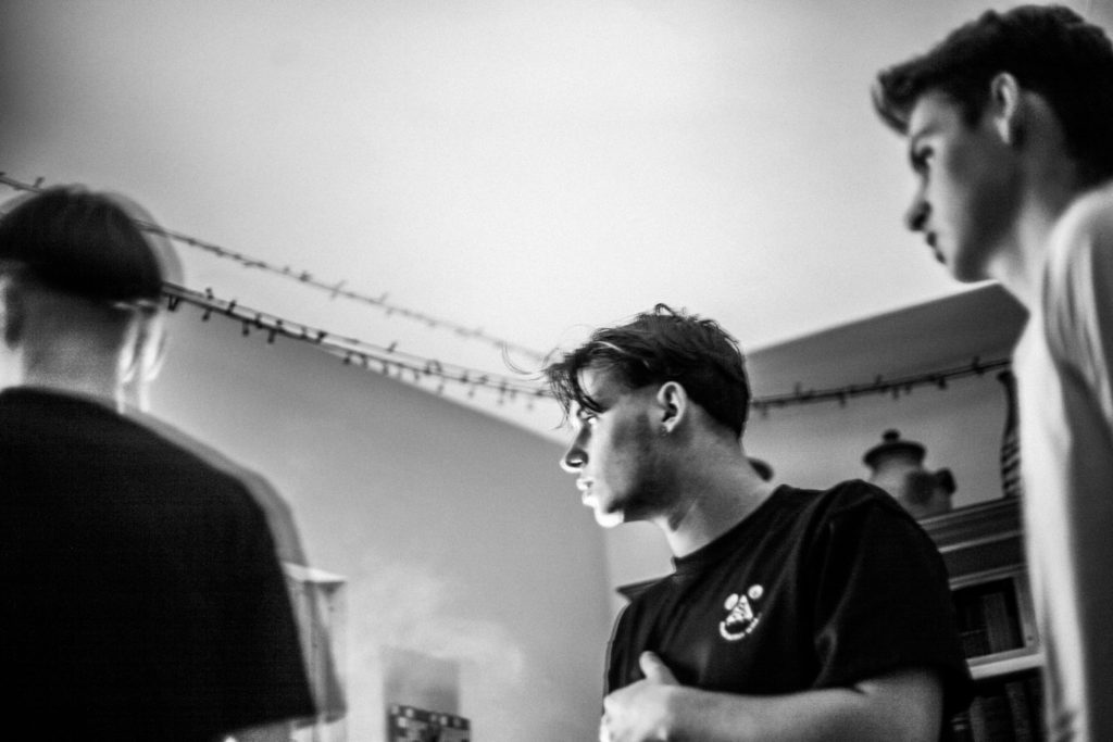
Choosing A3 for this portrait immediately establishes its importance in the narrative of the selection. I chose a second image to print as A3, a candid photo depicting three male individuals, whose focus is pictured away from the camera. This composition provides a sub-narrative, one of which implies promiscuity in accordance with the intimate portrait pictured alongside it. Having both these images as establishing shots creates a clear link between the two. The ambiguity of this link provides several different narratives to which the audience can interpret- The strong and dominating stance of the males (due to low camera angles) is contrasted by the fragility and vulnerability presented by the second portrait (due to the fact the subject is facing away from and possibly oblivious to the presence of the camera)