

Full bleed – one page:
Double page spread:

One page – grid layout:
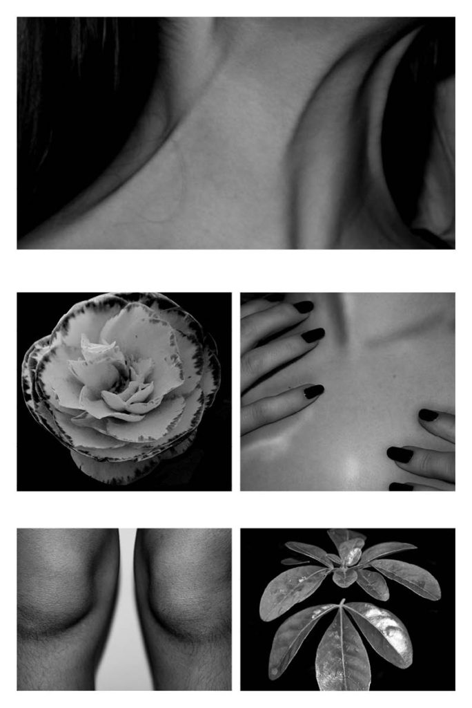
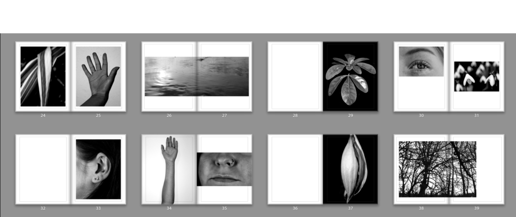
I chose these images as my final prints as I feel they represent my book and project well, with both aspects of nature and the human body being shown. I felt these were some of my strongest images and contrasted with each other well, as shown in my final layout below. The detail of each shadow and highlight in the images of the body create engaging and different views of the body embracing its natural aspects. Similarly, the intricacy of the detail in the plants create interesting images engaging with the viewer enabling them to look at every detail present.

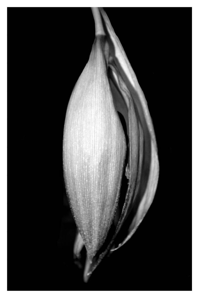
This image depicts the beauty and detail within the natural world. The composition of the flower lined up down the middle with the black background creates a focal point that draws the attention of the viewer in. There is a bold contrast between the light shades of nature against the dark background creating an interesting image due to the detail and intricacy within. I have created depth using black and white which adds to the intense tone and feeling of the image.
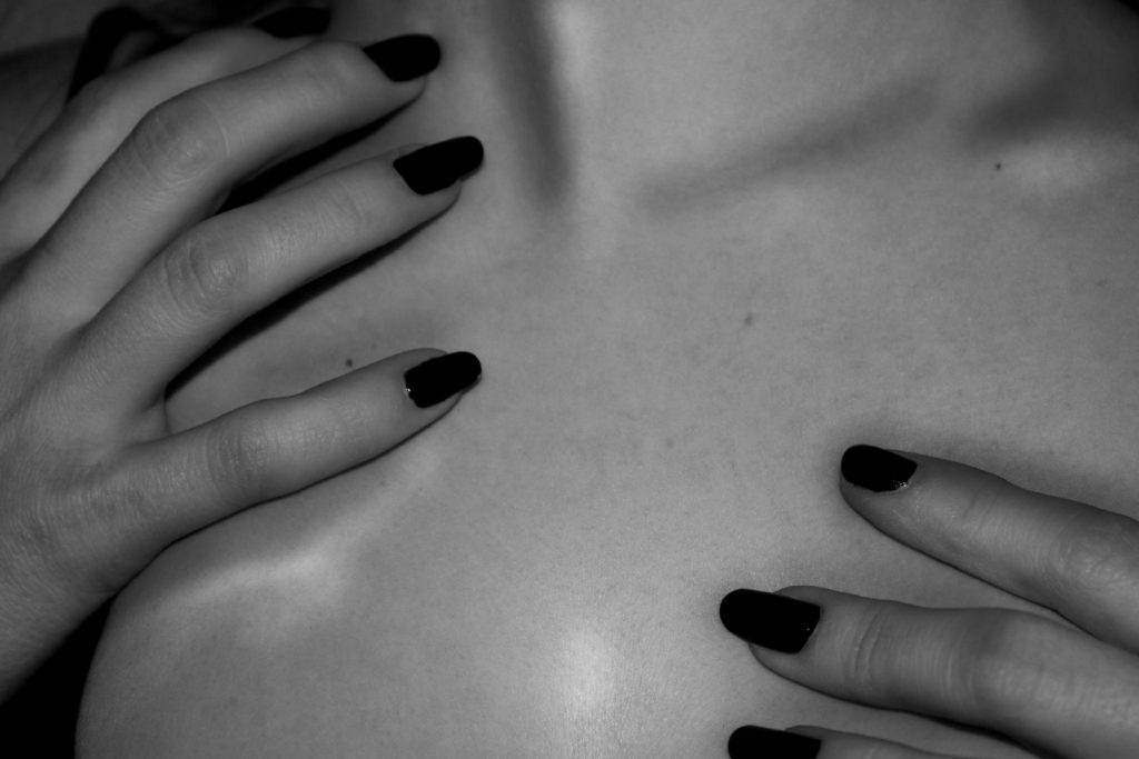
This image creates a sense of importance as it demonstrates an. individual holding there chest. This often symbolises distress which can be relevant to not accepting our own beauty and features. The contrast between the light skin and highlights on the chest create a nice contrast with the shadows from the fingers and the dark nails.
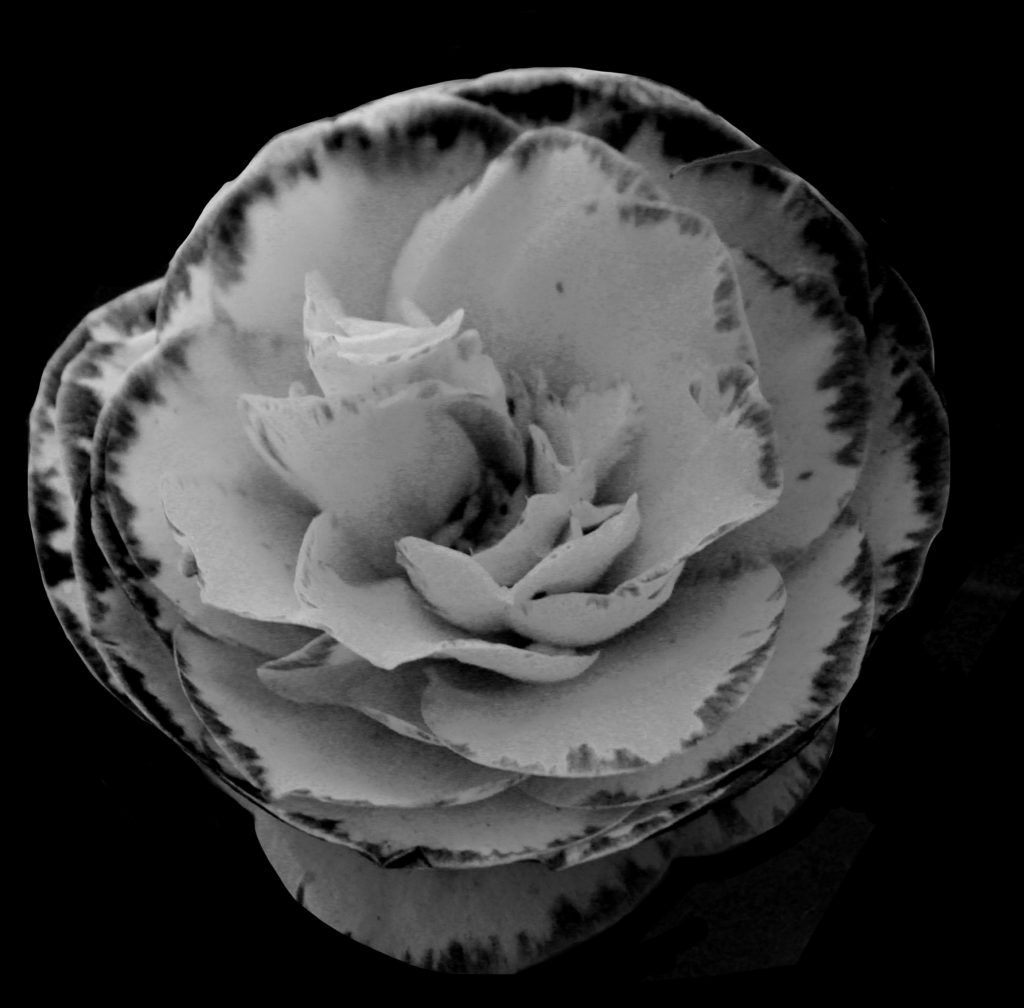
This image captures the beauty of nature in the most common form. Flowers are often referred to as being typically pretty for their vibrant colours and unique shape. I have tried to focus on the unspoken beauty of this form of nature. I have done this by composing the flower the centre of the image creating a strong focal point with the dark background making it really stand out. The contrast of the black and white photo enables attention the drawn to the detail within the petals, showing off the intricacy of beauty.
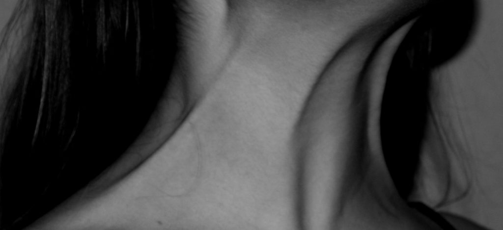
This image draws attention to the strain in the neck. The black and white creates a deep contrast in tones around the skin creating more detail and intrigue. It encourages individuals to love their bodies in all their forms.
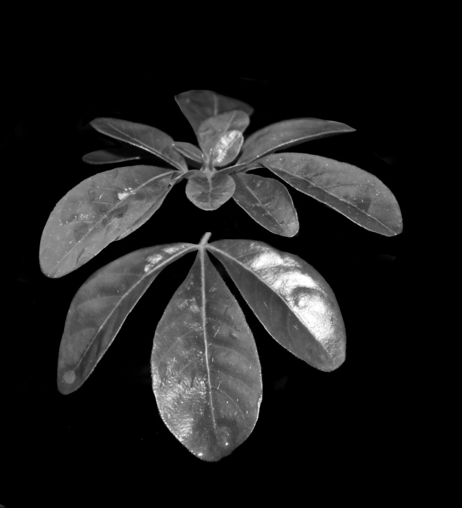
The composition of this image create a clear and centred focal point down the middle. The use of black and white highlights the detail in the plant, embracing its natural features making it unique and beautiful. The meaning behind this is to show that every little feature is a symbol of beauty and it should all be embraced with love.
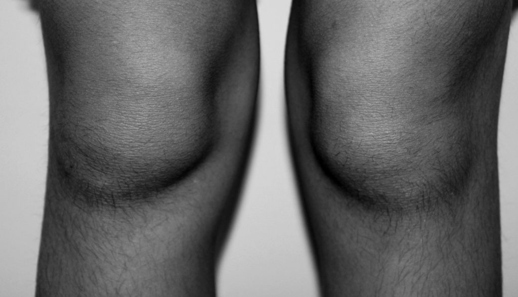
This image captures the natural beauty of the body. The use of black and white enables the fine details of the hair and skin follicles to stand out. The white background contrasts with the the dark tones in the legs and the shadows create a sense of depth making a more intriguing image.
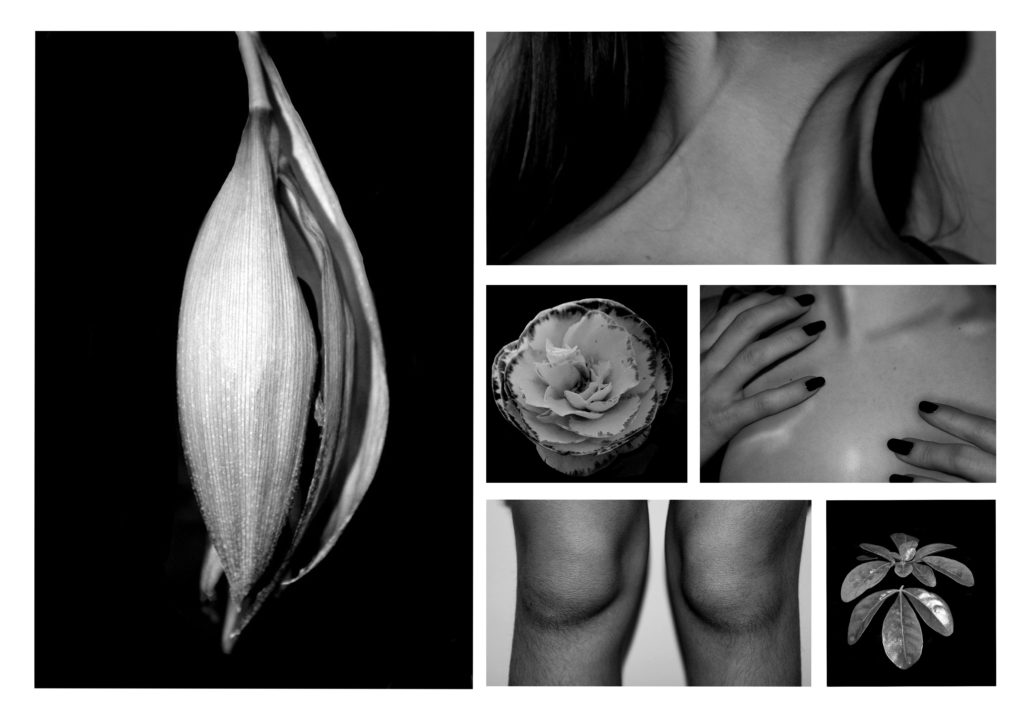
Left A2, top right A3, four bottom right A5
Link to photo book: Natural Beauty
https://www.blurb.co.uk/bookstore/invited/9112158/f85c7d225700e5b35aee8a1152c43c5f3ad73e4b
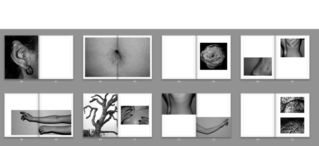
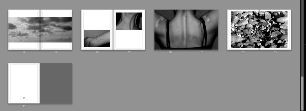
We rely on nature to survive, it is a cycle that underpins society. Our existence is dependent on nature, the ocean, soils, forests and rivers. They all provide us with the food we eat and the air we breathe in order to live. Not only that but nature is said to reduce anger, fear, and stress and increases pleasant feelings in humans. Nature contributes to both our emotional and physical wellbeing. My aim is to show this emotional connection through images in my photo book. The process of appreciating the natural beauty of the earth and its features enables us to love ourselves as human. I have compared aspects of the body with pieces of nature, demonstrating the similarities of the two and providing the concept of loving ourselves and embracing the differences we all have. If I was to recreate this book and improve it, I would take into consideration the double page spreads and loosing the detail in the middle of the page. As present in the fifth double page spread, the detail of the belly button is along the centre of the pages. This is lost in the final book where the pages meet. Apart from this, I am pleased with the final outcome of my photo book. I feel it captures nature and the human body in an abstract way creating a meaningful sequence of images entailing depth and detail, engaging the viewer.

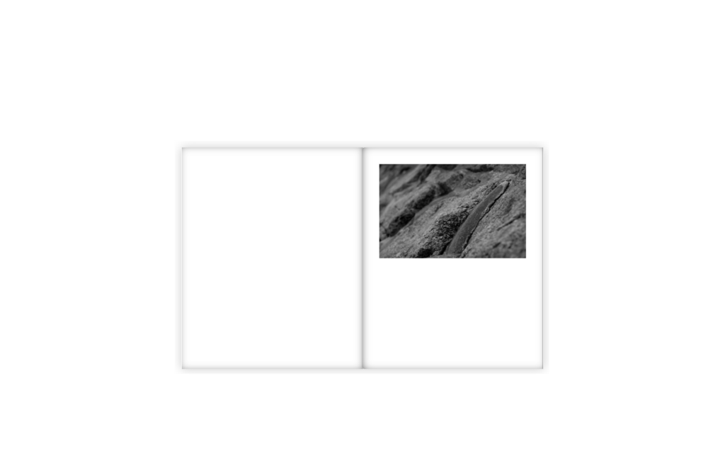
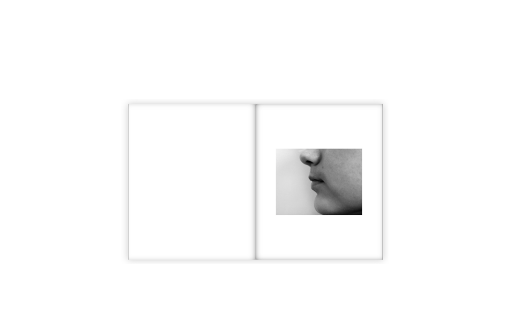
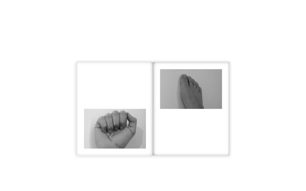
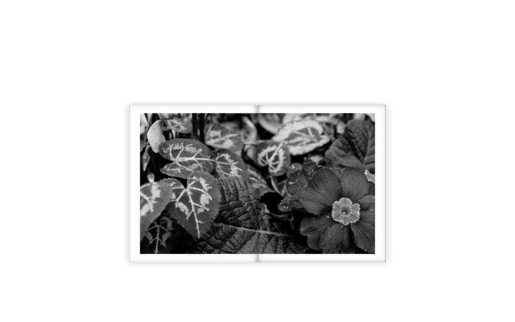
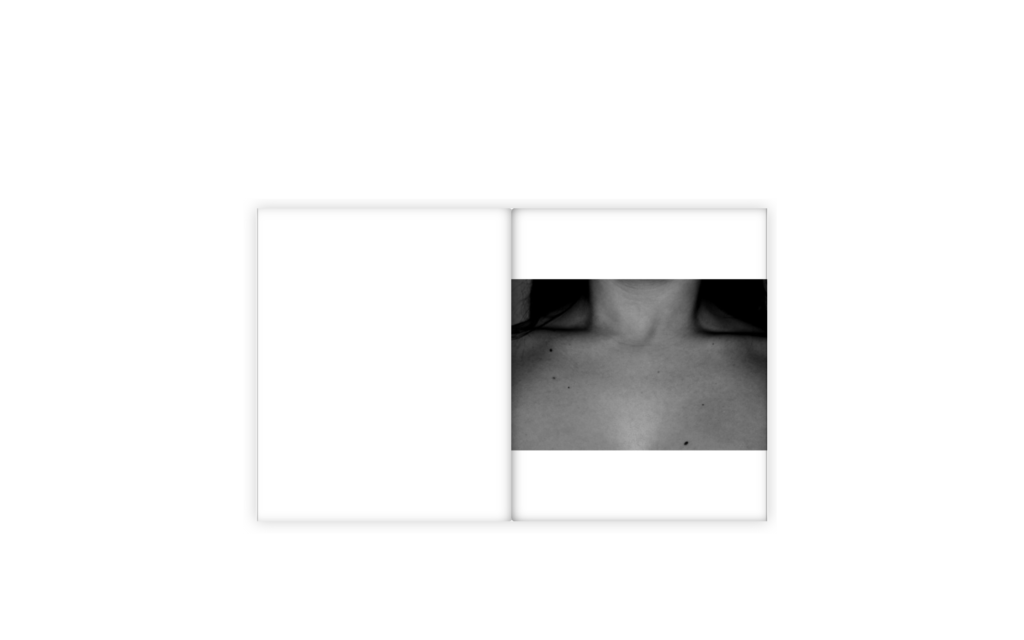
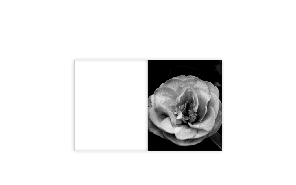
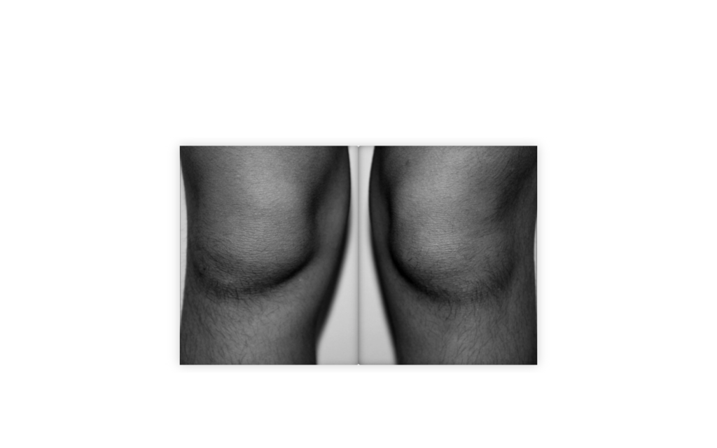
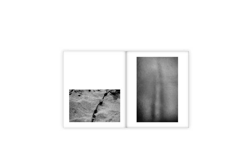
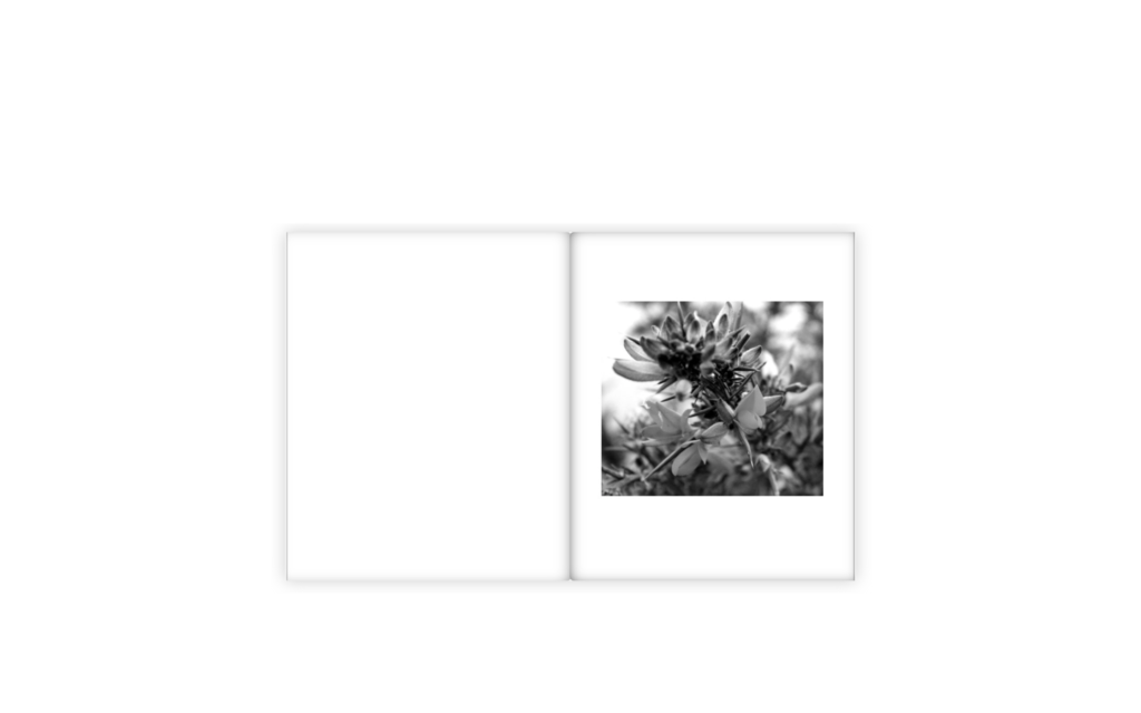
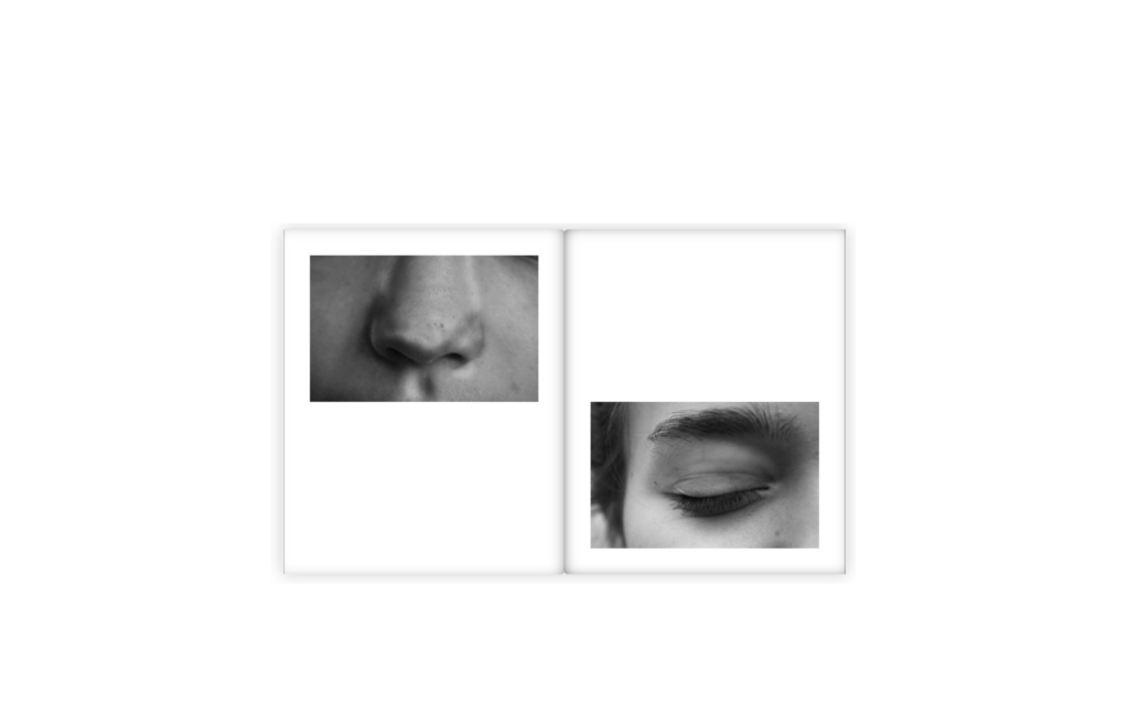
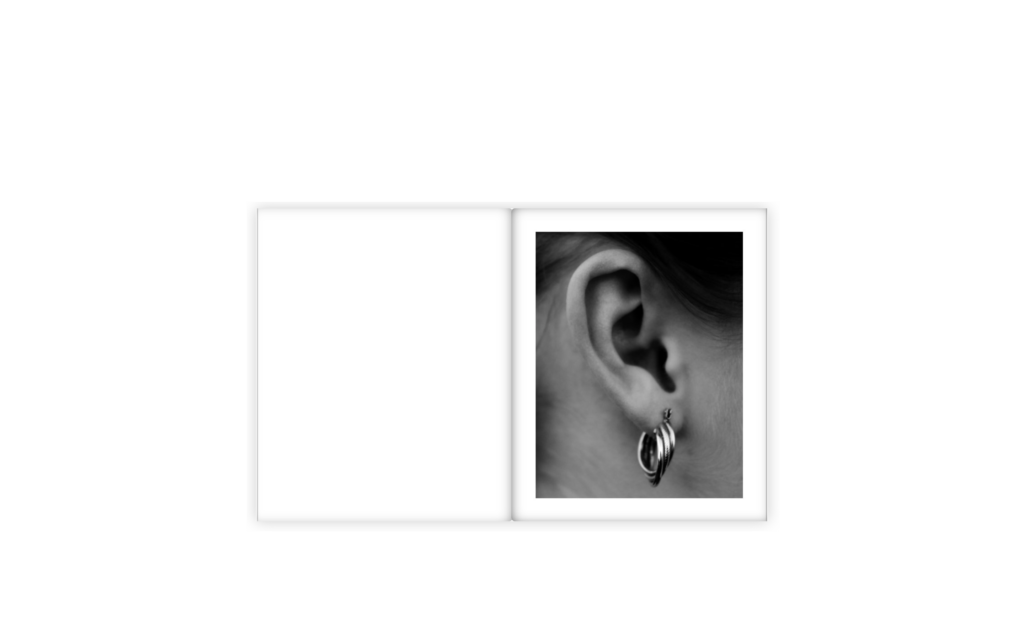
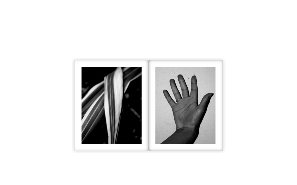
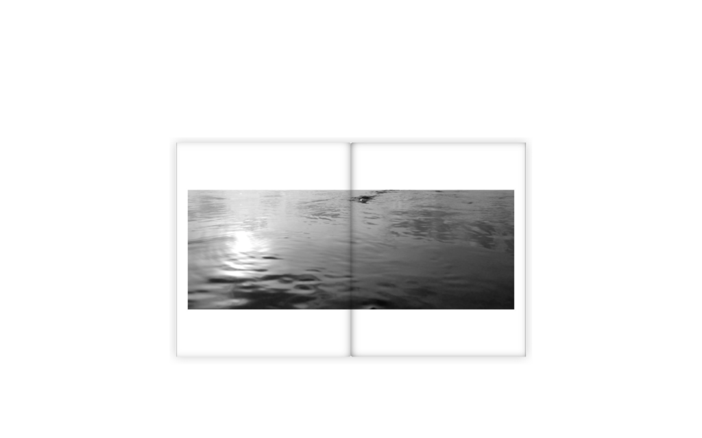
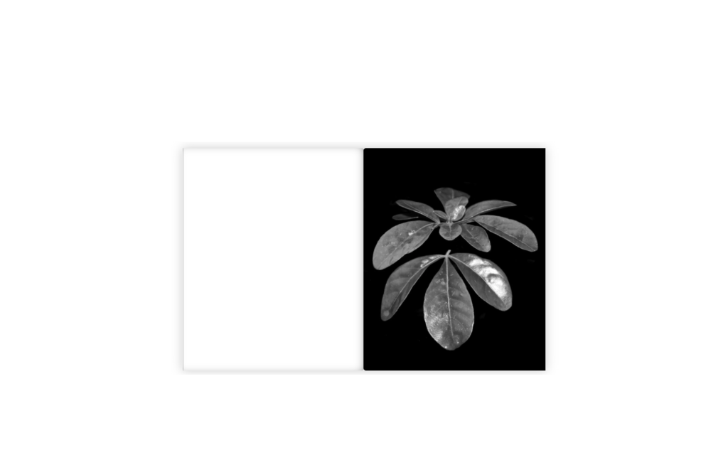
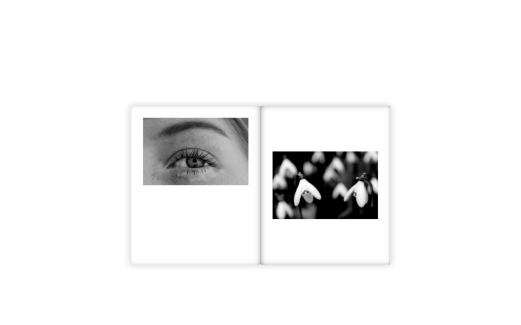
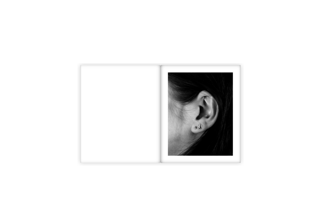
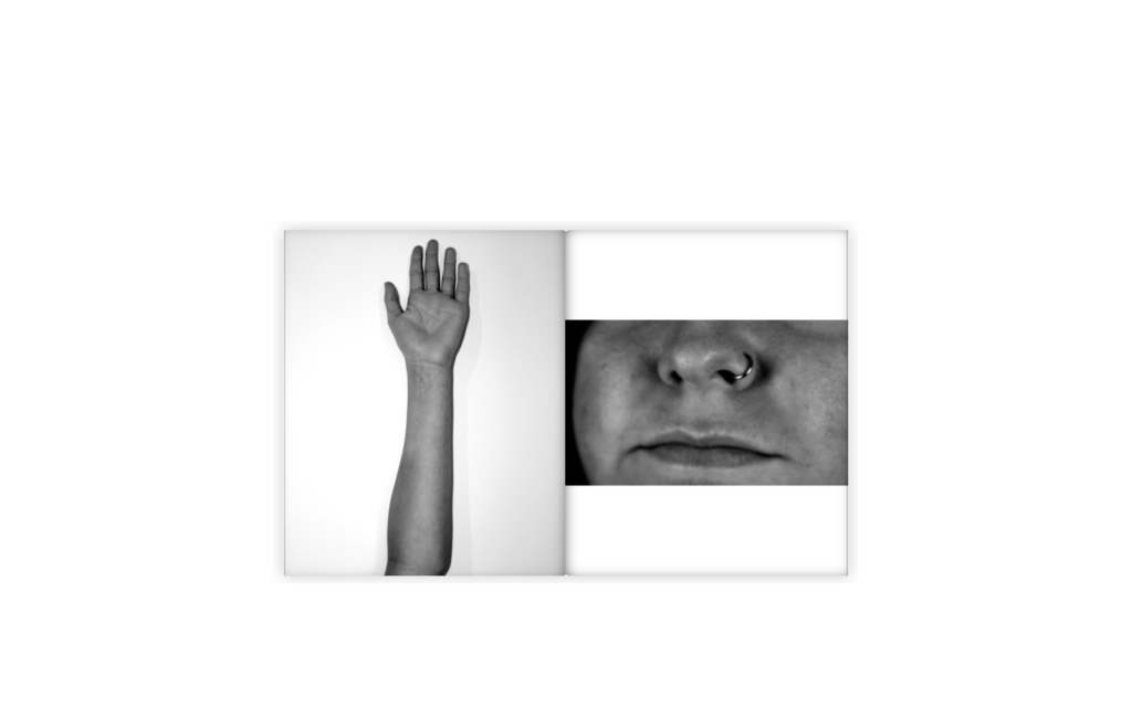
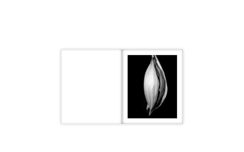
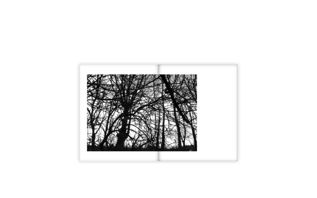
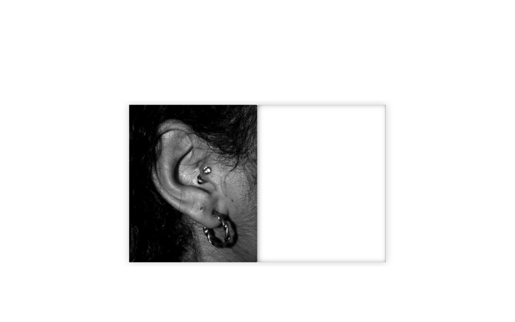
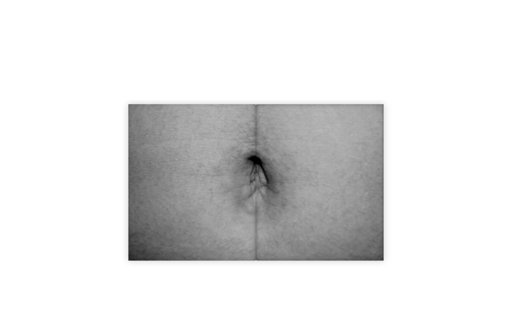
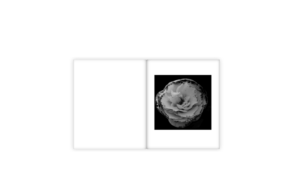
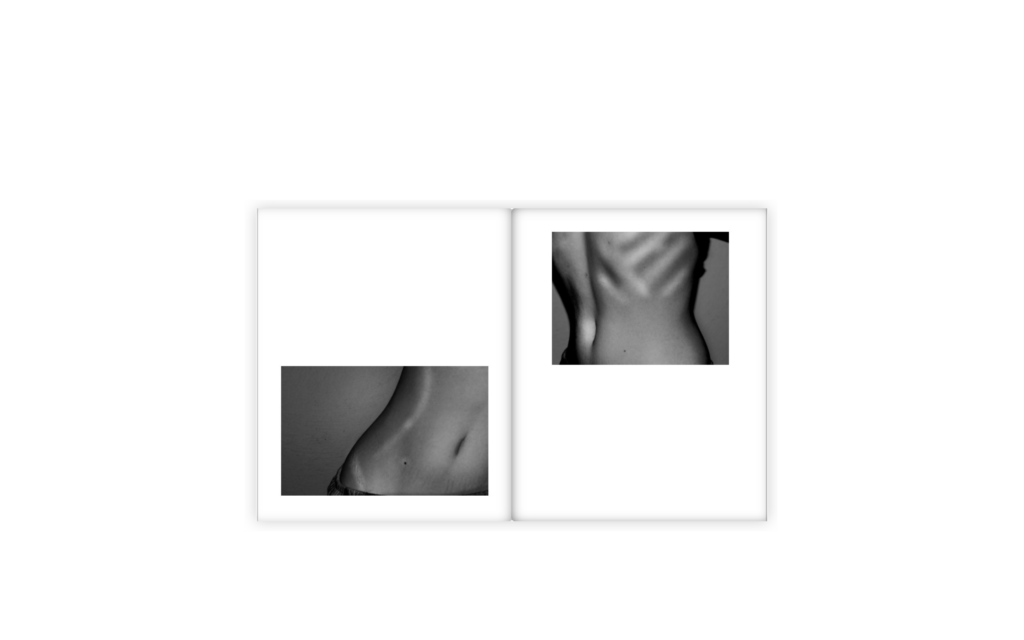
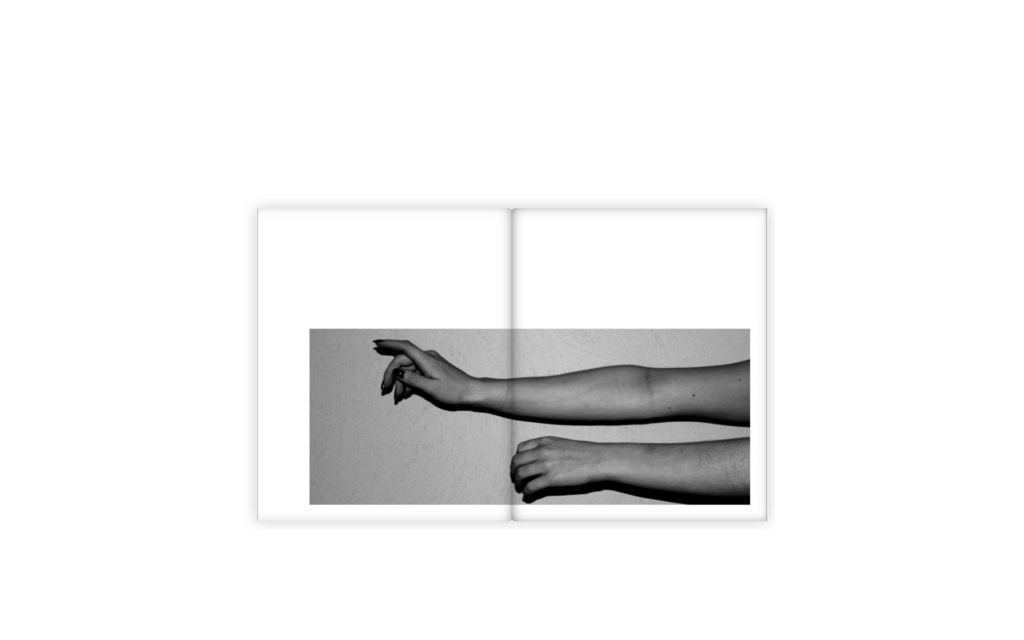

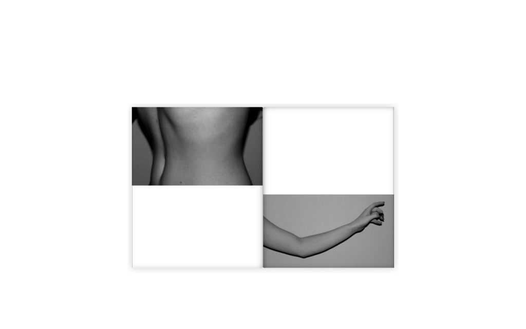
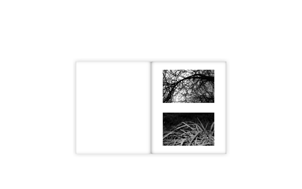
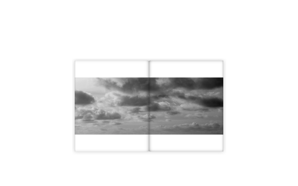
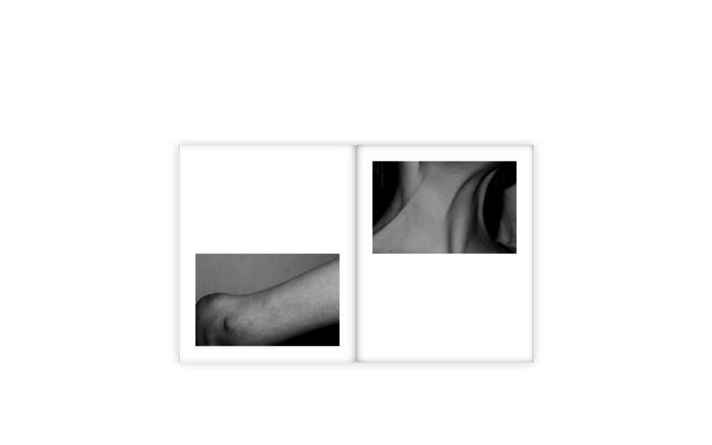
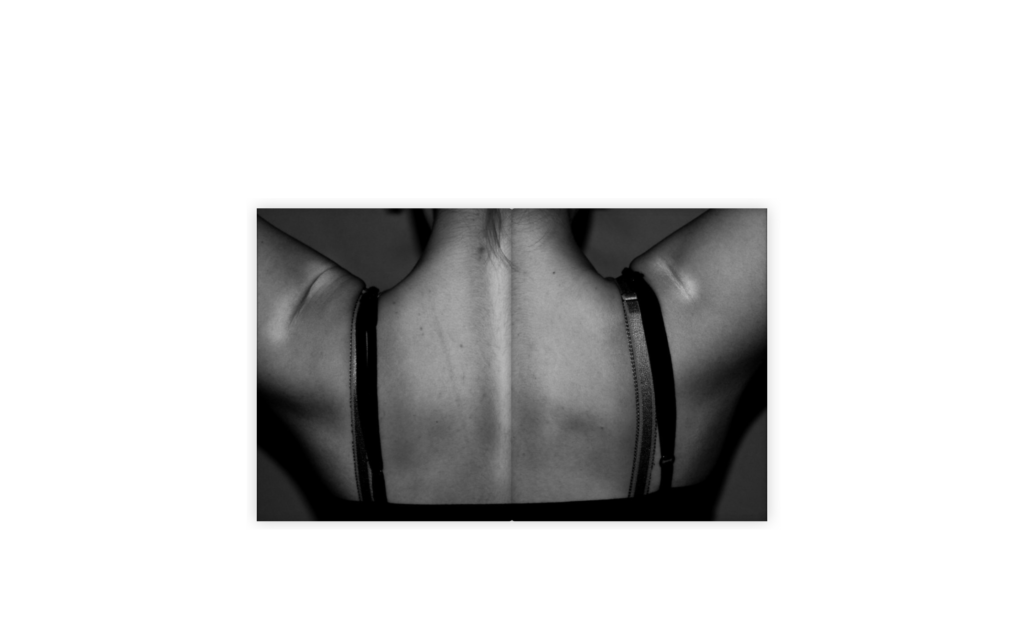
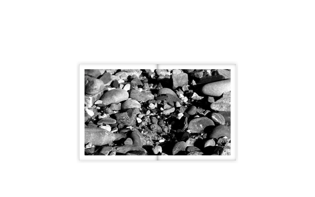


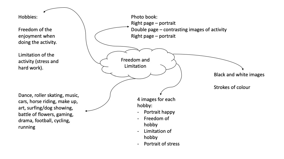
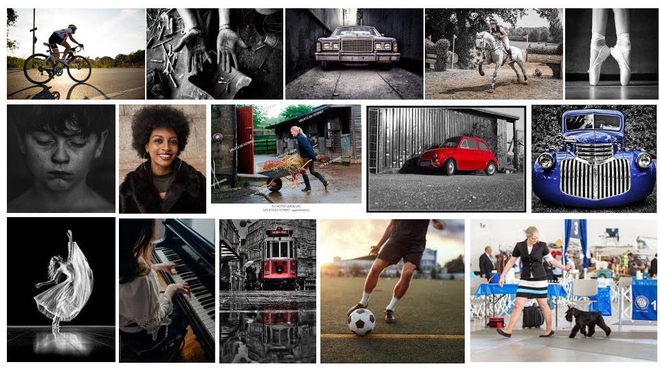
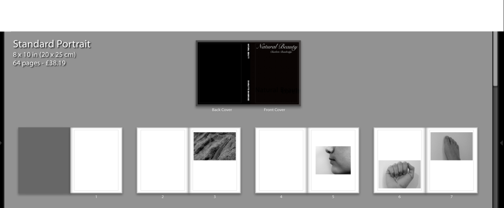
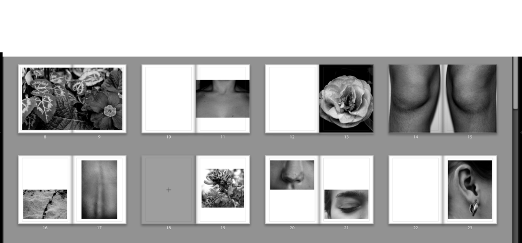
When designing my book, I decided to keep pages blank pages to break up the flow of images. I tried pairing different images together to find the right match and contrast. Some of the strongest images feature on their own page with some of them as a double page spread. I feel the full bleed images are the most engaging, drawing in the attention of the viewer. The sequence of body parts are imposed by images of nature. I tried to create some similarities between the nature and the body by matching two images together. For example the image of the spine along side the seaweed reflect each other nicely, demonstrating the similarities of nature and the body and how both can be perceived as equally beautiful. I decided to put all my images in black and white as it creates a more serious tone throughout the book, symbolising the importance of loving oneself. Using black and white also removes any distraction of colour, enabling attention to be focussed on the finer detail of texture, shape and pattern.
Can beauty and identity be expressed in a portrait?
‘With every breath of nature’s depth, she was becoming more herself.’ – Angie Weiland-Crosby
Looking at the idea of self love I will focus on certain features of the body and encapsulate the beauty in each part focussing on the simple things. I will then link this or contrast with a piece of nature showing the natural beauty, building on these views to create a whole picture representing the journey of learning to love your individual features enabling a person to love there whole self naturally with nature connected. I am focusing on the simple things and natural beauty. I will look at how the environment is a part of us as humans. We are learning to take care of the environment so I will look at how the environment has enabled people to learn to look after themselves. By focussing on single features alongside nature we begin to appreciate the beauty found within. This can then be compared to the whole picture with people beginning to be comfortable with who they are and rebelling against societies stereotypes and learning to love themselves fully. The artists I have been inspired by are: Agnieszka Lepka who looks at the relation between nature and human being. She uses close up shots of human body parts, landscapes and everyday objects. Bill Brandt who incorporates the human body into a landscape, e.g. cliffs, beaches. Albert Renger-Patzsch who looks at natural landscapes and specific pieces of nature, focussing on texture and tone. And John Coplans who focusses on the human body. The abstract images of body features make the viewer question what they are looking at. For example, a picture of the human back. The image below is one from my photoshoot, focussing on the detail in human aspects. We can see it is a spine however the we are drawn in with intrigue to look at the detail within a common feature. Noticing the details in natural features creates individuality and uniqueness forming an identity for each individual person. No two people are likely to have the exact same details within their body features. This enables us to appreciate and love our differences as they make us who we are.

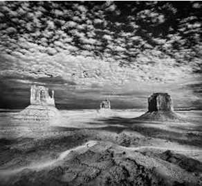
The ‘sublime’ has been debated in the field of the aesthetic for centuries. It has Latin origin and means something is set or raised high up. It is said to have qualities of greatness and intensity in both physical, metaphysical, moral, aesthetic and spiritual form. The sublime has become an expression for artists over the years. It was said ‘Aesthetics could not explain why one was a work of fine art and the other not, since for all practical purposes they were aesthetically indiscernible: if one was beautiful, the other one had to be beautiful, since they looked just alike.’ (Danto 2003, 7) This could be seen as in society people who fit a stereotype are categorized as beautiful. In my images I want to capture the beauty of each human’s individuality and unique feature. The aesthetic can link similar things together, therefore I will link this to my work by finding similarities in the beauty of nature and the human body. An example of work incorporating the sublime is the image below, by Tom Peck. We are instantly drawn to the depth of detail in the top half of the image with the intensity of the clouds in the sky capturing attention. The less busy bottom half of the image creates interest as we move down the picture to understand the context. The use of black and white brings out the clear details within and makes them stand out. The level of intrigue with the eye-catching sky has inspired me to focus of bringing out as much detail possible in my images to create a dramatic effect. I will focus on the details of the body and nature to draw people in and create an engaging photobook. One issue in the theory of beauty is whether it is subjective, in the eye of the viewer or objective, in the subject itself. ‘Beauty is no quality in things themselves: It exists merely in the mind which contemplates them; and each mind perceives a different beauty. One person may even perceive deformity, where another is sensible of beauty; and every individual ought to acquiesce in his own sentiment, without pretending to regulate those of others.’ (Hume 1757, 136) I want to show that beauty is in everything, when the we look closely at the intricate details. The world itself is beautiful and we are a part of that as humans.
The first photographer that inspired me is Bill Brandt. He was a British photographer and photojournalist. I chose to focus on his work from the 1950s which was very expressionistic. His collection: The ‘Perspective of Nudes’ became his best-known project. In this collection he focussed on parts of the human body, using a wide-angled fixed-focus at a close range, distorting the human body making it into abstract designs. Brandt says: “My new camera saw more and it saw differently. It created a great illusion of space, an unrealistically steep perspective, and it distorted. When I began to photograph nudes, I let myself be guided by this camera, and instead of photographing what I saw, I photographed what the camera was seeing. I interfered very little, and the lens produced anatomical images and shapes which my eyes had never observed.” (Brandt in Oden) He also made the human body into parts of landscapes, using the beach and natural settings. In his images he uses black and white to create depth and interest drawing focus to the contrast between the feature of the body in the foreground and the natural landscape in the background. I was influenced by Brandt’s work as I want to capture the relationship between the love of oneself and nature by comparing nature to the human body. His images created an abstract perspective, using unusual viewpoints and the wide-angled camera. Similarly, I want to explore the abstract perspective of the body, using close up shots of features of the body, focussing and enhancing the detail within. This image below by Bill Brandt captures a feature of the body against the nature of the beach. The use of black and white creates depth and interest within the image as focus is drawn to the contrast between the hand and the pebbles in the foreground of the image. The abstract perspective of this image forces you to look closely at what is in the photo, enabling details to be highlighted and intrigue created.
The second photographer that inspired me is Albert Renger-Patzsch. He was a German Photographer. I chose to look at his series of work called ‘Die Welt der Pflanze’ (The World of Plants) and after becoming an independent photographer his most famous work from 1982; ‘Die Welt ist schon’ (The World is beautiful.): ‘A collection of one hundred photographs whose rigorous sensitivity to form revealed patterns of beauty and order in the natural and man-made alike. Embodying a new, distinctly modern way of looking at the world, the book established Renger-Patzsch as one of the most influential photographers of the twentieth century.’ (Lewis). He had a focus on light, texture and pattern in his images creating depth and intrigue. His botanical studies inspired the nature side of my book. The detailed images he created out of such simple items made me want to create the same effect in my work. The image below focusses on the tones of greys and whites creating an intense feeling. The dark background creates a focal point down the middle of the image and the sharp contrast between the white and black shows depth. Albert Renger-Patzsch creates patterns within his images. This is shown here through the spikes. This detail makes the image more interesting. The texture created by the range of tones makes the image less flat and the use of black and white creates a serious feeling enabling us to focus on the detail within the image. I want to incorporate this into my work to create interest within my images. The focus on detail links back to the idea of finding beauty in the simplest of things and embracing the nature within it.
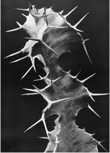
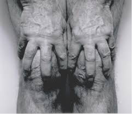
The third photographer who inspired me is John Coplans. He was a British artist, art writer, curator and museum director. His most known work is his series of black and white nude self-portraits, not including his face. He said ‘So, I’m using my body and saying, even though it’s a 70-year-old body, I can make it interesting,’ (Coplans) This inspired me as he focusses on the beauty of his natural body, he does not worry about his age he makes interest from the details and intricacy of his natural image. Coplans appreciates his body the way it is. I want to capture this in my images, showing off the simple beauty in our natural features. I will focus on the abstract body features that do not often get recognition for the natural form. The use of nature will help to highlight the idea of natural beauty throughout my photobook. Coplans image below represents the natural beauty of his body. The detail created in this single image is eye-catching and intriguing. The use of black and white highlights the tiny details within the hands and legs photographed, encapsulating the subtle refinement of the body. The positioning of the camera allows focus to be drawn to the specific aspect of the human body with the plain background and enabling depth in the image to clearly come through making the detail in the foreground stand out. I will use this in my work to create interesting images focusing on depth and detail within the human features, focusing on both facial features and body parts.
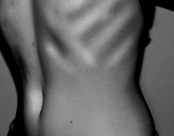
To begin my photoshoot, I started by photographing features of the body, by making a collection of these images I can then find a sequence and compare them with the collection of nature photographs. This first body image represents the impact of society acceptance of embracing your own body details. The definition of the ribs makes the individual features of the body stand out. It is an example of accepting differences we each have and not conforming to societies expectations.
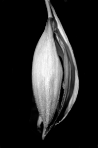
My first nature image depicts the beauty and detail within the natural world. The composition of the flower lined up down the middle with the black background creates a focal point that draws the attention of the viewer in. There is a bold contrast between the light shades of nature against the dark background creating an interesting image due to the detail and intricacy within. I have created depth using black and white, similar to the artists studied above. My aim to create a strong message through my images begins by creating interest and engaging photos that encourage the viewers minds interpreting the images in specific ways. I have expressed beauty in a form of portrait by focusing on the abstract ideas surrounding what is perceived as beautiful in today’s world and stripping this back to the basics, embracing everyone’s unique features along with the natural beauty seen in the environment around us.
To conclude, I will portray the natural beauty of nature and the body by focusing on depth, texture and light similar to the artists explored above. I will express beauty and identity in portraits by exploring the unique details of each individual that create an independent human featuring the abstract aspects of the body creating interest throughout my photobook. Bill Brandt, Albert Renger-Patz and John Coplan’s all have a similar photographic style. They focus on the detail, with their images in black and white there is depth and variation present. They create engaging images by capturing a feature of something, in this instance the body and nature. All of their work portrays a strong message that captures the beauty of these aspects, creating an intriguing image for the viewer. The beginning quote: ‘With every breath of nature’s depth, she was becoming more herself.’ – Angie Weiland-Crosby can be perceived as present in the images, especially in Bill Brandt’s work as it places nature and the body together. In my photo book I am portraying how we learn to love nature and the imperfections of the world we live in we can learn to love ourselves and embrace every part of us by looking at ourselves with the nature around us, this helps us to ‘become ourselves’.
Bibliography:
Danto. The Concept of the Aesthetic <https://plato.stanford.edu/entries/aesthetic-concept/>
Oden, L. Bill Brandt, International Photography Hall of Fame and Museum <https://iphf.org/inductees/bill-brandt/>
Lewis, E. Tate. Albert Renger-Patzsch <https://www.tate.org.uk/whats-on/tate-modern/display/albert-renger-patzsch>
Coplans, J. John Coplans < http://www.artnet.com/artists/john-coplans/>
TITLE: Absence
THEME: Spirits/Souls/Angel/Devil (Freedoms and Limitations)
INTENTIONS: To explore the freedoms and limitations of the mind within reality and within our own abstract thoughts. In my film I would like to venture to the captivity of our own minds and the limitations it causes and then explore the freedoms of having no commitments or responsibilities in another reality. I want to express the freedom a lost soul may have compared to a living soul and I will show this by showing the same person in two different worlds; one in the real world with commitments and limitations of what we are able to do and another world where the person has the freedom to do what they want. Within the spiritual world I’m going to use a red ball to show guidance to represent that freedom can also have its down sides of feeling lost or not knowing what to do with the space around you. The ball will lead the ghost to where their human self would like to go if they ever got the chance and then they’ll be able to enjoy and see the beauty in the different parts of the world around them that they wouldn’t get to do if they had the chains of responsibility and guilt holding them down. The girl in the real world is somewhat meant to represent the devil as the limitations and the girl in the spiritual world where she has the freedom to go wherever she wants is meant to represent the angel. So there is a good and a bad part to the story. At the end the devil and the angel both realise that in life there are freedoms but as well limitations.
SUBJECTS: Spirits/Souls/Angel/Devil/Good/Bad/Freedoms/Limitations/Dark/Light/Evil/Hope/Chance/Guidance/Surrealism/Adventure/Caged/Trapped/Nightmares/Dreams
TECHNIQUES: Tripods, personal perspective, specific editing to put my point across, transitioning from different scenes by using objects and shades which are similar to each other. Using Premier to add specific cuts to the individual clips.
VISUALS: A girl wearing a black dress to represent many things but mainly limitations and transition into another scene where the same girl is wearing a white dress to mainly represent freedom. The girl in the black dress will just show scenes of having a dull life and have a lack of enjoyment shown but longing for adventure and to see the more exciting parts of life e.g. the beach, nature, traffic lights and the urban parts of the island etc. The ending will show the girl in the white dress going into the room of the girl in the black dress and opening a book of sketches of the places the girl is black wanted to top to and then both of them merging into thew same person to represent the good parts of life and the bad parts and then to add a horror factor to the film I’ll make the eyes of the girl change colour and the candle going out that was lit at the start.
SOUND: I’ll add in my own sounds of things like: waves, trees in the wind, the lighter turning on etc to make sure the sound is clear. I will also add music in the background which I haven’t decided yet but I will make the music quieter and louder in certain places, where appropriate to do so. I will also overlap sounds to make the more dramatic affects and add sounds like birds to represent tranquility.
INSPIRATION: I have similar inspirations to the film I did previously but the other inspirations are: Duane Michals first made significant, creative strides in the field of photography during the 1960s. In an era heavily influenced by photojournalism, Michals manipulated the medium to communicate narratives. The sequences, for which he is widely known, appropriate cinema’s frame-by-frame format. Michals has also incorporated text as a key component in his works. I like the way that Michals presents his work as dark and ominous as that’s the way I like to go about presenting my work also. I like the theme of black white where shadow and light appears to be a lot more dramatic than it would be if the photograph or film was in colour. Whether the spirit/ghost is visible in the photo or if there is a feeling of the supernatural lurking around the photo, I think Michals work represents the unsettling feeling of uncertainty. His work links to my theme of Freedoms and Limitations as there’s the idea that the angel/devil near the bed had the freedom to do what they want without consequences but as had the limitations of not having a normal human life. My other inspiration is Michael Chaves, specially the music video he helped Billie Eilish make called Bury A Friend and the movie The Conjuring 3. When looking at Bury A Friend, from the album “When We All Fall Asleep Where Do We Go?”, I think the concept of nightmares and horror links in nicely as well as the title pf the song quite literally linking to death; intertwining with graves, spirits and ghosts. My idea of making peoples spirits/alter self come to life makes me think of the demonic character Billie Eilish is trying to portray. I was thinking of having two main people in the film like the music video where the man on the bed is unconscious but talking whilst dreaming in this dimly lit building and Billie Eilish being the monster in his bedroom watching him, under his bed and lurking around the hallways of his building. I also think the lyrics in the song itself have a lot of meaning and would help me to move forward with the theme of Freedoms and Limitations. The freedom to express your darkest thoughts and make them come to life but the limitations of how far you can express what you’re thinking without making your ideas too dark as well as the limitations of not having full control of what your thinking or feeling.
Robbie Lawrence is a photographer based in London with an extensive set of photo projects on his website.
Robbie Lawrence first travelled to Linn Gardens (on the west coastline of Scotland) in 2-16, and met the gardener of over fifty years, botanist Jim Taggart. Jim utilised the environment’s particular climate to grow a variety of plants and flowers from all over the globe, and eventually when he became too old to actively go out and collect specimens he passed it on to his son Jamie to recover new plants. Unfortunately Jamie disappeared in the mountains of Vietnam and his body was only found years later, leading Jim to keep his garden as more of a memorial to his son than a true botanical garden. Robbie Lawrence made two visits to the Linn Gardens, and on the second he found out that Jim had died at the age of 84, leaving the gardens to become overgrown and wild. This distinction is clear to see in Lawrence’s images, as the physical differences between the landscapes have changed and an overbearing sense of abandonment.

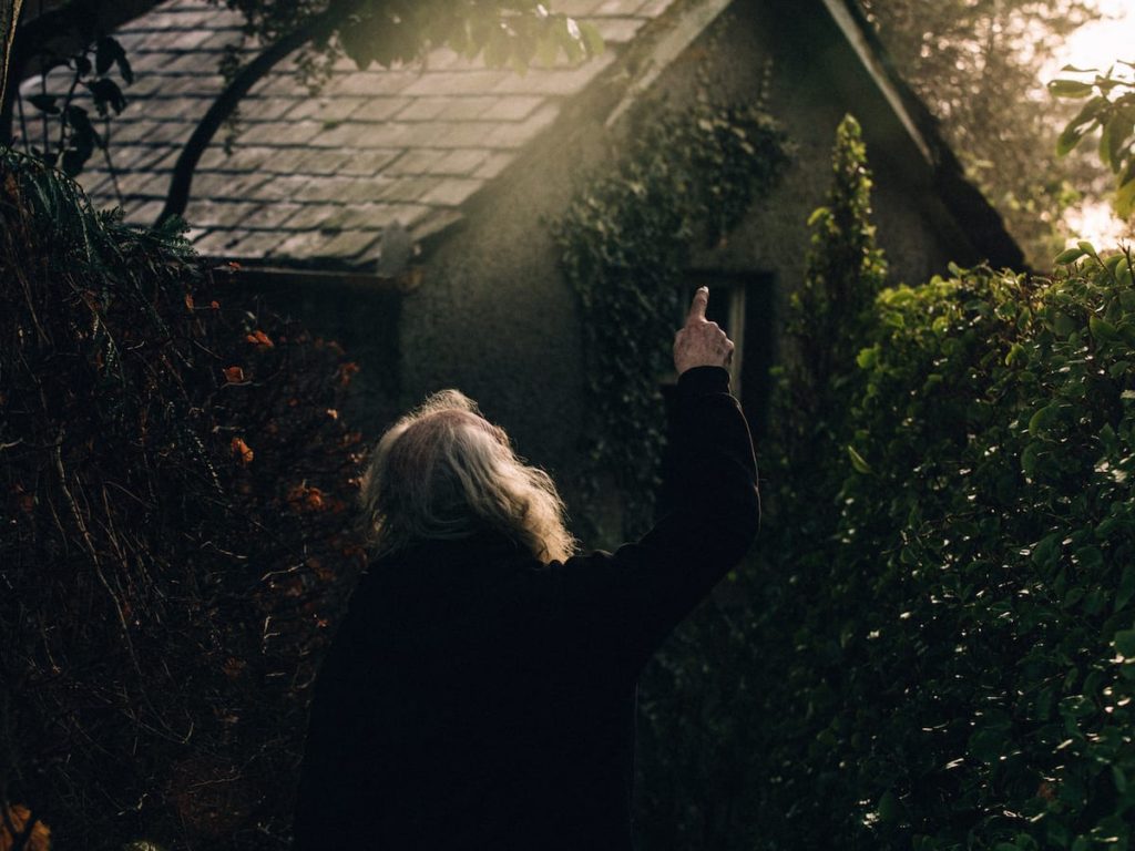
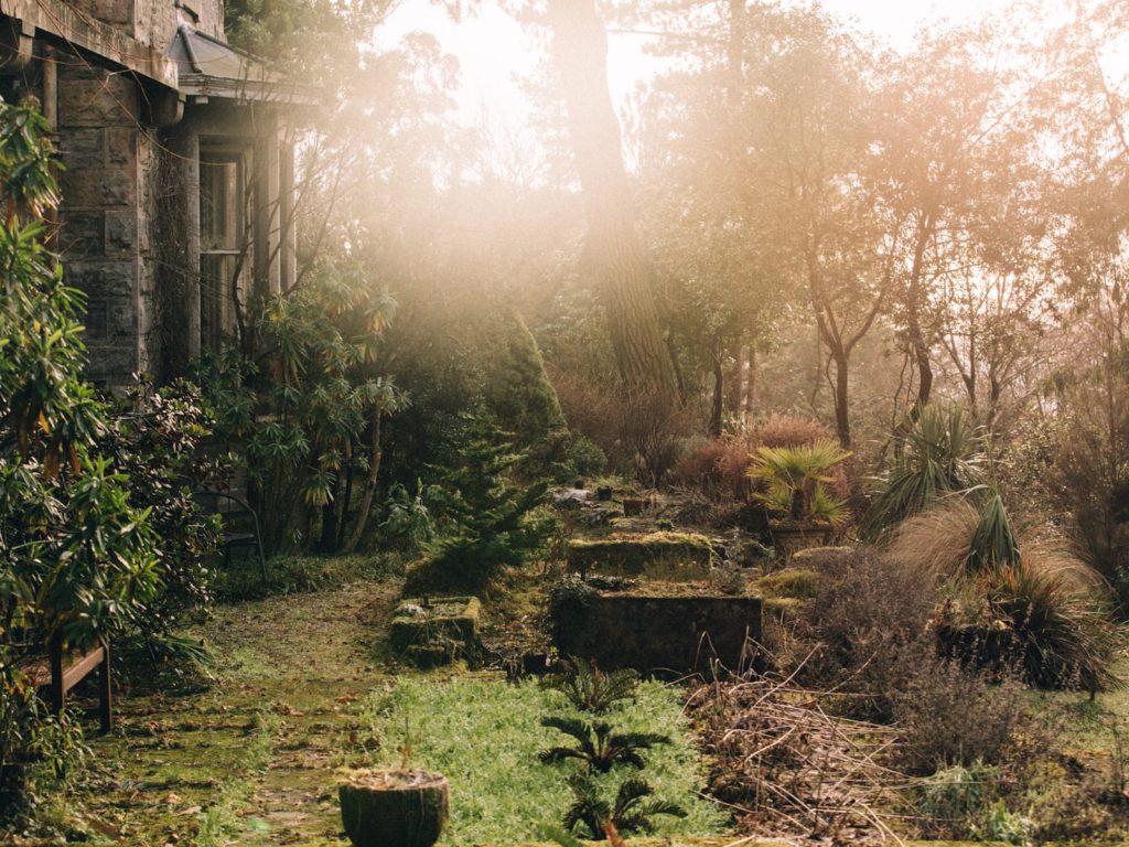
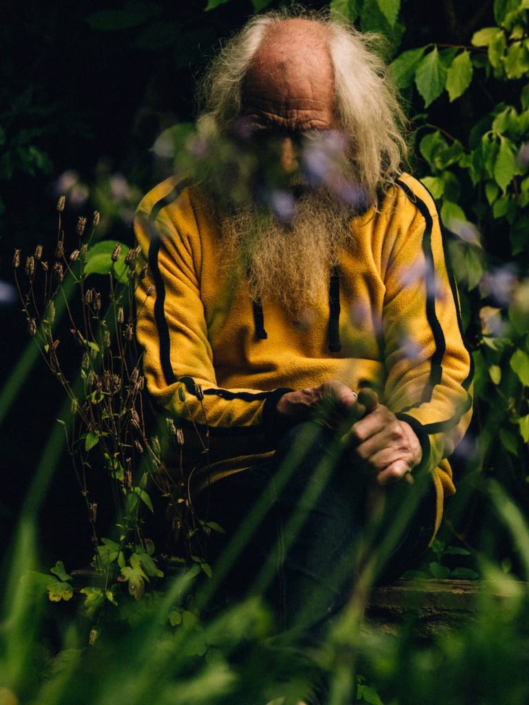
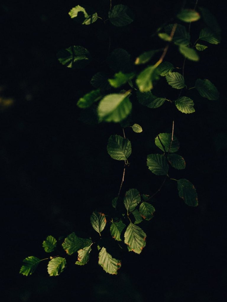
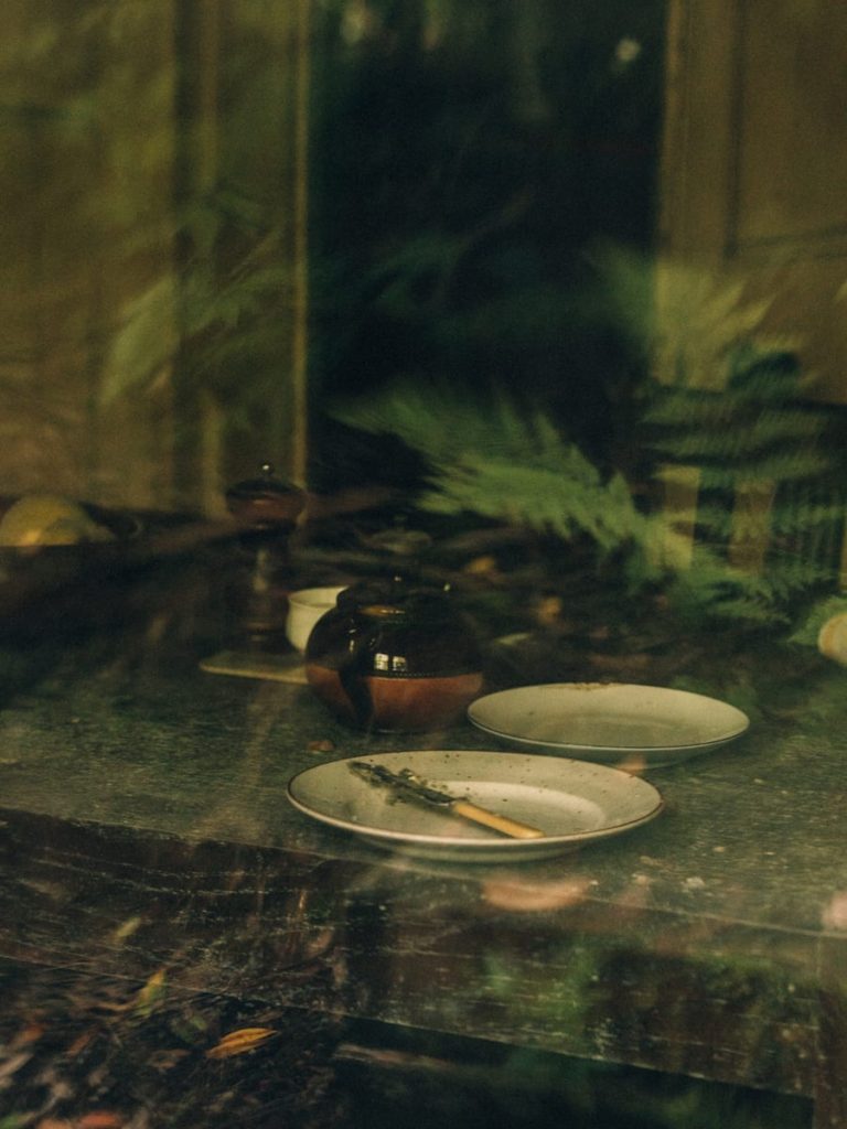
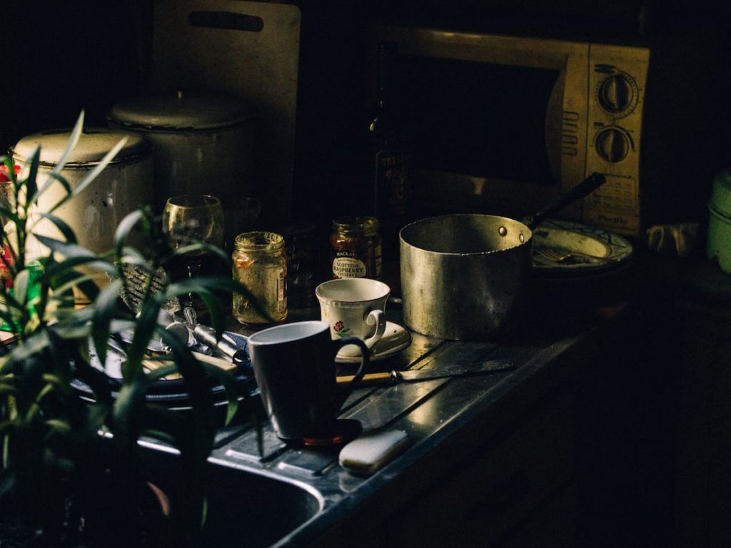
The book conveys the cold and somewhat lonely climate of that area of Scotland juxtaposed against the clear love and dedication Jim Taggart had for his gardens, and in a way his son. The colours are all natural but mostly either dark or over-exposed and muted, and there is an overwhelming abundance of green in different shades and hues. I particularly like Lawrence’s use of light: soft and delicate, perhaps like the plants and flowers within the gardens.
This collection of portraits was part of a project for Revue Magazine, taking images of women from various generations in Israel. Revue Magazine’s website says he “captures the emotions of the women…revealing a beauty that is neither artificial nor compromised.”
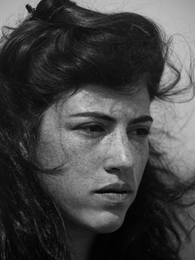
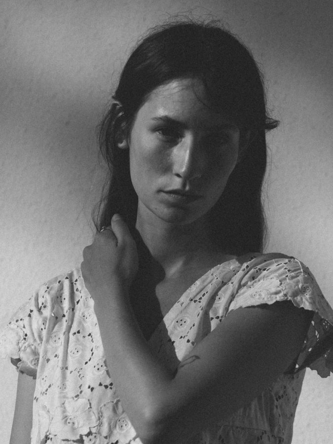
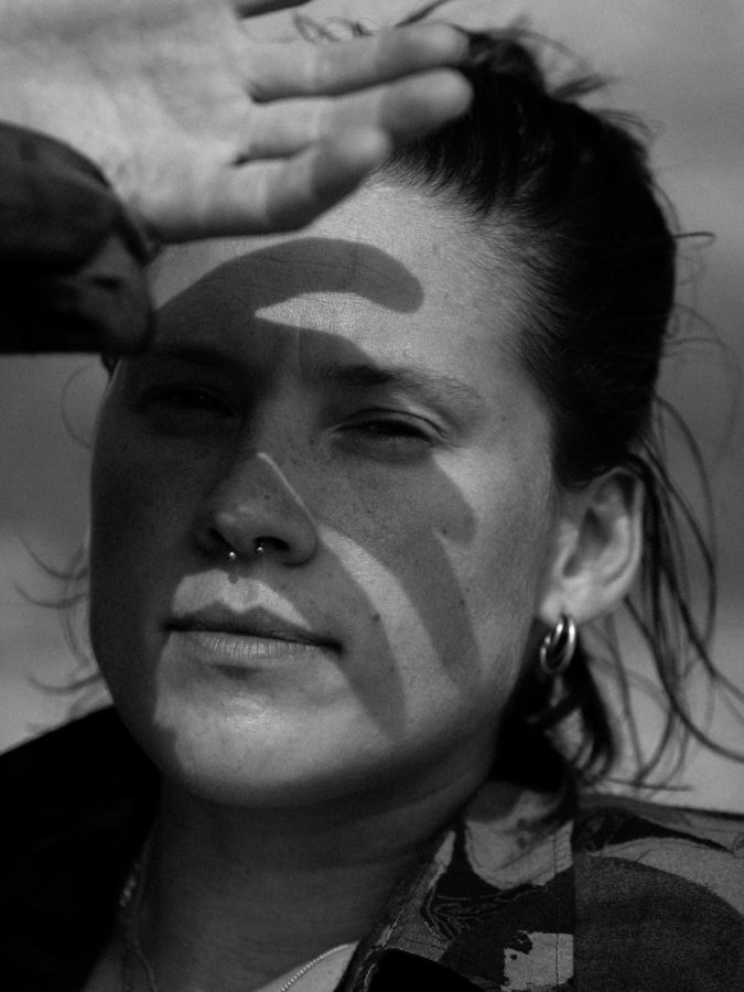
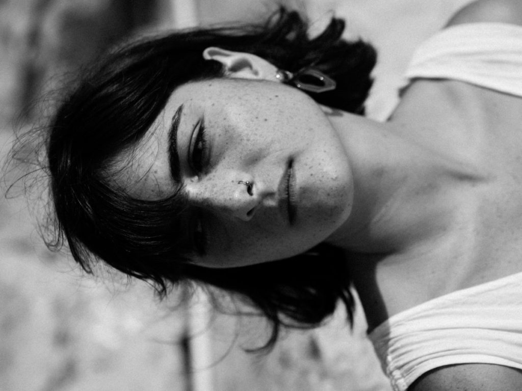
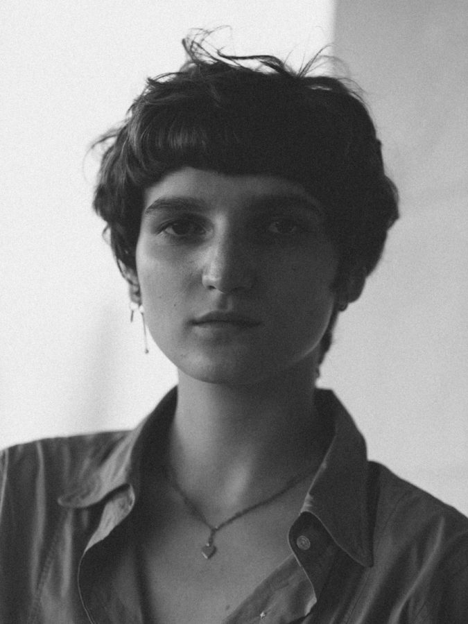
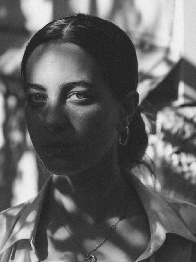
Robbie Lawrence’s use of light here is also interesting to me as he plays with shadows to project different emotions and general feelings with the image. The women are all portrayed fairly naturally, and the photographs don’t feel invasive or intrusive, just observing. The fact they are in black and white is also intriguing, as there are other images within this project which are in full colour. This could have been done to remove and background distractions that colour would have provided and have the central focus be the women, or to make the images feel ageless and removed from any particular time period. Most of the women are facing the camera lens straight-on, looking directly down the lens into the viewer’s eyes, sometimes with the result of looking almost defiant.