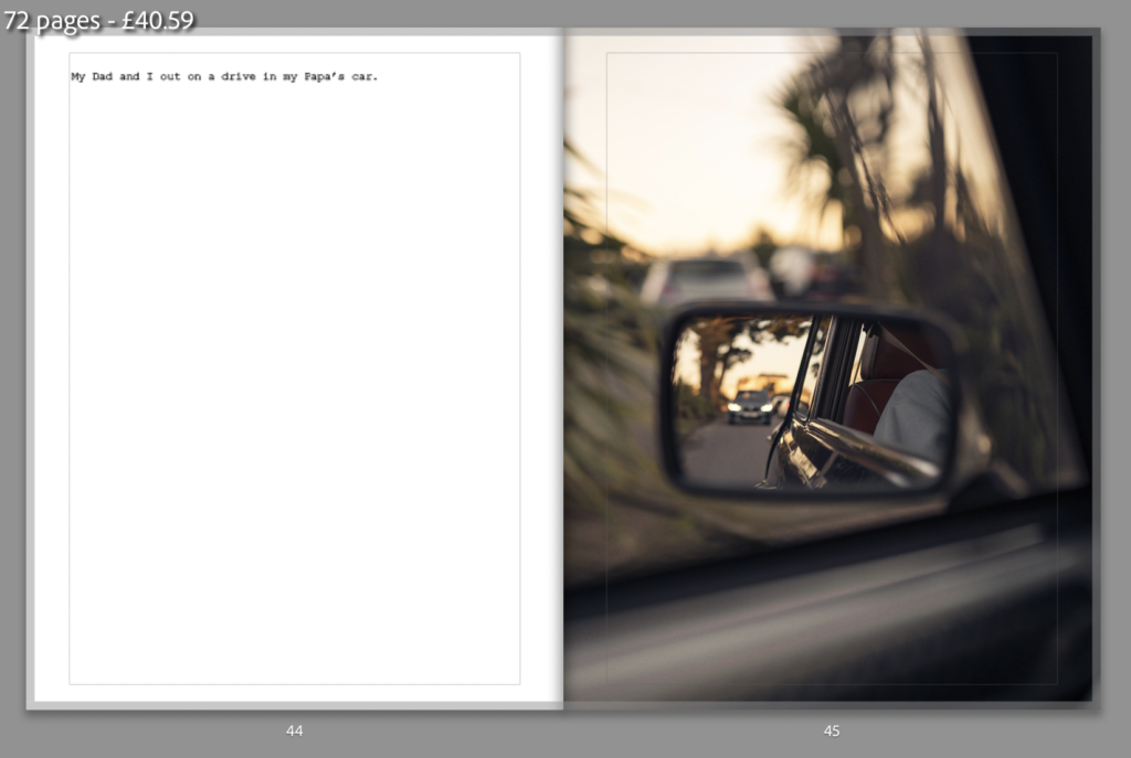
Overall I am happy with the design and I think it flows well. I went for a minimalistic approach using a similar design layout to the book ‘The Epilogue’ by Laia Abril. I chose to keep the paper white as it helps to lighten the mood of the book as the book is about happy memories rather than being sad. I wanted the order and layout of the images to try and tell the story without using words. The concept was that I had gone to see my Nan at her house where my Papa lived with her. We started looking through albums and memories started flooding back. I go to the garage where Papa’s mini used to be kept and where all his tools are. The book then moves on to the present day where I have my mini which I am fixing up so I can take out for a drive with my Papa’s mini. The book finishes with an image if me with both cars but I mention that the project car is not finished.
SECTIONS
For the beginning of each section I usually used a full bleed image on the right page with a short description at the top of the left page. I chose to do this a subtle way of separating the sections of the book. It is not consistent throughout the book but thee story flows well.
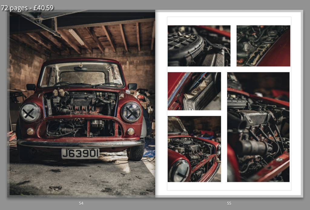
GRID/MULTIPLE IMAGE PAGES
I was happy with the grid layouts I ended up using to show multiple images
In my next project I’m studying the theme of Freedoms and Limitations in which I will be delving in to the idea of spirits/souls and possibly heaven and hell/ the devil and angels. I’ve chosen this theme of freedom as the ideas I had in mind links in quite nicely. I think that the freedom to push limits and have the freedom to do things that reality prevents you from doing usually whether it’s physically or having too many responsibilities in the real world to be able to do the things we wish to do. The theme of freedom is extremely similar to the theme of limitations which is why I decided to do both. I think photographers like Duane Michals are very inspiring when it comes to the idea I want to present in the film I’m going to make. I think that being inspired by his work and recreating it to come to life will be very interesting. I will most likely be making a film as I feel like a have particular strengths in that area compared to if I made a phonebook. Although I have been inspired by a lot of photographers as well as film makers and even music videos such as the song Bury a Friend by Billie Eilish, as the demonic occurrences are similar to the theme I want to portray with in my film, which was actually created by a film director called Michael Chaves who also made The Conjuring 3. I like the idea of surrealism and dreams from my last project as I find the Surrealist movement extremely inspiring for the ideas I come up with although this time I want to stray away from that idea slightly in order to not repeat myself.
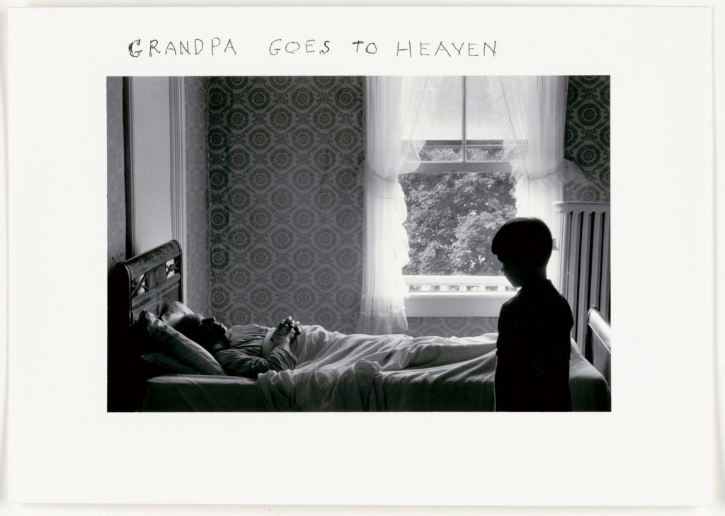
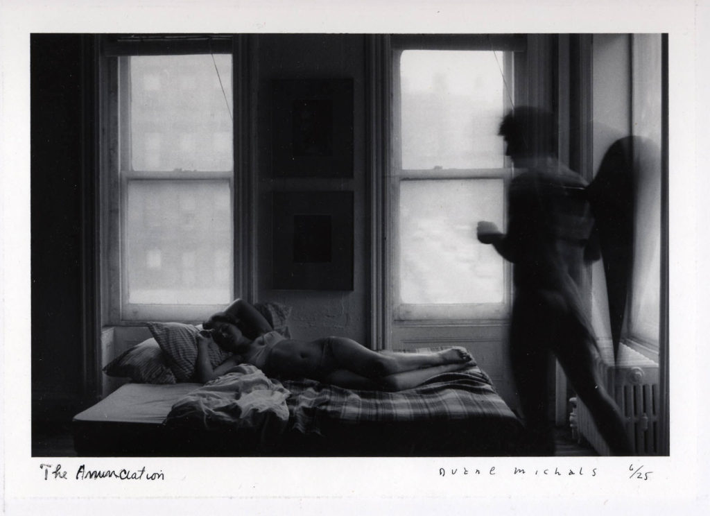
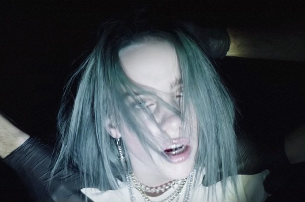
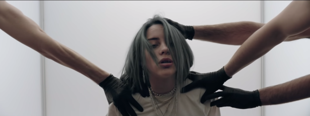
The contrast of the two inspirations for my project have a lot of similarities, as you can see above both photos have someone lurking near someones bed, creating an uncomfortable feeling of something ominous and inhuman.
Inspirations
Duane Michals
Duane Michals first made significant, creative strides in the field of photography during the 1960s. In an era heavily influenced by photojournalism, Michals manipulated the medium to communicate narratives. The sequences, for which he is widely known, appropriate cinema’s frame-by-frame format. Michals has also incorporated text as a key component in his works. I like the way that Michals presents his work as dark and ominous as that’s the way I like to go about presenting my work also. I like the theme of black white where shadow and light appears to be a lot more dramatic than it would be if the photograph or film was in colour. Whether the spirit/ghost is visible in the photo or if there is a feeling of the supernatural lurking around the photo, I think Michals work represents the unsettling feeling of uncertainty. His work links to my theme of Freedoms and Limitations as there’s the idea that the angel/devil near the bed had the freedom to do what they want without consequences but as had the limitations of not having a normal human life.
“The best part of us is not what we see, it’s what we feel. We are what we feel. We are not what we look at . . .. We’re not our eyeballs, we’re our mind. People believe their eyeballs and they’re totally wrong . . .. That’s why I consider most photographs extremely boring–just like Muzak, inoffensive, charming, another waterfall, another sunset. This time, colors have been added to protect the innocent. It’s just boring. But that whole arena of one’s experience–grief, loneliness–how do you photograph lust? I mean, how do you deal with these things? This is what you are, not what you see. It’s all sitting up here. I could do all my work sitting in my room. I don’t have to go anywhere.” – Duane Michals
Michael Chaves
My other inspiration is Michael Chaves, specially the music video he helped Billie Eilish make called Bury A Friend and the movie The Conjuring 3. When looking at Bury A Friend, from the album “When We All Fall Asleep Where Do We Go?”, I think the concept of nightmares and horror links in nicely as well as the title pf the song quite literally linking to death; intertwining with graves, spirits and ghosts. My idea of making peoples spirits/alter self come to life makes me think of the demonic character Billie Eilish is trying to portray. I was thinking of having two main people in the film like the music video where the man on the bed is unconscious but talking whilst dreaming in this dimly lit building and Billie Eilish being the monster in his bedroom watching him, under his bed and lurking around the hallways of his building. I also think the lyrics in the song itself have a lot of meaning and would help me to move forward with the theme of Freedoms and Limitations. The freedom to express your darkest thoughts and make them come to life but the limitations of how far you can express what you’re thinking without making your ideas too dark as well as the limitations of not having full control of what your thinking or feeling.
“When we made ‘bury a friend’, the whole album clicked in my head. I immediately knew what it was going to be about, what the visuals were going to be, and everything in terms of how I wanted it to be perceived. It inspired what the is about. ‘Bury a Friend’ is literally from the perspective of the monster under my bed. If you put yourself in that mindset, what is this creature doing or feeling? I also confess that I’m this monster, because I’m my own worst enemy. I might be the monster under your bed, too?”
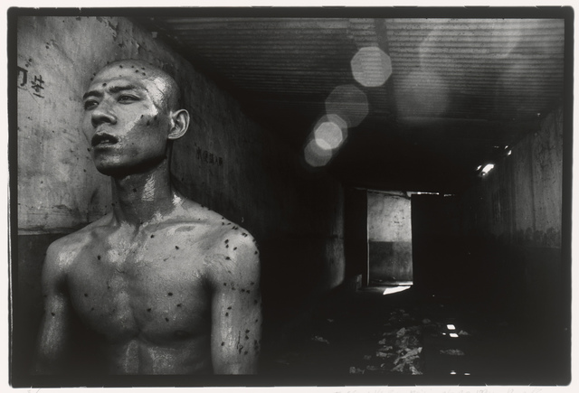
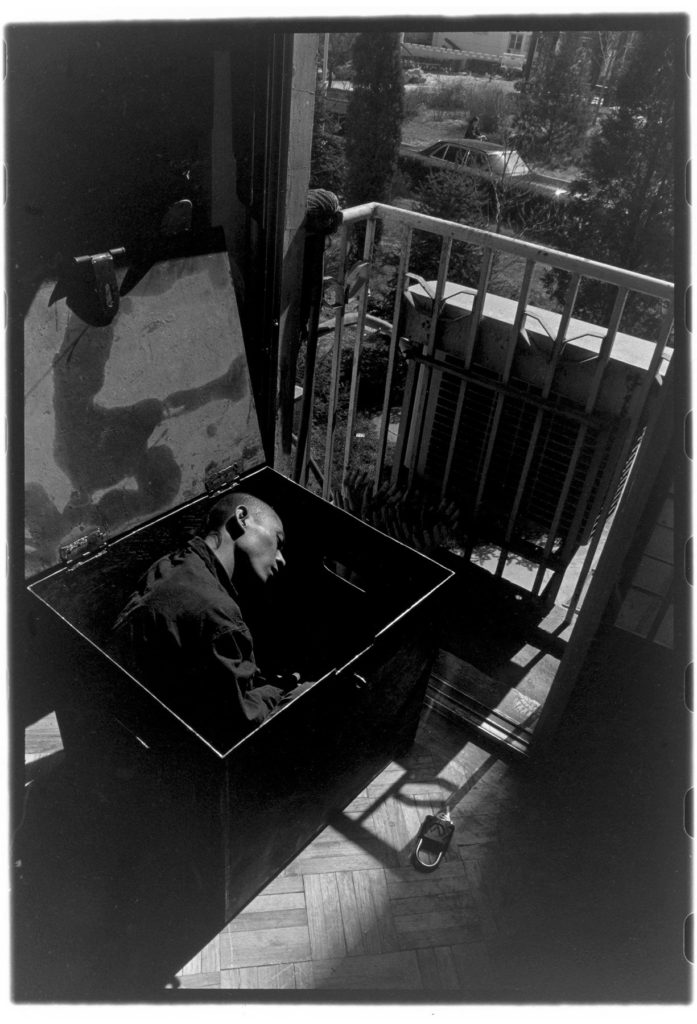
Rong Rong
Zhang Huan is a Chinese artist based in Shanghai and New York City. He began his career as a painter and then transitioned to performance art before making a comeback to painting. He is primarily known for his performance work, but also makes photographs and sculpture. He is usually photographed by the photographer Rong Rong. Both of the artists work combined creates an inspirational flow for which I will consider incorporating into my film. In relation to Freedoms and Limitation it is clear that the photographs below connect greatly to the theme.
The photography is clearly showing some people being completely trapped and chained by the society in which they live in. Whereas some of the photos show the complete exposure to the real world and freedom to explore nature and the imagination. I like the amount of depth the photos explore and the rawness; it has an unsettling element to it which I’d like to display within my own work. I also like the way the photographs are displayed as worn out photographs; it makes the viewer feel as if that they are viewing has some historical importance or that the photograph is deemed as special or one of a kind. The photograph above has also given me some inspiration for my film. I was thinking that if I wasn’t to present there beginning or the end of my film in my bedroom, I was going to use a bunker to have an element of darkness as well as to show one of the girls in my film to have a life which isn’t glamorous compared to the other character. I think the image has a lot of depth to it as the door towards the background shows the light coming through indicating that there’s a way out from the bunker which could be seen as metaphorical for a way to escape the darkness and move towards something to improve a persons life.
“Rong Rong belongs to the famous generation of artists that represents the birth of experiment art in China. After the Yuan Mingyuan was shut down by the authorities in the early 90’s, different artists of this avant-garde art community scattered to different parts of Beijing. Rong Rong belonged to the core of a group which settles in the ‘East Village’. Today the ‘East Village is better known as Da Shanzi or 798 Factory Art District and is considered to be the most dynamic art zone in China. Rong Rong is known for documenting the unique life-style of the East Village community with famous landmark performances such as Zhang Huan’s ‘12 Square Meters Head’ (1994). Rong Rong’s photographs are an autobiography of a certain lifestyle as well as landscape of Beijing. Images of dilapidated buildings, bleak walls, rubble and dust are a metaphor of the collapse and reconstruction of a modern identity and state of mind. The parallel between architectural and human transformations carries a lyrical sentiment which highlights and distinguishes Rong Rong’s work as a landmark in Chinese contemporary photography.”
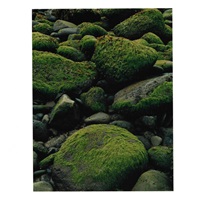
Eliot Porter was an American photographer working throughout the 50s to the 70s, known for his brightly coloured nature photography. His work was key to bringing about the change to viewing colour photography as a fine art medium and he often used his artwork to further conservation efforts and raise awareness on the subject, which he was very passionate about. He has published several critically-acclaimed photography books following his very extensive travels all over the world, including the Americas, East Africa, Antarctica and even the Galapagos Islands, the first being “In Wildness Is The Preservation Of The World”. He died on the 2nd November 1990, but his legacy lives on in his many vibrant photographs of culturally and ecologically important areas of the planet.
“When Porter captured the world around him, he often wanted to highlight elements the average person would overlook. He would look for specific plants, colours or textures that symbolised something far greater about the landscape he was shooting.”
-Urth Magazine
ARTIST EXAMPLES-
Birch Trees on Cliff, 1963
Apples, Great Spruce Head Island, Maine, 1942
Bracken and Hawkweed, Michigan, 1973
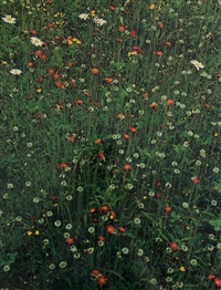
Foxtail Grass, Colorado, 1957
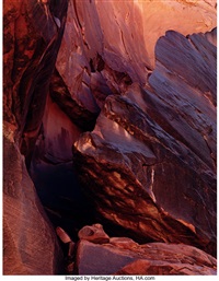
Cliff, Moonlight Creek, San Juan River, 1962
Foxtail Grass, Great Sand Dunes, Colorado, 1976
Portfolio II: Iceland
Hawkweed in meadow, Great Spruce Head 1968
Portfolio entitled In Wildness, 1953–1981
His images all seem to feature a range of interesting textures which transports the viewer to the location and immerses them in the environment. This was especially effective to Porter’s conservation awareness efforts, and he even produced an entire book with the sole intention of raising public awareness on the importance of natural environments; “The Place No One Knew: Glen Canyon on the Colorado” presented the canyon’s stunning beauty before it was deliberately flooded in 1963, and was published shortly after the flood.
“Every photograph that is made whether by one who considers himself a professional, or by the tourist who points his snapshot camera and pushes a button, is a response to the exterior world,”
-Eliot Porter
MORE ARTIST EXAMPLES-
Edge of the Colorado River at Mile 122
Shadbush, Near Hillsborough, New Hampshire, 1957
Portfolio One: The Seasons (nine photographs), 1963
Sunset behind Las Tres Virgenes Volcano, 1966
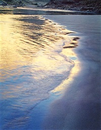
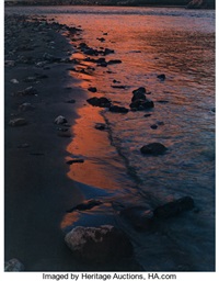
River Edge at Sunset, Below Piute Rapids, 1962
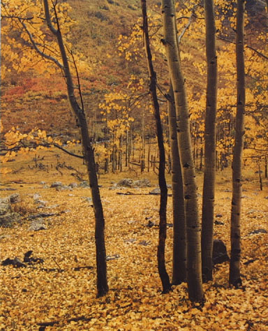
Yellow Aspens, Colorado
Tarn and Cotton Grass, Fjordharheidhi, Iceland
Tidal marsh, Mount Desert Island, Maine
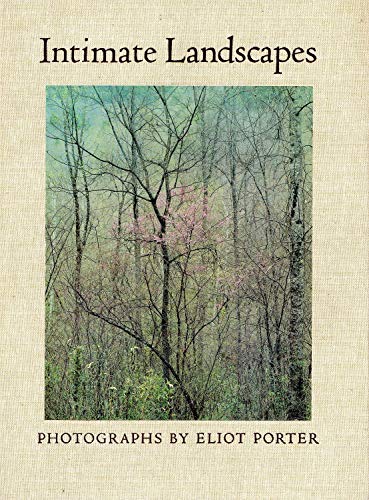
One of his photography books in particular inspires me, “Intimate Landscapes” (1979), which consists of 10 prints handpicked from Porter’s show at the Metropolitan Museum of Art at the time. He was using colour photography at a time when most other artists ridiculed the medium as an artform. Their belief was that colour film simply could not convey the same emotional effect as black and white images., however Porter’s images have been critiqued by experts as emotive and, as the title suggests, quite intimate. Porter was inspired by the natural world around him and his efforts to help preserve it were fueled by this appreciation and adoration of all the fragile beauty he saw, all of which is expressed in his photography.
the cover of “Intimate Landscapes”
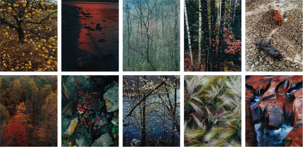
the images inside the book
IMAGE ANALYSIS-
Porter’s precise use of more delicate colours and the fine details of the plants all aide his environmentalist cause and help to establish in the viewer a shared sense of love and appreciation of the beauty of a natural environment. Personally I love how the colours and framing are simple and natural enough that it could almost be an image that you see with your own eyes while going on a walk, representing how these beautiful environments are actually all around us.
I particularly like this image, as I feel it is an accurate portrayal of Porter’s overall style and photographic eye. It is clearly separated into three parts which is not uncommon as many of his images feature patterns and a strong structural component. It also features a variety of different textures, all natural and different from each other. The smooth nature of the water contrasts against the more rough and bristly plants on both sides, cutting a clear path through the centre. The colours as well are particularly interesting: they are mainly warm-toned with the green on the right of the image providing a sense of cool-toned balance. This provides further insight to the viewer on the season at the moment the image was taken, the sort of weather at the time, and also the general whereabouts of the area according to its’ particular flora and fauna.