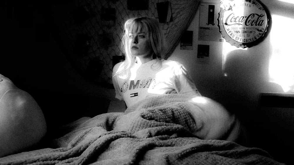
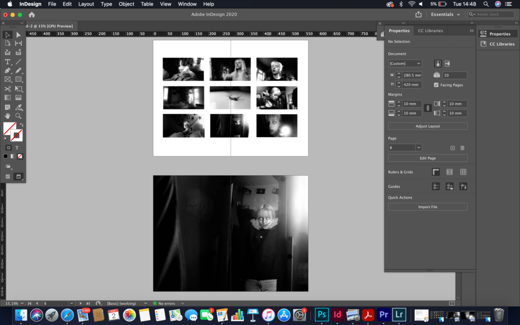
In the project Love and Rebellion we decided to make newspaper spreads to display our images, either from our phonebooks or films. I did a film for my final project which was more focused on rebellion to do with the fight against reality and dreams. I decided to keep the frame of the film for the majority of the spreads as I thought it captured more of what was going on composition wise. My film, Wake Up, was mainly based on being a horror and being an abstract/dream-like film as towards the end I tried to make the viewer feel as uncomfortable as possible with a mixture of imagery and sounds. Shannon O’Donnell uses the technique of selecting key frames from the timeline in Premier and presenting them as still-images. I will also print my spreads as final outcomes for mounting. I may use a different layout for mounting compared to my newspaper spread due to have more room to experiment with and being able to show a full layout of the filmed shot.
Inspirations:

Shannon O’Donnell: That’s Not The Way The River Flows (2019) is a photographic series that playfully explores masculinity and femininity through self-portraits. The work comes from stills taken from moving image of the photographer performing scenes in front of the camera. This project aims to show the inner conflicts that the photographer has with identity and the gendered experience. It reveals the pressures, stereotypes and difficulties faced with growing up in a heavily, yet subtly, gendered society and how that has impacted the acceptance and exploration of the self.

Death Comes to the Old Lady, 1969
Five gelatin silver prints with hand-applied text
3 3/8 x 5 inches (each image)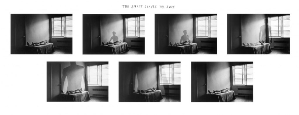
The Spirit Leaves the Body, 1968
Seven gelatin silver prints with hand-applied text
3 3/8 x 5 inches (each image)
Duane Michals (b. 1932, USA) is one of the great photographic innovators of the last century, widely known for his work with series, multiple exposures, and text. Michals first made significant, creative strides in the field of photography during the 1960s. In an era heavily influenced by photojournalism, Michals manipulated the medium to communicate narratives. The sequences, for which he is widely known, appropriate cinema’s frame-by-frame format. Michals has also incorporated text as a key component in his works. Rather than serving a didactic or explanatory function, his handwritten text adds another dimension to the images’ meaning and gives voice to Michals’s singular musings, which are poetic, tragic, and humorous, often all at once. Things Are Queer, 1973/ Nine gelatine silver prints with hand-applied text/3 3/8 x 5 inches
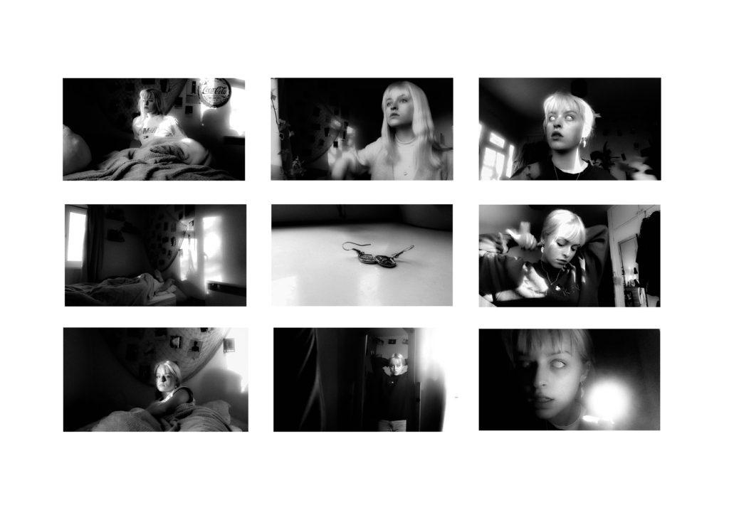
Sequence (grid)
I experimented with how to layout my sequences of photos. The 3×3 layout was my favourite layout because wherever you look across the three photos, whether its a row or a column or diagonally, they all make sense as a sequence. I put mostly portraiture shots within the sequence as most of film consisted of my portraiture shots are part from 4/5 of them. I chose top put the earrings as the odd picture out of the rest in the middle as a focusing piece of the sequence. The photos all relate to rebellion some way our another, I also found that as a viewer they seem to be quite ominous as each shot has some looming darkness surround the photo or emerging from the backdrop of the photograph.
Montage
When editing the montage I chose to make the outcome as nightmarish as possible and edit the photograph the way I would’ve intended my film to look like if I had more time to edit it and learn the skills I would need to make it as ominous and creepy as possible. I liked the montage before and after I cropped the image but I thought the final image should be cropped as it had more of a focus on where I had edited the image in order to have the full effect of surrealism and making the viewer feel uncomfortable. By using the blending and smudging tool to create the demonic smile and make it look as realistic as possible. As for the eyes a selected the pipette tool and used the lightest shad that was on the eye already and then coloured the two eyes in, similarly to what I did in my film but instead of editing the footage I just wore contacts to make the process easier. I also duplicated the cut outs of the face using copy and paste and then change the opacity to make a ghost like effect. I also copy and paste a another image I had created and hid it within the photo to add an even more disturbing attribute to thew image.
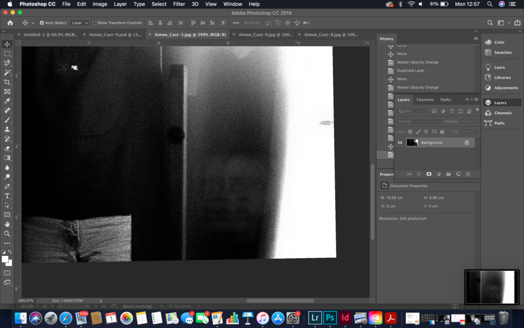
flattening the image
changing the opacity 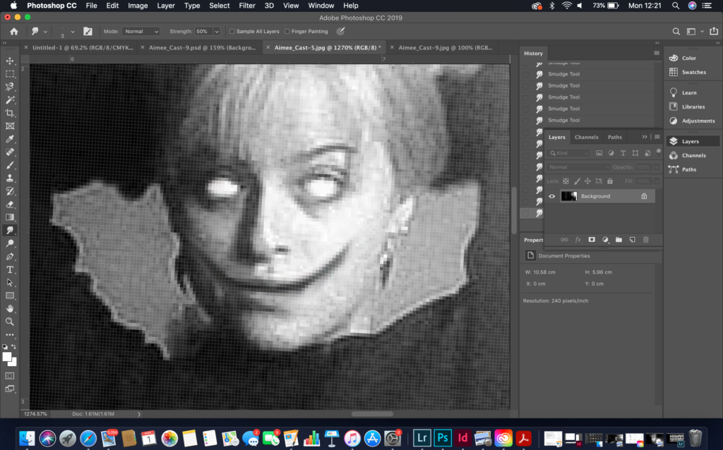
blending/smudging 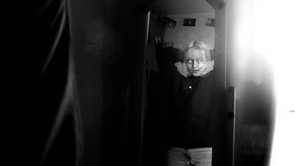
before cropping 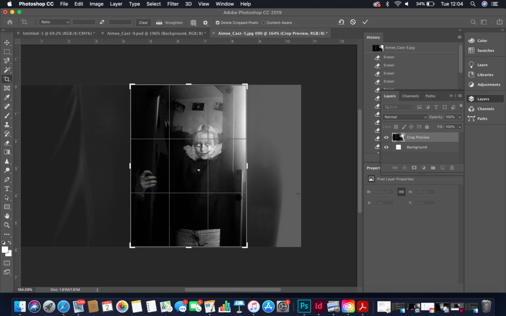
after cropping 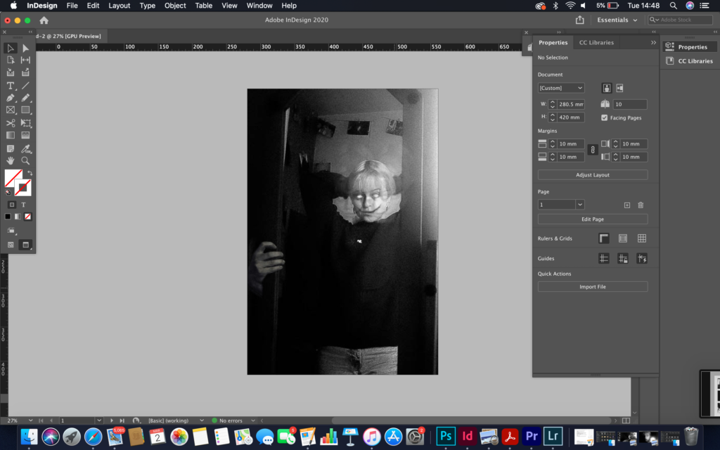


Juxtaposition
I found it fairly difficult to find a juxtaposition within my film and when I did find one it was difficult to lay it out on the newspaper as the film was landscape and I wanted to have images portrait in order to fill the pages. I used the two images from my school shots. One of them it a photo of me and my friends sitting in our art class and the other is me sitting by myself in the same room in pretty much then same position. I think these two images are opposites of each other as I purposely tried to show that within the film when I was shooting it. One by myself and one with everyone surrounding me; they’re linked but they are also different. These two shots represent thew little changes shown throughout the film which was a way of showing progression without changing too much.

Full Bleed
I chose this photo as the full bleed as it was one of the best executed shots through my film. I liked where the light hit the face of the subjects as it it represented and foreshadowed the ending of the film where the nightmarish dream will take over what you are used to seeing and change the normal daily lifestyle that the viewer and subject was used to. I also liked the highlights and shadowing within this shots as the shadows almost seemed to be consuming the surroundings pot the subject with a little bit of the light shining through before the ending ion the film where the nightmare took over the subject. I also like the actual shadow being shown on the wall coming from the subject as it is also another representative of the future; the subject being overwhelmed and being consumed by the dream in which she was stuck in. It almost seems like the shadow is lurking wherever she goes and is always lurking in a metaphorical sense.

