final essay-

In what way does the work of Francesca Woodman explore the concepts of femininity and sexuality ?

“Woodman’s photographs show a subject poised between presence and absence, where the body seems to hesitate in its visibility and identity.”

Townsend C, 2006, “Francesca Woodman: Scattered in Space and Time

INTRODUCTION-

The concept of femininity, its definitions and boundaries, has been explored thousands of times by multitudes of photographers, artists, philosophers and writers, female or not. It changes again and again with each individual interpretation and cultural movement, with the waves of feminism, and with the passing of artistic and cultural movements. The idea that there is an inherent essence to being female has been examined in depth by many artists, writers, philosophers and linguists, including by Judith Butler, whose work “Gender Trouble” revolutionised the way femininity and gender in general is thought of and discussed academically, as well as having a massive impact on the LGBTQ+ community, where gender and sexuality are often seen as fundamentally intertwined and are often questioned and analysed. These notions can all be seen to be represented in, an influence on, or interpreted in Francesca Woodman’s work in some way. From her depiction of her own femininity and sexuality, I believe that Woodman’s work is exceptional in portraying how she views these concepts in a way that is not only original but also has links to other artistic and cultural movements. In this essay I will explore how she connects her personal experience with other photographers’ work and her understanding of the photographic and artistic scene surrounding her work. I will provide an in-depth analysis of her work and discuss how it illustrates her experience with her own femininity. I will explain how she explores her sexuality look at contextual factors and other links to cultural and artistic movements, artists and themes.

THEORETICAL CONTEXT-

Women in the world of art and cinema have continually been portrayed, mainly by men, as sexual objects; their purpose being for exhibition only. Laura Mulvey puts it simply, “in their traditional exhibitionist role women are simultaneously looked at and displayed” (Mulvey 1975:19) which accurately explains the persistent representation of the female body as an object of desire first and foremost, both for the artist and characters within the artwork or film as well as the spectator. This perception of women as sexual objects can be linked to many traditional social attitudes regarding gender roles and can be argued to be the base of modern rape culture. However, this connection between a person’s sex and their gender has been furiously debated for decades and probably longer, possibly most notably by Judith Butler in her iconic and transformative book “Gender Trouble”. Her main points can be summarised as this: gender is a socially constructed performance, people’s gender identities are often far more complex than society expects, and the fact that women are socialised to fit within a set of defined “feminine” characteristics. In simple terms, “sex is not the biological meaning of gender and is socially constructed by norms, just as gender is an ongoing performance” (Marilou Niedda, 2020;1). Butler theorises that there is a clear disconnect between a person’s biological sex and their gender, meaning androgyny is a completely valid and understood form of gender expression. Androgyny in photography is used by many artists, often female ones, to distance themselves from the over-sexualised images of women which are seemingly everywhere in art and film, to show themselves as artists breaking barriers, and to represent women in general as more than just erotic objects. 
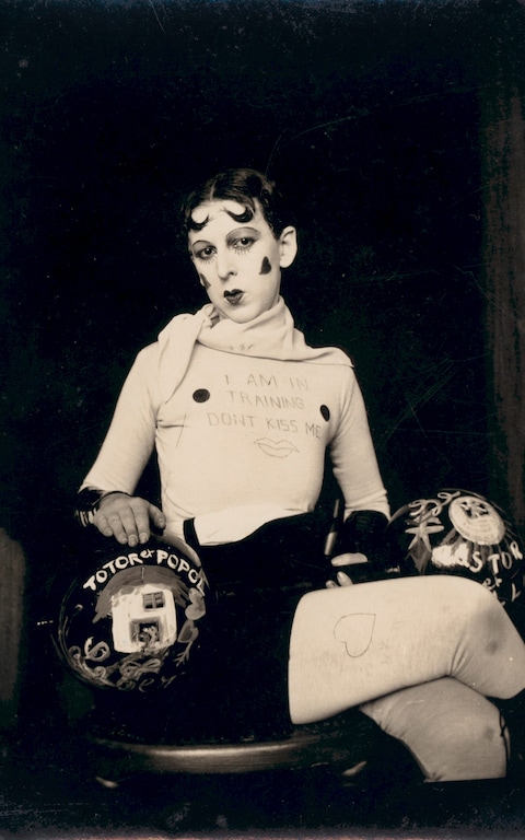
Presenting oneself as androgynous was used by Surrealists especially, because it subverted typical expectations of how women were portrayed in art, and it sometimes even caused controversy within the art world. It is essentially a way of fighting back against the fetishisation of the female body and against the male gaze, and the fact that Woodman was a teenager when she first started making these images makes it all the more impressive. The idea that “acting feminine” is an ongoing performance brought on by social expectations was famously explored by Simone de Beauvoir in her book The Second Sex (1949), “one is not born but rather becomes a woman,” which can be interpreted as an explanation of how traditionally feminine behaviour isn’t the natural state of being for people born to the female sex. Furthermore it can be said that the use of androgyny and femininity in art and photography, not only by Woodman but by everyone, is more of a statement of confrontation against traditional femininity than conformity to gender norms.
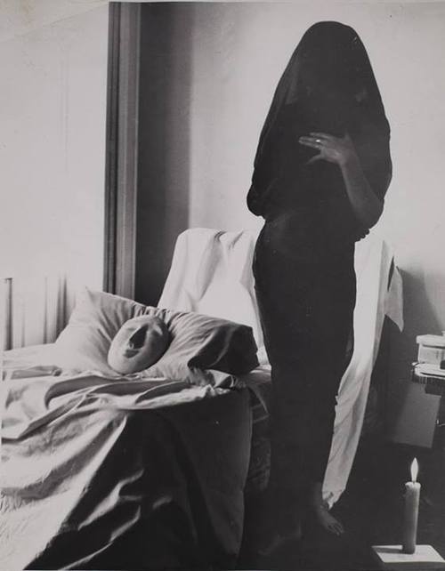
kati horna
Sín titulo (Oda a la Necrophilia) by Kati Horna (1962). Image via Museo Reina Sofia.

WOODMAN IN RELATION TO FEMININITY-

“In 1986 Abigail Solomon-Godeau presented Woodman as a prodigy who could be understood as critiquing the historical and linguistic construction of femininity and trying to produce an essentially feminist aesthetic” (Townsend 2006). Often in highly posed and abstract positions, she mainly uses herself as the subject of her images as well as other women and the occasional man, almost always featuring nudity in a way that de-sexualises their bodies and creates a strange sense of experimentation and self-exploration, where the viewer neither feels like a peeping-Tom nor engaged in a sexual act, but rather a witness to her grasp of her own femininity and sexuality, which is fluid and questioning in nature.
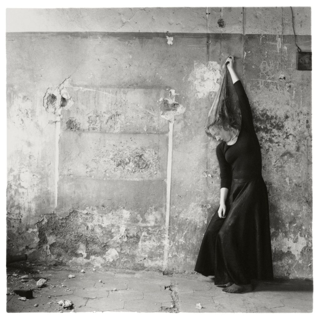
This can be explored by Butler’s theory of gender performance, namely “to say that gender is performative is to say that nobody really is a gender from the start” (Butler, 2011). Below are a few examples of Woodman’s use of nudity in her artwork in which there is no sexual aspect, which is in direct contrast to the vast majority of art (not just photography) featuring nude women. This could be interpreted in a couple ways, for example that it is simply the experimentative steps of a teenager who does not fully see herself as a sexual being yet. On the other hand, it could be perceived as a deliberate and premeditated attempt to break barriers surrounding women in the world of art by using her own body to contradict the idea that the female body can only be a sexual thing. Whichever of these interpretations one subscribes to, there is a prominent sense of androgyny and fluidity in these images and, indeed, throughout Woodman’s whole body of work, that demonstrates her incredible talent and capability to provide actual meaning and thought alongside aesthetically and technically pleasing artwork.

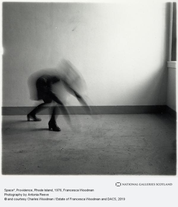
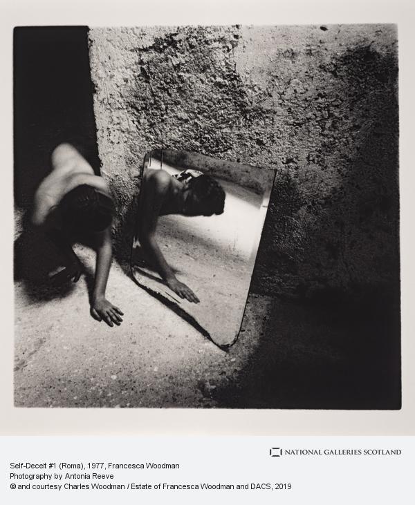
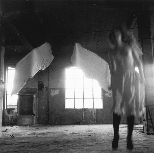
Woodman’s signature use of long exposure to achieve a blurred body has been construed in many different ways, but most often as a form of disappearance. She is essentially hiding herself in the environment she chooses to surround herself in, but for what reason? The far-left image features a nude Woodman creeping around a corner on her hands and knees to face a mirror. It is one of the few images where the camera blur does not obscure her face, and her use of a mirror to reflect the camera’s “eye” back onto itself gives us an insight into how she sees herself. She appears curious, but tentative and maybe even fearful, revealing how her teenage self is going through a period where her identity and self-perception becomes important. She was nineteen at the time this was taken, so although she may not have known it, she was only a few years away from the end of her career and her life. The second image is different in that, while she is still fully nude, her entire body is obscured by blur due to her manipulation of the camera’s exposure, and her face is not visible. She has positioned herself within a hole in the headstone of a grave (a common feature of some older graves), and so is, in a rather morbid way, encasing herself in death. This could symbolise how she feels like herself and her body is trapped within life itself, or possibly how she sees death as a way of “passing through” to another place. The key point is that her body is not meant to be perceived as sexual in any way, even though she is entirely nude, which feels very modern and liberating. Another interpretation of this image is that it is the way her body is literally emerging from childhood into womanhood, using the grave as a metaphor for this. Any way it is perceived, it is clear that Woodman uses her signature long exposure technique to further present her interpretation of her own femininity and sexuality in a vague and androgynous manner. 

COMPARING WOODMAN TO MICHALS-

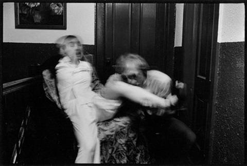
One of Woodman’s most obvious influences- and also one of the only ones she acknowledged as an influence on her artwork- was Duane Michals. He is an American Surrealist photographer, born in 1932, who mainly creates cinematic narratives through sequences of highly staged images, but also has taken many portraits of influential artists, such as Andy Warhol and Marcel Duchamp, over the course of his career. There are several clear similarities between his body of work and Woodman’s, possibly most obviously their use of long exposure techniques to intentionally blur the subjects of their photography. 

Above is an example of both Michal’s creation of narratives through sequences as well as this photographic technique. The dark background in focus contrasted against the bright white and blurry figures in the foreground help to make this photo-series impactful and emphasise the emotions portrayed in the second image: fear, shock, horror, hunger. Michals uses blur in a different way to Woodman, however, using it to further the narrative and his intentions behind the photograph rather than directly impacting the perception of the main subject, like Woodman does.
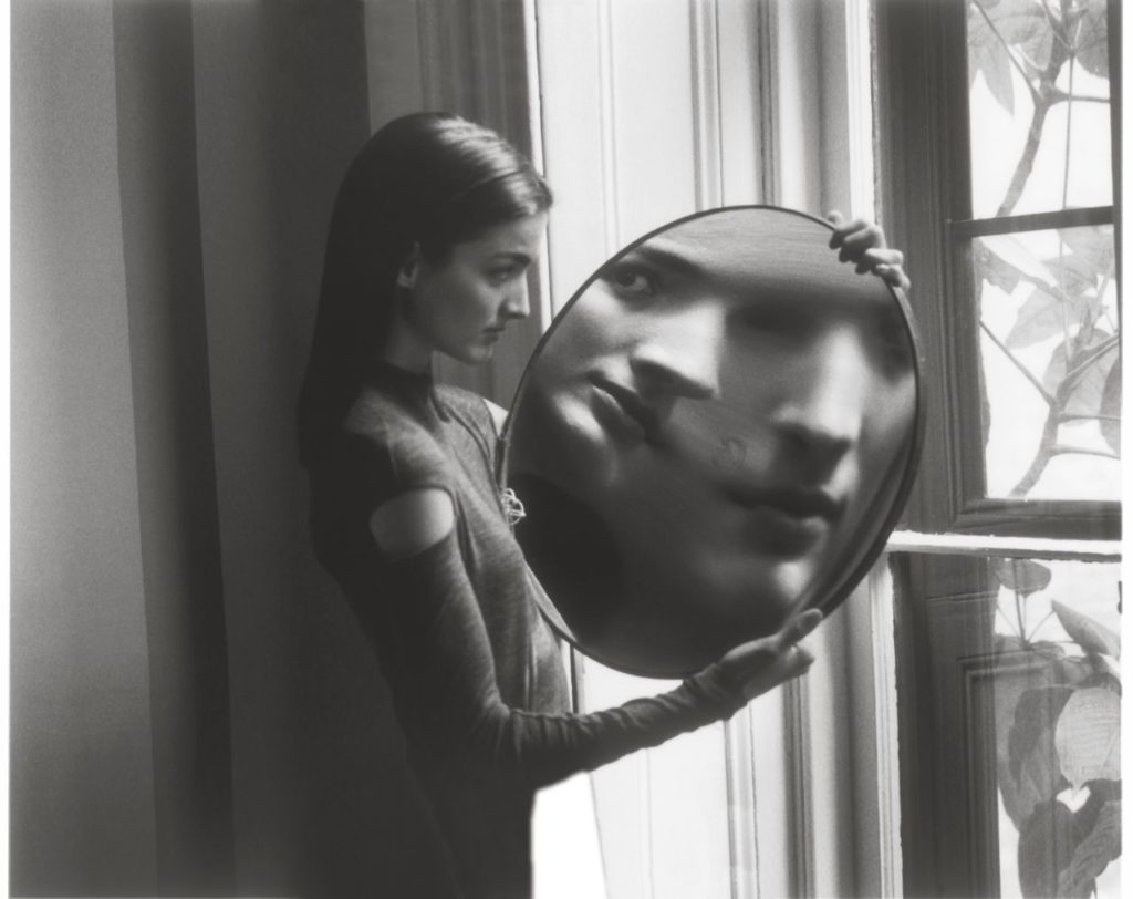
Both artists also use mirrors in their work as a way to portray how the subject sees themself, whether positively or negatively. Michals’ image above can be interpreted as reflecting how the subject has a distorted perception of themselves, and Woodman uses it in a similar way, but in a less literal manner. They both have fairly high tonal ranges which add depth and make the images more interesting overall, capturing the attention of potential viewers. In Woodman’s image, the whitest part of the photograph is the floor directly behind the subject’s head’s reflection in the mirror, which serves to make it the main focal point. In Michals’ photograph, the whitest part is clearly the strip of wall behind the mirror the subject is holding up, which has the same effect as Woodman in that the subject’s reflection is very obviously the intended main focus of the image as a whole.
The Fallen Angel (1968), Duane Michals

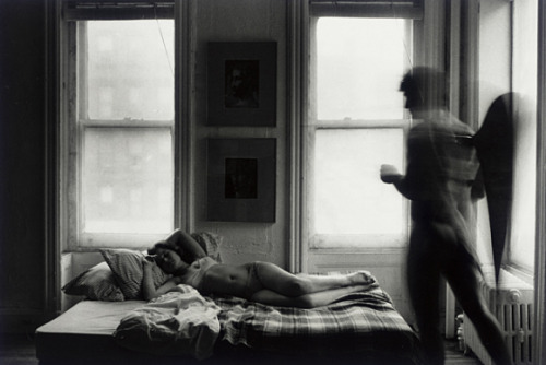
Another notable area Michal’s influence on Woodman is the use of angelic imagery, shown above. “The Fallen Angel” (1968is a photo-series about a girl and an angel who succumbs to his lust for the girl and kisses her but loses his wings as a result and is overcome by guilt and shame. This is a more traditionally Biblical portrayal of angels; the angel being male, and the concept of human sexuality is surrounded by shame and other negative emotions. This is in contrast to Woodman’s use of angels in her “Angel Series” (1977) in Italy, where she is the angel herself and is also nude, but in a way where it feels liberating and joyful overall rather than shameful. These differences can be attributed to both Woodman’s youth and her femininity altering her perception of angels and the nude human body, contrary to Michals, who is male and was 36 at the time of the “Fallen Angel” series. Michals’ photo-series also features a nude female woman, who is lying on her side on the bed. Her body is entirely facing the camera (and therefore the viewer) and her role in the narrative is clearly only as an object of lust and desire, the temptation that the angel feels and the ultimate cause of his suffering. This is (unfortunately) standard in the world of art and photography, as explained in the beginning of this essay, and further illustrates how ground-breaking Woodman’s work was in presenting a different approach to the portrayal of female nudity and femininity in general. 

CONCLUSION-

“Woodman’s linking of the woman´s body to the walls and surfaces it seems bonded to repeats the theme of the body as itself a surface.”

Abigail Solomon-Godeau, (1986) “Just Like A Woman”, published in: Photographic Work

In essence, Woodman’s exploration of her own femininity feels almost like an attack on the stereotypical perception of femininity expected from a teenage girl, in that she is open and confident about her nude body without fetishising or overly-sexualising it in the way that many of her male contemporaries were doing at the time, the way her influences had done before, and in the way that (especially male) artists and photographers have continued to do since her death. She photographs her body within almost exclusively abandoned and dilapidated spaces in a Gothic-like manner, which on the surface reduces it’s perceived “worth” but in actuality elevates her message and the emotions she conveys to even higher platforms. Although she never credited many, if any, other photographers and artists as direct influences on her art, but the few she has can clearly be seen throughout her whole body of work. For example, the extended metaphor of angels and general angelic imagery can be attributed to Duane Michals, and she has often been grouped within the Surrealist art movement as a result of the often strange and eerie tone we get from her photographs. Her age is also an impactful factor on her perception of femininity and how she represents her sexuality, as youth often sees the subjects of sex and gender identity as far more fluid and questioning than older generations tend to. In my opinion, her continued use of the nude female body is one of the most important components when evaluating how she explores femininity, because she completely subverts the traditional expectations of a passive, naïve, yet somehow intensely sexual woman, and replaces it with this image of a person who is at the same time shy and confident, trapped and free, and, to a degree, mocking the viewer’s shock at these unexpected sights.  

BIBLIOGRAPHY-

  • Butler, J. (2011) Your Behaviour Creates Your Gender.  
  • Mulvey, L. (1975) Visual Pleasures. Screen
  • Niedda, M. (2020). Feminist and queer studies: Judith Butler’s conceptualisation of gender.
  • Solomon-Godeau, A. (1986) Just Like A Woman. Photographic Work
  • Townsend, C. (2006) Francesca Woodman: Scattered in Space and Time). London: Phaidon Press Ltd

final essay plan-

title-

In what way does the work of Francesca Woodman explore the concepts of femininity and sexuality ?

main points-

INTRO: femininity has been explored in different ways throughout history, idea of gender identity is linked to sexuality for many people, Woodman links these concepts to other artists as well as portraying her own representation

PARA 1: women are often portrayed as sexual objects, Judith Butler’s work on gender roles/the disconnect between sex and gender, gender as a social construct/performance, use of androgyny in photography reflecting this, LINK TO SURREALISM

PARA 2: woodman in relation to femininity, the way she uses herself and her nude body in a sort-of desexualising way/ feels less like voyeurism and more like exploration, gender expression and self identity as fluid concepts, link to Woodman’s young age and how it could just be an example of her experimentation, long exposure as an artistic technique, ANALYSIS OF IMAGES

PARA 3: linking woodman to another artist (duane michals), michals’ use of long exposure and narrative sequencing, COMPARE AND CONTRAST TWO ARTIST IMAGES, use angel series for comparison

PARA 4: woodman’s fight against stereotypical femininity, link to other influences, use of space/abandoned buildings (sense of value), her youth as impactful on her perception of identity/sexuality/gender,

(possible) quotes-

“Woodman’s photographs show a subject poised between presence and absence, where the body seems to hesitate in its visibility and identity.” Townsend C, 2006, “Francesca Woodman: Scattered in Space and Time

“sex is not the biological meaning of gender and is socially constructed by norms, just as gender is an ongoing performance” (Marilou Niedda, 2020;1)

Simone de Beauvoir in her book The Second Sex (1949), “one is not born but rather becomes a woman,”

“in their traditional exhibitionist role women are simultaneously looked at and displayed” (Mulvey 1975:19)

“In 1986 Abigail Solomon-Godeau presented Woodman as a prodigy who could be understood as critiquing the historical and linguistic construction of femininity and trying to produce an essentially feminist aesthetic” (Townsend 2006)

“Woodman’s linking of the woman´s body to the walls and surfaces it seems bonded to repeats the theme of the body as itself a surface.” Abigail Solomon-Godeau, (1986) “Just Like A Woman”, published in: Photographic Work

Home editing Process

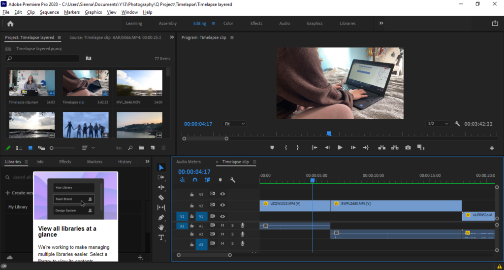
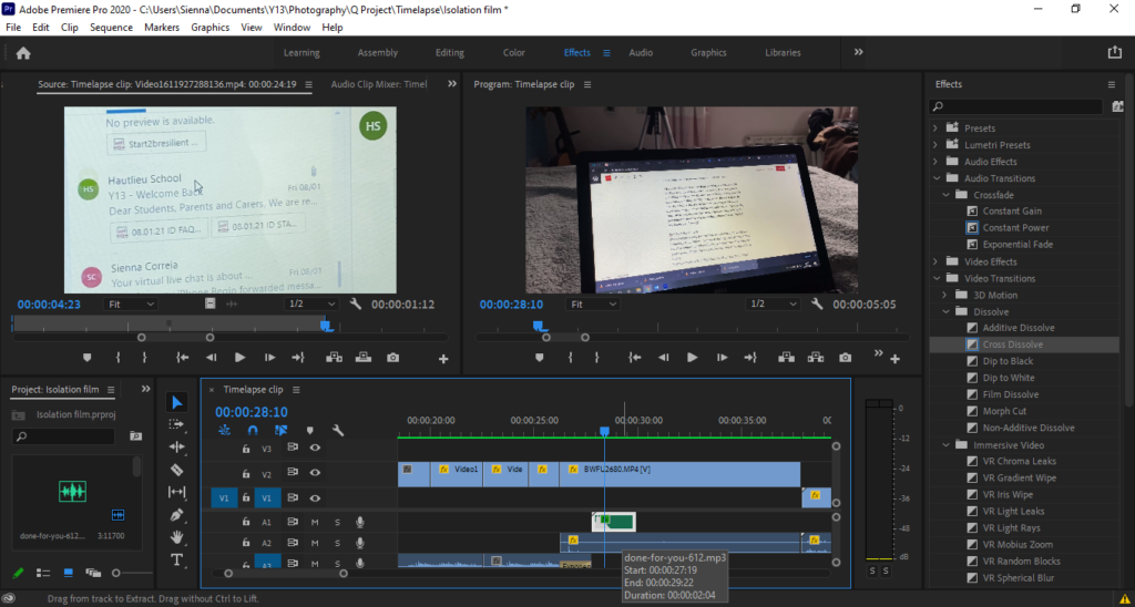
Firstly I uploaded all the footage for this scene and lay them out roughly – resizing, cutting appropriate frames and rendering all videos.

I then had lots of short videos of phone alarms, so cut these together with the first transitional frame being slightly longer, and the rest following a quick paced time-lapse style sequence.

This image has an empty alt attribute; its file name is image-302-1024x548.png

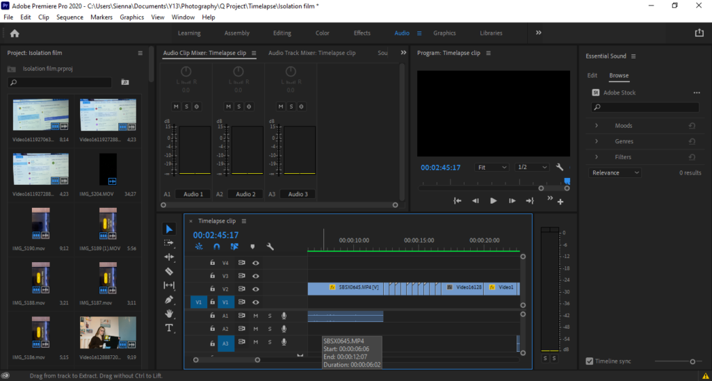
I then layered a continuous audio of the phone alarm across these short clips, as well as before (to transition into the sequence) and after to show a continuation. I then used an exponential fade to slowly blend out the alarm.

This image has an empty alt attribute; its file name is image-312-1024x548.png

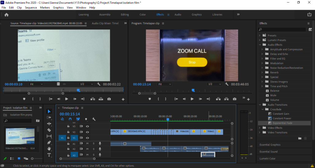
I then found and imported an email notification sound effect, and layered it an appropriate time with the video.

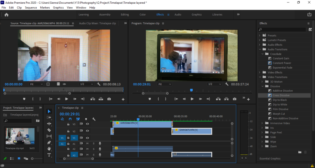
With the archived summer videos, i had them playing on the screen and used transitional fades to layer and switch between the multiple videos

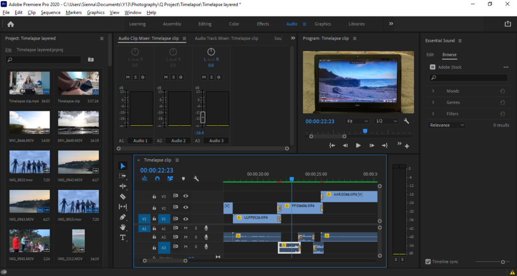
Next i imported the audio from the original videos, and used these to layer in sequence with the videos on the screen (removing the videos own audio). I adjusted these to a lower volume and used continual fade transitions to continue through one video to the next. For one clip specifically i cut up and re adjusted the audio as it had a flaw (loud shout in the background i didn’t want to include) and used fades between the cut audio to have them smooth, and make it unnoticeable that the audio had been edited.

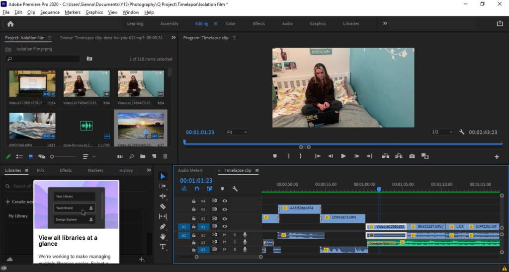
Lastly i continued the last videos audio slightly into the next clip, and used a constant gain transition at the beginning of the shown transitional to bring in and set up the music for the next scene

Essay: Paragraph 1 Historical/Theory

Realism and straight photography was a movement of photography that came around in the early to mid 1900’s. Pictorialism was phasing out of popularity and photographers had begun a new style of photography. Paul Strand was a pioneer of the realism and straight photography genre of image making. In the early 1900’s pictorialism was still popular, artists and photographers would use techniques such as putting vasaline on the lenses to make the images soft and and scratch the negatives to make the images look like painting. The emphasis on pictorialism is to make the images not look like photographs and look more like art, pictorial images soften featured stage scenes or actors posing for the camera rather than documenting. Paul Strand wanted to get back to the true meaning of photography and the roots of why image fixing was invented. He wanted to document the world exactly as he saw it. This meant not post processing the images in the darkroom and not affecting the image making process in any way.

Key characteristics/ conventions: Go back to the qualities of photography as it recreates accurate and sharp images. They wanted to take photos of what they actually saw. They took things the way they were and not manipulated in the darkroom. Trying to emphasise and focus on shape. The art came from the skill of the photographer

Artists associated: Paul Strand transitioned into and pioneered straight photography. Walker Evans, Ansel Adams. Group f.64 – A group that were interested in capturing the amazing natural landscapes.

Methods/ techniques/ processes: Photographers interested in the genre of straight photography would use a very small aperture to get everything in focus. A group was formed called group f.64. This represents the smallest aperture a large format camera can go to on the lens. This became a trademark and a common feature of photographers like Paul Strand and Ansel Adams

Understanding Photobooks – The Epilogue

1. Research a photo-book and describe the story it is communicating  with reference to subject-matter, genre and approach to image-making.

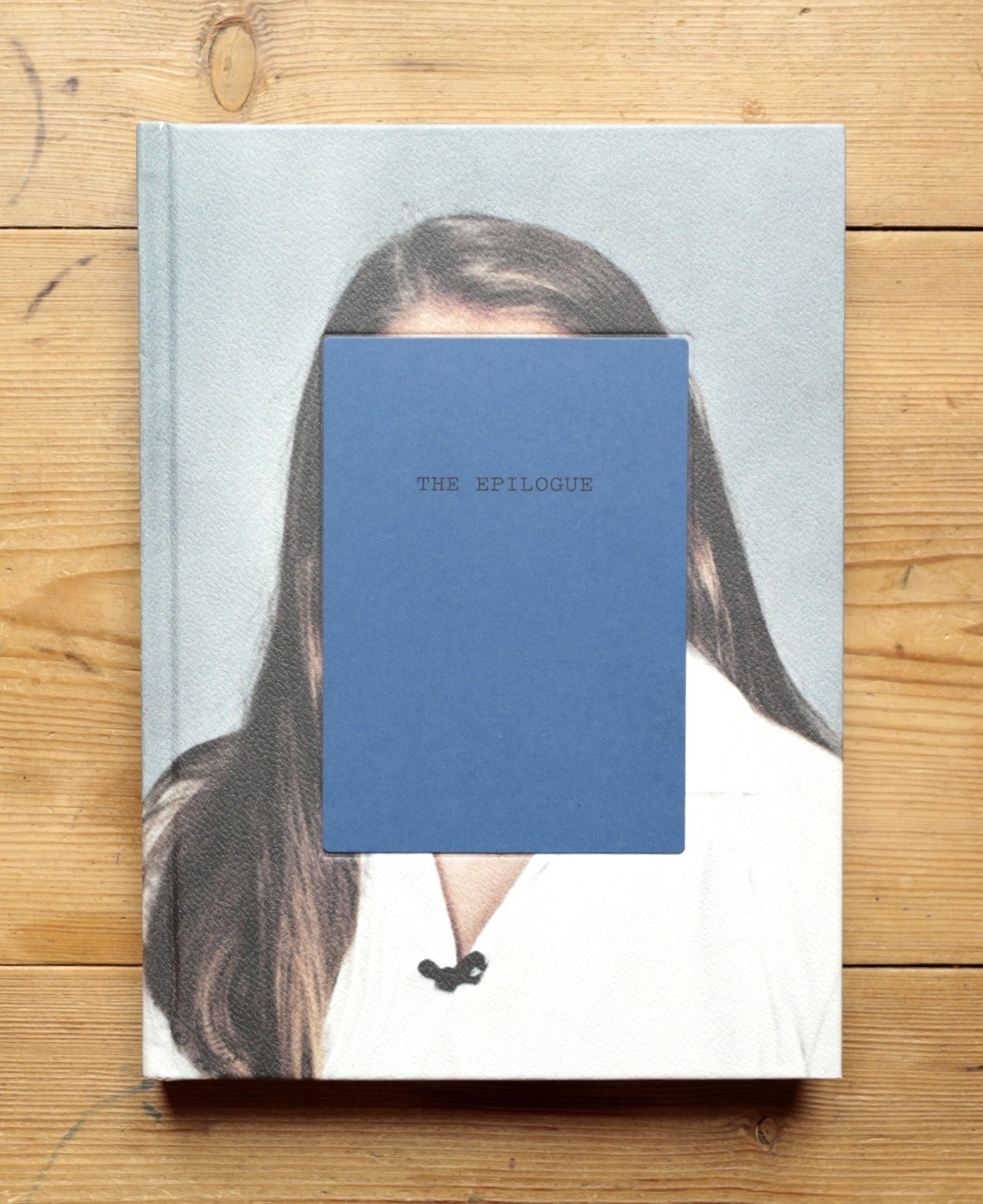
The Epilogue by Laia Abril, at Dewi Lewis

The book is about the way the Robinson family and how they remember and grieve about the passing of the 26 year old daughter ‘Cammy’ in 2005. The book features a series of images from and pieces from various mediums. The book includes letters from family member and letters to and from friends and church leaders. There are also extracts from newspapers and hospital reports. All these documents help to tell the story of the struggles and issues that led up and after the death of Cammy Robinson.

2. Who is the photographer? Why did he/she make it? (intentions/ reasons) Who is it for? (audience) How was it received? (any press, reviews, awards, legacy etc.)

Laia Abril is the photographer who produce this book. She created this book because she wanted to give a voice to the suffering and grief of the family as they remember their daughter. The book highlights how the mothers day and fathers day can be a very sad and sombre time for Cammy’s parents Wujen and Jan Robinson.

3. Deconstruct the narrative, concept and design of the book and apply theory above when considering:

  • Book in hand: how does it feel? Smell, sniff the paper.
    • The book is hardback with a scaly texture on the front and back cover.
  • Paper and ink: use of different paper/ textures/ colour or B&W or both.
    • Photopaper was used for the images and thin paper for the photocopied letters and texts. Colour images were used throughout.
  • Format, size and orientation: portraiture/ landscape/ square/ A5, A4, A3 / number of pages.
    • Portrait, 160 pages, roughly a4, spine is on the left
  • Binding, soft/hard cover. image wrap/dust jacket. saddle stitch/swiss binding/ Japanese stab-binding/ leperello
    • The book has a hard cover with the images printed on the front and back covers of the book instead of using a dust jacket. The pages are bound by a perfect binding method.
  • Cover: linen/ card. graphic/ printed image. embossed/ debossed. letterpress/ silkscreen/hot-stamping.
    • On the front and back
  • Title: literal or poetic / relevant or intriguing.
    • The title is intriguing but fitting to the book.
  • Narrative: what is the story/ subject-matter. How is it told?
    • The story is about a 26 year old woman who died of Bulimia. The book follows a family as they celebrate fathers day while mourning and remembering their daughter who passed away at such a young age.
  • Structure and architecture: how design/ repeating motifs/ or specific features develops a concept or construct a narrative.
    • The use of other material such as archival pieces like newspaper cuttings or old photographs is repeating throughout helping to build the story futher.
  • Design and layout: image size on pages/ single page, double-spread/ images/ grid, fold- outs/ inserts.
    • The book includes some fold out pieces added into the book. Most of the pages are either 1 photo per page or 1 photo as a double page spread.
  • Editing and sequencing: selection of images/ juxtaposition of photographs/ editing process.
    • The book does not include a lot of juxtaposing images rather just showing the progression of Cammy’s illness.
  • Images and text: are they linked? Introduction/ essay/ statement by artists or others.  Use of captions (if any.)
    • Short captions are use to explain who is in the image and what they are doing.

Film Research

Sites I have used to research with and or will incorporate into my film.

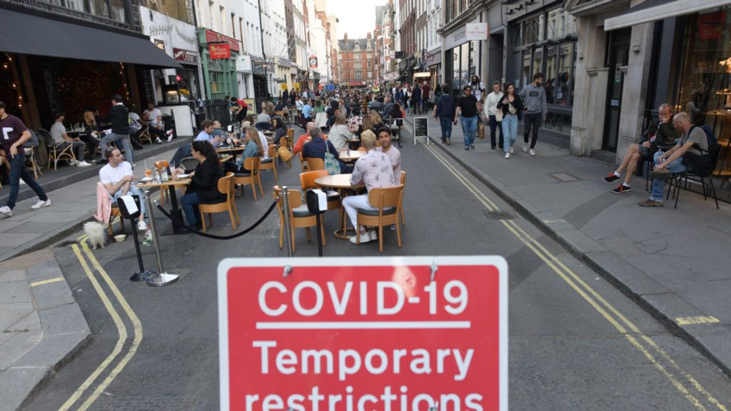
The shocking centre of the COVID-19 crisis – YouTube

How to look after yourself at home if you have coronavirus (COVID-19) – NHS (www.nhs.uk)

(20) COVID-19 Patient & Mom Posts Video Before Passing | NowThis – YouTube

(20) ‘Holding hands while they go’ – Inside the Covid ICU – YouTube (1.48-2.00)

WHO Coronavirus Disease (COVID-19) Dashboard | WHO Coronavirus Disease (COVID-19) Dashboard

Coronavirus disease (COVID-19) (who.int)

Coronavirus (COVID-19) – Google News

What is coronavirus? COVID-19 explained – CNN

Possible reports to use throughout film

My Book specification

Narrative: 

My book is about the relation between the human body and nature. I will look at taking abstract images of human body features creating intrigue, focussing on the depth of detail within the body features. I will also photograph aspects of nature, e.g. the beach, pebbles, flowers, plants. This will represent the beauty within nature. This natural beauty of the earth can be linked with the natural beauty of the human body creating love for oneself. My aim is to encapsulate the beauty of nature and our body parts, with the main focus being on depth of the image and capturing the abstract linking in the sublime.

Design: 

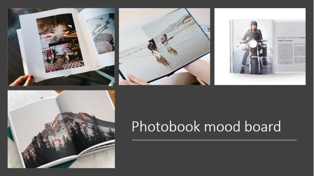
I want my book to look simple, with all the detail and interest coming from within the images. I will use light colours to not draw any attention away from the subjects photographed. The title will reflect the contents of the book with it linking to natural beauty. The design and layout of the book will be clear, with space between images and pages to enable focus on a single image at a time and the cover will be intriguing, engaging people to want to look further into it.

Photo-book Analysis ~ ‘Rinko kawauchi -illuminance’

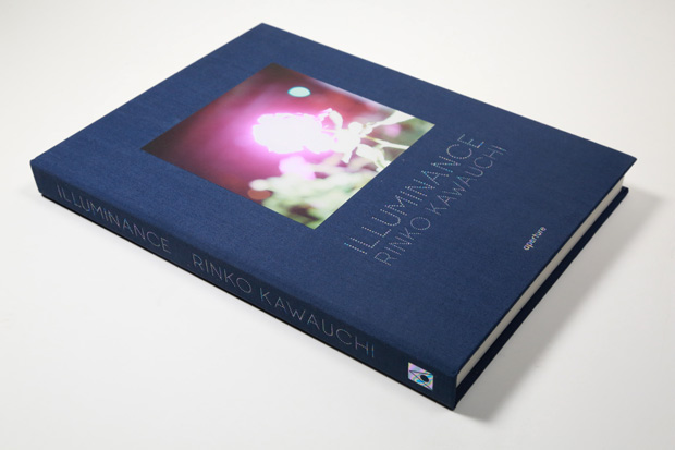
Rinko Kawauchi - Illuminance - reprinted

1. Research a photo-book and describe the story it is communicating  with reference to subject-matter, genre and approach to image-making.

The photo book, Illuminance shows the photographers passions through simple but striking images. Some people explain the images as solitary. Illuminance consists of 176 photos, taken over 15 years. The book was inspired by the aesthetic of Wabi-Sabi, which is “a philosophy of reduction, modesty and the beauty of imperfection” / the Japanese philosophy of accepting your imperfections and making the most of life. She creates her own unique perspective of the world.

Landscape Stories | Rinko Kawauchi - Illuminance

2. Who is the photographer? Why did he/she make it? (intentions/ reasons) Who is it for? (audience) How was it received? (any press, reviews, awards, legacy etc.)

Rinko Kawauchi is a Japanese photographer, born 1972 in Shiga Japan. She lives and works in Tokyo after studying graphic design and photography at Seian University of Art and Design. She is known world wide for her varied use of colour and power in composition. She draws attention to small details and looks at the world around her with enchantment. Her images offer us a captivating view of the world around us. Kawauchi says: “differentiates between a photograph and an artwork. Seeing two images next to each other opens up the imagination and gives birth to something else. Flipping through the pages of the book, it can arouse feelings of excitement, sadness, or happiness—things that are hard [for me] to do with words.” ~ https://time.com/3776240/rinko-kawauchis-illuminance/

Landscape Stories | Rinko Kawauchi - Illuminance

3. Deconstruct the narrative, concept and design of the book and apply theory above when considering:

Paper and ink: use of different paper/ textures/ colour or B&W or both. ~ Matte Paper, bold colours, smooth texture.

Format, size and orientation: portraiture/ landscape/ square/ A5, A4, A3 / number of pages ~ Portrait, 163 pages.

Binding, soft/hard cover. image wrap/dust jacket. saddle stitch/swiss binding/ Japanese stab-binding/ leperello ~ Clothbound Japanese binding.

Cover: linen/ card. graphic/ printed image. embossed/ debossed. letterpress/ silkscreen/hot-stamping ~ Printed image of a flower.

Title: literal or poetic / relevant or intriguing ~ Intriguing.

Narrative: what is the story/ subject-matter. How is it told? ~ The beauty of imperfection

Design and layout: image size on pages/ single page, double-spread/ images/ grid, fold- outs/ inserts. ~ Single pages, bottom part of the page left blank.

Landscape Stories | Rinko Kawauchi - Illuminance

Film Analysis

Richard Billingham – Fishtank (1998)

Since throughout my project I have been closely referring to Richard Billingham and his documentary approach to photography, I feel as though it is most suited to deconstruct one of his films. Billingham’s intention is close to mine, I am planning on making a film of my Mother and he has closely photographed and filmed his parents for many years. Thus, I feel as though this deconstruction is particularly relevant to me.

Billingham takes a strong documentary approach to where he simply films his parents going about their every day lives. His Father is an alcoholic who often demonstrates peculiar behaviors (Ray) and his Mum (Liz) is an overweight, temperamental women. Although, Ray seems to be the main character throughout. In the beginning, there was no particular intention to photographing his parents, apart from using the images for references when painting them. However, when the images became a success, he continued to photograph them, and then began experimenting with film.

Here is a link:

https://youtu.be/tTQjx_RyFzA

Deconstruction

Immediately, when watching the clip, I find myself very uncomfortable as the scenes are very raw and real, almost as if I am there with Billingham and his parents. The scenes take place in their home; in the kitchen and in the lounge mainly. The camera angles vary, from being very close up to his parents’ faces to quite far away and including a shot of their home, which then adds to the atmosphere and essentially, ‘sets the scene’. Billingham often enjoys zooming in to a large scale, almost as if he is experimenting with his camera and seeing what works best. I’ve noticed in particular that he enjoys getting close ups of his father’s face and his father acting in his general, over exaggerated, humorous manner. There is most likely no editing that goes into Billingham’s ‘FishTank’ series since the scenes are quite messy, unplanned and not very visually pleasing. However, this doesn’t make the documentary ‘bad’ in fact it makes it that bit more intriguing. The main character in the series is clearly his Dad, most scenes are of him drinking and generally being rowdy. But his mother and brother are also included in the scenes. His scenes capture a range of different events in his home including; drinking, play fighting, smoking, his mother putting on makeup, arguing between his parents, the TV etc. He also tends to use the real-life sounds that come with his videos. There’s no editing with the audio and no sound-scaping or overlaps. This intensifies the documentary feel to his videos and again creates the feeling that you are there with them while watching. You also find him speaking behind the camera, which I find interesting and gives you his point of view of the situation, through audio rather than camera. The general colouring and toning of his footage is also completely natural, no editing there, however the lighting is mainly created by the artificial lights that are in the house. Technically, the camera he uses is clearly quite old (it was filmed in 1998 and he was able to get hold of a small hand-held camera) which again adds to the atmosphere and emphasizes that documentary feel. Billingham has stated previously that he didn’t want to focus on visuals too much and wanted to make the footage moving rather than aesthetic, which explains the lack of editing and composition.

Theory

Focus: The moving of the lens elements until the sharpest possible image is achieved. Depending on the distance of the subject from the camera, the focusing elements have to be set a certain distance from the camera’s sensor to form a clear image. A typical auto focus sensor uses a charge-coupled device (CCD).

Billingham tends to experiment with focus quite a lot within his Fishtank documentaries, this usually can be seen when he zooms in closely to his father’s face. His camera tends to de-focus with the fast paced movement with the zoom, then Billingham readjusts the focus so that the footage of his dad is clear.

Depth Of Field: For many cameras, depth of field (DOF) is the distance between the nearest and the farthest objects that are in acceptably sharp focus in an image.

Billingham tends to have a short depth of field. It is clear that he is very up close and personal within his methods. As mentioned, he likes to focus his camera very closely on things, and enjoys zooming in closely. Emphasizing his short depth of field.

Angles:

Image result for bullseye angle in photography
BULLS EYE COMPOSITION (When you place the Main Subject right ‘smack’ in the center of the picture area )
Image result for canted angle photography
CANTED ANGLE

I’d say that Billingham doesn’t use a specific angle method as he is simply holding his camera and filming what is in front of him. However, out of all the angles within photography, I would say that he mostly uses the bulls eye composition method where the subject is pretty much smack bang in the center. This can often be seen when he his filming his dad in particular. He also tends to use canted angles which is where the camera is slightly tilted however I don’t think this is purposeful.

Movements:

Different movements in photography consist of; tracking, pannin, craning, titling, Steadicam etc. However, these are more high-end, technical filming techniques that usually come with larger cameras.

Image result for handheld movement in filmmaking
HANDHELD

Billingham uses a hand-held approach. His camera was a hand-held one at the time when he was filming Fishtank which often came with shaky, real-life visuals. This increased his documentary style and made it feel as though we were there with him at the time.

Shot Sizes:

Image result for medium shots in filmmaking
MEDIUM SHOT
Image result for close up shot in filmmaking
CLOSE UP SHOT
Image result for big close up shot in filmmaking
BIG CLOSE UP
Image result for extreme close up shot in filmmaking
EXTREME CLOSE UP

Billingham tends to use these shots when filming. He also uses establishing shots that show the scenes of his house however when filming his parents he tends to use these specific shots above. He uses the close up, big close up and extreme close up mainly on his father in the video I linked above.

Editing:

As mentioned earlier, Billingham didn’t tend to edit his footage too much as he wanted it to be as raw as possible. The editing method he is most close to using is Continuity Editing. Continuity editing is the process in film and video creation where you combine related shots, or different components of a single shot, into a sequence which directs the audience’s attention to the consistency of story across time and location. 

Continuity editing aims to create a sense of realism or ‘believability’ which essentially is Billingham’s aim in his documentaries.

I will most likely be using this method of editing in order to create a realist experience within my work and to increase the documentary style.