Final print images

A3 Landscape

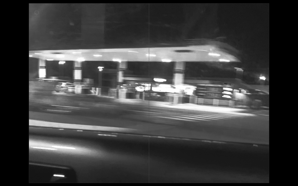
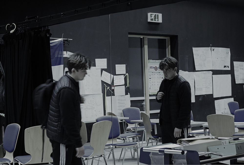
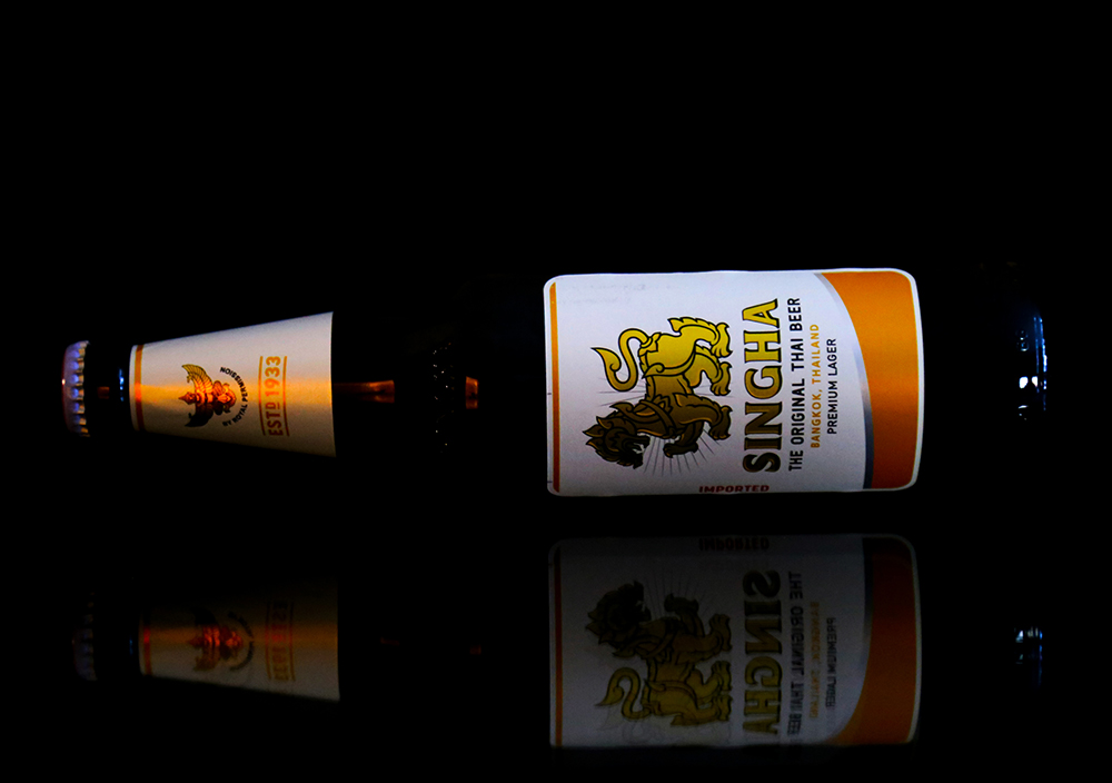
For this image I dropped the saturation near to 0 in order to create a dull effect. I did this to emphasise the lack of happiness and enjoyment that the subject feels about the world and him self. The image itself is meant to depict the detachment and hatred the subject feels toward himself due to his reflection not matching his actions and staring back at him.

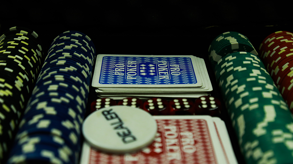
A3 Landscape
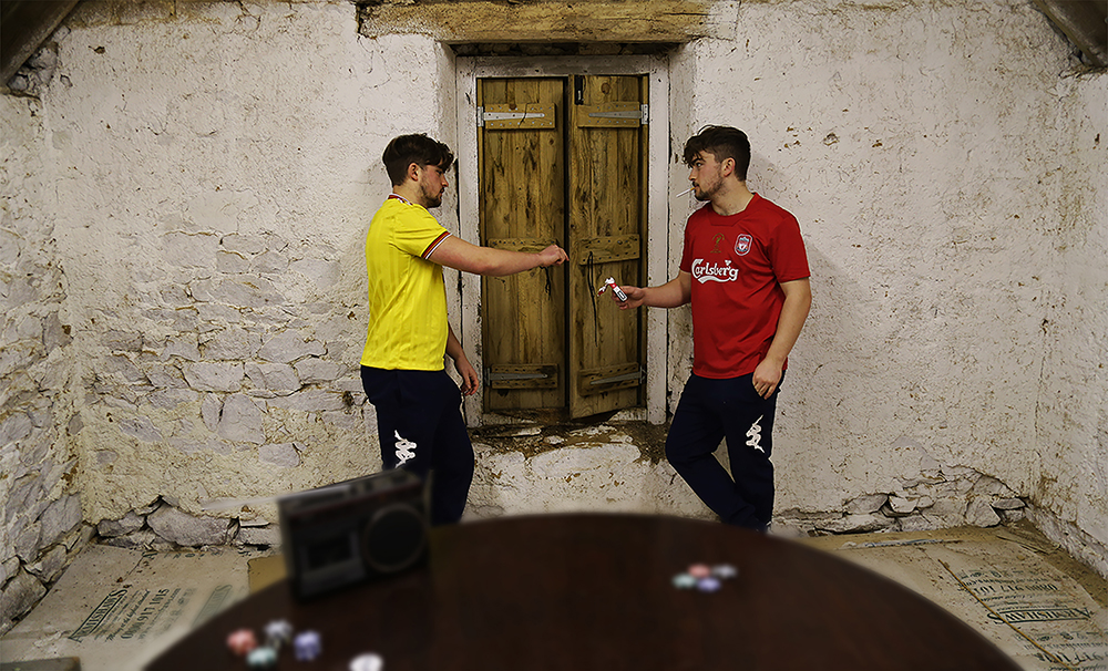
In comparison with the last photo, this image has a high saturation with a bright colour pallet seen in the t-shirts, poker chips and the cigarettes. This image is meant to amplify the commonality of smoking among young male adults. Many images from my photo-book represent the same subject carrying out actions considered ‘taboo’ with a sense of normality and this specific image is the strongest both visually and conceptually.

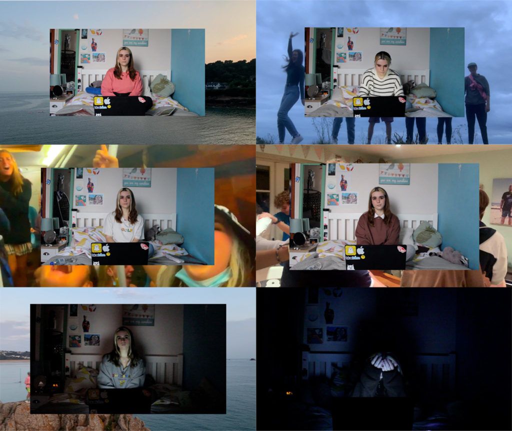
A4 Landscape
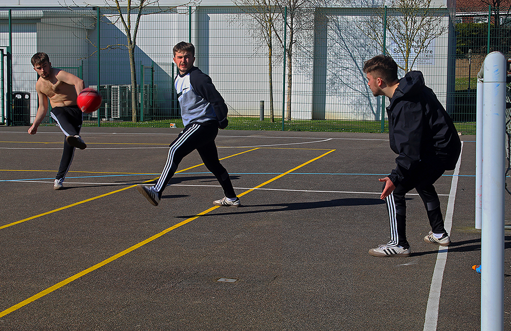
This image is a link to the few things that stay with us from childhood through to adulthood. I created this image with intense colours to emphasise the enjoyment felt by the subject. The subject himself is repeated to amplify that his identity is not needed in order to understand the meaning of the photo

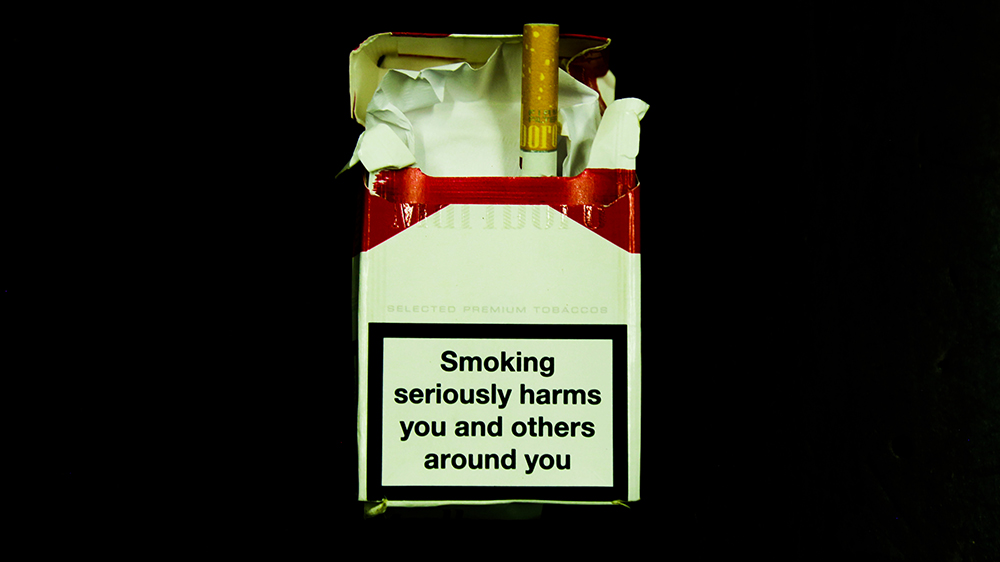
A5 Landscape

Finally, these three images were used to draw attention to the use of the objects in their respective images as it may have otherwise gone unseen. The photos themselves have clear meaning and are presented with no distractions in an attempt to fully emphasise this meaning.

personal study continuation- printing layout

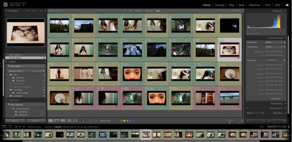
This process had to start with a careful run-through of the finished film in Premiere Pro and, using the frame capture tool, I selected roughly 30 individual frames that I felt worked well not only as single images but also with each other.

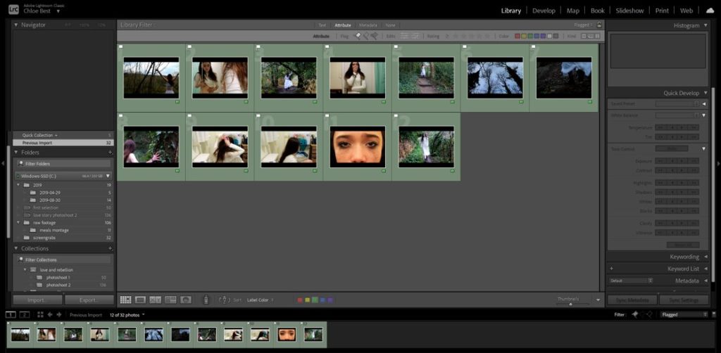
I then imported them into Lightroom in order to continue with the selection process and later the editing process. The first move was to go through using the Colour Label tool and rate them all either red, yellow or green.

Then I went through and filtered out all the “red” and “yellow” ones which didn’t work out or were near-duplicates of other images/frames. After I re-evaluated my chosen images and removed any that didn’t particularly fit in well with the others.

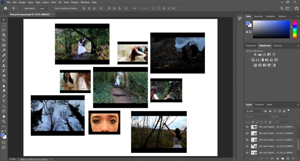
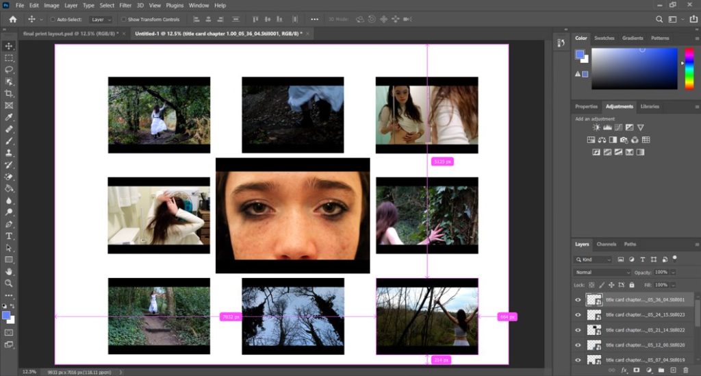
Next, I organised them around, experimenting until I came up with two different layouts, with different concepts but both utilising the chronology of the film and with varying image sizes. Because I’m using an odd number of images (9) they both are more oriented circularly, but the differences are that while the second is central to a single image, the first version revolves around a chronological group of three images, with the remaining ones grouped around them in groups of which are most aesthetically pleasing together.

After careful consideration, I am choosing to use version 1 for my final print layout, because I think it has a more interesting organisation and spacing and the images are more varied in terms of sizes. It also follows the theme of pairings of threes that I used in the actual film, so it stays close to the source material and my original ideas.