In the polishing up of the film I realised that I needed a suitable title and design that would work for the film. I worked with the following websites:
Free Logo Maker – Get Custom Logo Designs in Minutes | Looka
https://www.wix.com/logo/maker/
Possible Logos:
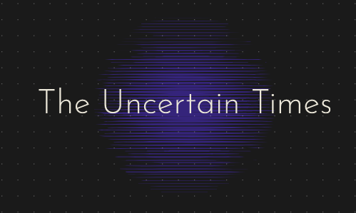
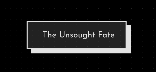
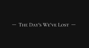
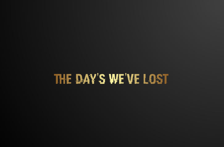
Final Decision:
I really liked this design however I could not get it to the correct resolution; therefore I found a similar font and made a logo on word. I thought that a deeper black would work better because in some frames of the film where I don’t add visuals (in order for the audience to focus on the audio) the frame is a deep black so I needed something to compliment that. I also noticed my typo so I fixed that with the final cover.

Low Resolution 
Final product
