Photo-shoots & Editing
My photobook project was largely based on archival imagery accumulated over the past year both on my phone and camera, with many also being taken specifically for the project. All the images with the objects on a plain white background were also taken as part of a couple photo-shoots specifically for the project in order to compliment the portrait photos you will see. These have a significant meaning behind them and are up for interpretation by anyone who reads my book.
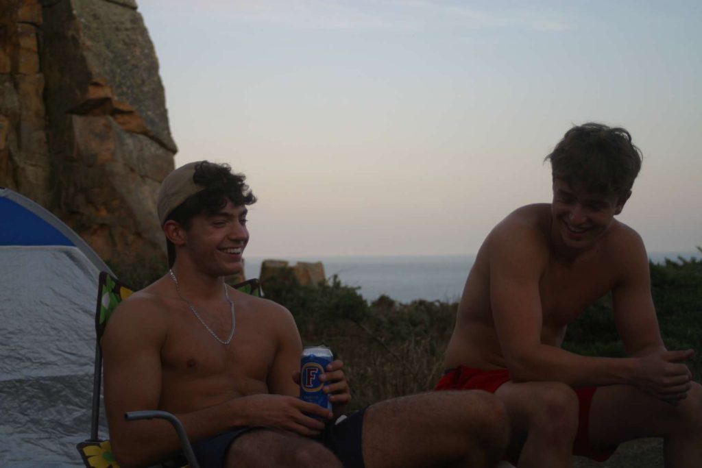
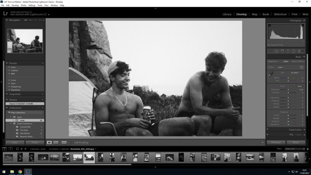
The photo above was taken on a night out camping. The photo was taken on a DSLR camera for memory in the future when we look back at the photos. This exact photo is one of only a handful or archival imagery but suited the job perfectly. The exposure from the onset was very low, especially considering that it was taken during sunset. For my photo book, I wanted black and white as a strong and reoccurring theme, so I used Photoshop CC, adjusting the integrated ‘levels’ and ‘black and white’ feature, with a bit of contrast and grain increased to give it that vintage, Mapplethorpe and Weinberger style. The exposure and highlights were tweaked more heavily in order to alter the darkness of the original photo, and allow it to “pop” more in the final prints.
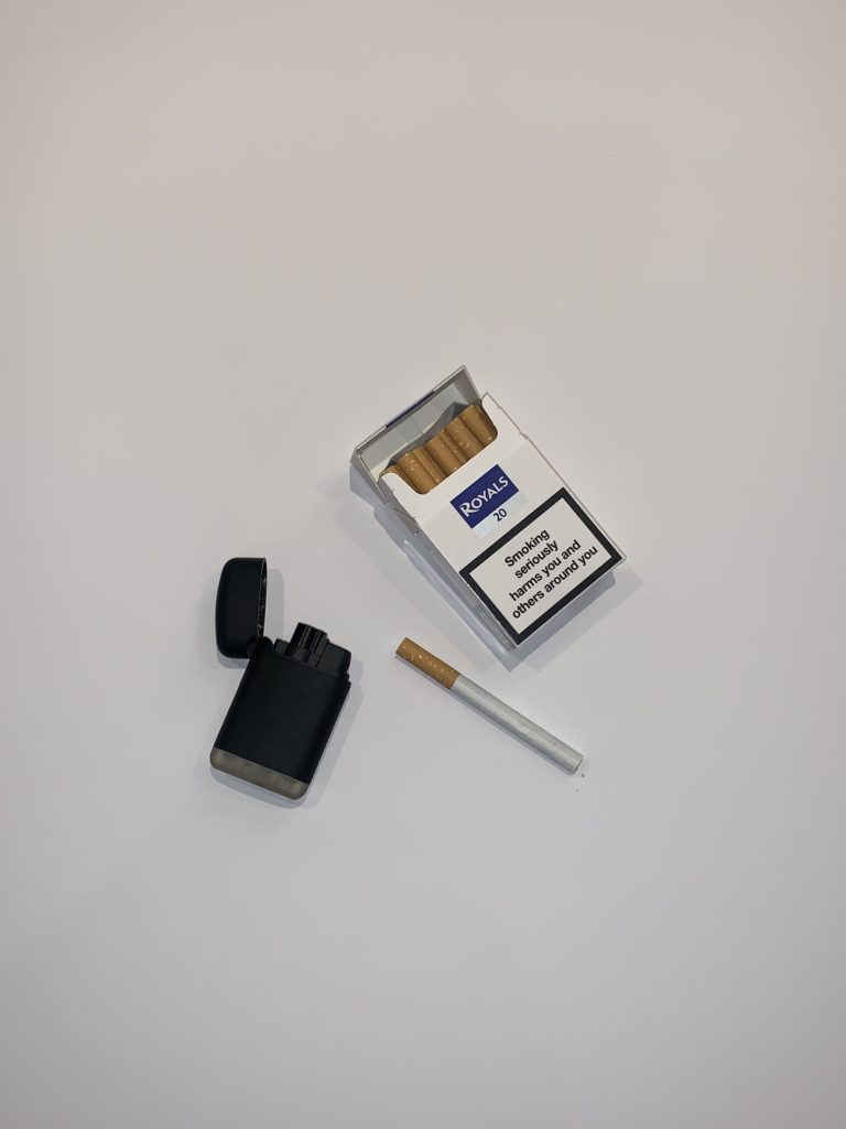
The photo below is one of the many left hand-side pages where I took photos of objects with significant relevance to the portrait photo adjacent on the right hand-side page. It was taken well so I didn’t need to crop it, rotate or re-scale it at all. Again, as previously mentioned, all this photo needed was to be edited on Photoshop CC to be made black and white using the ‘levels’ and ‘black and white’ feature, with a bit of contrast increased, as well as grain and exposure increased but only minimally to give it that vintage, Mapplethorpe and Weinberger style.
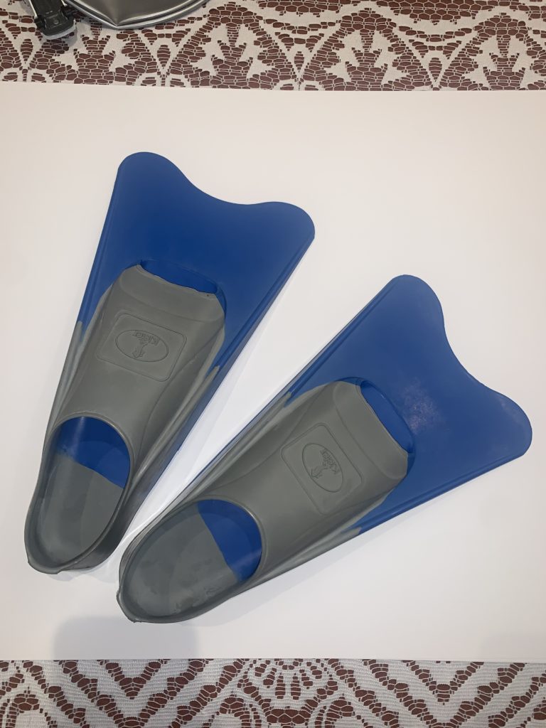
As one can observe in the photo taken below, some photos needed cropping as the items/objects were too large to fit in the normal aspect ratio, so needed to be cropped into a square later on in Photoshop CC.
Book Layout
For the photobook project, I decided it would be best to use Adobe Lightroom Classic CC and its integrated “book” feature that collects all your edited images at once and presents them in the form of a book, where it enabled me to edit and move photos further in order to have the book to my liking, in chronological order and laid out in a way that makes sense.
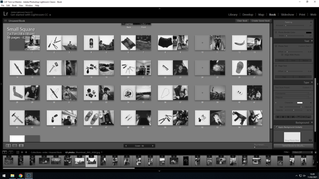
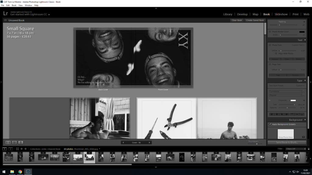
As you can see, the book follows a similar theme throughout. Every first page on a double page spread has a unique white background with an item positioned in the centre of the photograph. Normally, but not always, the photo has either some relevance to the photo adjacent, however not always, which keeps the reader/observer guessing the meaning behind each photo and the book/story as a whole, which makes for a more interesting book.
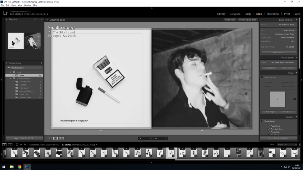
Sometimes, such as the screenshot above with the cigarette, the photos of the object on the left-hand page include an item that was included in the photo first-hand. Other times however, the object is someone’s dear possession, an item they cherish or wear, be it in the photo or not.
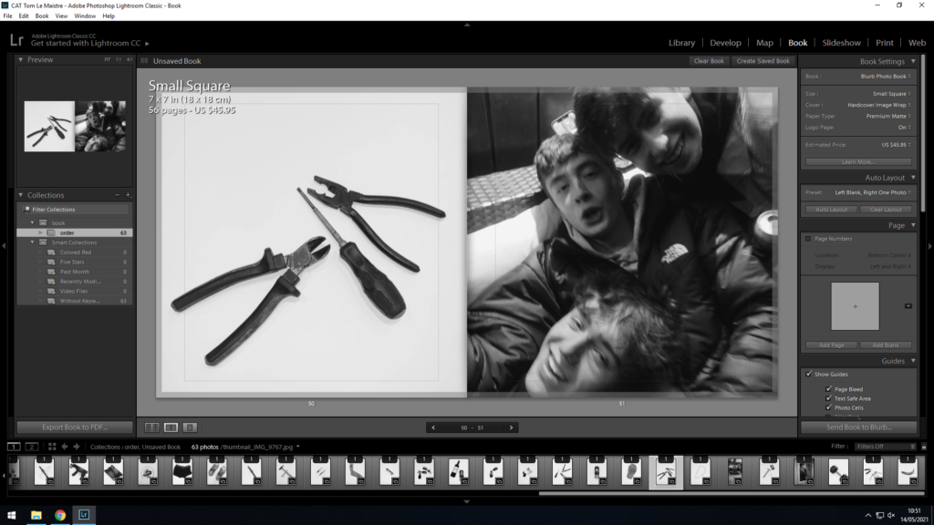
Occasionally, for example with the screwdrivers and tools, the items have no relevance to the photo, (although this may be up for interpretation), except for the fact that the items have been positioned to resemble the people or subject in the photo. As you can see, I you look closely, the tools are made to resemble each one of my mates. Some may also suggest that I’m referring to my mates as ‘tools’… you wouldn’t be wrong.
These photos were taken simply on white A2 paper, with camera flash enabled as well as including lights from all angles except from above, in order to highlight all the minute details but also no light beaming down from above to avoid ugly shadows. The light from the sides had to cover every angle/perimeter of the photo in order to enable complete light coverage and the minimization of shadows. This allows for a great contrast and makes for striking photos, that contrast well with the following photos that are normally darker toned environmental portraits, not staged objects in studio lighting, which allows for a great disparity between the two. This makes the book less repetitive and thus ore interesting for the reader/observer.
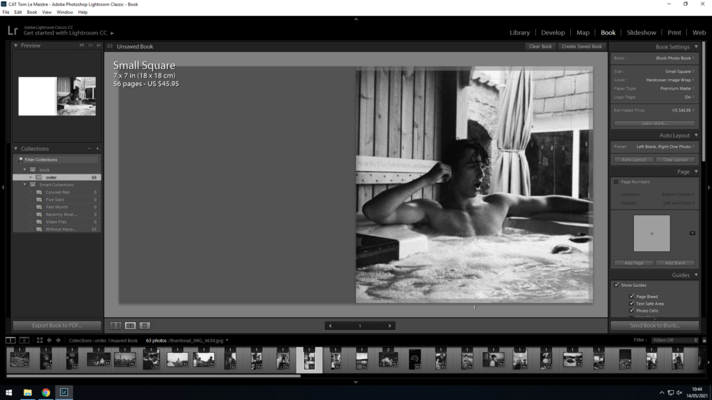
Furthermore, you may observe the occasional grey page as shown in the screenshot above, initially where photos had ran out but also a “happy accident” I guess, as they allow pages act as a sort of division in the book, signifying a new chapter per se, but also a breaking up the book and preventing repetition, as these pages occur around every 12-16 pages.
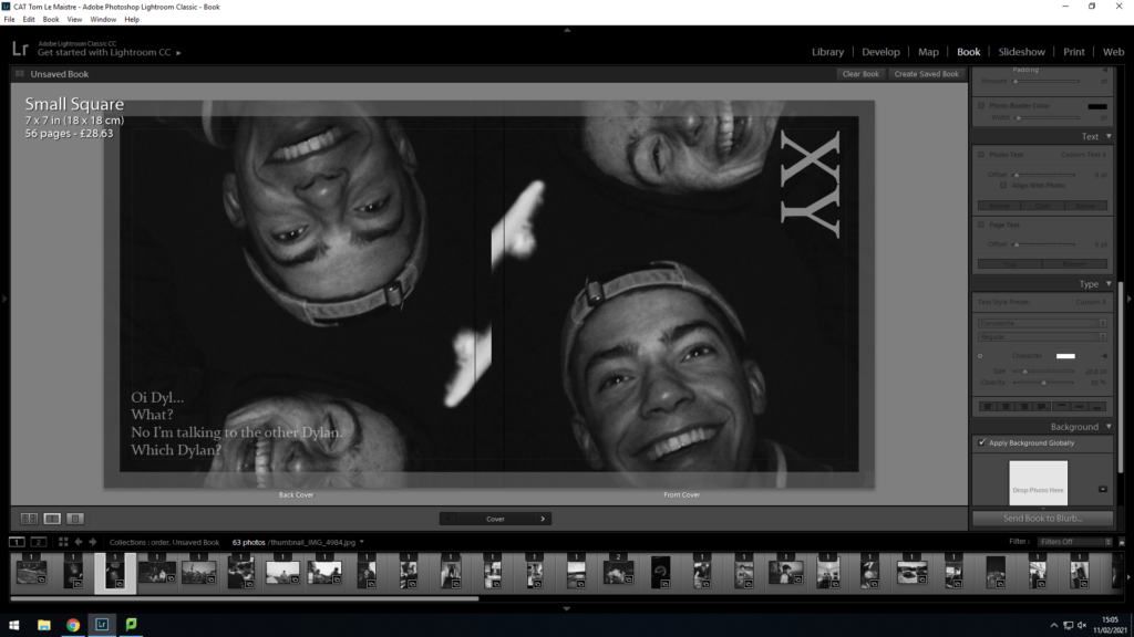
Lastly, the front and back of the book also had much thought considered during their creation. The photo included on the front cover was easily chosen as it just made the perfect cover. I love how the photo not only is archival, but taken by accident, with both me and my mate sharing a strong happiness that many people unfortunately struggle to find nowadays. This happy and colourful vibe contrasted with the dark tones of the summer night, makes for an interesting photo, where the happiness beams back at the observer as it stands out from the darkness of the background, suggesting it’s a cheerful, jokey, typically teenage book of stupid and cocky adolescents.
To me, it made sense to repeat the photo on the backside of the book too, as this means there is no border between the photos as the dark colours mean the book’s front and back page blend seamlessly with its dark colours and therefore allow for a smoother looking, well put together book. The back page also has a small, goofy quote written in order to segregate the two pages but also add a bit more interest. The quirky quote is often heard from both my mates simultaneously and is a mention to the fact that both my best mates share the exact same forename, hence every time I say their name to one of them, neither of them knows which I’m speaking to. The quote can be regarded as funny, and a little bit odd, and without context, seems to fit in perfectly with the books theme as a whole. As a result, I’ve finally resorted to referring to them by their surnames to avoid confusion.
Evaluation
Overall, the book went exactly the way I envisioned. My ideas and thought processes all came to reality, and the book turned out exactly how I wanted it. My only criticism would be that the picture quality in most of the pictures could do with being a higher resolution which mainly boils down to the original camera’s resolution being sub par. This was mostly fixed in Photoshop CC where I increased the size and resolution of the images and exported them at the highest quality possible. Despite this however, I’m happy with the way the majority of the photos turned out, especially the ones with the white background which I was surprised to how well they turned out in the book especially.
