1 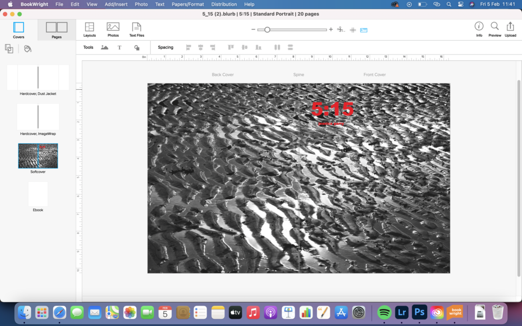
2 
3 
4 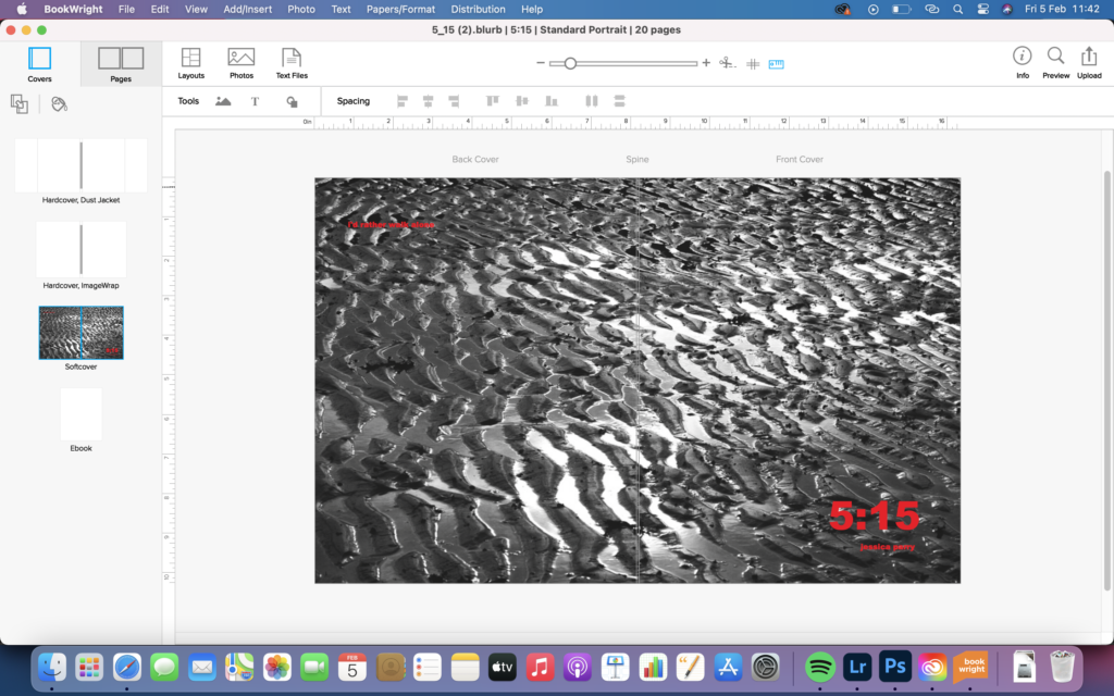
5 
6
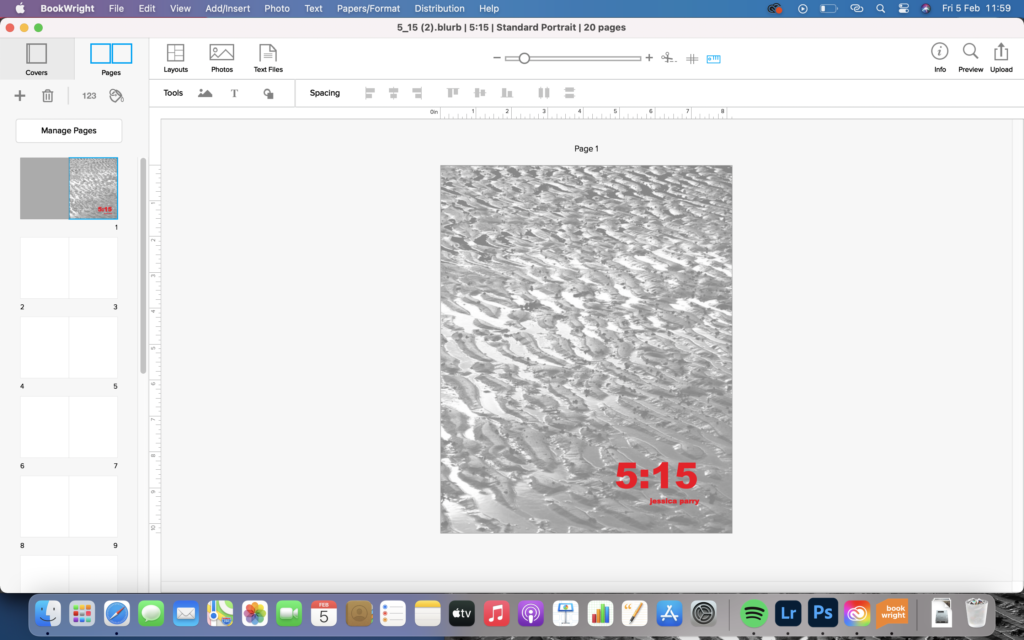
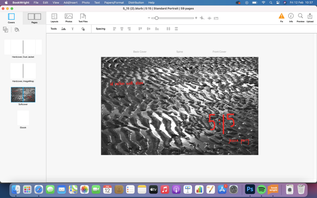
I started creating my front cover. I wanted the image to be very abstract, and create questions for the viewer as to what the book was going to portray. I have named the book ‘5:15’ because that is the time I wake up everyday and the images that are included in my book essentially illustrate what shows what I do during my waking hours, how I feel and who I am. image 1 and 3 shows my first layout for the cover, I personally didn’t feel the placement worked and didn’t want the title and my name to be separated. image 2 and 4 shows another layout that I liked, where the title and name was placed together. I felt this worked better. I knew when I started the planning process of my book I wanted the quote “id rather walk alone” on the front cover. image 5 and 6 shows my processes of working out the placement of this quote. I felt it needed to be diagonally placed from the title and my name, as this aesthetically looks very neat. I felt that in image 6 the quote was placed incorrectly and it was too hard to read it on the white parts of the strongly contrasted image. image 5 was the final cover
I then wanted my first page to have the same image as my front cover but slightly faded. I did this by adjusting it in photoshop. I then used the same placement of the title and my name as the front cover on this page.
1 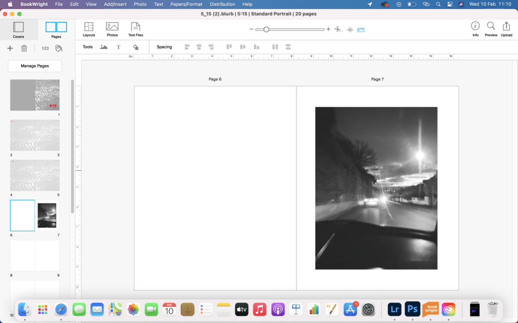
2 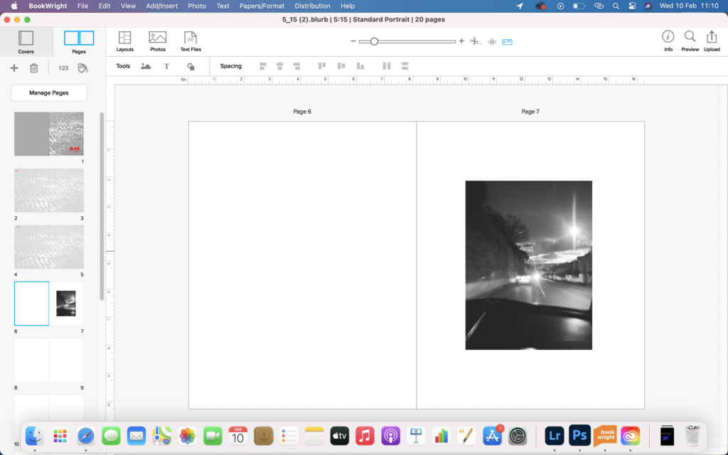
3
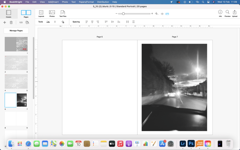
image 1 shows my first placement of the image. I found it was too big and overwhelming on the page. image 2 was the image slightly smaller, but I found that it still wasn’t the perfect size and needed more of a surrounding space around it. image 3 is the perfect size of the image and meant that it wasn’t too overpowering on the page.
1 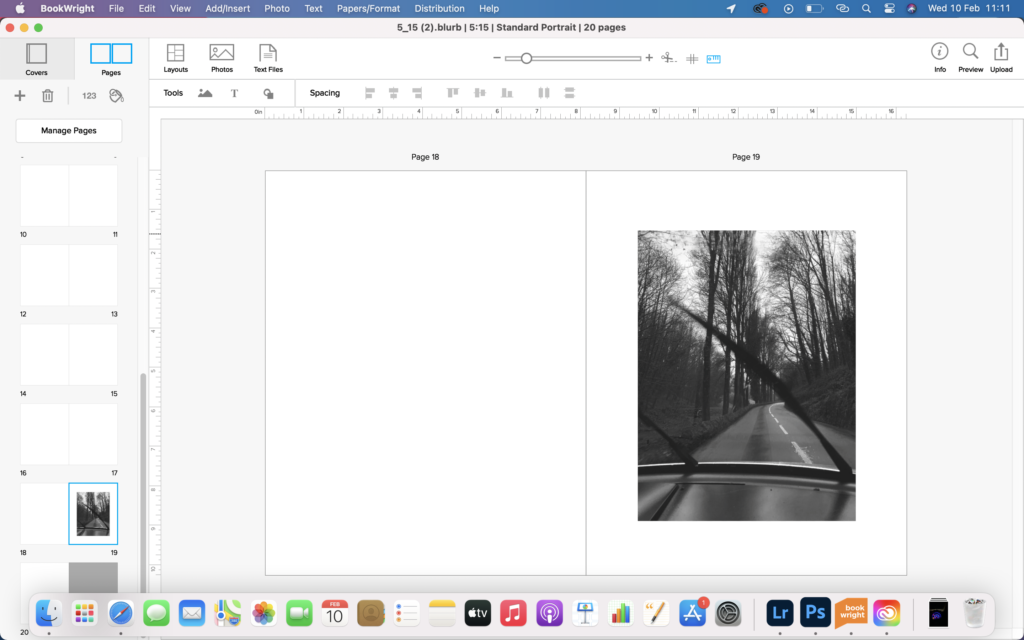
2 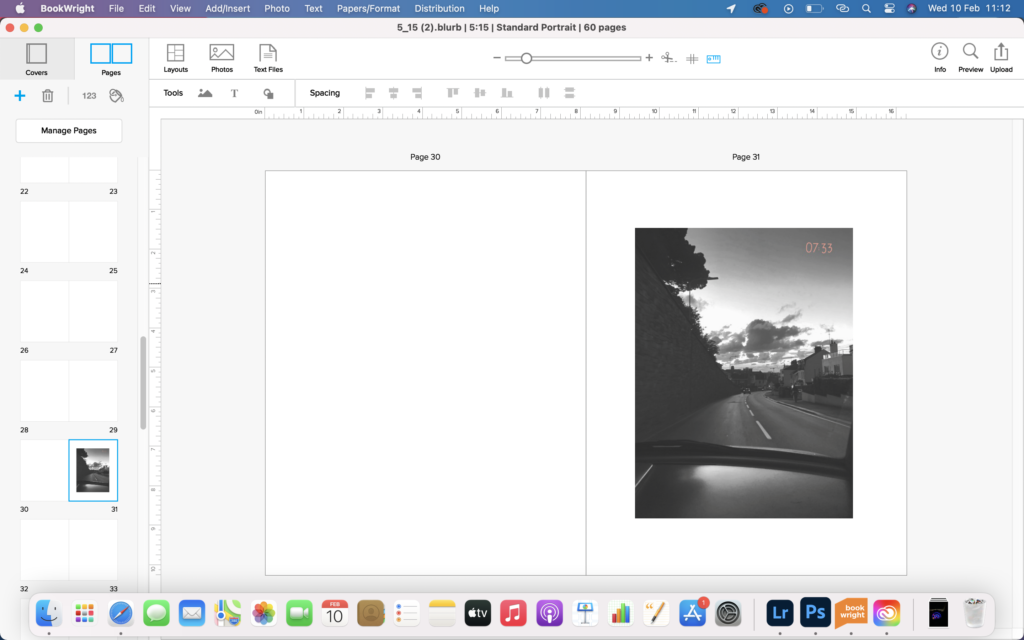
3 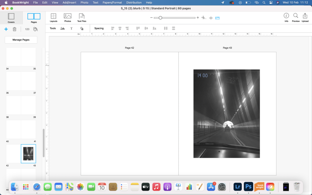
4 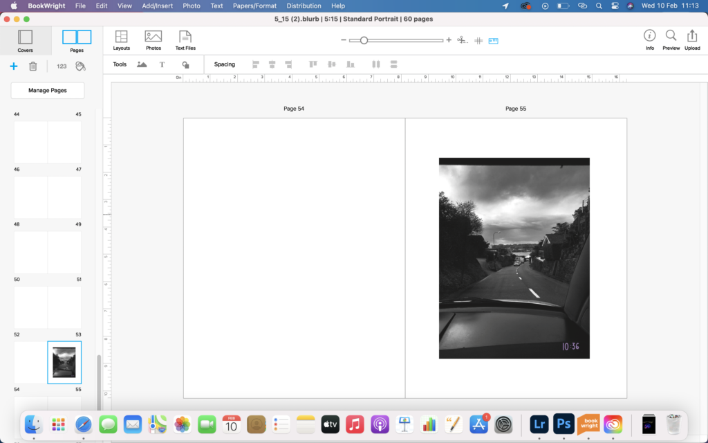
5
all of these images are very similar and are placed periodically throughout the book to separate the narrative up.
1 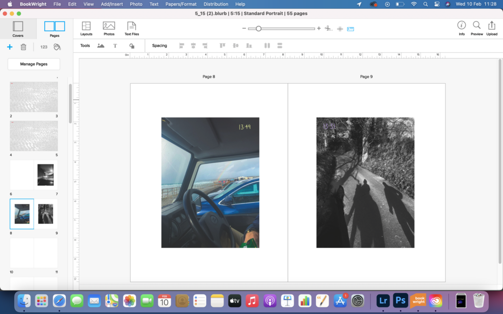
2
image 1 shows one way I placed these 2 images, I felt this way worked best because the compositions of both images looked nice like this. image 2 shows another way I could have placed them, but I felt this didn’t really work as image on the left looks odd there, as the image just ends there.
1 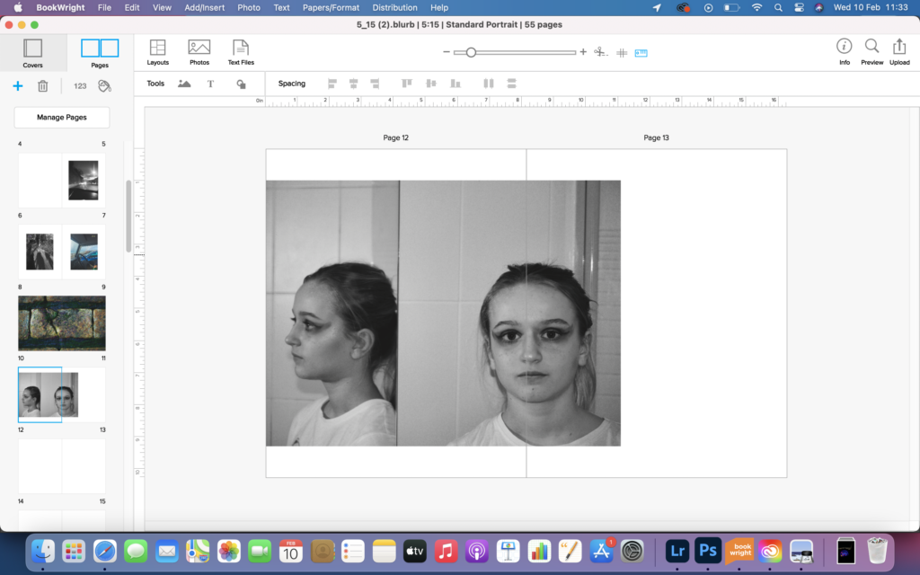
2 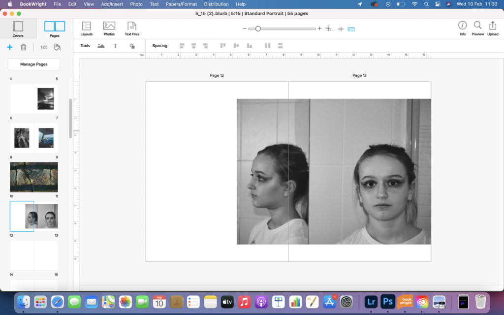
3 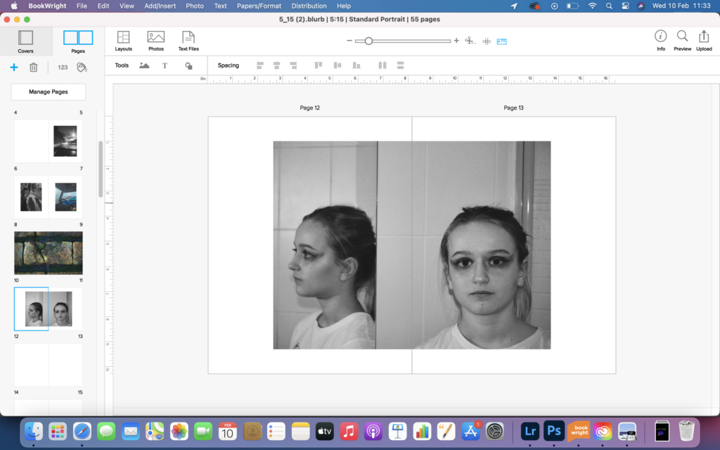
4
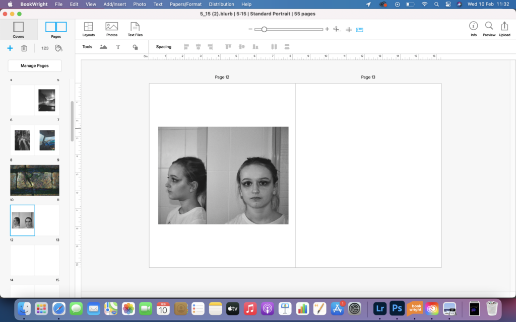
image 1 shows the image just placed on the left page, I felt this looked odd and didn’t look aesthetically pleasing. image 2 showed the image placed more to the left, and slightly larger. This placement is not great because the face is placed directly on the centre of the double page spread. image 3 is the image placed to the right of the book. I find this looks good because the centre line of the double page spread is in a place that works for the images and almost separates the image into 2 images entirely, however but line sits on the face reflected in an odd place and I don’t like this. image 4 shows the image placed slap bang in the centre of the double page spread and works similarly to image 3, in the sense that it separates the image into 2 images. the significance of this aspect is important because it show disassociation and how the two figures, both real and reflected are two separate entities.
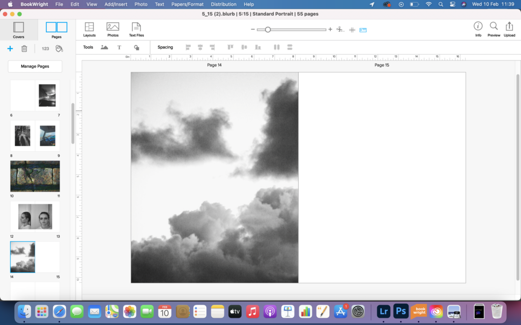
1 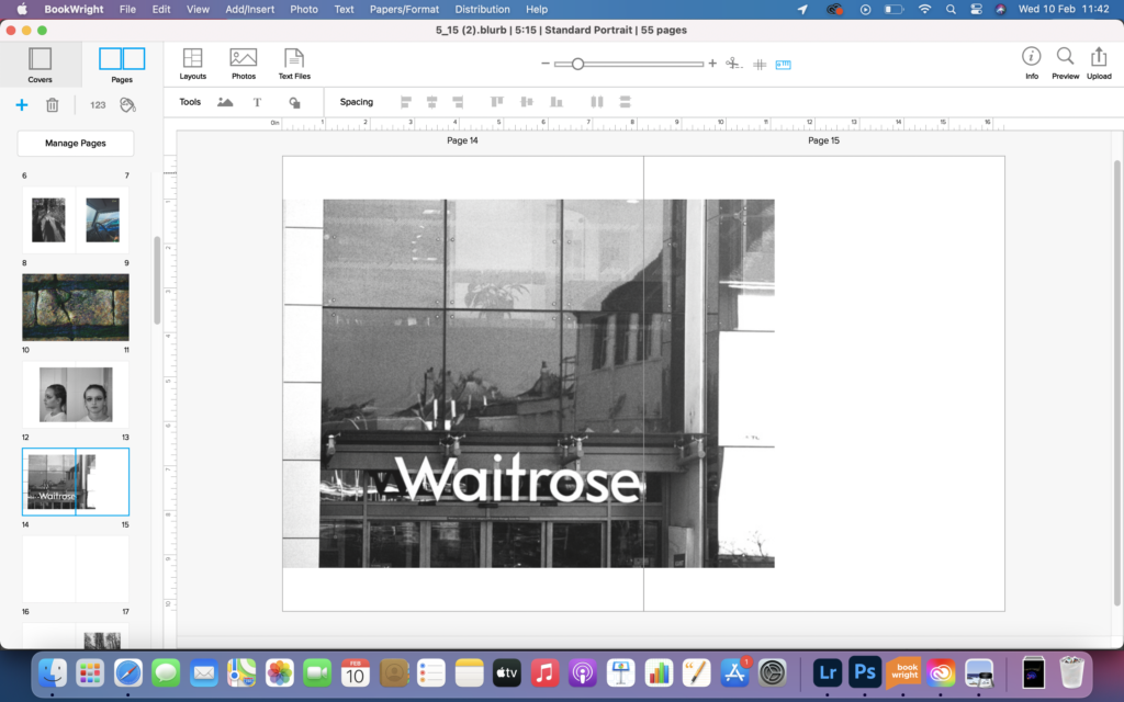
2 
3
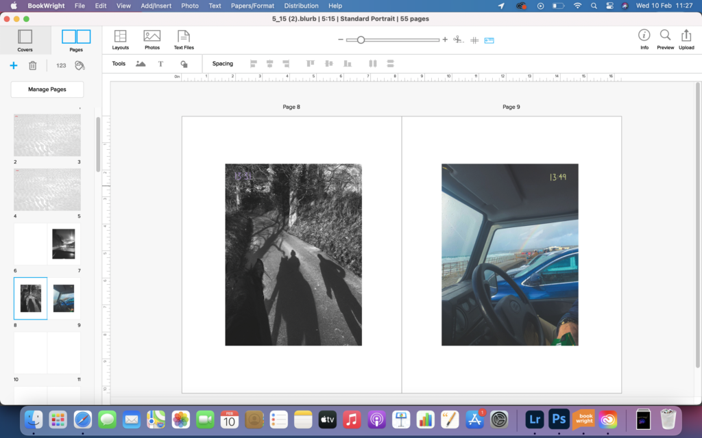
image 1, 2 and 3 show the development of this spread. I found that image 3 looks the best because it is full of colour and in the book the few previous images have been predominantly black and white. The change to the colour left the book feeling fresh and not too samey.
1 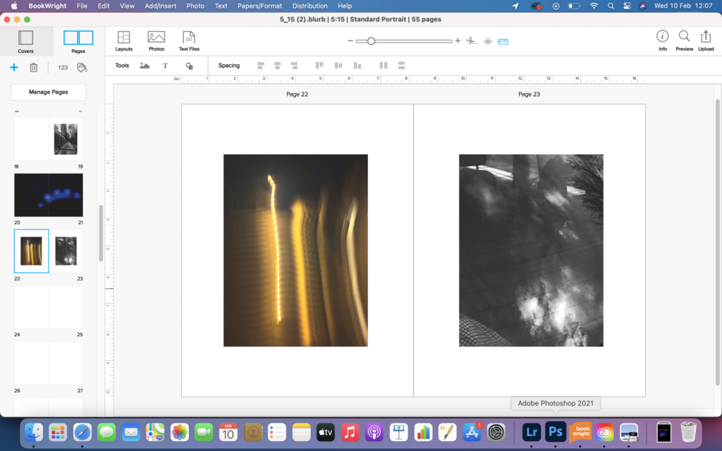
2 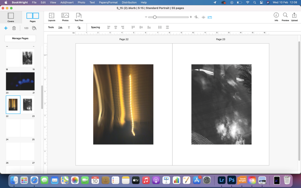
3
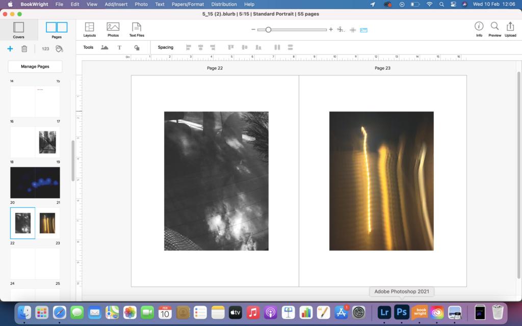
image 1 shows the first arrangement of a spread that contained two very abstract images. I found this spread was not very correct and lacked aesthetically aspects. image 2 shows an alternative arrangement, however I feel it still didn’t look great, as the light was coming from the same place. image 3 shows how I changed the orientation of the image and makes the overall spread looks better and more succinct.
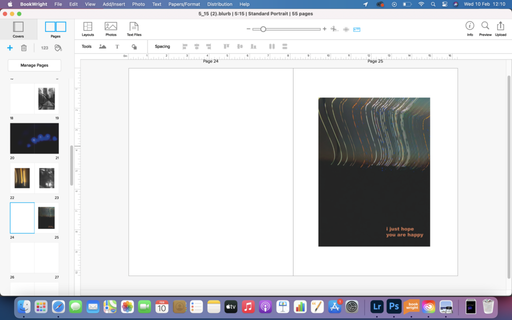
1 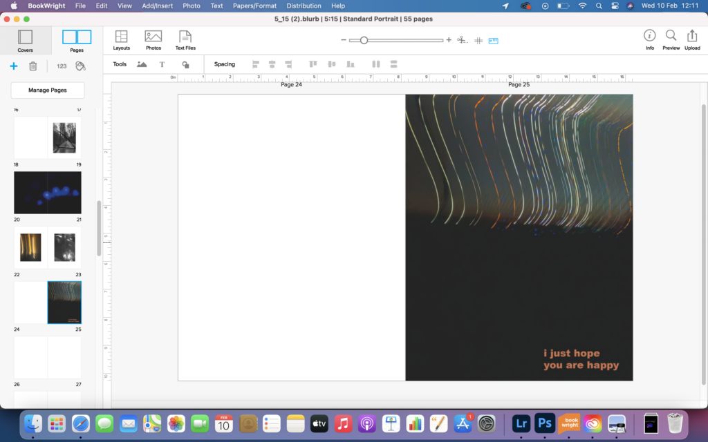
2 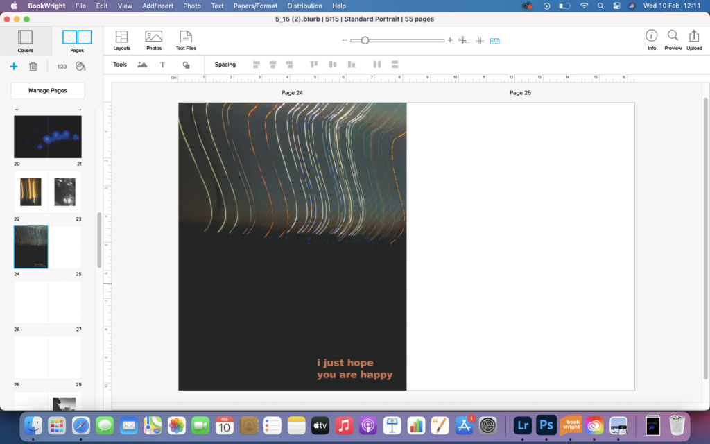
3 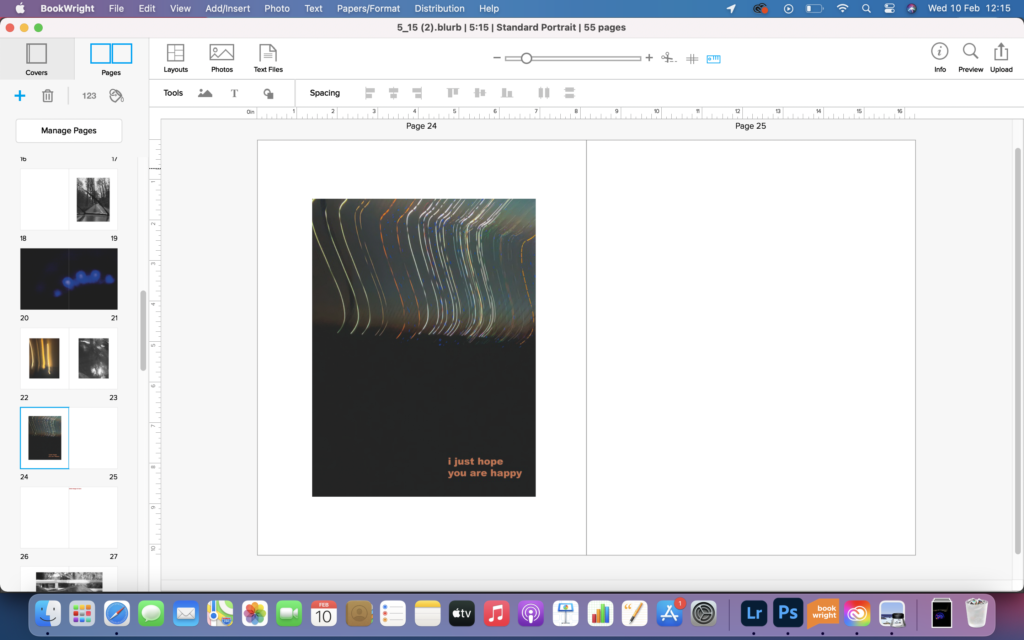
4
image 1 and 4 show 2 different ways I could have presented this image in the centre of the page, I preferred it on the right as I liked the writing on the bottom righthand side as it looked aesthetically pleasing. image 2 and 3 shows 2 different ways I could have presented the image as a full page. I didn’t really like this as it was too full on and needed some white space around.
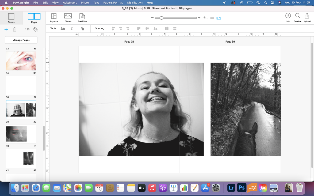
1 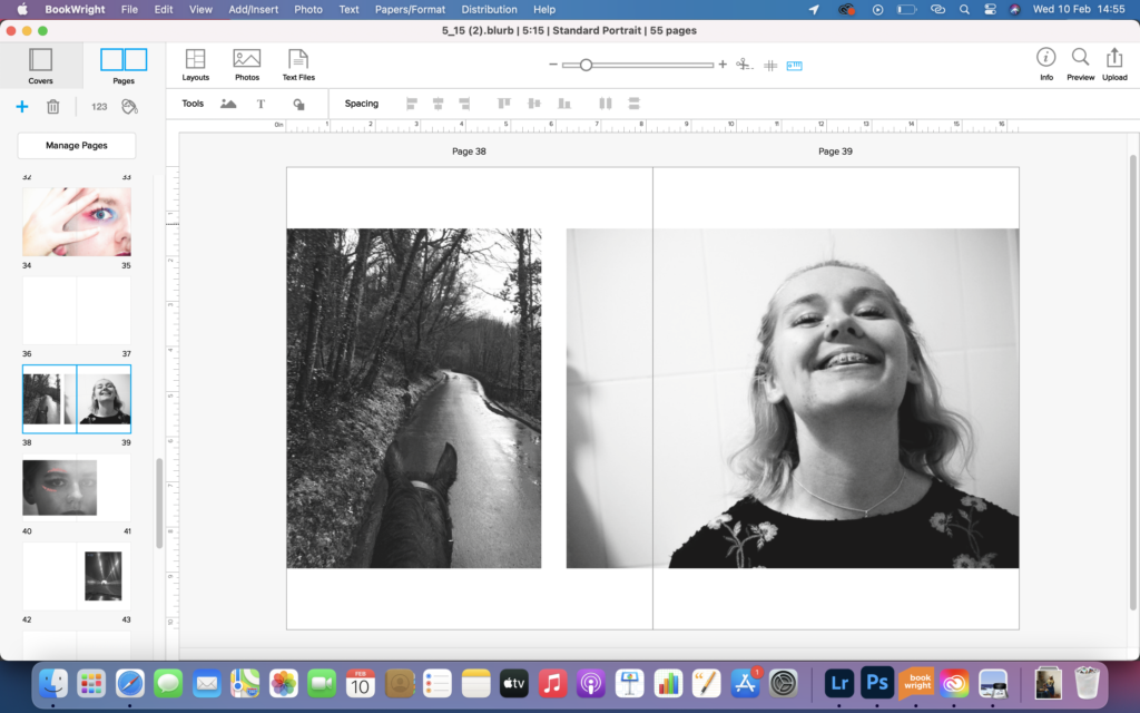
2
image 1 shows the placement of these 2 images. I didn’t feel it looked great this way because the centre line of the double page spread cut through the portrait and ruined the aesthetics of the page. image 2 shows an alternative arrangement of the 2 images. this arrangement works best because the centre page line sits better on the portrait.
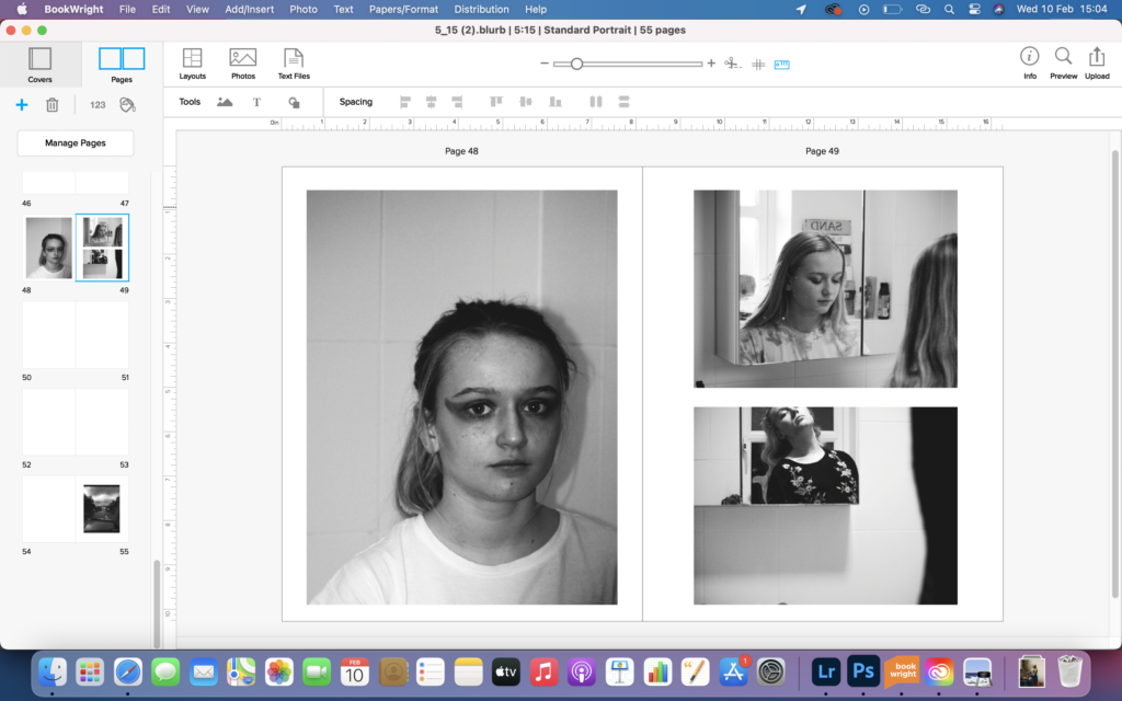
1 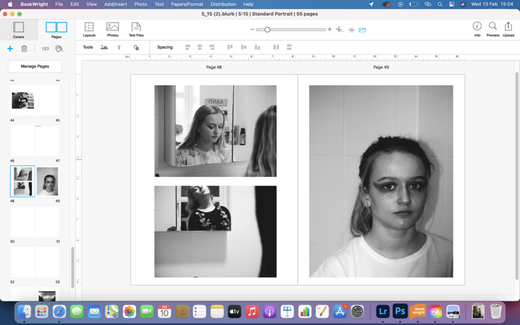
2 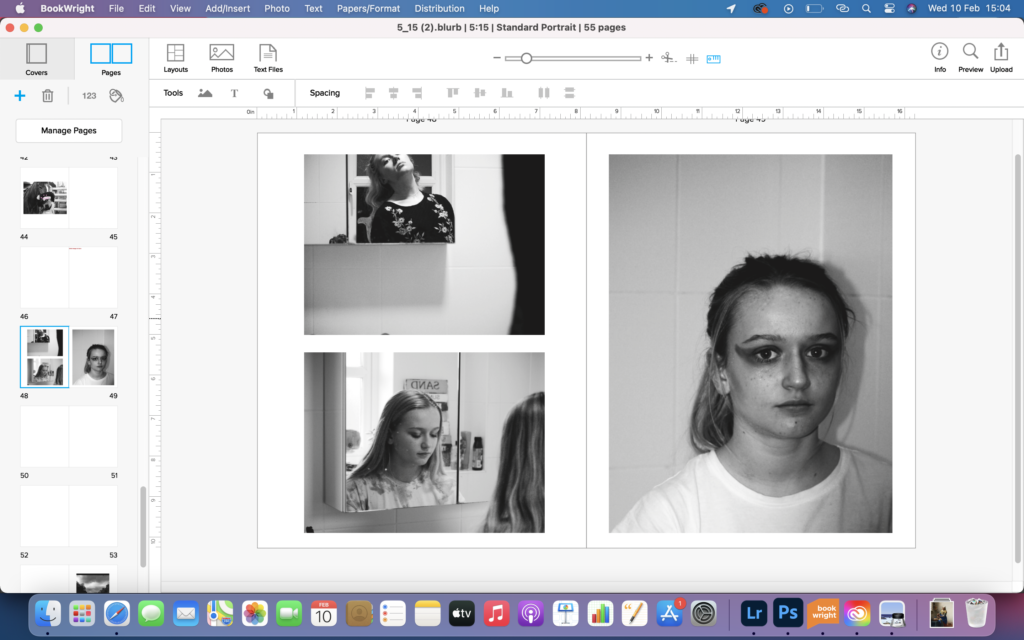
3
image 1 shows a potential placement of 3 images. I feel this doesn’t look great as the single portrait sits unbalanced and doesn’t really look great next to the other 2 images. image 2 shows an alternative arrangement which to me looks the best and the foregrounds of the two images on the left sit nicely on the centre line of the double spread. image 3 shows a different arrangement of the two images on one side of the page. I found this arrangement looked off because the figures in the foreground didn’t flow from one to another.
1 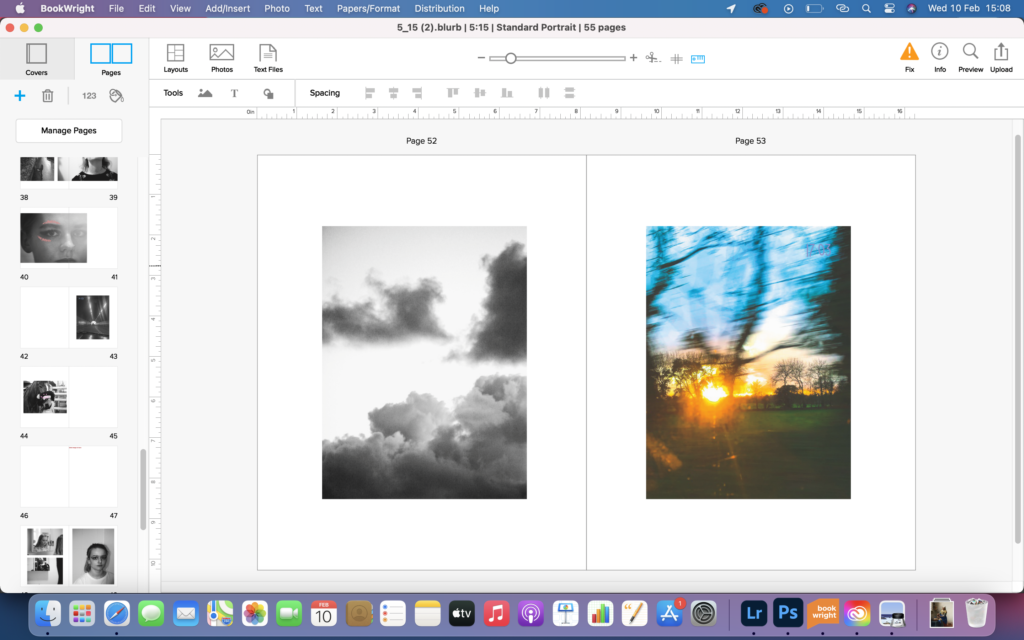
2 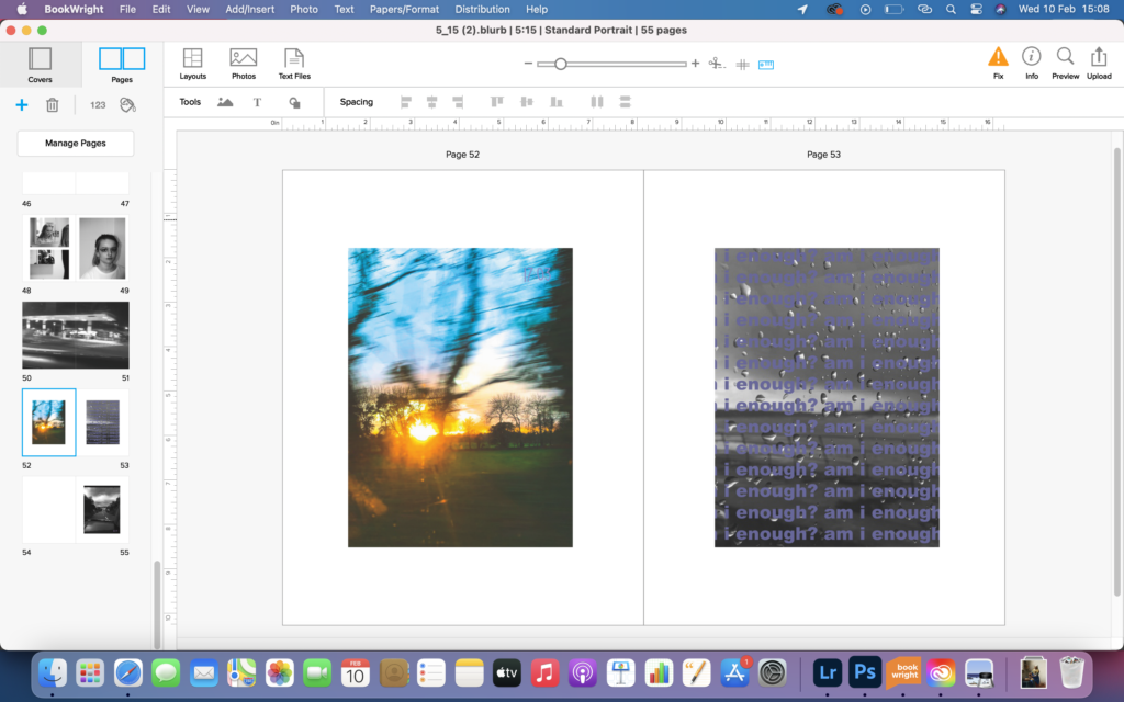
3 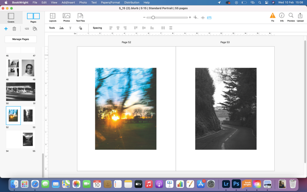
4
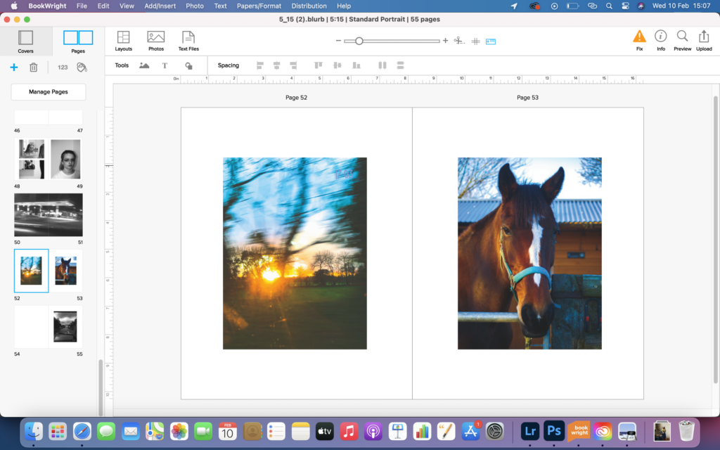
image 1 shows a spread of 2 images. I felt these images didn’t work great together because they are both very similar in colour and dont complement each other. image 2 shows another potential spread, however like the image 1 doesn’t really work either, as the are both very busy. this spread did make me realise that the 1 of the 2 image needed to be black and white to create a contrast between the 2. image 3 shows a spread that contained an image with words. I felt this didn’t really work either, as the words were distracting and took the focus away from the colourful image to the left of it. image 4 shows the chosen spread. I used this black and white image with the colourful image because 1 was full of movement and the other 1 was still and juxtaposed nicely.
1 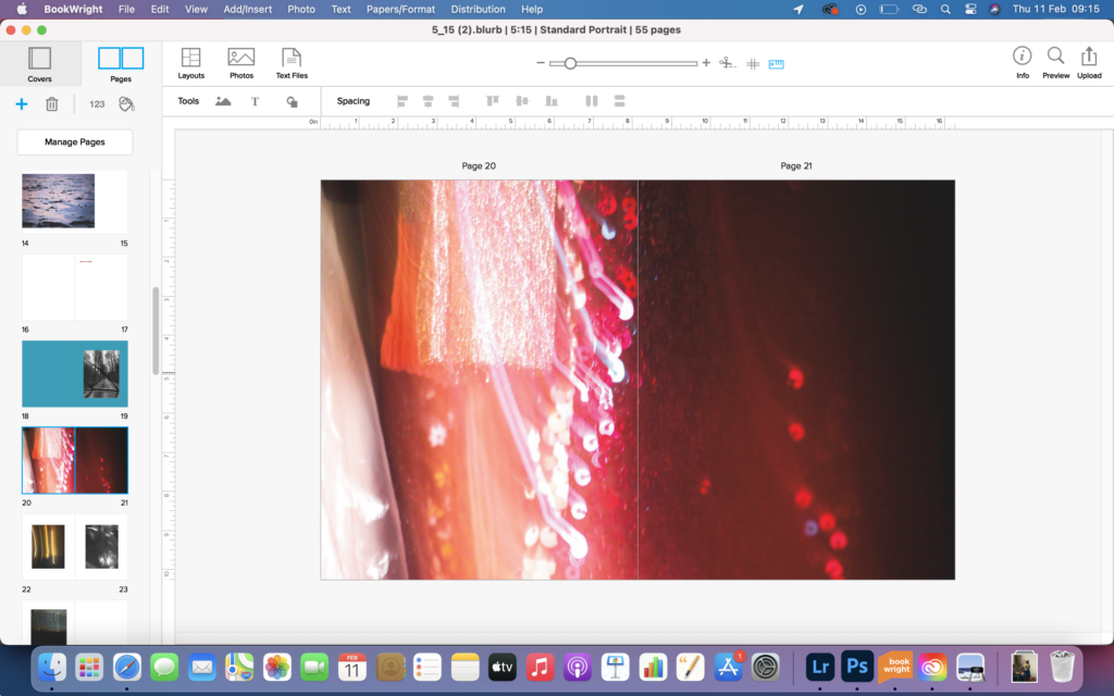
2 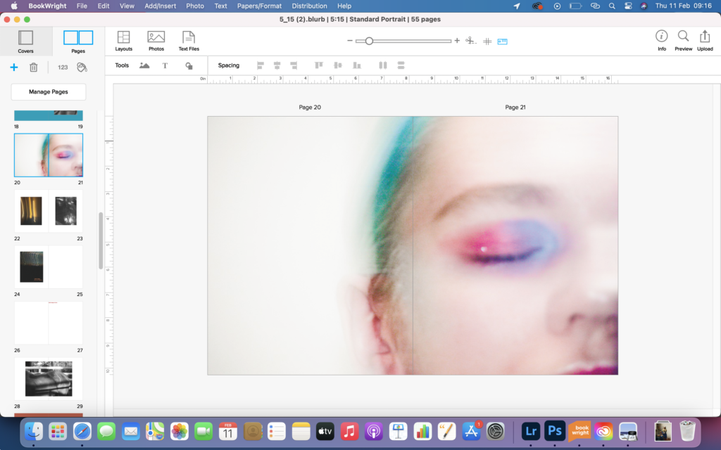
3 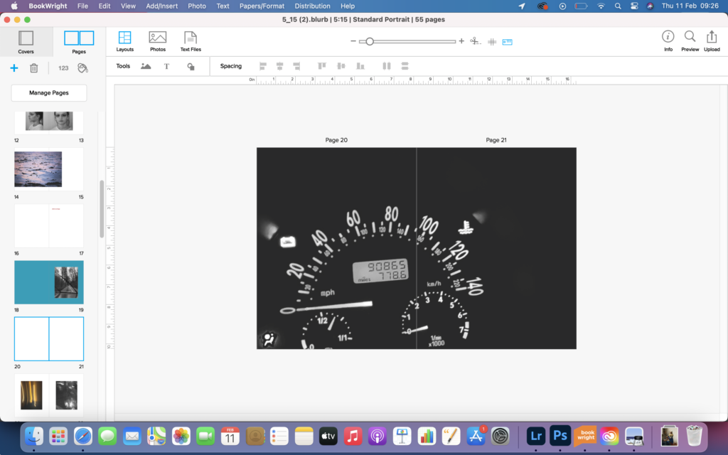
4
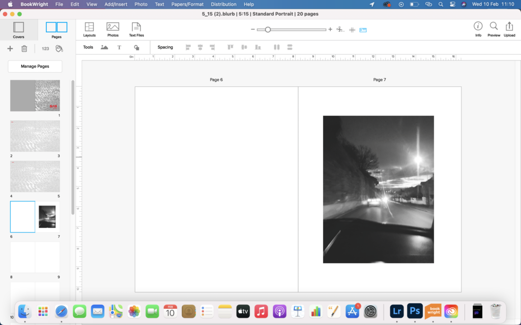
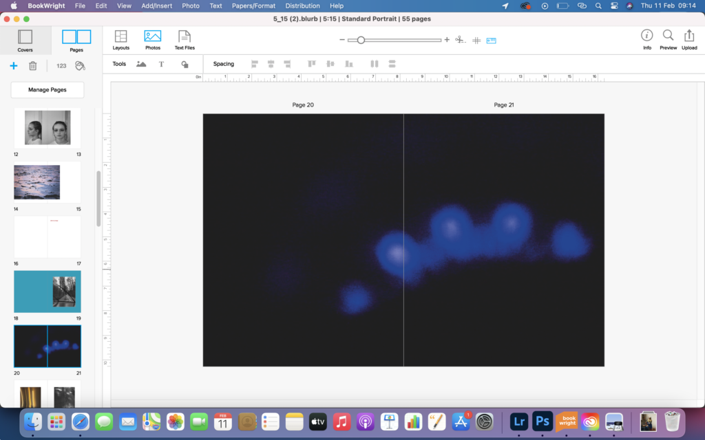
image 1 shows the image that I used in my first draft of the book, however I felt it lacks interest, was too simple and also didn’t really relate to the narrative of my book. image 2 was of a photo that I really liked but like image 1 didn’t really relate to the narrative of my book either. image 3 included an image that was similar to another and I didn’t want the book to be too samey so it was rejected. image 4 shows a full bleed of an image that is similar to the photograph in image 1 but has a much more clearer and purpose for the book. I chose a full bleed for this image because I found it was an important image for the narrative, and represented speed, time and travel.
1 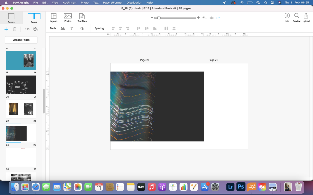
2 
3
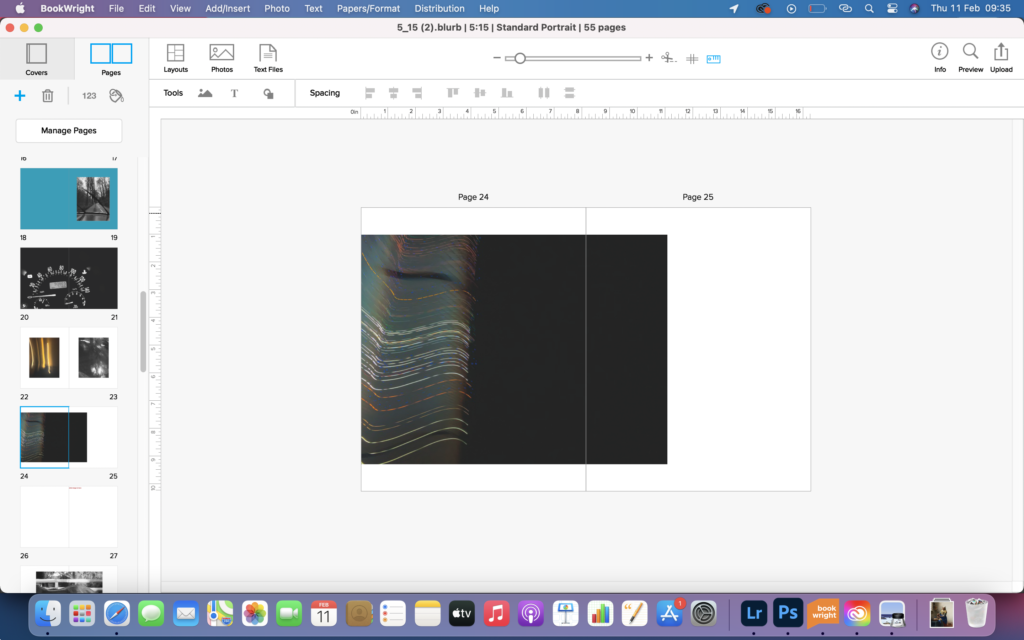
I had used this image in the first draft of my book but it had a piece of text in the bottom righthand corner and I felt this was distracting and didn’t help with the minimalistic, clean and sleek feel I was going for with the book. image 1 shows the image with a different orientation and without the piece of text. on reflection I felt the image lacked interest so decided to reedit the image and increase the saturation to brighten up the streaks of light. I also cropped and flipped it too as there was too much negative black space within the image and which left the streaks of light being the smaller element of the piece, whereas I wanted it to be the larger element of the piece. image 3 was the final version of the photograph and placement in the photo book.
1 
2 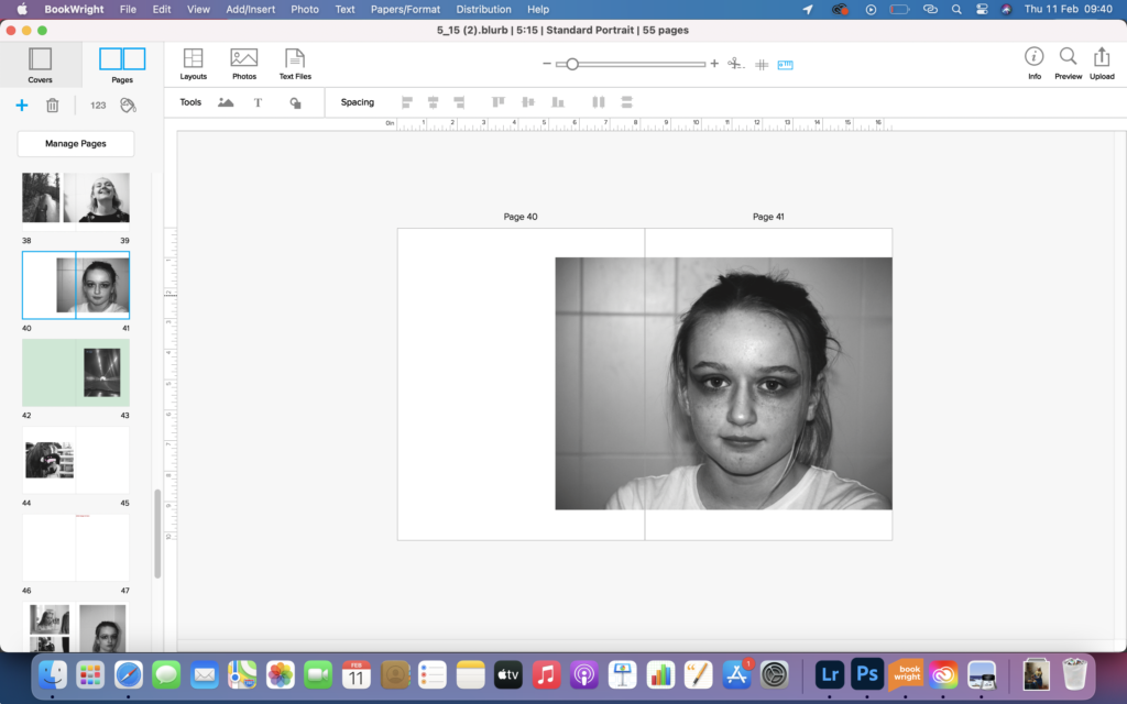
3 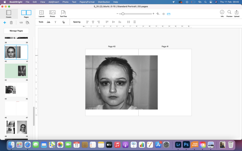
4
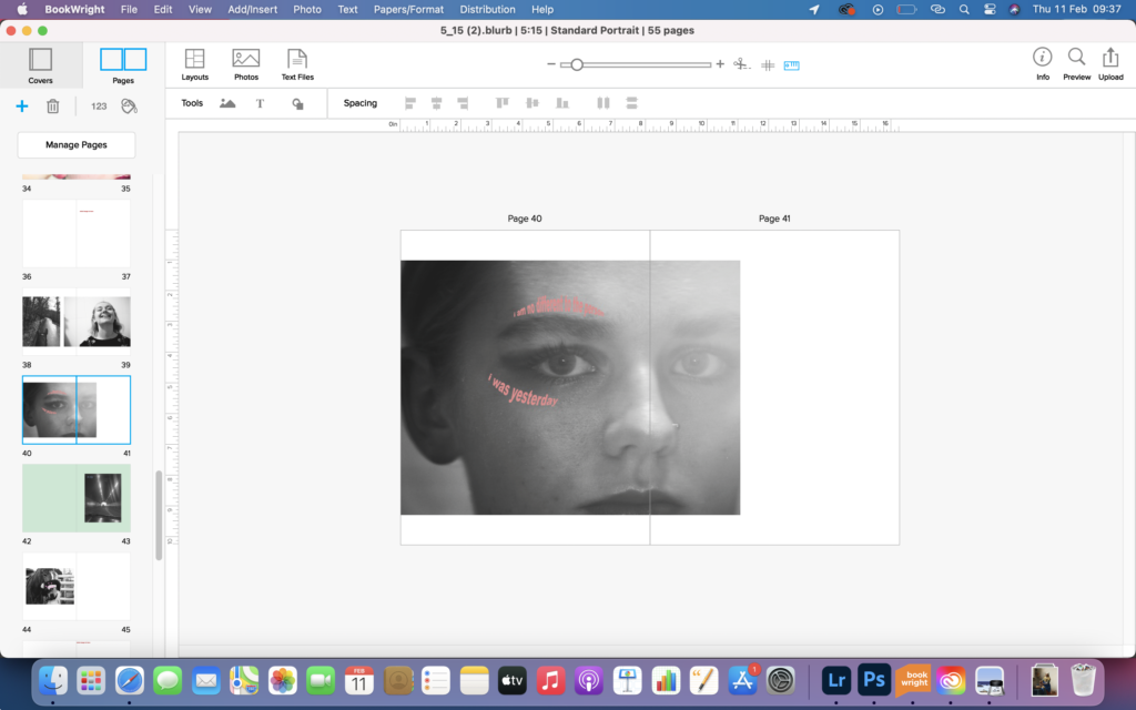
image 1 shows the original image that I used for this spread. I felt that the text that was placed on the picture was distracting. However on reflection I felt that I didn’t really like the image after all. Personally I wished it was all in focus and that elements weren’t blurry. image 2 shows a potential image that I chose to replace the other one, however I felt the colours were too bright and didn’t flow with the ones before it, so I decided to chose a black and white image instead. image 3 shows a different image that I liked. I placed the it to the left as I didn’t want the centre line of the double page spread to cut across the image as it would then lower the aesthetic level of the spread. image 4 shows another potential photo to use, however I felt that it was framed badly in the photographic process and the face was too zoomed up and would have looked better with more of a background.
when planning the book I had decided that I wanted the book to have some personal elements but wasn’t sure of how I was going to execute this. after some thought I decided to hand write the title, my name and the quote for the front page and the first page too. I did this by using the brush tool on photoshop on transparent page, writing whatever needed to be written. I kept the same placement of the title, my name and quotes as before as it worked well.
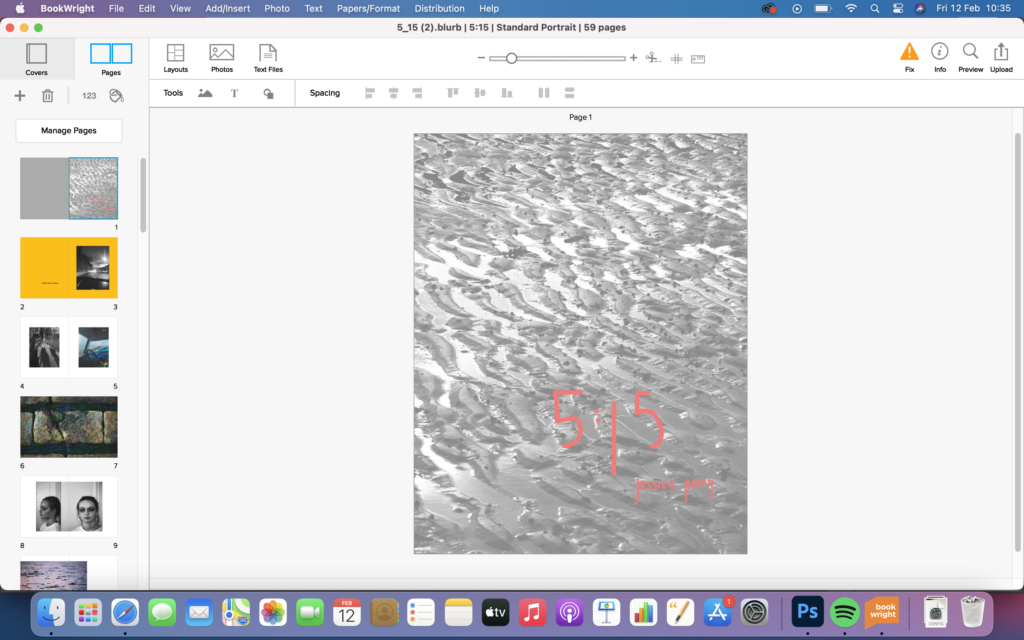
light red 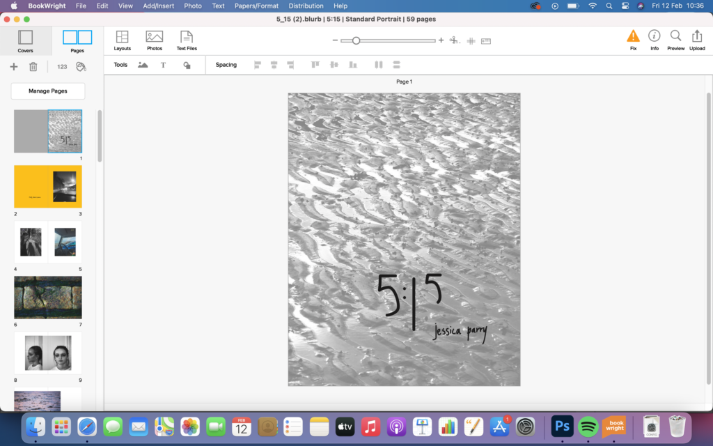
black
I found that the red was too bright on the more faded background on the first image, so I tried 2 different colour : a lighter red and black. I felt that the black looked the best as the lighter red sort of blended into the background and was harder to read.
1 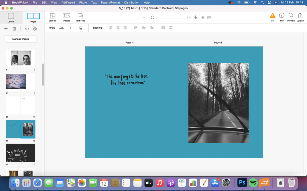
2 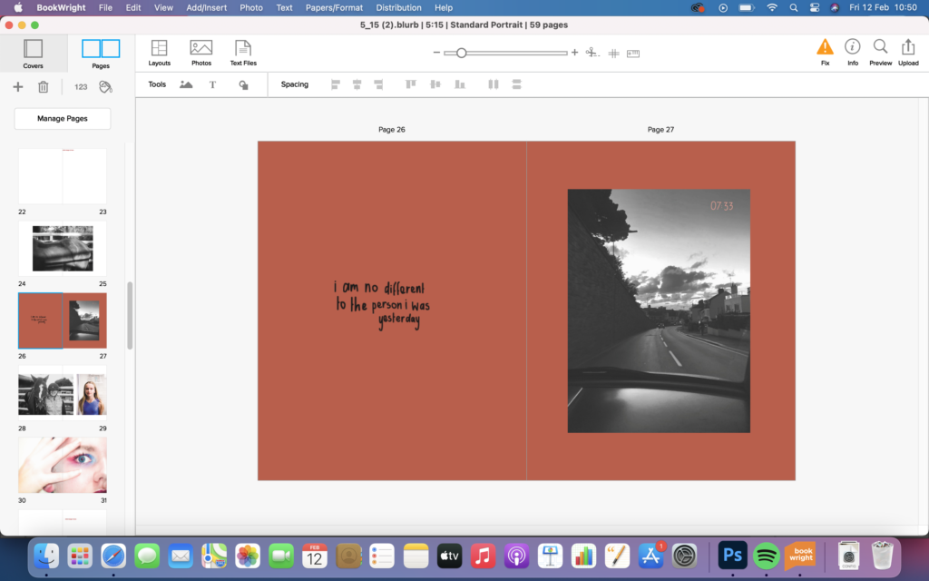
3 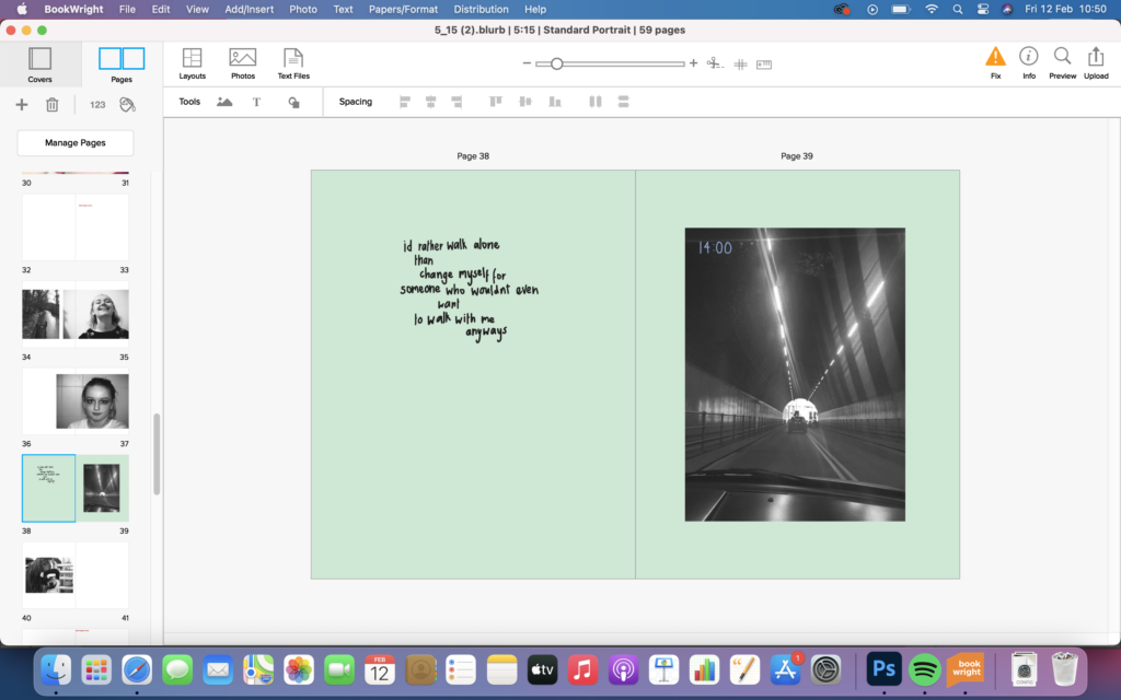
4 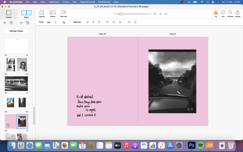
5
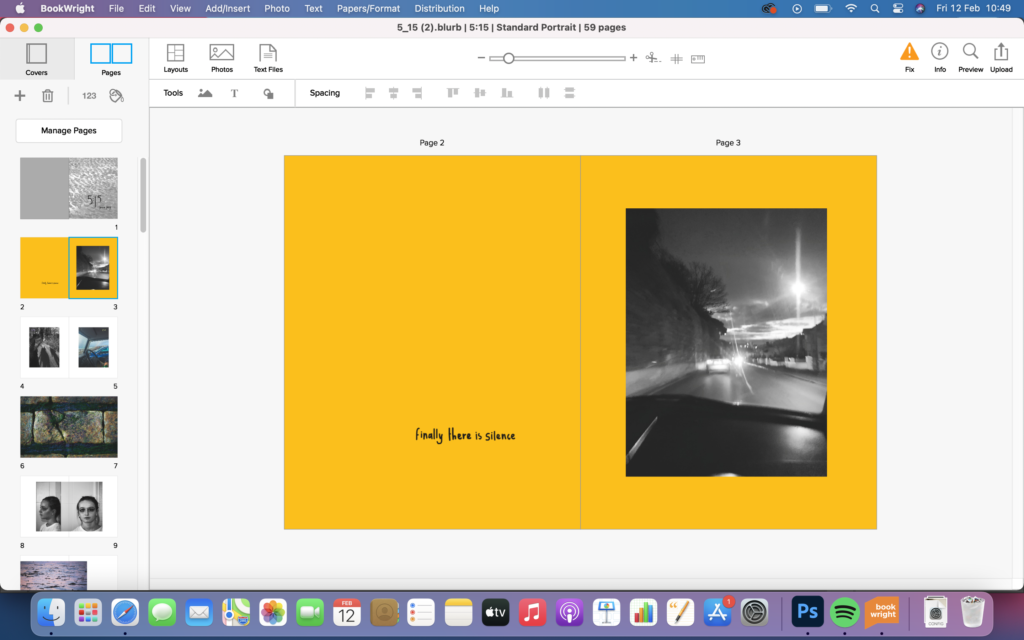
after reviewing the book I found that it had lots of white pages which was honestly very boring so I decided to make the key pages with the similar images have a bright colour in the background. This also helped separate the book up into sections, and split up the narrative better. I also added quotes from my personal journal and found words. I did these in my handwriting too, to add to the personal elements I wanted to include in my book. When first editing my images I did have some photos with quotes on, but I did find that they distracted from the original intent of the image, so when this idea came about I thought it was the perfect way to include my own words from journal and found words that I like.
Throughout the project I have taken some images, however they are on film and didn’t want to add them in digitally but physically. after the book has been printed I am going to add them in.

