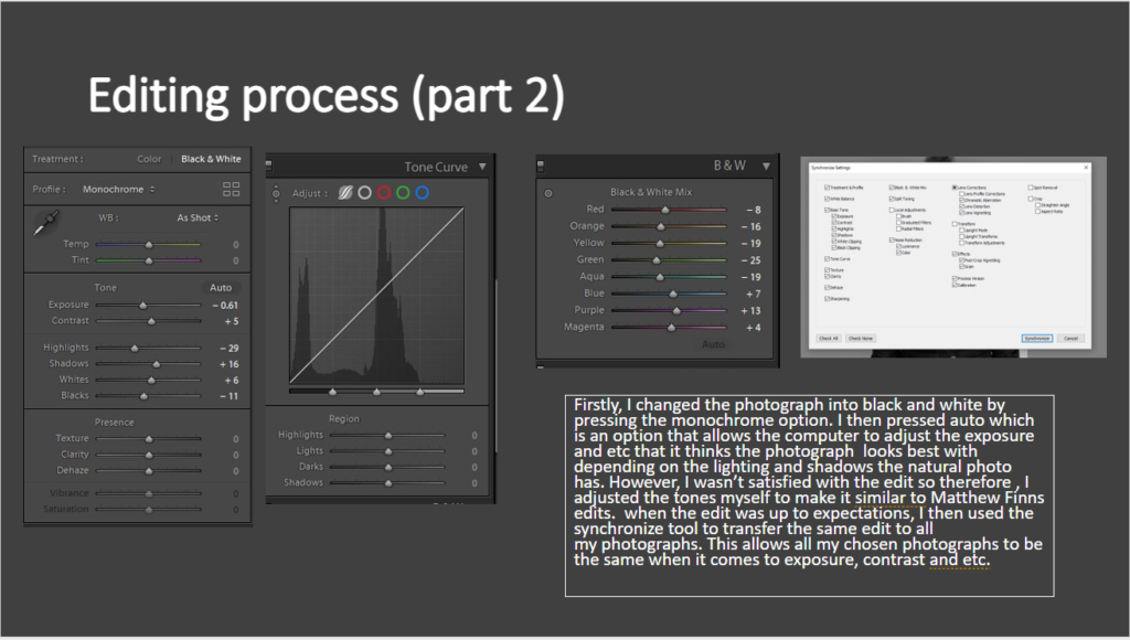
For my project I have decided to use Bookwright as it is a relatively easy and well made program to make my photo-book. I created an account with blurb and downloaded bookwright. I chose a small square layout ( 18cm x 18cm ) with premium matte paper and a hardcover design.
COVER DESIGN:
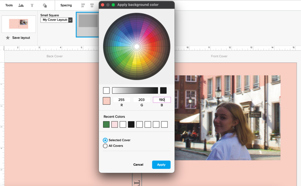
Above is my final edited cover image that I will use to wrap my photo-book cover with. Using an app called ‘coolors’, I was able to pick out and create a palate of the main colours from my image. This enabled me to make a direct colour decision that would compliment my image; whether the colour would be added to the spine only, or on the pages its self. Some of the colours I experimented with are shown below.
The colour I decided to use in the end was a light purple called ‘Wild blue yonder”, a colour I picked directly from the jacket I was wearing. The bright but cool tone compliments the image while also contrasting the warmer pinks and oranges. I also added my title and name to the front cover; Dear, Liw.
MY FINAL COVER DESIGN:
MY PAGE DESIGN:
I decided to set up all my image sizes and orientations on my page. I chose an image setup of 6 x 4 inches, top centre of a page and copied it onto all the other pages. Like in my specification, I wanted all images to be the same size and place on each page (consistency). I also chose 6 x 4 in because that was the size of the original capture of all images, meaning the images can display the true qualities and angles of the raw image.
I have also decided to keep the pages white to contrast the images.
all images are 6 x 4 inch.
all images same place on the page.
text will go underneath the images
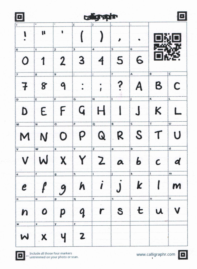
MAKING MY OWN FONT:
For this particular project, I am deeply inspired by Corrine Day’s use of her own handwriting to annotate her photographs. I have decided to create my own font to make my photo-book more personal to me, and allow it to have a home-made feel. I used a website called calligraphr.com and I was able to print and complete a template to scan later on. This was easy to download onto my laptop and was readily accessible to use in Bookwright.
For the first page of my book I would like to include a very personal statement about all my images in the book:
Intimacy is a beautiful thing, a close, familiar, and usually affectionate or loving personal relationship with another person or group. Throughout my life, I’ve found myself in sheltered in the private and relaxing atmosphere of my own photos. Always aiming for a tranquil aesthetic in my images, I have enabled myself to be constantly encompassed in the hundreds of complimentary images I have created. Despite intimacy being regarded as an emotional connection between one person and another, I’ve found myself sharing a sentimental relationship with my photographs, an intimate relationship. A relationship where I feel a closeness of observation or knowledge of a subject – a unique love for the memories arranged within beautifully crafted filters. Aesthetics have always been a huge piece of my craved visual experiences.
FINAL BOOK LAYOUT:
Processes:
In my original plan, I was going to add text below my images. However, after deciding that it didn’t look that aesthetic, even after I experimented with different designs, I didn’t add any text under the images. I feel that this also allowed the viewer to create their own narrative and interpretation of the images, without context to influence their outlook on the image. Although, I will add a page at the back of my book with annotations of each page and image, so people can see my thought on each image at the end.
In the photos below, I have put all of my images from a couple of my photoshoots onto Lightroom. I plan to choose one or two photographs from each shoot in my photo-book. I flagged and rejected which images I wanted to keep or delete first. I did this by zooming into each image to see if the composition and focus. After sorting through all the images I then colour coded all the images from individual shoots so I can differentiate the images.
I also began to rate my images from 1-5, by comparing each one to each other. I only rated images from 1-3 in the beginning. In the left image above, I filtered out all of the images that where 2 or under and began comparing the 3 rated photos. I used the compare tool to have a greater feel for each images focus and quality. The tool allowed me to compare two very similar images to pick the best looking one. The image on the bottom right is the kind of editing style I am aiming for; it is very indie’ and teenage like, the fading and colour vibrance reminds me of what is assume a vivid memory would look like in my mind. It is also an image directly from Corinne Days book, Diary.
FINAL IMAGE SELCETIONS:
SELECTION FOR FRONT COVER:
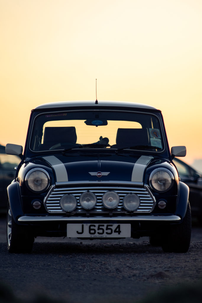
For my front cover I would like to use an image of myself, linking to the fact that this is my diary. I have a couple archived images in mind which I would like to use, from my trip away in Gdansk, Poland. they where taken by my dad and are very ‘free’ and candid. The images from this event are a true representation of me as a teenager, and will be of high importance when I take a look at this project in years to come. My final image I have chosen of myself to act as the front cover of my photo-book is the image number 3, below. I will edit the photo just like the rest of my images inside of the book.
I think the overall colours in this image are very mellow but bright and the palate of colours is very aesthetic: The edited and final cropped image is to the right.
This was the last shoot I did to get footage for my film, as I only had a few key scenes left and they only featured two key scenes: the woods and my house.
THE WOODS-
Because the location wasn’t one where I could just go back and re-film easily, I chose to film every clip several times to avoid having to skip a possible key shot because it came out blurry or the framing or timing was wrong. This meant that I had to have more of an in-depth selection process and analyse which clip would work the best and which was technically the best as well. To visualise this easily, I used the Colour Label tool in Lightroom before editing the selected final clips to be more vibrant and colourful, representing the joy and freedom in this final chapter.
These clips had to be in a specific order which followed the physical journey through the woods up onto the hill, which I had planned out before, so I made sure to double check that all the clips were used in the right place. I ended up cropping, zooming in and re-framing a clip showing some trees moving in the wind and adding the newer version in-between two later clips to create a sort of transition between them. This was purely experimental and I wasn’t expecting to keep it like that, but in the end I liked the changes and thought it made the whole final scene more cohesive and consistent.
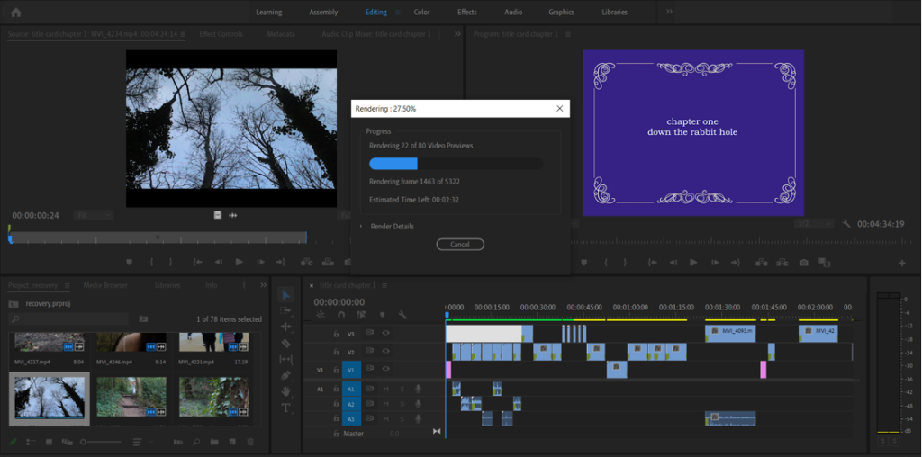
It was at this point that I decided to render my film so far. Rendering is a process that allows the timeline of video clips to run smoothly as all the data is fully processed into the computer. This took a little time due to the amount of footage I have, but it helps me to appreciate what I have so far and see any possible issues that could arise in the future.
AT HOME-
I carried on using the same technique as I have done from the beginning, taking multiple videos of the same shot so as to be able to select the best one. After going through the selection process in Lightroom, I ended up with the final six clips that I needed. I had a couple more shots planned on my planning sheet, but after some consideration I decided not to include them because I didn’t feel comfortable filming them and I also thought they weren’t really all too relevant to the film as a whole and so were possible to cut from the final version.
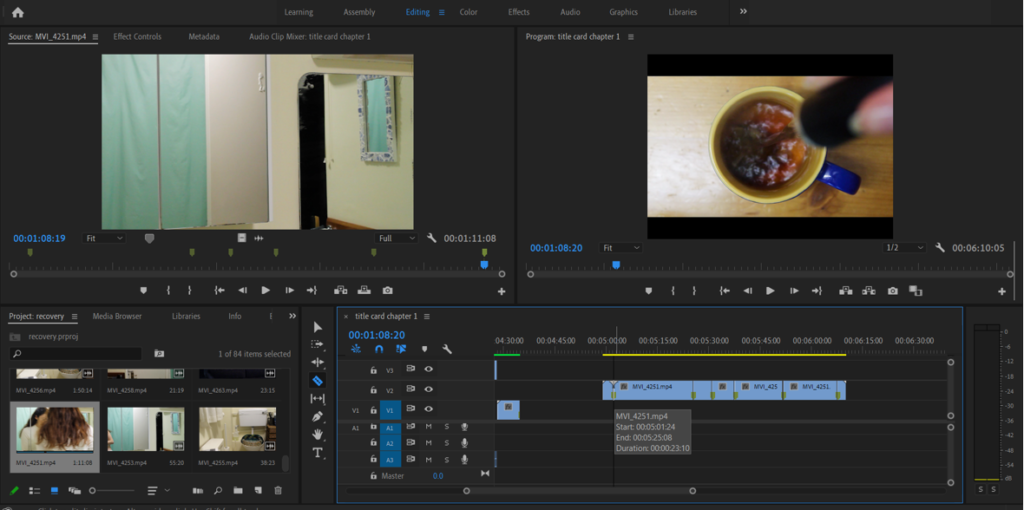
Throughout this whole process I’ve been doing essentially the exact same editing techniques, to keep the same style from the start to the end of the film. I just needed to make a few minor colour corrections and exposure/contrast adjustments, and my select final videos were ready to be exported out of Lightroom and into the film project.
For these two sections, I had to splice a longer video into smaller clips at certain intervals and with the second video, in the bathroom, I even had to switch around the clips into a different order that flowed aesthetically as its own smaller narrative. This wasn’t too difficult for me because it just relied on the skills I’d acquired from doing the rest of the film, and I enjoyed the experimentation aspect of trying different orders of the clips and seeing the effects they gave.
The last stage of the visual aspect of the film was to run through the film as a whole and close up any gaps that were left from scenes that ended up being cut, and to double check that all the clips were in the right order and switched at the right time. After this, I was able to move on to the final stage: recording and importing the audio voiceover.
I had written out the voiceover script near to the beginning of the filming process, and I had already annotated a rough set of timings to match up what needed to be said at the same time as which video clip. To achieve this accurately, I watched the completed film at the same time as I recorded the voiceover. Because of the gaps left by the scenes I cut from the film, I knew I had to re-evaluate some sections of the timings, but this was easily done. Once I had recorded a few versions of each chapter, I went through and chose which ones I preferred and imported them into Premiere, making a quick crop of any excess silence at the beginning and end of each clip and lining them up to their respective chapters.
All in all, I’m happy with the finished product and the way the voiceover adds so much to the visuals.
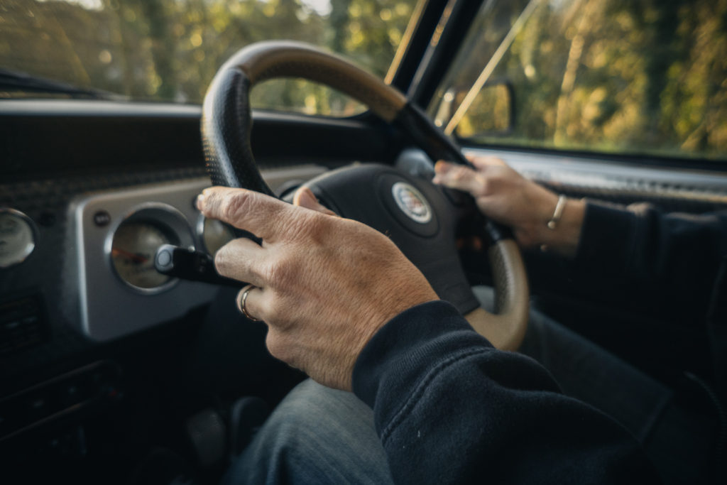
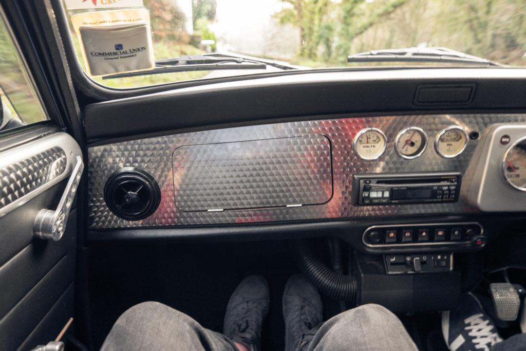
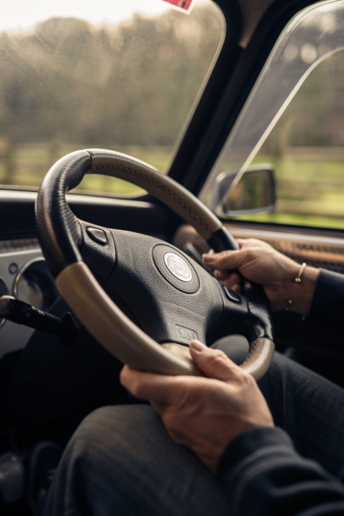
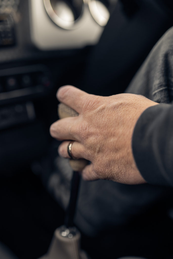
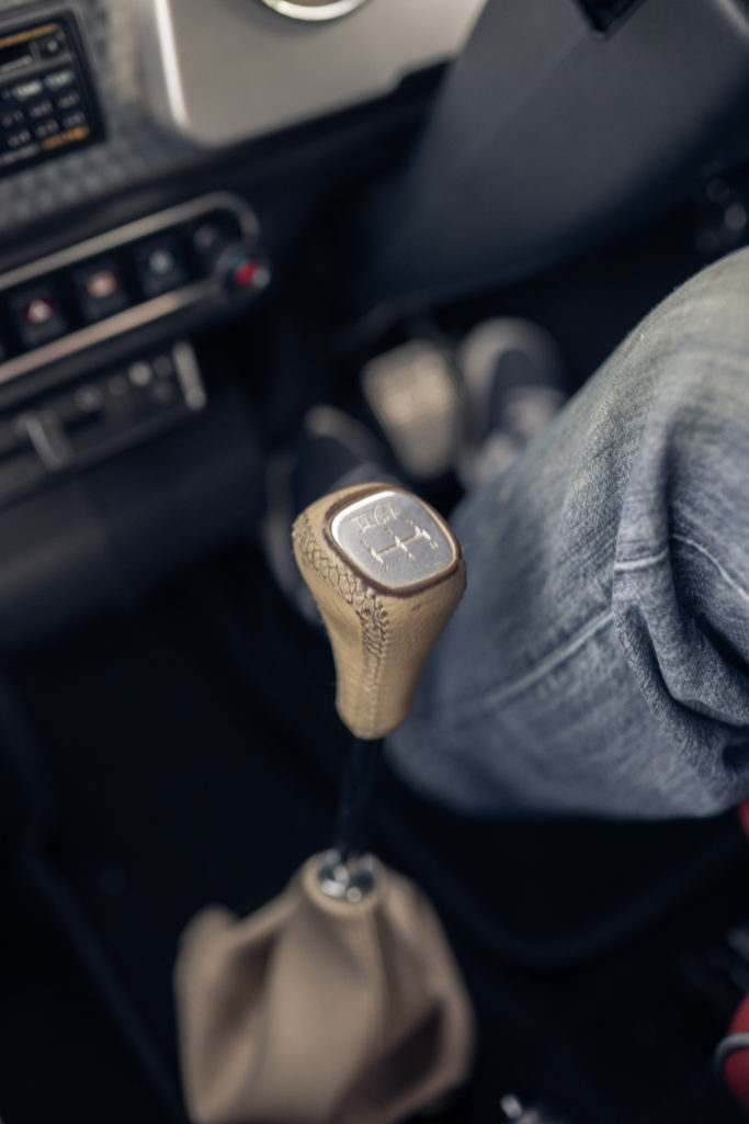
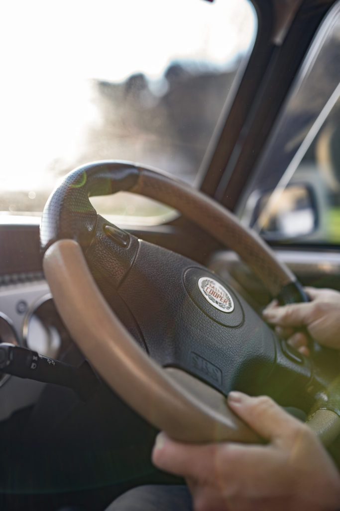
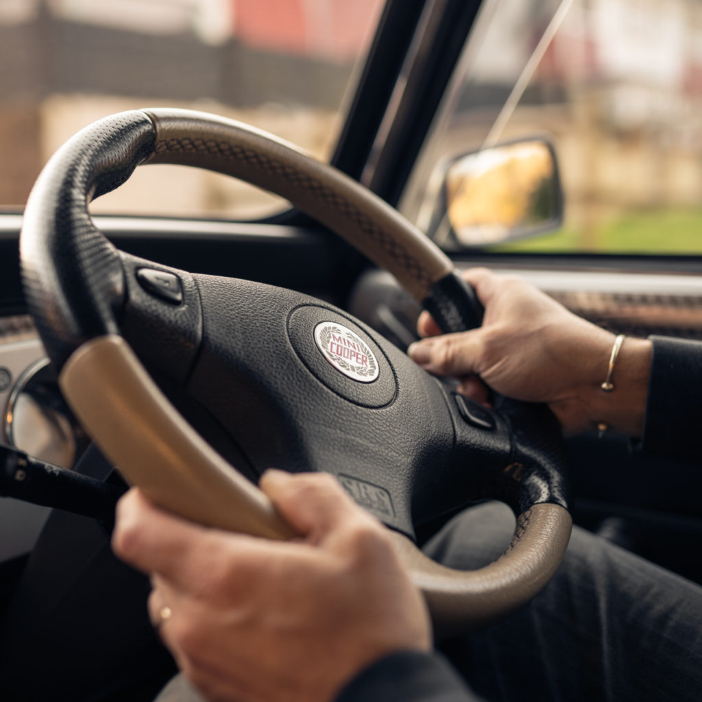
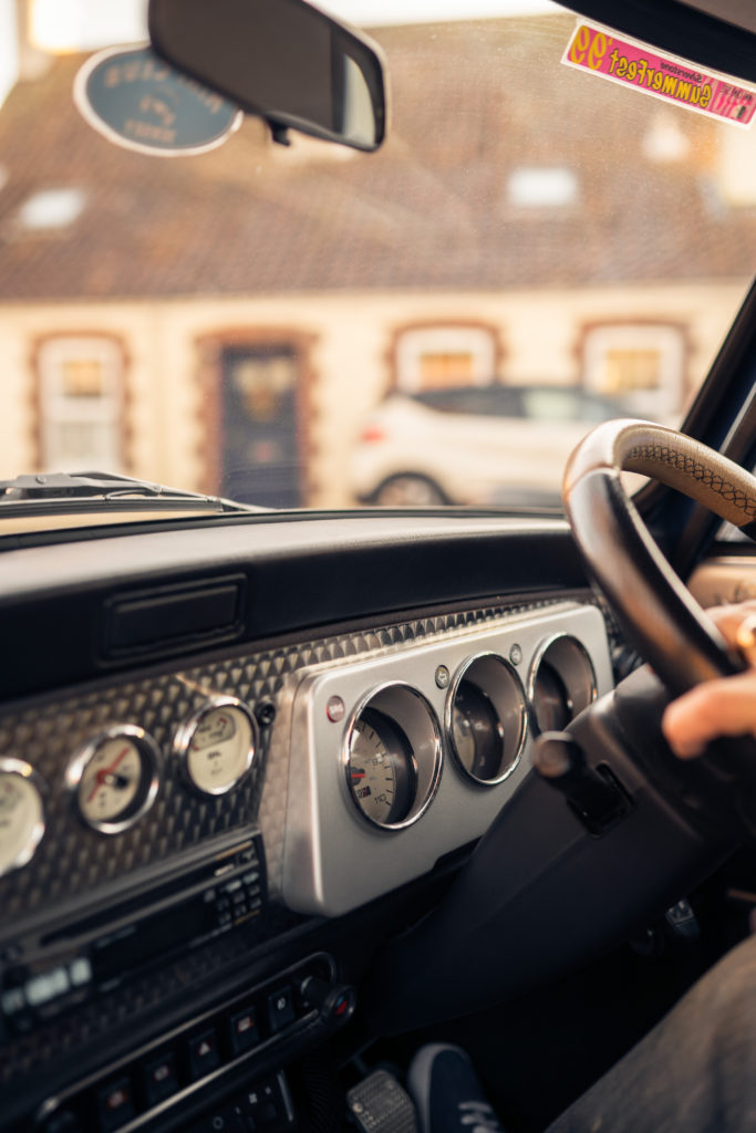
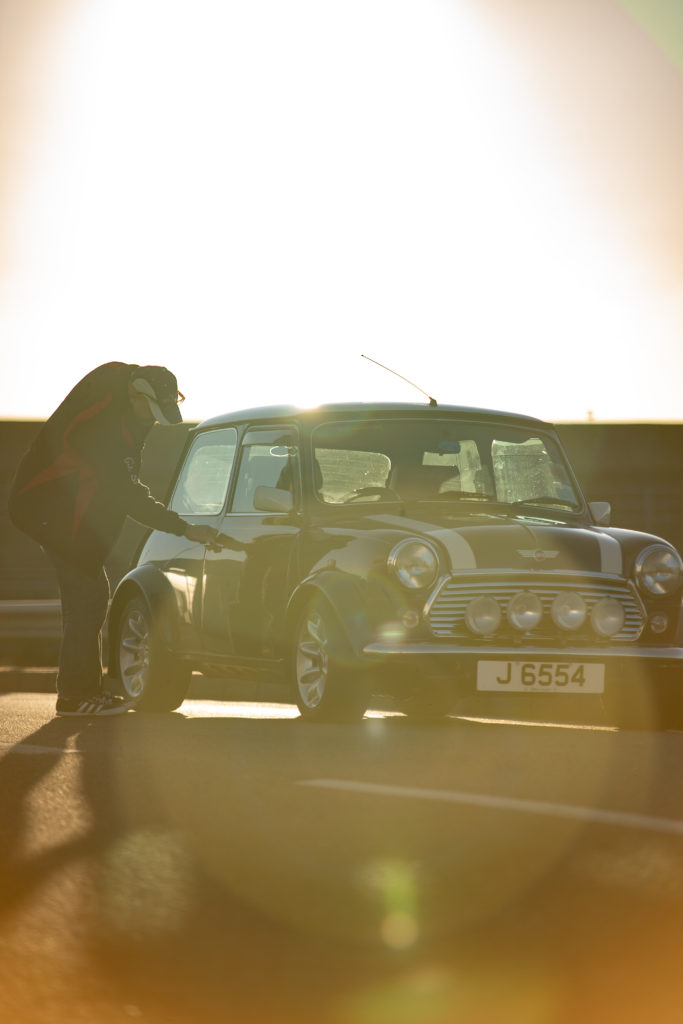
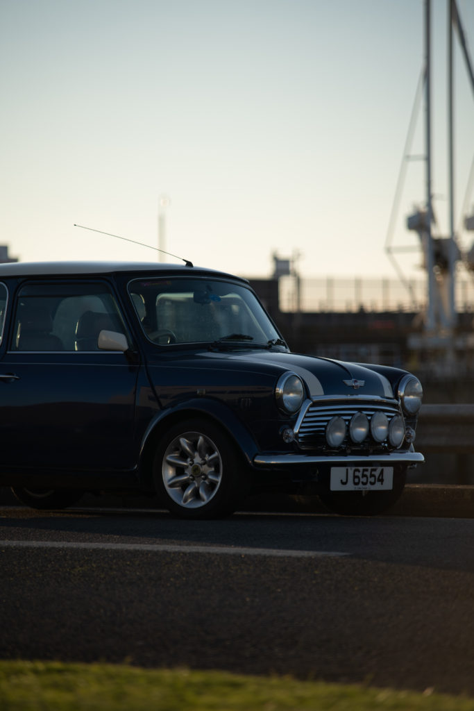
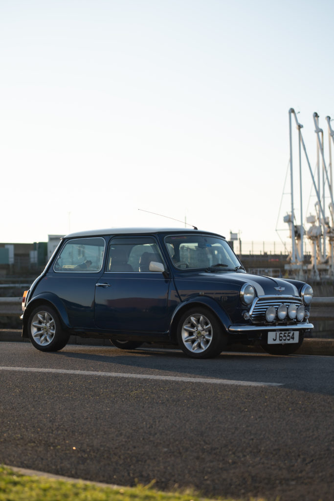
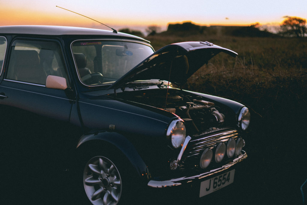
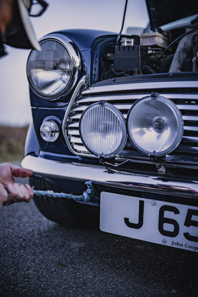
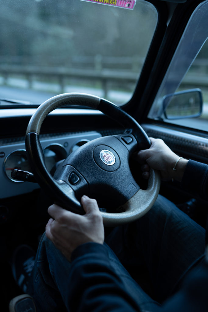
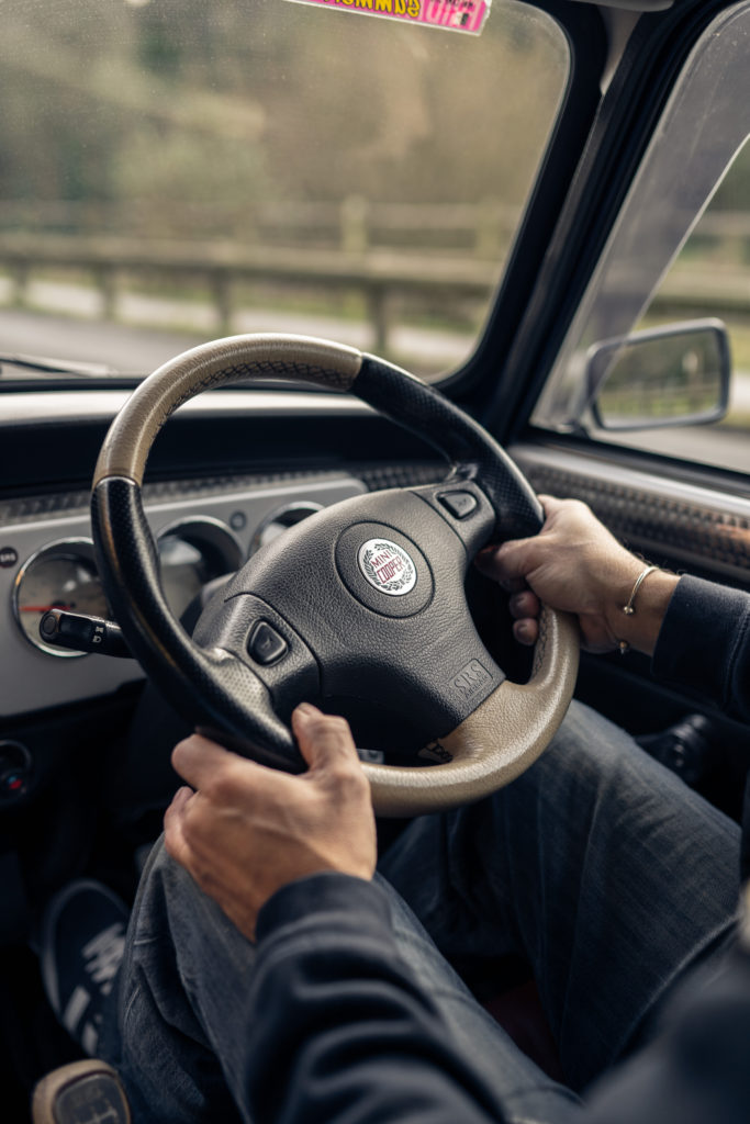
WHAT: For this shoot I want to photograph and document driving my grandad’s car on the inside and then the outside of the car in nice locations.
WHERE/WHEN: I am looking to photograph the car at golden hour or just after sunset as the lighting is soft and warm. I want to shoot on the coast by the sea as this will make for nice backdrops.
EQUIPEMENT: I will use my a73 for this shoot. Using this camera will be very helpful as especially in raw there is high dynamic range meaning there will be a lot of details retained in both the sky and the shadows. I will use 2 lenses for most of this shoot. My sigma 35mm 1.4 for the inside shots while we are driving as this lens is quite wide on the full frame camera and produces nice bokeh. And I will use my 70-200 f2.8 for the exterior shots of the car as I want a lot of compression from the long zoom to isolate the car from the backdrop. I won’t use a tripod as I will be shooting outside so there will be enough light so I can have a fast shutter speed.
CONTACT SHEET
The shoot went well however it was cut short as the alternator on the car stopped working so the battery was no longer being charged. This meant that we had no lights and we had to get the car towed back to the house where it is kept. I did manage to get some good usable images of the car but I had to work fast.
BEST IMAGES
EDITING
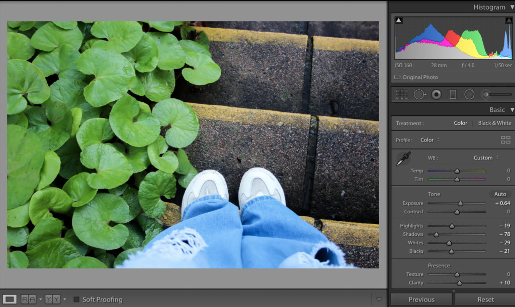
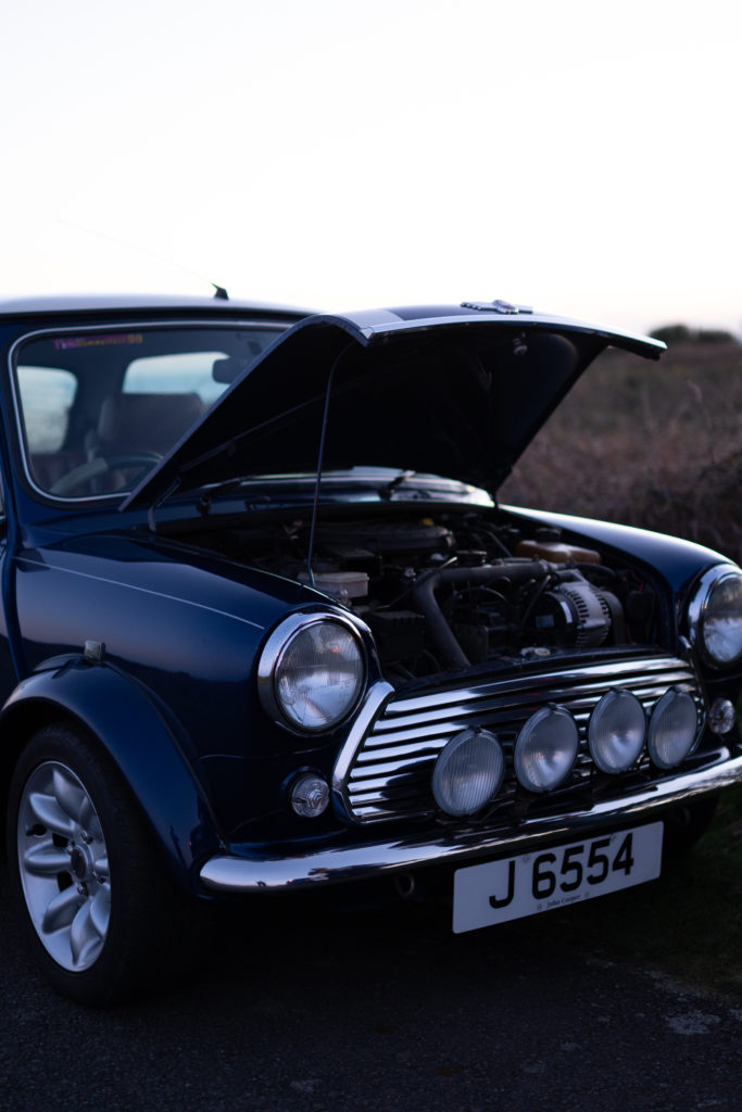
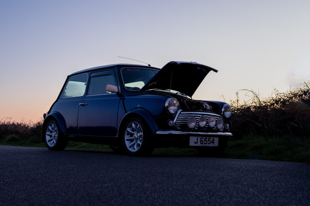
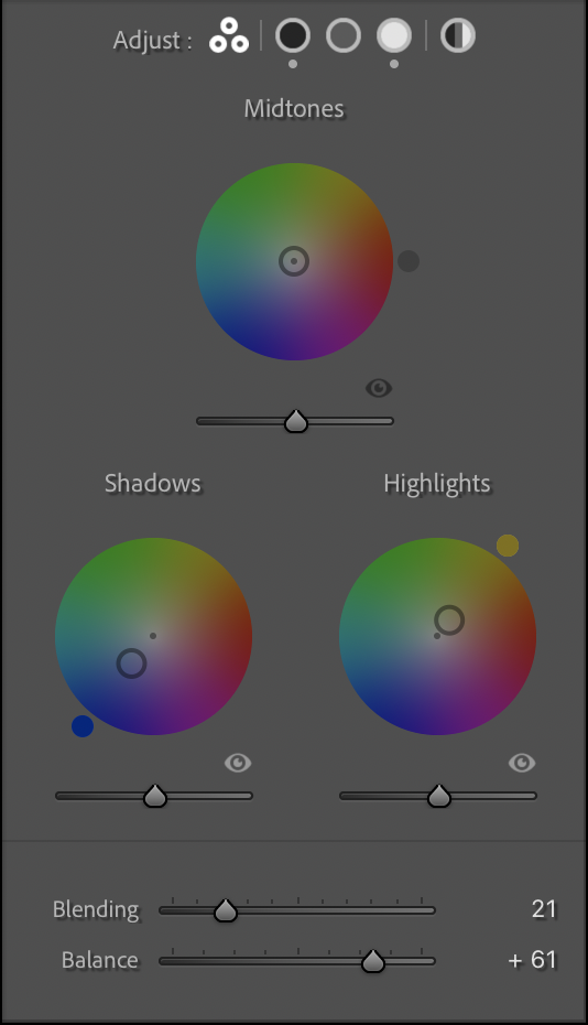
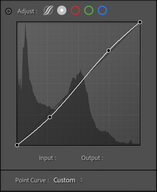
The overall look I wanted with this edit was to make the shadow cold but the highlights warm because it was golden hours. I am happy with the look but I may alter the edit when I come to put it in the photobook to match the other images better.
I started by correcting the white balance as the image was very blue. I then corrected the exposure, decreased the highlights and increased the shadows. I added blue to the shadows and yellow to the highlights and changed balance so the blue wasn’t too overpowering. I added a small s curve to add some contrast to the image and decreased the saturation of the blues.
In what way can self-portraiture explore different female personalities, identities, and stereotypes?
“I am not de problem I greet yu wid a smile Yu put me in a pigeonhole But i am versatile”.
No Problem, Benjamin Zephaniah
Introduction
The word Tomboy originated around the 16th century. It was used as a term for a rude, nasty boy. However nowadays the word is reverted to a new meaning. It referred to a girl who would rather climb trees, do sports and other things that you would typically think a boy would do.
For most of my childhood I was known as a Tomboy and I did not like doing all the girly things stereotypical girls would do, I liked to skate and play in the mud with the boys. By the age of 9 I was known to be ‘one of the boys’. My parents (mainly my mother) judged me and didn’t really approve, sometimes she would make snide comments “I didn’t expect to have a daughter who was basically a son”, or even ” I wanted another daughter and not a son”. I have been stereotyped and judged for things I like doing not just by my mother but also by society.
Shannon O’Donnell is an artist born in Jersey, Channel Islands. Her work explores themes around the gender experience with the focus femininity and masculinity and gender traits. She explores self-identity. Her work lies with questioning society and challenging traditional views of gender through. Much like what I want to do with my personal study she focuses on the sociological understanding of how gender is viewed or challenged within mainstream society.
Claude Cahun was a French queer photographer, sculptor, and writer. Her work was both political and personal, and often undermined traditional concepts of static gender roles. In her autobiography, Disavowals, she explained, “Masculine? Feminine? It depends on the situation. Neuter is the only gender that always suits me.” During WWII, Cahun was also active as a resistance worker and propagandist. In many ways, Cahun’s life was marked by a sense of role reversal, and like many early queer pioneers, their public identity became a commentary upon the public’s notions of sexuality, gender, beauty, and logic. Her adoption of a gender-neutral name and her androgynous self-portraits display a revolutionary way of thinking and creating, experimenting with the audience’s understanding of photography as a documentation of reality. Her poetry challenged gender roles and attacked the increasingly modern world’s social and economic boundaries.
Brooklynite ELLE began as an illegal graffiti artist in the streets of New York a few years back. Nowadays, she is considered one of the top touring street artists. Using aerosol cans, pump cans, stencils, paint rollers and more; she uses every facet of street art to put her mark on the cities she travels to. ELLE’s work is featured in the URBAN NATION 2018 exhibition. Elle is just badass. She has a background in graffiti and is unashamedly feminine in a lot of her work, which really comes across in her style; lots of pinks, bright colours, bold fonts, and female figures.
“When I started, I wanted to be called ELLE, because that means ‘she’ in French, so that people would know that my work was female.” – Elle, in an interview with URBAN NATION
POST-MODERNISM
Becoming prominent in the 1970s, it is often linked with the philosophical movement Post-structuralism, in which philosophers such as Jacques Derrida proposed that structures within a culture were artificial and could be deconstructed in order to be analysed. The transition period between Modernism and Post-Modernism happened throughout the 1960s. Pop Art served as a bridge between them.
Pop Art was obsessed with the fruits of capitalism and popular culture, like pulp fiction, celebrities and consumer goods. It is seen as a reaction against the ideas and values of modernism, as well as a description of the period that followed modernism’s dominance in cultural theory and practice. At the heart of Post-Modernism was conceptual art, which proposed that the meaning or purpose behind the making of the art was more important than the art itself.
There was also the belief that anything could be used to make art, that art could take any form, and that there should be no differentiation between high art and low art, or fine art and commercial art. This movement gave rise to the acceptance of a host of new approaches. Among these new forms were Earth art, which creates work on natural landscapes; Performance art; Installation art, which considers an entire space rather than just one piece; Process art, which stressed the making of the work as more important than the outcome; and Video art, as well as movements based around feminist and minority art. Much of this art gave inspiration to graffiti. Feminism is also by product of Postmodernism and Claude Cahun is today recognised as one of the pioneers of artists exploring gender boundaries in her work.
Analyse Artists
Cahun’s work explored gender identity and the subconscious mind. The artist’s self-portrait from 1928 epitomises her attitude and style, as she stares rebelliously at the camera in an outfit that looks neither conventionally masculine nor feminine. I took her idea of self-portrait and modernised it while linking it to skate culture, with her photography one of her many skins is gender-defying as she gives this photograph a very neutral look that leaves to question ‘What is this person’s gender?’ this was one of the many questions that was going through my head when I first saw this photograph. I think she is trying to show us that it really should not matter what gender she identifies as because its not going to change her so the pigeonhole that society has put her in does not identify her.
Elle is one of my favourite artists because she’s very eloquent in discussing women’s issues such as under-representation in the art world, but also actively does her bit to change it by doing exactly what it is she loves to do without letting stereotypes or expectations stop her. She is unapologetically her.In her Street art most of her murals she represents different types of women from different races all in one mural and brings them together to construct a face or faces. She is daring and trying to defeat stereotypes with her art.
“...it’s traditionally frowned upon to get dirty, climb tall things and be out at night by yourself. But, for me that was even more motivation—I love breaking the rules”. – Elle, in an interview with URBAN NATION
Present and evaluate your own images and responses.
I took this photograph with me standing in front of a wall with graffiti covering every inch some have work drawn on top of old graffiti. However, there is a board of plywood about 1 meter by 1.6 meters that is screwed onto the wall of the skate park in memory of a skater who died in a car crash a couple of years ago. I used this photo for my book as, in a way it’s like Elle’s work, it represents something normally a memorial for someone is a grave or some flowers attached to a bench of their favourite place they sat or hung out. Eventually those flowers die and need to be replace or the person becomes forgotten. With graffiti, something that is viewed as vandalism it sends a beautiful message that the person will never be forgotten as it is hard to wash away graffiti, it’s a constant reminder of the soul that has passed on, and a message to the skate community that even when your soul has passed on you will always be apart of the skate community, heaven is a half-pipe. Much like some tribes do when a member has passed. Although Elle’s work shows a different message it still has the same concept the difference being her work is about unifying women and joining the different races and ages to become one and stand together to fight the stereotypes, whereas my image and the graffiti shows the unity of the skate community and how we need to unify and defeat the stereotypes society have against us.
Generally, men tend to use all tobacco products at higher rates than women. A common stereotype is that all skaters smoke wheatear it be tobacco products or weed or even vaping. Another old-fashioned belief is that “A proper lady should not smoke, that is something only men do”. Growing up this was a common belief in my household, my grandmother and mother both strongly believe this.
So in this image I stood in a neutral stance with a neutral face having the smoke cover some of my face, For this photoshoot I purposely wore clothes that were baggy and belonged to my guy friend who is around 6” tall, including the jeans which I had to wear a belt that I owned and roll up the end of the legs. The only indication I am female being my long hair with blonde dipped ends, which I purposely placed in front of my OBEY jumper to show that I was a female. Similarly, to Cahun’s work she likes to show gender neutral outfits and poses which chose to do with the colour palette of my outfit. Blue jeans are more likely to be used by women, however I used a typically male aesthetic of how I wore the clothes and beanie. What I did differently from Claude Cahun’s work was that on the feminine side of this photography I used my hair which I love and am proud of it adds to my femininity and often reflects on how I’m feeling.
conclusion
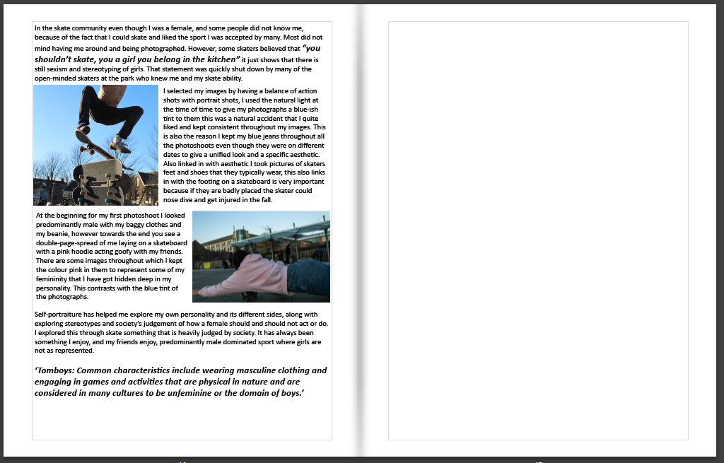
In the skate community even though I was a female, and some people did not know me, because of the fact that I could skate and liked the sport I was accepted by many. Most did not mind having me around and being photographed. However, some skaters believed that “you shouldn’t skate, you a girl you belong in the kitchen” it just shows that there is still sexism and stereotyping of girls. That statement was quickly shut down by many of the open-minded skaters at the park who knew me and my skate ability.
I selected my images by having a balance of action shots with portrait shots, I used the natural light at the time of time to give my photographs a blue-ish tint to them this was a natural accident that I quite liked and kept consistent throughout my images. This is also the reason I kept my blue jeans throughout all the photoshoots even though they were on different dates to give a unified look and a specific aesthetic. Also linked in with aesthetic I took pictures of skaters feet and shoes that they typically wear, this also links in with the footing on a skateboard is very important because if they are badly placed the skater could nose dive and get injured in the fall.
At the beginning for my first photoshoot I looked predominantly male with my baggy clothes and my beanie, however towards the end you see a double-page-spread of me laying on a skateboard with a pink hoodie acting goofy with my friends. There are some images throughout which I kept the colour pink in them to represent some of my femininity that I have got hidden deep in my personality. This contrasts with the blue tint of the photographs.
Self-portraiture has helped me explore my own personality and its different sides, along with exploring stereotypes and society’s judgement of how a female should and should not act or do. I explored this through skate something that is heavily judged by society. It has always been something I enjoy, and my friends enjoy, predominantly male dominated sport where girls are not as represented.
‘Tomboys: Common characteristics include wearing masculine clothing and engaging in games and activities that are physical in nature and are considered in many cultures to be unfeminine or the domain of boys.’
Since the concept is positioned around my mum, there will be scenes including her. However, due to ethical reasons I am not wanting to expose her too much and make her uncomfortable. I also don’t think it would be nice to expose her at her worst. I do want to reveal the struggles, however filming her having an exacerbation/attack would be quite unethical.
Therefore, I will only get a few shots of her. Some visuals I am thinking of are: her lying/sitting down on the sofa after a tough day (this is because the lounge is where she is most and will be an environmental shot), I may get some visuals of me and her shopping as I help her at the shop weekly due to the experience being too tough for her to do by herself. I would most probably like to get some shots of her tattoos, since this makes up the person that she is today, potentially her in her room, using her nebulizer, struggling to walk etc.
When getting some shots of her using her nebulizer or struggling to walk, I’m going to exclude her face as I feel like this may make her uncomfortable and may be over-exposing her which is what I don’t want since I want this to be a respectful and thoughtful piece of work. Thus, I will use medium/close up shots of her lower body that includes crucial subjects like the nebulizer for example.
I may also want to get some shots of my 14 year old sister, Mary doing some chores around the house. This is to show that my mum does need that extra help around the house as she struggles to do it by herself.
Additionally, referring to the prompt question below “What do you remember about being young?” I may want to include some archive images of my mum of when she was younger. This would add strong contrast within my film, showing what she looked and lived like before and what she looks and lives like now.
VOICEOVER
For my audio I’d like to insert an audio of my mum speaking about her illness. Therefore, I need to create a list of prompt questions in order to get the audio that I would like. I feel as though her telling her own story will add the hard-hitting aspect of my film.
The questions will be:
What do you remember about being young? (Health wise)
When did you begin to notice feeling unwell?
How would you describe the feeling of your illness?
What’s your worst memory about being ill?
Are there any side effects to your illness?
What do you struggle with the most?
What is your biggest regret?
What is the next step for you?
What are some things you wish you were able to do?
This will most likely provide me with a lengthy audio to play with and edit and include upsetting but factual elements that happen in her life.
In addition to the voice over I’d also like to include some background noise just to fill in the gaps in the audio that may be apparent and to make the film also pleasant to listen to and not just to watch. I’m thinking that a slow heart beat sound may be a good background sound to represent hospitals, illness, getting through life etc and again to make the film more hard hitting.
WHAT?
Aside from clips of my mum I also want to include clips of my home and other elements that surround my mum and her illness.
I most definitely want to include her wide range of medications. This will provide me with a number of clips since she has too many to even count. I feel as though that this as well will be very striking to the viewers at how much medication she has to consume in order to keep her going. I would like to include clips of her bedroom as that is her place of rest and belongs to her and therefore connotes to her. I want to symbolise my mum in various ways as I feel like this adds some ambiguity to my film and allows the audience to think and also allows them to listen to the audio more closely since that is the main focus. Additionally, Id like to include different aesthetic visuals in my film just to add some interesting elements into the footage also. Things like shadows on the walls, windows, sunsets etc.
WHERE?
Most of the footage will take place in my home since my main visuals will be of my mum in the lounger, bedroom etc. This is where all her medication is also. Also because my mum rarely goes out due to the extreme anxiety she experiences when thinking about walking anywhere due to it being so difficult for her. Therefore, in order to keep her comfort and to keep the film as natureal as possible, most of the filming will be done at home.
However, I will also get some footage when at the shop and if we are ever out for a walk, to show how breathless she gets just from walking.
The voice over will also happen at home as this is where I can most likely get the most quiet area and to get a clear and thorough audio of my mum’s experiences. This also will increase my mum’s comfort and hopefully allow her to speak from her heart without any pressure.
HOW?
I will be filming on one of the Canon’s lended by school. In previous films I have made, I used my iPhone. However, due to the topic of this film and how important it is to me, I would like it to be in the best quality possible. But, if we are out and there is a something that strikes me as a quality piece of footage, I won’t hesitate to film it on my phone, making sure that it is in landscape so that it matches the layout of the other pieces of footage.
Before starting to film, I will gain the consent of my mum and my sister. This is because I may film them automatically while they’re doing their every-day things. Therefore, I don’t want to disturb them and then have an artificial piece of footage. I want my footage to be as natural as possible and therefore I will gain their consent and inform them that I may be filming them at various different times due to this photography project.
For my voice over, I will film the ‘interview’ on my camera. Then, I will upload the footage onto Premiere on my laptop, discard the visual footage and keep just the audio.
A sentence: The story is about a tomboy who likes to skate and hangs out with guys.
A paragraph: A girls who is considered one of the boys, has more male friends than girl friends. A girl who likes to skate and surf and do things a typical guy would like to do. But society feels the need to put a label on her TOMBOY even though she is very much a girl and like do go get her nails done and loves shopping.
Design: Consider the following
How you want your book to look and feel
Colour, I want it to feel moody but still have light and some colour, I have decided to put in only some images with graffiti in the book as I feel like graffiti or ARTISTS that like to publicly display their art this way are shunned and also stereotyped much like SKATERS and ‘TOMBOYS’ as most consider it ‘VANDALISM’ rather than ART and people expressing themselves. Although society has started to accept some artists and some people even pay for a graffiti artist to put his design on sides of buildings which makes me feel happy that times are slowly changing but some are still stuck in their old mentality.
Paper and ink
black ink
Format, size and orientation
Standard A4 portrait (20x25cm)
Binding and cover
Hardcover with a Dust Jacket
Title: TRIBE inc. ina graffiti style if I can find a font that’s decent on either photoshop or lightroom.
It is going to be in black.
Design and layout
Most pages are going to be full bleed while others are in a different layout. A lot like organised Chaos.
Editing and sequencing
I want a smooth transition between the images also I would want it to be unpredictable for the reader and have some random double page spreads.
Images and text
The essay at the end of the photobook, the Title and my name will be on the first page and have an opening Quote. I will also have some direct quotes from skaters/ my friends on top/ next to some photos.
In What Way Have Richard Billingham and Matthew Finn Photographed People Who Are Close to Them?
“An inside position allows engagement, participation and privileged knowledge.” (Abigail-Solomon Godeau: Inside/Out)
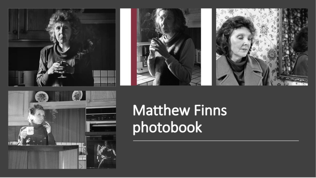
In this essay I will be evaluating the different ways as to how Richard Billingham and Matthew Finn have photographed people that are close to them, in this case, their parents. My area of study in my personal project is documentary photography. This is a style of photography that provides a straightforward and accurate representation of people, places, objects and events. Specifically, I am looking into filmmaking using a documentary approach. I am positioning it around my mum, particularly, creating a documentary film in order to expose the hardships and complications that she faces on a day-to-day basis while struggling with a terminal illness – Stage 4 Emphysema. My overall aim of my project is to create a hard-hitting film that triggers powerful emotions for the viewer. Since I am also filming someone who is close to me, I feel as though looking into Billingham’s and Finn’s methods will add greater knowledge to my personal work and allow me to potentially take notes from the methods they have used when photographing their own parents. Billingham started off by taking images of his parents (with no prior experience) for reference so that he could paint them, as his main aim before photography was painting. His images of his parents then got noticed and became a huge success. The images exposed his tough life living in a tower block with his alcoholic Dad, Ray, and his overweight, temperamental mum, Liz. The exposure of his parents was intriguing to viewers and he eventually led on to create several documentary style films surrounding his parents. Matthew Finn took images of his Mother for over thirty years. His father did not live with him and he stated that his first intentions were not to create an archive of his mother, but to create stability, the photographing eventually became a habit. The more Finn discovered about his father, the more he wanted to protect his mum and be the person/man that would never let her down. The fact that his mother was wanted and needed to be in his photography, formed a strong bond between the two and she played a huge role in the making of the photographs. Years later, she developed dementia, and could no longer recognise Finn or herself even, thus, all he had left were these archival images.
Contextually, Abigail Solomon-Godeau published an essay, Inside / Out, that became incredibly successful. She discussed what she refers to as the inside/outside position of photographers in relation to their subjects. Referring to the opening quote above, she believes that an inside position (when you are close with your subjects and have a personal relationship with them) “allows engagement, participation and privileged knowledge” (Solomon-Godeau 1994: pg2). It’s an intimate, trusting and engaging role for photographers and their subjects that often allows authenticity. She then goes on to say that an outside position can often be objectifying, distant and unsympathetic – since there is no personal relationship with their subjects and no ‘inside’ point of view.
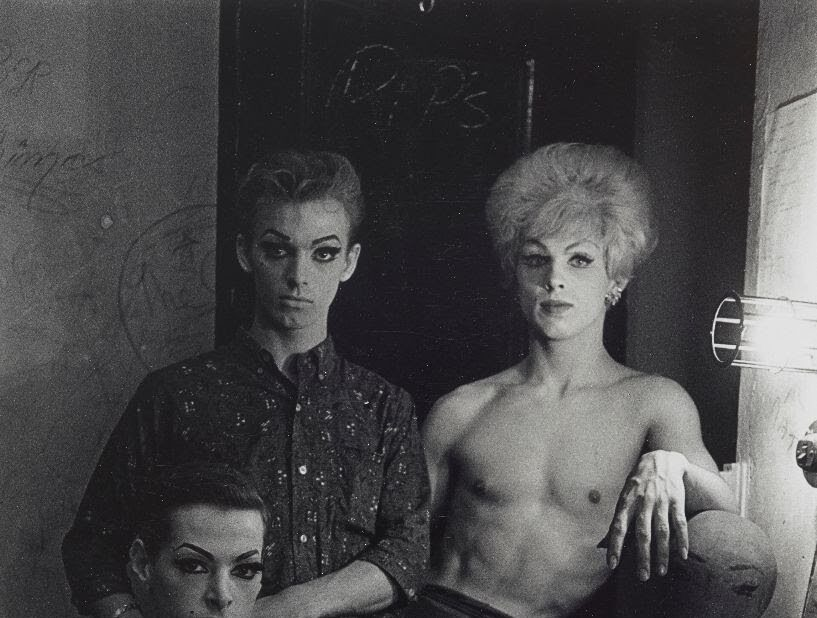
Diane Arbus
Consider this image above taken by Diane Arbus of transvestites. She often depicted people who were seen as ’different’ at the time e.g., gay people/people with disabilities etc – Solomon-Godeau, in her essay, criticises the work of Arbus. Arbus specifically takes an outsider’s point of view to photography and has often been accused of basing her photography on ’distance and privilege’ rather than using her photographs for positive effect. She has often been described as having a ’guilty pleasure’ when it came to photographing people who were different and was accused of being voyeuristic in her approach. Thus, an inside perspective to photography can be known as the” good position” as an outside position can be very controversial and used for the wrong reasons. However, having an inside position also has its pros and cons. One con is that having an inside position can be very socially sensitive, and sometimes may be over personal, gritty and brutal. Due to Richard Billingham and Matthew Finn being very close to their subjects – their family members, they most definitely have an inside position to their work but are they using their positions for the right reasons and how is their position revealed through their work?
As mentioned earlier, Richard Billingham revealed his tough life with his unique family members, specifically his parents Liz and Ray. His photos and films were extremely intriguing as they were extremely high in ecological validity and gave us a truly real experience within his images – no set up composition, no plan, just simple, raw images that exposed his own life.
Richard Billingham
Take this photograph for example, within this one image, there’s a number of things that maybe other photographers wouldn’t see as visually pleasing: slouching, food stains, a generally messy frame, an obese Mum and a drunken Father. Billingham, quite clearly, takes an inside approach to his work, since the circumstances he depicts would only be seen privately in your own home. Billingham is one of the only people that would’ve had access to his parents in this way. This is what made his photos so unique and special, the lack of accessibility to these kinds of photos, showing a lower-class life and the events that occur within it are fascinating and hard-hitting. Billingham’s insider position is what brought his images to success. Due to his close relationship with his Dad, Billingham stated ’I don’t think he took any notice,’ [when filming] – this emphasises the rawness of Billingham’s images and films as no behaviour was exaggerated and all was an accurate representation of his life. Richard’s overall aim wasn’t to expose his parents in a negative light; therefore, he didn’t use his inside position to objectify or to distance himself. After all, his first intentions were to paint the images of his Mother and Father in the style of Post-Impressionist art. On the other hand, you could argue, that after realising that the images of his parents were the key to his success, he then continued to use them to his advantage in order to gain more attention. Similarly, he has been accused of over-exposing his parents, and that filming his parents in a vulnerable position was unethical. Like me, Billingham takes a documentary style approach to his images and films, he claimed, ’I didn’t want images of the tragedy of the situation. I wanted them to be emotionally very moving’ (Richard Billingham: Photoworks, 2007). This then, suggests that his insider position wasn’t used to expose/objectify his parents, but to create an emotional effect for his audience.
Matthew Finn
Matthew Finn, took pictures of his Mother for over 30 years, exposing the shift from middle-age to old-age. His work is described as a ’poignant body of work, filled with warmth yet conscious of the fragility of life’. Like Billingham, Matthew’s work also takes a documentary style to his work, representing an account of life, a deeply humanistic response to a set of human circumstances. Since this project with his Mother was so personal, Finn also clearly took an inside perspective when it came to photographing. There is no objectivity or distance within his photographs since one of his intentions were to create presence [of his mother] within his work. His images show the definition of an inside perspective, allowing ’engagement, participation and privileged knowledge’. He used this position for positive effect, since he gathered these images over a long period of time, and only published them when his Mother essentially disappeared due to the onset of dementia. The photographs are those of remembrance and respect, which demonstrates the advantages of an insider’s perspective; to look back on personal memories that the photographer and subject experienced in real life. His inside perspective also outlines other pros; he was able to photograph his Mother over a long period of time. This, as mentioned, showed the shift in her life and preserved her beauty. An outsider’s perspective wouldn’t have that kind of opportunity and makes Finn’s photographs interesting and raw. Additionally, due to his personal perspective, he was able to capture his Mother doing mundane, everyday tasks, which again isn’t accessible from an outsider’s perspective. His images provide the true bond and trust that Finn and his Mother, Jean have.
Comparatively, it is apparent that both photographers demonstrate an insider’s perspective when photographing their family members. Often, an inside perspective is criticised due to its over-exposure and social sensitivity. However, both photographers’ aims are clearly not to objectify their subjects. Billingham clearly wanted a factual and raw take to his work to create an emotional response to his audience, and had no intention at all to create negative connotations surrounding his Dad’s drinking etc. He stated, ‘I didn’t want to illustrate alcoholism or make a documentary about it’(Richard Billingham: Photoworks,2007). This again shows that he wasn’t using his perspective to expose his Father in any way and used his photography positively. Billingham also has stated that he had no specific aesthetic in mind when it came to visuals, and again just wanted footage that was 100% true to his life that he experiences. Matthew Finn had an extremely close bond with his Mother, especially after his Father left and secrets were revealed. Like Billingham, Finn had no intention of publishing the images that he had taken. Overall, however, his images show a very close, positive relationship between the two. Finn obviously had no negative intentions when it came to photographing his Mum, instead, his photos reflect great admiration and love for her. One difference between the two artists is, Billingham’s relationship with his parents seems somewhat distant. He has stated in the past that he hated growing up in a tower block with his parents. In some way, Billingham reveals the emotional turmoil that appears often in their flat. The behaviour seen in his images and documentaries, especially from his Father, often impact the audience so much because of how shocking it was. It is difficult to imaging the effect that, that environment had on Billingham. On the other hand, Finn’s images reflect love, memory and closeness with his Mother. Although the images were documentary style, he always seemed to capture his Mother in her best light, and the images have been softly adjusted, creating an atmosphere of admiration for the closest person in his life. In conclusion, the relationship to their subject’s is clearly very different.
In conclusion, my analysis of both artists’ perspectives has inspired the methods that I will use when filming my own Mum. Since Matthew Finn’s perspective is a little more personal and reflects the bond that the two had I will most likely be referring a little closer to his methods. I, overall aim to create a respectful, loving video for my Mother, showing my appreciation for her and my understanding of her illness. My perspective will evidently be from the inside, since I’m uncovering details of mine and my Mother’s personal life that only we have access to. However, Billingham’s documentary-style, film-making methods are what I will be looking to when it comes to visuals. I want to capture, raw, real-life footage of my Mum and the experiences we go through. This will be more hard-hitting for the audience, in my opinion. Unlike Billingham however, I’m not wanting to capture my Mum in a negative light, as this will essentially defeat the point of my project. I enjoy the fact that Finn created a large archive of his Mother before publishing the images. This inspires me to add older, archival images of my own Mum in order to reveal a ‘shift’ in her, going from healthy, happy and lively to ill, tired and struggling. Overall, an inside perspective allows me to have access to footage that no one else would and gives access to a wide range of information about my subject, thus forming an authentic, detailed movie that shows a close relationship between me and my Mother. My close relationship with my Mum and my inside perspective also allows me to have empathy with her whereas an outsiders perspective may be objectifying and may not show the true effects of her illness.