1. Research a photo-book and describe the story it is communicating with reference to subject-matter, genre and approach to image-making.

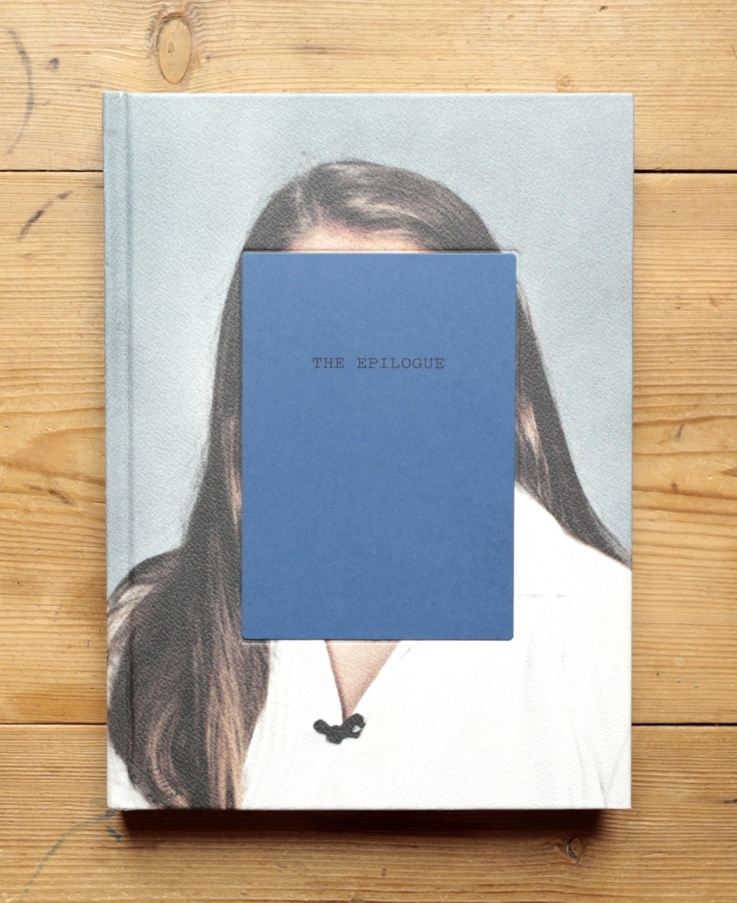
The book is about the way the Robinson family and how they remember and grieve about the passing of the 26 year old daughter ‘Cammy’ in 2005. The book features a series of images from and pieces from various mediums. The book includes letters from family member and letters to and from friends and church leaders. There are also extracts from newspapers and hospital reports. All these documents help to tell the story of the struggles and issues that led up and after the death of Cammy Robinson.
2. Who is the photographer? Why did he/she make it? (intentions/ reasons) Who is it for? (audience) How was it received? (any press, reviews, awards, legacy etc.)
Laia Abril is the photographer who produce this book. She created this book because she wanted to give a voice to the suffering and grief of the family as they remember their daughter. The book highlights how the mothers day and fathers day can be a very sad and sombre time for Cammy’s parents Wujen and Jan Robinson.
3. Deconstruct the narrative, concept and design of the book and apply theory above when considering:
- Book in hand: how does it feel? Smell, sniff the paper.
- The book is hardback with a scaly texture on the front and back cover.
- Paper and ink: use of different paper/ textures/ colour or B&W or both.
- Photopaper was used for the images and thin paper for the photocopied letters and texts. Colour images were used throughout.
- Format, size and orientation: portraiture/ landscape/ square/ A5, A4, A3 / number of pages.
- Portrait, 160 pages, roughly a4, spine is on the left
- Binding, soft/hard cover. image wrap/dust jacket. saddle stitch/swiss binding/ Japanese stab-binding/ leperello
- The book has a hard cover with the images printed on the front and back covers of the book instead of using a dust jacket. The pages are bound by a perfect binding method.
- Cover: linen/ card. graphic/ printed image. embossed/ debossed. letterpress/ silkscreen/hot-stamping.
- On the front and back
- Title: literal or poetic / relevant or intriguing.
- The title is intriguing but fitting to the book.
- Narrative: what is the story/ subject-matter. How is it told?
- The story is about a 26 year old woman who died of Bulimia. The book follows a family as they celebrate fathers day while mourning and remembering their daughter who passed away at such a young age.
- Structure and architecture: how design/ repeating motifs/ or specific features develops a concept or construct a narrative.
- The use of other material such as archival pieces like newspaper cuttings or old photographs is repeating throughout helping to build the story futher.
- Design and layout: image size on pages/ single page, double-spread/ images/ grid, fold- outs/ inserts.
- The book includes some fold out pieces added into the book. Most of the pages are either 1 photo per page or 1 photo as a double page spread.
- Editing and sequencing: selection of images/ juxtaposition of photographs/ editing process.
- The book does not include a lot of juxtaposing images rather just showing the progression of Cammy’s illness.
- Images and text: are they linked? Introduction/ essay/ statement by artists or others. Use of captions (if any.)
- Short captions are use to explain who is in the image and what they are doing.
