
TITLE CARD CREATION-
A key part of my film is the idea of three “chapters”: life before an eating disorder, life during it, and then the (slow) process of recovery. I chose to achieve this by making title cards, similar to those used in silent movies to indicate speech, and named them all in connection to the “Alice in Wonderland” books, which I drew inspiration from when writing the piece of text for the voiceover and used imagery from in the film itself.
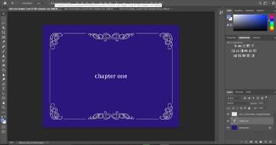
I started by going into Photoshop and choosing what colour background to have for each card. In the end I went with variations of the colour blue, starting with a dark blue and ending with a pale blue for chapter three. Blue is linked to sadness and is often used metaphorically to represent depression, but it is also the colour of the sky, and so freedom, serenity and is generally considered a calming colour. I used a JPEG I found online to create to border effect similar to those in black and white movies, and once the cards were complete I saved them as singular images and put them into the film project in Premier.

Since I don’t have much actual footage at this point, I just put them in order and cut them to the length I want them on screen: just a couple seconds long enough to read the title, I didn’t want them to distract the viewer from the actual film. Because I’m using the first title card to begin the whole film, it introduces the idea of the three chapters very early on, and so the viewer isn’t surprised when these title cards appear through the rest of the film and isn’t taken out of the narrative too much.
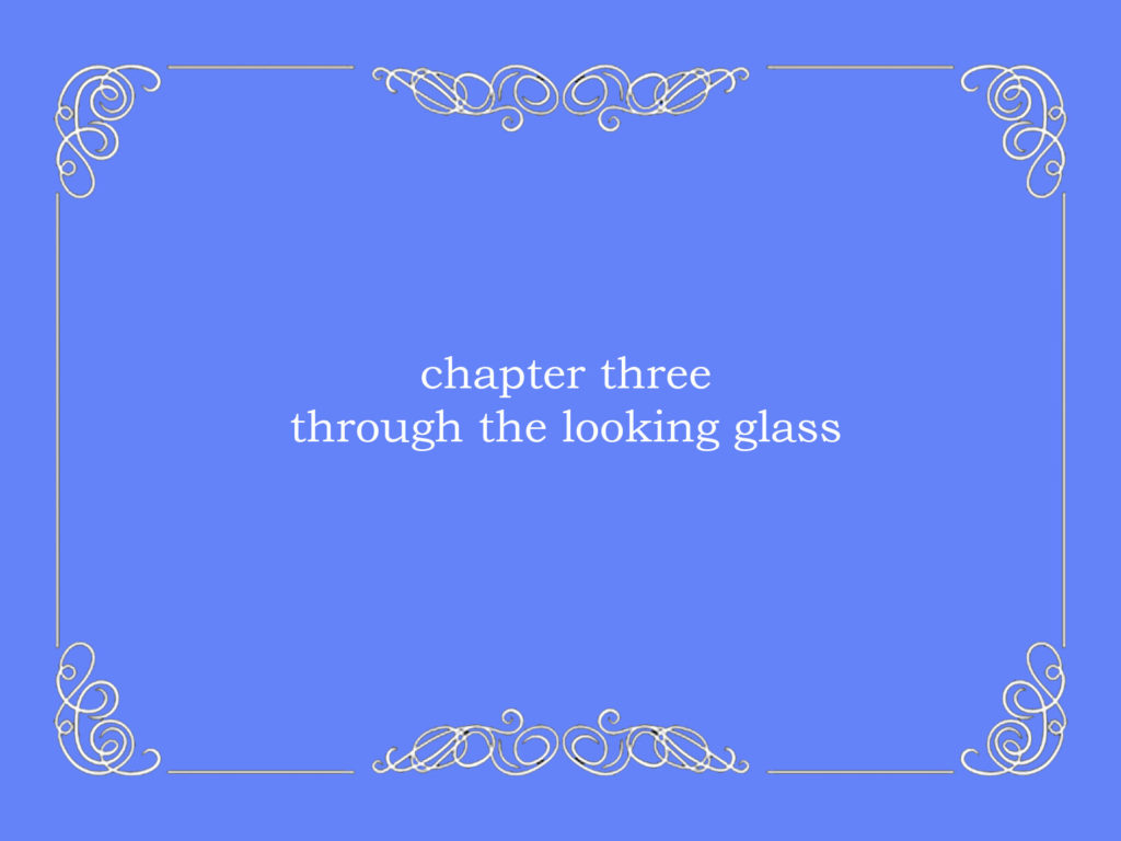
FINISHED TITLE CARDS-


ARCHIVAL IMAGERY SHOOT (#1)-
For my first shoot, I stayed at home and went through archival imagery (baby photos) with the plan to find some key ones I liked and film them for a couple seconds each, then cut them down to whatever length I decided in Premier. I used a piece of white fabric as the background to eliminate distractions and focus completely on the image in the centre. I thought about choosing only landscape images to fit better in the film, but then decided it didn’t matter so long as I actually filmed them with the camera in landscape.
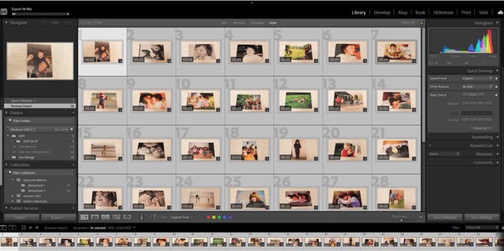
I took roughly 40 short videoclips, then imported them all into Adobe Lightroom for selection and editing before putting them into the film. Firstly I had to eliminate any that were immediately too blurry or just didn’t fit with the others in the way I expected them to, which narrowed it down to 21 clips. From there I made some minor edits, mainly increasing the exposure to hide creases in the fabric background and to make them all the same level of brightness.
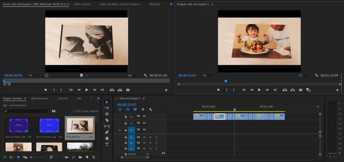
After importing the images into Adobe Premier, the program I am going to be creating my film in, I played around with a few different editing ideas before settling on having five of my favourite images for 1 second and the others for half a second inbetween, simulating the concept of a flash of memories while growing up, with the core memories for longer. These included an ultrasound of me as a foetus, my first birthday, a close up of me as an infant and my mother, me with my brother and my first day in school uniform. I chose these and ordered chronologically them to represent the passing of time. It took some time to have them in an order I felt was right and to edit them all the same length of time, but my previous knowledge of how Premier works helped a lot to achieve the effect I wanted. Overall, I like the way it turned out and I feel like my selection process whittled the images down to the right length for the film, which I’m happy about.