Attention Service member – time to reenlist.

This book tells a vivid and detailed experience of an american army soldier on different tours in Afghanistan and Iraq. The book begins and ends with black and white images of life before and after the army, images of a young girl, possibly Brody’s daughter, symbolizes innocence and a representation of what people are protecting by joining the army. A full bleed is used for ‘army’ portion of the book which helps continue the story and emphasize the scale of warfare and its effect. The book consists of many detailed image that are kept natural and unembellished, this draws out the rawness of war and the brutality that soldiers face.

Book Review: Attention Servicemember — Musée Magazine

Ben Brody is an independent photographer, educator, and picture editor working on long-form projects related to the American wars in Iraq and Afghanistan, and their aftermath. Brody enlisted in the U.S. Army in 2002, when he was twenty-two years old, not because he supported the impending invasion of Iraq—even then he was “skeptical”—but because he wanted to photograph it. 

Attention Servicemember by Ben Brody — Tipi Photo Bookshop

Brody quotes:

  • I wanted them to feel the murderous heat and arbitrary death and relentless absurdity that came with my job
  • You learned what pictures the Public Affairs Officer would release and what he wouldn’t … Soldiers looking calm or stoic. Yes. Soldiers looking angry or frightened or exhausted or confused or lost with eyes like the bottom of the ocean. No.
  • meaning that my account didn’t conform to his tightly scripted vision of what victory was supposed to look like. (in reference to the regulation of certain images)
Attention Servicemember - Photographs by Ben Brody | Book review by Justin  Herfst | LensCulture

Narrative and design

An extremely obvious yet effective layout within this book is the margins/bleed of the images. The life before and after the army are all B&W images in different sizes and dimensions taking up certain parts of the page. In contrast the colour photos made during war time are full bleed images to emphasize the realism they represent and the lacking margin for error in the army. The full bleed also means that there is a lot going on within every page which symbolises the chaos of war. The use of media and newspaper extracts within the book support the realism that Brody is attempting to represent. The story is told from a strange perspective with images appearing as if an outsider is looking in, however the photographer was apart of the army with the men photographed. There are no images from the war portion of the book shown on the same page which draws attention to the importance and meaning of every single image. The title is a literal reference to and army letter received by Brody which further amplifies the theme of realism.

Attention Servicemember — Red Hook Editions

photo book analysis

1. Research a photo-book 

She made it to shine a light on the struggles that she faces. She wants to show things that are normally kept covered, hidden, but she wants them to be seen. Shows her vulnerabilities that she has. She takes self portraits, because she has a story to tell. emotion is carried by each image, and is displayed within each picture. They tell you about her, who she is and how she feels.

2. Who is the photographer? 

The photographer portrays the issues surrounding beauty, identity and body image, by creating these beautiful images, using natural light and strong compositions. The genre that Jen Davis uses is tableaux however they are to show her own life and invite the viewer into the past eleven years of her private life, exploring the vulnerabilities that she carries associated with a life-long struggle with my body, feelings of isolation, the battle to recognise beauty, a quest for intimacy, and sense of acceptance through the camera’s eye. Sometimes the images would be taken in real time and some would be staged, with the perfect lighting, posing and props.

3. Deconstruct the narrative, concept and design

  • all images are in colour and are printed on the same type of paper.
  • the format of the book is portrait, and is slightly off A4, and takes more of a shape of a square.
  • the book has a hard cover. on the front cover there is an landscape image in the centre of the page, and on the back cover there is the title and the photographer the book was created by. the binding can be seen by the viewer and is covered by some blue tape.
  • there is no special things on the front page, just a simple image on the front page
  • the title hints to the subject matter. if you don’t know what the book is about the title will make no sense
  • there are similar images throughout the book, containing a similar narrative. all the images contain jen davis and sometimes another person
  • all images are a similar size and are all centered. some of the double page spreads contain two images. but there no grids or other things included in the photo book
  • to me the images are in a random order but to the greater they may show a journey that she has made in learning who she is.
  • the book contains 2 main bits of text, one half way through and one near the end. these pieces of text go into depth of jen davis’ progression throughout the time of her creating the photo book.

PHOTO-BOOK Analysis

1. Research a photo-book and describe the story it is communicating  with reference to subject-matter, genre and approach to image-making.

Initial Decoding of narrative –

Based on my first initial look of the book, there are certain connotations and conventions used by the photographer, Raymond Meeks, which suggest that he is trying to explore the identity of others, represented through the setting and how many subjects are constantly looking everywhere but the camera (candid). However, there are also features that suggest the photographer is trying to disguise any obvious identifications of his subjects, such as the use of nature and trees to hide their faces. The title of the photo-book, ‘Half story, Half Life’ also implied that many of the nature-orientated images are real, candid and not staged where as the half story title suggests that some images may be constructed and alienated from reality, such as those where the subject clearly breaks the ‘fourth wall’ and makes direct eye-contact with the camera and therefore, the audience. There is also a nostalgic aesthetic that refers to summer and times spent with friends though teenage years/ early life.

Halfstory Halflife

F494cd22 7a76 453d a4be 89f64728e21c
A6730e72 01a9 457a 8a1b 2114b2c259da

2. Who is the photographer? Why did he/she make it? (intentions/ reasons) Who is it for? (audience) How was it received? (any press, reviews, awards, legacy etc.)

Raymond Meeks – Halfstory Halflife

“This book oscillates between the collective experience of these young men and their private meditations on a future that is yet to present itself. It is, itself, a journey, a rite of passage marking the death of one phase and the birth of another – just like the butterflies, now at the end of their lifecycle. There are no conclusions in Halfstory Halflife, only transitions. “How did we get here?” “Where are we going?” So ends Meeks’ book, with a young man sat on the cliff-edge, poised for the dive yet overcome with uncertainty. We do not know what happens next, but what we do know is that he is perched at a precipice both in space and in time.”

The photo-book explores the life of American adolescents, taking a key focus on males which links into misogyny and how this contributes to the ideological foundations of stereotypical American beliefs, also represented through the nature aspect.

From an interview with lens culture, Raymond Meeks expresses how his son is very influential over how his images are places and constructed in order to form a narrative throughout his books.

“RM: It was ritual. I was raised Catholic, so these rock outcroppings to me were like altars. These bodies leaping into the dark void almost became like this sacrament. I feel like each generation has to pay for the sins of the previous generation. They were almost offering up their bodies and it’s the process of evolving by way of ritual—that process of coming of age, something that’s been going on at this specific place for as long as people can remember.”

LC: And what is that demographic?

RM: Lower middle-class. Usually both parents, and multiple siblings. But not a lot of spending money, working minimum wage jobs. About half of them go off to college. The other half do military or just work locally until they figure something out.

3. Deconstruct the narrative, concept and design of the book and apply theory above when considering:

  • Book in hand: how does it feel? Smell, sniff the paper.

Matte card photo paper – ‘Card cover’ – Embossed text on the cover and back of the book. I ain’t sniffing it.

  • Paper and ink: use of different paper/ textures/ colour or B&W or both.

Apart from the cover, the same paper is used throughout – Thick, Matte photo paper, smooth texture and pure white which allows for the Black and white (all) images to stand out.

  • Format, size and orientation: portraiture/ landscape/ square/ A5, A4, A3 / number of pages.

A4 size, Portrait, though not all images take over one full page, some take up a section, some full bleeds allowing for each individual image to be the primary focus of each section/ page. 144 pages

  • Binding, soft/hard cover. image wrap/dust jacket. saddle stitch/swiss binding/ Japanese stab-binding/ leperello

Softcover with flaps – similar to dust jacket though it is attached to the inside of the book
144 pages
21,5 x 28 cm
78 black and white photographs

  • Cover: linen/ card. graphic/ printed image. embossed/ debossed. letterpress/ silkscreen/hot-stamping.

Card, light-contast. blue hue printed graphic. Embossed text on cover.

  • Title: literal or poetic / relevant or intriguing.

Poetic Title – Half Story, Half Life, suggest that the images or main story is so peaceful that it presents itself as a story – Intriguing.

  • Narrative: what is the story/ subject-matter. How is it told?

The story is central to the lives of a group of teenage boys in America during the summer, although the subjects do change over the course of time that the book was produced in (roughly 3 years) the key ideas and themes are still present. So although the boys do not know each other they are still connected on a wider cultural light.

  • Structure and architecture: how design/ repeating motifs/ or specific features develops a concept or construct a narrative.

repeating motif – black and white, majority male, nature, abandoned man-made structures such as cards or doors.

  • Design and layout: image size on pages/ single page, double-spread/ images/ grid, fold- outs/ inserts.

Images tend to take up one A4 side, with a small white border surrounding it, apart from that some images take up an A5 side and cover only 1/4 of the page. There are a few ‘Bleeds’ of images whereby one covers the gutter and half of the second page and very few full-bleeds.

  • Editing and sequencing: selection of images/ juxtaposition of photographs/ editing process.

There are multiple juxtapositions prevalent throughout the narrative some examples being – Masculinity VS femininity, Action VS Calm and Nature VS Man-made. Although the images of the teens jumping off of the rock face does suggest masculinity and action, the use of the juxtaposition of a calmer image of leaves or trees next to it allows for a theme of tranquility to be formed.

  • Images and text: are they linked? Introduction/ essay/ statement by artists or others.  Use of captions (if any.)

“If you could just say I feel lost here and I am going home. For where on Earth would you find that ticket. Who would meet you when you got there. By what sign would they know you.”

Places at top of page in a small font.

Short blurb-like section on receiving end of book, many connotations and symbols of religion through language – “Altar”, “Prayer”

Inspirations –

Blank double page for the middle of the book

Black and white throughout

Borders

Size and style of font

Useful Sources –

HalfLife HalfStory Interview

HalfLife HalfStory Chose Commune

photobook ANALYSIS

Research a photo-book, describe the story it is communicating  with reference to subject-matter, genre and approach to image-making.

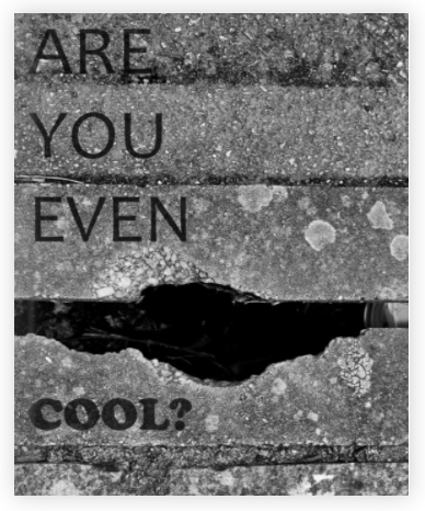
ARE YOU EVEN COOL?– Is the title of the photo-book it references Friendship, Identity and Youth Culture the photographer uses a mix of styles from portraits and close ups of certain body parts to landscapes and environmental photography.

Who is the photographer? 

The photographer is called GIO RIOS, I think he aimed his audience at the youth and society in general. I believe he made the book to show people some stereotypes of a “COOL KID”.

Deconstruct the narrative, concept and design

The book feels smooth with a dark glossy hard cover paper, inside the photo-book the pages are a mix between glossy and a little rough feeling. The whole book is in black and white with some pages being left white- blank. The photo-book is made to be portraiture and A4 sized with 56 pages. The binding of the photobook is saddle stitch and it has an image wrap with a durable matte finish.

Title

The title is quite poetic and sarcastic and relevant to the youth it was intriguing as you didn’t know exactly what to expect. I felt like the title was purposely open to interpretation.

Narrative

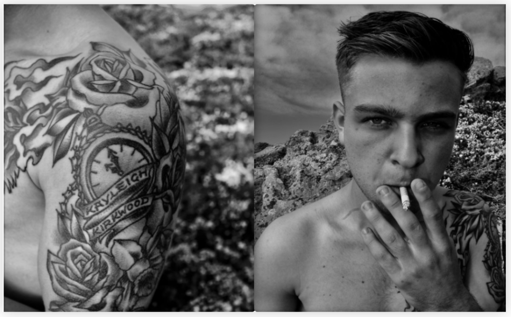
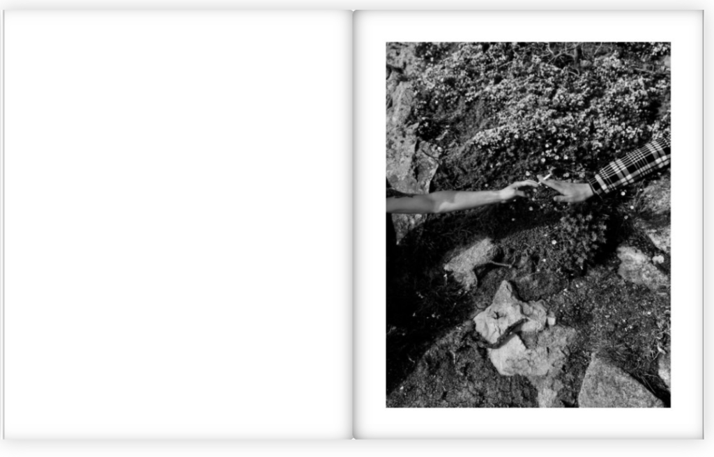
the story’s first few pages start by showing a hangout spot a tree that’s been cut to look like a chair, followed by a tattooed arm and a boy smoking. Cigarettes seem to be a reoccuring theme as some images feature passing a cigarette, smoking, or blowing out smoke. The cigarette concept of the photo-book might be hinting at the TITLE that the stereotypical teenager smokes and smoking is for “COOL KIDS” making it a motif.

Design

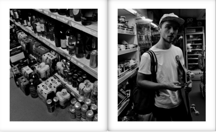
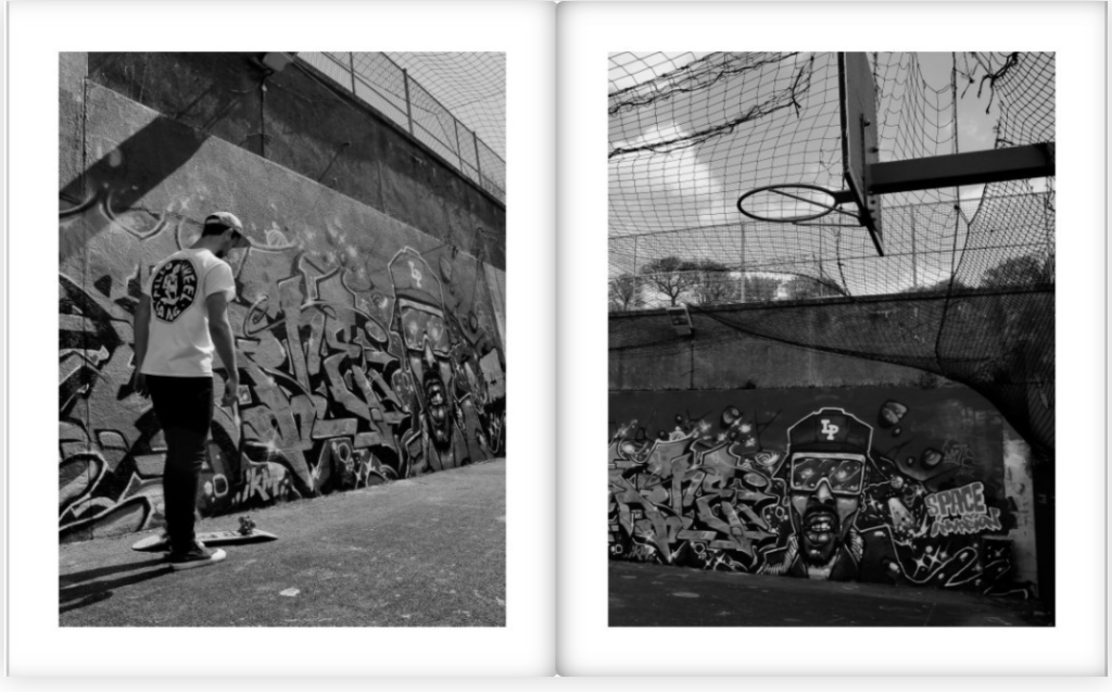
Most images are a full bleed covering the whole page with occasional plank white pages in between, however there are no double page spread or fold- outs/ inserts. Gio Rios made sure to evenly space out the images where there is a cigarette, the portraits of his friends were also kept together or either on the next available page. The only text throughout the photo-book is the title and the first page where he wrote: ‘aesthetic of attitude, behaviour, comportent, appearance and style which is generally admired.

NARRATIVE – PLANNING MY PHOTO-BOOK

STORY: What is your story?

  • 3 words : My personal diary
  • A sentence : A range of photos from key events in my life 2020/2021.
  • A paragraph : I am going to create my own personal photo diary, taking pictures of people I love as well as all the simple, mundane parts of my life. The photos will depict my forest memories, good and bad, that I would like to remember.
NARRATIVE: How will you tell your story?

SPECIFICATION

and describe in detail what your book will be about in terms of narrative, concept and design with reference to the same elements of bookmaking as above:

  • How you want your book to look and feel. I would like the book to fell matte and smooth like ‘Diary’. It could possibly have a textured surface.
  • Paper and ink. matte images and matte pages.
  • Format, size and orientation.
  • Binding and cover.
  • Title : some of my ideas have been ‘dear diary’, or ‘dear future me’, but my favourite title has been ‘Dear, Liw’ which really focuses on who’s life my book is about; myself.
  • Structure and architecture: random arrangement of images, jumbles dates. One image per page preferably, and all the images will be the same size. Most of the images will be edited in the same way to keep consistency and authenticity.

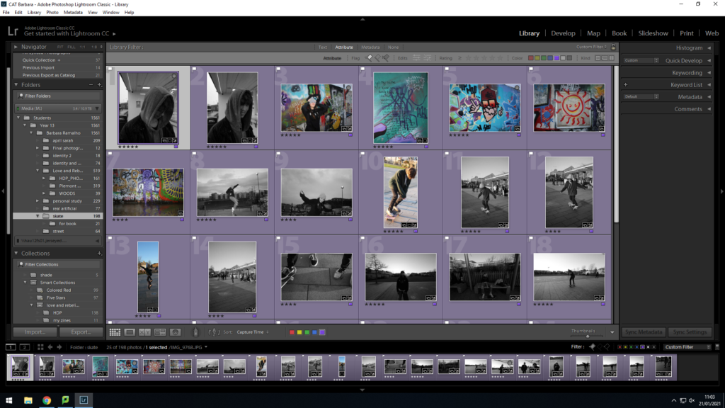
Design and layout. Editing and sequencing. There will be one image per page in the same orientation, mainly landscape and not portrait. Photos will rarely be in black and white. Images will mainly look like disposables (aiming to edit like Nan Goldin and Corinne Day). Random sequencing, what images look best together on opposing pages. All images will be mostly edited the same, I will try to not crop the images so they are as real to the scene I took a photo of.

Images. New photographic responses, photo-shoots. I will be taking photos on a daily basis of my friends and family. I plan for all of my images to be extremely candid. Due to the fact they will not be particularly planned, it gives a natural feel like a diary would and lets the audience feel like they’re in the moment with me. Old photos from family albums, iPhone. I may want to use photographs from 2020. Due to C19, I have not been able to see/ meet with friends and family like I would usually. I would like to use some images from 2020 t fill my book with lively events.

text. letters, documents, poems, text messages. These will caption each photograph in my book. There will be short caption to each image, explaining what the image is about, however I plan to write what makes sense to me; I’m not explaining the whole story, just what reminds me of the event/ experience. I also plan to scan through my own handwriting to caption each image, making it further seem like my own diary. I could include ‘souvenirs’ from days such as tickets and wrappers, letters etc.

2. Produce a mood-board of design ideas for inspiration. Look at BLURB online book making website, photo books from photographers or see previous books produced by Hautlieu students on the table in class:

images will include things like:

  • washing my own first car
  • practicing driving for the first time
  • going on family walks
  • going to friends
  • meeting with my boyfriend
  • cool images that I find interesting

David Lynch – Director of Dreams

The First Famous Surrealist – Pauline Kael

“We think we understand the rules when we become adults but what we really experience is a narrowing of the imagination.” 

― David Lynch

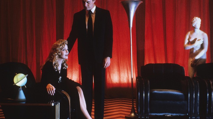
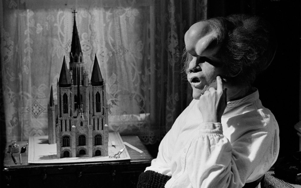
Gripping the audiences imagination is one of Lynch’s true talents when it comes to the film industry. Although he started off as an artist, his artistic skills contribute to his films and they start to make more sense when you remember where he started. Most of his film have very little dialogue and if they do it’s because its used more as poetry and each line has a purpose and specific meaning. Similar to how he frames each scene; each one is framed a certain way and creates a particular feeling with the viewers and often it leaves them mildly disturbed. Being one the biggest contributors to surrealist film industry, you would think that Lynch’s work would be fairly mainstream although it is quite the opposite. Although he is mostly a film maker now he felt as if he wanted to be known more as an artist, who typically won’t be as well known as a film maker. His most famous film (his debut film), Eraserhead, still stands as a benchmark in surrealist horror, and Lynch would go on to define surrealism in film through his later works Blue Velvet, Twin Peaks, Lost Highway, Mulholland Drive and Inland Empire. But what gives Lynch’s strange masterworks their strange ominous feeling upon his fans and longevity is his keen artistic eye; his fascination with the light and dark of American life, and his brilliant command of unique character and melodrama. It’s a powerful and heady combination of strange and amazing; a combination that has earned David Lynch a legion of devoted fans and earned him a place as one of the greatest filmmakers in history.

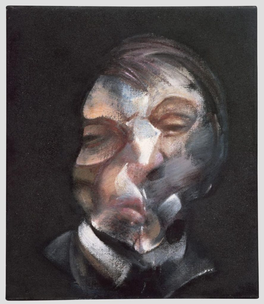
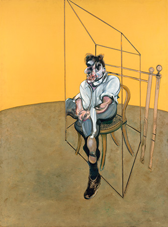
Inspiration: Francis Bacon

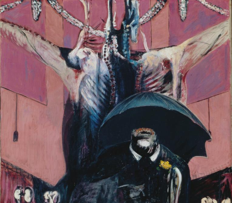
At the beginning of David Lynch’s Career he found inspiration through the famous and wealthy, Francis Bacon was an Irish figurative painter, who was influenced in his earlier years by Picasso and surrealism. His most expensive painting was a staggering $142 million! His unique expressionist and deeply disturbing style of painting, which emerged during the 1950s, featured pictures of people screaming or in pain and often portrayed inside bathrooms or cages. Arguably this painter of the twentieth century, was also for forty years the most controversial. Bacon’s art often appears deliberately disturbing. His subject was the human form. Bacon reinterpreted the physical construction of the body with a new and unsettling intensity. To him it was something to be taken apart by the artist’s penetrating gaze and then put back together again on canvas. He forces us to see, perhaps for the first time, the separate shapes and stresses hidden in the familiar human figure. The way Bacon painted his faces could be especially challenging. In his portraits, generally of people the artist knew well, the subjects are sometimes shown screaming. Due to his paintings, he was often called an Expressionist or even a Surrealist, Bacon himself strongly rejected both labels. He insisted that in its own way his work was close to the world we see every day, remaining true to what he called “the brutality of fact.”

Surrealism was a movement in literature and art, that now links in to photography and film making, which was popular between the First and Second World Wars. It was founded by the poet André Breton and the movement emphasised the importance of unconscious thought as a starting-point for creativity, inspired by the work of Sigmund Freud. Surrealist artworks are signified by their juxtaposition of incongruous imagery and figurative, typically photo-realistic style.