The Narrative
Rebels, Rejects and Outcasts.
The photo-book is to be a self commentary about myself and the people I surround myself with; documenting the mischief and mishaps we experience as the modern youth. The book aims to capture the rebellious temperament of youth in the modern age. By incorporating a rejection of societal standards and the governing law, the project will show a depiction of the liberating and care-free nature our youth has and the sense of immortality that they approach life with. I want to change the view of the typically ‘corrupt’ lifestyle that society labels many young individuals as living by granting the audience with some insight into the modern youth culture of today. A theme of rebellion is to be presented throughout the book by presenting the sense of release felt from rejecting typical social standards, giving the reader an insight into the subjects’ hedonistic and rebellious subculture.
The book should impact those of all ages but resonate particularly with individuals who are of a similar age to the subjects within the book. However, the emotions and nature of the subjects may be shared with older generations, who may have previously expressed their identities in similar ways in their own youth. The book aims to present a youth subculture that expresses different attitudes to the standard accepted beliefs and values that older generations hold.
Design
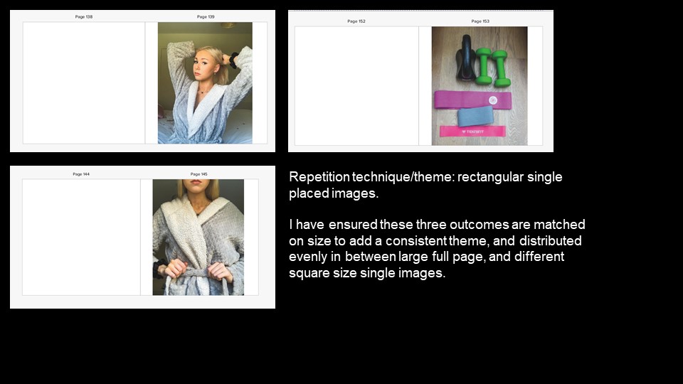
For my photo-book, I want the general feel to be similar to that of a scrapbook. I’m planning to have physical inserts and ephemera, such as: Polaroids, parking notices, old debit cards. Furthermore, I plan to incorporate physical handwriting into the project, as inspired by Corrine Day’s ‘Diary’, adding captions and labels where I feel necessary.

Some reoccurring colours I want to appear in my photobook are red, yellow and black. Both red and yellow have connotations of caution and danger, though red can also represent anger, courage love and joy.
The colours will be present in some of the ephemera, such as the parking notice or the spray paint from one of my photoshoots.
FRONT AND BACK COVER:
I will begin this colour theme on the front cover. The cover is to have a visually striking combination of red and black, conveying a sense of power that the subjects inside have. Layering the images on the front cover straight away gives the reader an insight into the scrapbook-nature of the book and the overall messiness and complicated nature of the subjects’ lives.


I plan to produce a portrait photo-book, allowing for the placement of establishing landscape shots comfortably over two pages. Additionally, a portrait book is similar to that of diaries, portfolios, sketchbooks and other personal items one might own or carry around with them. I aim for the book to be larger than a standard novel but small enough to make it portable. My reasoning for this is to have something that allows for a clear depiction of the photographs inside but can be stored or carried about with ease.
Furthermore, the cover of the book is to be a matte hardcover. A physically hard cover is durable, depicting the strength of the relationships within the book, as well as the strength of each of their characters and personalities. A matte finish means the cover can collect swirls, scratches and other imperfections over time which can make the reader feel as though they’ve added to the genuinity of the book, in turn physically linking them with the subjects in the book.
PAPER:

My choice of paper was one that adds an organic feel to the photobook. I decided against glossy paper as it would make the book look and feel more artificial and synthetic, both of which are concepts I’m aiming to avoid. The eggshell paper I favoured provides a rustic element to the feel of the book. As it is textured, it allows the reader to engage with the book with a sense of touch. This ties in nicely with the scrapbook design I intend to produce. With a mixture of interactive inserts alongside the textured paper, the book as a product has more authenticity and feels unique, giving the reader a privileged insight into the lives of the subjects inside. This, in turn, encourages the reader to handle the book delicately and with sentiment.
TITLE:
For the title of the photo-book, I decided on ‘Passing Youth‘. This links to the content of the book, as it is a double entendre. Firstly, the title relates to the depth of the youth subculture and the type of characters found within. The first meaning behind the title is that it stands for ‘the passing of youth’, which represents how youth itself is a short period of time; one everyone experiences that is extremely fleeting. This momentary period in everyone’s life is precious and is often what people look back on in their older years, making my photobook nostalgic for older groups as well as making those of a younger age want to take advantage of their freedom during this period. Secondly, ‘Passing Youth’ can also place the reader in the shoes of someone who is physically observing these adolescents. This gives the reader the option to view the subjects the same way a passerby might, looking at the reckless and careless nature of the characters and judging them on a superficial level, as society might do. In response to this judgement, I hope that the hedonistic images and physical inserts will alter the way these youths are perceived, by granting insight into their lives, their emotions and their actions, therefore removing the societal judgment teenagers are often greeted with and instead replacing it with a new understanding which may have previously been overlooked.
ARCHITECTURE:
As previously mentioned, physical inserts play an important role in the architecture of the photobook. They allow the book to become interactive, giving the reader the option to physically connect with the narrative. Firstly, a parking notice conveys reckless and careless driving. This particular piece of ephemera is large enough to take up a substantial amount of space within the book. I will designate it a singular page to which I will juxtapose with either an image depicting a car boot filled with alcoholic paraphernalia (to convey careless driving) or against a portrait of the individual who received the notice, which grants insight into the type of character and, more specifically, the type of driver the subject is.
Another important physically element I am incorporating into the book is a debit card. So as to protect my personal data, the card has been cancelled and is therefore void. A major association with cards in the youth subculture is the ingestion of illegal substances. Cards, whether it be a driving license, credit card or gift card are used to crush up pills or divide up portions of a substance. This association adds to the recklessness of adolescents and the adaptation they take in order to carry out their hedonistic lives.
Finally, by incorporating polaroid pictures taken by the subjects themselves it amplifies the personal aspectof the book. The polaroid images have been physically handled and taken by the subjects, therefore adding another physical link to the characters in the book. This extra insight into the characters presented creates a greater rapport between the reader and the subjects within.
SEQUENCING:
I want the first image the reader sees to be a hedonistic image, so as to establish the overall tone of the book. By choosing an image with a strong, positive emotion, I can convey the type of experiences the modern youth culture seek out. I plan to open the photobook with a portrait of a subject covered in spray-paint from one of my shoots. This begins the narrative ambiguously, due to the lack of context as to why the subject is covered in the paint.
Adversely, I may use a debit card as the first thing the reader sees, placing it on the right page of a double page spread. Placing this insert first leaves the significance of the card up to interpretation by the reader as they progress through the book. The context of the card, as well as the paint, will be unravelled later on through establishing shots so as to encourage the reader to flip back through the book with knowledge of the context. Alternatively, I may place the debit card insert next to the image associated with it, so as to give the reader a physical connection to the moment captured in the image beside it.
Design: Moodboard