Sequences –
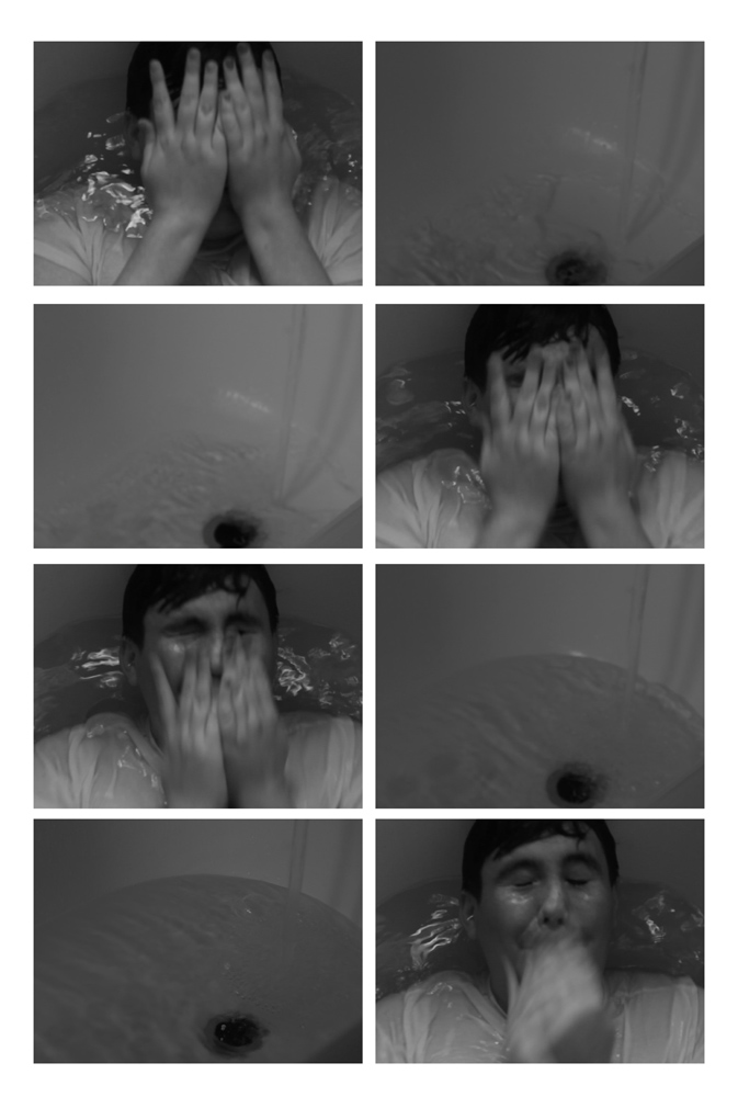
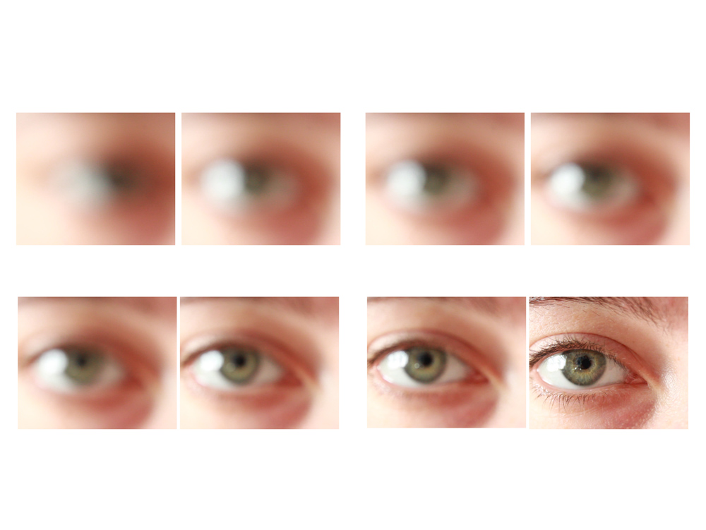
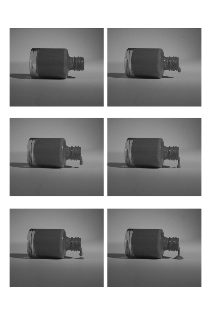
Montage –
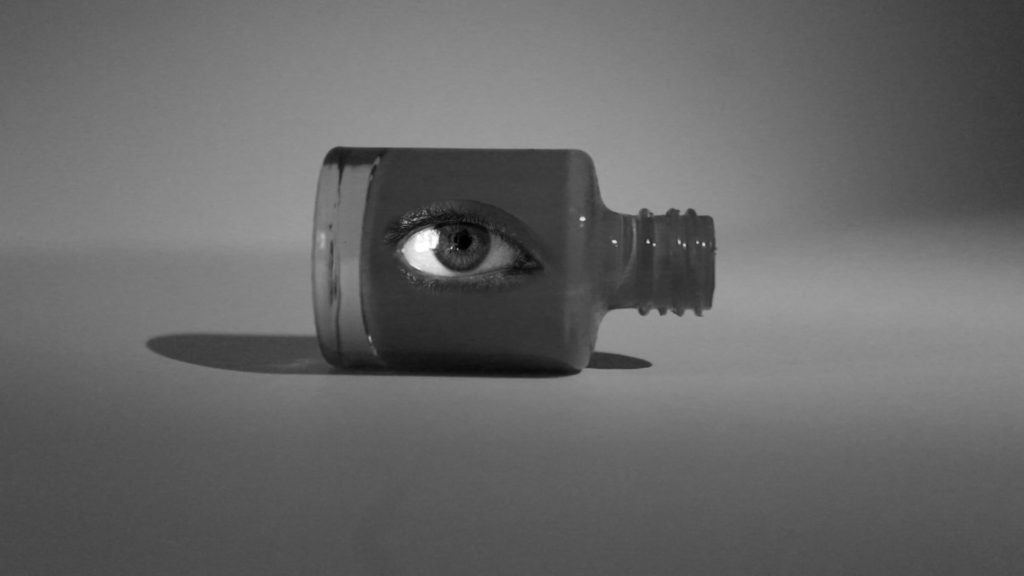
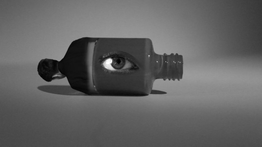
Juxtaposition –
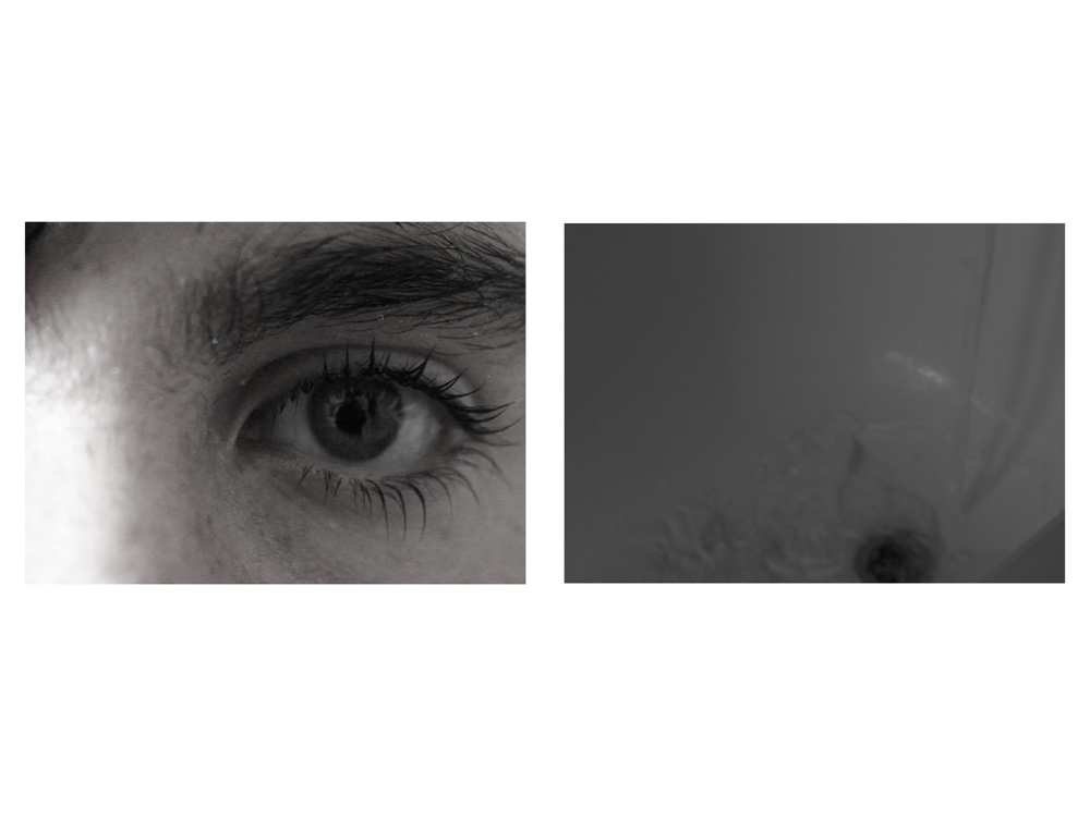
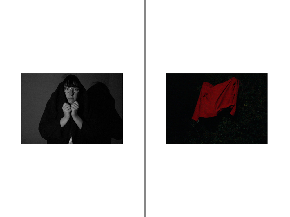
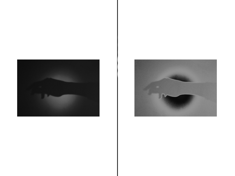
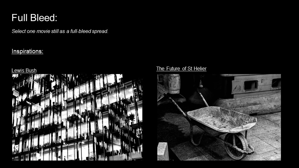
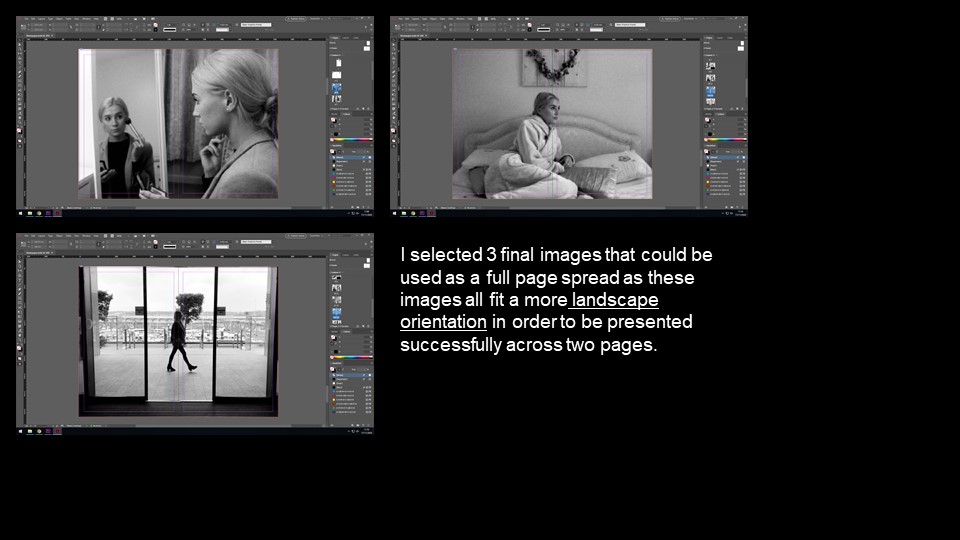
Full-Bleed –
Sequences –


Montage –


Juxtaposition –


Full-Bleed –


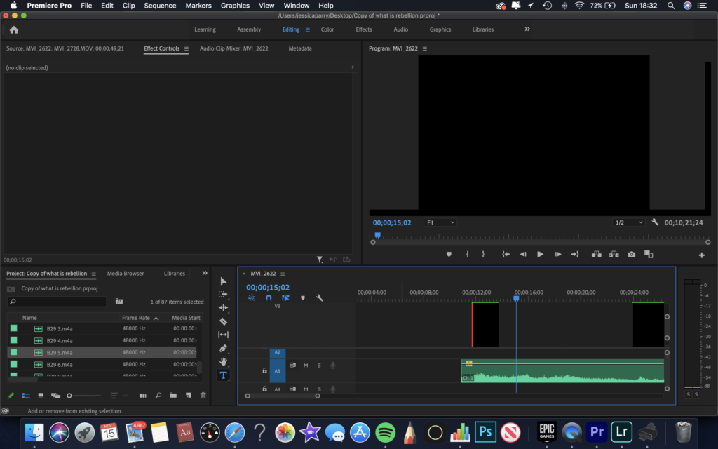
At the start of the film, I started with a black screen as I wanted to increase the viewers attention on the audio playing. I decided on the colour black as it related directly to the sombre mood of the film. The black screen lasted 24secs until the audio changed and required a visual to complement and explain it.
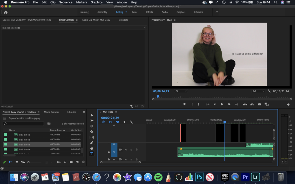
I decided to add captions of what the audio was saying, as I wanted to make sure it was accessible to all. The captions also allowed me to make the audio a more prominent feature of the film as the viewer would both read and hear the voice. I placed the captions in relevant areas that didn’t intentionally distract the viewer from the visuals.
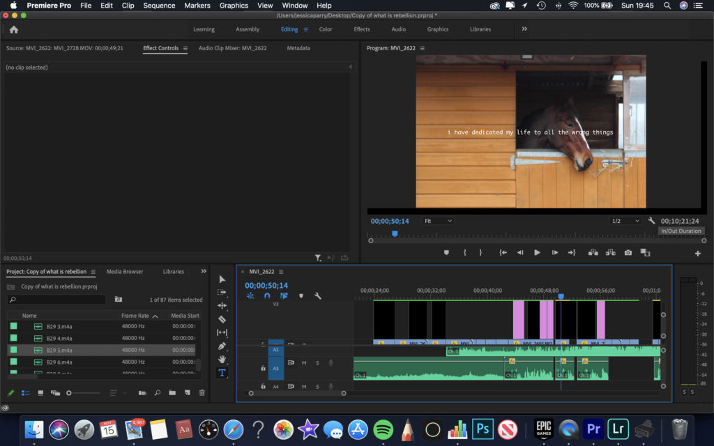
With this video I was mostly looking to add some bright colour into the film. The film started off quite plain and as it went on more colours were introduced.
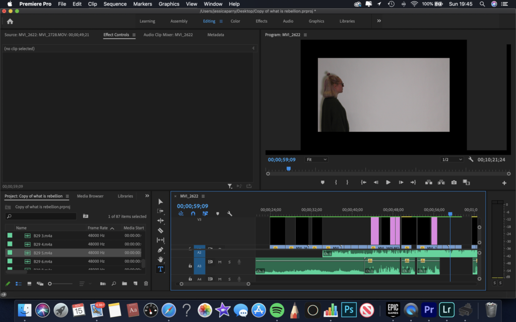
I decided to add a border on this clip, as I wanted to emphasise the position and the message that was displayed which was distancing yourself from things.
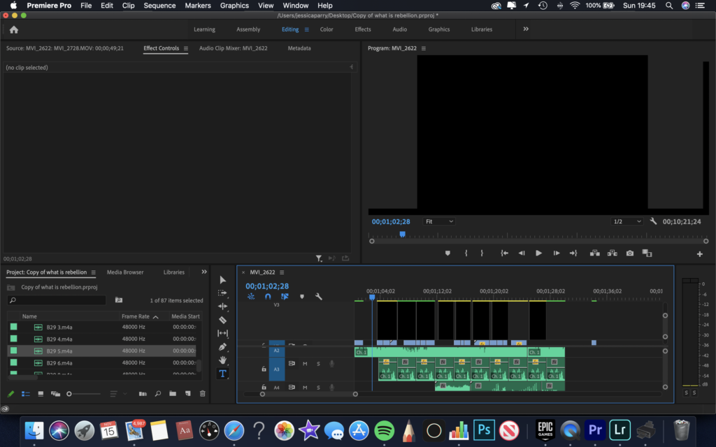
Throughout the film I added small snippets of black screens to display a pause, and a time for people to reflect. Some of the black screens repeated and followed a pattern near the end when the phrase, ‘I feel as if I haven’t lived at all’ was heard in the audio.
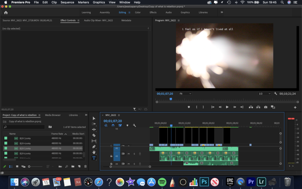
Throughout the film there are some clips that are out of focus, I did this on purpose as I wanted to dramatise the meaning of the film and to show that the definition of rebellion is blurred and is under interpretation.
below are some newspaper spreads that I have made including some stills from my films which was a response to the question, what is rebellion?
montage
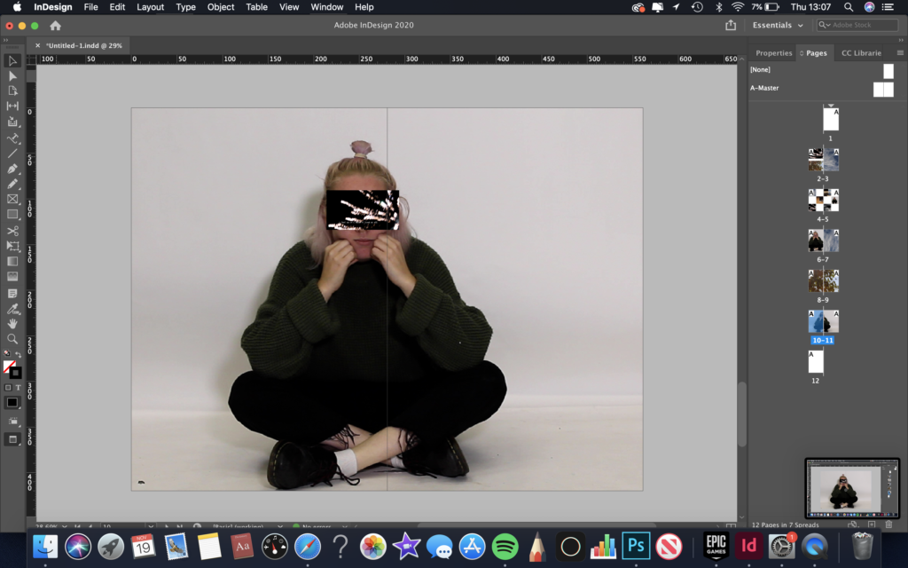
my idea when creating this was to juxtapose two images on top of each other. The background image connotes to lack of freedom and boredom, whereas the foreground connotes to liberty and living freely. the titling on the foreground relates directly to the background, by stating ‘i feel as if i haven’t lived at all’.
sequence
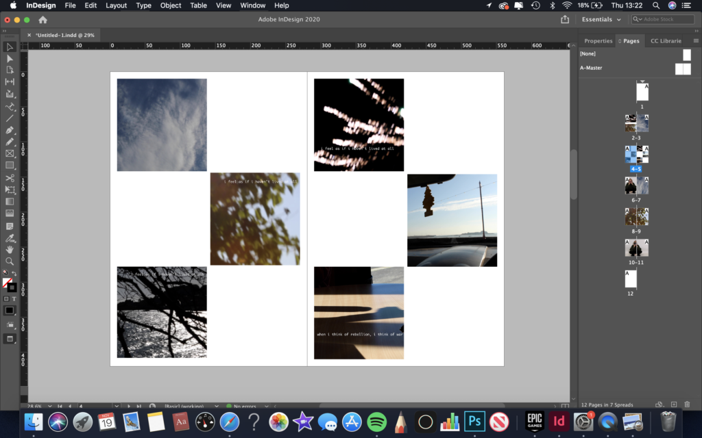
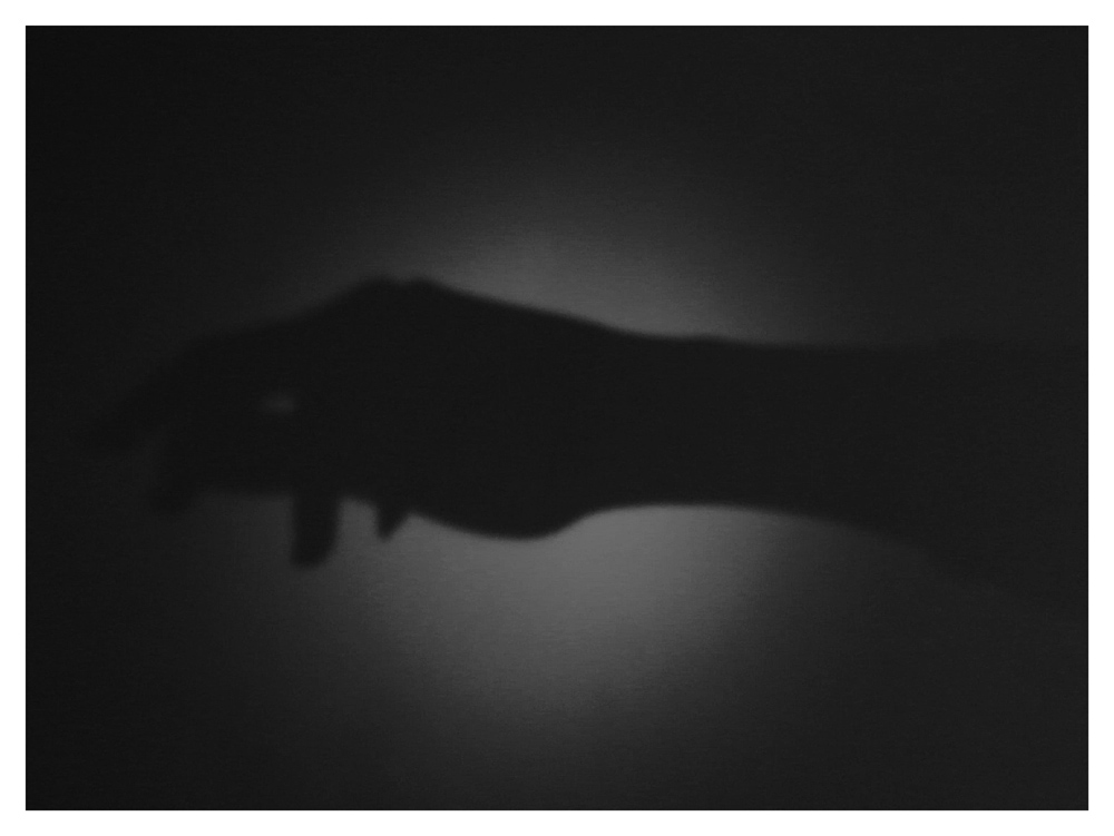
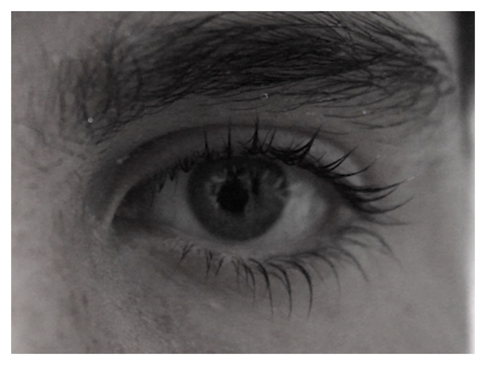
my idea when creating this was to have a continuous sequence from having freedom to a lack of freedom, which can be seen as a running theme throughout my film.
juxtaposition
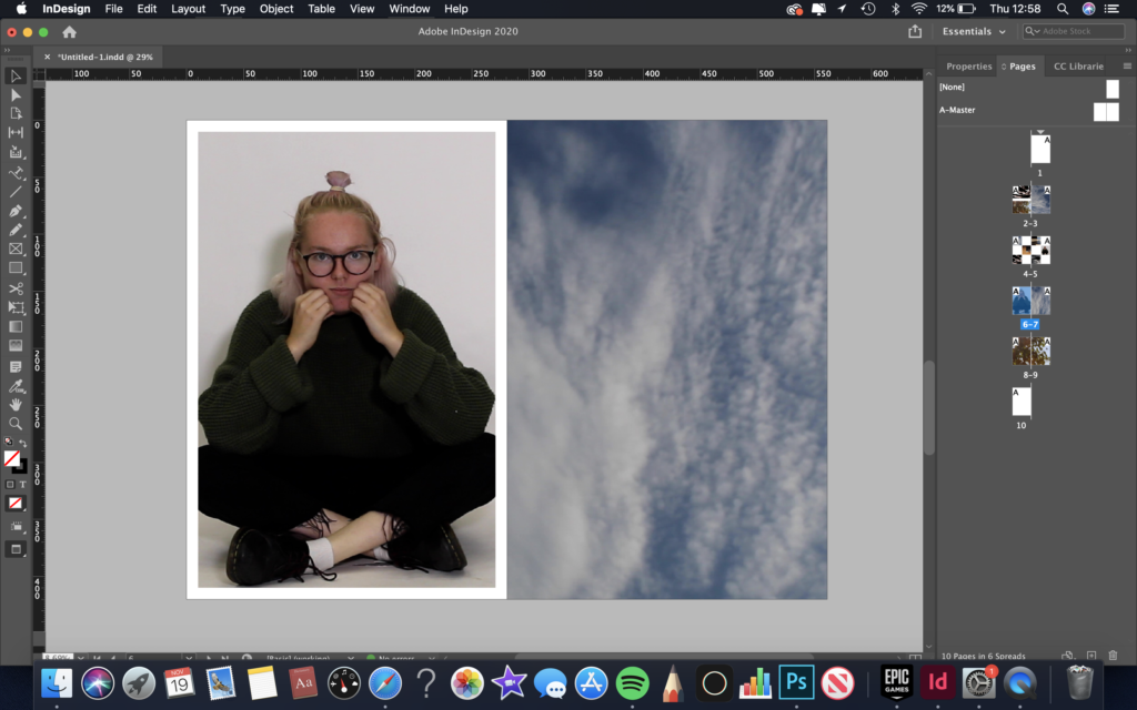
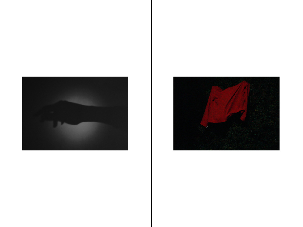
my idea when creating this I wanted to place two images next to each other that juxtapose each other. the image on the left relates to lack of freedom and the image on the right relates to liberty and having freedom. i decided to have a white border around the image on the left to show how the image could relate to being held back in aspects of life. i then decided to contrast this by making the image on the right fill the page to show how this image relates to not being defined and being free.
full bleed
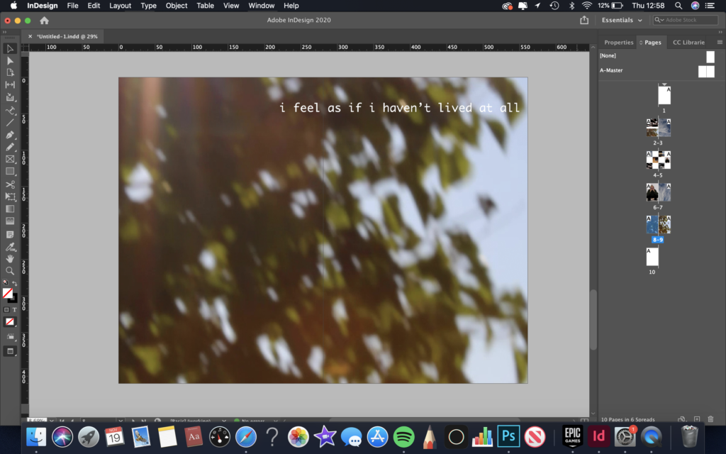
my idea when creating this was to have a large image of my main theme from my film, which was feeling as if I hadn’t lived at all.
Here is the link to my final film, Multiple Identities, which explores gender identity.

Something else: a short film on gender labelling. By Charlotte Bainbridge, Lexie Stephens and Lucie Hardisty.