
As previously shown in a last blog post, I have already selected a number of still images that came from me selecting specific frames from my movie, and print screening them in order to create a still image. Now I will be presenting these still images in a certain layout that will go on to be published as a newspaper spread.
SEQUENCE
Inspirations for my Sequence design:
Duane Michals
Bernd and Hilla Becher

MY OWN STORYBOARD/TYPOLOGY LAYOUT
STORY BOARD
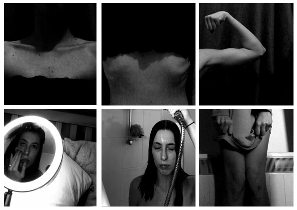
In this case, I opened Photoshop, opened a custom canvas and began opening the still images that I had already chosen and edited. I then would crop each of them into a square format and placed the images in the order that they appeared in my movie to create a storyboard.
I feel as though this turned out quite nicely however some of the images for example, the shower still image, appears a little stretched which takes away the aesthetics of the storyboard. I also dislike how the lighting is extremely inconsistent across the story board however this does create some juxtaposition.
TYPOLOGY
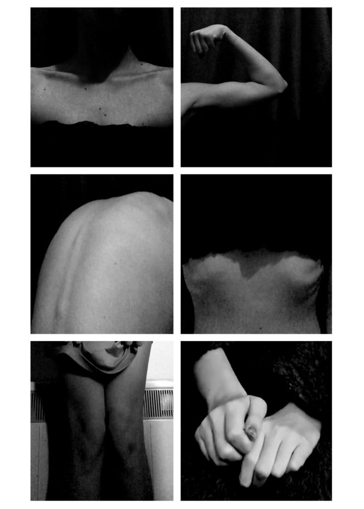
For this typology, I collected the different frames that involved a number of different body parts as this is the category I decided on for this typology. Most of them were easy to gather as a lot of my movie involved showing various different body parts, however, specifically for the bottom two photographs, I had to gather a couple of other still images that aren’t explicitly showing body parts and zoom in onto specific areas like my hand. I also leveled each image a little more to my preference and to create an eerie/dark atmosphere among the typology.
Overall, I’m really happy with this typology and wouldn’t change anything.
JUXTAPOSITION
I made a few juxtaposing spreadsheets due to the fact that my still images all quite similar and I wasn’t sure how the images could juxtapose each other therefore I experimented with the images.
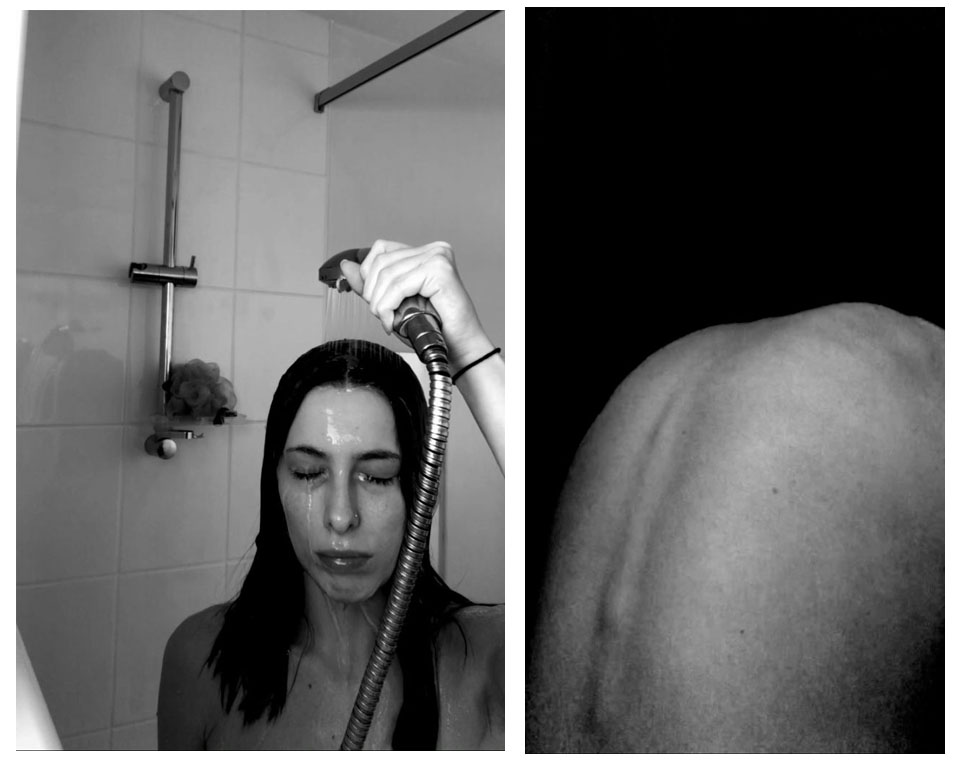
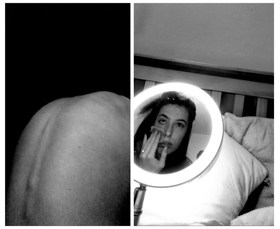
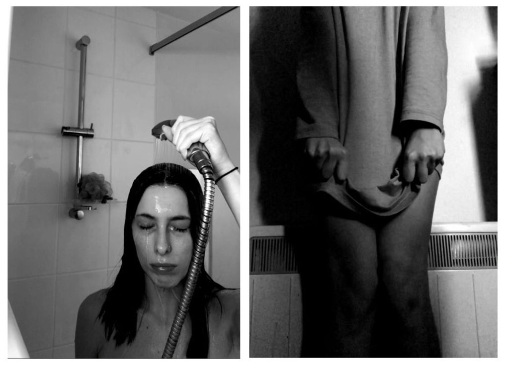
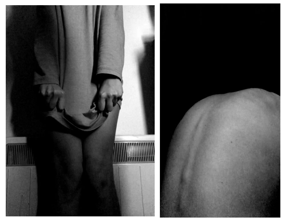
I chose the still image of my back a few times as I feel as though this is a really powerful image, I also think the contrast within it is really great and creates a clear, aesthetic photograph. I feel as though my favourite justxaposing images are either the second spread sheet or the last, just above us. This is because in the second one, I feel as though not only do the images juxtapose each other, but the lighting does too. It also shows to sides of different stories, for example, the picture of my back is showing body insecurity, and the other is showing facial insecurity which creates the overall theme of not loving yourself. The last spread sheet is also my favourite because of the strong contrasts between the two. The shadows in the first image have many strong shadows that make it really aesthetically pleasing and the same with the second image. I also like how one image involves clothing while the other doesn’t – representing exposure and not wanting to cover up while the other image is clothes and is almost as though the subject doesn’t want anyone to see her body.
FULL BLEED
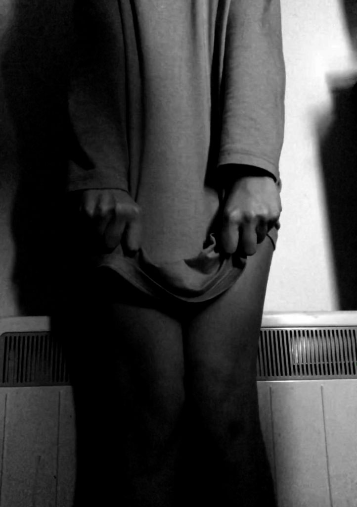
This is the image that I’d like to make a full bleed page spread due to the fact that it could have many connotations and meanings. There are a lot of emotions that could be interpreted here for example, fear, disgust, insecurity, anger, guilt etc. I also love the harsh shadows that are created in this image. I took it into Photoshop once more before uploading just to enhance those shadows and to create a darker, more mysterious tone to the image.