Daily Archives: 24/11/2020
Filters
Evaluation Of Film
RESEARCH AND PLANNING
I feel as though my research was quick and easy process. This is because we had Shannon O’Donnell, a documentary film maker come in and inspire us with her video surrounding identity politics in the theme of gender fluidity. I fell in love with the elegance of her film’s and the way that she made them; through filming herself in front of the camera and experimenting with different clothing and positions. It is no doubt that she inspired me hugely and influenced the production of my film. We had spent a couple of weeks looking at Culture Wars and Identity Politics of which I looked into and created a blog post about, showing my knowledge and understanding. To me, culture wars and identity politics were hugely important, as they are in society in general, however I felt a personal connection with these certain topics. Things like gender, race, abortion etc are all things that I have a strong opinion on and things that I have wished to explore for a while. This is why I took such a personal approach to my film (body shaming and how women are stereotyped and expected to look a certain way). Not only had I been discriminated for that in the past, but it was something I felt very strongly about. Overall, the research I did and the help of Shannon O’Donnell was extremely helpful, I may have explored Identity Politics further and developed a more rich, in-depth blog post however I fully understood it.
The planning for my video however was quite weak. I didn’t quite know where to start with the whole filming process, on the other hand, again, Shannon O’Donnell inspired me hugely and I know that I wanted to use the same filming technique as her and the concept for my film came to me almost instantly due to personal experiences. My story board though for example, was quite weak as I had very little idea where I wanted to go with it and I wanted to jump straight in – the impulsive decisions that I made however were what created my film. This is similar with the voiceover – there was no real plan and I almost jumped into it and read aloud my stream of consciousness, again though, this is what made my film so excellent.
FILMING
Again, filming came with many impulsive decisions which isn’t necessarily a strong point as there was no real structure to my plan. Again though, it came out brilliantly. The weaknesses of my filming included things like not having the correct equipment – I found it difficult to film on an IPhone due to the portrait format that it had, this made me struggle with angles etc. I also didn’t have a tripod to lay my phone on, that left me scattering around looking for anything and everything I could get my hands on that would be able to balance my phone in the correct position. Another problem was the area in which I was filming, I was struggling for a long time on where I should film that had a plain background yet was also a spacious area – due to my house being quite small there was really no area. So, I decided to hang my grey blanket over my door in order to create a back drop. All of these elements made it hard to film, and thorough planning would’ve cancelled these issues out however, my impulsive quick-thinking allowed me to make a good, aesthetically pleasing movie. Next time, I will most definitely think in depth of how, where, why, what and when I am filming to reduce the stress.
EDITING PROCESS
To begin with, I was quite nervous about working with Premiere as it was a software I hadn’t used before and it appeared to be quite complicated. But, I managed to get the hang of it and after that it was a fairly quick and easy process. I was also worried about the fact that I had filmed on an IPhone, and that it wouldn’t upload efficiently, however there were no issues when it came to importing them and they rendered perfectly. Editing was the most time consuming process, but it usually is, as you have to re-watch it a number of times and make sure it was perfect. The audio was also easier to import than I thought, and fit so perfectly with my movie. The voiceover, again filmed on my IPhone and via camera, this also worried me concerning importation, however all I had to do was delete the footage of my voiceover and separate that from the actual audio – again, easier than I thought it was going to be. Lastly, I thought that the subtitles would be a really time consuming process however I found my own little knack when it came to it. I simply selected each frame and added the subtitles with the text tool – this made it much easier and cut down the work load so much.
OVERALL
Overall, I am extremely happy with how my movie turned out, It looks amazing and it is exactly how I envisioned it to look. The impulsive decision making and lack of equipment may have cut the quality slightly however, it now has a contemporary look to it and I also wanted that atmosphere to be portrayed. So, although my technique and processes weren’t perfect, I feel if they were, my video wouldn’t have turned out the way it did. As mentioned before, if I were to make a film again, I would put more effort into research and planning and not just jump straight into it.
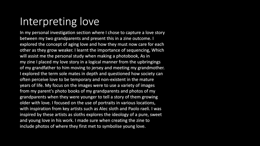
REVIEWING AND REFLECTING
Designing Newspaper Spreads
As previously shown in a last blog post, I have already selected a number of still images that came from me selecting specific frames from my movie, and print screening them in order to create a still image. Now I will be presenting these still images in a certain layout that will go on to be published as a newspaper spread.
SEQUENCE
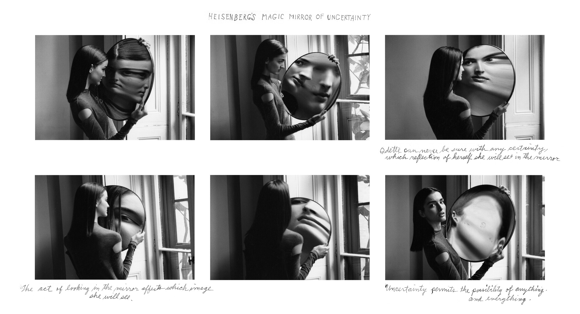
Inspirations for my Sequence design:
Duane Michals
Bernd and Hilla Becher

MY OWN STORYBOARD/TYPOLOGY LAYOUT
STORY BOARD
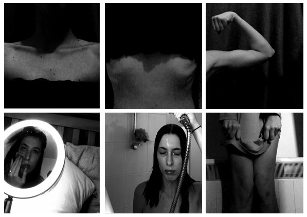
In this case, I opened Photoshop, opened a custom canvas and began opening the still images that I had already chosen and edited. I then would crop each of them into a square format and placed the images in the order that they appeared in my movie to create a storyboard.
I feel as though this turned out quite nicely however some of the images for example, the shower still image, appears a little stretched which takes away the aesthetics of the storyboard. I also dislike how the lighting is extremely inconsistent across the story board however this does create some juxtaposition.
TYPOLOGY
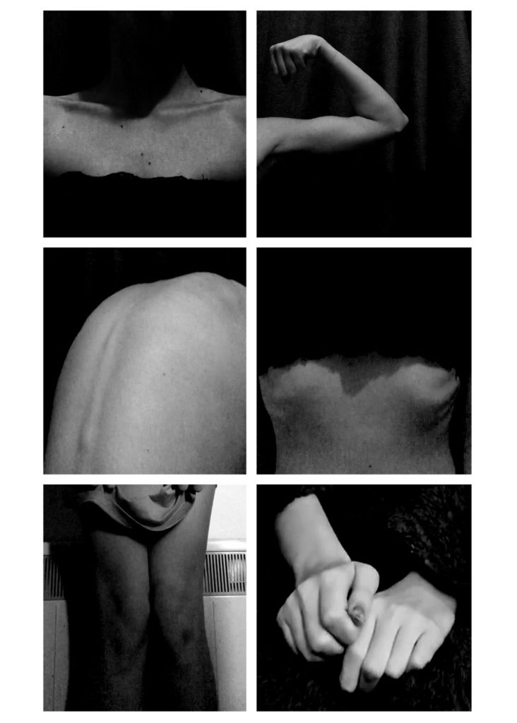
For this typology, I collected the different frames that involved a number of different body parts as this is the category I decided on for this typology. Most of them were easy to gather as a lot of my movie involved showing various different body parts, however, specifically for the bottom two photographs, I had to gather a couple of other still images that aren’t explicitly showing body parts and zoom in onto specific areas like my hand. I also leveled each image a little more to my preference and to create an eerie/dark atmosphere among the typology.
Overall, I’m really happy with this typology and wouldn’t change anything.
JUXTAPOSITION
I made a few juxtaposing spreadsheets due to the fact that my still images all quite similar and I wasn’t sure how the images could juxtapose each other therefore I experimented with the images.
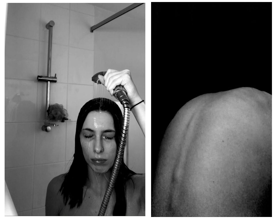
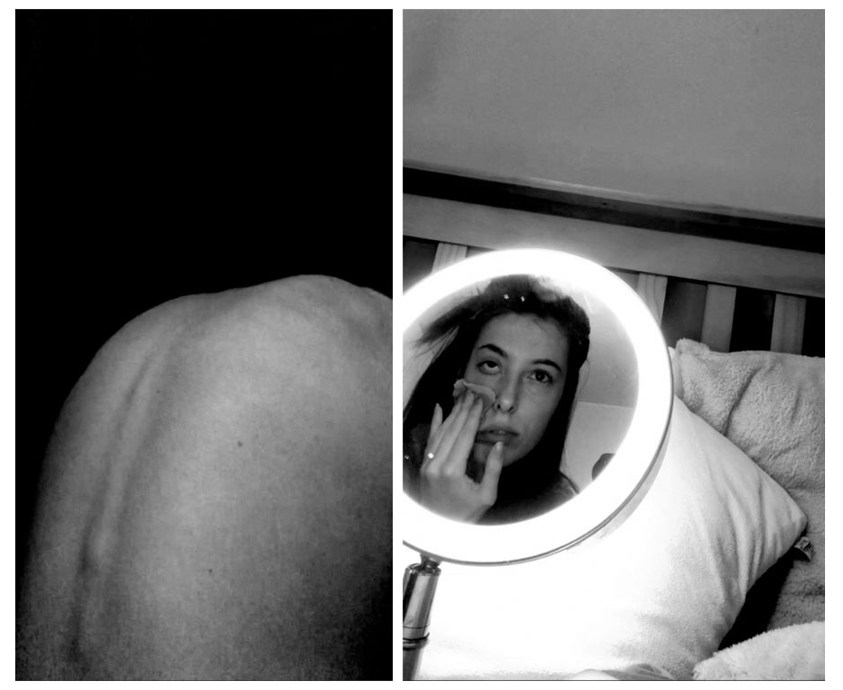
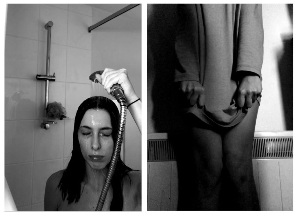
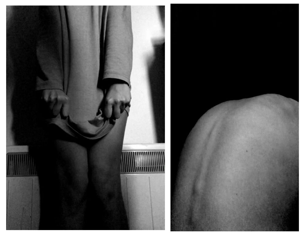
I chose the still image of my back a few times as I feel as though this is a really powerful image, I also think the contrast within it is really great and creates a clear, aesthetic photograph. I feel as though my favourite justxaposing images are either the second spread sheet or the last, just above us. This is because in the second one, I feel as though not only do the images juxtapose each other, but the lighting does too. It also shows to sides of different stories, for example, the picture of my back is showing body insecurity, and the other is showing facial insecurity which creates the overall theme of not loving yourself. The last spread sheet is also my favourite because of the strong contrasts between the two. The shadows in the first image have many strong shadows that make it really aesthetically pleasing and the same with the second image. I also like how one image involves clothing while the other doesn’t – representing exposure and not wanting to cover up while the other image is clothes and is almost as though the subject doesn’t want anyone to see her body.
FULL BLEED
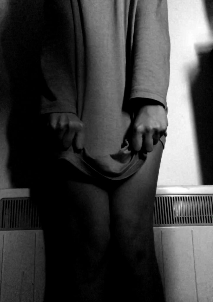
This is the image that I’d like to make a full bleed page spread due to the fact that it could have many connotations and meanings. There are a lot of emotions that could be interpreted here for example, fear, disgust, insecurity, anger, guilt etc. I also love the harsh shadows that are created in this image. I took it into Photoshop once more before uploading just to enhance those shadows and to create a darker, more mysterious tone to the image.

