After filming the pieces inspired by my mood board. I print screened particular parts of the footage so that I will have some still images. After screen printing, I put them into Photoshop and edited them slightly through levelling so that I could accentuate different parts of my body in particular scenes e.g my rib cage. This fits my title of ‘DYSMORPHIA’ quite well when including the still images.
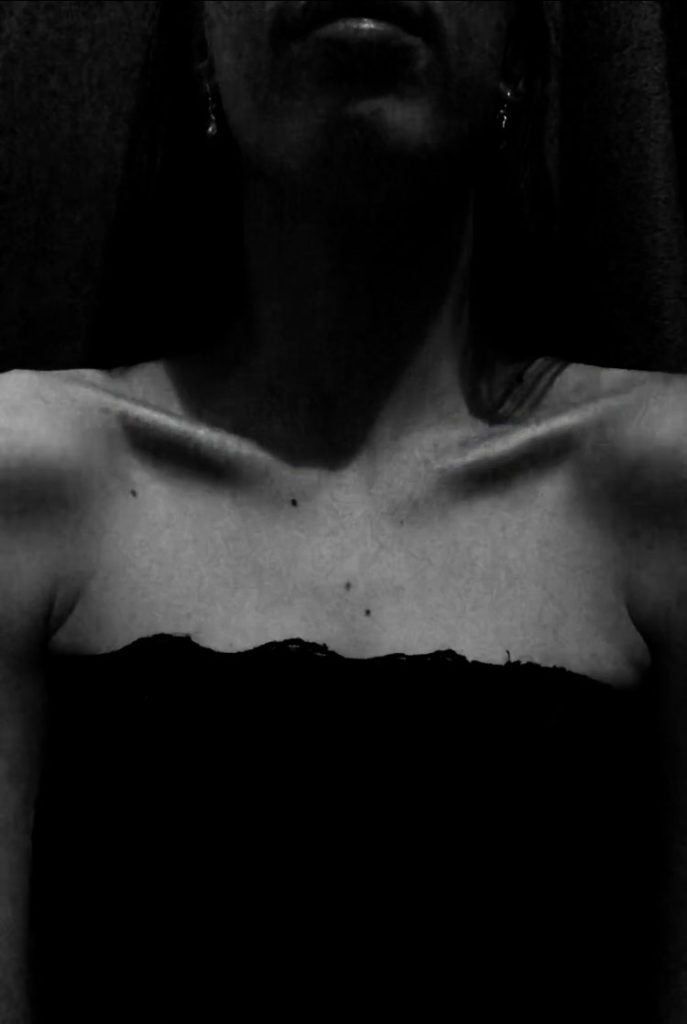
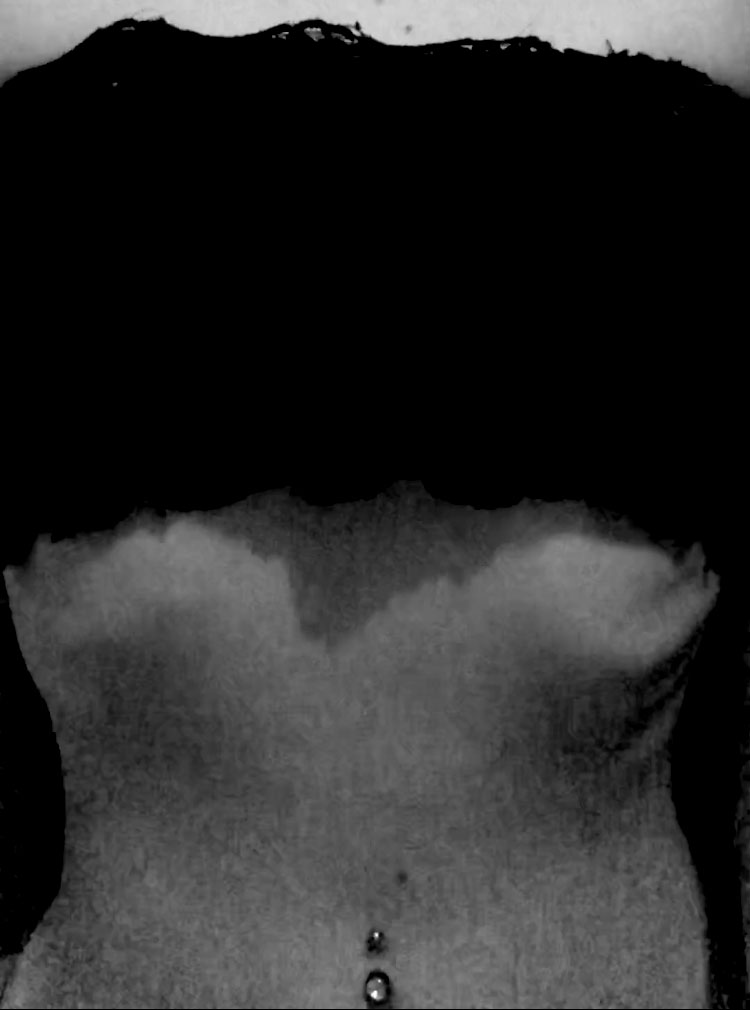
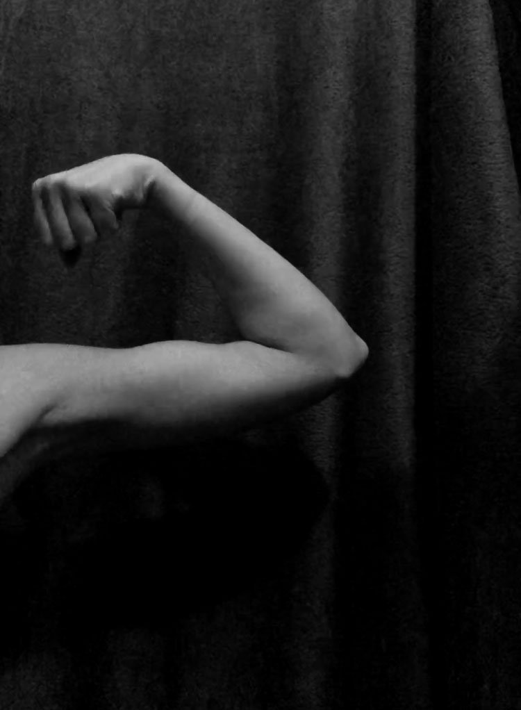
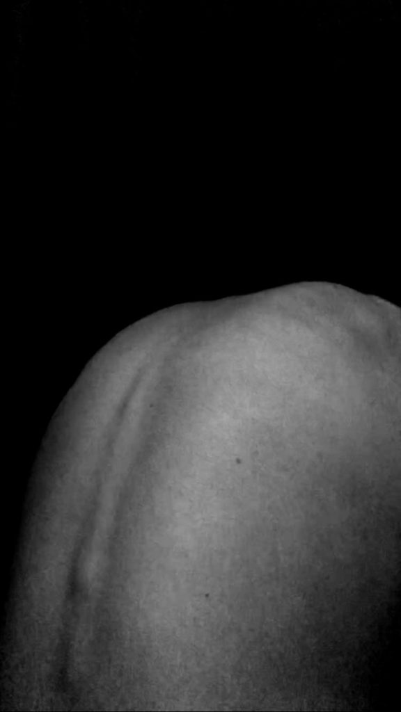
In these first few images in particular, I was looking to accentuate different features of my body for the movie, this gave the idea that I was picking at every little bit of my body due to the judgement that I have received. The use of levelling helped with the accentuation with my bones as it created shadows that fell beside the structures and helped them pop out in the image. I like these photos because my goal was achieved (accentuation) however I do feel as though the images are quite dark. This is due to the levelling however without the darkness I wouldn’t of achieved that level of accentuation of my bone structure. The darkness also creates a great contrast between my body and the background.
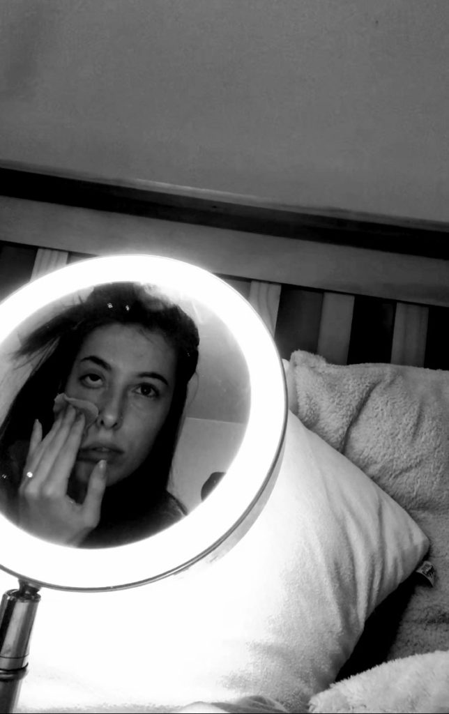
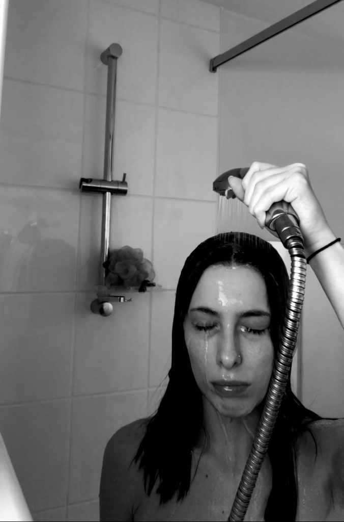
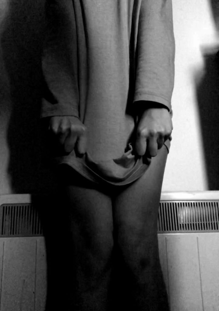
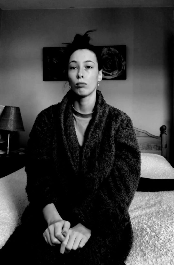
These images are a bit brighter and do not focus so much on different parts of my body but instead reflect in a way the numbness that I feel about myself on a day to day bases. The levelling in these images helped with the contrast and added a little boldness to the images in order to make them more intriguing. The stills represent a really mundane atmosphere which is what I was going for overall in my film. Overall, I really like these still images and I’m also proud of how I managed to replicate my thoughts and ideas from a story board to literal footage and still images. These really reflect my concept and allow my message to get across.
