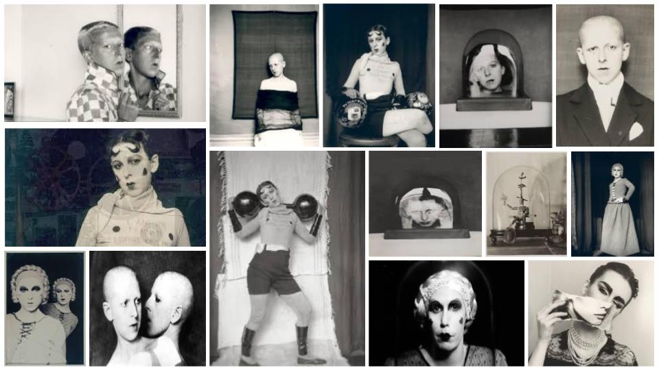
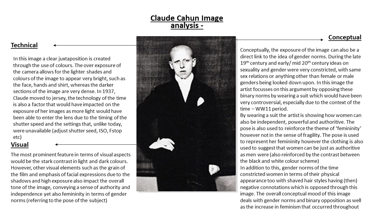
Claude Cahun (real name is Lucy Renee Mathilde Schwob) was a writer, sculptor and photographer born in 1894. Her self portrait work was very influential, empowering women and contradicting very unfair female gender roles in late 1910’s until her death in 1954. Cahun presented herself in men’s clothing, and with short hair. This work was courageous as it was difficult for women to freely express themselves during the times her portraits were taken. For her time, Cahun’s work was considered ‘different’ and ‘odd’ leading to people categorizing her in the Surrealistic artist group. Cahun lived in Jersey during World War II as a Jewish gender neutral person.
Technical
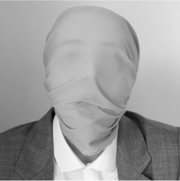
Close up shot which are often linked with emotion and encourage the viewer to try and understand how the subject feels.
Soft Black & White to create a neutral image with emotion.
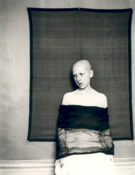
Visual
The item over O’Donnell’s head removes all sense of identity from her and creates a sort of ‘blank’ human.
The bland suit and shirt compliment the item over her head and further emphasizes the loss of identity.
The male clothing contradicts gender stereotypes.
The background of the image and the item are very similar in their colour causing them to appear as if they are merging with one another. I feel as if this is a statement towards gender stereotypes and performativity making everyone the same.
Conceptual
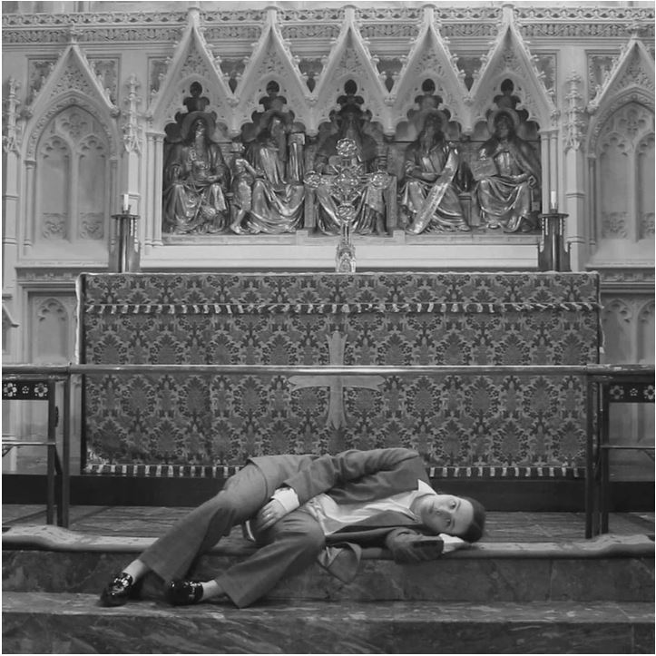
This image is taken from O’Donnell’s short film ‘That’s Not The Way The River Flows’ which highlights the issues surrounding gender and it’s affects on individual identity.
O’Donnell says ‘ As we unpick the complicated narrative of gender and the generalisations that it encapsulates, we are forced to re-imagine what it is that makes us who we are and what we want or can identify as.’ I believe this image represents her idea of re imagining who we are by creating a ‘blank’ human with space for a new identity.
Her use of male clothing also contrasts the ‘generalisations of gender’ which she comments on / brings attention to throughout her film.
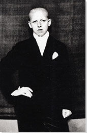
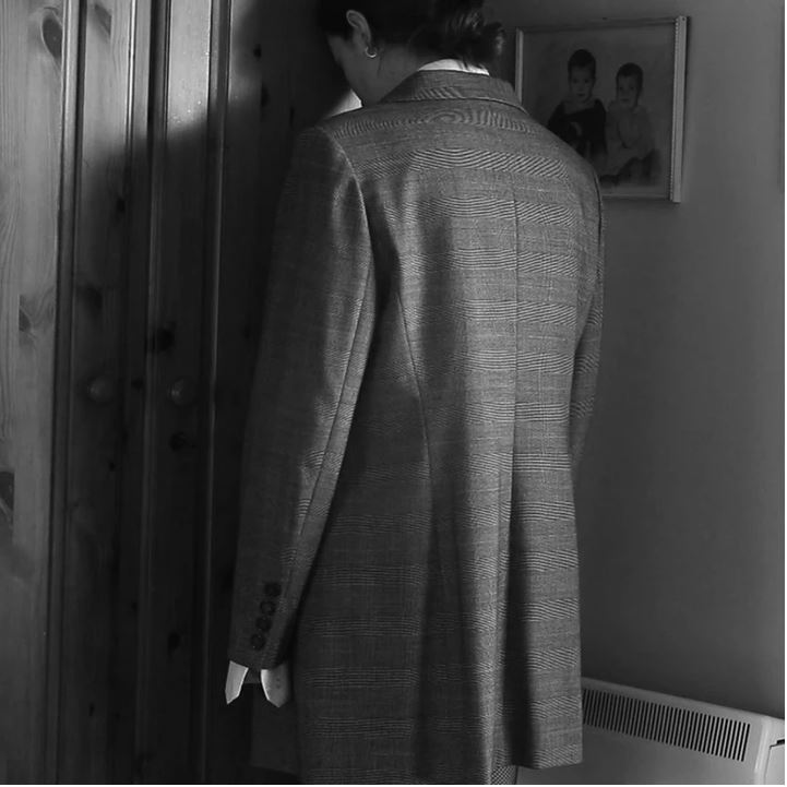
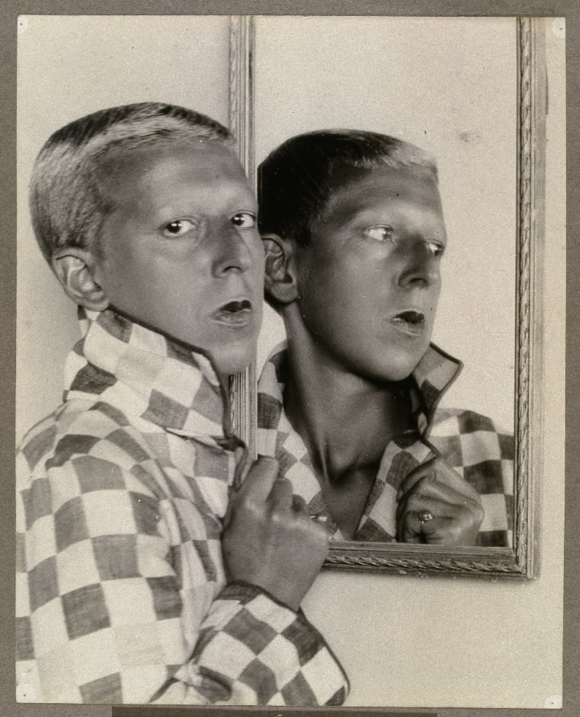
Technical
Close up shot which are often linked with emotion and encourage the viewer to try and understand how the subject feels.
Soft Black & White to create a neutral image with emotion could be a link to Cahun’s neautral gender.
Visual
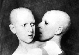
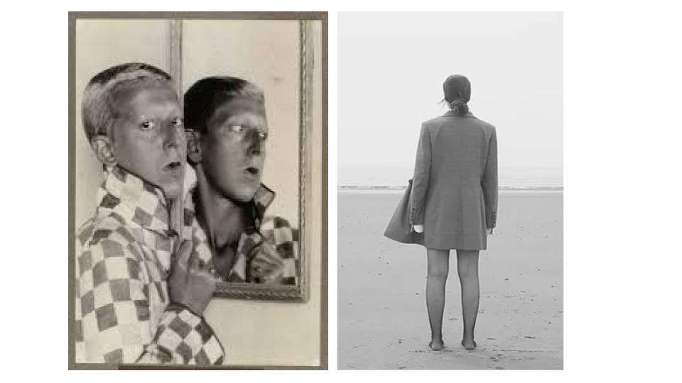
We can see a mirror in this photo which shows a different view of Cahun through the reflection. This can be seen as a link to her duplicitous identity (her true self and the identity she hides behind). Cahun said ‘Under this mask, another mask. I will never be finished removing all these faces.’ this links well with this image as we see a portrayal of two masks through the use of the mirror.
The male clothing contradicts gender stereotypes and the very short hair adds to this making it difficult to assume a gender with no knowledge of Cahun.
Conceptual
Her use of male clothing also contrasts the ‘generalisations of gender’ which were very prevalent in the late 1910’s.
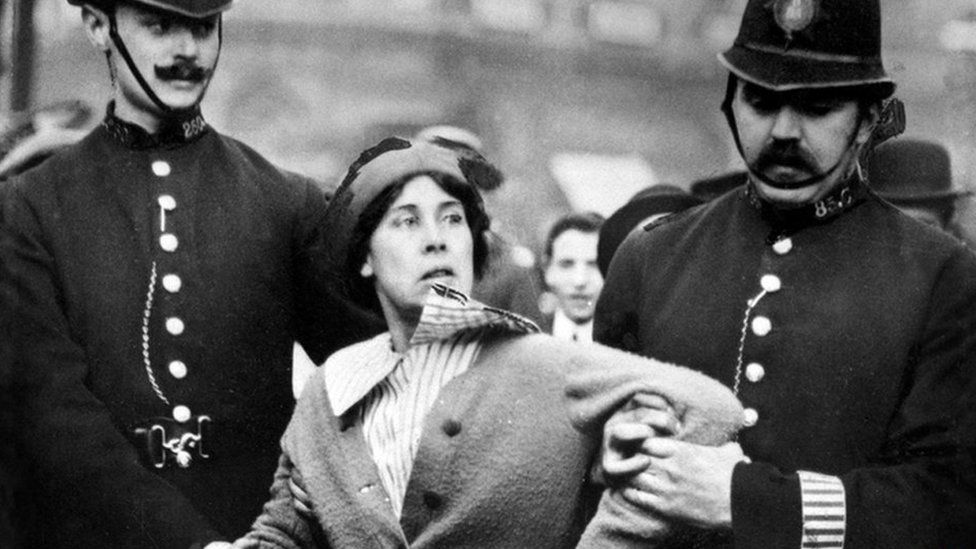
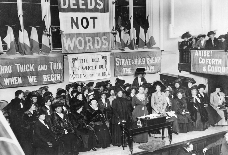
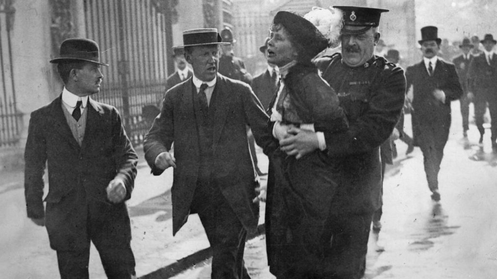
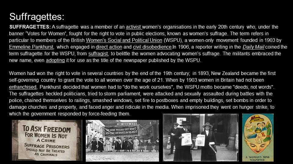
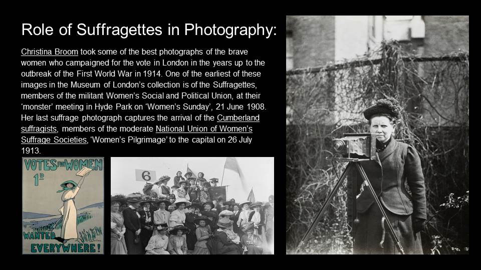
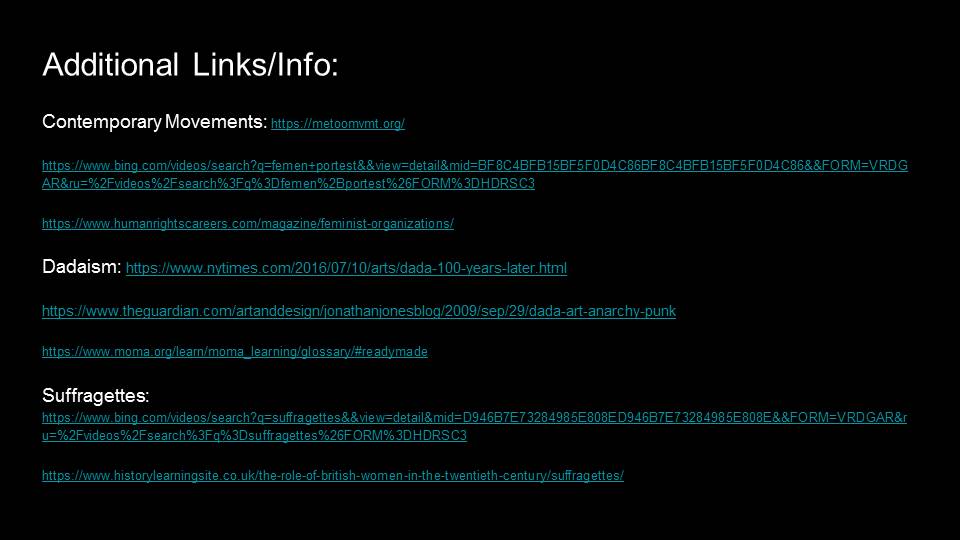
Suffragettes: an activist women’s organisations in the early 20th century who, under the banner “Votes for Women”, fought for the right to vote in public elections, known as women’s suffrage. Debated over several days, it was passed on 22nd May 1919 and entered into force on 12th July 1919. Although the movement started out peaceful they weren’t being listened to so they resorted to violent tactics, from smashing windows and arson attacks to setting off bombs and even attacking works of art – in attempt to highlight that there was more care over property than over woman’s rights. Which, was what helped them gain attention, but also brought up issues over police brutality, as seen again repeated recently.
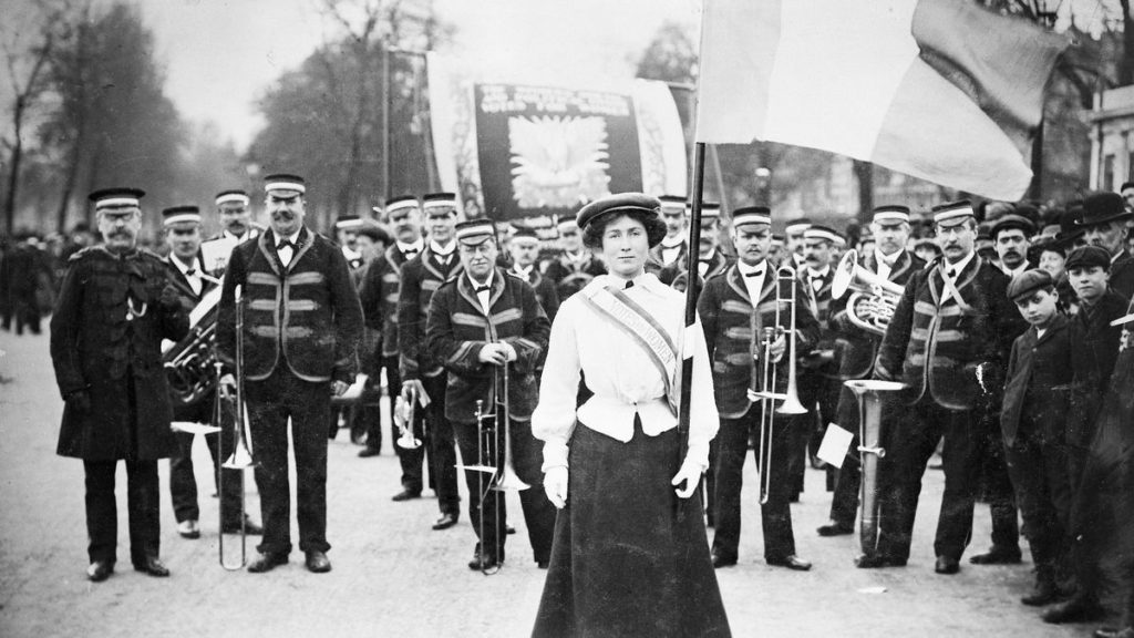
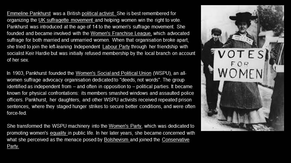
Emmeline Pankhurst: The leader of the suffragettes in Britain, Pankhurst is widely regarded as one of the most important figures in modern British history. She founded the Women’s Social and Political Union, a group known for employing militant tactics in their struggle for equality.
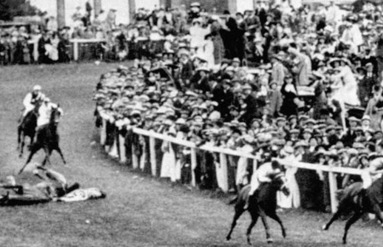
Emily Wilding Davison: Died at a horse race as she ran infront of the kings horse in protest for women’s suffrage. Although she gave no explanation of her plan on what she was trying to do at the race, many believe she was trying to hang a women’s rights banner onto the horse but other people think it could’ve been an accident, suicide attempt. Either way it resulted in a very historic mention for the suffragette movement.
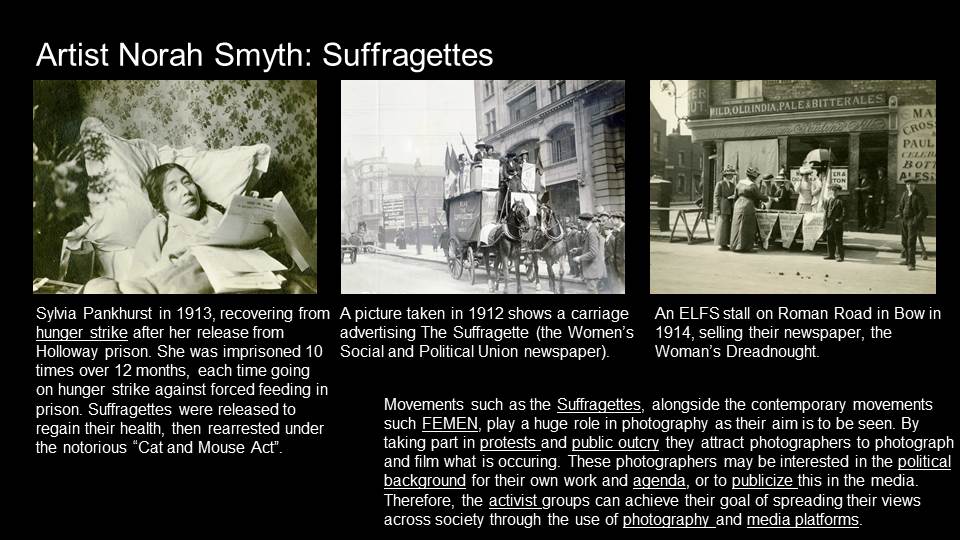
Another example of a woman who risked her life for the suffragette movement was Mary Richardson. She was imprisoned for her protesting activities, so she continued her protest in prison by engaging in a hunger strike. She was forcibly fed in 1914.
“They fed me five weeks by the nose and at the end of that time my nose what they called ‘bit’ the tube, and it would not pass into the throat even though they bent it and twisted it into all kinds of shapes. Instead, it went up to the top of my nose and seemed to pierce my eyes… Then they forced my mouth open by inserting their fingers and cutting my gums… and the lining of my cheeks… when I was blind and mad with pain they drove in two large gags. Then the tubes followed and they pressed my tongue down with their fingers and pinched my nose to weaken the natural, and also the purposeful, resistance of my throat.” – Emily Richardson.
dictionary definition : “self-published, often handmade collection of photographs laid out in a magazine style.”
I want my photo-zine to have warm mood, so I am going to edit my images to have a high temperature. I want to do this because this type of love story I am narrating is warm and familiar.
in my photo-zine I am going tell a narrative of a love story, however this story doesn’t contain 2 people loving each romantically, but a dad, a daughter and a horse sharing the love of living a life in nature and the peace it holds.
I want the layouts to flow with the narrative and be easy on the eye. For some of the layouts I want to have grid effect, to display many images that relate to each other. On other pages I want full bleed images, this layout will be used for photographs that have a lot of importance relating to the narrative.
On certain pages, when a piece of text is necessary I will add one, it will mostly be found quotes or short pieces of text needed to elaborate on my narrative.
A suffragette was a member of an activist women’s organisations in the early 20th century who, under the banner “Votes for Women”, fought for the right to vote in public elections.
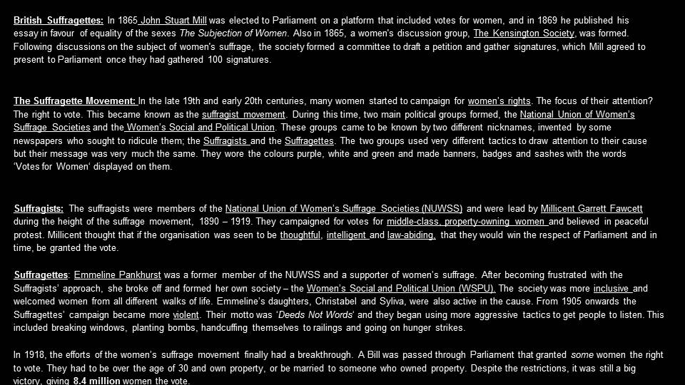
Emmeline Pankhurst became involved in women’s suffrage in 1880. She was a founding member of the WSPU (Women’s Social and Political Union) in 1903 and led it until it disbanded in 1918. Under her leadership the WSPU was a highly organised group and like other members she was imprisoned and went on hunger strike protests.
In 1908 the co-editor of the WSPU’s newspaper, Votes for Women, Emmeline Pethick-Lawrence, designed the suffragettes’ colour scheme of purple for loyalty and dignity, white for purity, and green for hope.
Emily Wilding Davison (suffragette) who died at the Epsom racecourse during the Derby 100 years ago under the hooves of the king’s horse has been saluted by some as a brave martyr and attacked by others as an irresponsible anarchist.
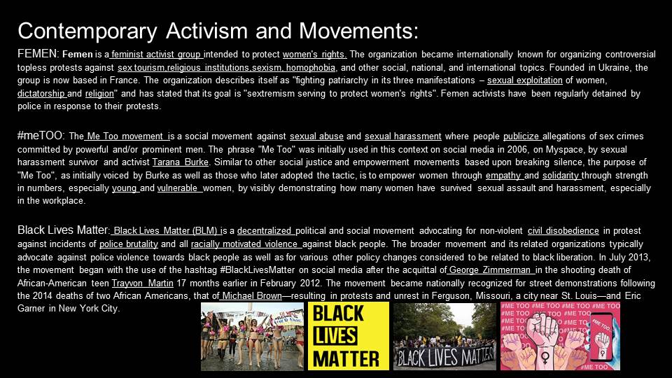
The movement has influence many other feminist protests in more modern times eg. Me Too movement, FEMEN movement
The suffragettes main challenge was to gain the right for women to vote. Photography played a role in their eventual success by spreading awareness of the movement to larger numbers of people.
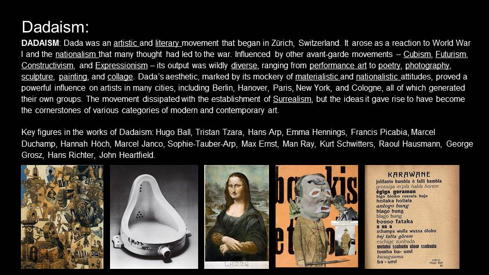
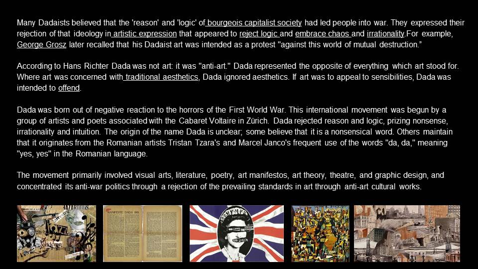
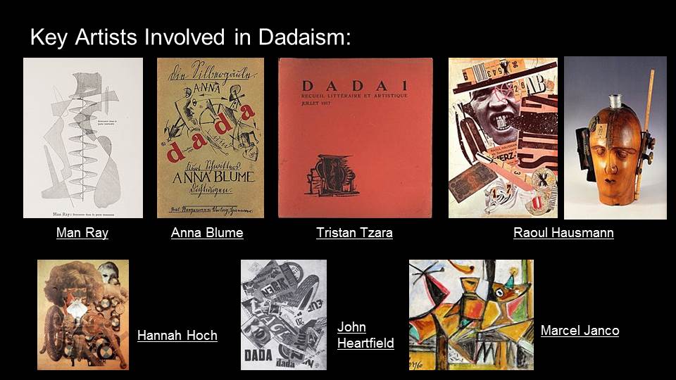
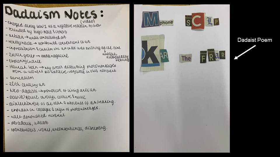
Dadaism
Dadaism was a movement with explicitly political overtones – a reaction to the senseless slaughter of the trenches of WWI. It essentially declared war against war, countering the absurdity of the establishment’s descent into chaos with its own kind of nonsense.
Abstraction and Expressionism were the main influences on Dada, followed by Cubism and, to a lesser extent, Futurism.
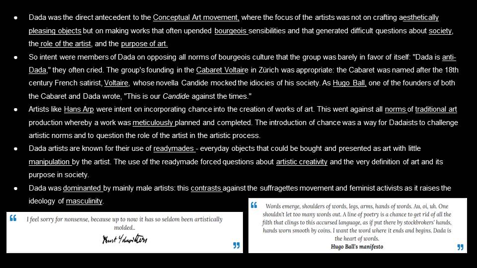
At the first public Dada soiree on July 14, 1916, Dada founder Hugo Ball read from the Dada Manifesto: “How does one achieve eternal bliss? By saying dada.”
Photography allowed for people to take absurd photos to join the movement but also allowed for sculptors and other physical art to be recorded and spread to a wider audience. raising awareness for the artistic movement.
The term Identity Politics is described to be political approach that people who fit into the category of race, class, religion or social background, in which they would take a particular approach develop political agendas and organise based upon the interlocking systems of oppression that affect their lives and come from their various identities.
The definition of Culture Wars
A lifestyle warfare is a cultural combat between social agencies and the warfare for dominance of their values, beliefs, and practices. It often refers to matters on which there is normal societal disagreement and polarization in societal values is seen. The time period is normally used to describe current politics in the United States, with troubles such as abortion, homosexuality, transgender rights, pornography, multiculturalism, racial viewpoints and different cultural conflicts based totally on values, morality, and life-style which are described as the most important political points.
LGBTQ
People’s identities have always been important but in today’s society, the freedom to be yourself is now more important than ever. The LGBTQ community have greatly suffered the. it comes to expressing themselves and being who they want to be without anyone being around to criticise them or judge them. Many people are blind to the fact that homophobia is still around and think that celebrations such as pride is a pointless march which just belittles heterosexual people. Of course this completely untrue; pride is a celebration of rights and freedom to be yourself and no harm is meant to come from it whatsoever. On the other hand, there are people who are more extreme with their views and are completely against the LGBTQ community, a lot of people call these kinds of people “old fashioned”. Old fashioned people believe that straight is the only way to go and nothing else is acceptable. A lot of the time this can be due to their religion or their own upbringing.
Thankfully a lot of people today are very accepting and supportive of people in the LGBTQ community which has allowed more people to show who they truly are and being less afraid to do so. Being allowed to show off to the rest of the world through pride rather than hiding from everyone is way or liberating everyone around you. The freedom of expression is what makes a lot of us human and unique from each other. The pride that everyone has within themselves helps people to become successful and happy with their lives which is why our identities have a huge roll in our daily lives.
Cahun was a French sculptor, writer and photographer born 25th October 1894 till the 8th December 1954. They’re real name is Lucy Renee Mathilde Schwob. She adopted the gender-ambiguous name Claude Cahun in 1917 and is best known for their self portraits, in which Cahun assumed a variety of personae. Their work is both political and personal and often undermined traditional concepts of static gender roles. In their autobiography, they explained, ‘Masculine? Feminine? It depends on the situation. Neuter is the only gender that always suits me. ‘ Her work was very controversial for her time and even when to extremes such as shaving her head, which would’ve been frowned upon within her time; she was courageous and unafraid to express herself. She was often considered part of the Surrealist artist group due to her ‘odd’ and ‘different’ work for her time.
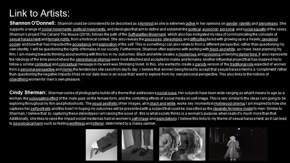
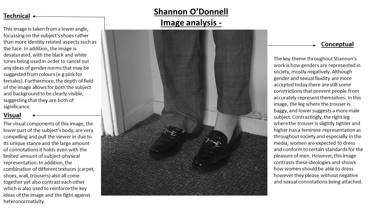
Shannon O’Donnell was born in Jersey, Channel Islands and also attended Hautlieu School, studying Photography, Media and History which all seem to interlink within her work. Her images explore themes around gendered experience with a focus on femininity and masculinity as gendered traits. Through her deep research and a sociological approach to her work she explores the self and identity. Her fascination lies within questioning society and challenging traditional views of gender through her work. She claims her work is informed by her own personal experience and through interviewing specific demographics to help gage a sociological understanding of how gender is viewed or challenged within mainstream society.
Shannon came into Hautlieu and gave us a presentation that described her life as a student and showed us her inspirations, her research methods, her documentary films, and her techniques when it comes to creating photographs and videos.
Her inspirations are: Claude Cahun, Duane Michaels, Casa Susanna, Walter Pfeiffer, Adi Nes, Judith Butler and June Singer.
I noted some of her techniques when it comes to filming/photographing. She enjoys the use of sound scaping which consists of recording different sounds and compiling them together to put in the background of her videos, creating a dramatic and compelling effect. She also tends to record herself in front of the camera instead of actually photographing herself. She enjoys playing with her movements, actions and tends to have fun in front of the camera while recording in order to get the perfect shot for her narrative. After recording herself, she puts her videos into a software and actually print screen’s sections of her videos that she feels fits with her narrative and thus creates a still image out of her videos. She then edits the still images, creating an intriguing still image. She insists that tests are very important when it comes to filming in order to get the right lighting, exposure etc.
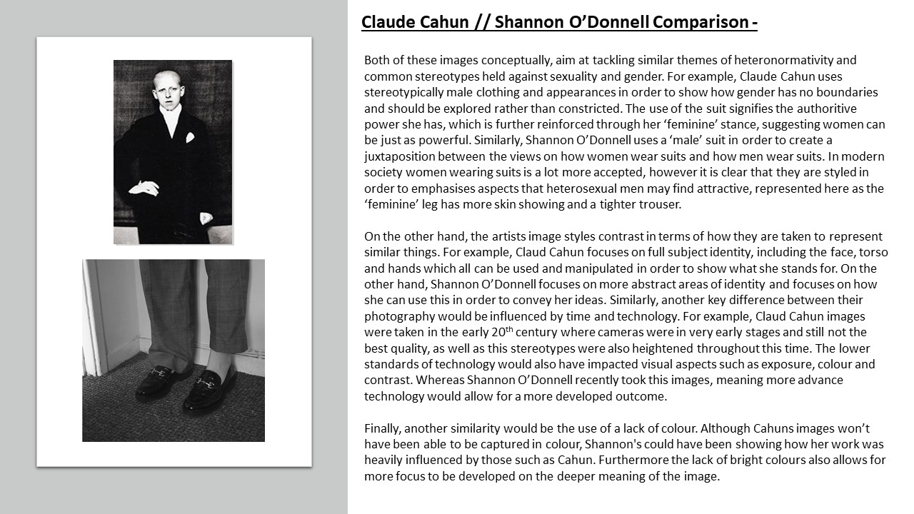
TECHNICAL: The lighting that the two artists seem to use are very similar and appear to both use natural lighting. Both also seem to have a high level of control over the camera. It is easy to recognise that they have positioned and located their camera in a specific way in order to get their self portraits correct. Both artists most likely also used a lower aperture in order to achieve a brighter photograph since natural lighting was used. I know that Shannon in fact did not use shutter speed as she likes to video herself in certain position and then create still images out of that video, however, Claude Cahun most likely used a fast shutter speed so that she didn’t have to stay in the position for a long amount of time since her images were self portraits.
VISUAL: Both artists, as you can see from the images above, enjoy photographing and editing their images in black and white. Claude is an early photographer, therefore the technology wasn’t quite advanced as it is now, therefore her images are most likely black and white due to the technology that was available in Cahun’s day. On the other hand, Shannon has clearly edited her still images to be black and white, most likely to increase the atmosphere of her narrative in her images, and also maybe because she was aiming to create images similar to those of Cahun’s. The tones of their images in this example is quite bright, however often the tone of their images are quite dark which creates a mysterious atmosphere and also a historical atmosphere. The composition of both their images are a little different. Cahun clearly positioned herself into specific poses and in different places in order to create a nicely composed image, however O’Donnell enjoys filming herself in front of the camera in various different poses using various different movements in order to capture the perfect still image while editing.
CONTEXTUAL&CONCEPTUAL: To conclude, both artists have very similar concepts. They both enjoy exploring identity and more specifically how gender is a social construct and they both enjoy breaking that boundary of a construct concept and exploring fluidity of gender through photography. As you can see, Cahun was not gender-constructed and explored the boundaries through hair experimentation and clothing experimentation. Shannon also does this through her videos and still images. As you can see in Shannon’s photo on the right, she is exploring gender by portraying herself in a suit which is seen as powerful and masculine, almost breaking the stereotypes. Both artists; photography narratives also come from a personal standpoint within their identity.
If there is horror, it is for those who speak indifferently of the next war. If there is hate, it is for hateful qualities, not nations. If there is love, it is because this alone kept me alive.
Shannon O’Donnell –
My fascination lies with questioning society and challenging traditional views of gender through my work. My work is informed by my personal experience and through interviewing specific demographics to help gage a sociological understanding of how gender is viewed or challenged within mainstream society.
Here I will guide you through my thought process and why I laid out my Zine the way I did, explaining context and reasoning behind each and every photo.
In all my three photo shoots, for my first editing process, I used the 5 star rating feature of Lightroom Classic CC to rate all my photos. Then, based on these ratings that i gave my photos, i decided whether they’d be used or not by filtering through using the p key on the keyboard to approve photos as demonstrated by the small white flag in the upper left hand corner, and alternatively used the x key on the keyboard to disprove photos as shown by the black x symbol in the upper right-hand corner.
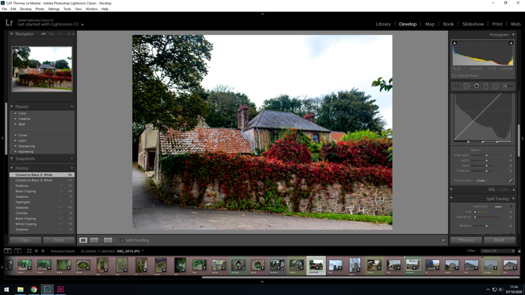
After I chose my best set of images, I proceeded to edit almost every aspect of each of my chosen photos with the ‘Develop’ tab as can be seen in the photo above to the right-hand side. Here I could edit the exposure, contrast, blacks/whites, shadows and highlights of each and every photo, also adding a darker border in the corners known as vignette to draw the eyes towards the centre of the photo highlighting the subject, whether it be a person, object or building.
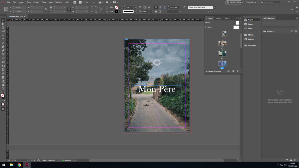
For my front cover, I needed a bold and eye catching photo, however not too “in your face” so to speak. I wanted to go for a more chilled out, relaxed, nostalgic vibe, nothing too abstract or aggressive as that doesn’t fit the story of my zine very well. The photo in question had been chosen mainly because it is very significant as it was the house my father was brought up in from a young age. I like the colours as they aren’t too punchy, however deliver a nice contrast in places and highlights Furthermore, the title is fitting as it translates ‘My Father’ to french. In addition to simply explaining what my zine is about, it’s also written in french as both me and my dad and his whole side of the family have close links with France, with my dad being half French making me Quarter French.
For the second and third page, I thought it was only fitting to include the subject of this entire story, my dad. To achieve this, I wanted to include a childhood photo of his compared to a very recent photo of him. Firstly, the childhood photo of him was placed first as it is essentially puts both photos in chronological order, as it came many years before the next photo of him in the present day at the age of 67, which also creates a stark contrast as both photos have been taken around 65 years apart. Furthermore, both photos my dad is entertaining himself with a hobby, both photos fit together as they essentially highlight his curious side, and potentially his childish side too. Lastly, both photos are comprised of a similar colour palette of beige, browns and whites, which results in similar, matching photographs that fit together hand in hand to make a satisfying double page spread for the observer to look at.
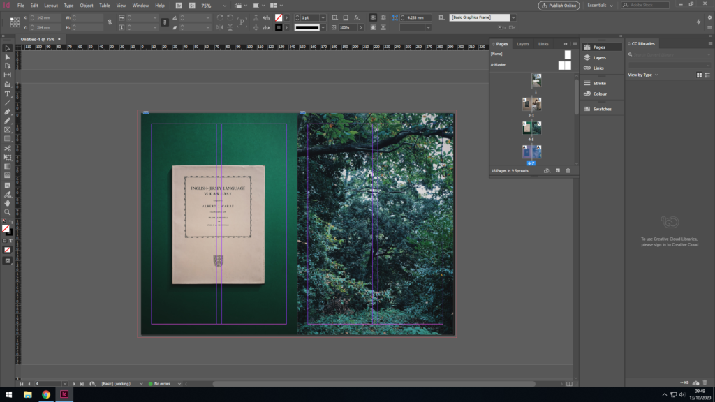
For the second page, I wanted to mix it up a bit, so rather than carry on with photos of my dad, I wanted to add something much different, however relevant to the story at the same time. To the left, there is the Jersey-French dictionary which my dads uncle published and is quite famous and significant to Jersey’s history even to this day. I placed the book on a green background as the colours contrasted nicely aswell as complimenting each other in a subtle way, as the book has a tint of green to it. I centred the photo of the book in lightroom to make it symmetrical and matches the previous page where there is a childhood photo of my dad instead.
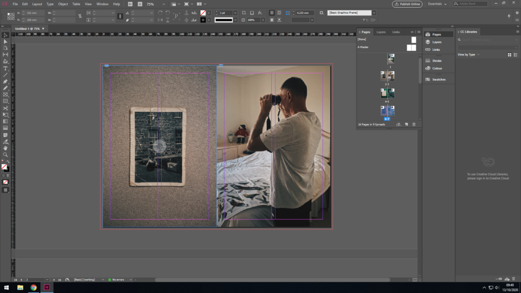
Yet again, I wanted to match colours between the two photos where the background that compliments the book on the first image, also compliments my dad’s skin tones, with vibrant hints of oranges and yellows making up the majority of the colour palette on this double page spread. The first image as previously is a book and also has been centered with the aim of symmetry and continuity. It follows a theme with the past 2 photos where a random (although significant to the story) object has been placed on a colourful , contrasting background. The photo on the second page (to the right) is a zoomed in photo of my dad who is the main focus of this story and whole zine, where his eye is in the centre of the page.
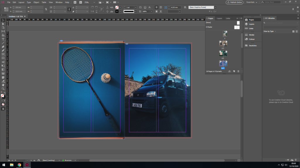
Again, the theme carries on with the animate object to the left. My dad enjoyed badminton much as a kid, teenager through to his adult years and played it often with his mates. It’s also meaningful to me as he taught me badminton with that exact raquet, the same one he used from a young age. To the right, there is a photo of my dad’s work van, he is very hard working and has become very successful as a result. Both photos as symmetrical as per usual throughout this zine, as well as both sharing the blue tints throughout the photo, hence why i placed them together. Also, one could say the first photo shows my dad’s playful and childish side, the other shows his serious, hardworking side, adult side which provides a nice contrast between the two, and highlight the type of person my dad is.
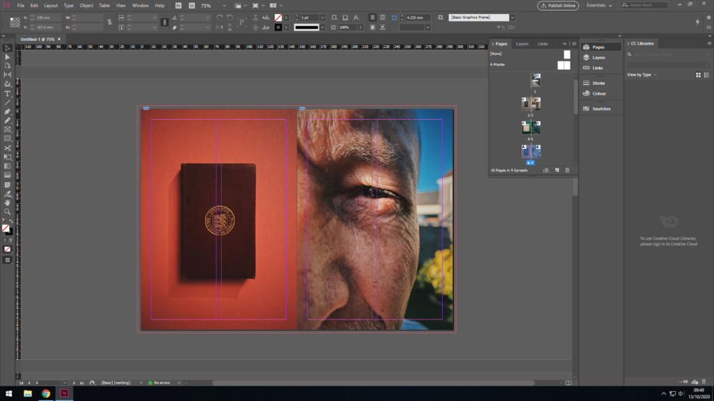
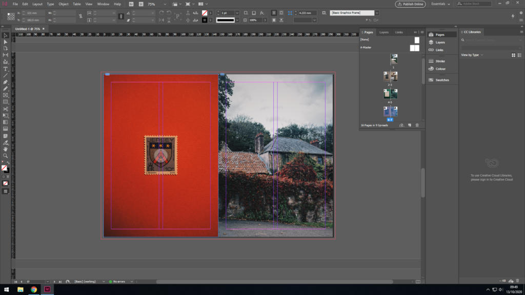
Sticking with the theme, a close up photo of a Jersey stamp with my families’ (Le Maistre) name and crest on it. These were a series of Jersey stamps made after the original Jersey family names and has much historic importance, as well as having great significance to my story. Furthermore, the colours match between the two photos in a subtle way, as well as the having the flower in the crest on the stamp coinciding with the flowers in the photo adjacent to it. Everything has a meaning and everything has been placed intentionally where it is.
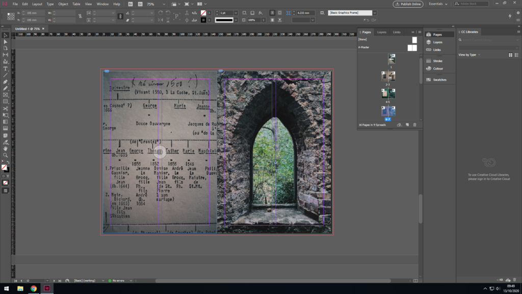
Here you can see me and my dad’s family tree paired up with an image of an old Jersey folly located in a forest. The family tree dates back to the 1500s however said to be even longer, however less documented, making us apart of one of the original Jersey families. This links back to the previous pages where the photo of the stamp resembles this strong family heritage.
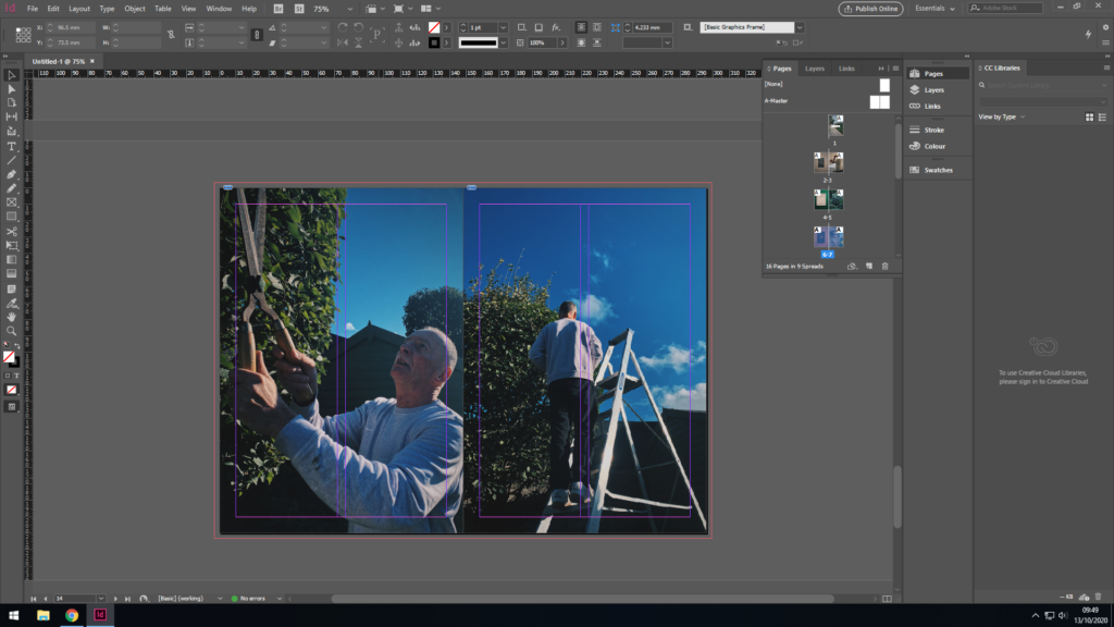
The last two pages highlight my dad in the present dad, hence why they came last in the zine as I aimed to have it laid out in chronological order. The colours and composition match in both photos, as you can see my dad hard at work maintaining the garden. He really does have a good eye for detail.
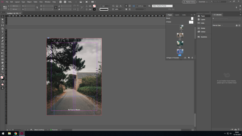
For the back cover, I wanted to chose a photo similar to the front cover, as well as still sharing some significance to my dad’s past. The photo I’ve chosen is my dads next house which he moved to after and spent his teenage years growing up in. Furthermore, both photos share similar colours so match when the book is closed, as well as also being in chronological order, i.e. his first house comes first in the book, the next house comes last.