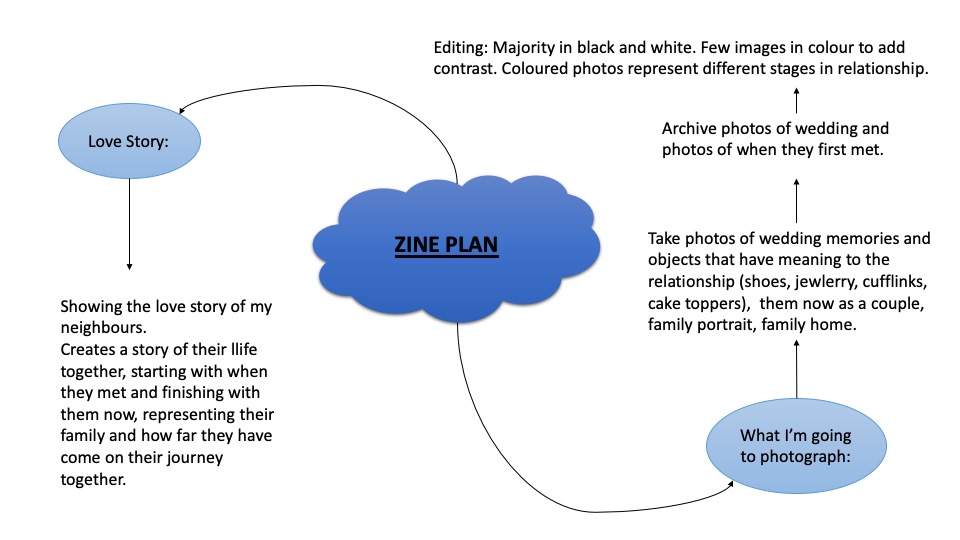
For this project I decided to dedicate it to my friend Zita, Here i wanted to show her in her own environment of her home, and school subjects that she likes, I tried to be creative with the editing styles but also stuck with some historical looking images
Edited Outcomes
Enviromental
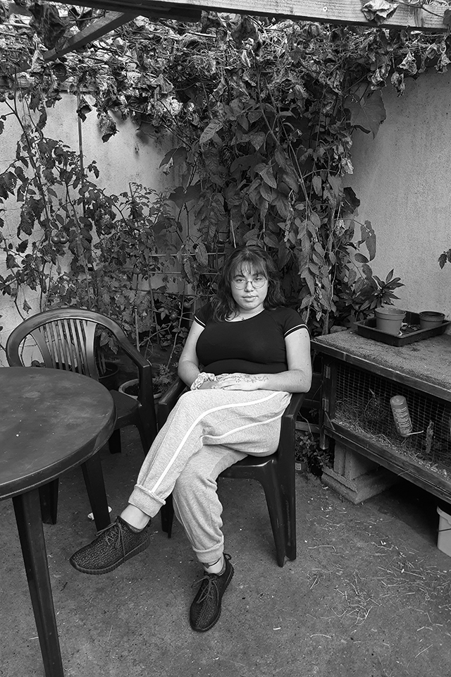
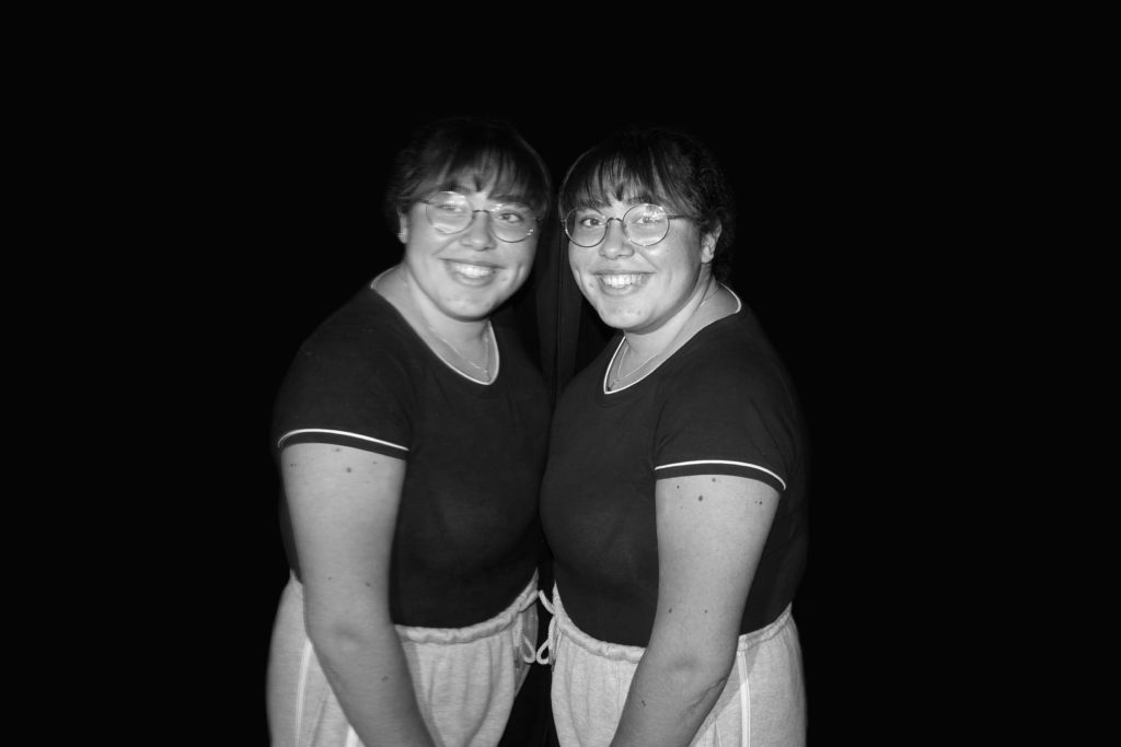
This has to be my favourite image of the whole shoot as I think the black and white is striking and works well to make this image look high quality and professional, this shows Zita in her environment of her garden and I think gives zita power and she looks strong and confident. i think this matches Arnold Newmans work and it shows my model in their environment and confident, it is also a formal portrait as she knew I was taking this picture of her.
Historic
Historic
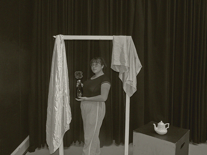
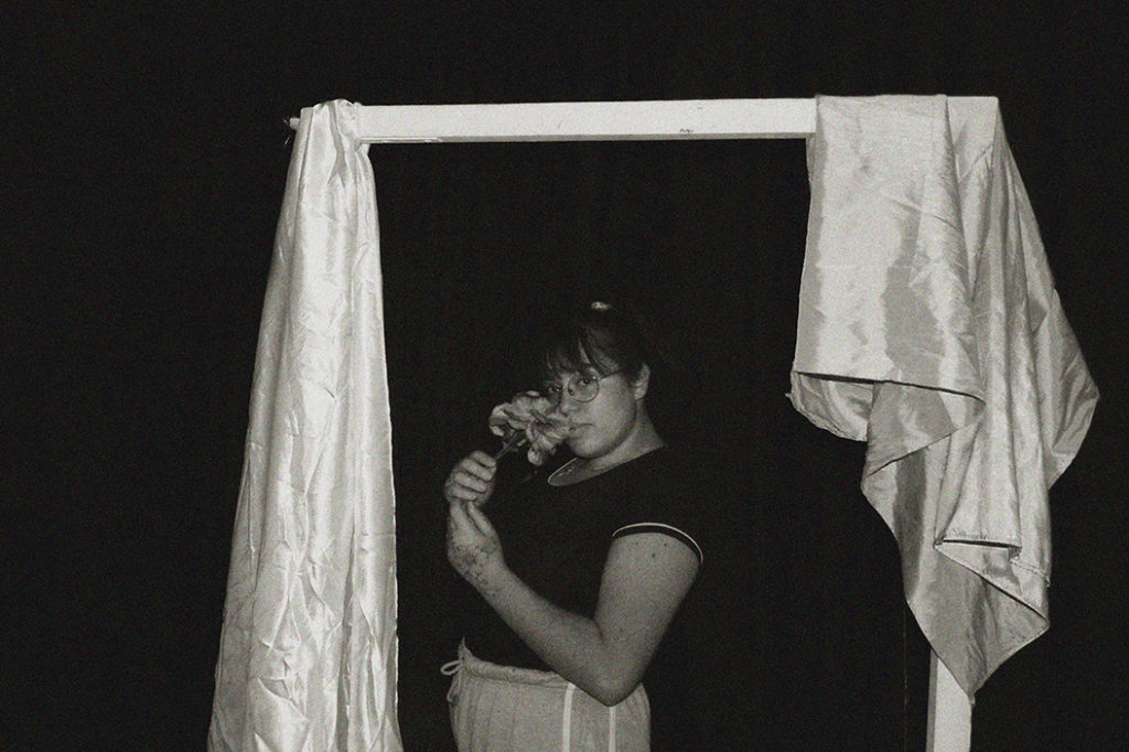
These two images is what I came out with from the historic shoot I tried to mimic henry Mullins images with the set up and the use of drapy fabric matches the curtains used in his images. I also added grain to help add a more vintage look to the image
CandidContemporary
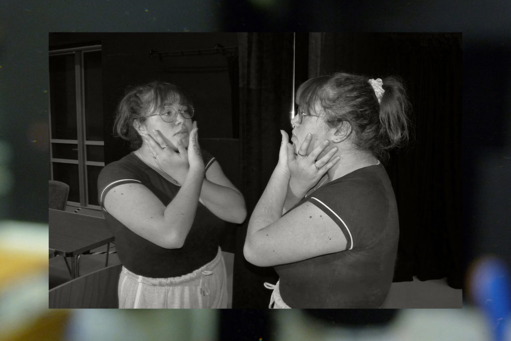
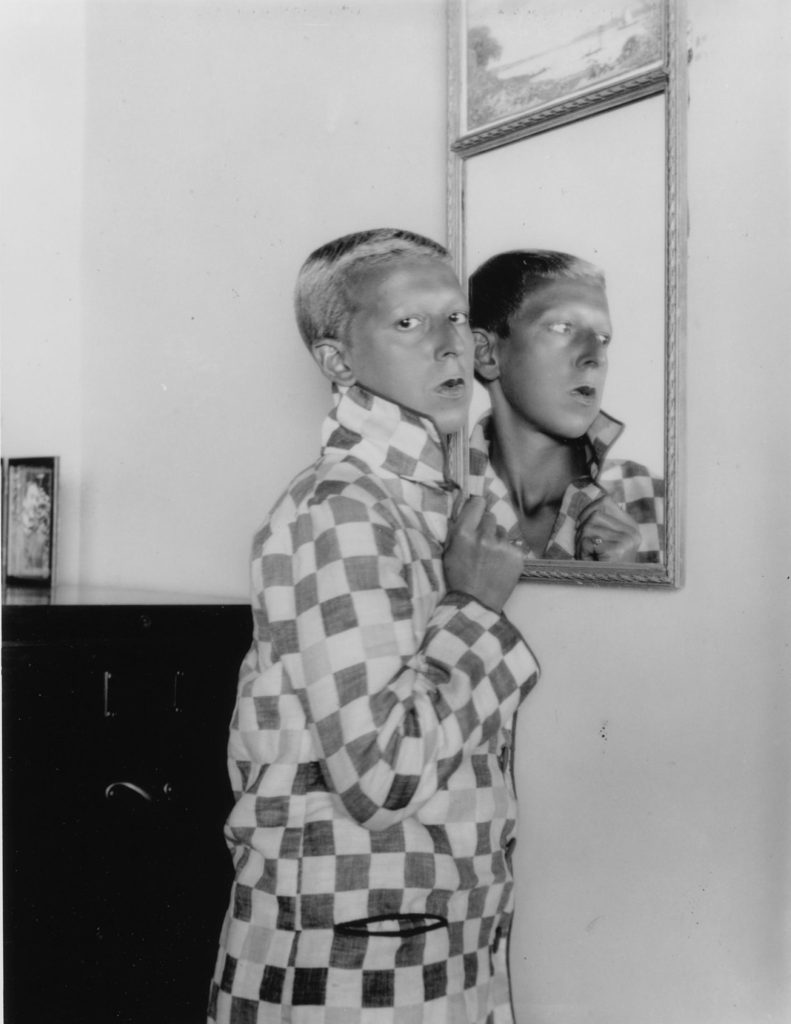
For these last two images I tried experimenting with different effect, for both images I worked with mirrors for reflection.; but in image one I added a out of focus image to the background to create an interesting frame; and in the second image I blacked out the background to help put Zita as the focus of the image.
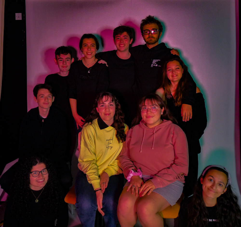
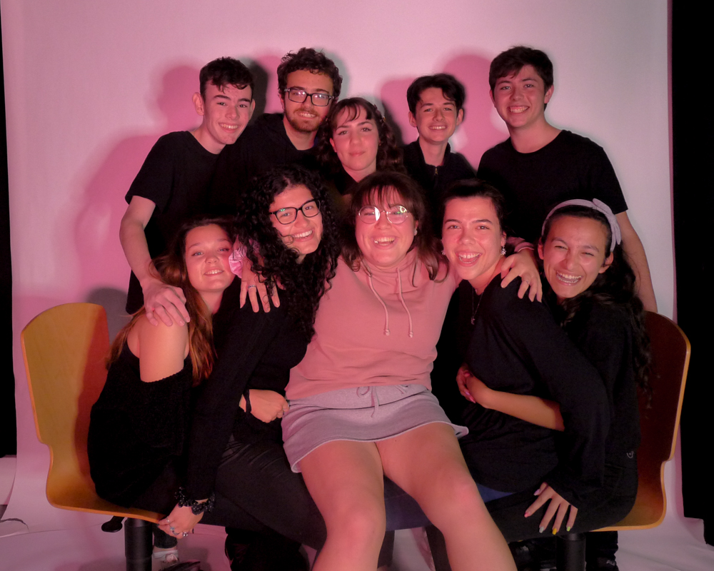
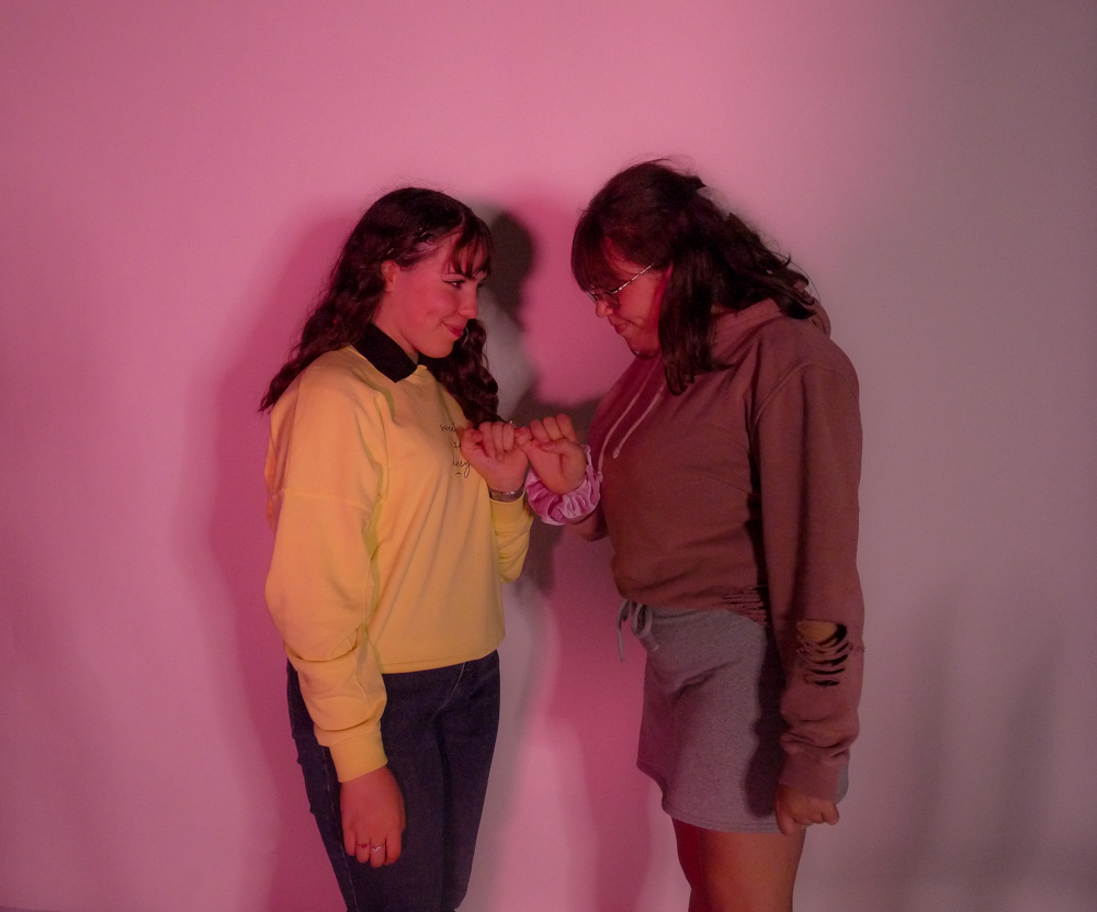
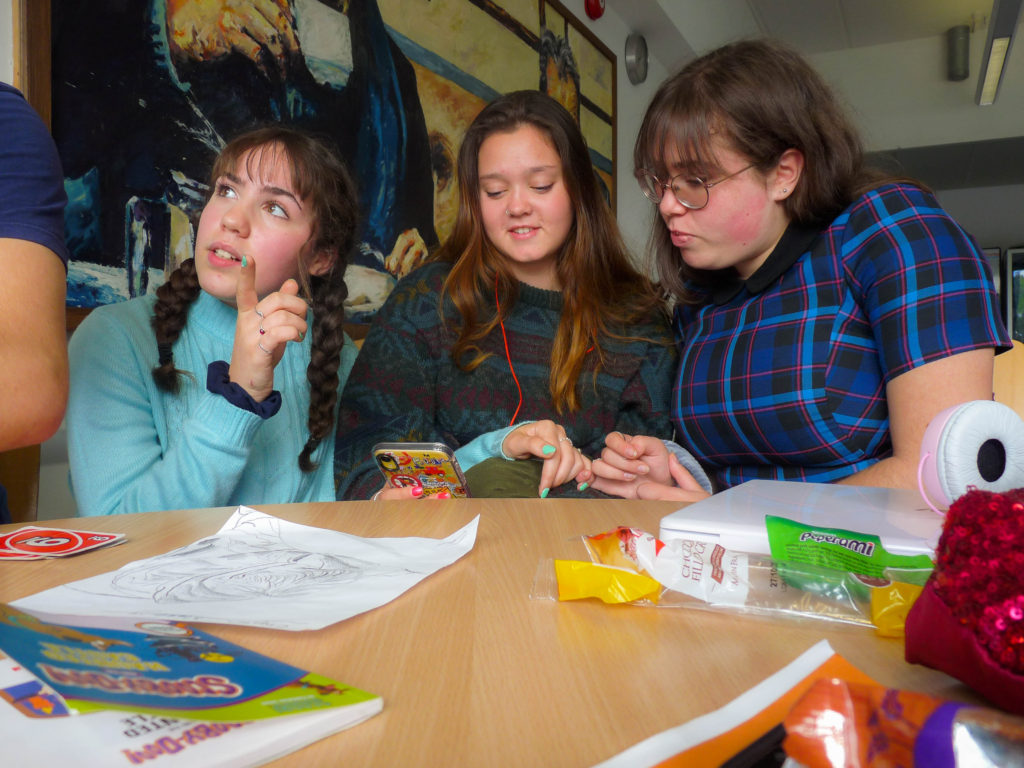
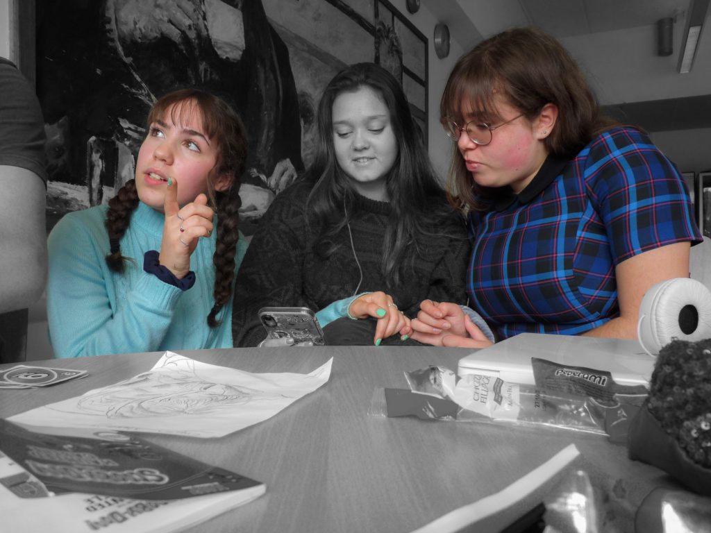
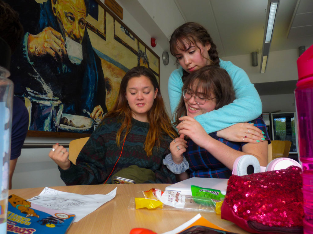
For this shoot, I wanted to capture the idea of friendship further by getting a group of mine and Zitas friends together in the studio. I used pink gel lighting to help tie in with the idea of love.
Photoshoot Plan
LOCATION:At school, in the studio, using artificial lighting such asring lights and normal LED lights with a pink gel cover; using a white backdrop to contrast against everyone’s black clothing
MODEL: I will be using our group of friends including zita and I
POSING: I will, be using both informal and formal shots to use which are better to there for create some candid and other formal shots
Smaller selection of images from large photoshoot, here I used thew star rating and use of colours to help me decide
Edited Outcomes
I like the formal arrangement in this image, however I could never get the editing quite right due to the lighting in this picture so it came out a bit too dark for my liking. I think the fact that the group is wearing black but me and Zita are wearing colours works as it makes Zita and I stand out linking back to our friendship but still showing our relations with other people.
I really like this image as it captures the fun side of our friendship group and successfully captures a candid and happy side to us.
I like this image as it’s more intimate but still shows our friendship through the use of the pinky promise as it shows our trust we have for each other.
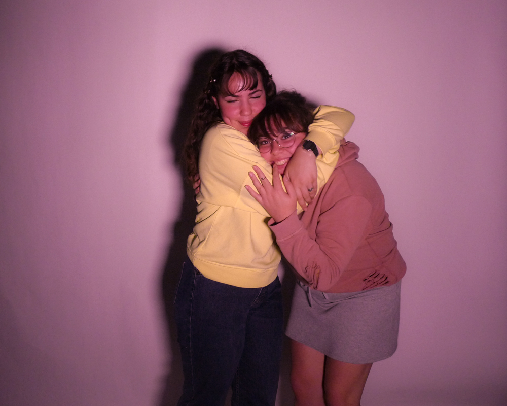
I also like this final image as it shows Zita’s joy in hugging me and our happiness when together as friends.
First photos together from when they met – Wedding photos – Photos of objects that have meaning to their relationship (wedding items) – Family portrait (children/family).
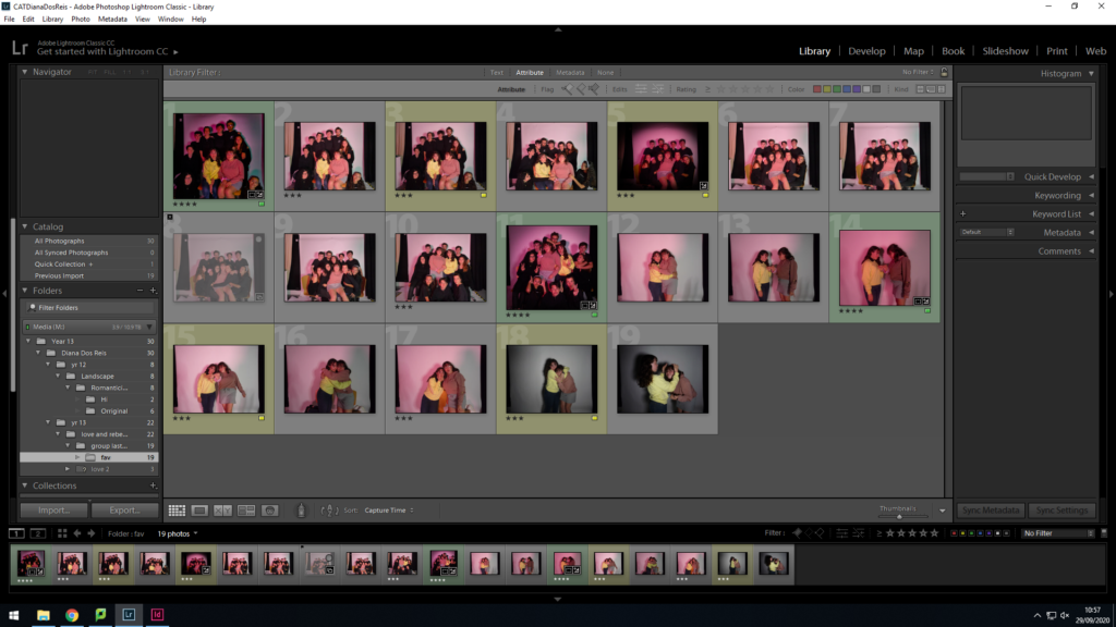
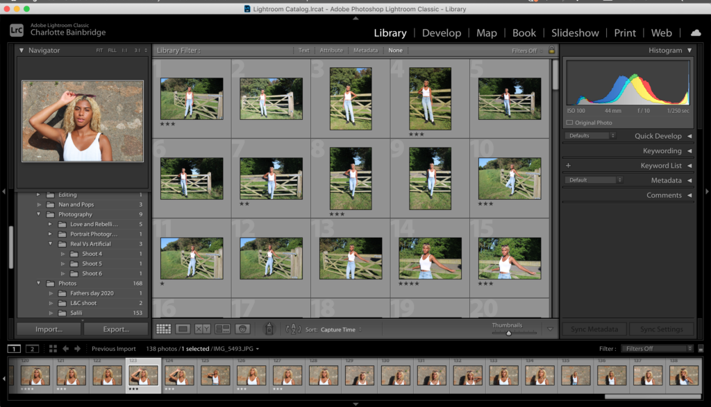
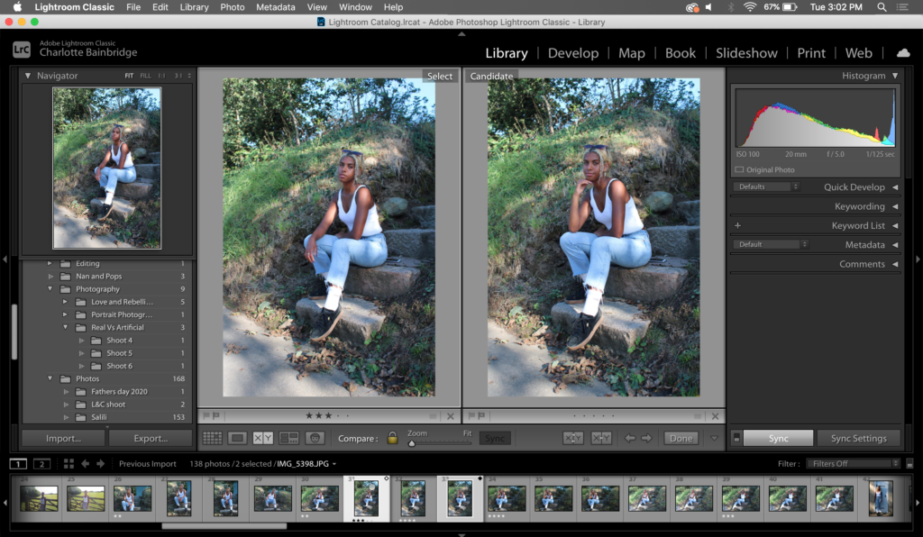
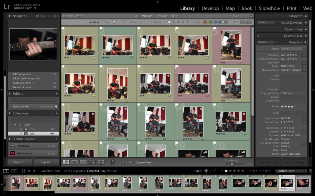
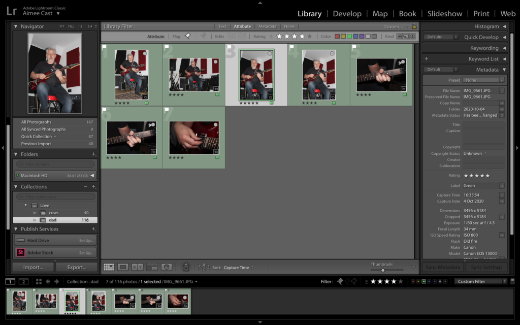
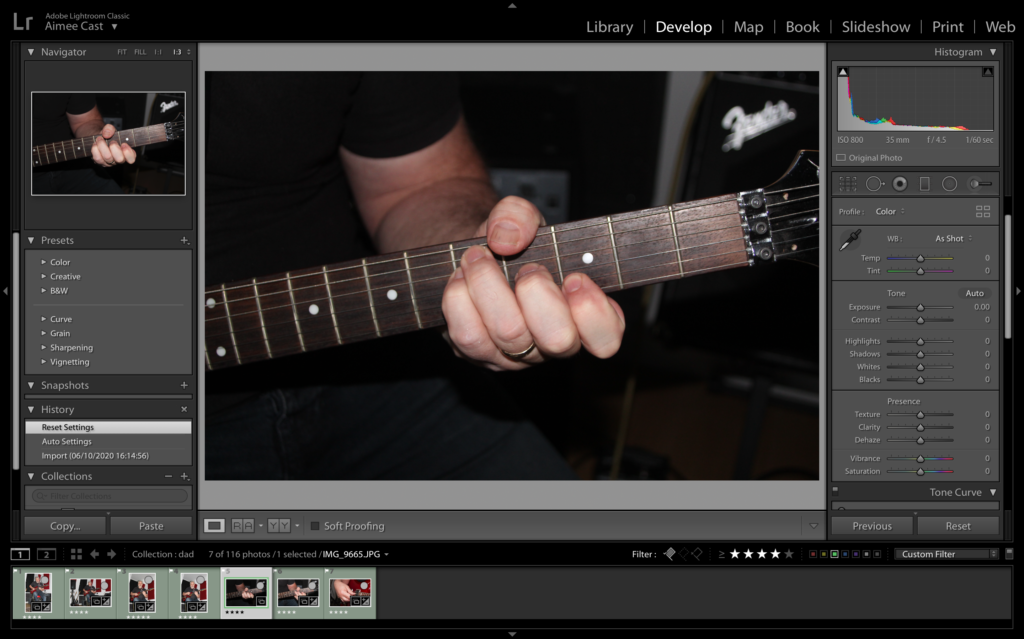
This shows the process of choosing my best images, using Lightroom. Using this resource allows me to compare and contrast images next to each other and put them in order of photos I am more likely to use.
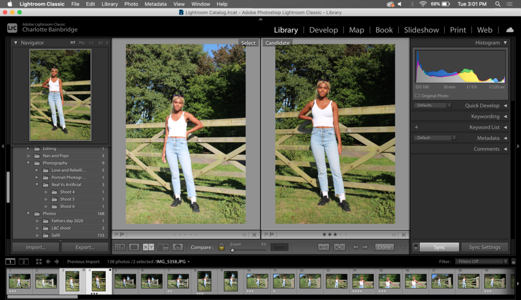
For these two images, I used Lightroom to compare the opposite standing positions and exposure. The image on the left is over exposed and the pose on the right looks more natural, therefore I would use the image on the right in further work.
Between these images, I am comparing the composition. The two different poses create a contrast in emotions. The image on the left has a more serious tone, due to the facial expression and rigid pose, whereas the image on the right has a more relaxed tone due to the slight smiling expression and loose body posture. Personally I would choose to work with the image on the left as I feel it draws in more attention looking at them both next to each other.
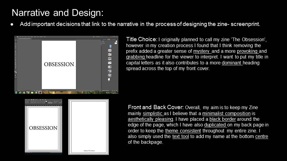
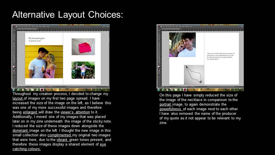
There were many reasons as to how and why I made my zine the way I did but here is some backstory to the meanings behind it which may explain some of my reasons: my final zine is about my Dad’s journey with music, in particular his journey through his life with his guitar and where he is today. My dad has play the guitar since he was 13 years old and today he is now a professional guitar teacher as well as a musician that gigs as often as possible. He has been in multiple bands and is currently in a duo called Acoustic Shock with another guitarist called David Ashurst.
Whilst my Dad was travelling around the world to places such as New York, Florida, California, Canada, Africa,Australia and many other places he was in a professional band called Cruise Control and played in many famous pubs and stages. Eventually he came from Canada to Jersey in his 30’s to settle down whilst the other member of the band, Jim, carried on trying to be successful as a professional guitarist.
Overall, everything went correctly whilst making my zine and it told the story accurately and clearly of what my dad’s life was like when it comes to music.
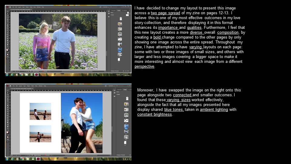
My Final Zine and the Experimentation
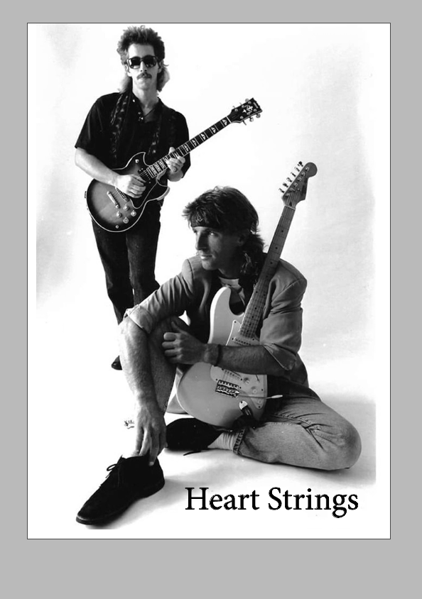
I used this photo of my dad’s old band as it’s quite an iconic image of them and has a good composition. The photo was taken from when Cruise Control was becoming popular around Nashville in the early 80’s. The picture clearly represents what my dad as a career also which is why I also thought it was a good fit. The title on the cover is meant to represent my dad’s journey with his love for music. I thought Heart Strings was a good fit for the title of my zine as it can also be heard often as “pulling someone’s heart strings” representing someones emotions and admiration for something.
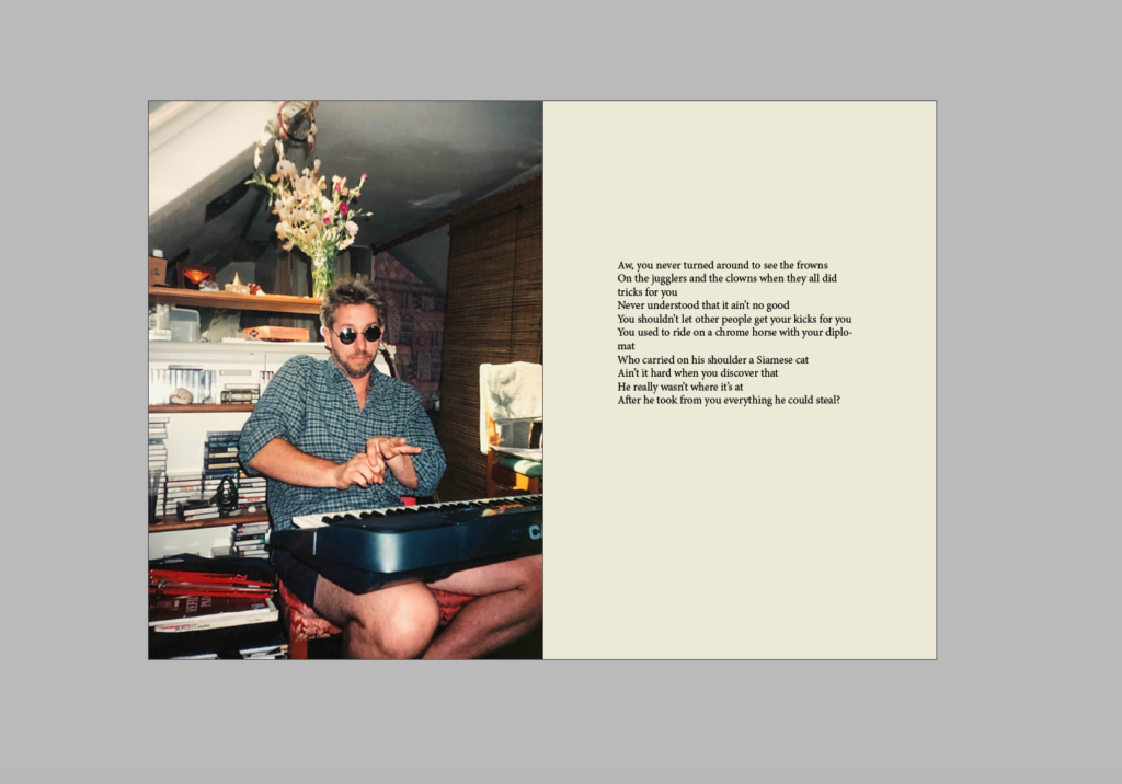
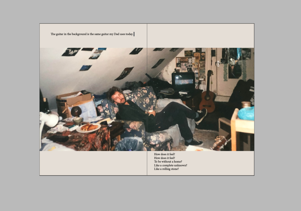
For most of my layouts for the pages in my zine I used the pipet tool to match a colour or shade from the photograph so they made a nice comparison next to each other. The older photos look nicer next to a dulled out yellow tone as if it was an old piece of paper from the day the photos were taken. This photo was taken in Jersey above the Pulente Pub where he started his job as a bar tender fro over 10 years.
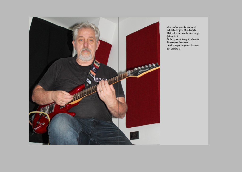
I chose this photo, as the place where I positioned my dad contrasts nicely with the backdrop with the red sound proof foam panels and his guitar. I chose to put the photo over the two pages as it fitted better as it was a landscape photo. The writing also fitted better in the top left hand corner in comparison to an other place on the two pages. I kept the writing format as it was as they are lyrics and although they may have fitted somewhere better on the page if I changed the layout, it may not have been as easy to recognise that they were lyrics.
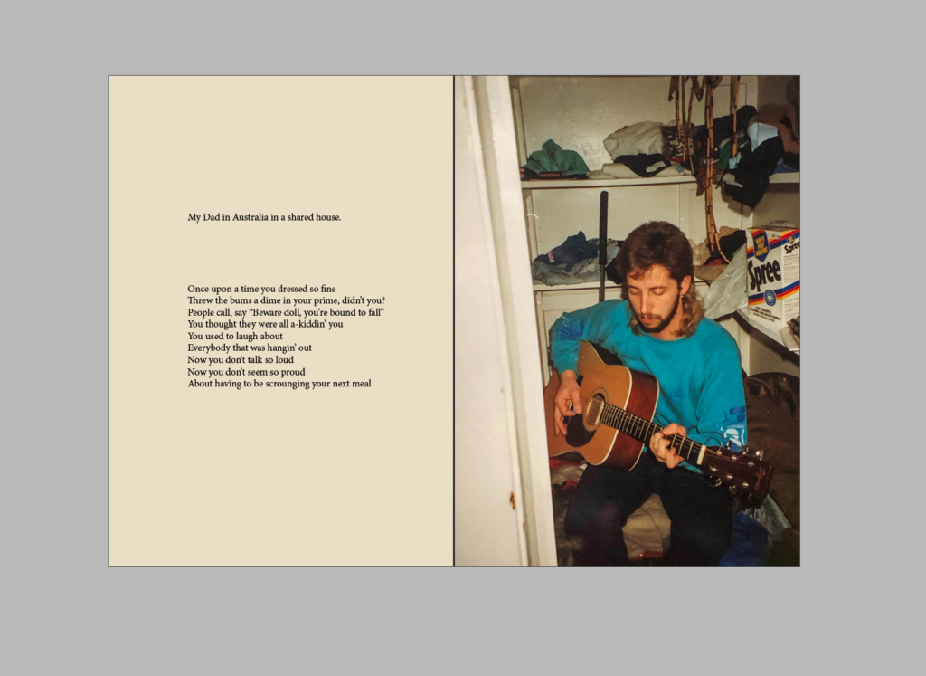
I’ve laid out the page similarly to one of the older ones above. I’ve used the pipet tool to add similar tones from the photo to the other page, again to make the page look older as well. My dad was living in Australia with his friends Kevin and Nigel at the time. He gigged at multiple place and worked many labour jobs on farms and building sites to be able to afford to travel to his next destination.
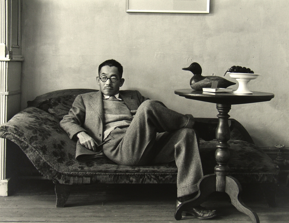
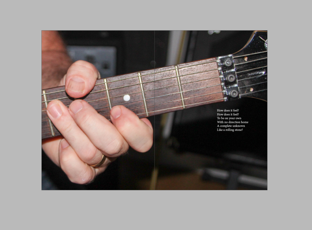
I again chose this photo, as the place where I positioned my dad contrasts nicely with the backdrop with the red sound proof foam panels and his guitar. I chose this photo to go in my zine because I liked the composition and the way my Dad is looking into the lens because it makes the photo feel interpersonal as if he is staring at the viewer.
This photo was also taken in Jersey above the Pulente Pub. I liked the composition of this photo as my dad is placed in the middle casually posing and the objects surrounding him add to the narrative of what is happening in the photo.
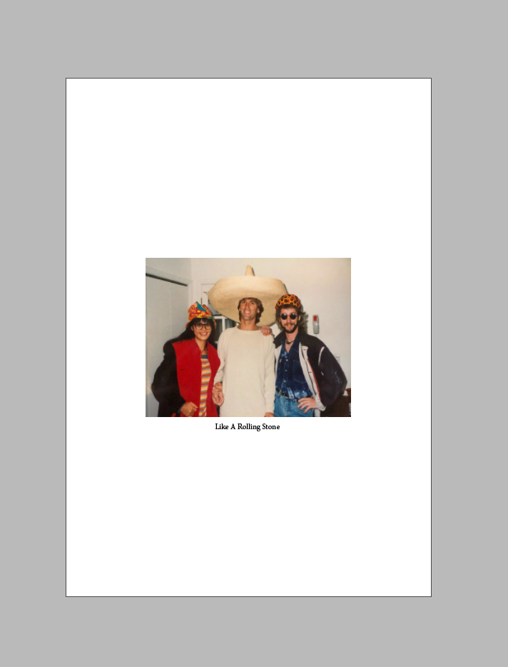
I decided to choose this photo of my Dad, Jim and his wife as it was one of the last photos of them together. The words ‘Like A Rolling Stone” is the title of the song that was written through out the zine. I chose that song as it is my Dad’s favourite song that he has loved for many years as well as the lyrics having some correlation to his life a the time. I also chose to just put the title underneath the photo with nothing else as I think the simplicity ends the zine nicely and rounds everything up. I’d like to think as well that my Dad’s Journey with music relates to this title for many reasons. One of them being that he was similar to the band; The Rolling Stones, in the sense that he travelled around the world as they did playing music and doing what he loved for a very long time just like they did. In a metaphorical sense he is like a literal rolling stone and he goes through his life taking different paths and rolling with the punches along the way. I also added the white around the photo was chosen to blend nicely into the front page.
Whilst editing my images for my zine I tried to consider my previous artists references to make the photos look as high quality as possible.
In Light Room I selected several images using the rating tool and colouring different images to show which ones I liked the most and which ones I thought were the best quality e.g. green being the best quality and red being the worst, 5/4 stars are photos i like the look of due to their composition or the vibrancy etc and less than 5/4 stars are photos i don’t like the composition of.
Whilst editing this image I thought that the photo was slightly too dark, so I decided to lighten the exposure, as well as lightening the shadows a lot and darkening the highlights so it wasn’t too bright. I also lowered the contrast so there wasn’t such a drastic difference between the light and dark tones.
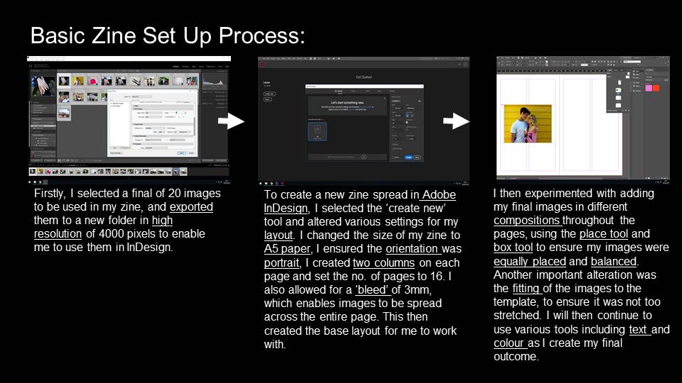
InDesign is a program to organize and compile your work into a single document to be printed in your chosen format. In this case the aim is to make a 16 page zine which contains a clear narrative.
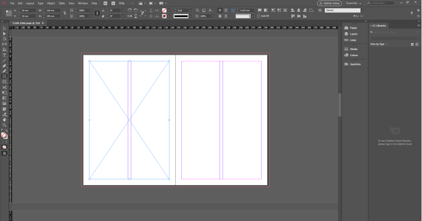
The first step of the process is to create the document to your tailored liking. This includes formatting such as size of page, how many pages, margins, the bleed and the gutter.
The bleed can be seen on the outer edge of the two pages. The purpose of this is to ensure that if an image is placed full size on the page(s) it won’t leave a thin white gap in between the edge of the page and image. There are evenly spaced margins on each page, in the purple lines, to maintain a structure throughout the zine and to vary from placing full bleed images. The line in the middle represents where the pages meet and create a slight distortion to an image if it is spread over both of the pages. This has to be taken into consideration when arranging the images. For example if the line cuts across an important section of a portrait such as the eye, it would be better placed somewhere else. The blue lines on the page is the frame tool selection(F). Similar to a text box in Word, this tool is used to create your desired frame for an image to be placed in. You can chose to place it in various way; either full bleed, to the margins or any other custom placement. Using Ctrl+D, brings up the files to select your desired image. Once the photo has been chosen, the next step is to fit the image. There are two main types of fitting. The first is to fit the frame proportionately to the content which may cut a bit off the image but still keeps the exact dimensions of the original frame. The other is to fit the content proportionately to the frame. This option ensures that all the content is visible but does not ensure that the frame will remain the same size.
As well as adding images to the zine, text is another element of the sequence. It is useful to insert context to images and quotes or thought to go alongside images to give them a new dynamic. The title is also an important feature that requires text.
In this shoot I tried to capture photos throughout our school day, as we go to the same school and it is there that we spend most of our time together; walking to and from school and during our frees
Edited Outcomes:
I love the colour in this image that I helped bring out through editing. I think this works well with zita as she is wearing predominantly dark clothes which contrasts with the colourful background.
Here I took this picture again using self timer, to show our day to day during breaktime, I tried not to interfere with the foreground as I wanted it to be as realistic as possible. In this image zita and I’s pinkys are link to synmbolise our bond that is still present even when spending time with others or as a group
I then futher edited this image to focus on us linking pinkys by setting the background to black and white but keeping us in colour.
Here our bond is more present and direct in this image which I also like as it still holds the candid aspect to the photo.
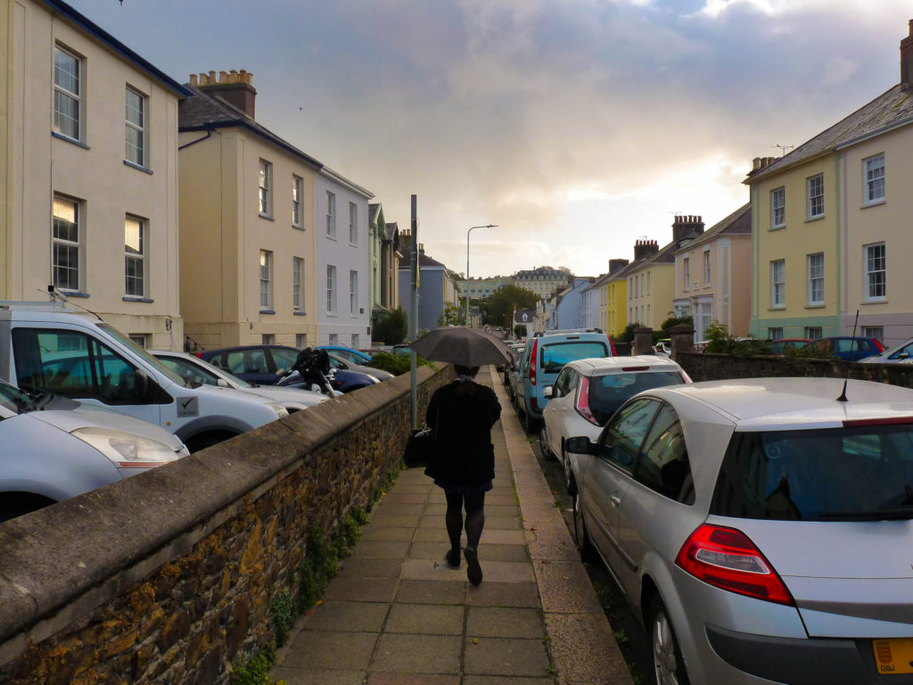
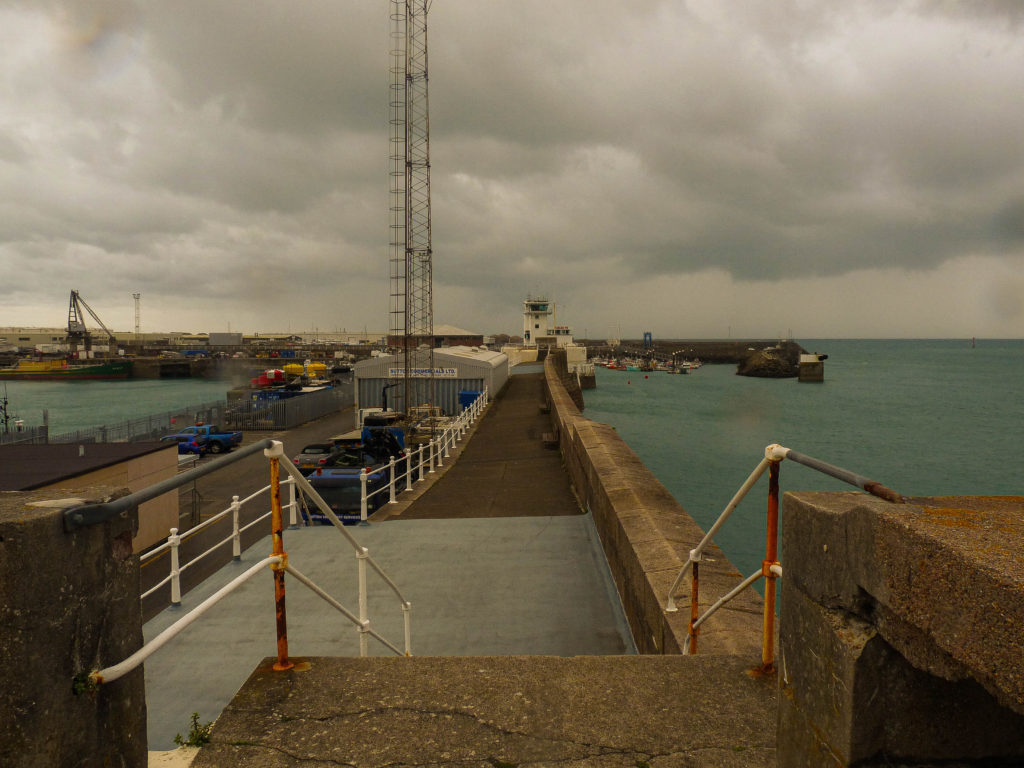
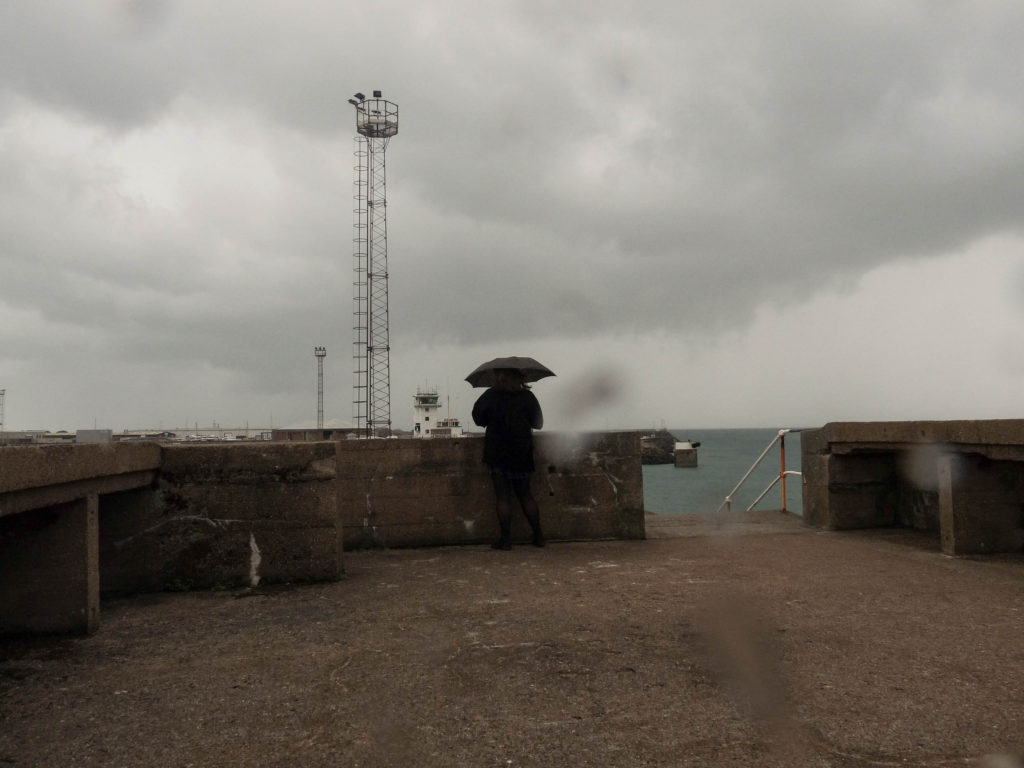
For this shoot I went to a place zita and I sometimes go to to hang out, near the harbour, a place that we value spending time together at.
Edited Outcomes:
I wanted an image of the location as I thought it work well in the zine side by side to the close up images of zita and I. I quite like this image and the texture shown as it brings warmth to the image and I think that the weather helped symbolise the reality of friendship as it isn’t always full of happiness; but sometimes there needs to be a “little thunder before the rainbow and sunshine comes” and times turn good again.
This image also links to the ups and downs to the friendship idea I spoke about above^
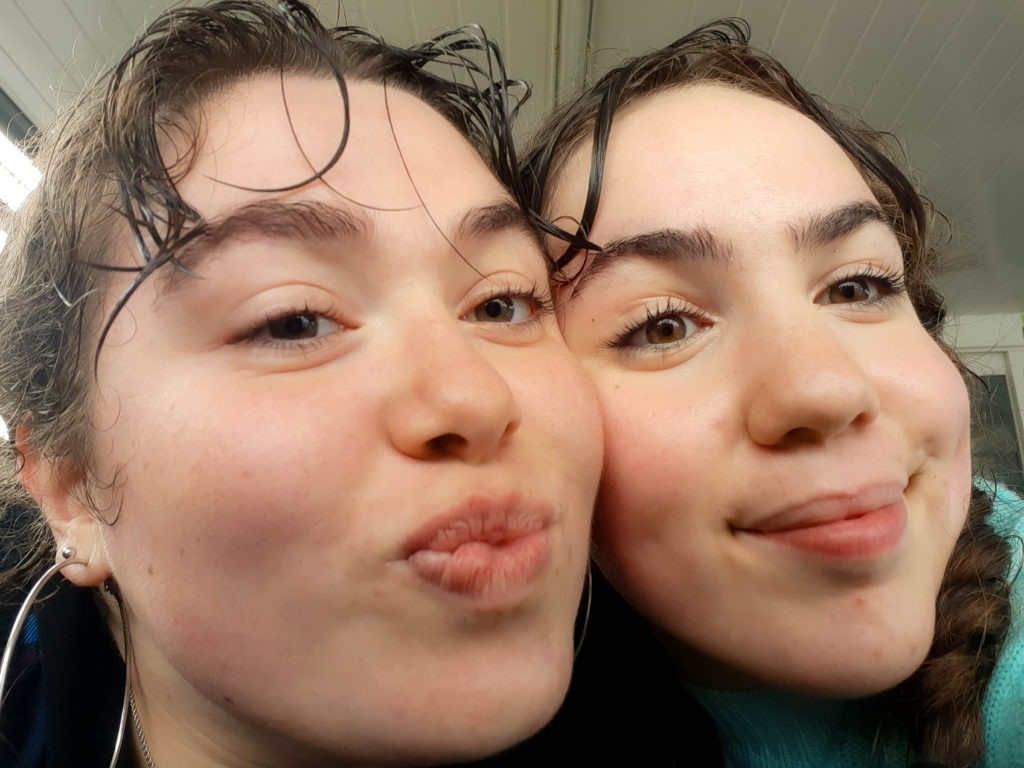
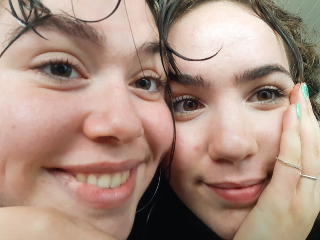
These photos were inspired by a photobook I saw by ___, I loved the up close and personal theme to the images showing the beauty within the imperfections and perfections and Ithink these images fit this idea.
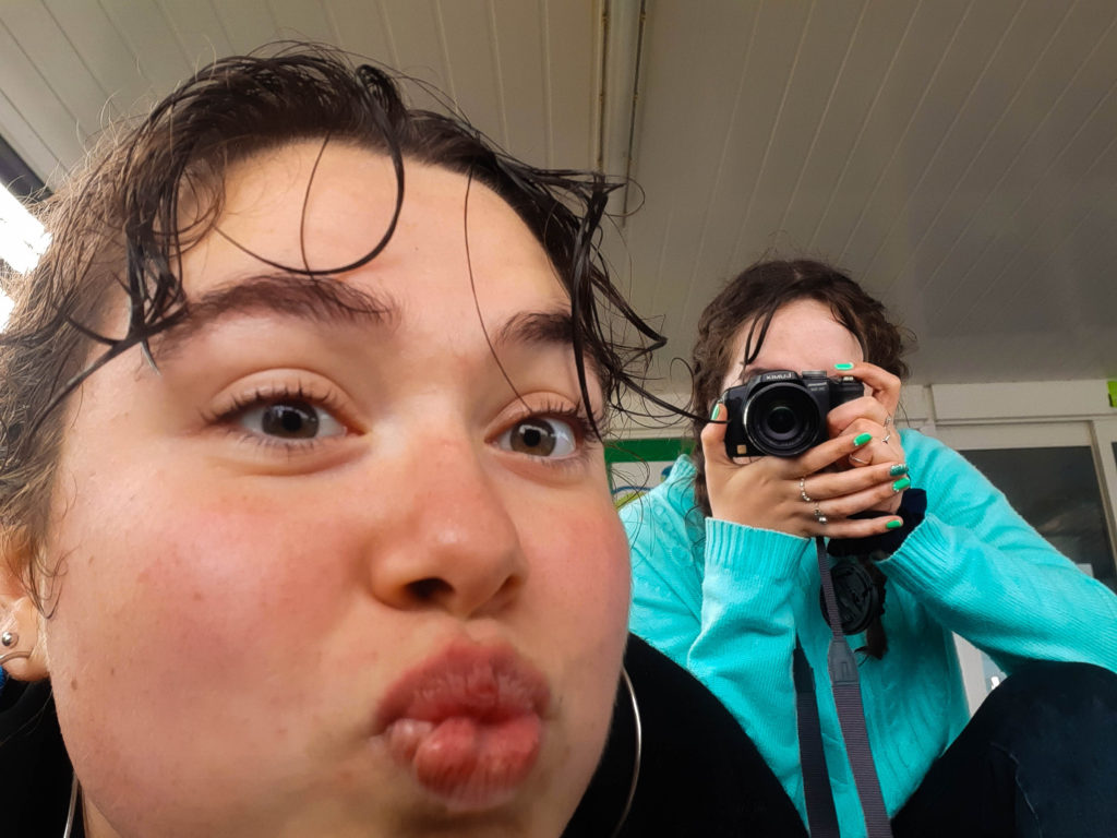
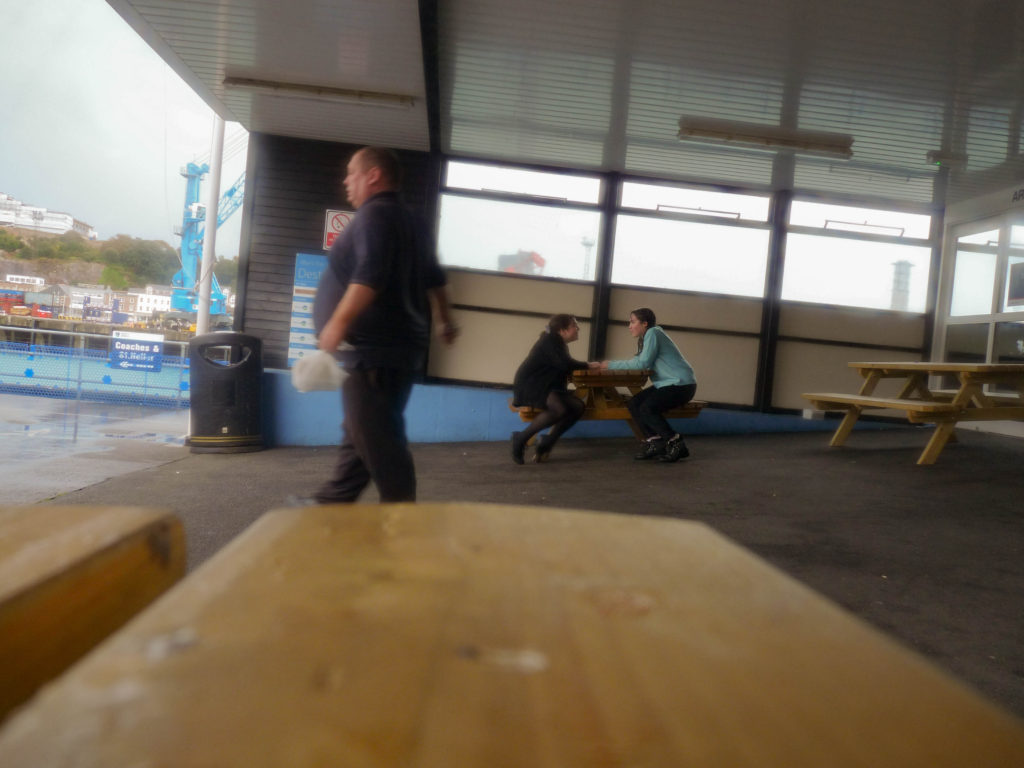
i chose this last image not for it technical skill and quality but for the conceptual idea of capturing reality and the rawness I think this image can hold. This image shows us two having fun speaking to each other from a bystander’s perspective (photo taken using self timer) I think that the fact that it isn’t completely in focus or the right angle helps this as it captures a moment in our life and we still stand as the focus of the image