
Here I will guide you through my thought process and why I laid out my Zine the way I did, explaining context and reasoning behind each and every photo.
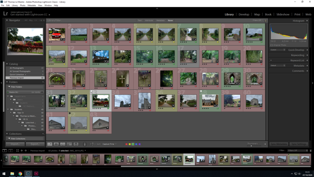
In all my three photo shoots, for my first editing process, I used the 5 star rating feature of Lightroom Classic CC to rate all my photos. Then, based on these ratings that i gave my photos, i decided whether they’d be used or not by filtering through using the p key on the keyboard to approve photos as demonstrated by the small white flag in the upper left hand corner, and alternatively used the x key on the keyboard to disprove photos as shown by the black x symbol in the upper right-hand corner.
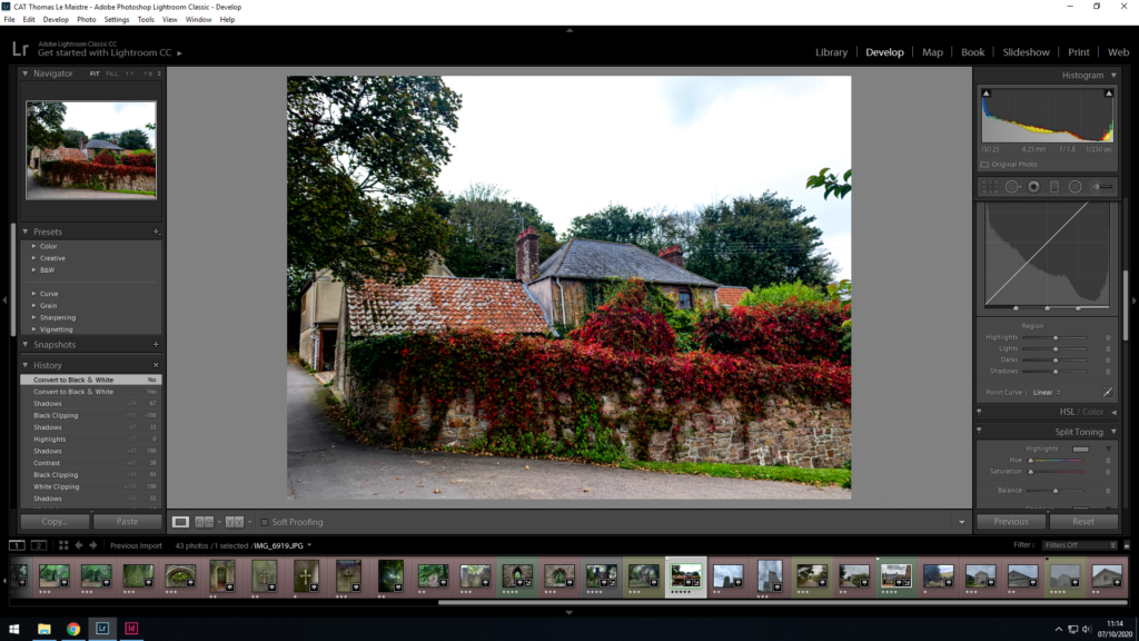
After I chose my best set of images, I proceeded to edit almost every aspect of each of my chosen photos with the ‘Develop’ tab as can be seen in the photo above to the right-hand side. Here I could edit the exposure, contrast, blacks/whites, shadows and highlights of each and every photo, also adding a darker border in the corners known as vignette to draw the eyes towards the centre of the photo highlighting the subject, whether it be a person, object or building.
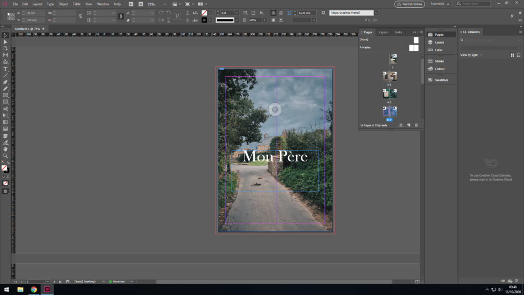
For my front cover, I needed a bold and eye catching photo, however not too “in your face” so to speak. I wanted to go for a more chilled out, relaxed, nostalgic vibe, nothing too abstract or aggressive as that doesn’t fit the story of my zine very well. The photo in question had been chosen mainly because it is very significant as it was the house my father was brought up in from a young age. I like the colours as they aren’t too punchy, however deliver a nice contrast in places and highlights Furthermore, the title is fitting as it translates ‘My Father’ to french. In addition to simply explaining what my zine is about, it’s also written in french as both me and my dad and his whole side of the family have close links with France, with my dad being half French making me Quarter French.
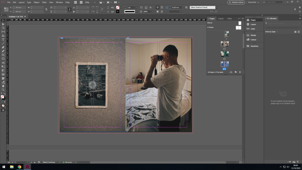
For the second and third page, I thought it was only fitting to include the subject of this entire story, my dad. To achieve this, I wanted to include a childhood photo of his compared to a very recent photo of him. Firstly, the childhood photo of him was placed first as it is essentially puts both photos in chronological order, as it came many years before the next photo of him in the present day at the age of 67, which also creates a stark contrast as both photos have been taken around 65 years apart. Furthermore, both photos my dad is entertaining himself with a hobby, both photos fit together as they essentially highlight his curious side, and potentially his childish side too. Lastly, both photos are comprised of a similar colour palette of beige, browns and whites, which results in similar, matching photographs that fit together hand in hand to make a satisfying double page spread for the observer to look at.
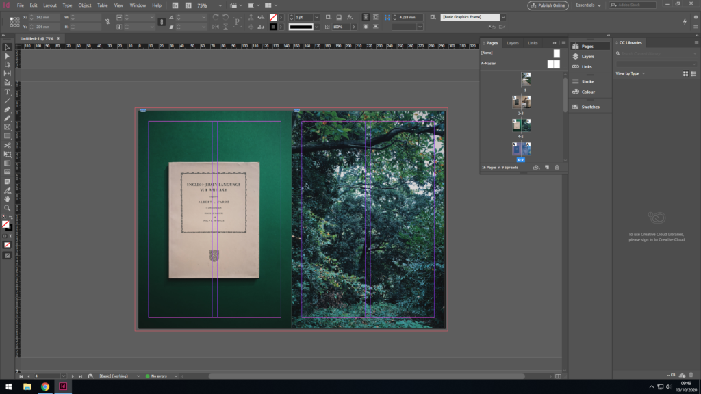
For the second page, I wanted to mix it up a bit, so rather than carry on with photos of my dad, I wanted to add something much different, however relevant to the story at the same time. To the left, there is the Jersey-French dictionary which my dads uncle published and is quite famous and significant to Jersey’s history even to this day. I placed the book on a green background as the colours contrasted nicely aswell as complimenting each other in a subtle way, as the book has a tint of green to it. I centred the photo of the book in lightroom to make it symmetrical and matches the previous page where there is a childhood photo of my dad instead.
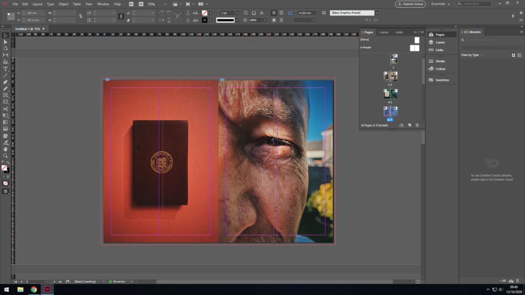
Yet again, I wanted to match colours between the two photos where the background that compliments the book on the first image, also compliments my dad’s skin tones, with vibrant hints of oranges and yellows making up the majority of the colour palette on this double page spread. The first image as previously is a book and also has been centered with the aim of symmetry and continuity. It follows a theme with the past 2 photos where a random (although significant to the story) object has been placed on a colourful , contrasting background. The photo on the second page (to the right) is a zoomed in photo of my dad who is the main focus of this story and whole zine, where his eye is in the centre of the page.
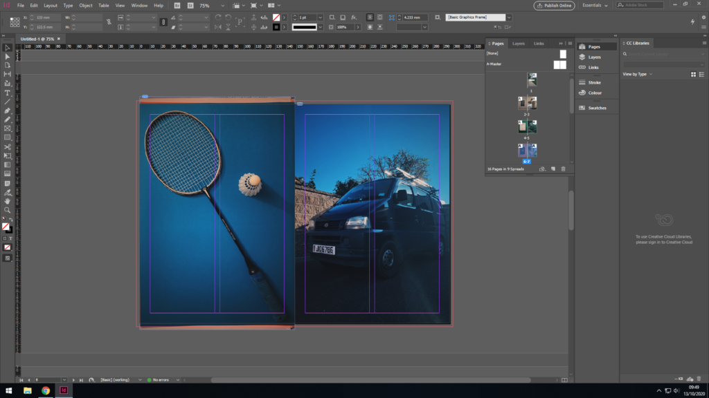
Again, the theme carries on with the animate object to the left. My dad enjoyed badminton much as a kid, teenager through to his adult years and played it often with his mates. It’s also meaningful to me as he taught me badminton with that exact raquet, the same one he used from a young age. To the right, there is a photo of my dad’s work van, he is very hard working and has become very successful as a result. Both photos as symmetrical as per usual throughout this zine, as well as both sharing the blue tints throughout the photo, hence why i placed them together. Also, one could say the first photo shows my dad’s playful and childish side, the other shows his serious, hardworking side, adult side which provides a nice contrast between the two, and highlight the type of person my dad is.
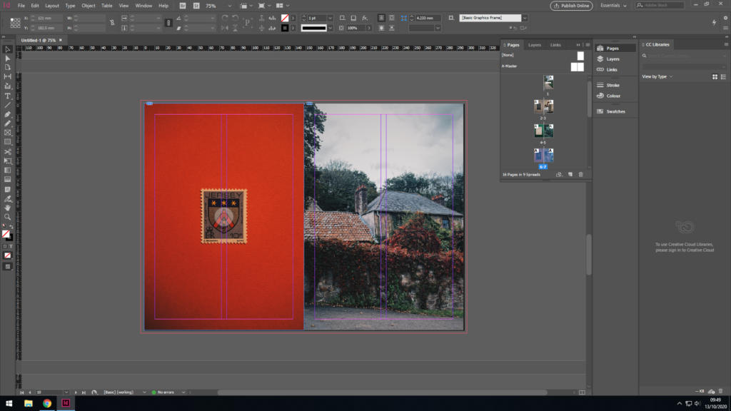
Sticking with the theme, a close up photo of a Jersey stamp with my families’ (Le Maistre) name and crest on it. These were a series of Jersey stamps made after the original Jersey family names and has much historic importance, as well as having great significance to my story. Furthermore, the colours match between the two photos in a subtle way, as well as the having the flower in the crest on the stamp coinciding with the flowers in the photo adjacent to it. Everything has a meaning and everything has been placed intentionally where it is.
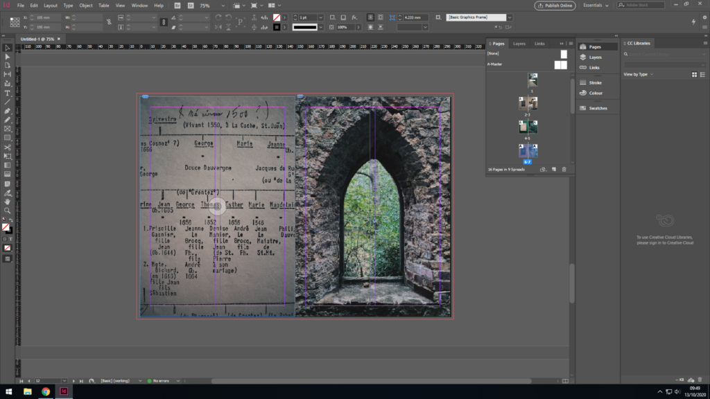
Here you can see me and my dad’s family tree paired up with an image of an old Jersey folly located in a forest. The family tree dates back to the 1500s however said to be even longer, however less documented, making us apart of one of the original Jersey families. This links back to the previous pages where the photo of the stamp resembles this strong family heritage.
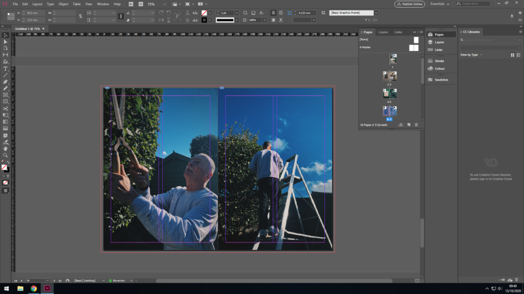
The last two pages highlight my dad in the present dad, hence why they came last in the zine as I aimed to have it laid out in chronological order. The colours and composition match in both photos, as you can see my dad hard at work maintaining the garden. He really does have a good eye for detail.
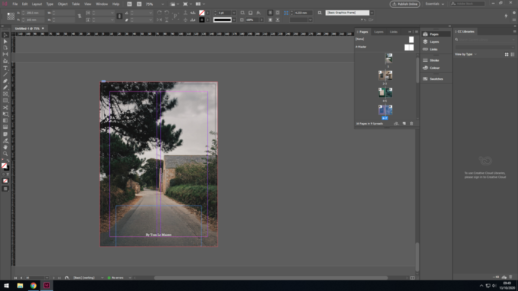
For the back cover, I wanted to chose a photo similar to the front cover, as well as still sharing some significance to my dad’s past. The photo I’ve chosen is my dads next house which he moved to after and spent his teenage years growing up in. Furthermore, both photos share similar colours so match when the book is closed, as well as also being in chronological order, i.e. his first house comes first in the book, the next house comes last.