
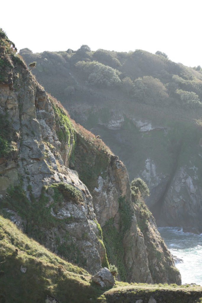
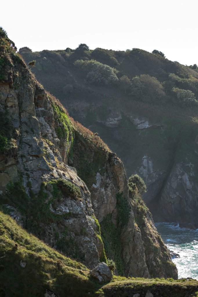
To start the process of my photozine, I photographed the first location that held significance to one of my subjects. After a conversation with my subject, they concluded that Devil’s hole was a place they wanted photographed.
Location 1- Devil’s hole. (natural landscape)
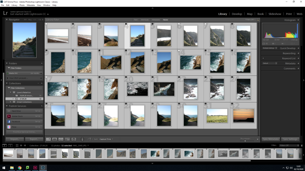
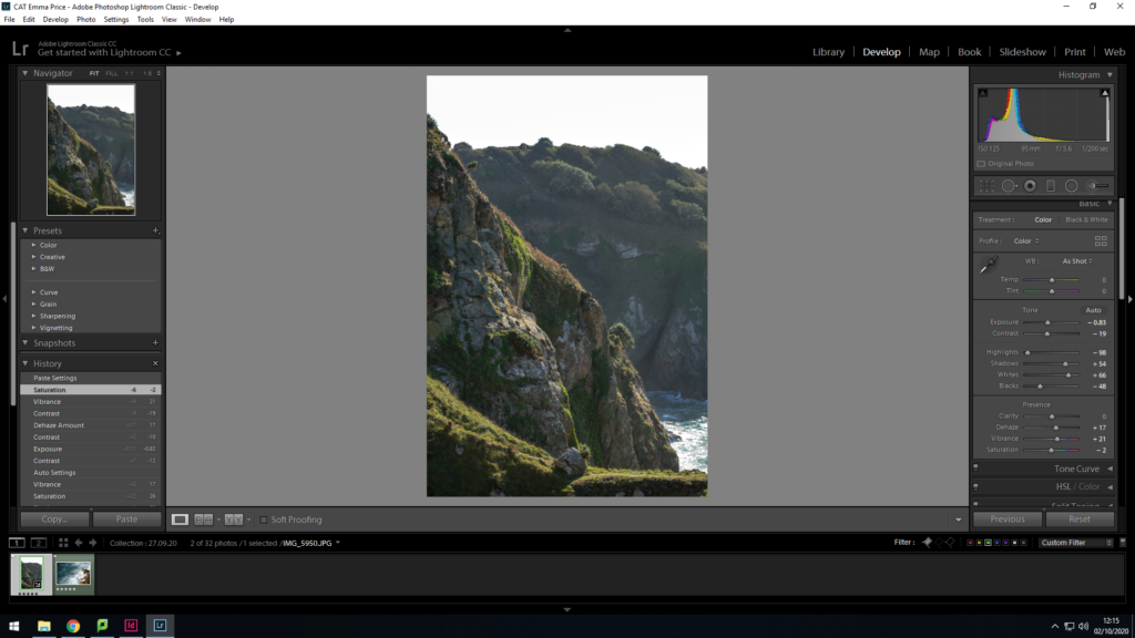
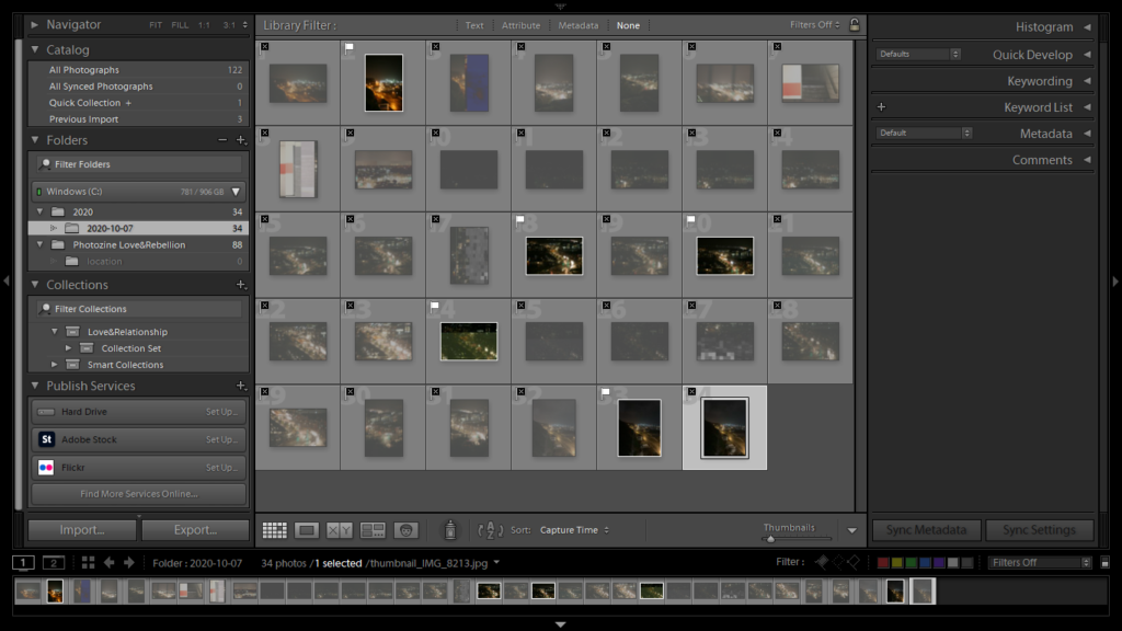
I began the filtering process of my images by going through each image and either flagging (Ctrl+P) or rejecting (Ctrl+X). I then did a rating system of 4 stars if I was unsure of the image and 5 stars if I was completely satisfied with the image.
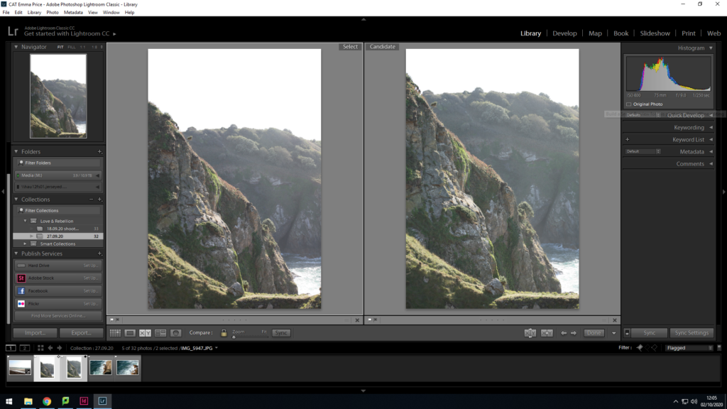
To decide the final image out of these two I used the ‘X|Y’ tool. After a quick comparison, I decided that the image on the right had a better composition, as the grassy area in the foreground took up a larger proportion of the frame, as well as having more vibrant coloured shrubbery. Additionally, I altered the exposure when taking the shot on the right, in order to reduce the amount of light entering the lens (due to the bright conditions).
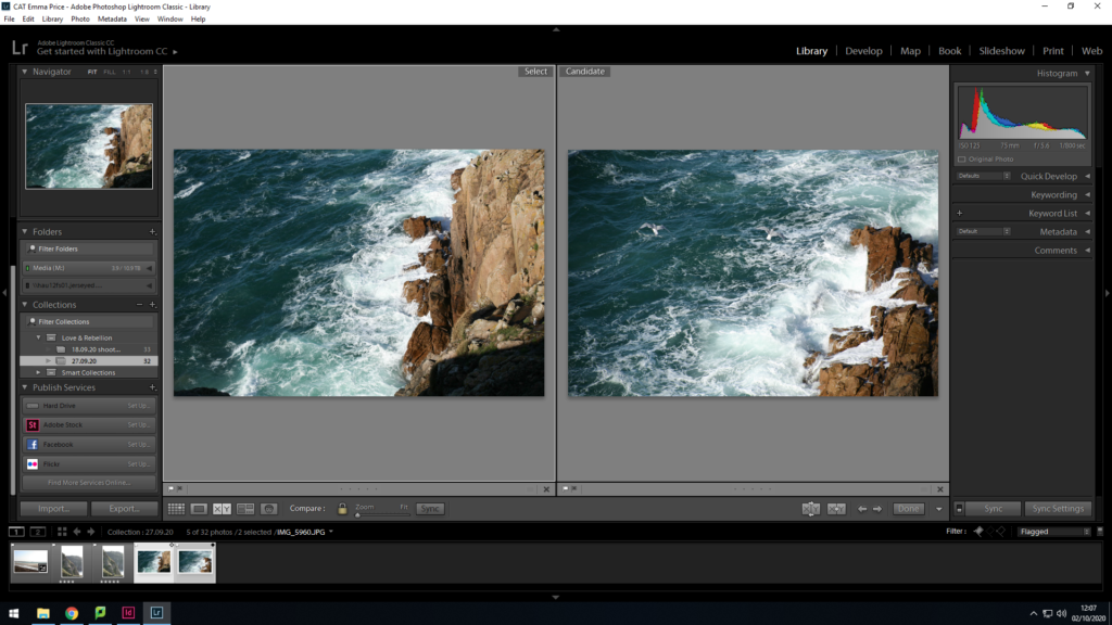
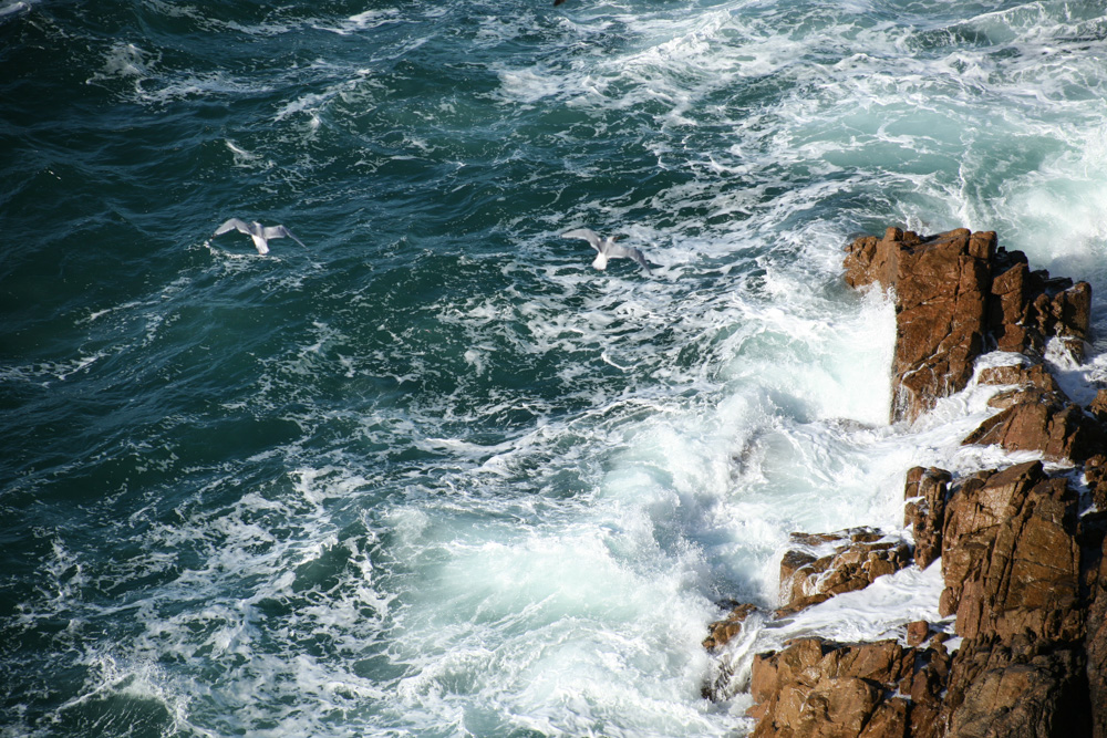
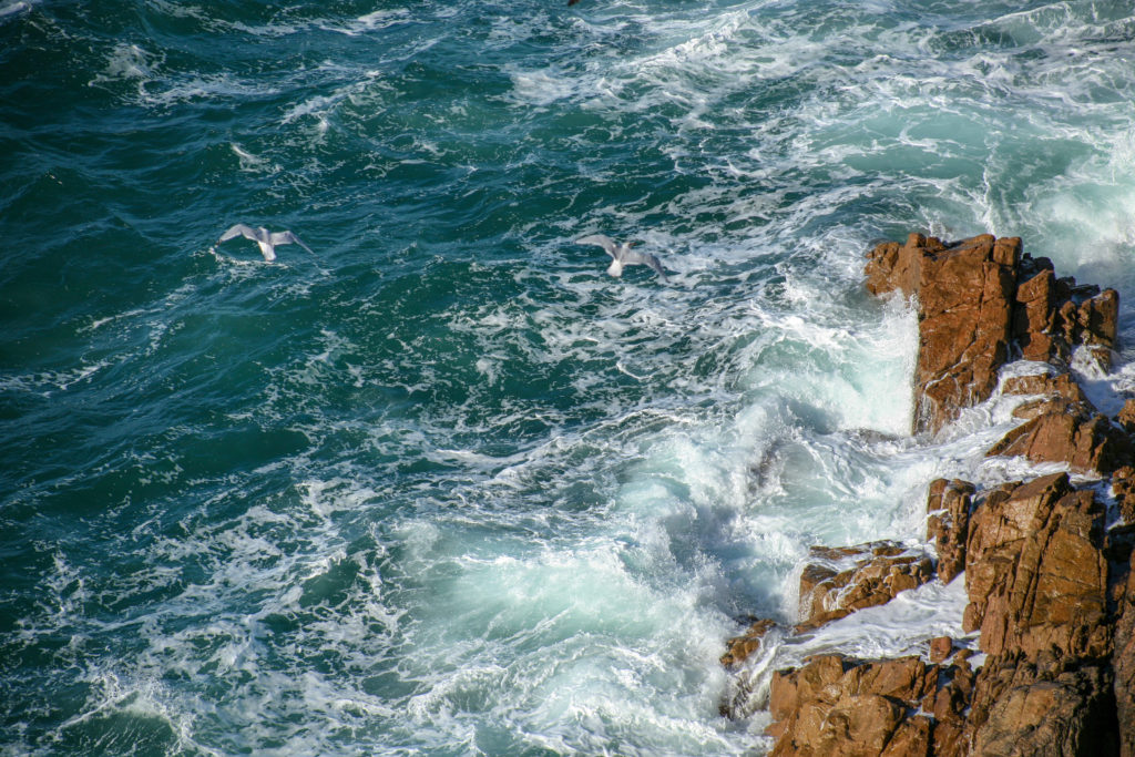
To decide between these two images I analysed the composition, and how it may look when placed in a photozine. As a double page spread, the image on the right proved to be a better candidate as it had a stronger contrast between the brown of the rocks, the white of the broken waves and the blue of the sea. As well as this, the positioning of the seagulls within the frame creates a spot in the negative space of the sea for the audience’s gaze to avert to.
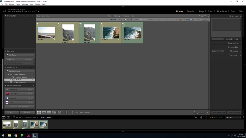
As a final selection, I came out with two mages I felt were the strongest candidates for my Zine, which I have colour coded as green in Lightroom.
editing:
1.
colour editing-
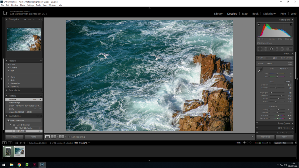
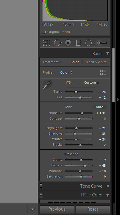
To enhance this image, I wanted to decrease the haziness of the image, in order to increase the clarity of the image. To achieve this I increased the shadows within the image and increased the vibrancy. This had a major impact when editing the photo, as it brought out the greenery of the grassland and allowed for a clearer view of the sea.
2.
To edit this image, I wanted to make the colours within the image lighter and more vibrant. I increased the saturation slightly but mainly focused on the basic tone of the image. I decreased the exposure and the contrast, as well as a strong increase in the shadows of the image. Increasing the highlights of the image resulted in a photo that’s less gloomy than the original.
Location 2- Fort Regent carpark/ St brelades (urban landscape)
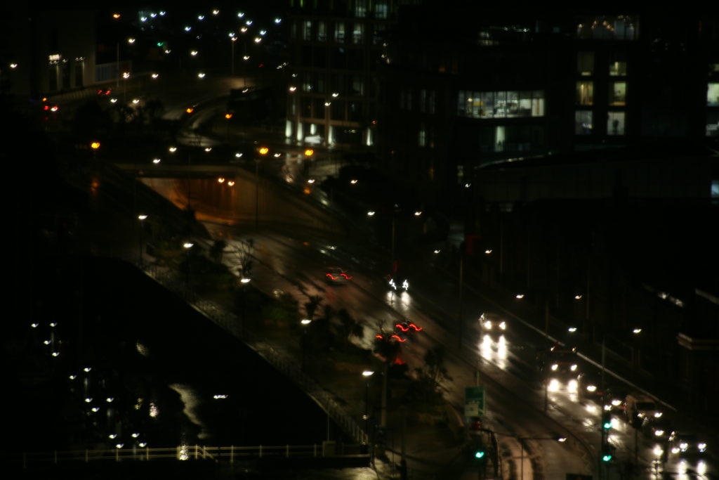
For my second location, I photographed an urban landscape, a place that held strong meaning to my second case-study. Stating that the lights have a significant effect on her I decided to take the shoot at night. A long exposure time was required and I used flat surfaces to steady the camera. The conditions were adverse, allowing many of the street lights and car headlights to be reflected off the avenue.
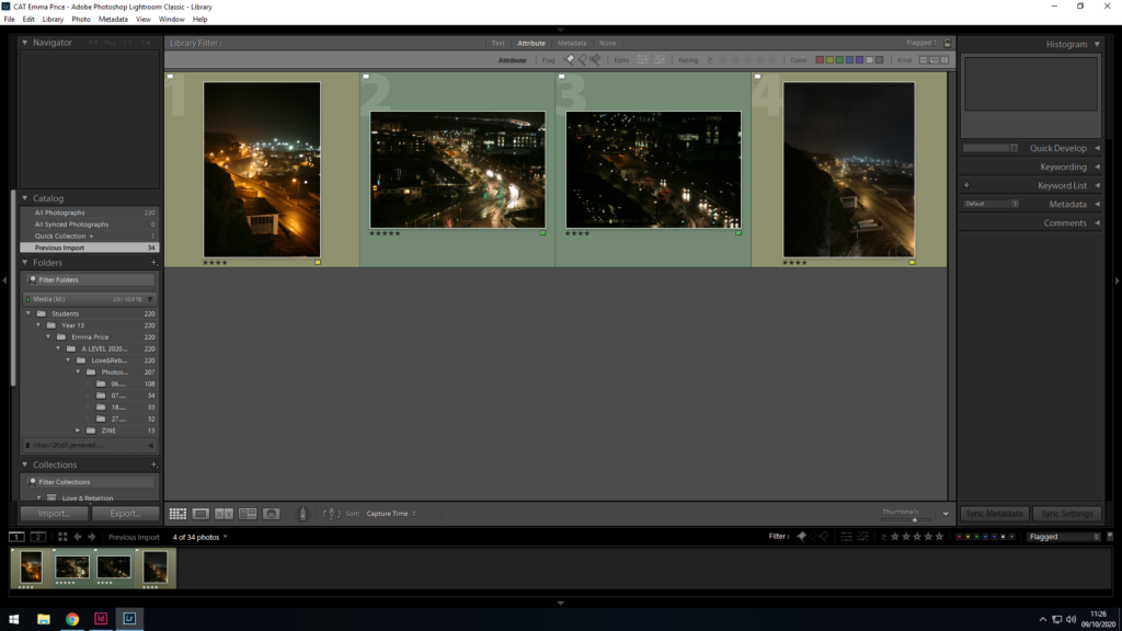
I selected 4 of the most clear and vibrant images by ‘flagging’ (Ctrl + P) or ‘rejecting’ (Ctrl + X) each image within the library. I colour rated (green for certain, yellow for uncertain) before the editing process.
Editing
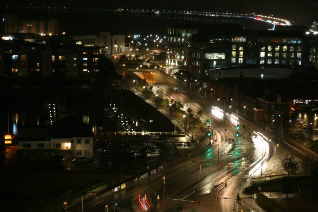
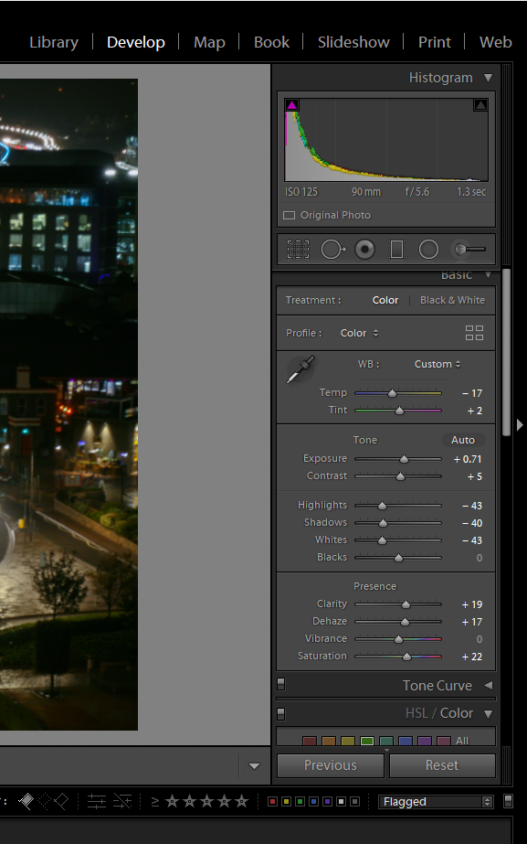
I initially began the editing process, by cropping the image. I rotated the image slightly so as to straighten the image. Then, I enhanced the image by decreasing the temperature, which allowed me to get rid of major yellow tones within the image. From this point forward, I increased exposure and contrast to amplify the effect of the street lights as well and increase the effect of the shadows. Additionally, I decreased the highlights and shadows to reduce the glare of these lights and to improve the visibility of the photo.
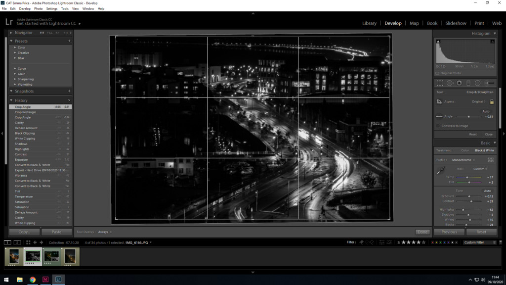
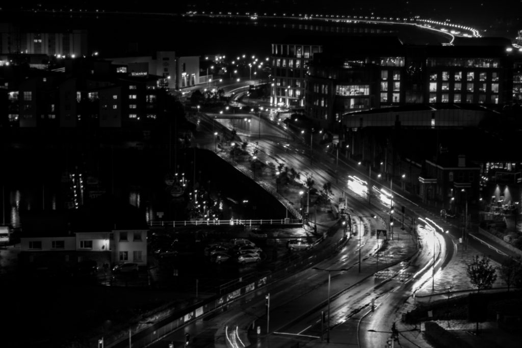
As a final experiementation (to design my photo zine), I converted the image to black and white.
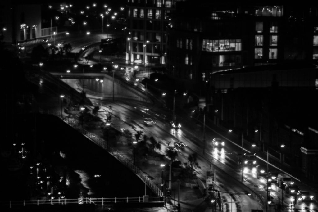
I converted the image to black and white to be able to layer a portrait over it without the colours clashing.
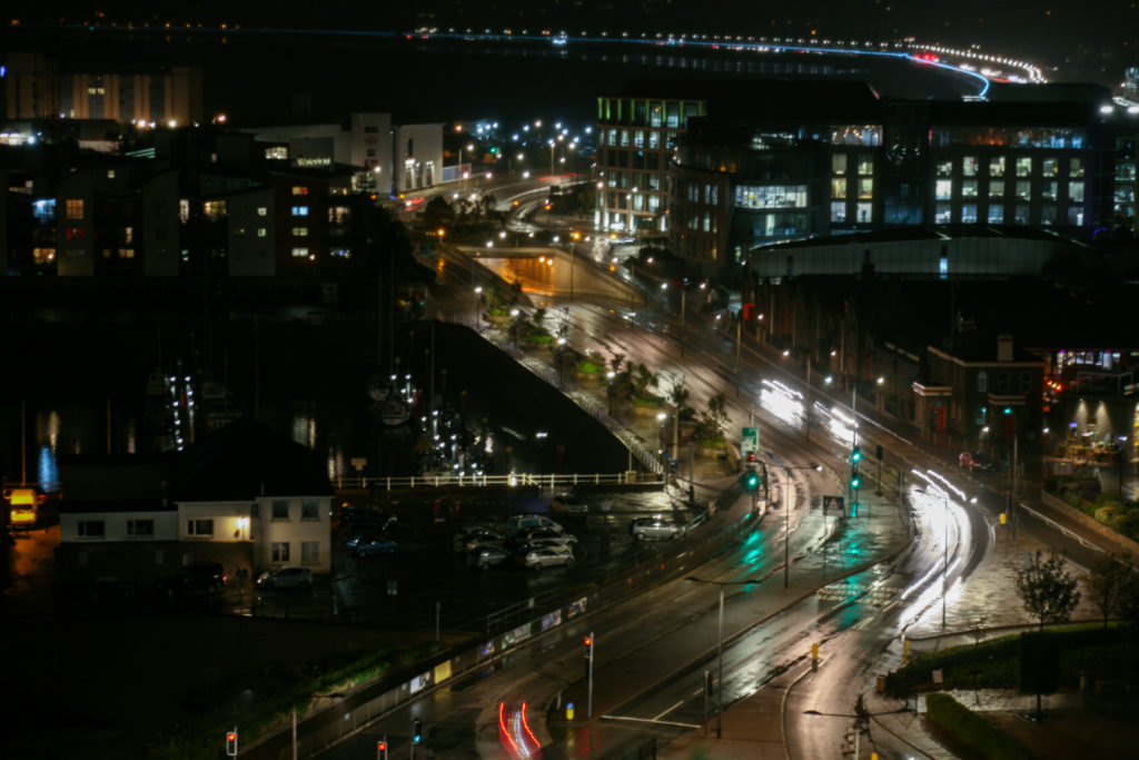
I began the editing process by increasing the exposure. This allowed the road and other areas of the image to become more visible. I also want to reduce the yellow of the lights, so I decreased the temperature of the image and reduced the highlights so as to limit the glare from the lights. Additionally, I reduced the shadows in the image to increase visibility
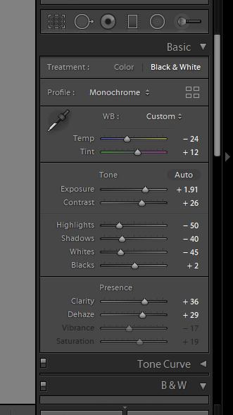
Lastly, I converted the photo to black and white, increasing the contrast and clarity of this image. This resulted in a successful image I could use for my zine.