
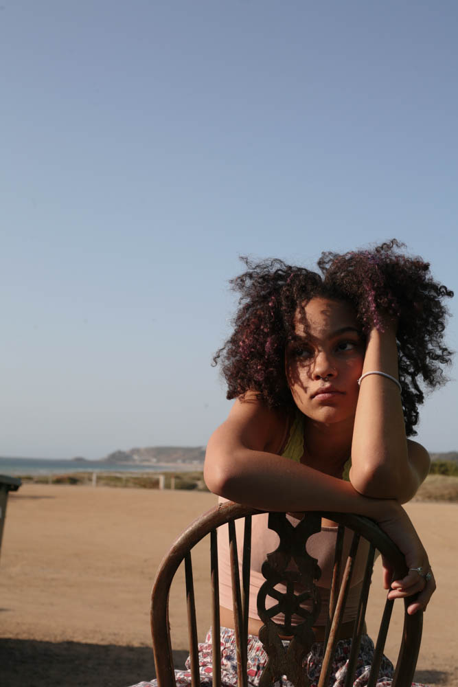
For this case study, I aimed to incorporate some of the successful images from my photo-shoot of ‘Someone you love’. These are pictured below:
Additionally, I carried out a second photoshoot, with the knowledge that my subject is used to the process of the photo-shoots and comfortable in front of the camera.
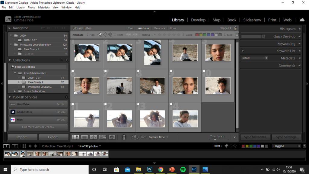
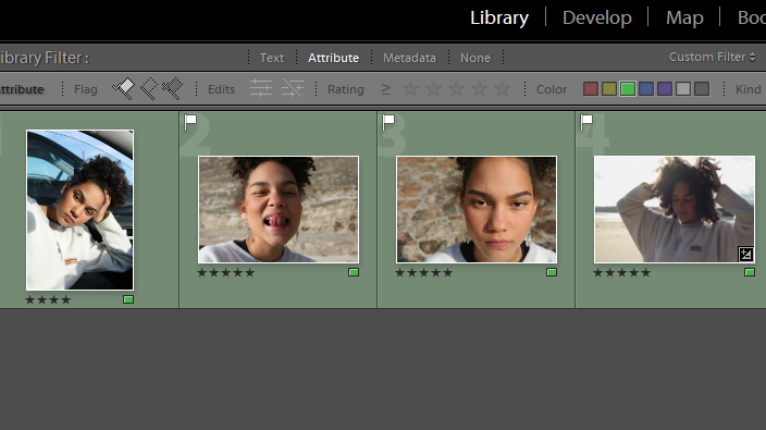
Selection Process
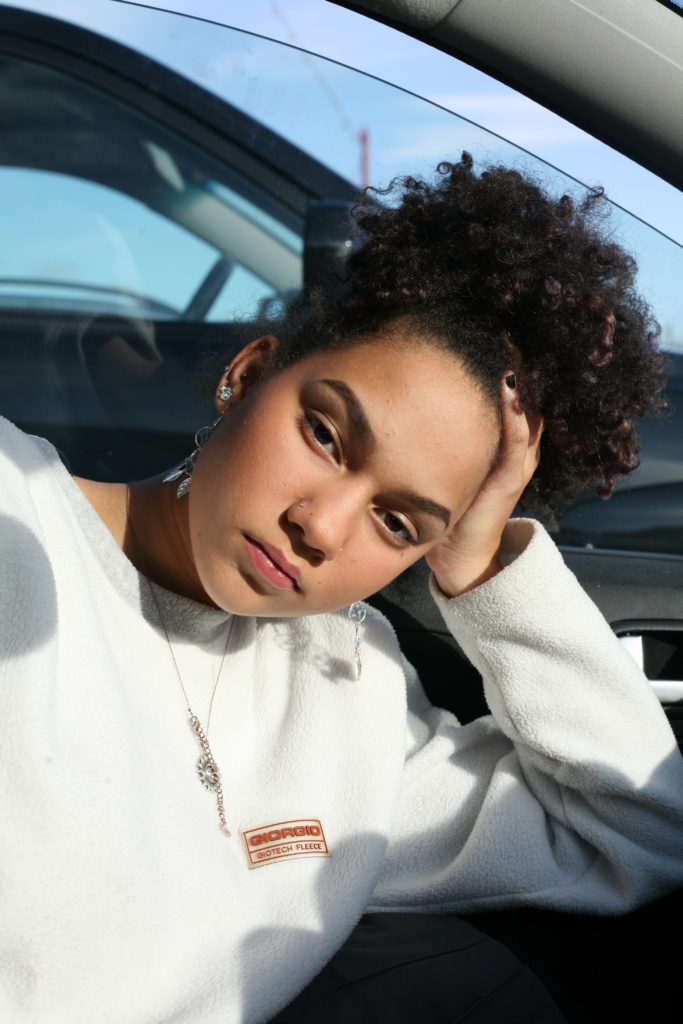
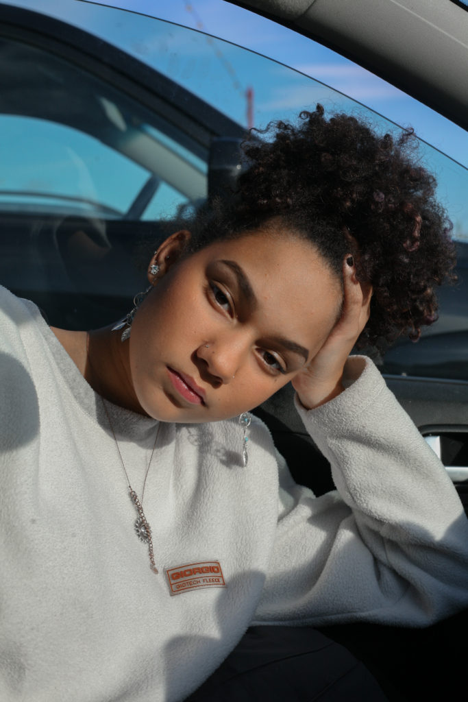
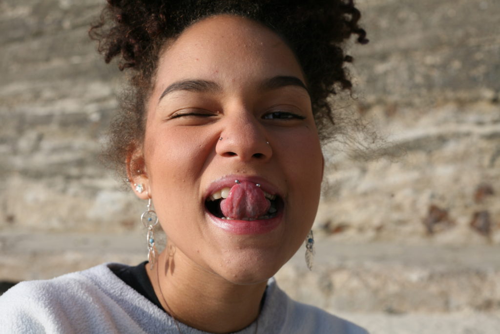
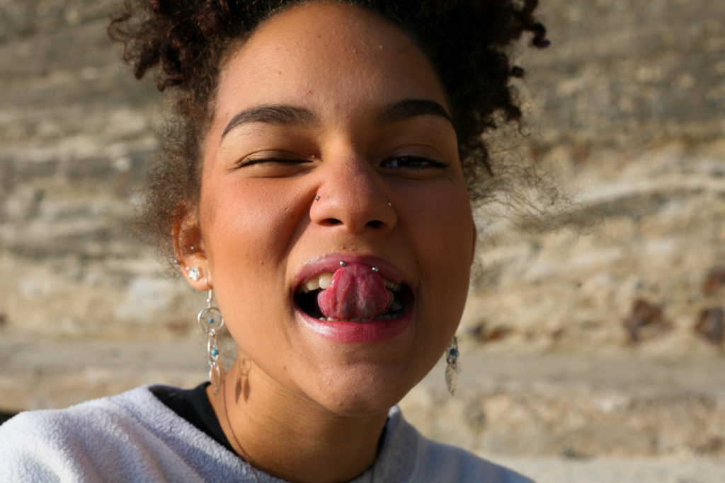
Using the compare view (‘X|Y’ tool), I compared similar images like the two above. I decided that the image on the right was more successful as a larger portion of my subject’s face is visible, as well the colours on her face being more vibrant. Additionally, the horizon in the background takes up half of the frame, reducing the negative space in the photo.
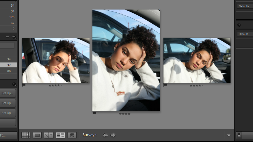
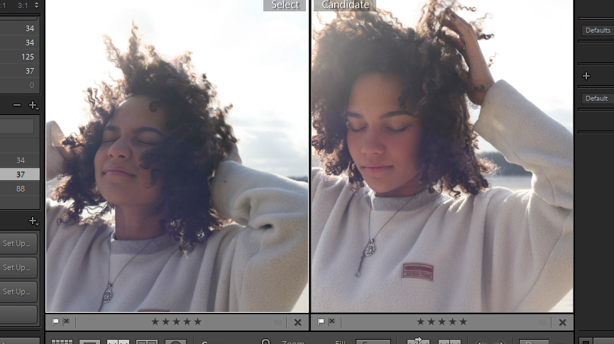
I also used the survey view to pick between a set of similar images. Out of these three photos, I decided the most successful was the portrait in the middle. The angle is more flattering on my subject and she takes up the majority of the frame, with his face in the golden third of the image. Her eyes are also opened more widely, improving the connection the subject as with the camera.
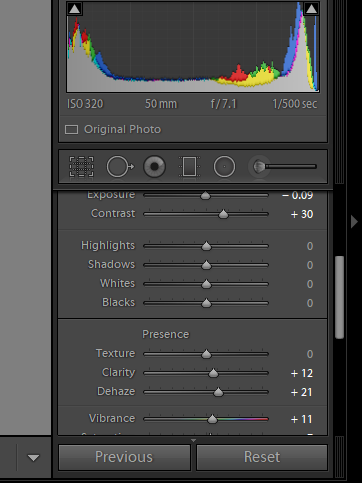
Editing
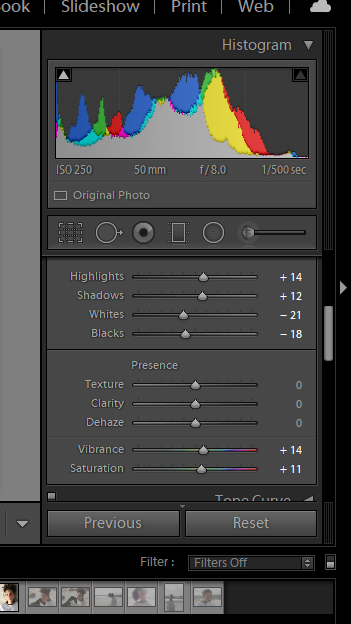
For this image I was fairly content with the exposure, clarity and contrast within the image, so the only thing I decided to amplify was the vibrancy and saturation. I slightly increased both of these using Lightroom to create a more vibrant image.
For my second image, I felt as though it showed the playfulness of my subject and so I wanted to amplify this by increasing the vibrancy and saturation of the image. Additionally, I wasn’t entirely happy with the angle I took the image at, so I used the … tool to adjust this, making the subject’s face appear more straight on to the camera.
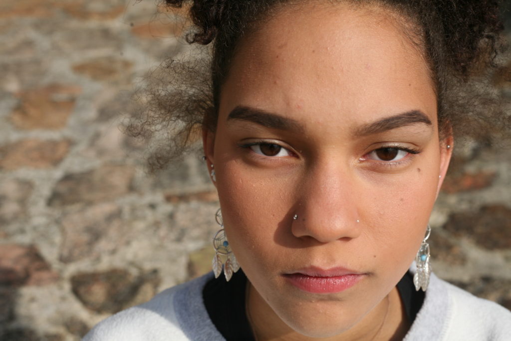
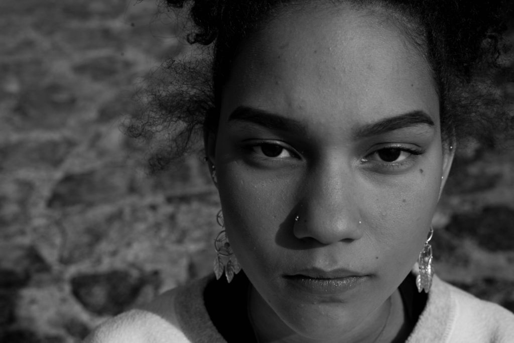
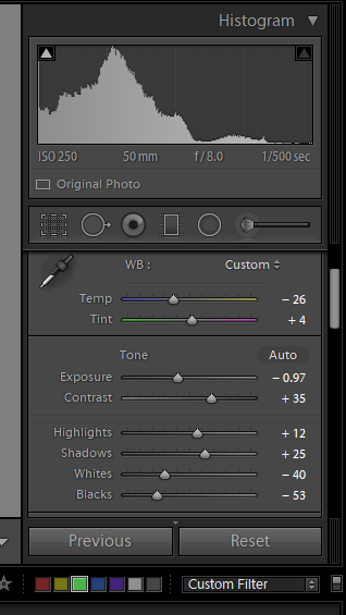
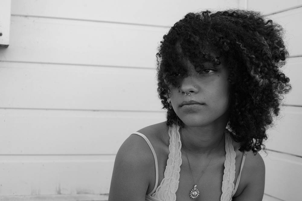
My intention for this image was to focus on the details of my subject’s face. The best way to achieve this is by converting it to black and white. I started by decreasing the temperature (in turn upping the contrast), I then decreased the exposure and ‘whites’ within the image to reduce to glare of white tones in the monochrome image. Increasing the shadows also allowed me to increase the contrast of the image. The darkest tones are present within the pupils and irises and so, by increasing the contrast, I could make my subject’s eyes a main focus.
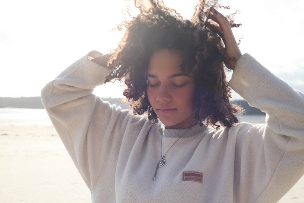
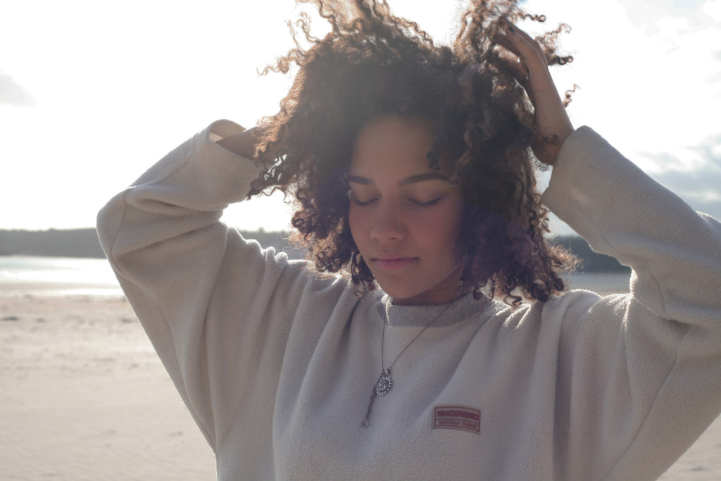
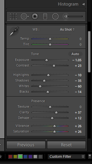
For this image, my main concern was to reduce the glare of the background. As the image was taken candidly, I didn’t get the opportunity to move the subject away from the natural lighting. Because of this, the background is very over-exposed.
Someone they love
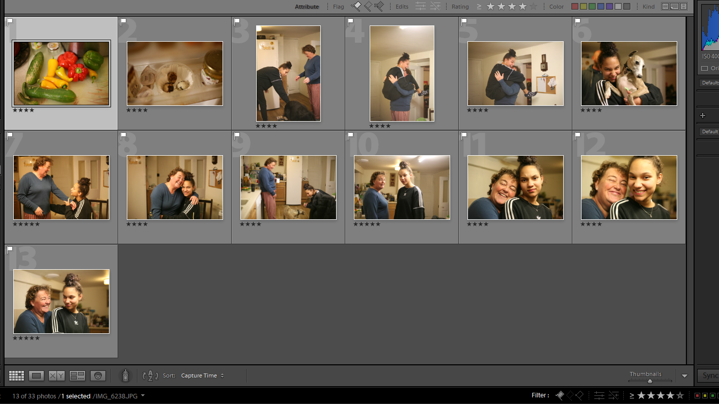
The editing process for these photos was relatively simple. I reduced the saturation of yellow tones within the images. This yellow tint was a result of the lighting within the house which was easily corrected using the HSL/Colour tool and decrease the hue or saturation of the tone.