The narrative I had chosen to portray through these images was one of a group of friends going about their normal lives together. Most of the images are shots of individuals, which represents how they each have their own lives separate from their friendship group, but how they all work well together and care about each other as a group. With the individual shots, many of them have the person clearly facing and looking in one direction away from the camera lens, and the sequencing of the images makes it so that they are looking at another person, which forms more of the “togetherness” in the narrative. The “love story” aspect is shown in the way that they all have platonic love for each other, which is obvious in the group images, but also all of the individual photos were taken while in a group setting, therefore the expression of happiness, or possibly not-happiness, as clear representations of the love story within the friendship group. The “love story” could also be related to their own individual love of their home where they grew up and their youth altogether.
I had a couple of different versions of the sequence of images, but here I’ll show to actual process of how I did the best one, in InDesign.
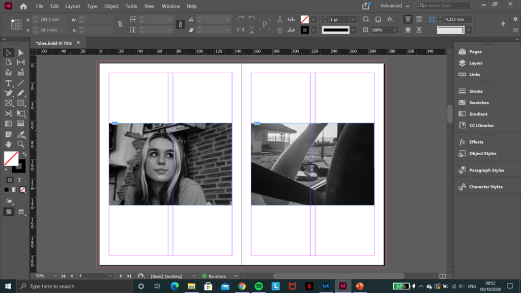
To begin with, I skipped making a front cover or title until the rest had been done, to save me having to change it halfway through, and because I needed more time to work on an appropriate title. So, I started placing my images into the zine in the sequence I had worked out before. I started off by placing them directly next to each other, like this.
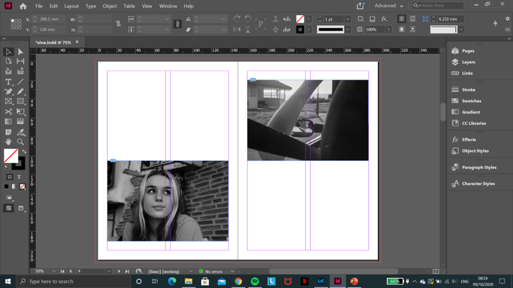
However I quickly realised how much more interesting it would be if I had the pairs of images in different positions on the page as you flipped through the book, so I experimented with this on each page until I got a pattern I liked.
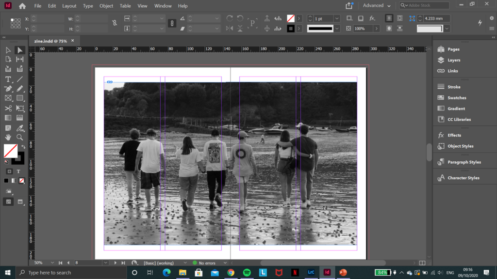
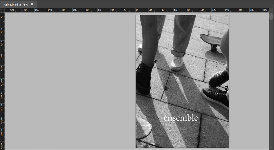
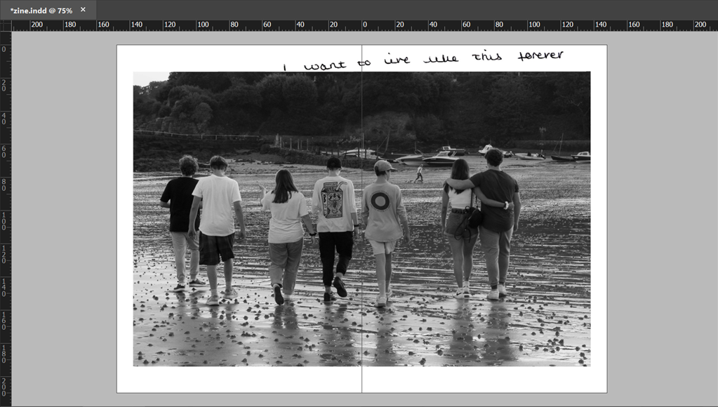
Most of my images are landscape, but I knew I wanted this one to be a standalone image and I placed it in the centre of the zine, so that it could have the full advantage of a two-page spread. This is one of two images that I had as standalone in the zine, because I felt they work work to full effect if they were the main focus.
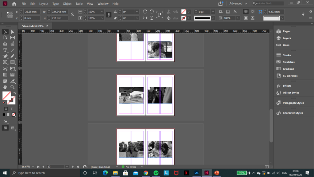
I continued with this pattern of placing the pairs of images in a frame in InDesign, sizing them and cropping them where necessary, then adjusting their position on each page, re-evaluating as I went along, until I’d put all my images in the zine. I scrolled through a couple times, just to check I still liked the sequence and the narrative it shows, then went to the next stage.
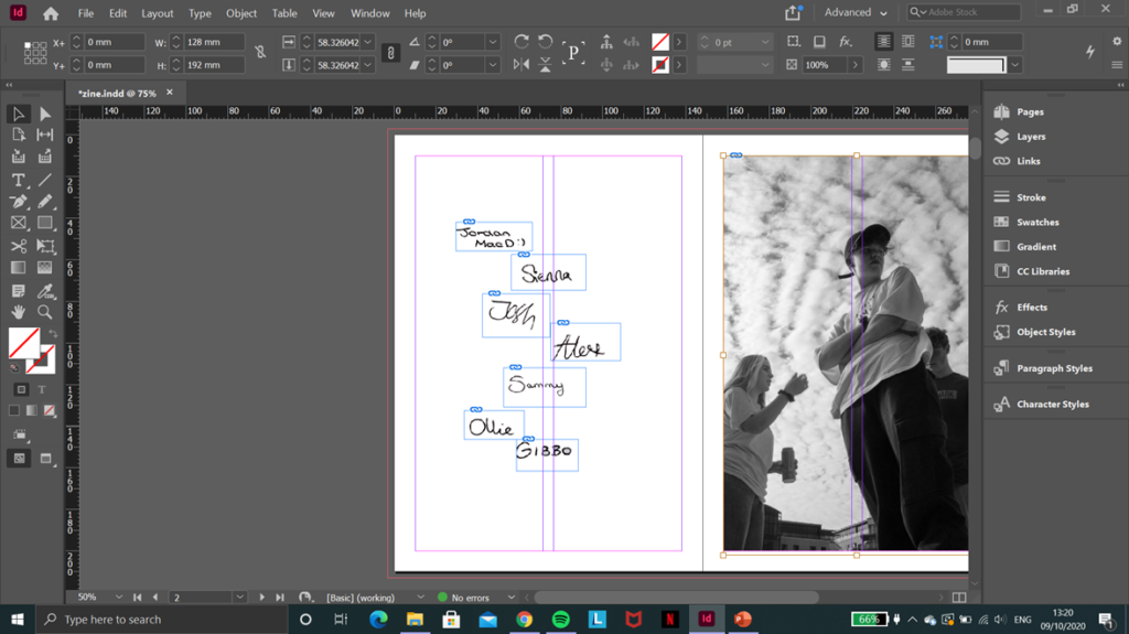
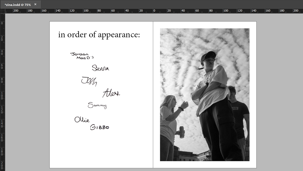
I had all of my friends who featured in the zine to write their own names on a sheet of paper beforehand, which I then took a picture of, uploaded to my laptop, cropped and fixed so that only the writing was visible and not the paper, then placed them all on the first page of the zine, opposite the other standalone image, which I decided to have like that because it was the only portrait image in the series and it worked best just individually, instead of next to a landscape photo.
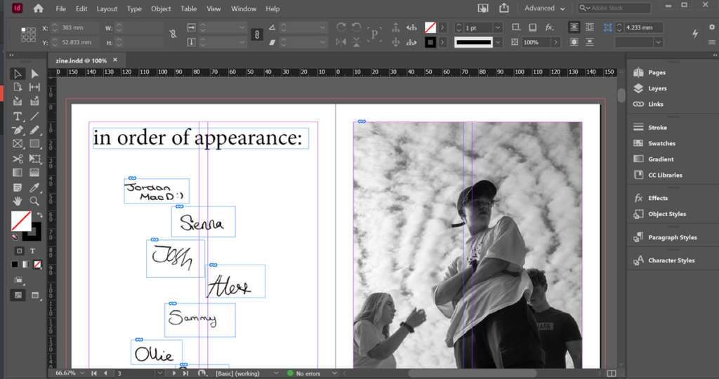
Next I added this title because it reminded me of the beginning credits scene in a movie, and I think it did well to make the zine a little more personal and fun, because the black and white of the photos could make it seem quite formal when that’s not the tone I was intending. As the title states, I placed the signatures in the order that their corresponding people first appear in the zine, and I resized and reshuffled them about a couple times before deciding on the way they are presented in the screenshot.
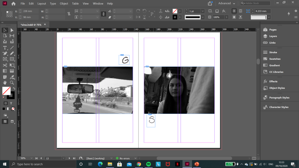
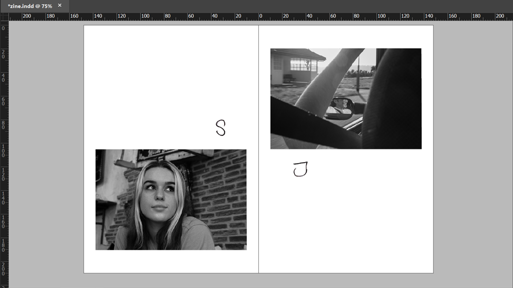
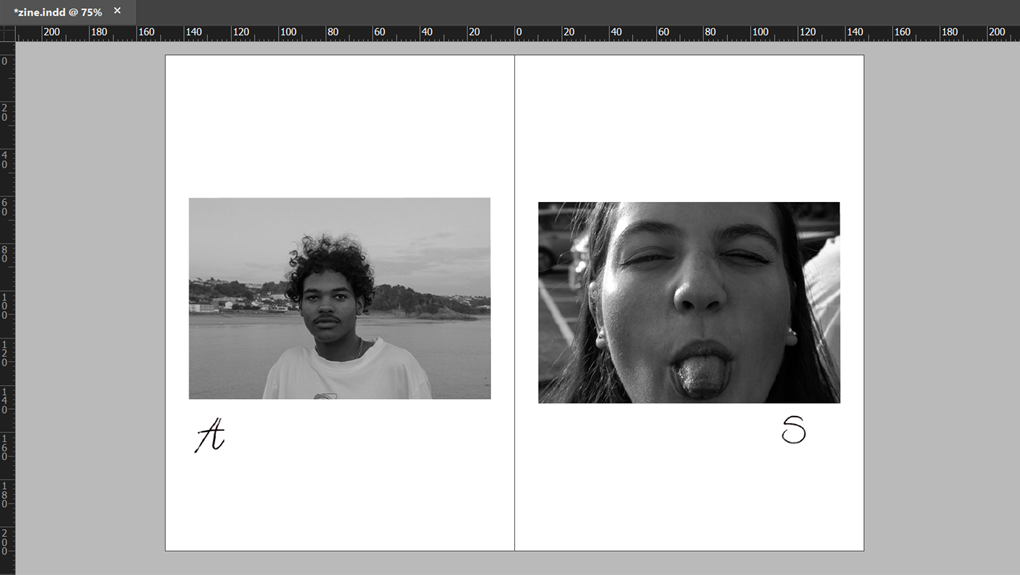
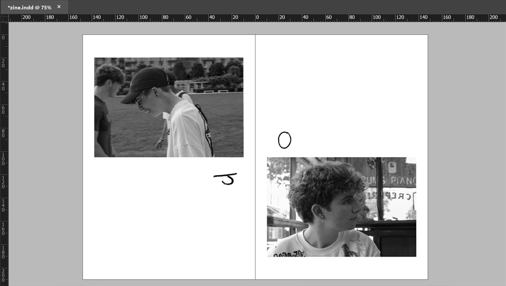
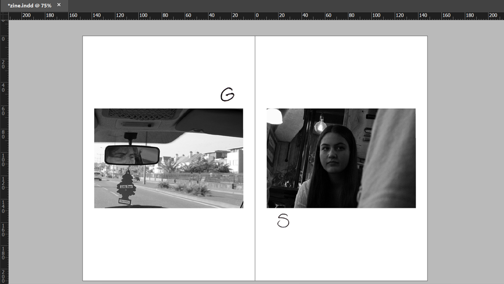
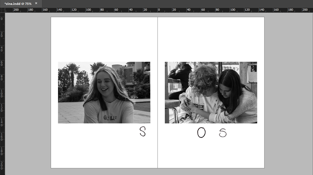
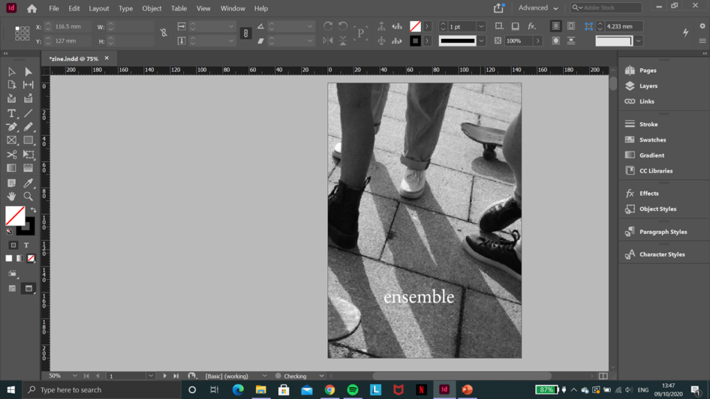
Then, I cropped the signatures to only the first initial of each name, made that a new image, and placed the initials near to their people each time they featured in the zine (except in the one big group image in the middle). I wanted this to have the effect of making it a little less plain and simple, but not distracting too much from the images, as well as making it more personal and distinctive. There are many studies that show how people’s handwriting may reflect their personality, and whether you believe in this or not I think it is a good way to add a bit more character to each unique photo.
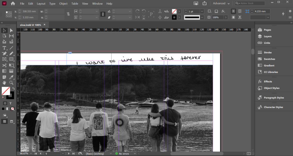
I also added this to the centre image, because I thought it was a little odd that all the other pages had handwritten elements except this one. It’s a quote from on of my friend’s favourite books that she wrote down, and it works very well with my narrative and corresponds perfectly to this particular image, I feel. I was debating whether to put it over the actual image itself or not, but in the end I decided that it looked more natural to have it on the border, as though she had written it it the margins of an actual book.
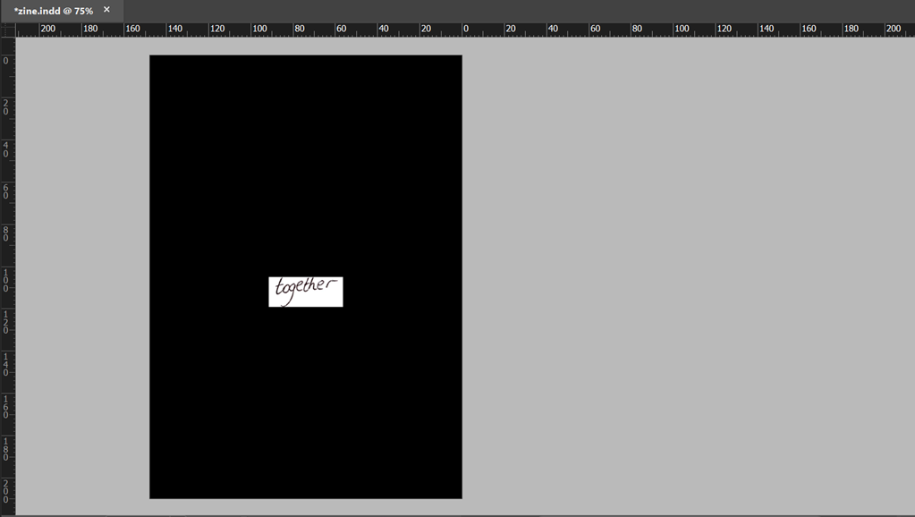
Finally, I went back to the front cover and used a spare image from my first shoot that I liked but couldn’t fit into the actual zine, edited it in the same way as the others so that they all worked together visually, and chose a title that I felt represented my narrative well and conveyed the sort of tone I was going for. It’s the French word for “together”, which was one of the things my friends wrote down on the sheet of paper form before, and so I repeated the process as I did for the signatures and added the actual English handwritten word onto the back cover, as shown below. I kept the font the same as the title in the first page with all the signatures, and kept it relatively small and simple so as not to make it too overbearing or distracting, and try and keep the same minimalistic classic vibe throughout the whole zine.
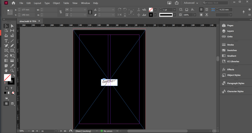
I went for a plain black background to stick to the black and white theme, but I was conflicted on where to place the word for a while. I tried a couple of different sizes and positions on the [age before just settling on the simplest : small enough to be legible but not too big and in the centre of the page.
I then went through all of my pages, made any final adjustments to placing or size, double-checked that I was still happy with the sequence and my narrative, and then I was finished.
COMPLETED ZINE-