Now that I have my selection of images that I’ve gone through to double check and am happy with, I can move on to developing them in the same style as the others. They don’t require much work at this stage, only switching them to black and white and slightly adjusting them so that they are the most visually pleasing that they can be.
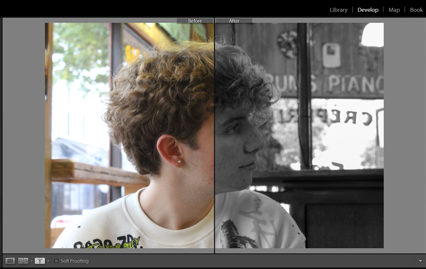
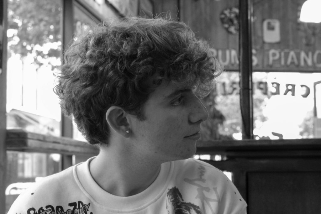
I chose this image because it was a nice portrait and I knew I didn’t already have any portraits of this person in the zine, I like the fact that it’s his profile instead of face on; I think that makes it more interesting. I think the lighting makes his earring stand out and the light coming in from the windows makes for a nice backdrop. It’s also quite clear that it’s a coffee shop, because of the writing in the windows, which adds to the narrative.
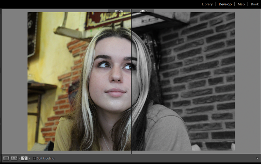
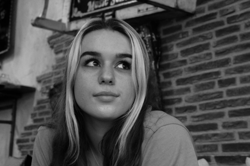
This is a posed portrait instead of a candid like most of the rest of my images, and I especially like how the brickwork comes through quite strongly in the background because it adds some character. I think the way that her eyes are very clear draws the onlooker’s eyes into the centre of the image, and I also think her facial expression is fairly enigmatic/neutral.
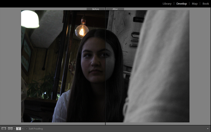
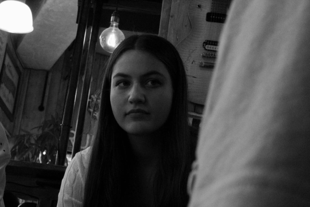
I quite like the framing of this image and how the main subject isn’t entirely centre-frame and that it’s at a slight angle ; it’s clear she’s looking at someone else which makes this photo feel slightly intrusive and as though we’re disturbing a private conversation. This image turned out darker than the rest of them, but I think that works because it shows a different viewpoint of the shop and adds some differentiation between the images.
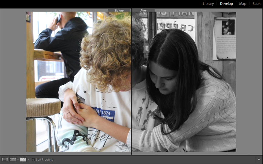
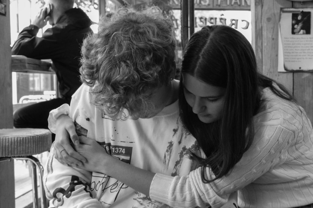
I especially like this image because, unlike the others, it isn’t an individual portrait and shows a more candid and natural interaction between friends. The body language shows intimacy and how they’re comfortable around each other, and I believe it worked particularly well in black and white as well.
Overall, I think the final selection of images are going to work quite well with the others, and with the narrative as a whole that I’m planning. If I had to change anything, I would maybe try for some more images from different angles, like form behind or from above/below, but I also think that the images I actually have are a success. Below are all of the images in their finished state :

