How Do I Want It To Look/Feel?
I want my zine to look dark and almost have a depressive feel to it so that the audience can potentially relate to my work. Dark colours such as purples, blacks, grey’s etc would be best to create that dark tone. I may even turn my images black and white to enhance that depressive tone that I’m going for, however I will look at this when it comes to my experimentation.
Format Size and Orientation
I would like my images to bleed out to the edges of the book so that there is no white margin around the edges. I’d like to do this because I feel like it is more appealing to the eye and I also feel as though it makes the image a lot bolder and more appealing to look at. My images will be portrait on the pages so that the audience doesn’t need to turn the book around in order to look at the images and so that everything is the exact same.
Narrative and Visual Concept
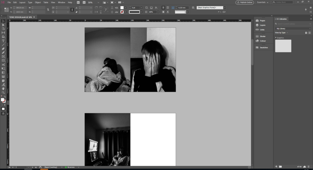
So, my narrative is; revealing my true emotions within my relationship. emotions such as, insecurity, low self esteem, paranoia etc. However, I am going to be comparing these images that symbolize my emotions to the good times that happen within my relationships. I have taken two photo shoots, one symbolizes the happy times and the other symbolizes the sad times. The way I’m going to show this is; on the double page spreads, I will put one image of our happy side and next to it, to add juxtaposition, the sad times that we have. The photographs I have decided, will be in black and white, just to add the tone of sadness a bit more.

This is what I mean by juxtaposing the images. So, as you can see, there is a happy, sentimental moment on the right, and on the left there is a not so happy, depressing image on the right to show the struggles that come with relationships.
Title and Captions
The title for my love story is DISQUIETUDE – this means a state of uneasiness or anxiety, which essentially is the narrative to my story. I THINK, somewhere I will put a piece of text explaining my emotions if i have room – I will have to look into this a bit more. Although the text will be quite ambiguous so that it’ll leave the audience open for interpretation.
Front and Back Cover
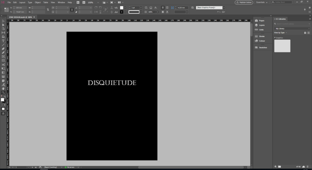
I want my front and back covers to be quite plain, I don’t want anything overshadowing the story that’s inside. Maybe a plain black or grey to compliment the images inside and to add the somber tone, I feel as though a plain and simple front cover sometimes can also intrigue the audience a bit more. My title ‘DISQUIETUDE’ will most probably be in white writing to stand out from the dark tones behind, the font is to be decided.

This is what I’ve finally decided for my front cover. It is all black to set the tone and to make the title stand out. I chose a font that I liked and one that is easily read, with a touch of edge to make it aesthetically pleasing.
