Daily Archives: 05/10/2020
Filters
Light room, and editing
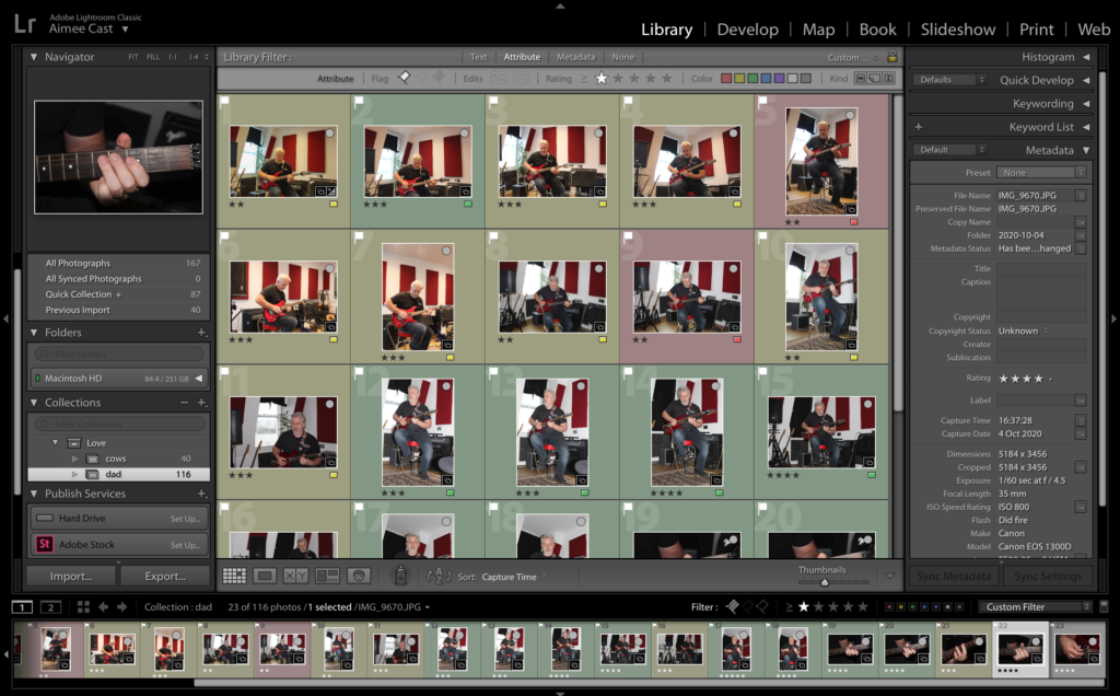
Whilst editing my images for my zine I tried to consider my previous artists references to make the photos look as high quality as possible.
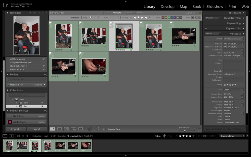
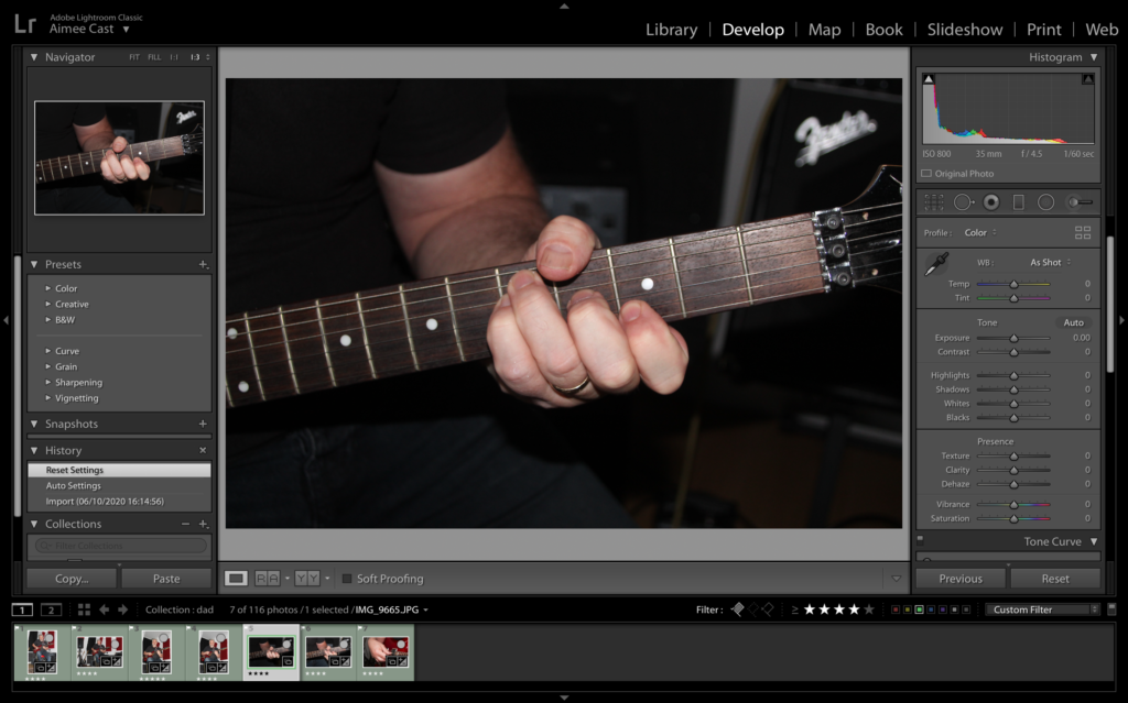
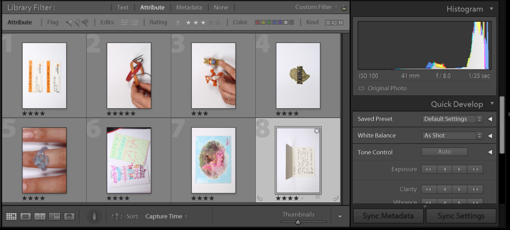
In Light Room I selected several images using the rating tool and colouring different images to show which ones I liked the most and which ones I thought were the best quality e.g. green being the best quality and red being the worst, 5/4 stars are photos i like the look of due to their composition or the vibrancy etc and less than 5/4 stars are photos i don’t like the composition of.
Whilst editing this image I thought that the photo was slightly too dark, so I decided to lighten the exposure, as well as lightening the shadows a lot and darkening the highlights so it wasn’t too bright. I also lowered the contrast so there wasn’t such a drastic difference between the light and dark tones.
InDesign
InDesign is a program to organize and compile your work into a single document to be printed in your chosen format. In this case the aim is to make a 16 page zine which contains a clear narrative.
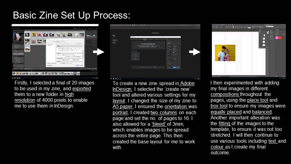
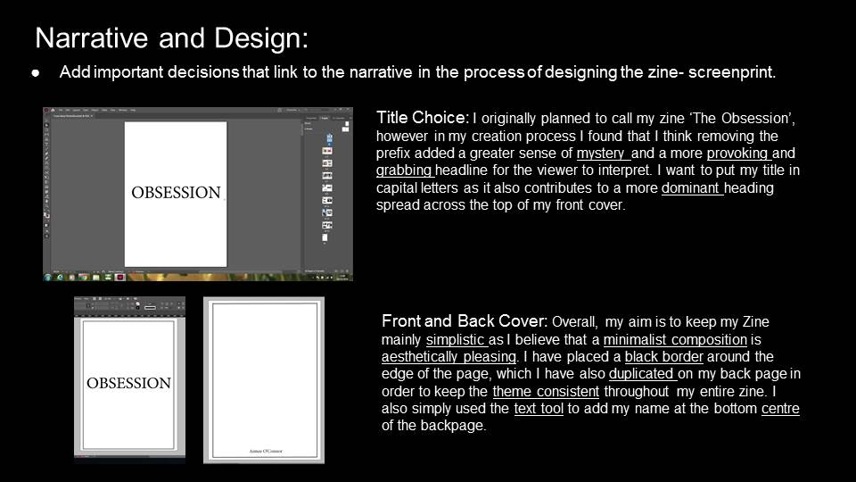
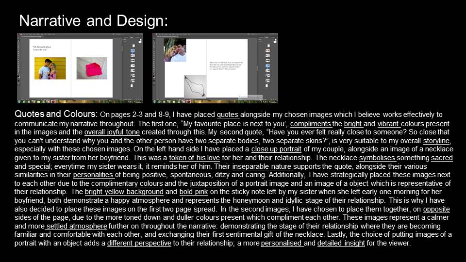
The first step of the process is to create the document to your tailored liking. This includes formatting such as size of page, how many pages, margins, the bleed and the gutter.
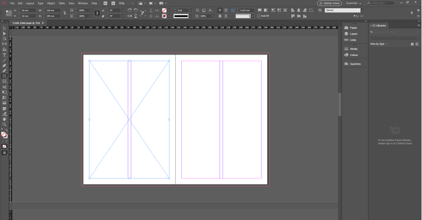
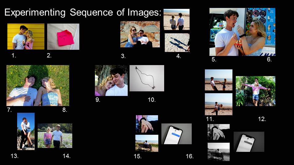
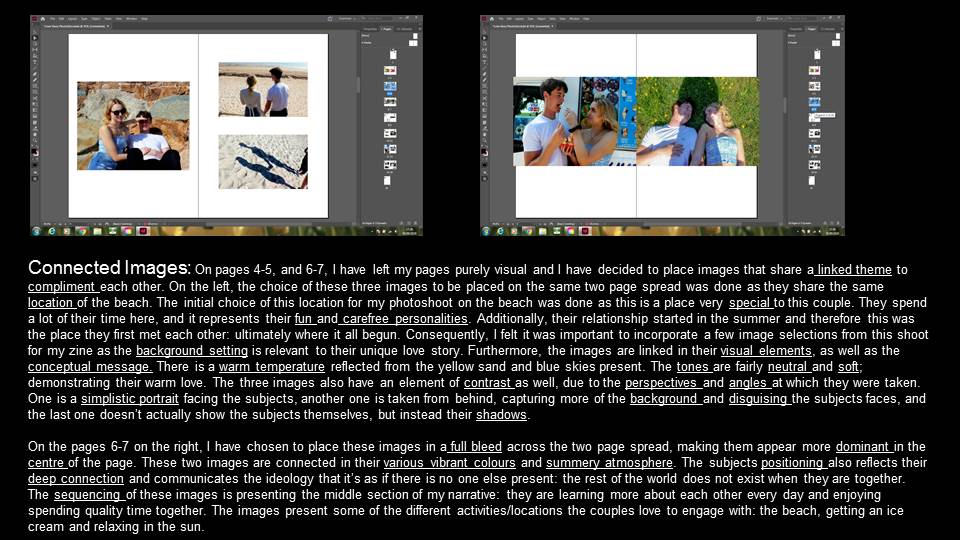
The bleed can be seen on the outer edge of the two pages. The purpose of this is to ensure that if an image is placed full size on the page(s) it won’t leave a thin white gap in between the edge of the page and image. There are evenly spaced margins on each page, in the purple lines, to maintain a structure throughout the zine and to vary from placing full bleed images. The line in the middle represents where the pages meet and create a slight distortion to an image if it is spread over both of the pages. This has to be taken into consideration when arranging the images. For example if the line cuts across an important section of a portrait such as the eye, it would be better placed somewhere else. The blue lines on the page is the frame tool selection(F). Similar to a text box in Word, this tool is used to create your desired frame for an image to be placed in. You can chose to place it in various way; either full bleed, to the margins or any other custom placement. Using Ctrl+D, brings up the files to select your desired image. Once the photo has been chosen, the next step is to fit the image. There are two main types of fitting. The first is to fit the frame proportionately to the content which may cut a bit off the image but still keeps the exact dimensions of the original frame. The other is to fit the content proportionately to the frame. This option ensures that all the content is visible but does not ensure that the frame will remain the same size.
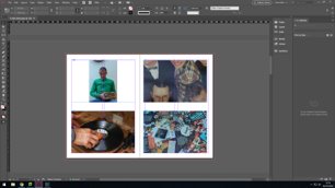
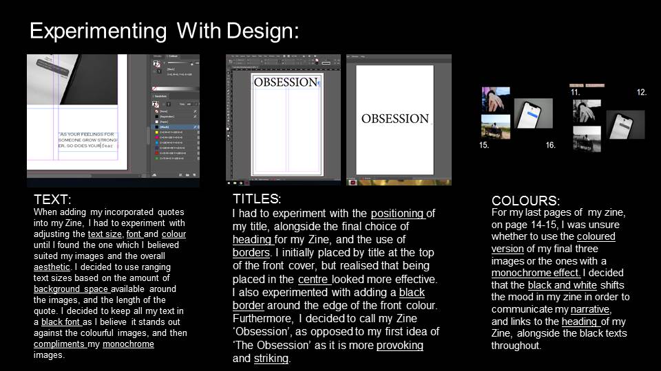
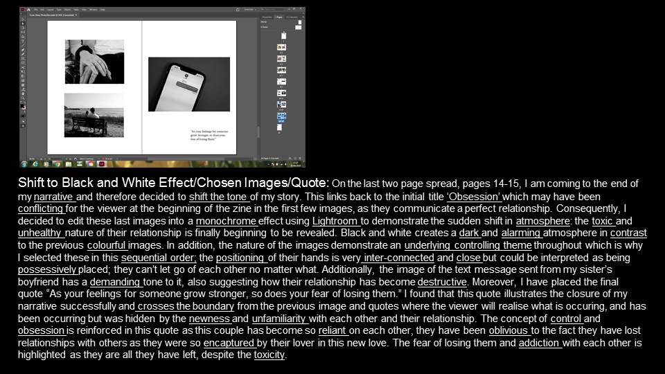
As well as adding images to the zine, text is another element of the sequence. It is useful to insert context to images and quotes or thought to go alongside images to give them a new dynamic. The title is also an important feature that requires text.
shoot 3: school
In this shoot I tried to capture photos throughout our school day, as we go to the same school and it is there that we spend most of our time together; walking to and from school and during our frees
Edited Outcomes:
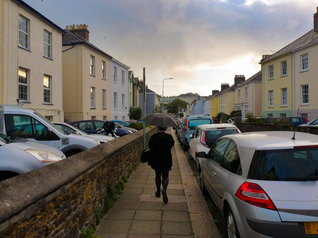
I love the colour in this image that I helped bring out through editing. I think this works well with zita as she is wearing predominantly dark clothes which contrasts with the colourful background.
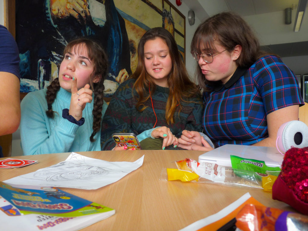
Here I took this picture again using self timer, to show our day to day during breaktime, I tried not to interfere with the foreground as I wanted it to be as realistic as possible. In this image zita and I’s pinkys are link to synmbolise our bond that is still present even when spending time with others or as a group
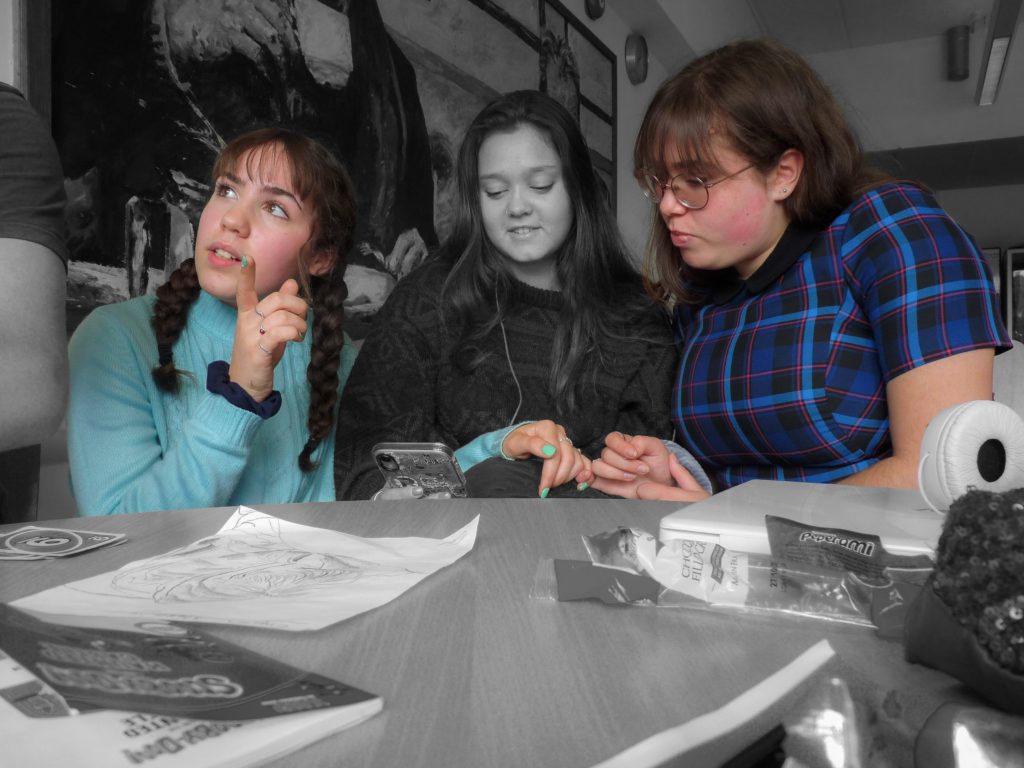
I then futher edited this image to focus on us linking pinkys by setting the background to black and white but keeping us in colour.
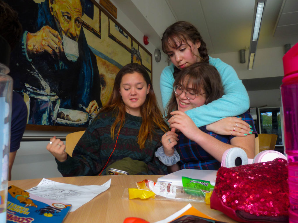
Here our bond is more present and direct in this image which I also like as it still holds the candid aspect to the photo.
Shoot 4 – Portrait of a couple
For this shoot I went to a place zita and I sometimes go to to hang out, near the harbour, a place that we value spending time together at.
Edited Outcomes:
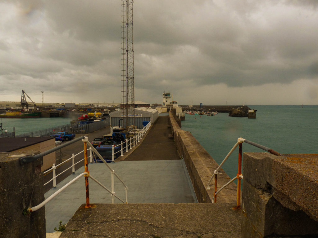
I wanted an image of the location as I thought it work well in the zine side by side to the close up images of zita and I. I quite like this image and the texture shown as it brings warmth to the image and I think that the weather helped symbolise the reality of friendship as it isn’t always full of happiness; but sometimes there needs to be a “little thunder before the rainbow and sunshine comes” and times turn good again.
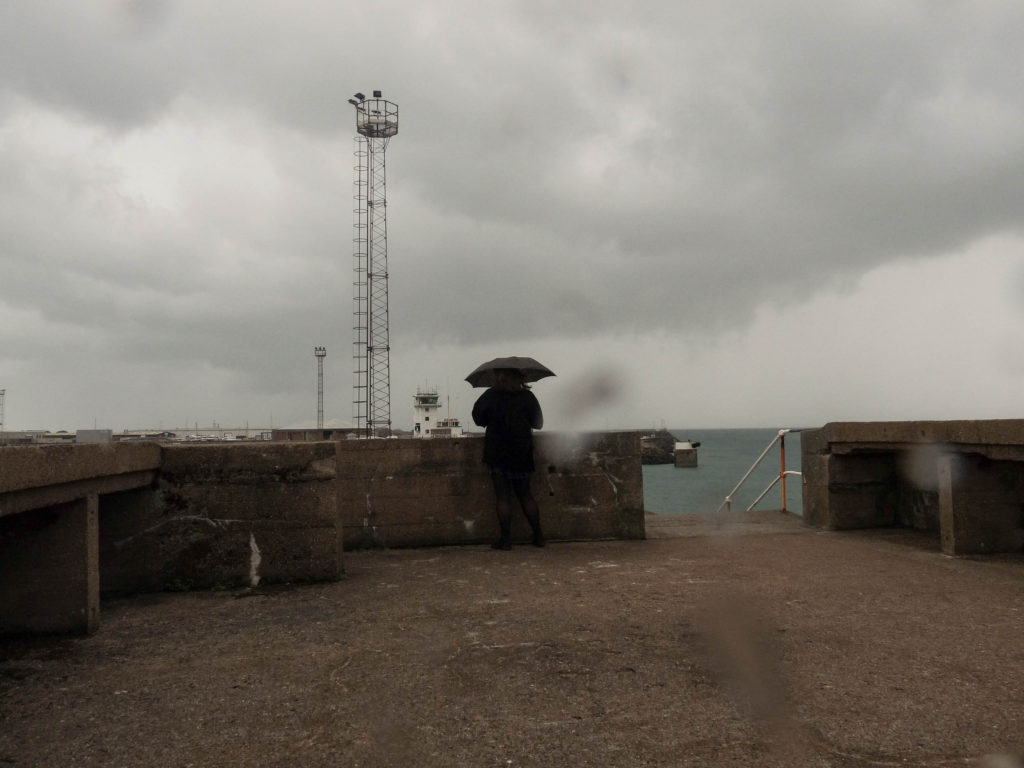
This image also links to the ups and downs to the friendship idea I spoke about above^
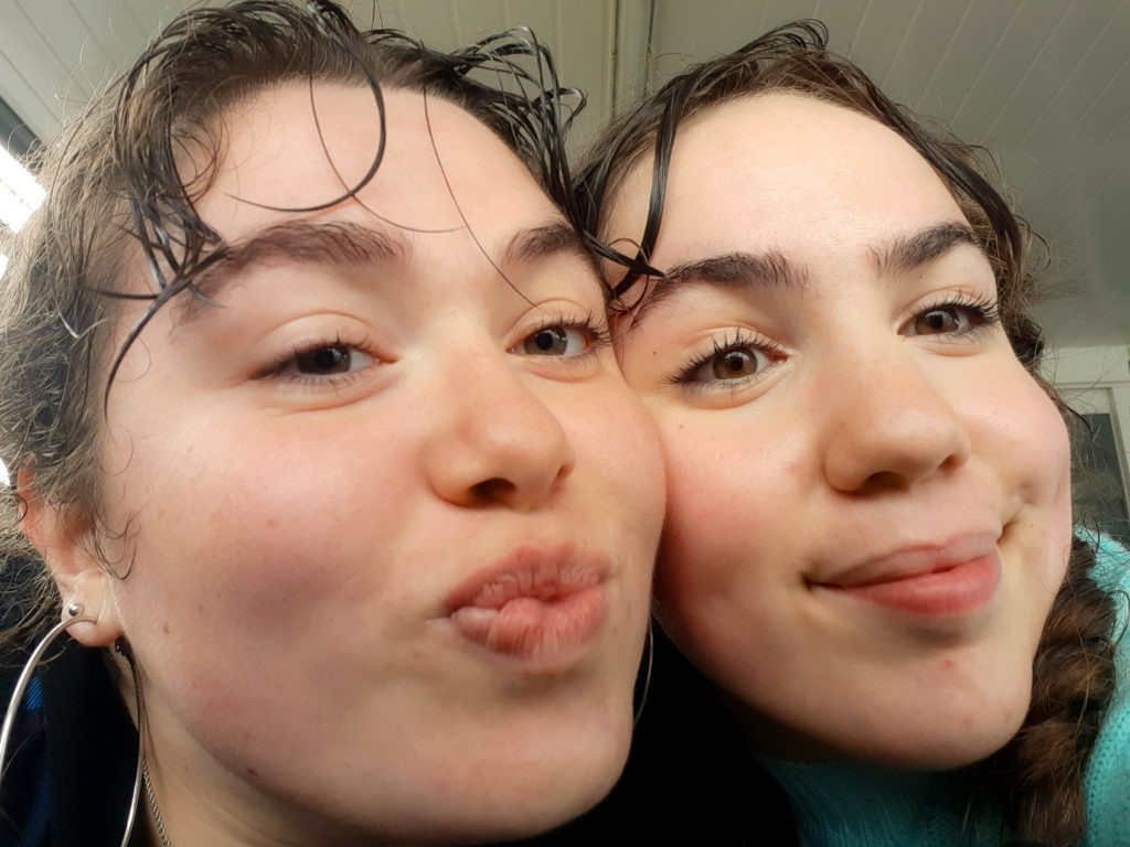
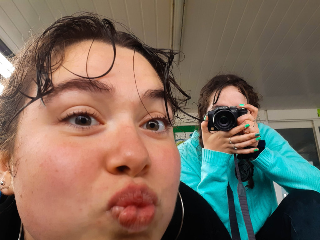
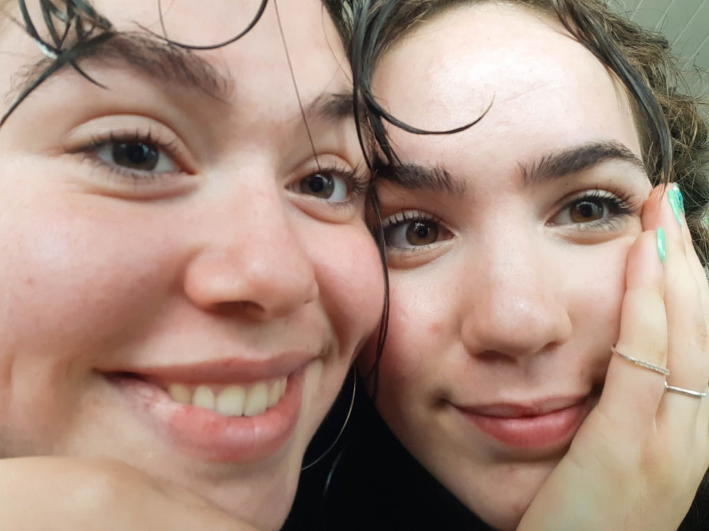
These photos were inspired by a photobook I saw by ___, I loved the up close and personal theme to the images showing the beauty within the imperfections and perfections and Ithink these images fit this idea.
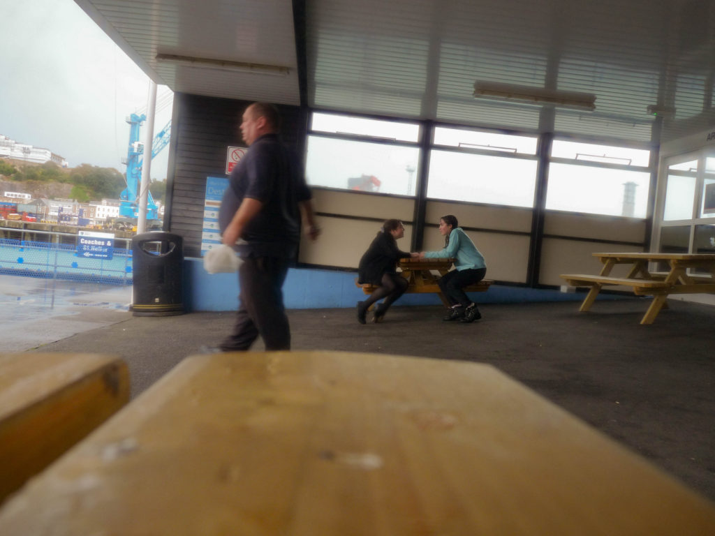
i chose this last image not for it technical skill and quality but for the conceptual idea of capturing reality and the rawness I think this image can hold. This image shows us two having fun speaking to each other from a bystander’s perspective (photo taken using self timer) I think that the fact that it isn’t completely in focus or the right angle helps this as it captures a moment in our life and we still stand as the focus of the image
PHOTO-ZINE INSPIRATION
Concrete Jungle by Dale Konstanz
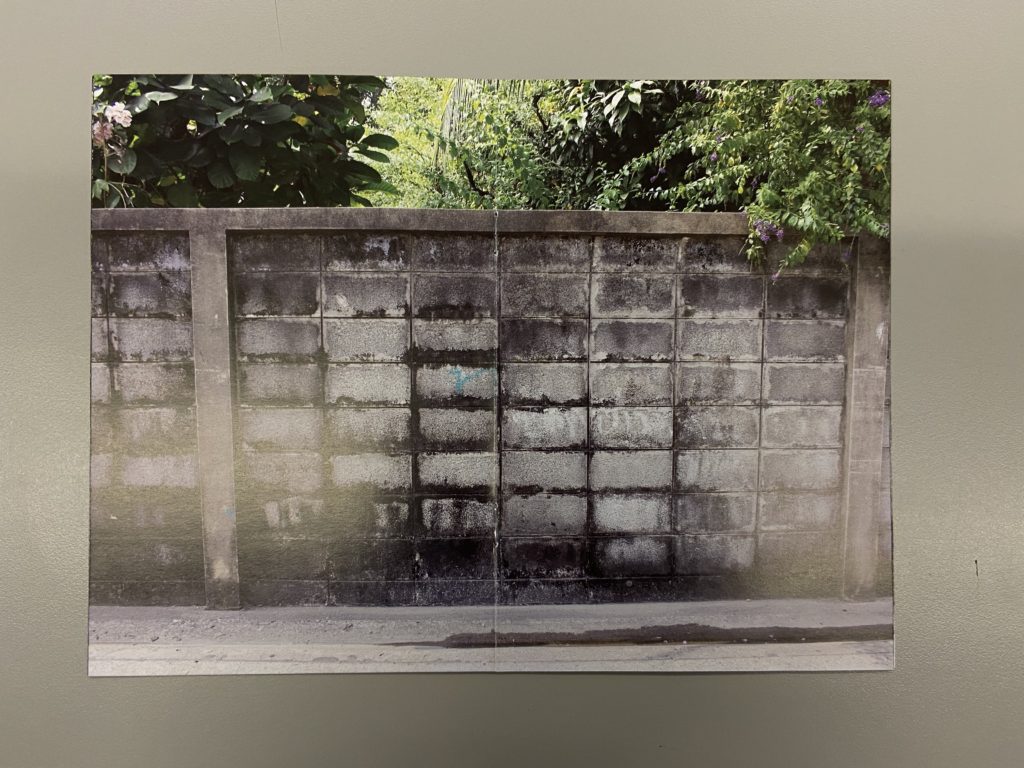
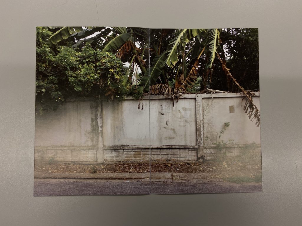
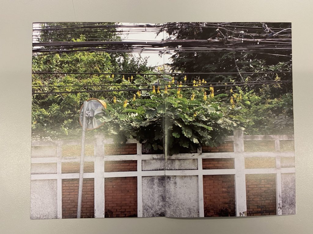
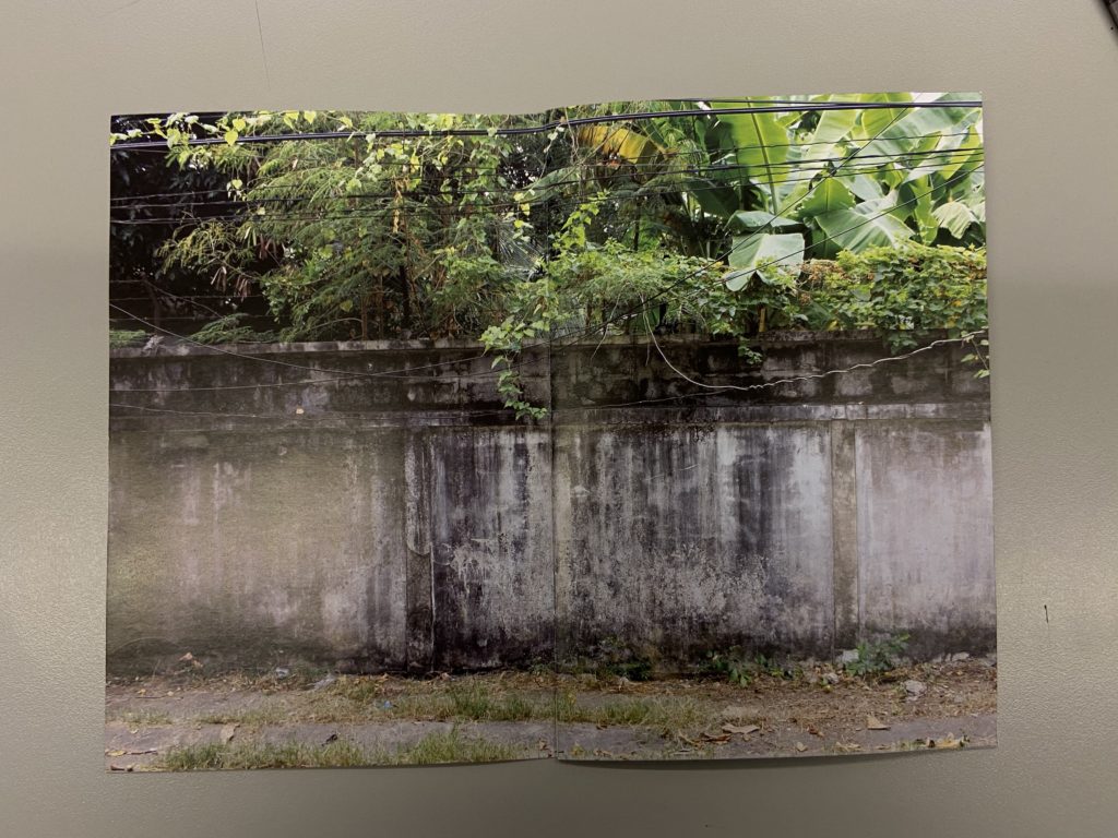
In the zine ‘Concrete Jungle’ by Dale Konstanz, the images on each page show a clear link to one another. The photographer has made such a strong connection by following the same basic principle in each image, this being that there is a wall on the bottom half, with greenery flowing over the top. there is an interesting colour scene to the images, with cool grey colours coming from the wall and luscious greens and yellows common g from the jungle aspect of the photos . This clever layout has a direct bond to the title of the Photo-zine, ‘concrete jungle’, (concrete linking to the wall, and jungle linking to the foliage over the top of the wall).
This intelligent thought process has inspired me to ensure that I make clear and well though links with each image through the zine, most importantly to the title. I also enjoy the way the images are displayed on the page. They seem to fill the whole entire page with no white boarders, drawing more attention to the image itself
This equals That by Jason Fulford and Tamara Shopsin
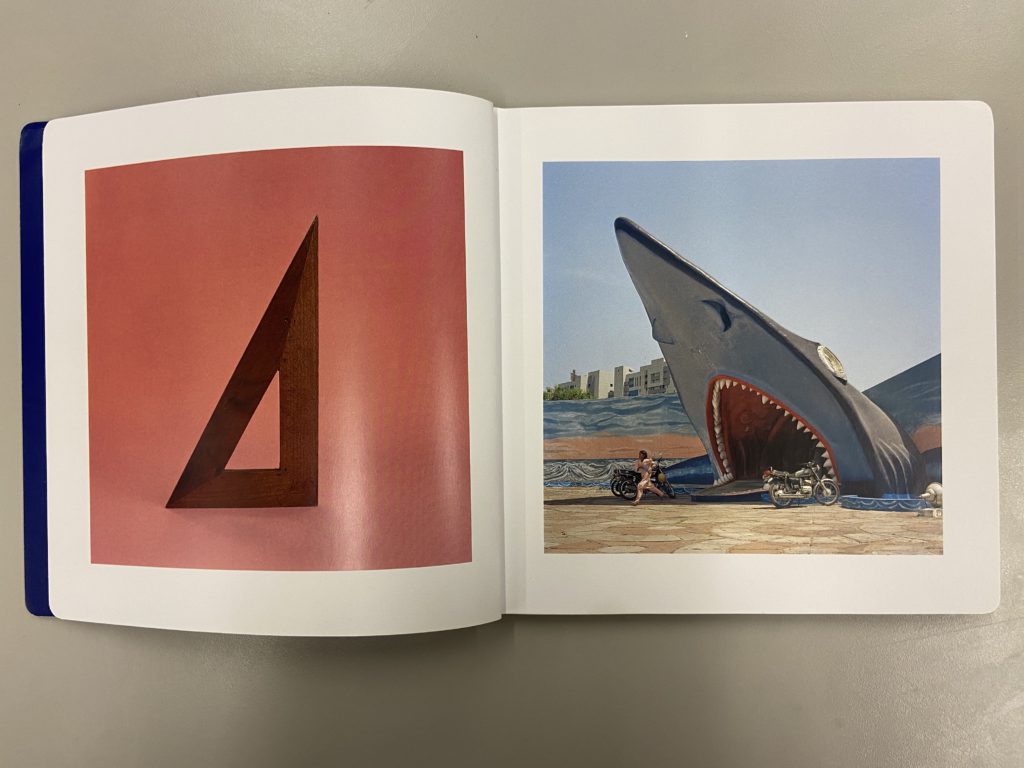
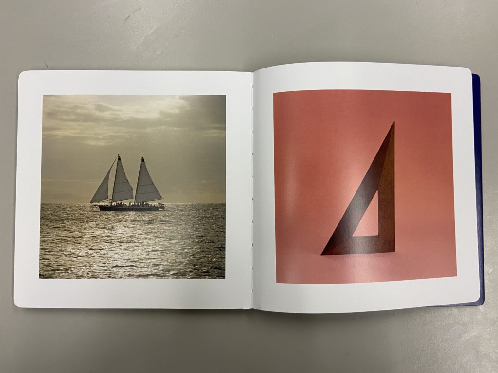
In the book ‘This equals That’ by Jason Fulford and Tamara Shopsin, there is a very clever layout of the photographs, and a clear and thoughtful story. Each image has a certain pattern, shape, colour that is reflected in the next image, each time you turn a page it starts with the image from the last. This reinforces the storyline, linking one image to another. The bond between the photos in shown in the image above (the first image image in the book), where the triangle of the wooden structure is complemented with the triangular shape of the sharks mouth.
The two images also contrast each other in colour, blue and red. I am particularly interested in the formal boarders around each image, which makes a brilliant systematic lay out. The book then finishes the the staring photograph liking back to the start of the book, but also giving a well rounded end photograph, showing the book has a clear and structured end and beginning. I would like to ensure that in my own photo-zine, there is a clear end and beginning. I would also like there to be contrast and links between photographs like in ‘This equals That’.
Looking For Alice by Sian Davey
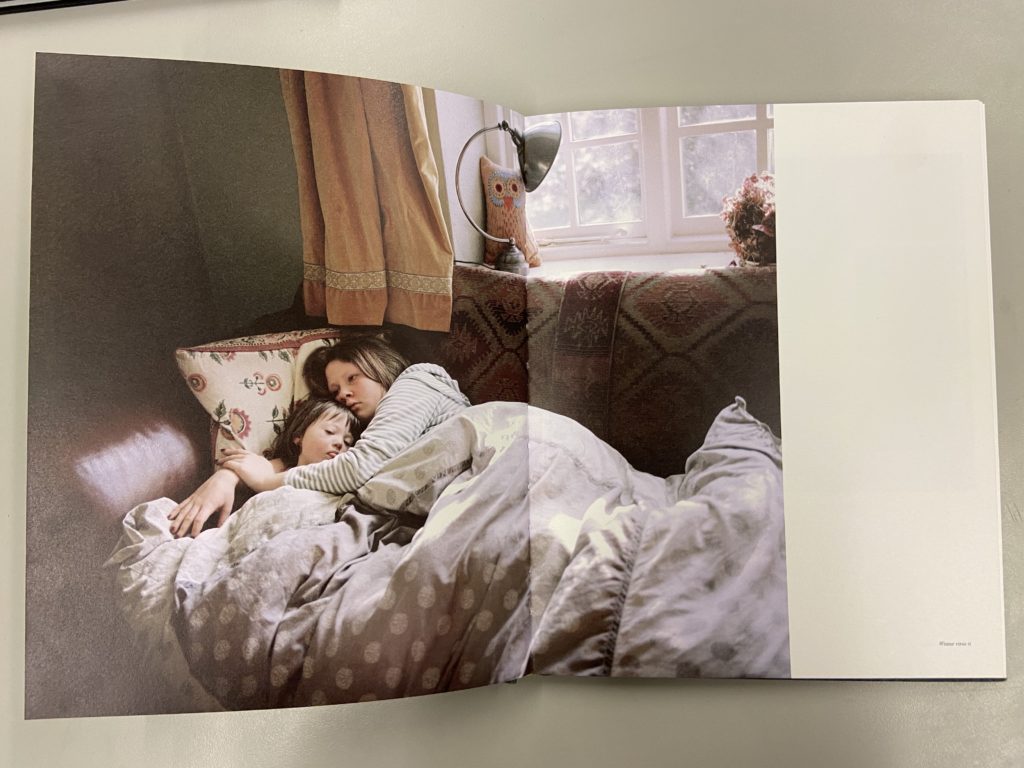
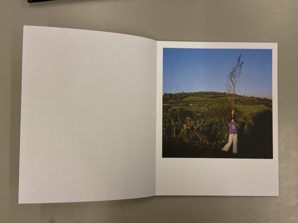
In the book ‘Looking For Alice’ by Sian Davey. The images are interestingly layed out in the book, for example in the image above, the photo fills one side of the page, however it only fills one half on the next. This leaves an intriguing black space on the right hand side of the pages. This is a clever concept and I may use this idea in my own photo-zine.
All Quiet on the Home Front by Colin Pantall
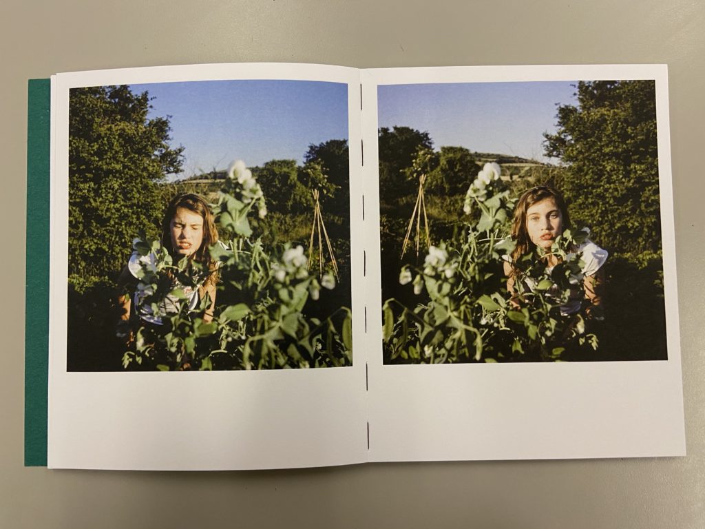
These three images are from the book ‘All Quiet on the Home Front’ by Colin Pantall. The two images on the top are of his daughter (which the book is about). I really enjoy the layout of the two images on the left page, they seems to mirror each other even though they are different images. in all three photographs they seem to be positioned on the page to make them look like Polaroid pictures. I may use this interesting layout in my photo-zine.
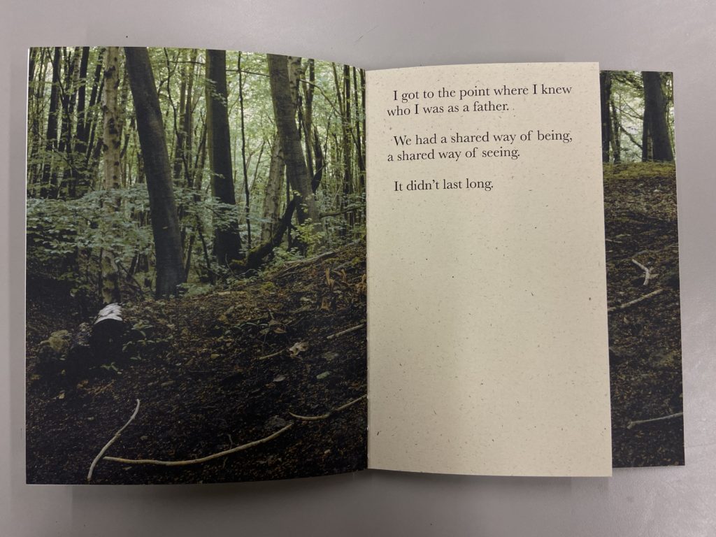
In the book he explains, using text on some pages, that he didn’t know who he was until his daughter was born, and after tat moment he became a father. I like the way Pantall uses smaller pages to narrate the book using small sentences. It makes sure the viewer understands what the story is about, and breaks up the photos in the book slightly.
SHoot 5: Objects
For the last shoot I wanted to focus on the items we value hand have collected from each other throughout the years of our friendship. Here I wanted to show our friendship through objects and memories that symbolise us and our friendship rather than our physical selves.
For this shoot I kept the editing style simple as I just focused on enhancing the colours and quality of the pictures

