
This is the first sequence I created for my zine
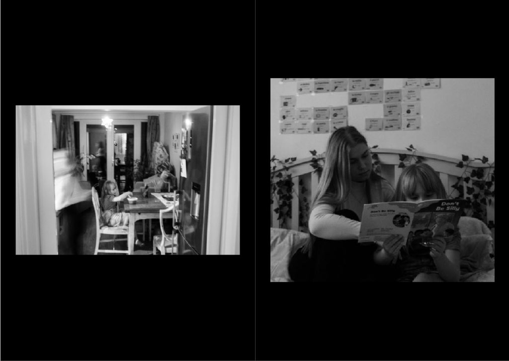
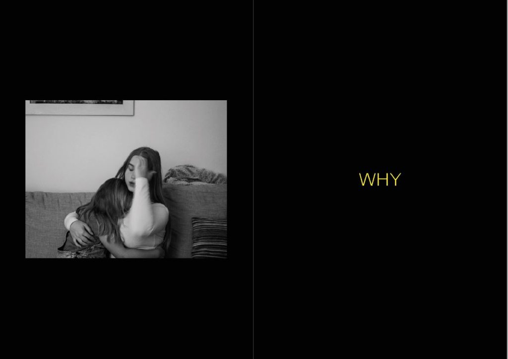
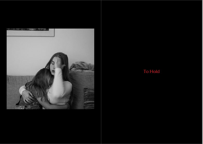
The first half of the zine consists of high key images of Paulina and her sister where as the second half of the zine progresses in a darker lower key set of images. I am trying to tell the story of someone who has an almost split personality ( a caring and loving side against a darker more emotional side) The text on page 2 and 6 is going to change as it is only there as an example for now and I am likely to replace the image on page 5 as I feel it does not posses enough meaning or represent my narrative well.
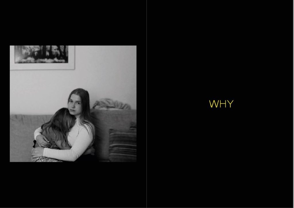
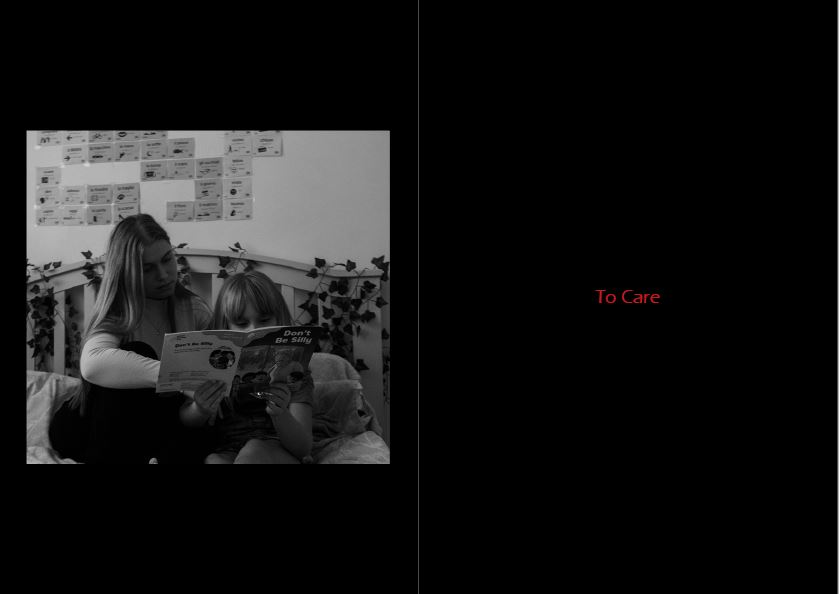
My opening image is a strong portrait of the sisters to show the connection between them and develop a first idea of Paulina as an individual.
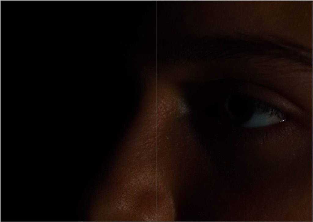
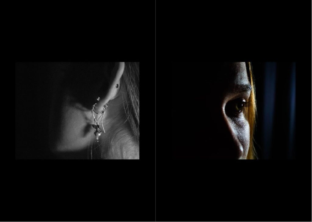
My middle image is an extreme close up of Paulina and also the first and colour image. I chose this image to separate the halves of this zine as it best represents the sense isolation and separation from love she feels.
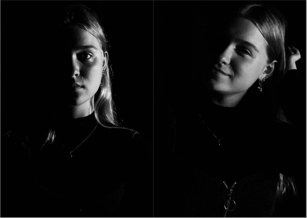
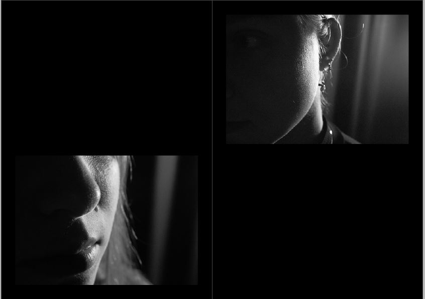
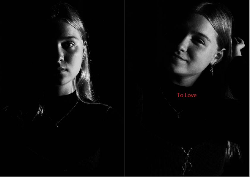
My last page consists of two similar portraits of Paulina that both convey different emotion. I am using these images to emphasise the split between her feelings.
Final sequence
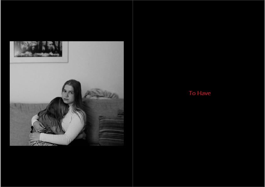
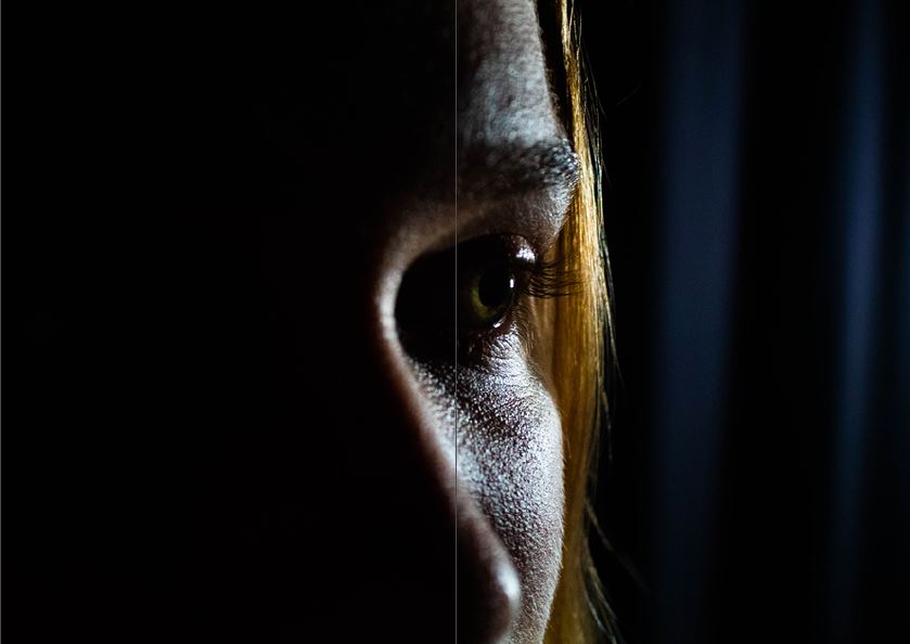
My first and final image have remained the same as my first sequence however I have selected a more powerful image for the middle of the zine. This image is still the first colour image but is also now the only photo in colour. This further emphasises the importance of this image and it’s meaning.
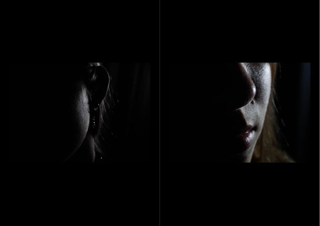
Although the order of my images are not in separate halves any more the high key vs low key theme is still relevant and shows the split in her personality.
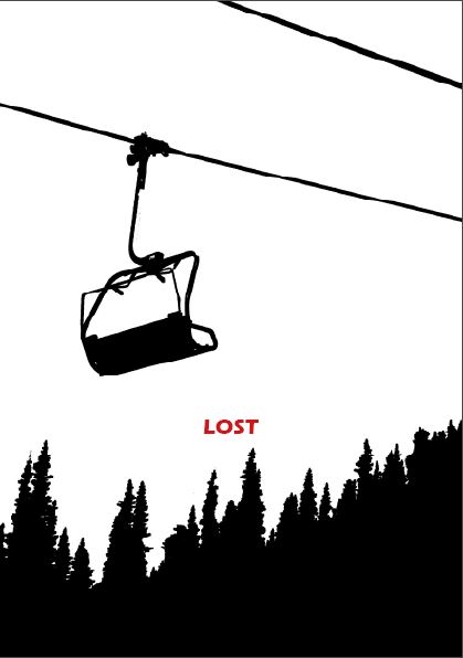
My new front / back cover shows two things that are meant to be together, however they are separated by the book. I liked this for my cover as it is an appropriate metaphor for the themes of this Zine and it is different from the rest of the photos showcased, this difference amplifies the meaning of the image.
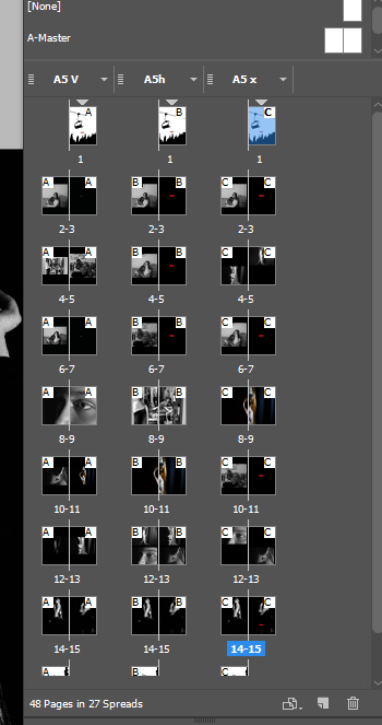
I ended up with three alternate layouts. After some feedback I went with the 3rd layout shown below. This was the best layout as there was a constant and clear narrative throughout the sequence and it used my best images.
Overall I am pleased with my zine and I think it represents a good narrative with high quality images and an interesting sequence. I believe I could have completed an extra photo shoot to further develop the quality of my zine and therefore would have been able to follow my original specification more closely. I am happy with the final print of my zine as the dark images appear to merge with the black background of the pages. This brings the book together and incorporates it within the narrative demonstrating confinement and isolation. The images from different photo shoots are never shown on the same page as I wanted to truly enforce the idea of the split between her personality and the difference in the way she acts around loved ones and by her self. The final spread is the only bridge between these two feelings. I used this to finally compare the two sides to this story side by side so it was clear to the viewer.