
Creating an edit.
When creating an edit of images, Lightroom provides a quick and efficient system to pick your best images.
1.
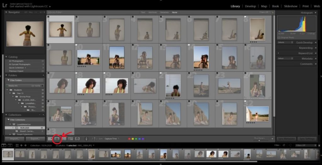
I began with a small photoshoot of 33 images. To filter through these images I clicked the single view button starting at the first photo. I held down the shift key and pressed P (for images I wanted to flag) or X (for photos I wanted to reject).
2.
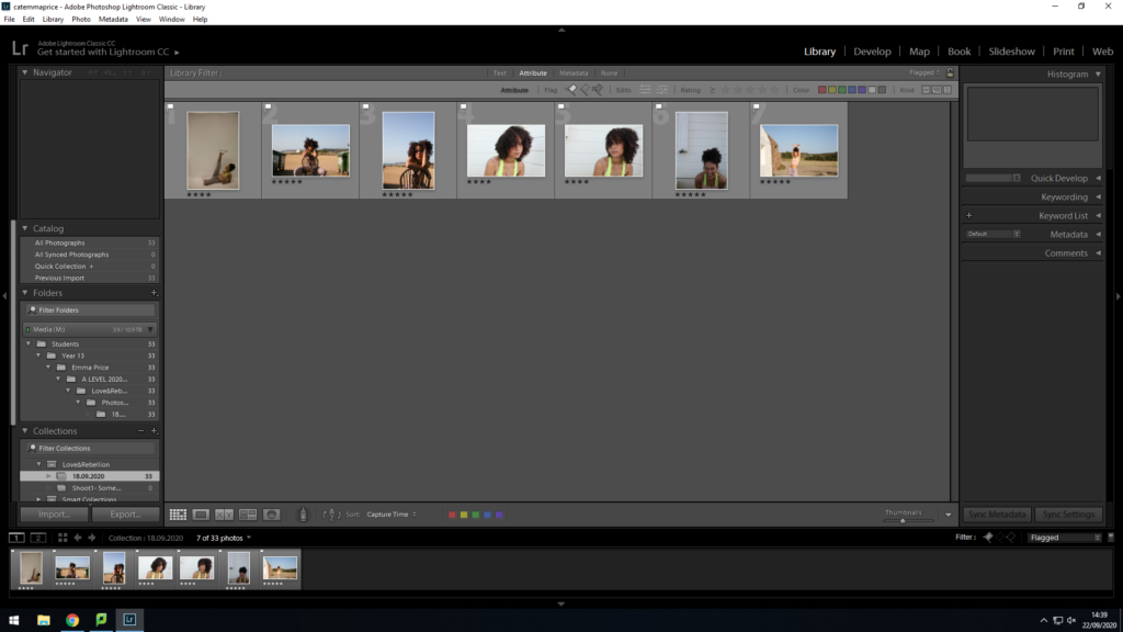
Once I flagged my top images, I viewed them by clicking the ‘flagged’ option in filters. With only these photos in view, I was able to start ranking them. I decided that if I rated my photo 4 stars, then it’s an image I’m unsure about. If I rated it 5 stars, then it’s a photo I’m fully confident with and will definitely use.
3.
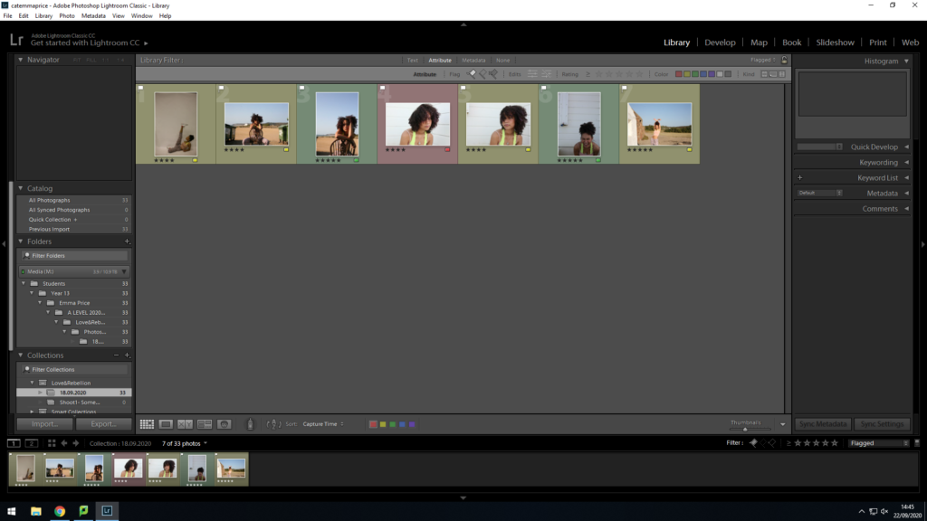
After rating the images, I colour-coordinated my choices. Green= Definitely using. Yellow= Unsure. Red= Rejected.
4.
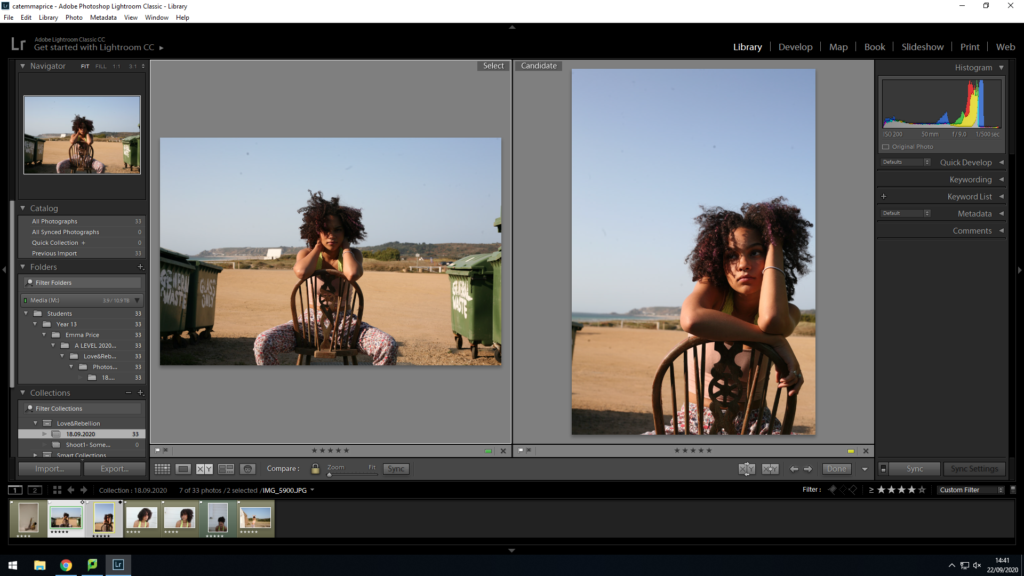
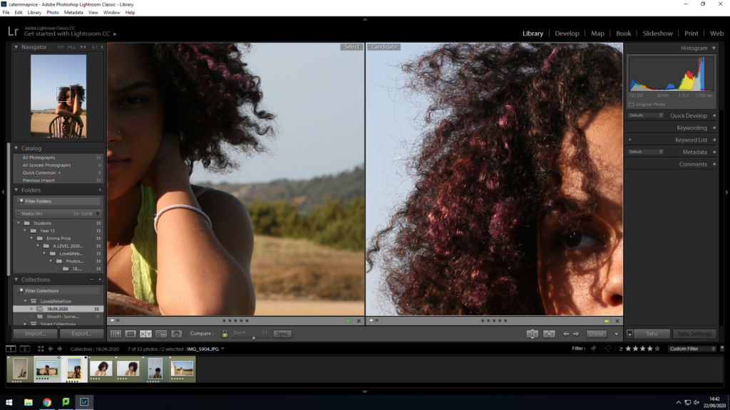
To decide between images that are similar, I used the ‘X|Y’ tool with the magnifying glass. For these two images I wanted to compare the exposure and the visibility of my subject’s eyes. I selected the image on the right for a final selection as the colour within her hair is more vibrant and the eyes are far more visible.
5.
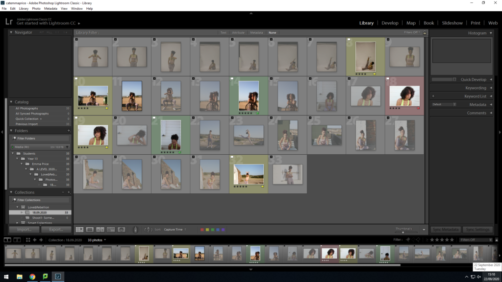
Finally, once all the images for the set have been selected, I am able to easily pick them out from the whole shoot.
Developing images.
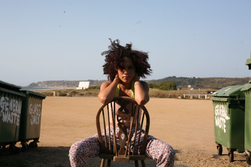
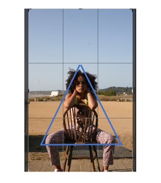
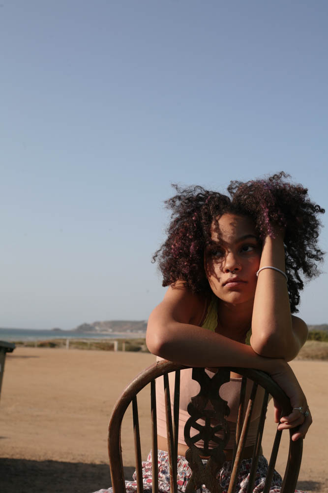
Firstly, my choice for this pose was to create a triangular focus, to lead the eye around the image, rather than the focus being in just one area.
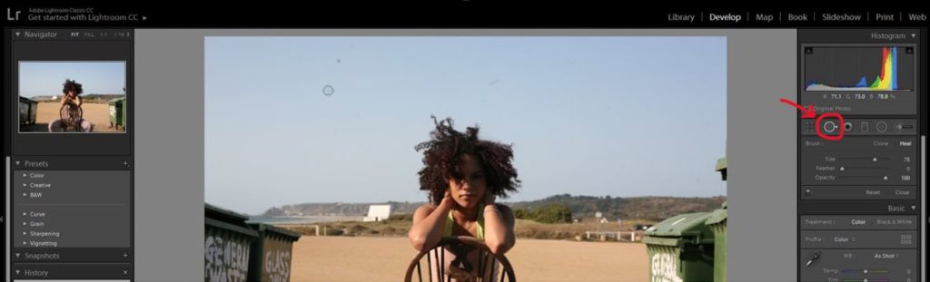
I started by using the spot removal tool to remove marks present on my camera lens. The tool colour matches the area you want to cover with the surrounding part of the image, meaning the spot can be covered effectively
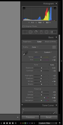
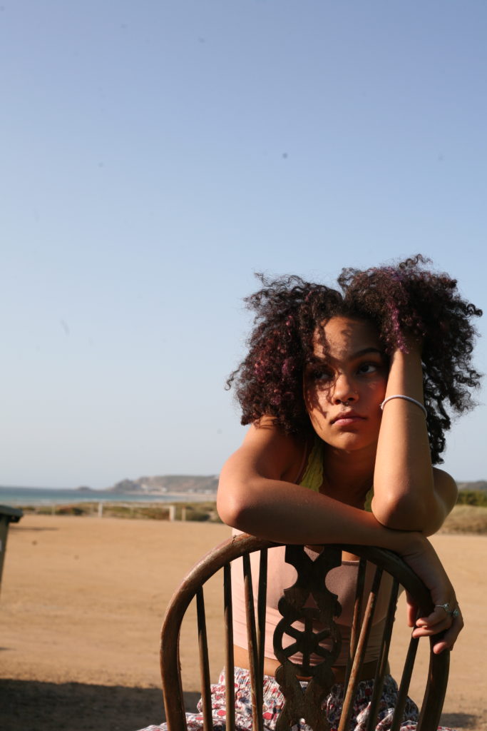
For this particular image, I wanted to reduce the orange tones of the image and increase the vibrance of the blue background. I made small adjustments to the exposure and highlights within the image, then made more drastic changes tot he vibrance of them image, resulting in a photo with a larger range of colours.
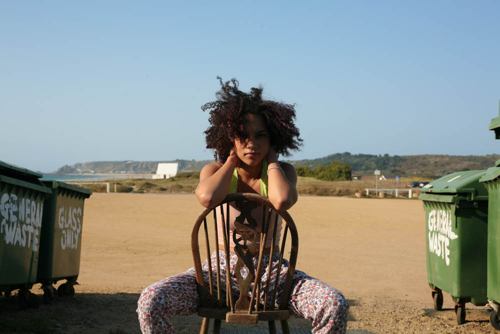
To reduce the amount of time editing images, I imported the edits I made on my first photo and applied it to the image I wanted the same effect for. This is both efficient and effective as the images are very similar in terms of setting (beach) and colour-wise.
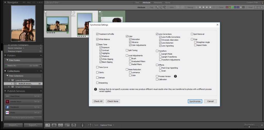
I selected the colour effects (increase in vibrance) that I wanted to apply and unselected the basic tonal changes, as I planned to adjust this seperately. I didn’t select the spot correction, as the positioning of each spot had changes due to the orientation of my two images.
To finish the image, I reduced the contrast by -36 and reduced the exposure slightly by -48 to ensure that my subject’s face was enitrely in focus. I selected the spot removal tool and manually picked out the parts of the image that were affected by the lens. The darker effect of the sky in the final image intensifies the mood of the image. The subject has a somber face and is not masking direct eye contact with the camera and so I felt the darker sky would amplify this.
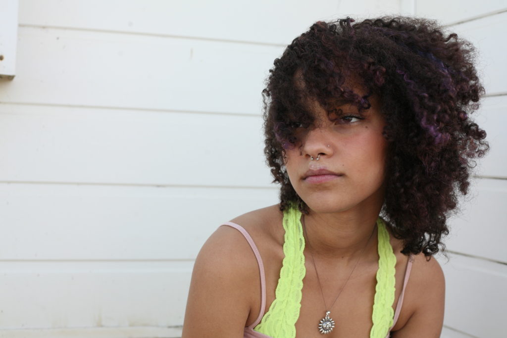
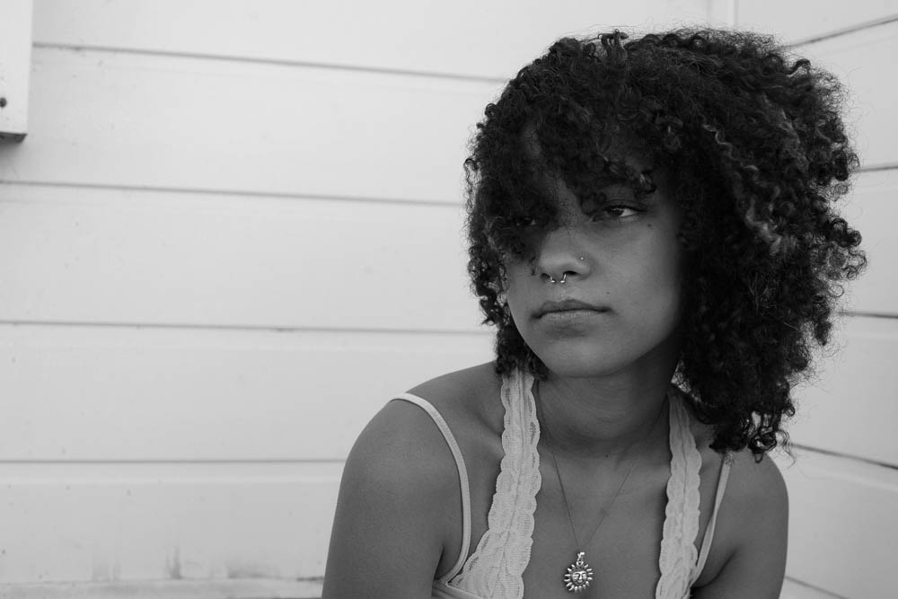
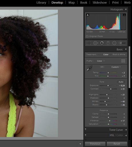
For this image I began by editing the basic tone and presence of the photo. I initially decreased the exposure by -0.24 and majorly decreased the ‘whites’ of the image by -45 to decrease the glare from the background. Increasing the contrast and vibrancy, alongside the shadows, allowed me to create a more vibrant and striking image, where all the graphic details of my subject can be seen.
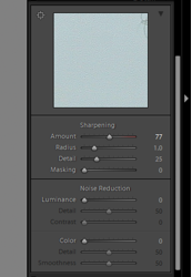
I then used the sharpening tool under ‘Detail’ to enhance the clarity of the image. I increased the amount of sharpening by 77 and the detail by 25 to achieve this.
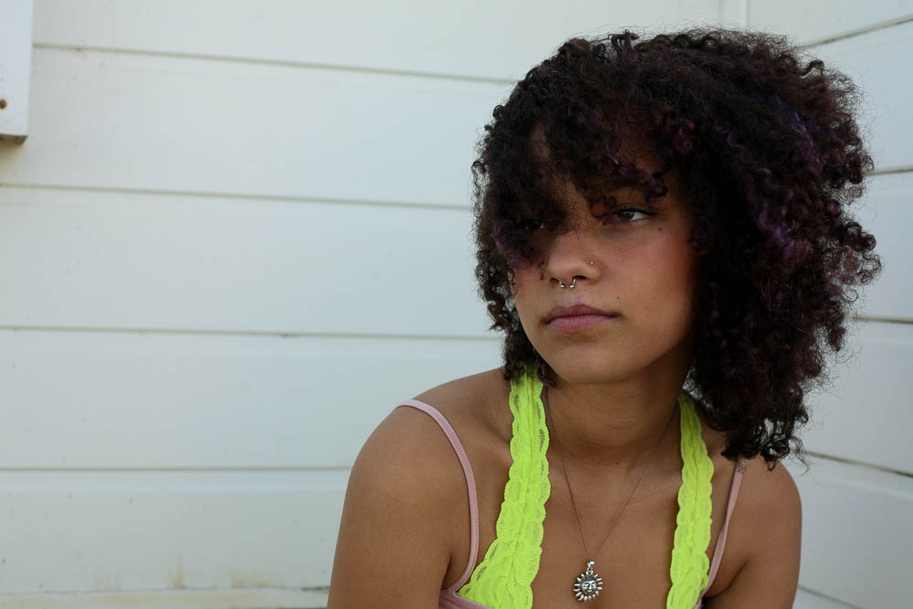
I experimented with the transform tool to adjust the lines in the background (make them parallel to the frame of the photo) but it took the focus off of my subject and resulted in her being too close to the right side of the composition.
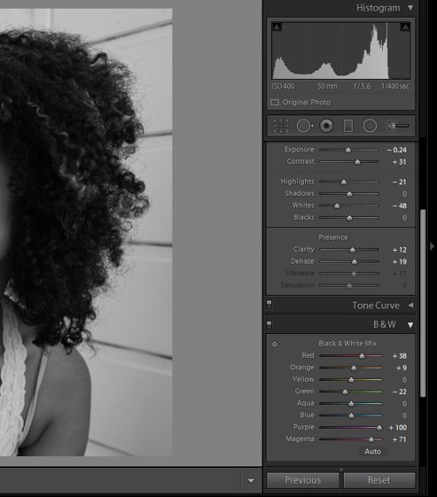
Finally, I converted the image to black and white. I majorly increased the purple and magenta tones to make my subject’s highlights in her hair stand out. I decreased the highlights and whites of the image so as to reduce the glare that appeared during the conversion. Additionally, I increased the contrast to produce an image with a large tonal range.