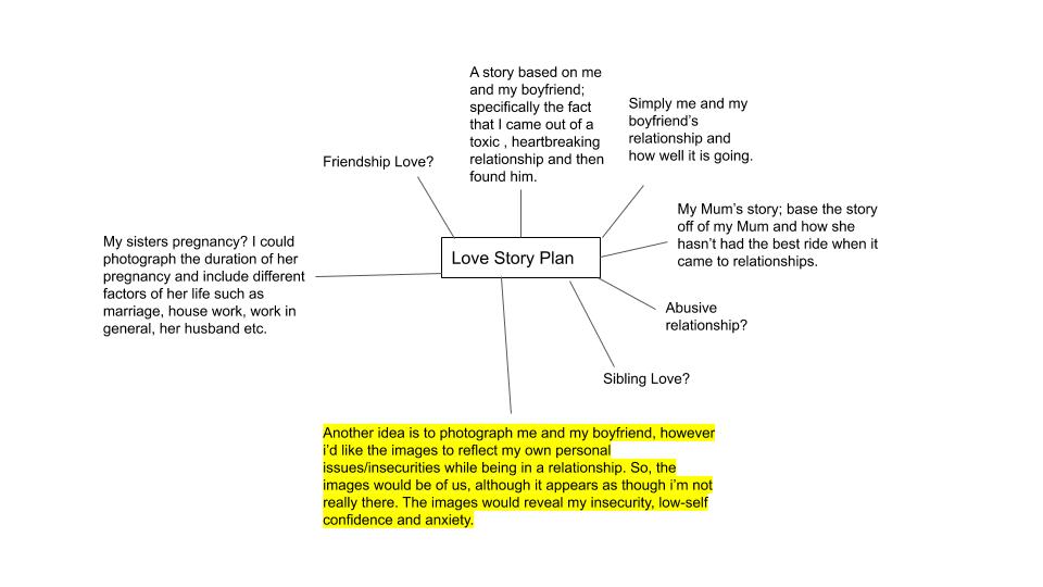
PLAN
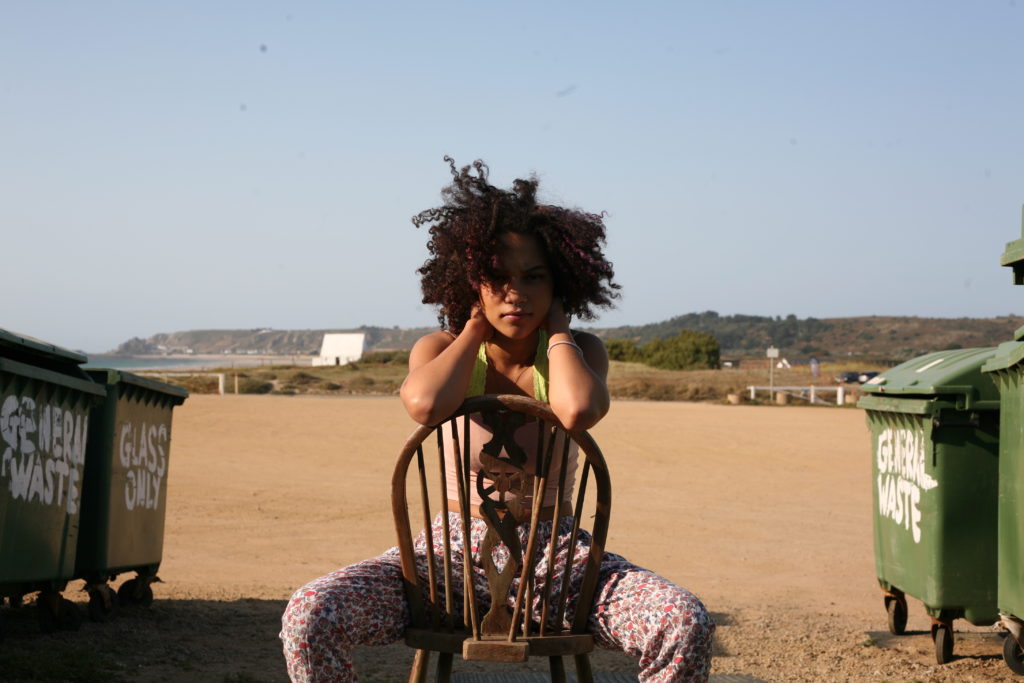
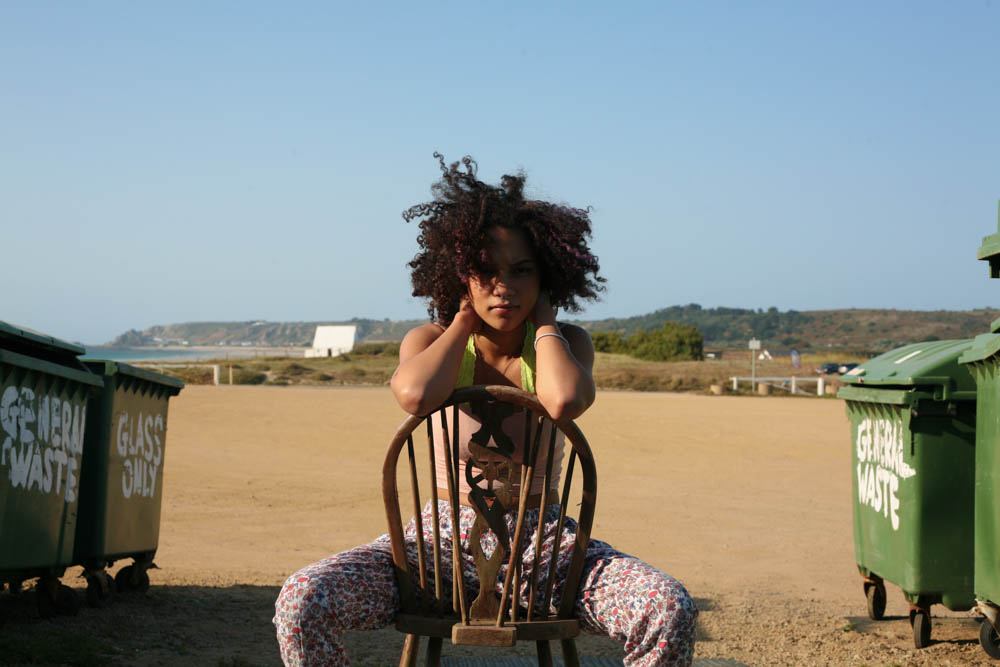
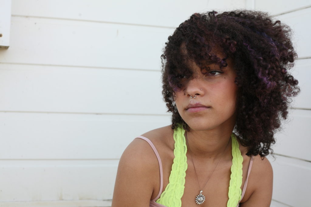
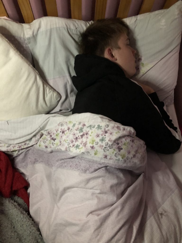
WHO?: The couple I am going to photograph will be me and my boyfriend. As mentioned in my specification, I will be exploring my own personal issues that effect my relationship on a daily basis, this assignment will help me get some practice and help get a feel of how I want to portray this symbol.
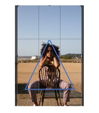
WHAT?: So like the artist that I analysed, I am mainly looking to explore my ideas through body language:
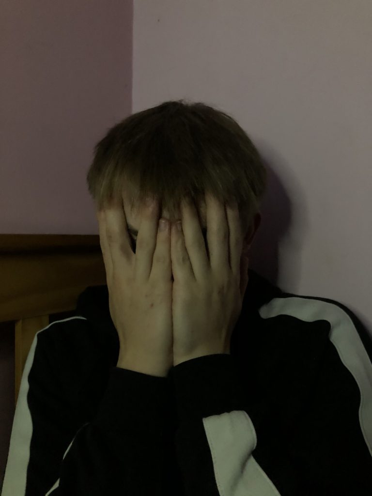
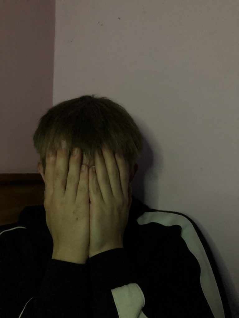
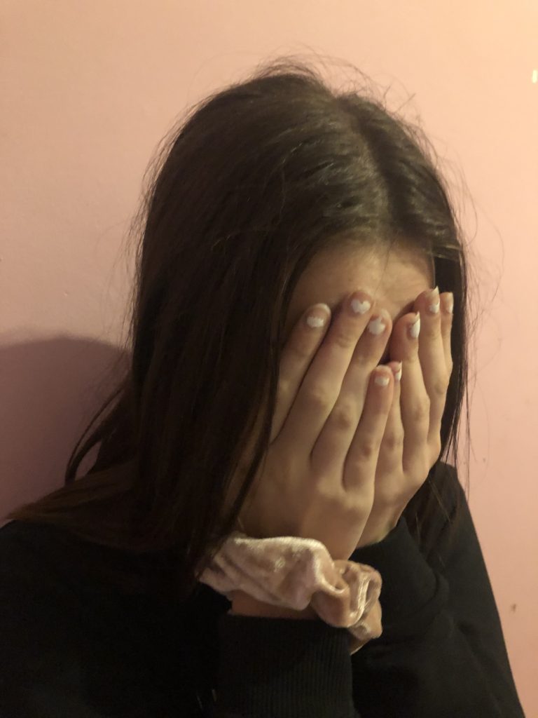
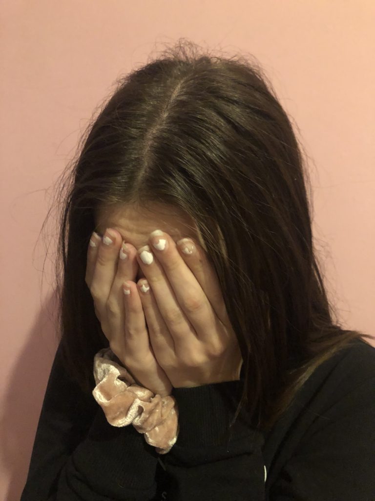
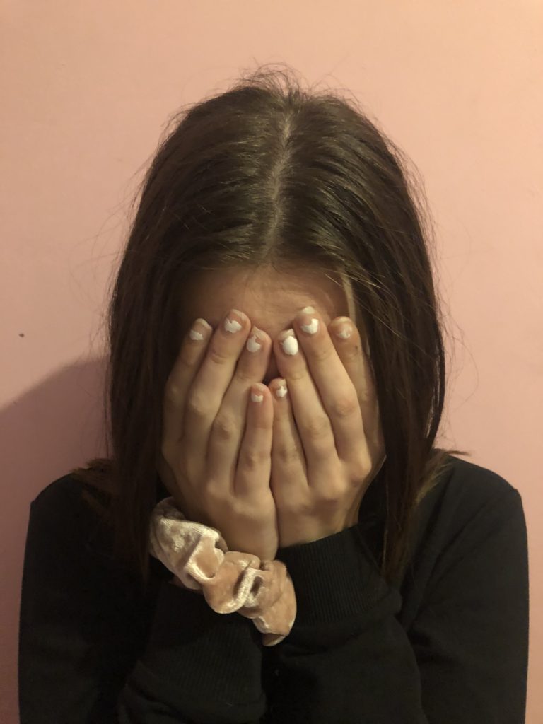
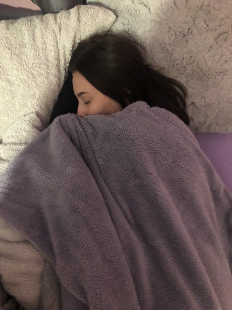
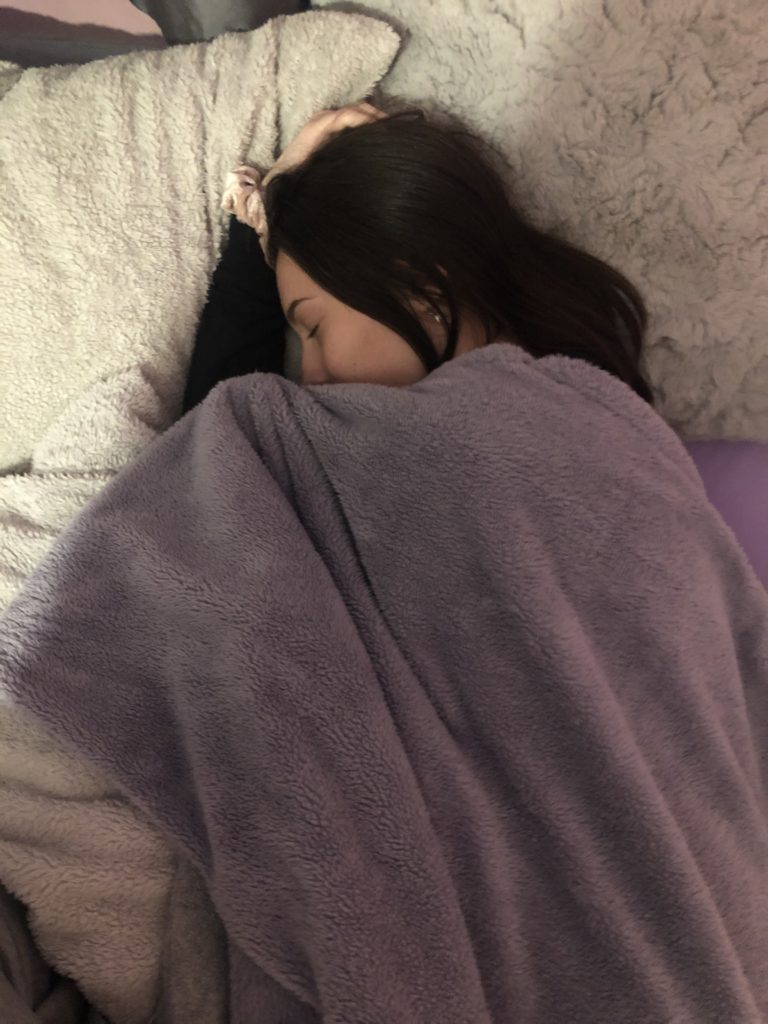
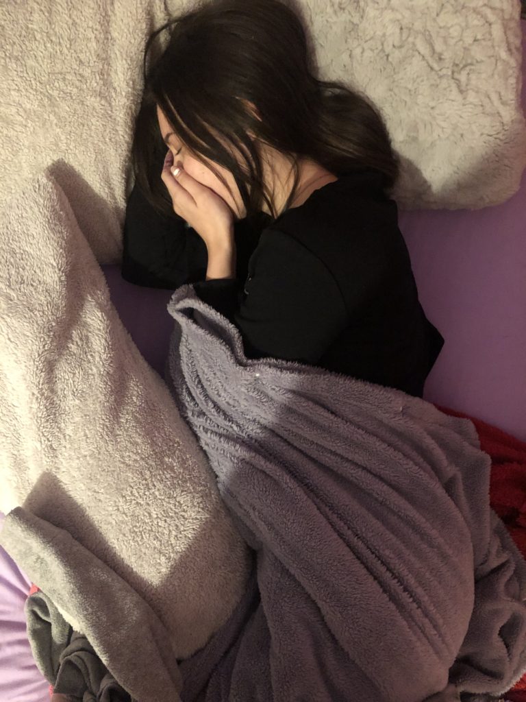
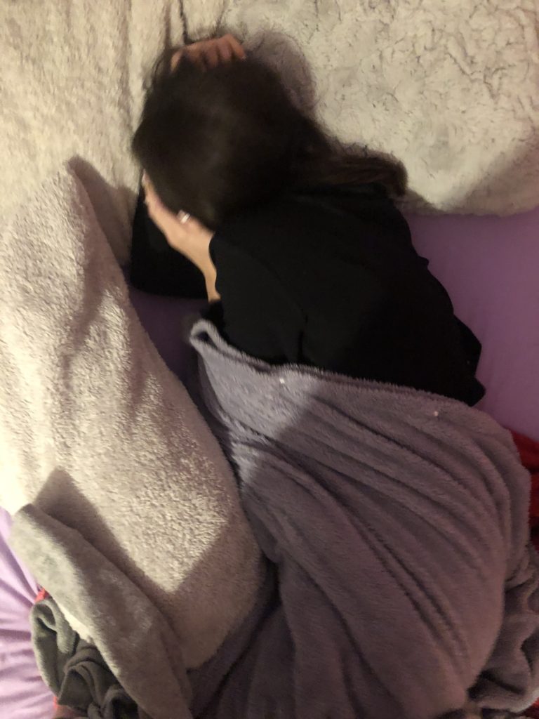
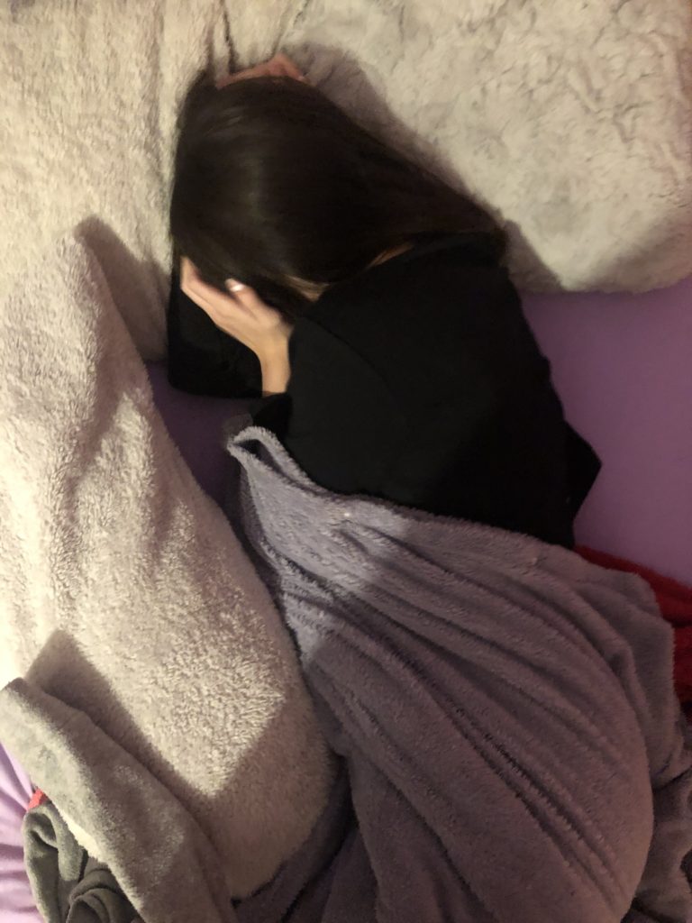
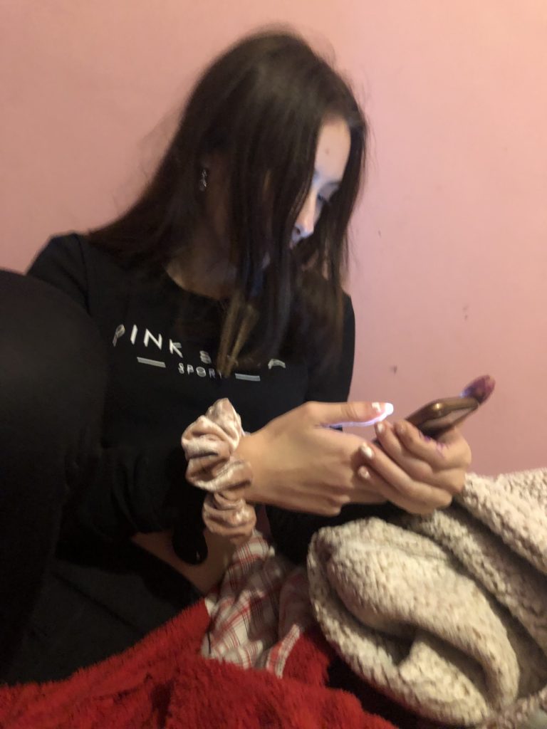
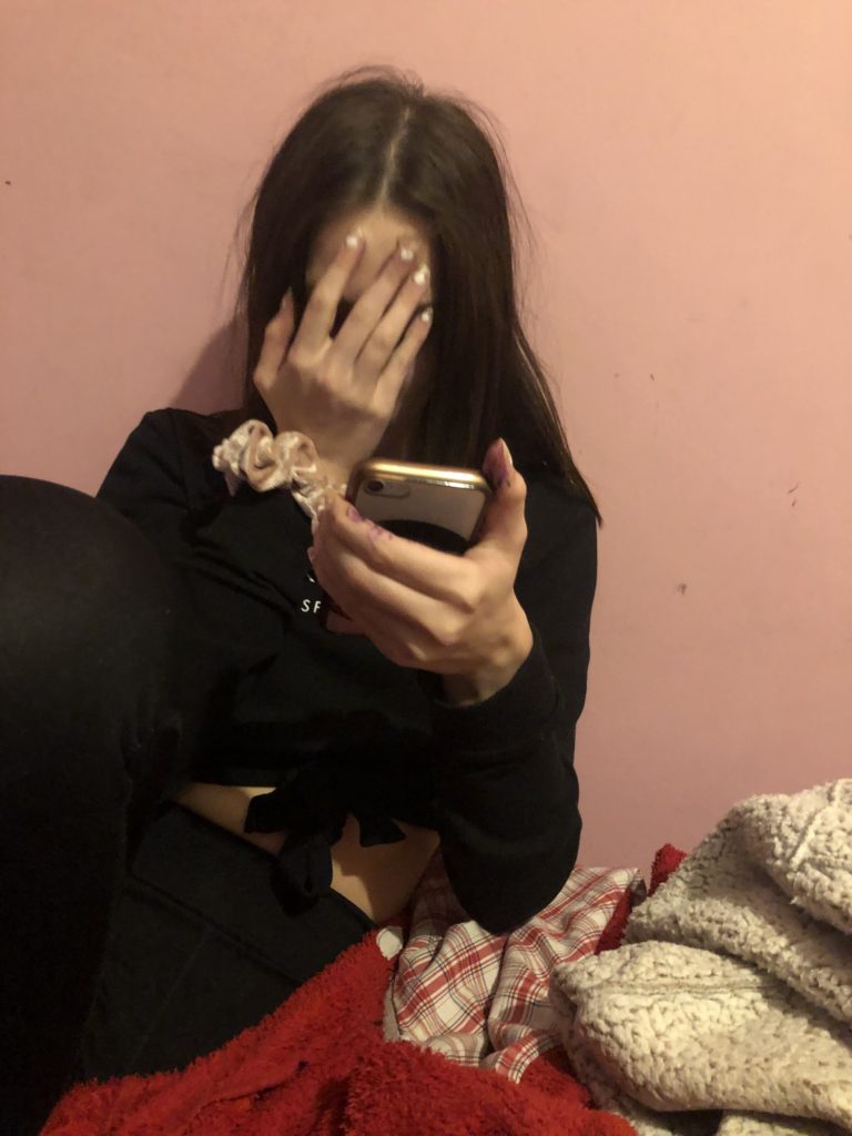
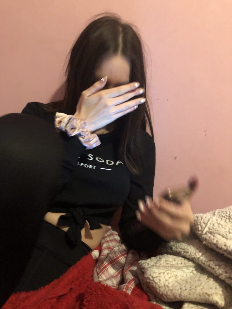
- Paranoia – shown by me having the urge to look at his phone all the time, me sitting next to him with a closed body language, me looking bored etc. That is how i could portray paranoia.
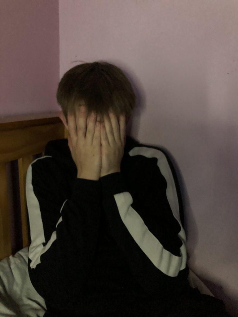
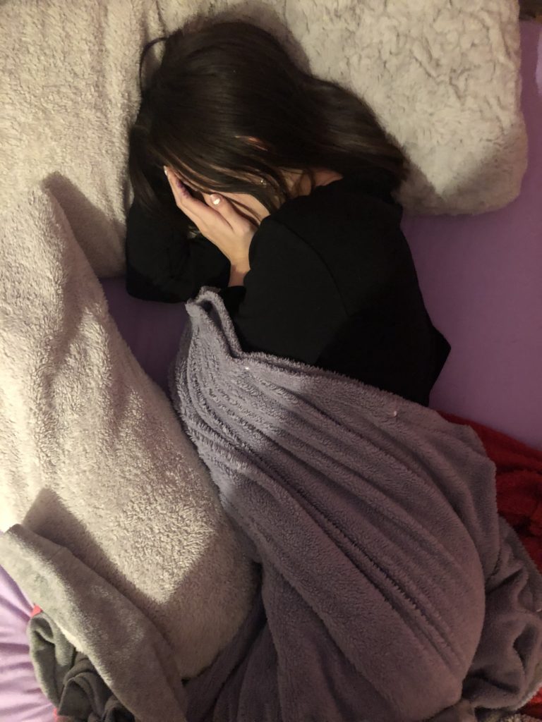
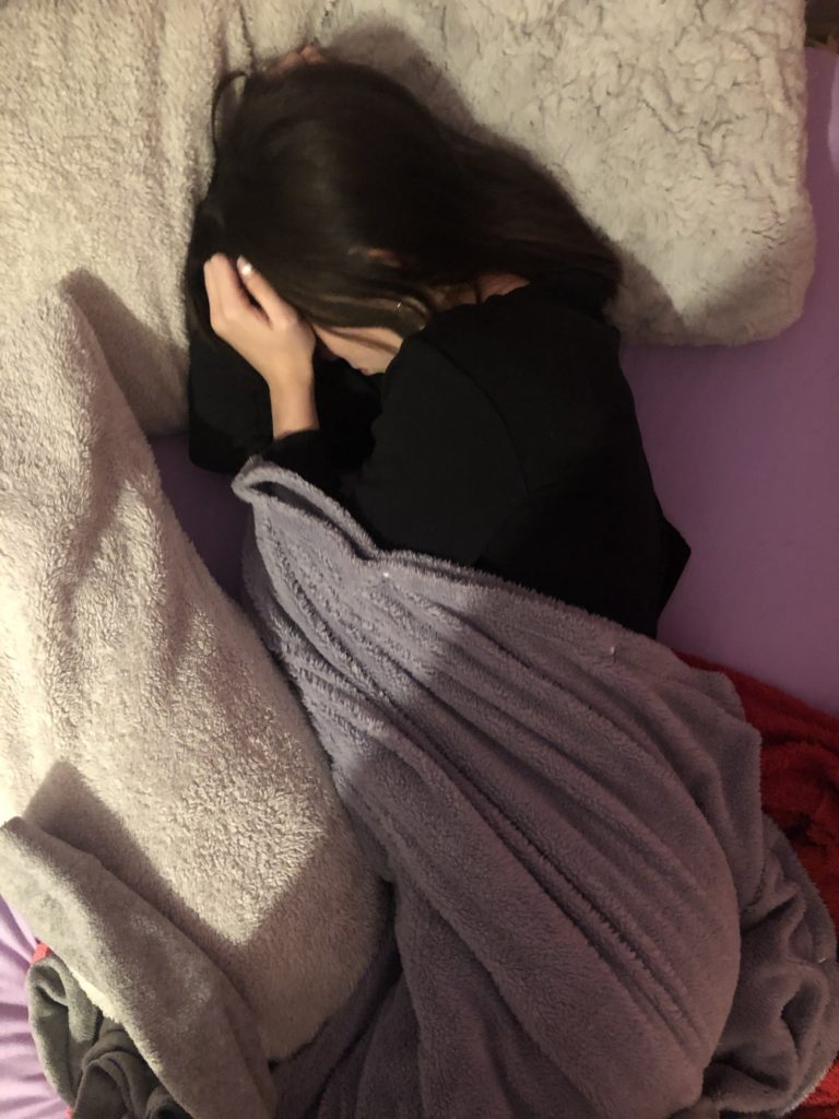
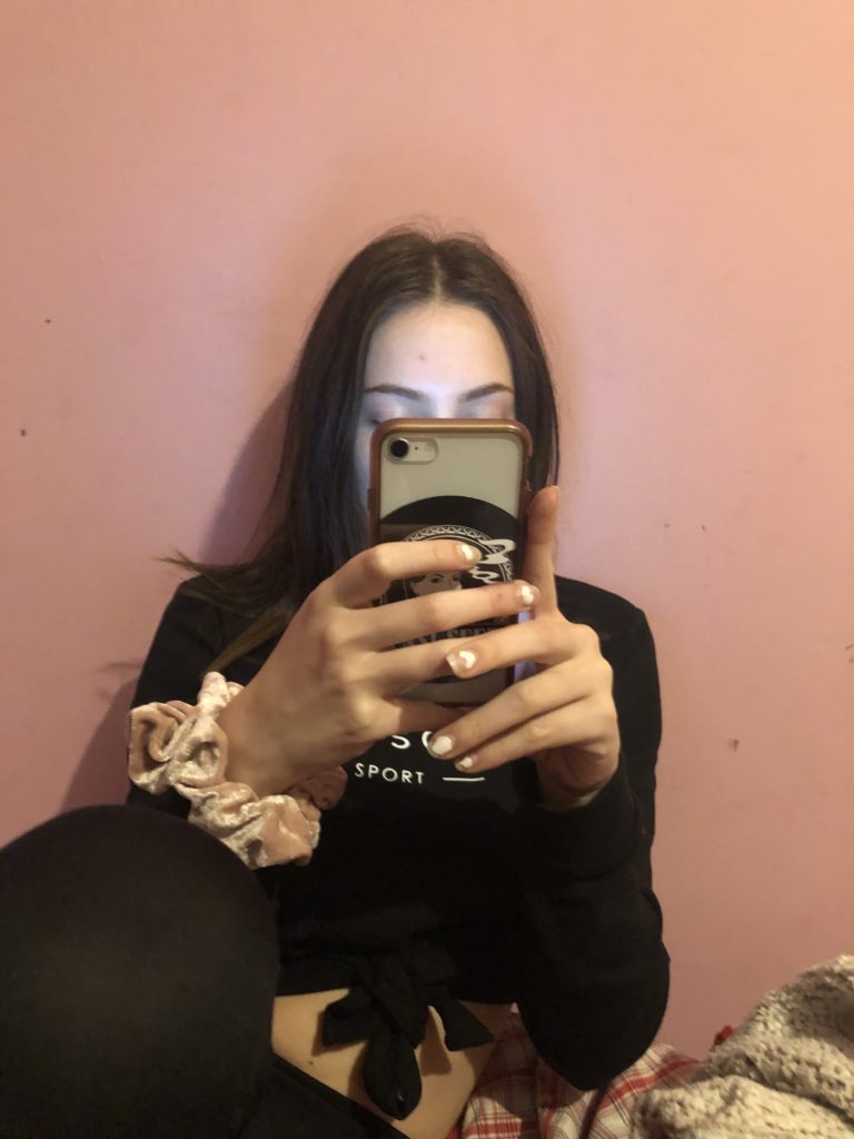
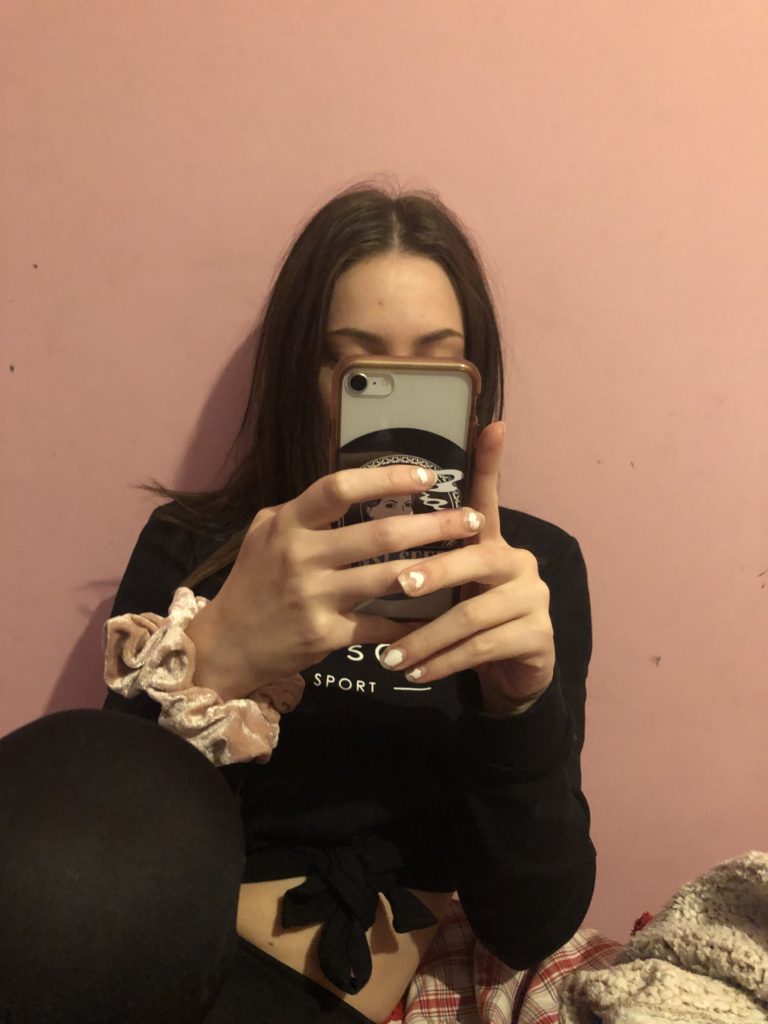
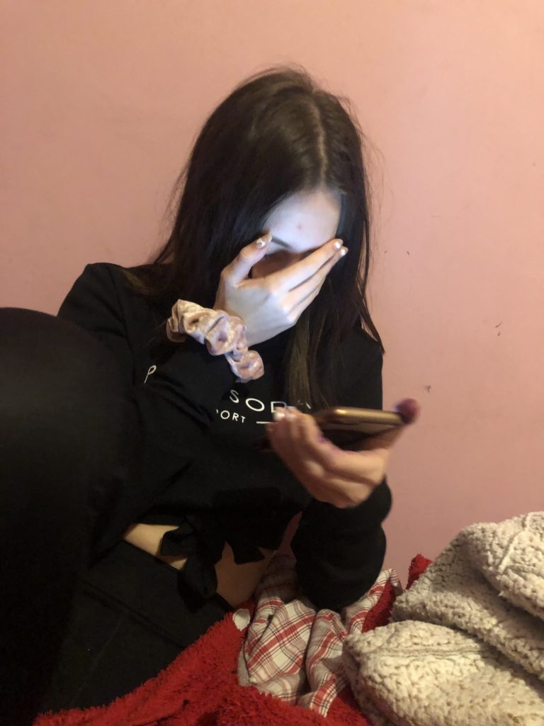
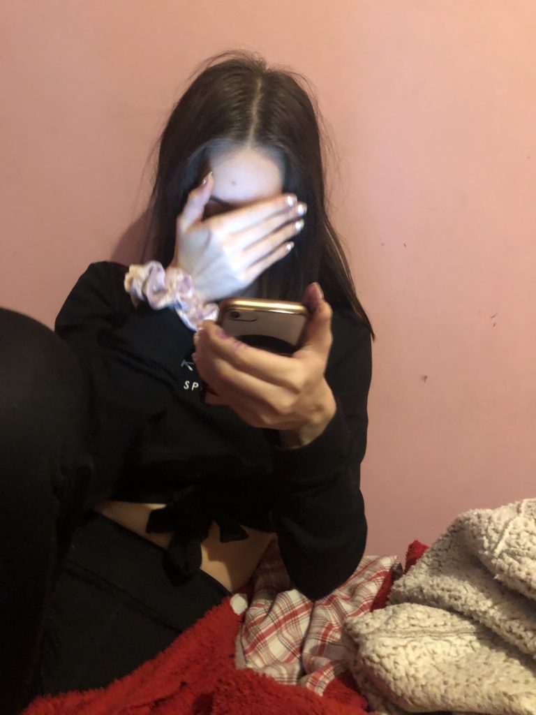
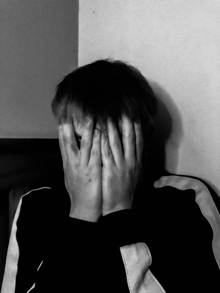
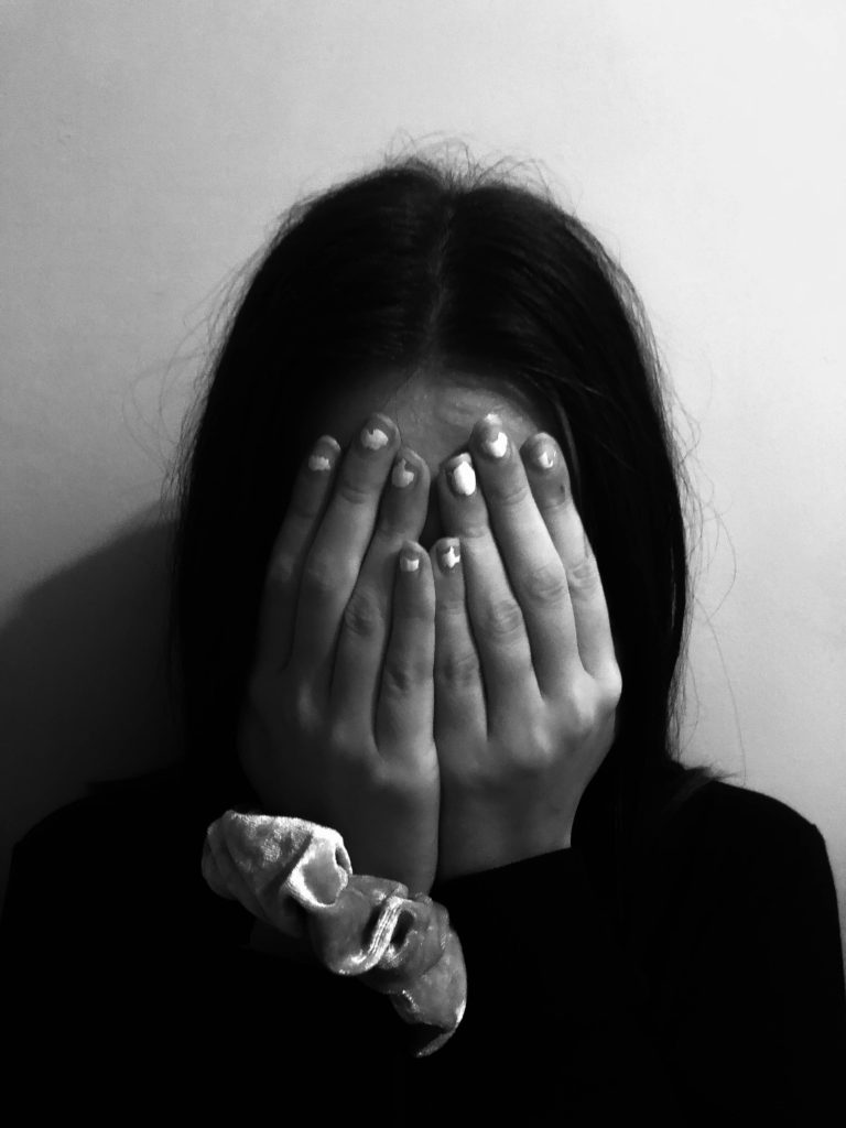
- Self-Confidence issues – me looking in the mirror with his reflection in the background behind be, me covering up my body, me looking at models on Instagram, me crying etc.
- Anxiety – me never knowing whether I am annoying him, could be shown through doodles on the images with my mouth appearing to be shut.
- ^ doodling could also actually be a really good idea in order to show my emotions and my inner thoughts, I will have to explore this idea carefully within my editing process.
WHEN?: The week of 21st September-24th September in order to get the assignment in by the deadline and to keep up.
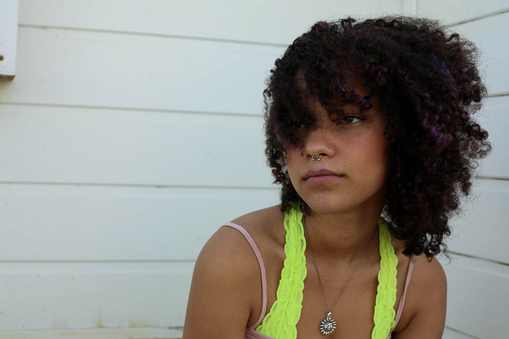
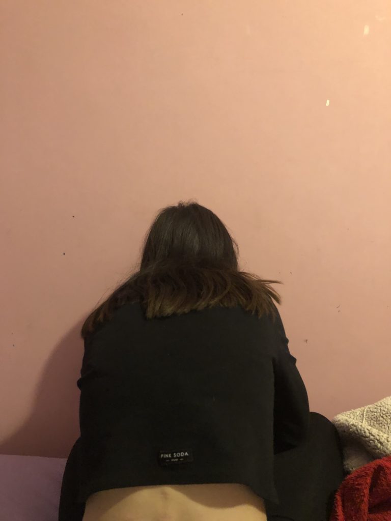
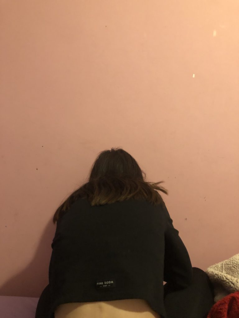
WHERE?:I will most probably base my photographs around the areas me and my partner are a lot of the time. So this would be my house, his house, his car, aesthetically pleasing out-doorsy places. However, I want a similar aesthetic to Hsing Wang, so, plane and bleak, so I will most likely be shooting and mine or his house.
HOW?: I will be taking these images on an IPhone and most likely, a DSLR camera as this would give better quality and will give the tones that I want my images to have. A tripod will also be extremely helpful with this shoot as I am photographing myself and my partner, this would mean having to pose in a specific position in order to get the perfect frame.
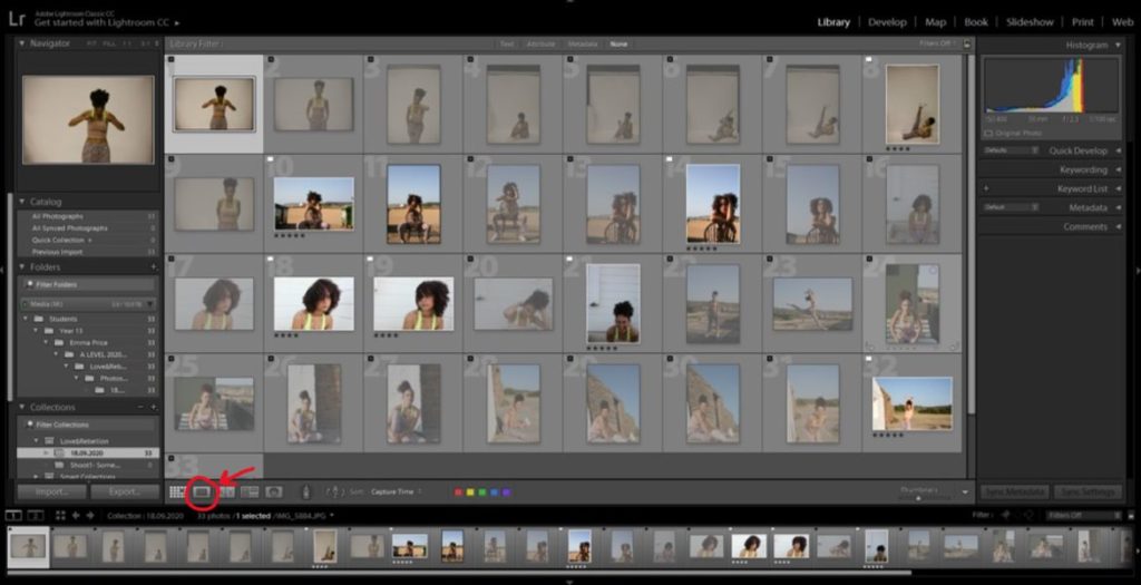
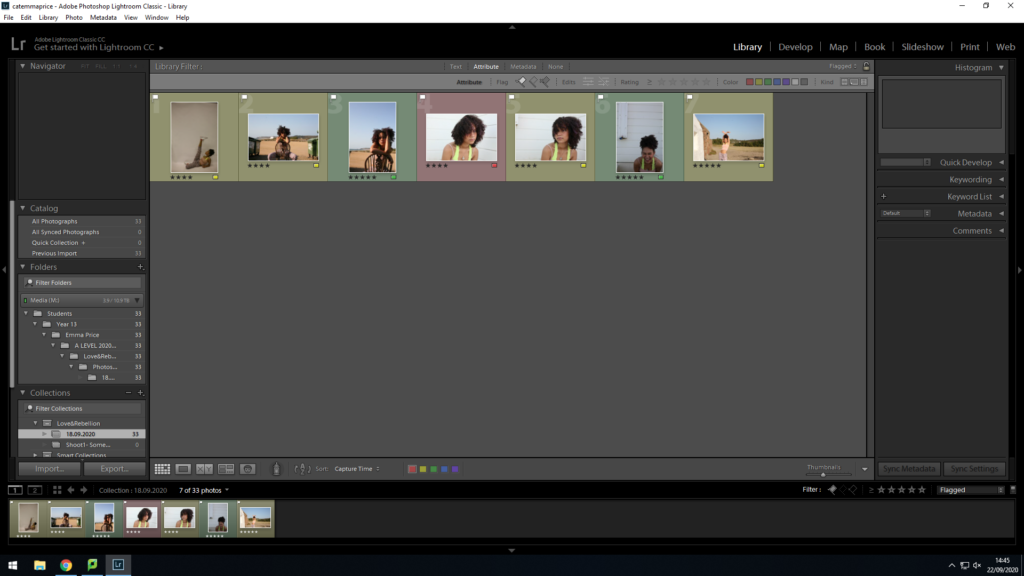
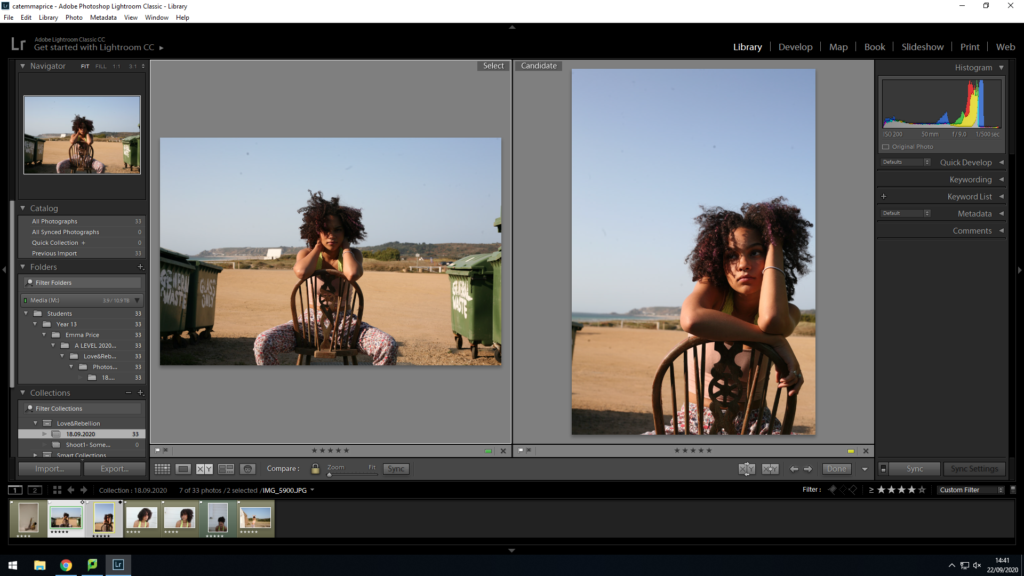
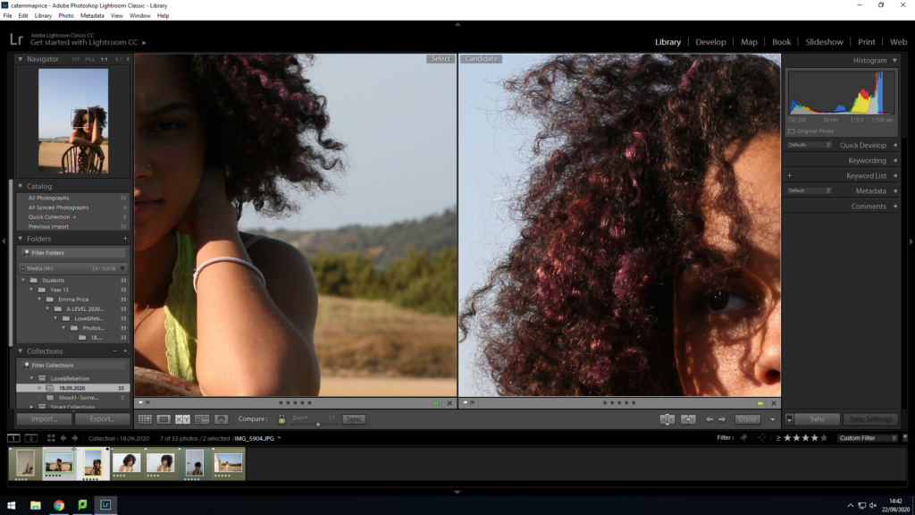
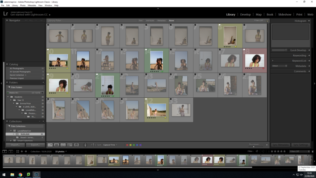
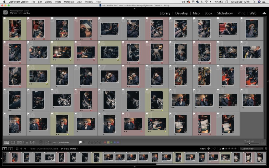
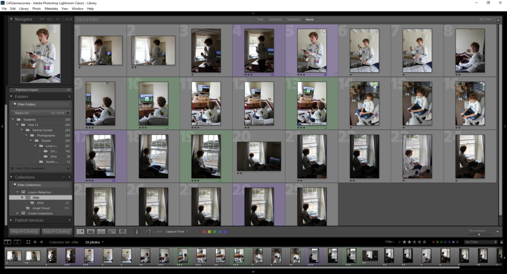
Shoot:


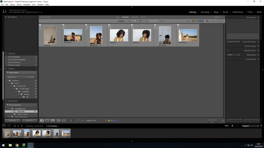
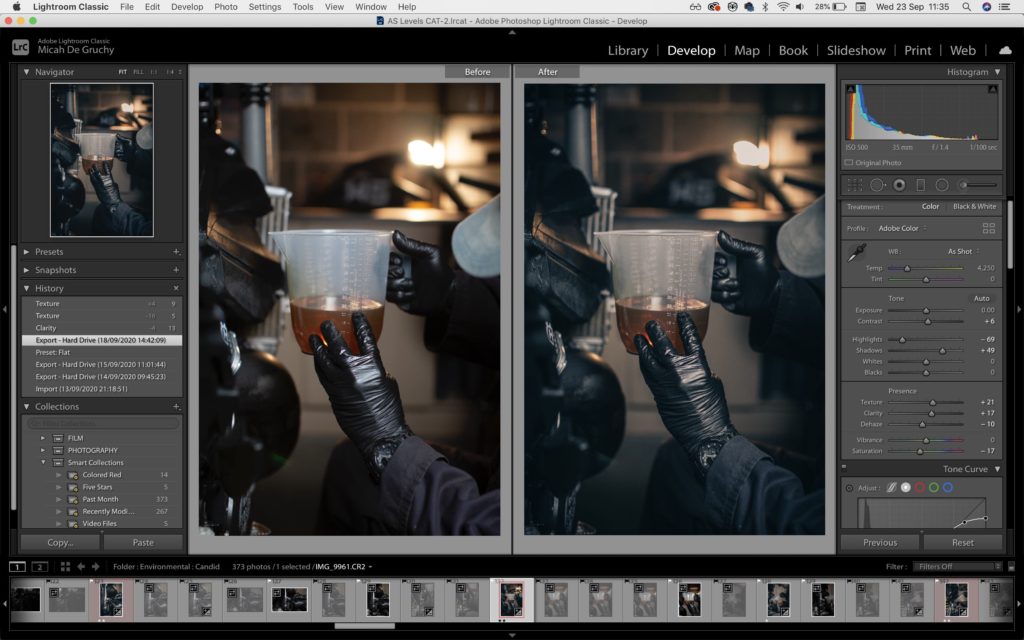
Editing
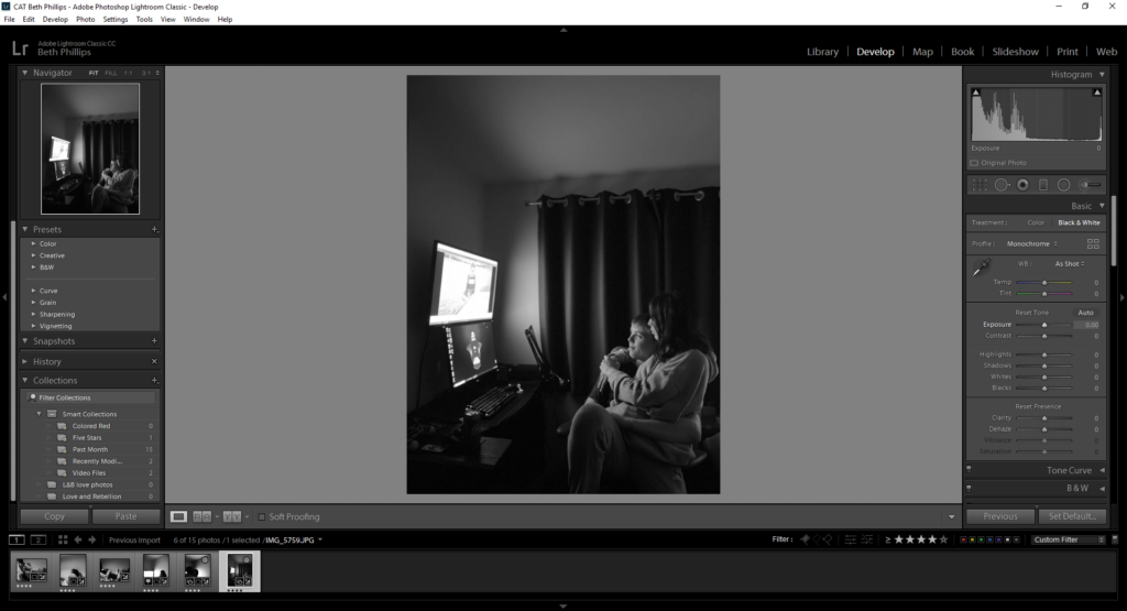
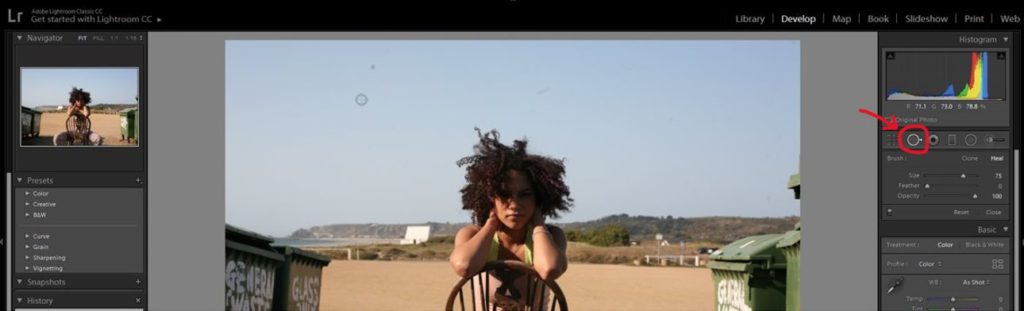
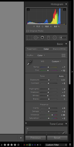
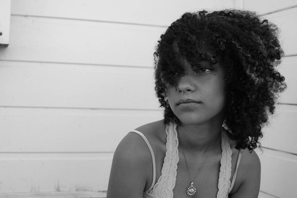
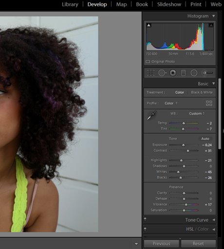
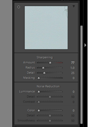
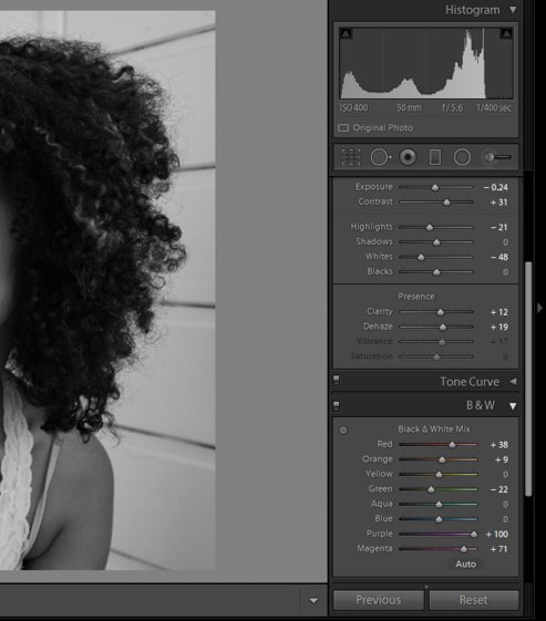
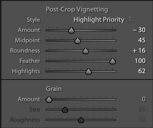
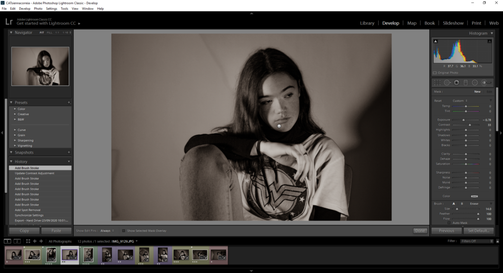
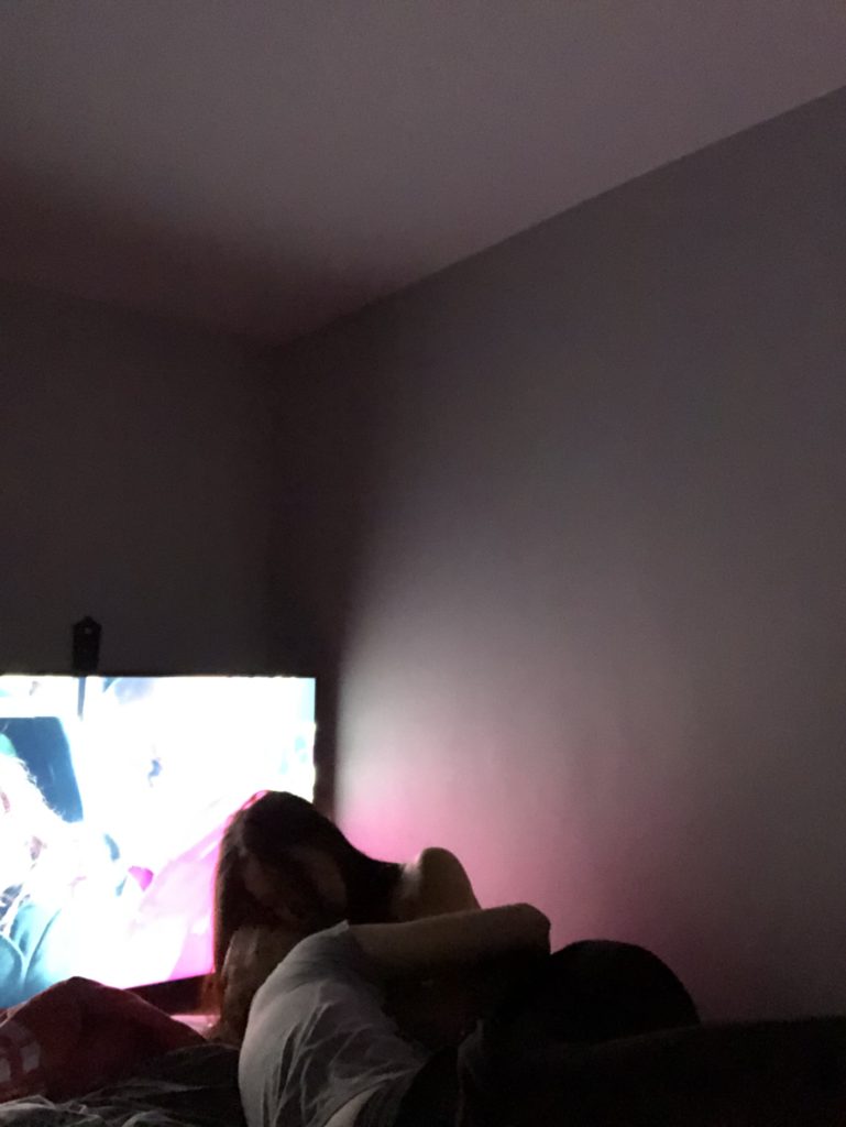
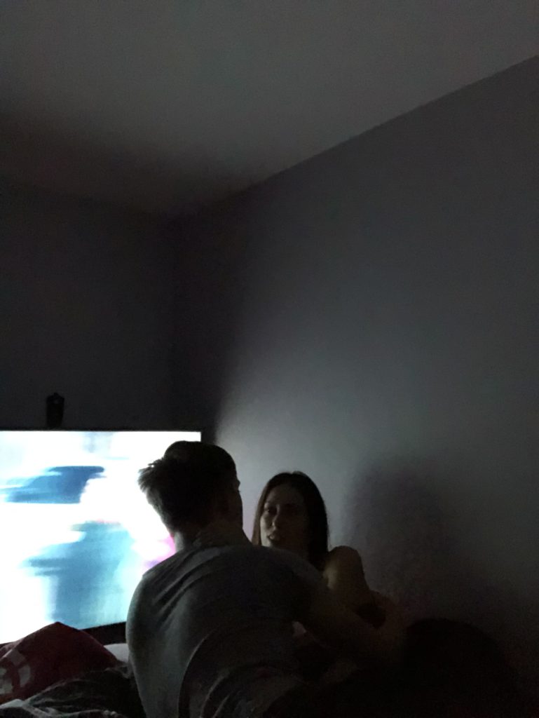
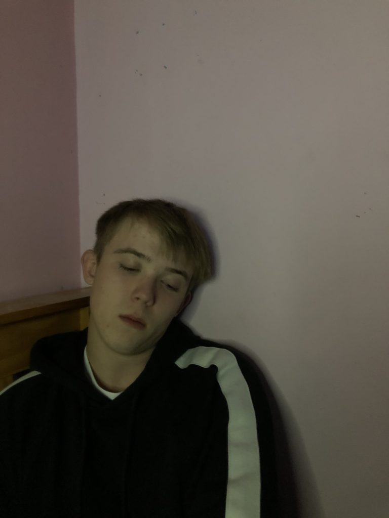
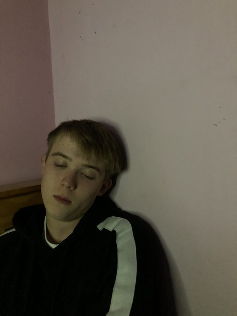
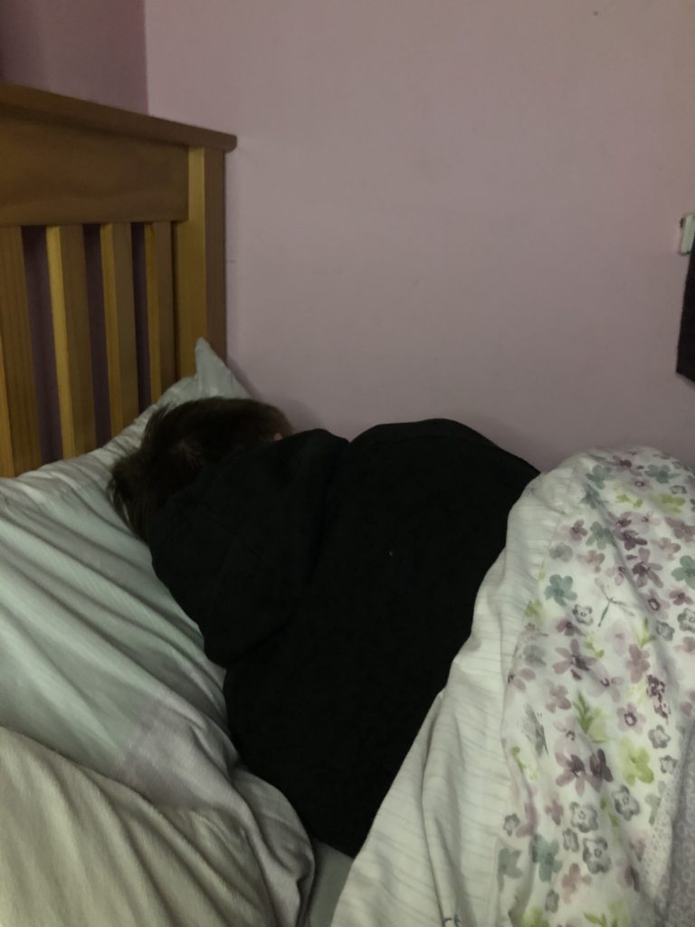
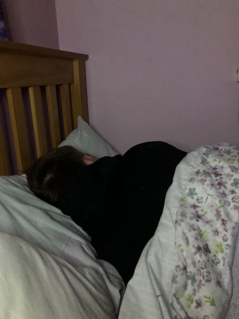
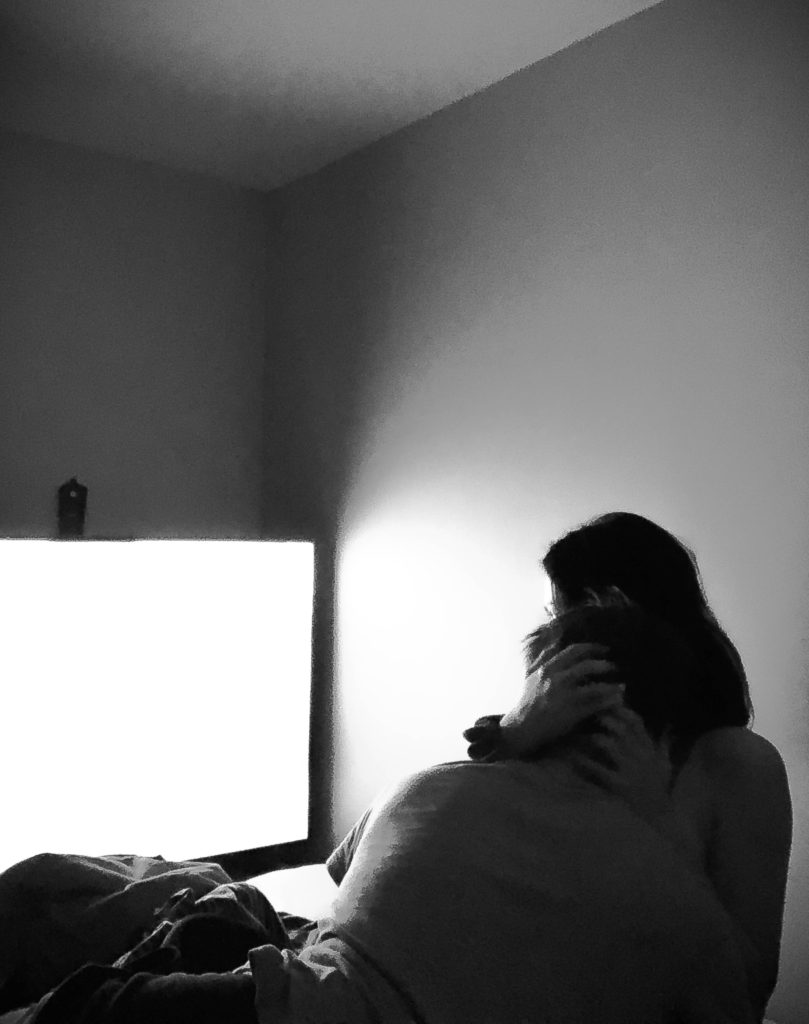
To start editing, I cropped the image to my preference, mainly to cut out all of the extra space in the image that wasn’t needed. After, I turned the image into black and white. Firstly because I didn’t particularly like the photograph in colour and secondly because it fitted my narrative for my story which is insecurity and isolation based, therefore creating a somber tone. Black and white helps to create that overall mood.
After turning it black and white, I then played with the shadows/exposure/contrast etc. I increased the level of shadows to increase the glow of the TV, this made the image more aesthetically pleasing. After, I increased the contrast, this helped boost the blacks within the image and gave the image more structure. I also lowered the exposure as I didn’t want the image to be too bright, as again I wanted it to match the tone of my overall narrative, this darkened the image nicely. Lastly, I increased the sharpness of the image. Since these images were produced on the phone they were a little grainy, therefore I decided to increase the sharpness of the images just to add more detail and quality.
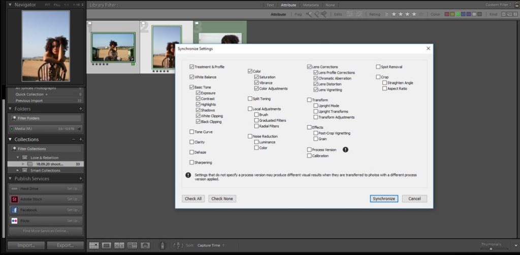
I repeated this process with every photo until I was happy with the quality of each image.
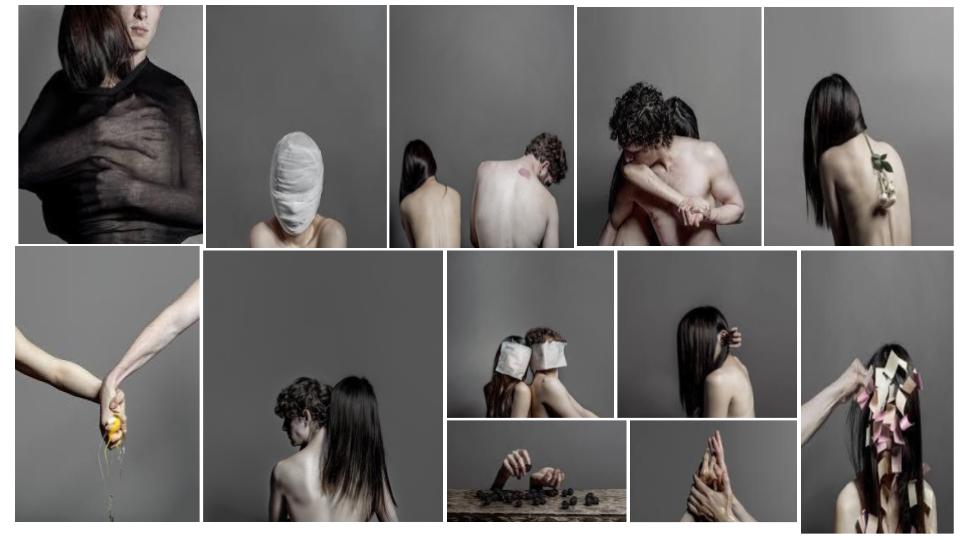
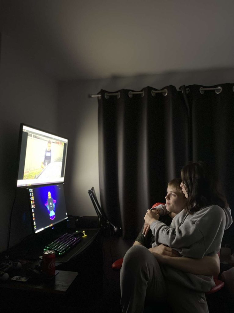
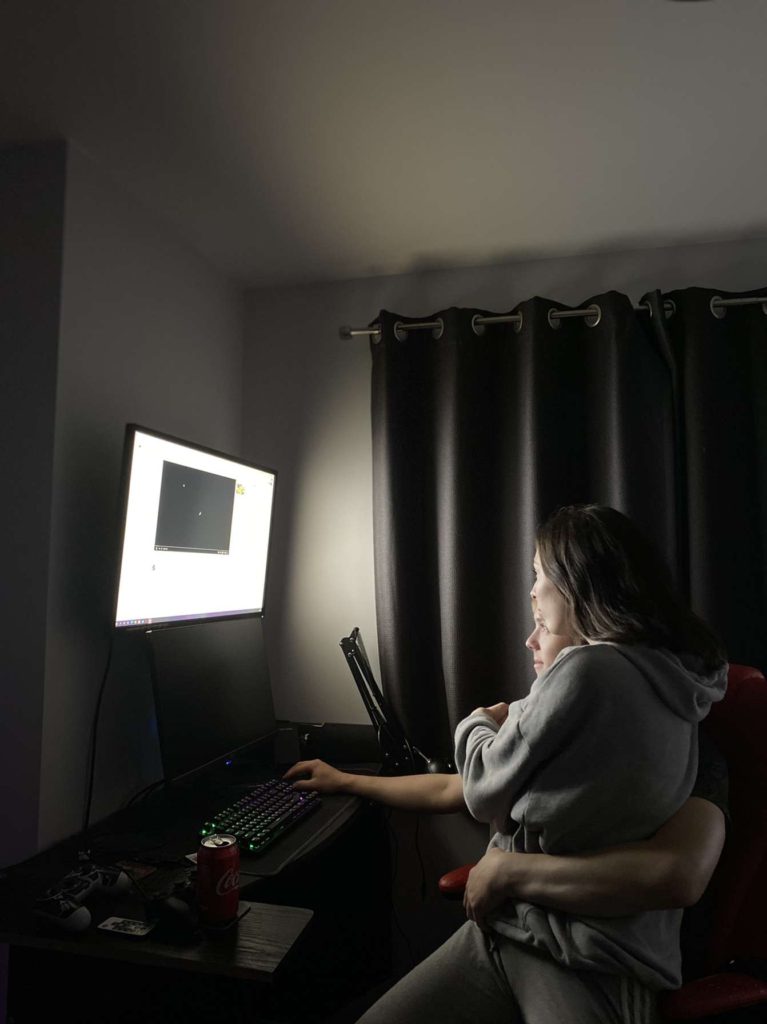
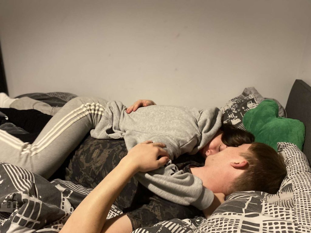
Final Images
Evaluation Of Final Images
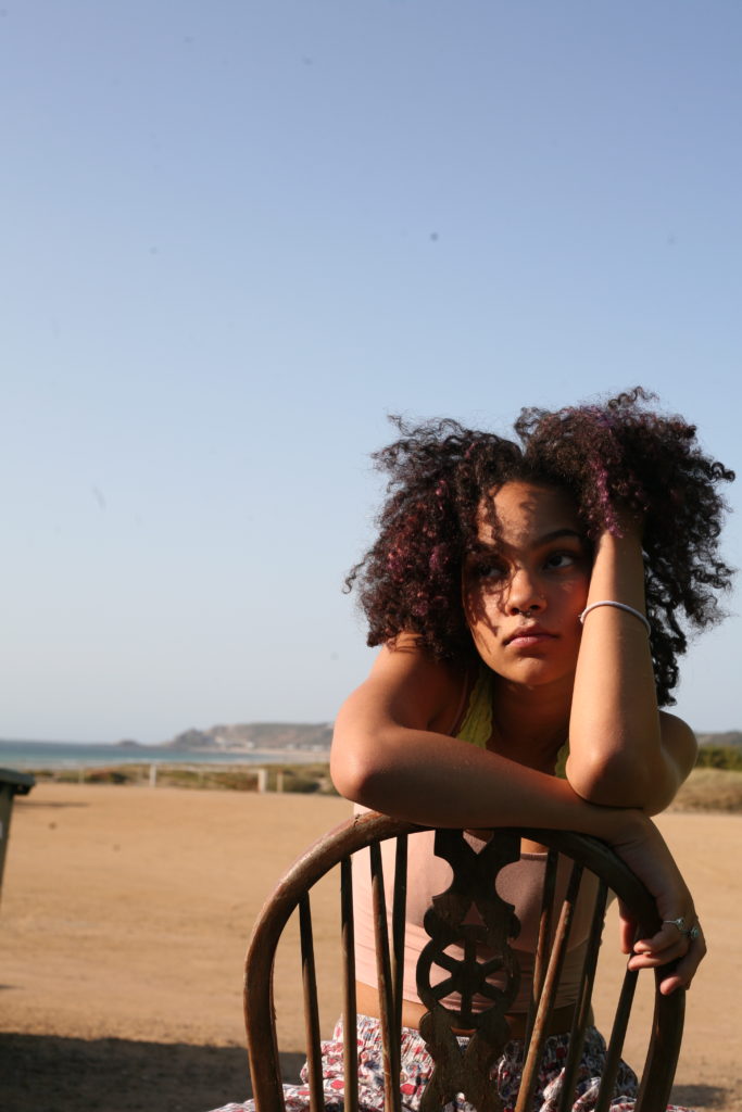
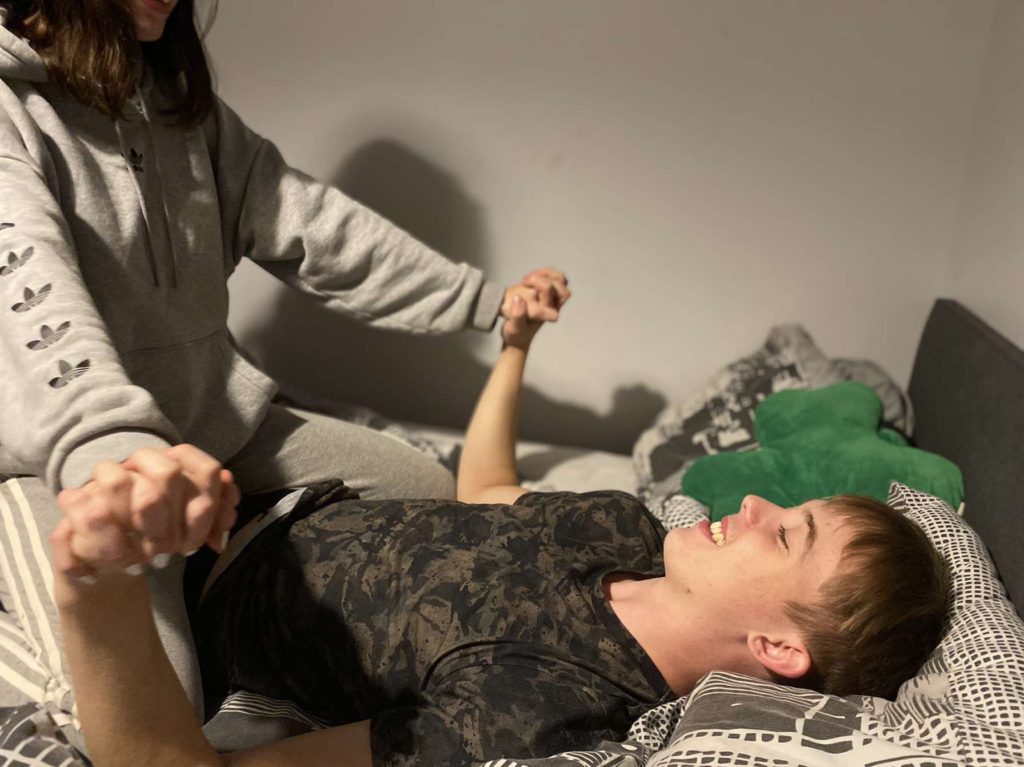
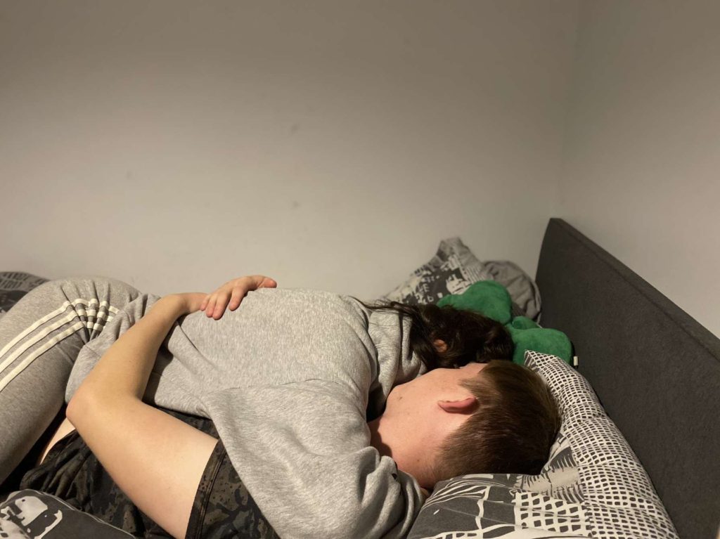
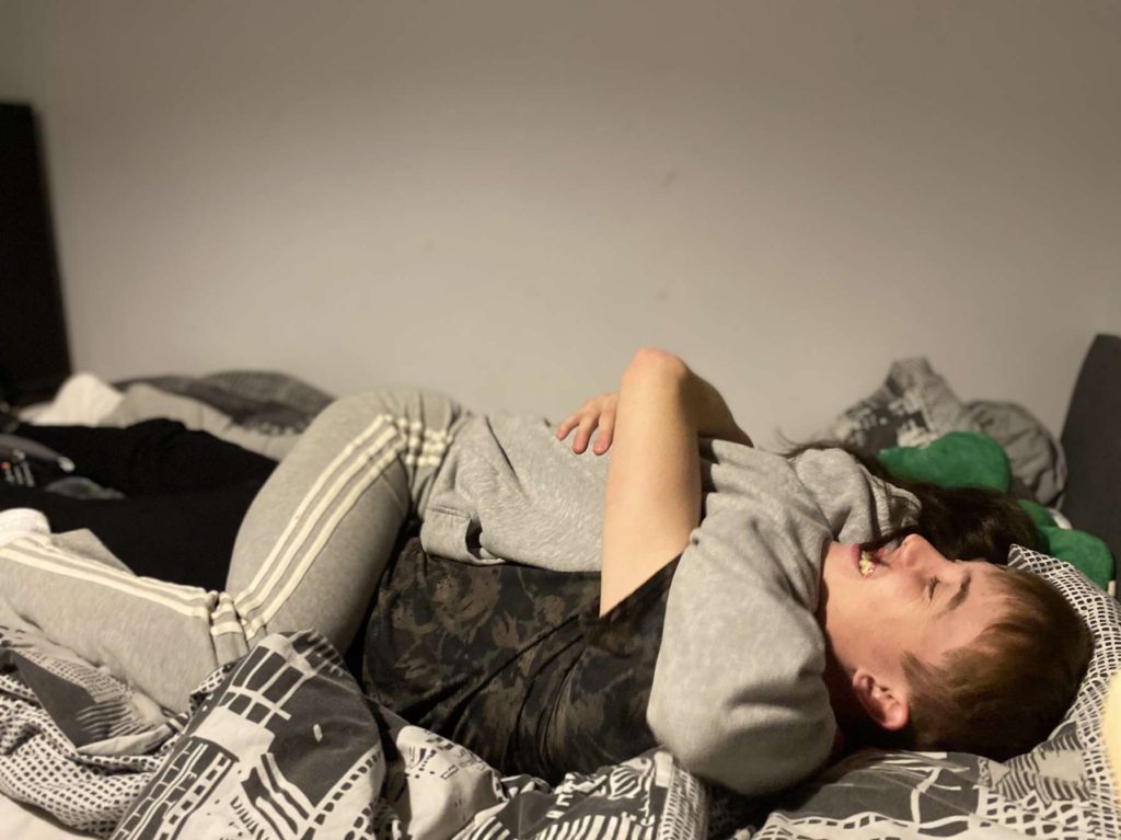
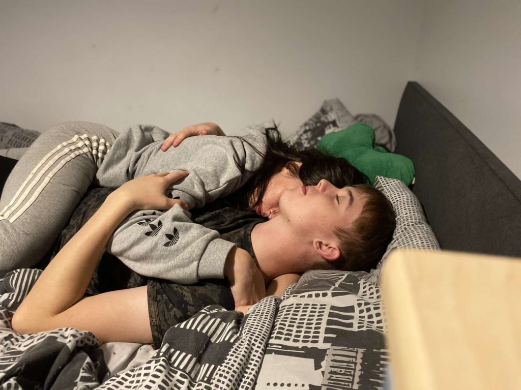
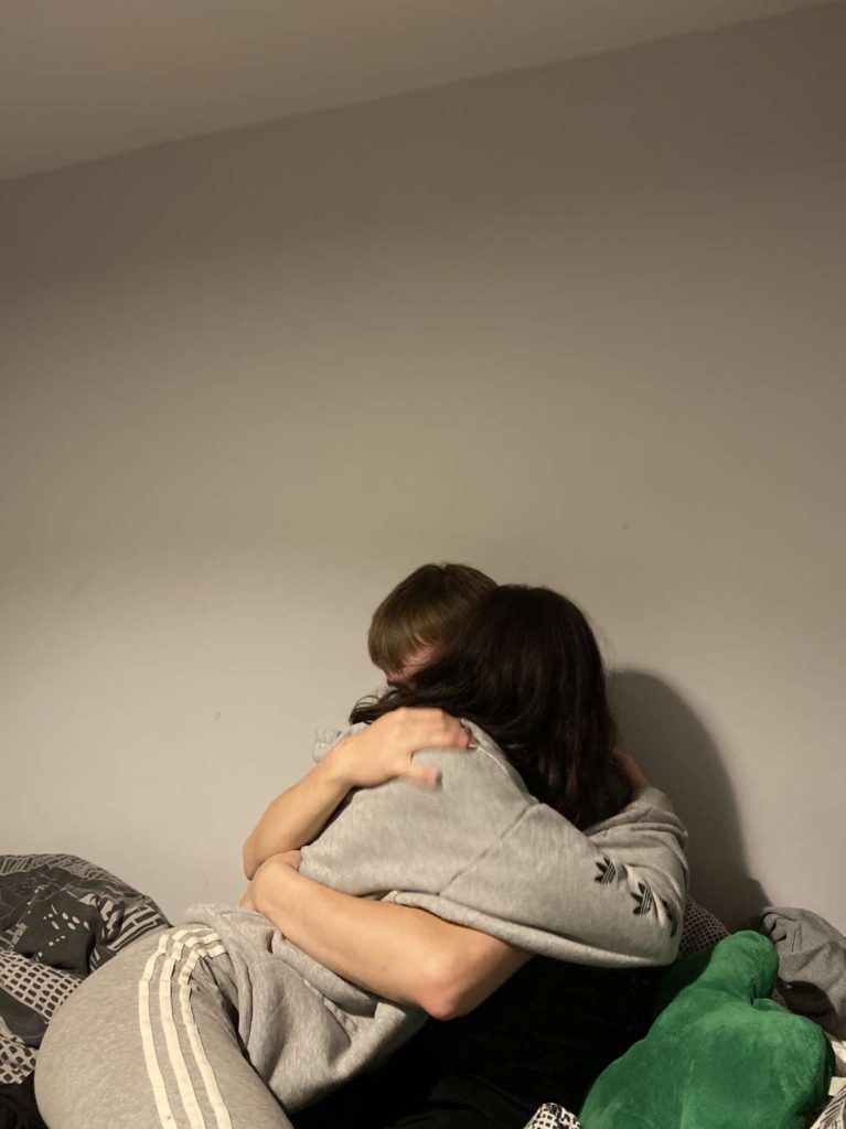
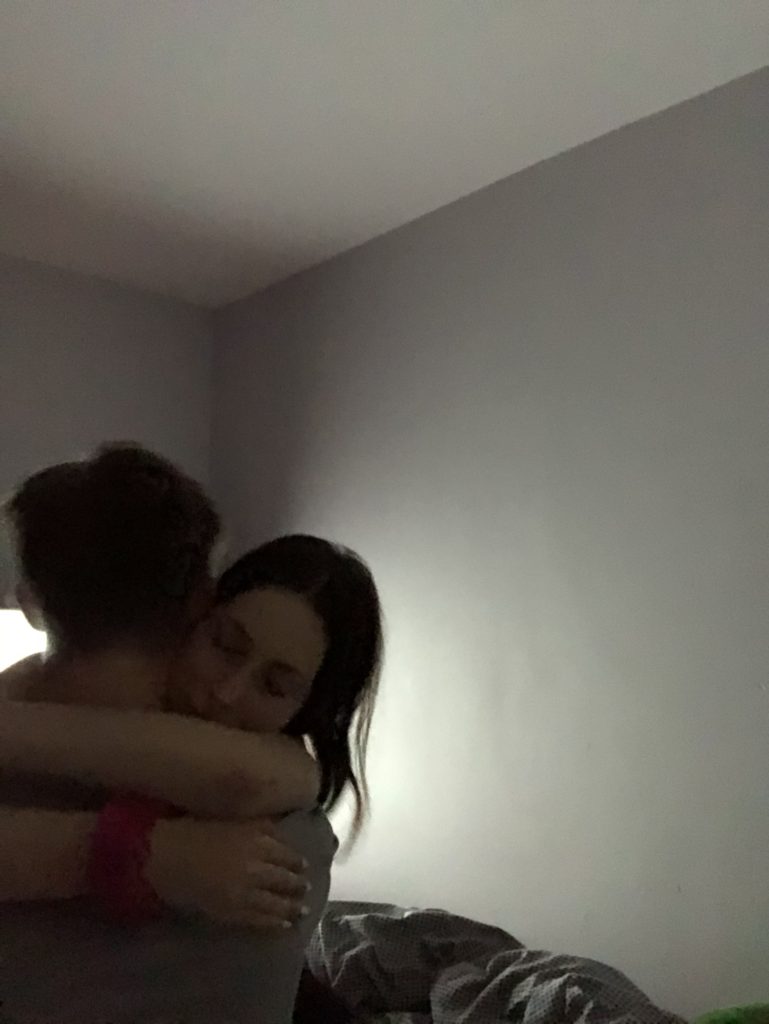
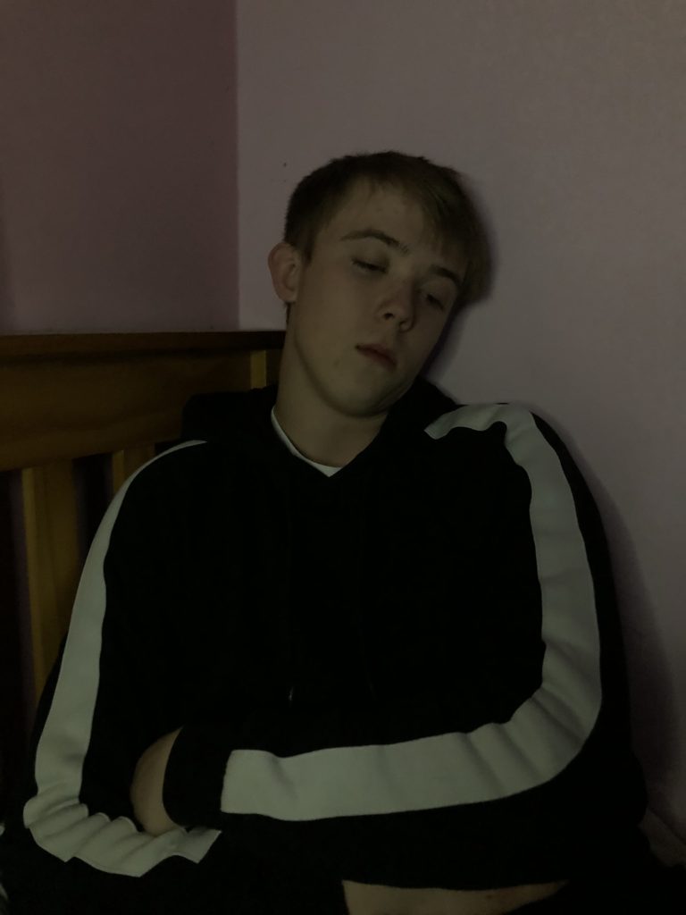
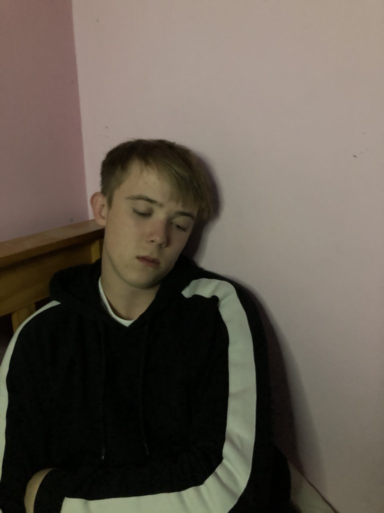
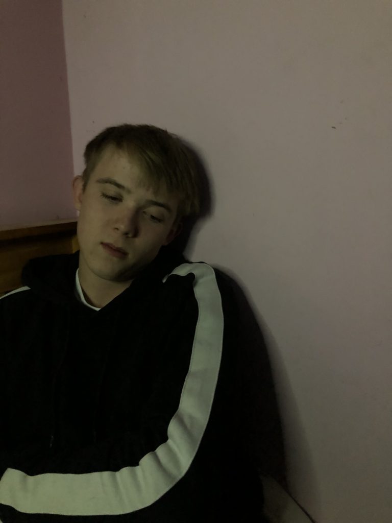
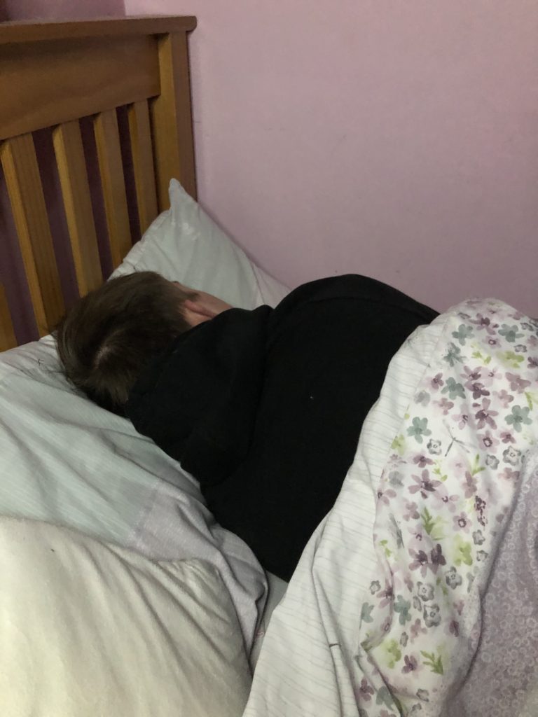
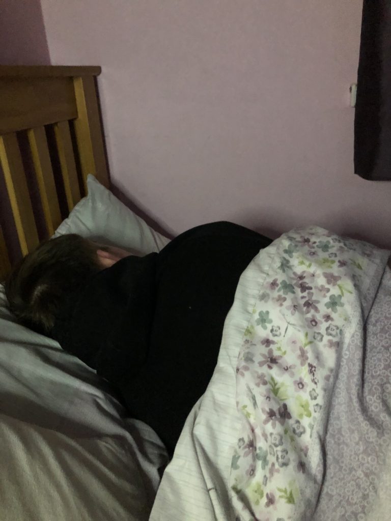
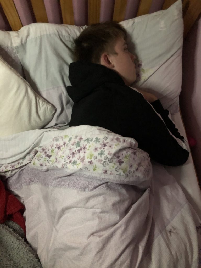
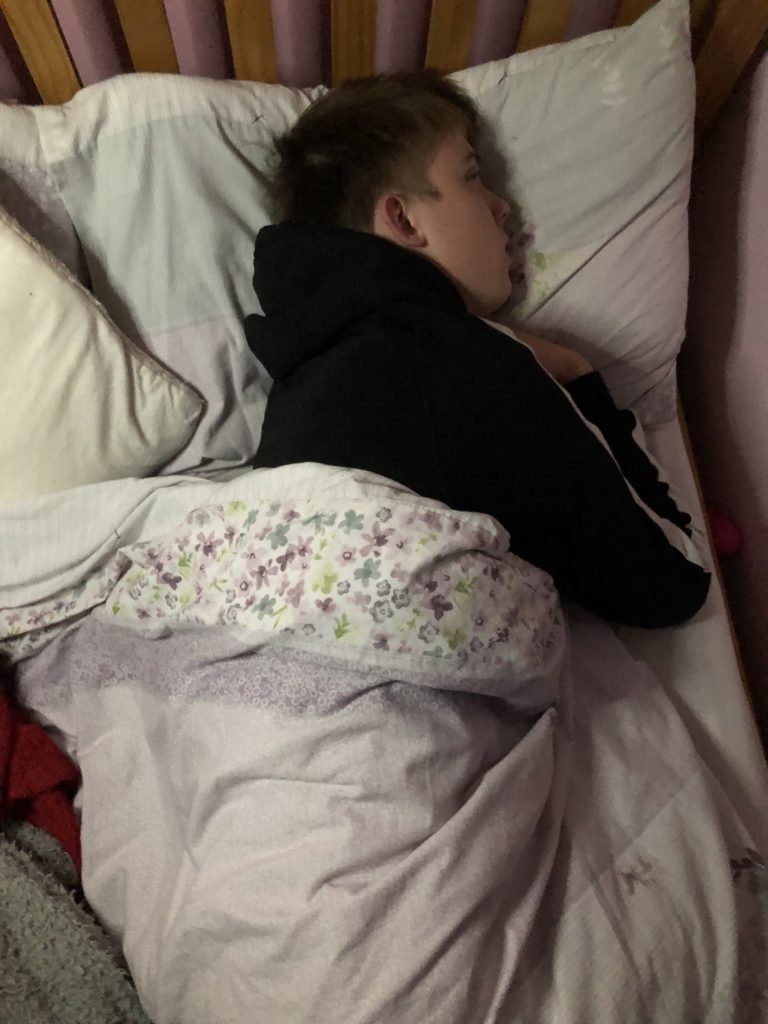
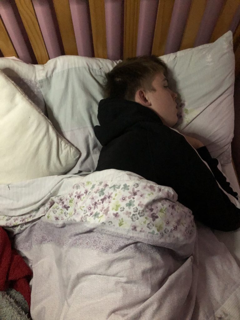
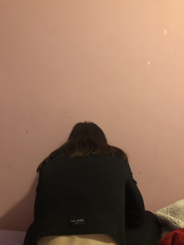
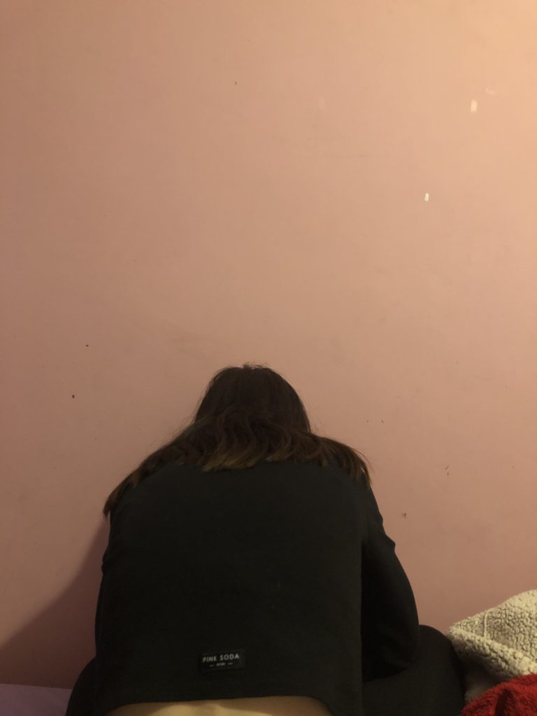
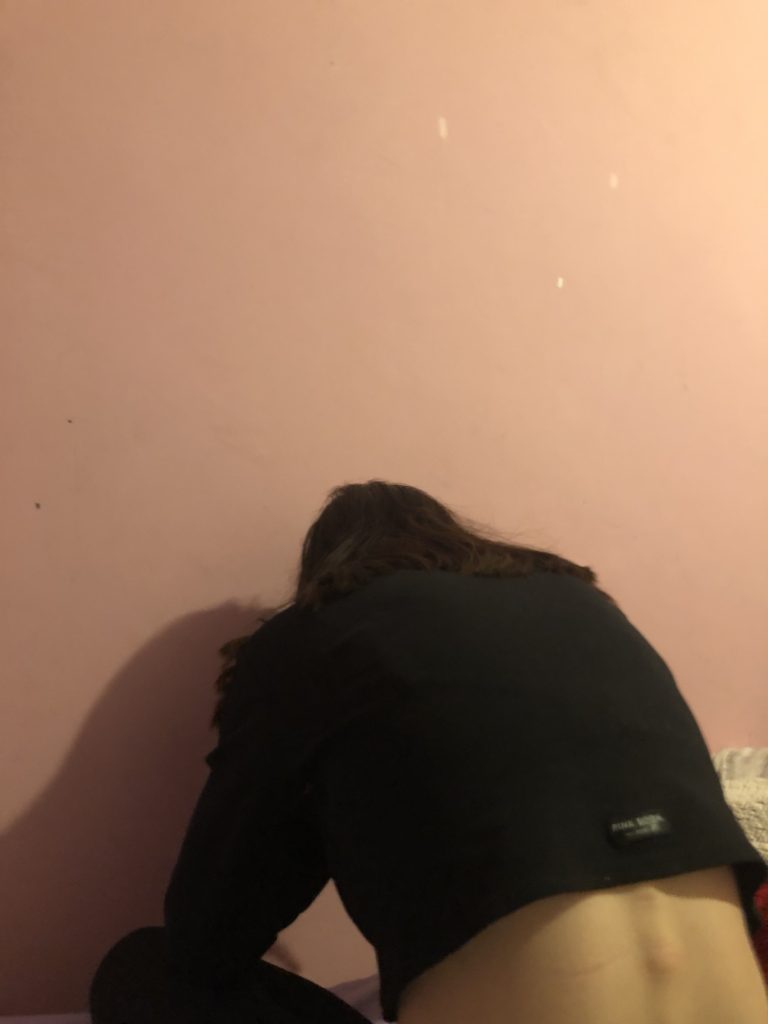
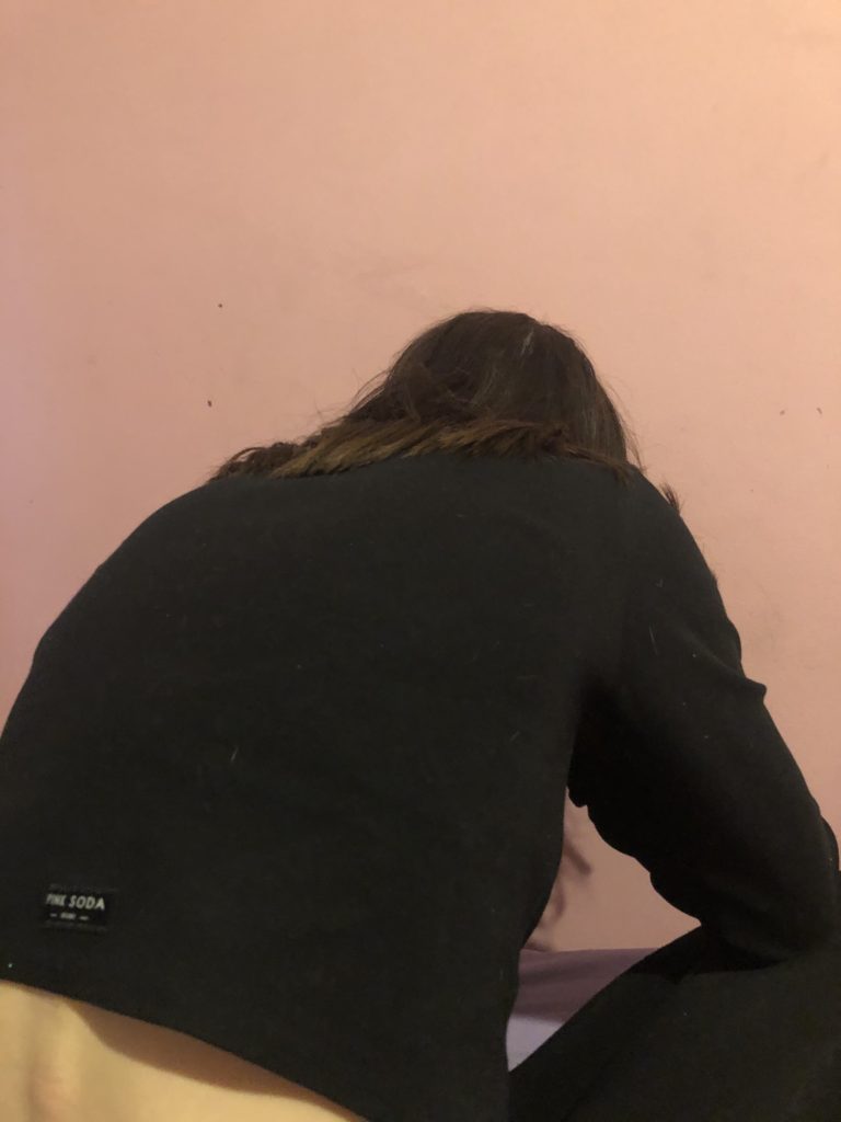
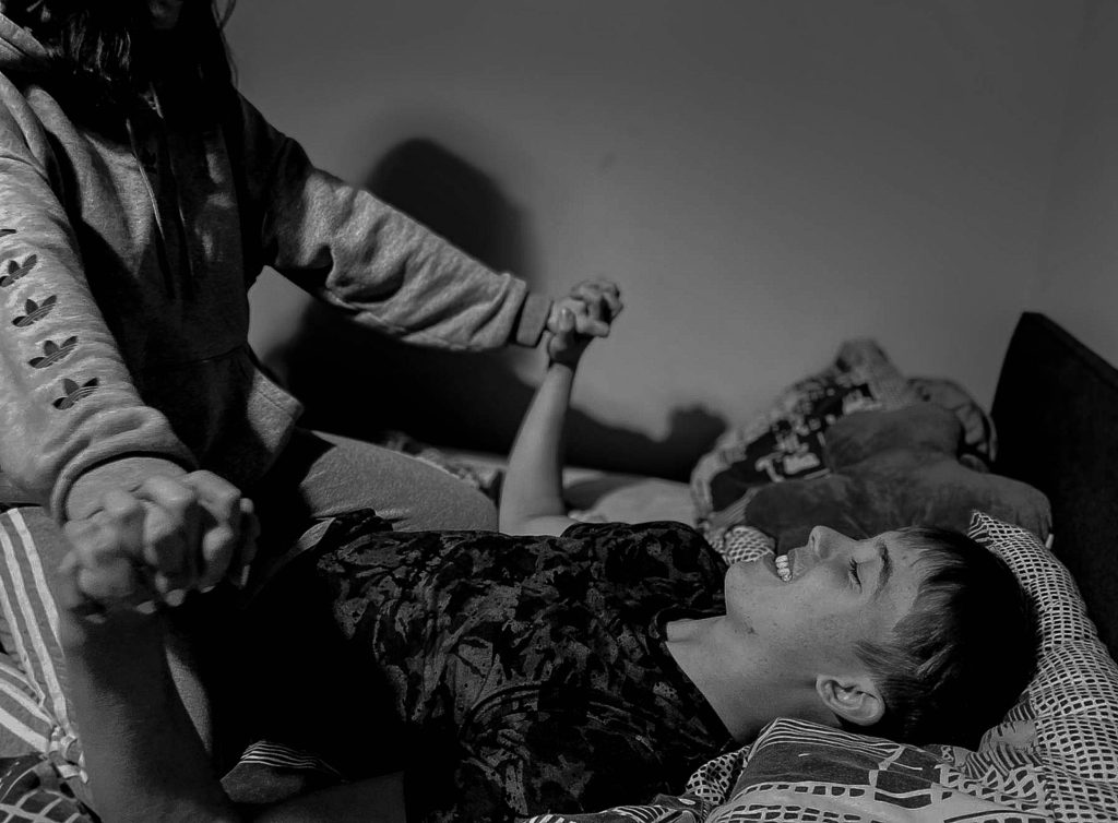
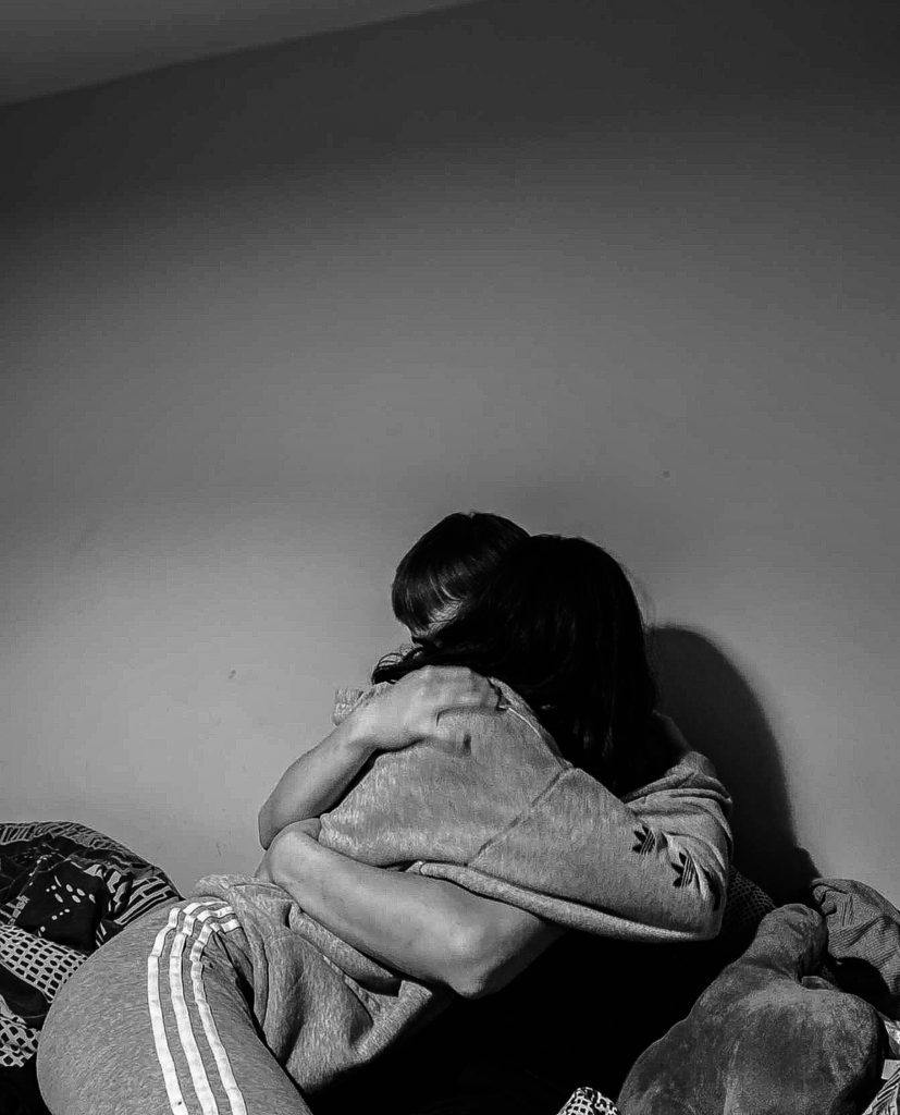
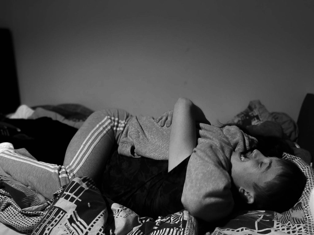
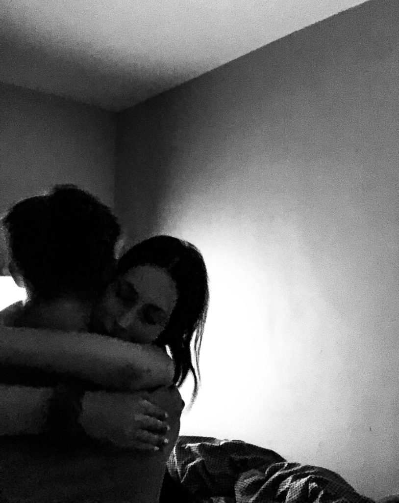
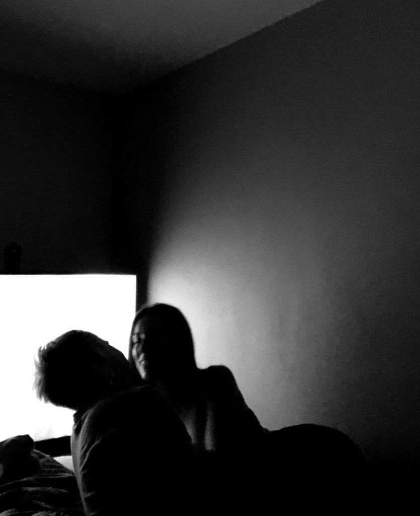
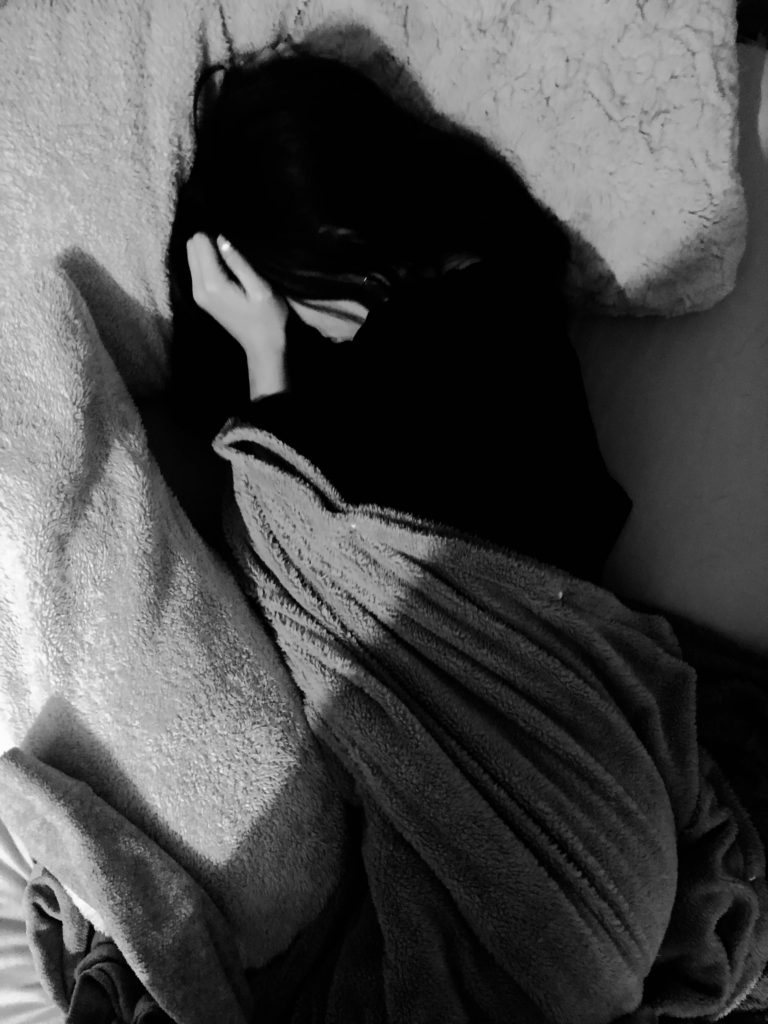
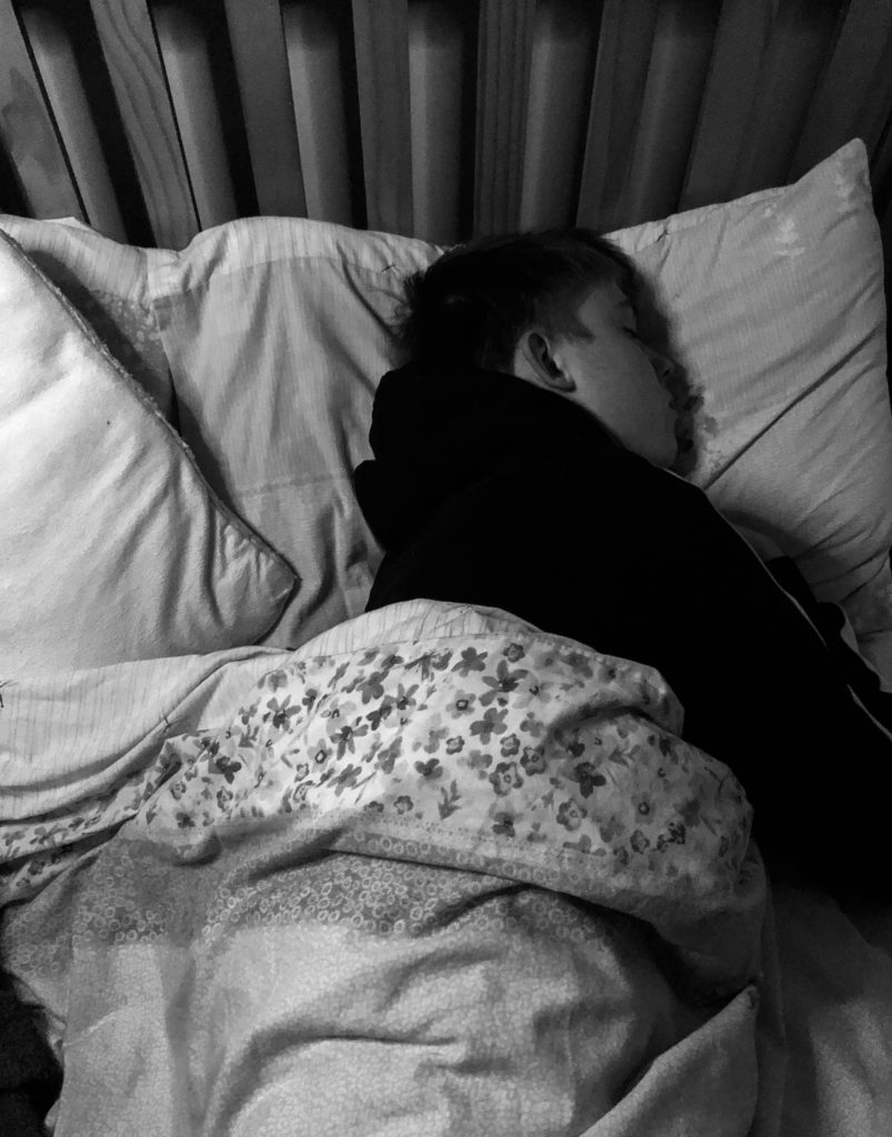
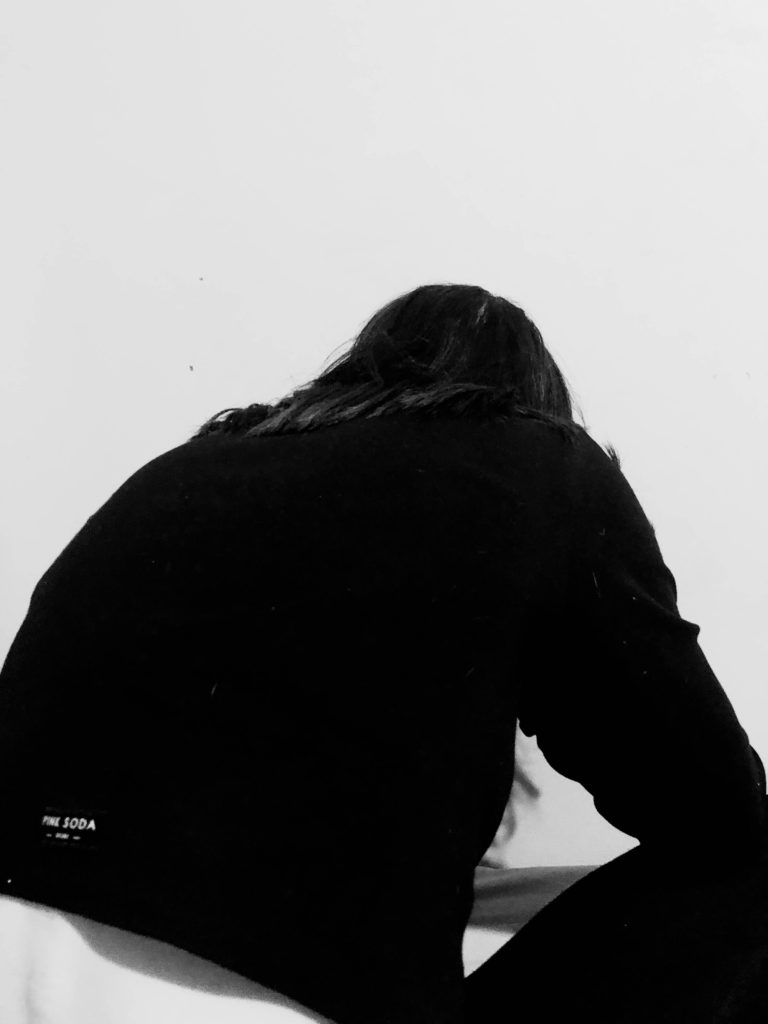
So, just to restate I changed my plan for this photo shoot in order it to fit yet juxtapose with my narrative. These are images of me and my partner in some of our happiest moments and saddest moments that will contrast with each other in order to create my sense of narrative.
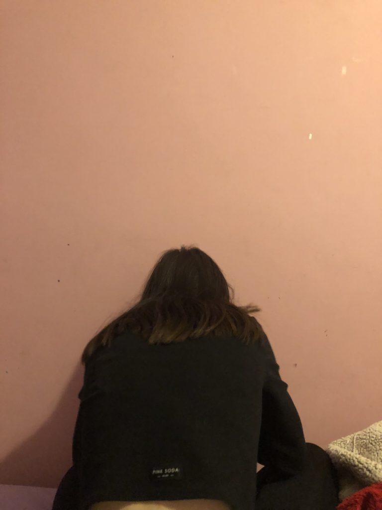
One thing that I would change about the images is the framing. I found it quite difficult, considering I was taking the photos without a tripod and with a timer, to frame the images well because often, I couldn’t see what I was photographing; it was almost a hit and miss when it came to framing. So, in some images there are fragments that I wish were not in the frame to make the image more aesthetically pleasing. However, considering it was quite difficult, I do also think I did well.
In addition to framing I feel as though there was more that I could’ve done concerning the background; in some images the background was quite cluttered and for me this takes away the aesthetics of an image. I wish I I had done something about that when photographing.
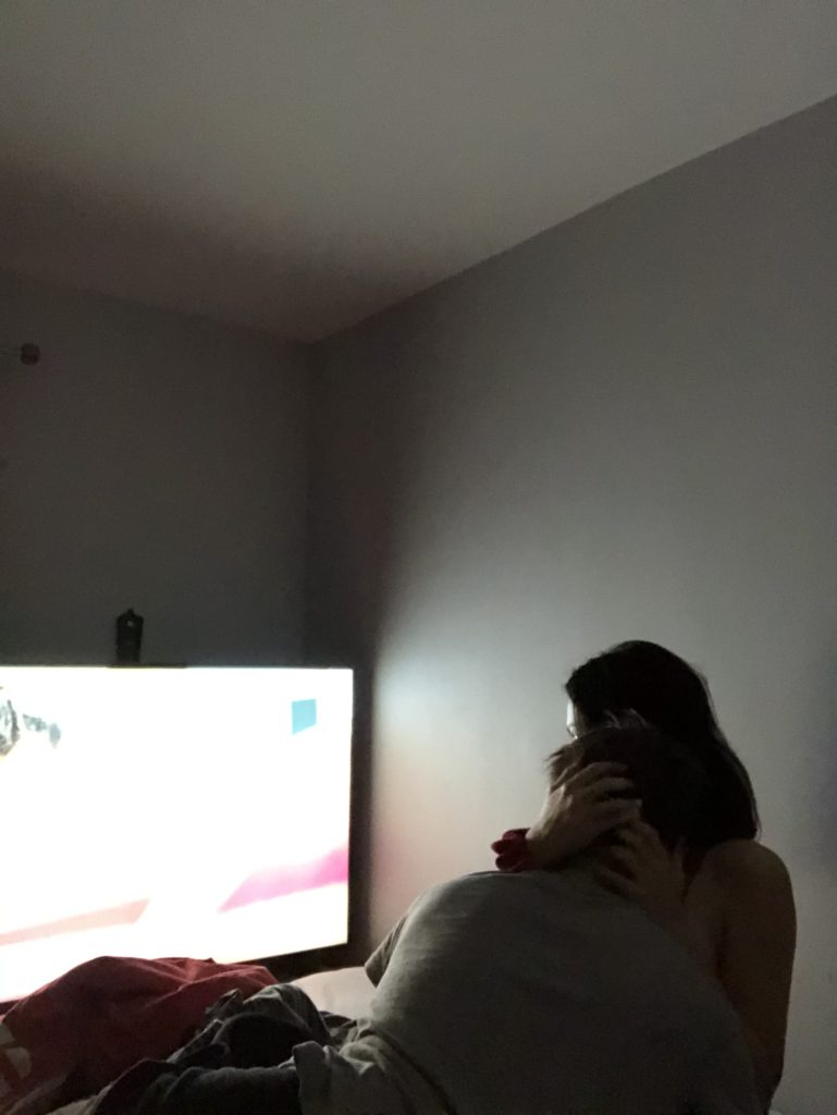
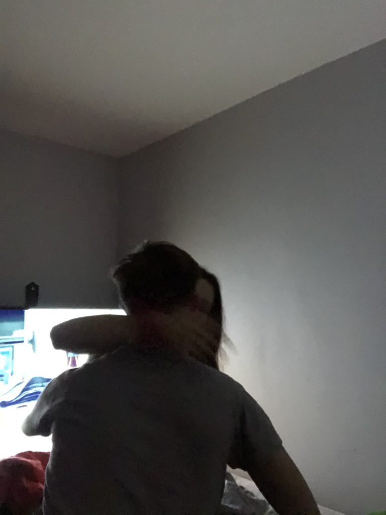
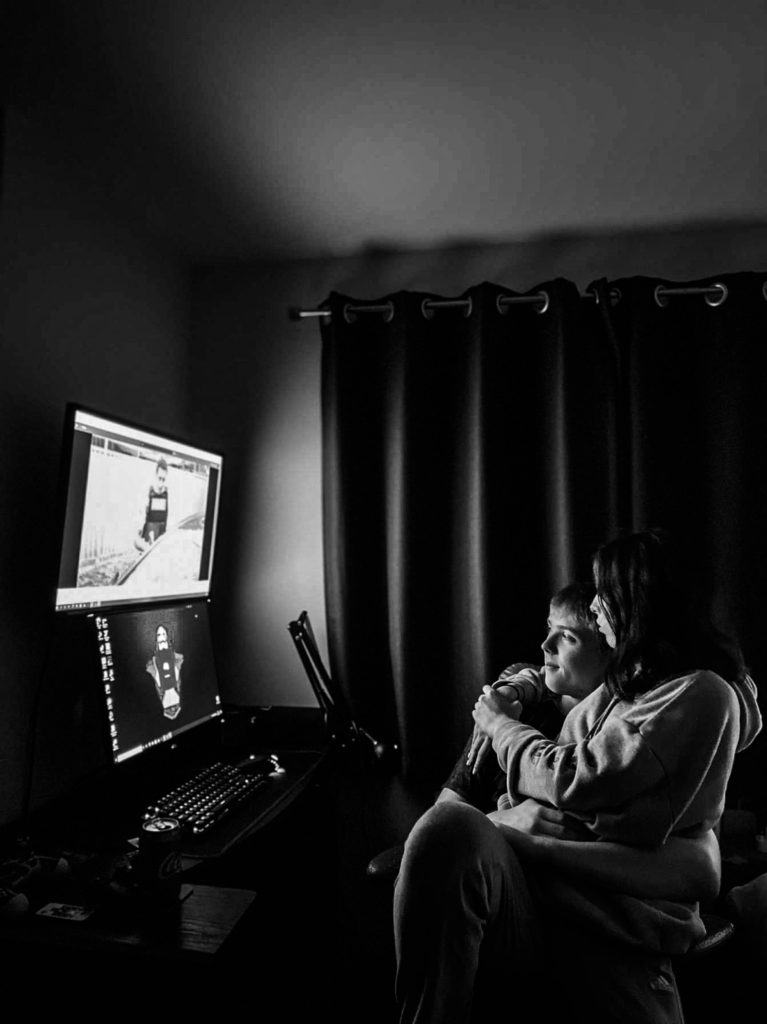
Another thing that I wish I would’ve focused on more is the lighting. One image that I loved was the image with me and my partner in front of his computer as there is a nice glow that lights up the room. However in other images, there was a harsh artificial light right above us that I don’t think compliments the images very well. The atmosphere is quite bland and I feel as though there could’ve been more depth and manipulation when it came to lighting. The lighting also affected the quality of the images. For example, in the last image the lighting was very dark which therefore affected the camera ability to pick up me and my partners outline. Therefore it made the images quite grainy and unfortunately lacked in quality, however this could add to the tone potentially.
Another thing I lover about the final images is my editing. In some images, the lighting made the quality of the images grainy, however, turning the images into black and white almost concealed the low quality and almost increased the atmosphere of the images. Also, editing the highlights, exposure and contrast also turned the low quality images into silhouettes which added to the tone beautifully in my opinion. This is why I feel as though my editing of my images was a good aspect of this process.