
Case Study
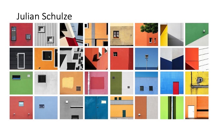
Julian Schulze is a german photographer who takes a lot of abstract and surreal photos. He states that he is ‘always on the go to find inspiring architecture’ . His style of photography is very unique. He looks for interesting architecture that encompass a lot of colour. His images are also often symmetrical and feature geometric shapes, many of his photos are shot in a deadpan style and feature a windows in many pictures. He likes to travel and be constantly travelling, documenting what he sees and the way he views it. Looking at his work, you can instantly see that there is a lot of colour, pretty much all his images are vibant and include one, two or three colours. He doesn’t overdo his photos by using loads of colours.
Analaysis
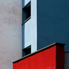
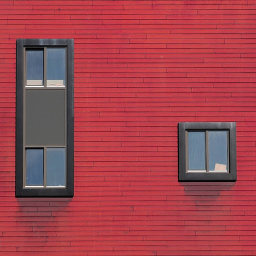
NATURAL vs MAN MADE: both images encompass man made objects as they are architectural images of buildings. There is no natural elements to either of the images.
REPETITION/RHYTHM: None of the images show much repetition apart from the right image which has repetition of the redbricks.
DEPTH: The image on the left shows a lot more depth than the right image. The image on the right was taken in a deadpan style which means straight on, because it is a picture of a wall which is flat the image feels very shallow, also nomatter what aperture is used (apart from a tiltshift lens), the whole image would remain infocus because everything in the image is the same distance from the sensor. The image in the left show depth as it shows 3dimensions, it has parts of the building from different anlges to show depth. The image was also taken using a small aperture as everything in the image is in focus.
TONE: tone refers to the values of light and dark areas in the image, the left image has a lot more contrast meaning that there are very dark areas and very light areas. The right image has a lot less contrast.
LIGHT: The lighting in the right image is much softer than the lighting in the right image. I can tell this because there are soft fading shadows underneath the windowsills in the right image, whereas in the left image has hard shadows cast from the other buildings. This means that the left image was taken in the middle of the day with less clouds and harsh sun light, and the right image was taken on an overcast day with more diffused light.
LINE: The left image has more lines going in different directions, the lines from the building lead my eyes to the window at the top. The right images has different lines because there isn’t much depth, but there are lines in the bricks.
FRAMING/CROPPING: the framing in both images have been thought about and framed to a certain desire. The right image is very symmetrical and has been framed to give equal room either side of each window. The left image has been framed to look almost like a 3d axis.