Task 2: Response

Shoot Plan

WHERE: I have a light box which i can use to get even lighting all around the image, this will help me to be able to control the shadows and the highlights therefore controlling the overall tone. Therefore I can do it anywhere in my house.

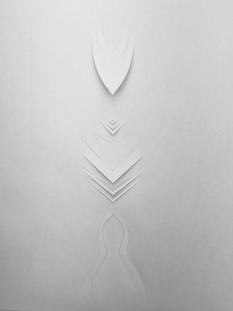
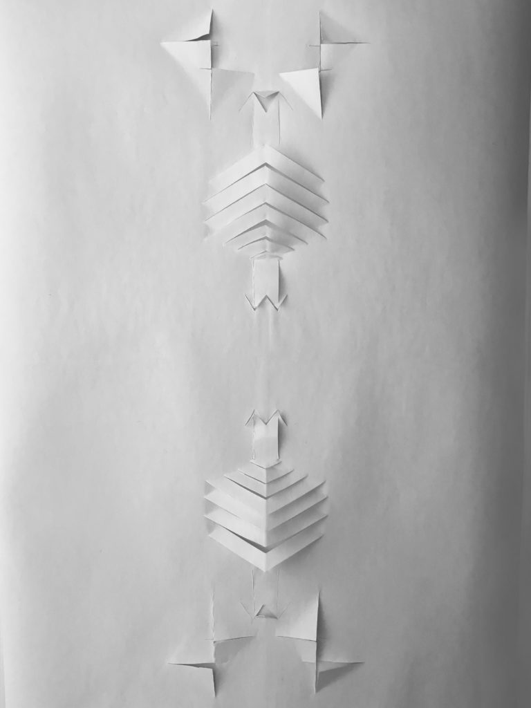
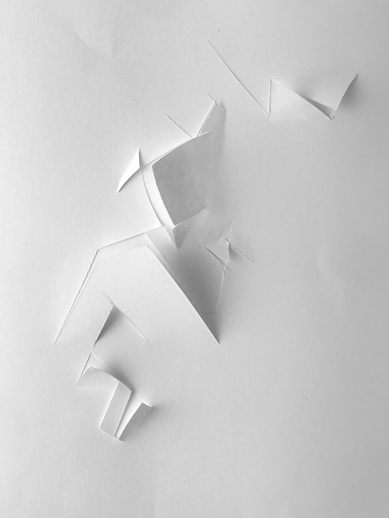
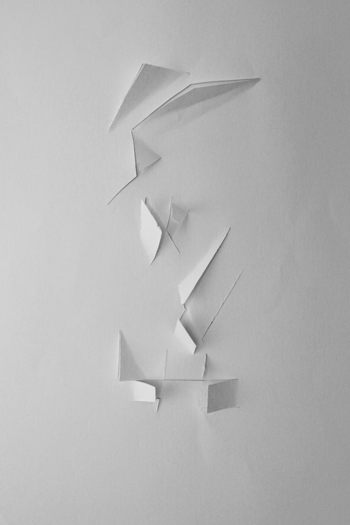
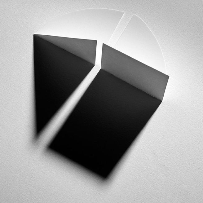
WHAT: I am going to be creating my own series inspired by Vjeko Sager’s ‘Antimatter’ series. It features raised and lowered sections of cut out paper.I want my series to have meaning and have some sort of story to each creation which will make it more interesting.

HOW: I am going to use either thick paper or white card as the card might fold better. I will cut slices in the paper so I can fold bits to create a sort of architectural look structure. I will use my lightbox for even lighting and take the photo from straight above. I will just use the kit lens as it has the widest focal length which will be helpful as there is not much room in the lightbox.

WHEN: I can do it at anytime as the lightbox has its own light.

Contact Sheet

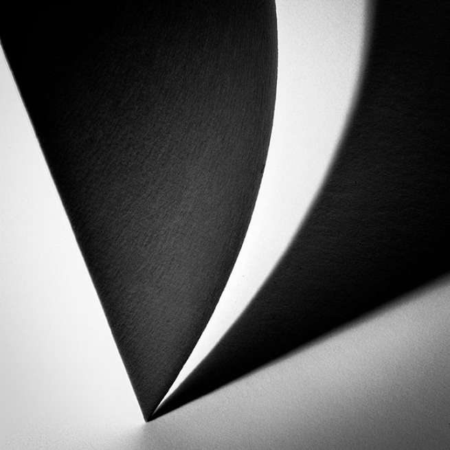
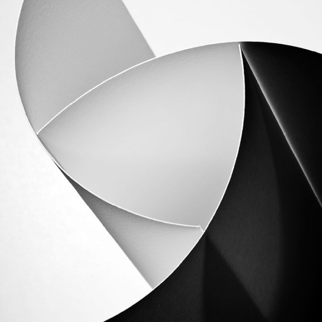
I am happy with my photoshoot. I used my lightbox so I could easily control the lighting and shadows, it allowed me to also get soft shadows rather than harsh lighting. I flagged the images I were good so I could filter out all the other images so I could just edit the good ones. I wasn’t to bothered about the colours as I could change the white balance in lightroom and I would make the images black and white anyway.

Edit Process

Edits

Evaluation / Compare
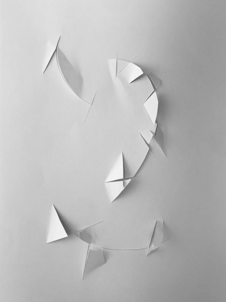
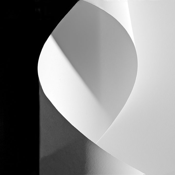
This was my best outcome because it most accurately resembles the style of Vjeko Sager. This photo that I took looks more like an architectural structure than a sliced up piece of paper. It also capture light and tone well. The other images also capture light and tone but this image looks the best. There is a nice equal balance between the shadows and the highlights. However, to make my images look less like paper and more like a structure, sharper cleaner lines would need to be cut and possibly a different lighting set up. Overall, I am happy with these outcomes, they look good and resemble the style of Sage and explore light and tone.

Task 2: Vjeko Sager

Case Study

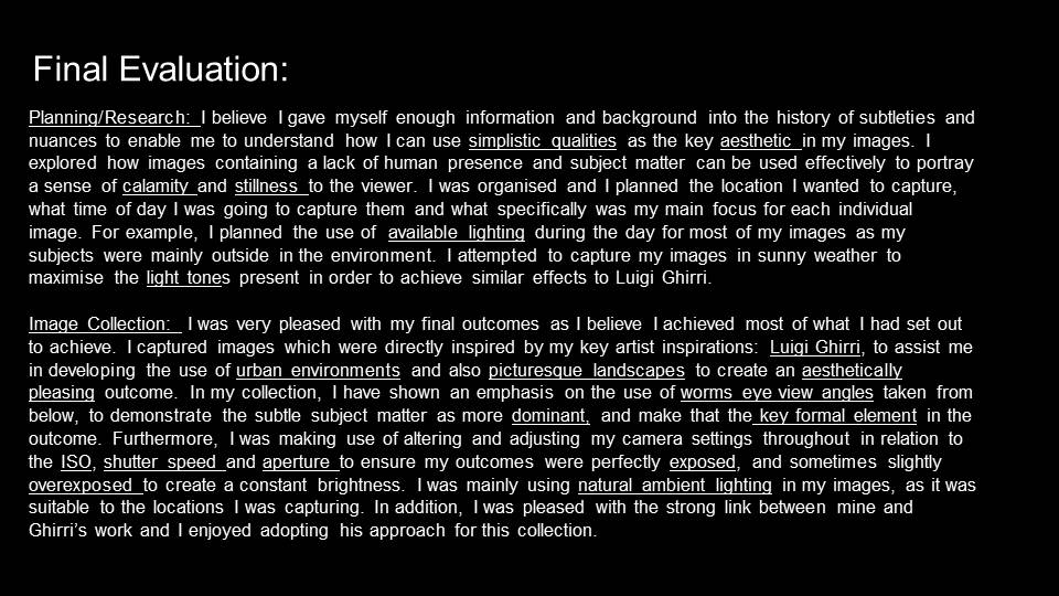
VJeko Sager is a current contemporary artist who experiments with an architectural style. He is also a philosopher, educator and curator. In this series called ‘Antimatter’ he creates shapes by cutting paper to raise levels and lower levels. He likes to push the boundaries of what we think we know. He doesn’t take simple solutions as answers and believes that society has become numb to the complexity of reality. His work has achieved awards and has been exhibited all over the world. Because of his philosophy and style of work, he has been described as an architect of the mind.
Analysis

Abstract Forms

Visual

Looking at this image it doesn’t look like cut paper at first glance. To me it looks like cracks in the ground and like something is trying to break through from beneath. When I look at this image there is not much depth, it shows some depth by taking what was a completely 2d looking image and adding depth to make it look 3d by cutting pieces of the paper to make structures. This image is also very minimal, not a lot is happening and from a distance it almost looks like a blank page, I like the simplicity behind the image and then the thought out placement of the ‘cracks’.

Technical

In this image, the light and tone has been explored by cutting the paper and lifting or pushing down bits. By doing this, shadows are created. Tone is about the values of light and dark that make up an image, in this image the is a vignette meaning there are dark areas around the image and in the corners, this suggests that a light was point straight down. I think an on camera flash may have been used as you can often get a vignette when using a camera flash, also the fact that there are no shadows from where the camera would have been. Overall, the image is very bright in tone and has a lot more white and highlights rather than dark areas. It obviously lacks colour so the image is made interesting by the use of the shadows.

Concept / Context

Vjeko Sager likes to push the boundaries of knowability. Tis image is part of a series called ‘Antimatter’ they look like things are breaking through the surface. With this image I like the placement of the ‘cracks’ on the page as it looks like cracks from roots or perhaps a mole. The way there are big cracks make it look like where something started then went back under and tried again further up. Sager also believes that culture is being numbed of how complex reality really is, this may be why he has made this series as he has taken paper which is usually always overlooked for what we think it is but then he creates it into something we had never even considered.

FORMALISM Vs ABSTRACTION

AbstractFormalism, is the concept that a work’s artistic value is entirely determined by its form. To understand formalism, you have to know what form is. Form is the shape of something, and the visual aspects that come together to make that shape. It’s purely visual aspects.

Formalism emphasizes compositional elements such as color, line, shape and texture rather than realism, context, and content. In visual art, formalism is a concept that suggests that everything necessary to comprehending a work of art is contained within the work of art. The context for the work, including the reason for its creation, the historical background, and the life of the artist, is considered to be of less importance. Formalism is an approach to understanding art.

Abstract photography, sometimes called non-objective, experimental, conceptual or concrete photography, is a means of depicting a visual image that does not have an immediate association with the object world and that has been created through the use of photographic equipment, processes or materials.

Exploring Tone with Jerry Reed

Tone= The range of lightest to darkest parts of an image as a whole or the particular area in an image.

Jerry Reed

Jerry Reed is an English, abstract photographer, predominantly known for his three-year project titled ‘Paper Work’. In his project, Reed explores light and tone, focusing on the heavy contrast caused by shadows, resulting in a bold, two-toned effect in his images.

The series is based on paper sculptures carefully designed and created by Reed, which explore the spatial relationships between the architectural forms he’s created. Many of his projects began conceptually, “like Sol LeWitt” he states.

LeWitt was an American artist who helped to establish Conceptualism and Minimalism in the postwar era. LeWitt’s work presents geometric shapes, a clear element within Reed’s pieces.

Reed directly cites both Rössler and Bruguière as heavy influences towards his work. His work can be described as objective and analytic, possibly reflecting his past career as a scientist.

The work Reed presents is majorly conceptual. He believes his work ‘speaks indirectly, but with continued caring about how society’s institutions affect its members.’. The effect of light within his ‘Paper Work’ series clearly reflects this. He incorporates the imaginative use of Fresnel lighting (usually found in theatres) to provide a powerful and linear light source to illuminate certain parts of his structures and completely blackout others.

Photo Analysis

Jerry Reed- Paper Work

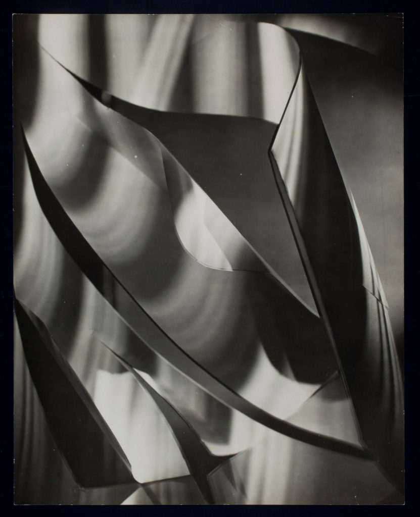
The lighting within the image is artificial, possibly taken in a studio. A strong source of light illuminates the right side of the paper, creating dark, heavy shadows as the paper blocks the light from travelling any further.

Reed incorporates line and tone within the photo. The curve of the paper creates curved, overlapping lines guide the eye around the centre of the image. Soft shadows form an almost parallel line with the curve of the paper.

His image has a low tonal range (three or four main tones) which creates a highly contrasting image. The lightest tones are in the centre of the image and to the right. The light tones take up the majority of the image, possibly inferring the power of societal institutions over its members. The darkest tones are apparent in the shadows behind the paper (pictured to the left), continuing with the allegory of society it may represent how people’s individuality is ‘overshadowed’ by these institutions or societal norms, influencing the behaviour of individuals away from how they might usually act.

The subject of the image itself (white paper pictured centre) splits the image into thirds. Negative space on the left and right third of the image creates a strong contrast in the image. Sharp corners in the paper subject make the shapes within the image almost geometrical, yet the lack of straight lines (the curve of the paper) creates more organic shapes, which juxtapose the sharpness of the angles created by overlapping paper.

Task 2: WHITE PAPER | Light and Tone

Exploring Light and Tone

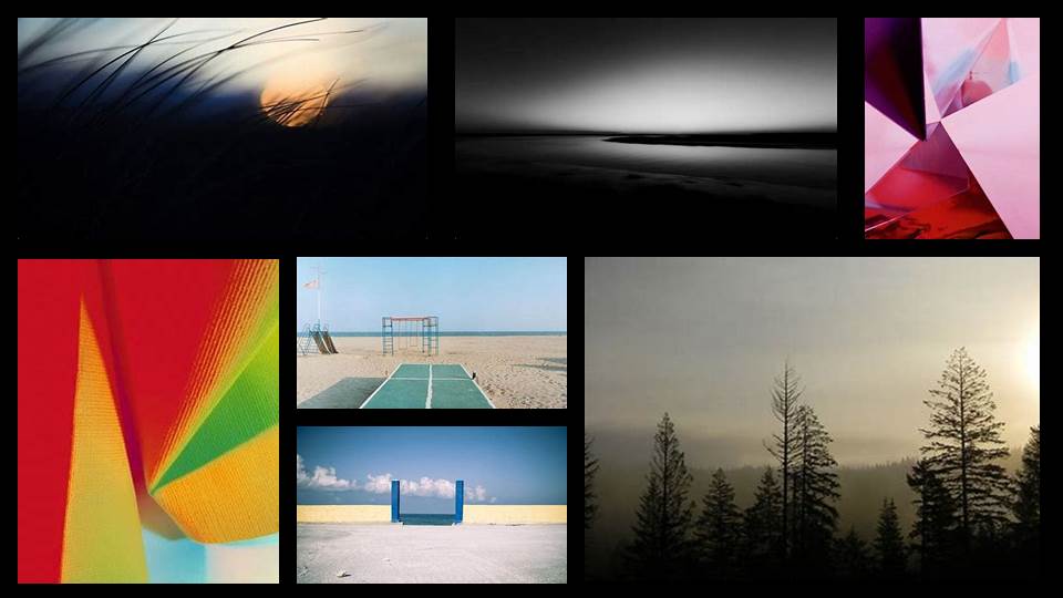
Tone in the context of art is the light and dark or highlights and shadows values in a scenario that render a realistic object. Exploring light and tone is about the shadows cast from positioning lights or objects in different positions. Looking at this mood board, the artists and photographers are playing with the light and dark to create interesting compositions. They are abstract because they are photographing real things, in this case the paper but it doesn’t look like anything we naturally see.

INTRODUCTION TO ABSTRACTION V FORMALISM

Abstract Portfolio

Abstract photography is a non-objective, experimental form of photography, which can be perceived as being either conceptual or concrete. Abstraction is a means of depicting a visual image that does not have an immediate association with the object world and that has been created through the use of photographic equipment, processes or materials according to Wikipedia. Abstract art has its origins in the 19th century. The period characterized by so vast a body of elaborately representational art produced for the sake of illustrating anecdote also produced a number of painters who examined the mechanism of light and visual perception.

On the other hand, formalism is the study of art based solely on an analysis of its form, essentially looking at the way it is made and what it looks like. Formalism dominated the development of modern art and photogrpahy until the 1960s when it reached its peak.

During this upcoming project, I will explore different aspects of abstract/formalist photography, researching different artists and recreating their work.

The Formal Elements- Photoshoot

Plan:

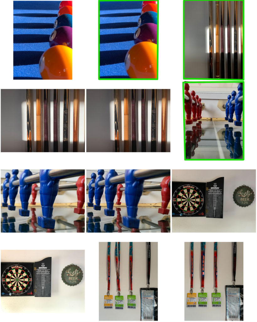
For my personal response to Albert Renger-Patzsch and the New Objectivity, I’m aiming to photograph Natural and Man-made items/areas. Additionally focusing on formal elements (Light, Tone, Line, Shape, Form, etc)

I’m striving to capture objects and areas in a new perspective, in order to allow the viewers to appreciate the beauty of things they encounter daily. My reasoning for this is because Renger-Patzch aimed to photograph the beautiful complexity of the modern world we live in.

Photoshoot:

Editing process

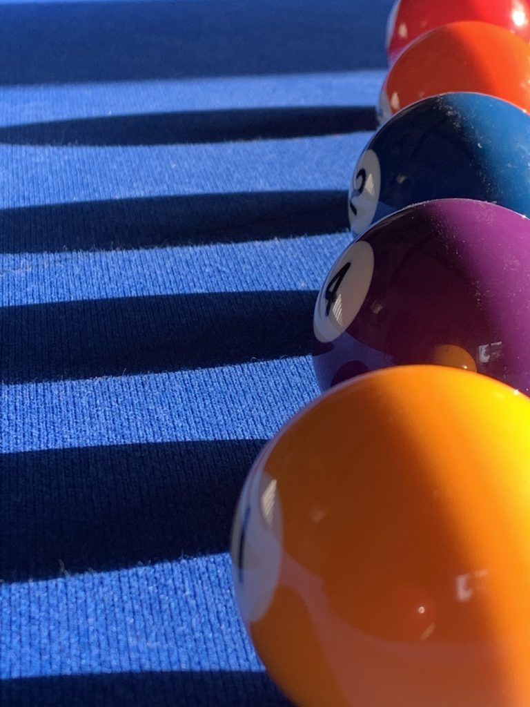
1-

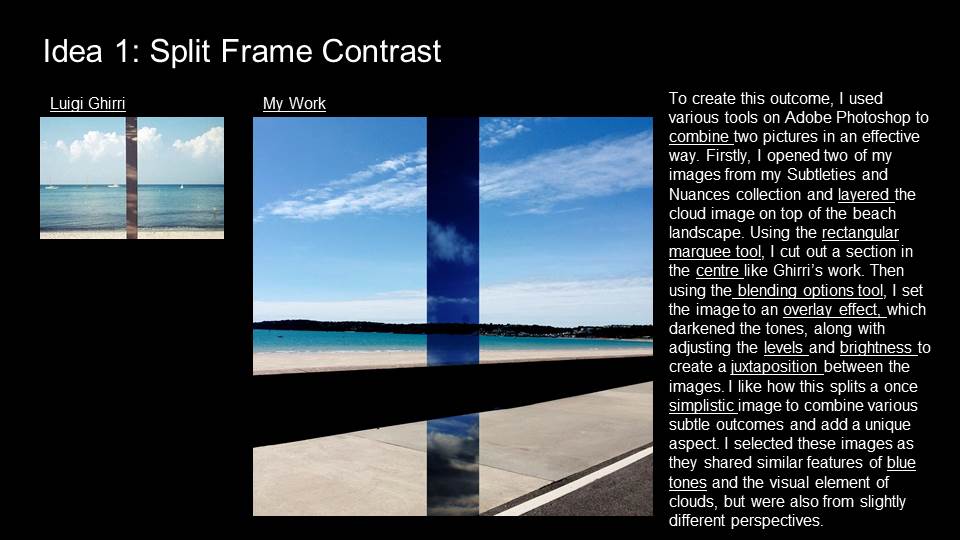
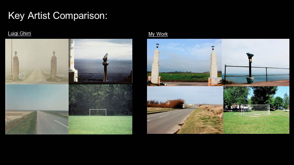
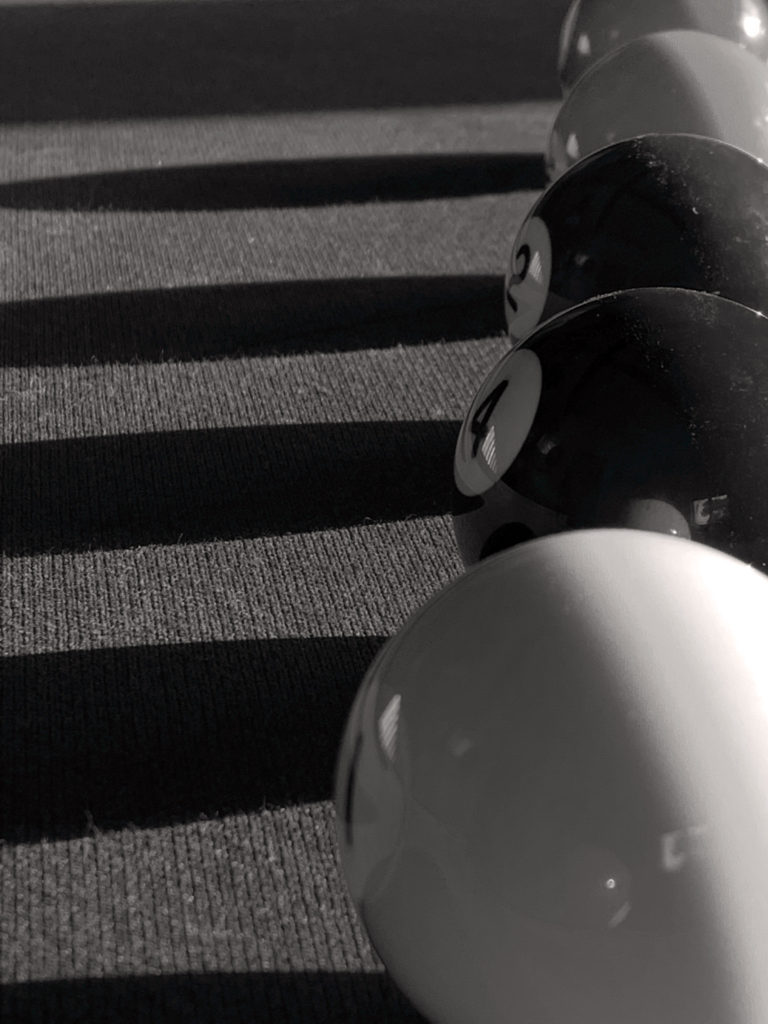
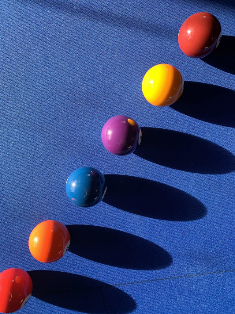
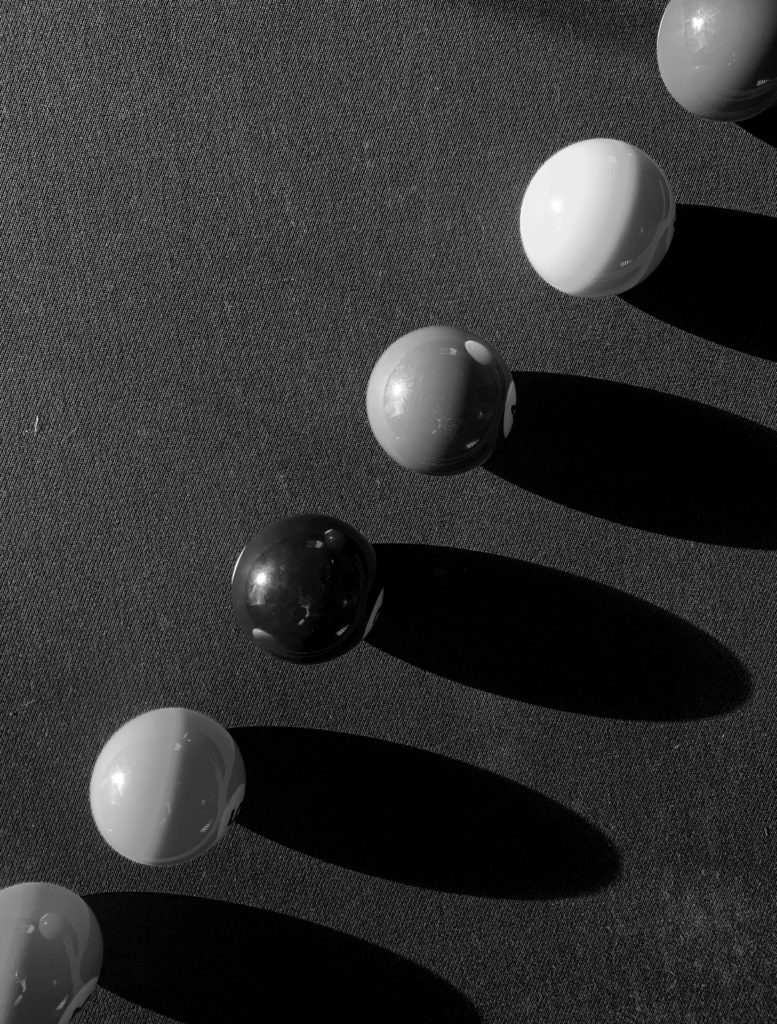
When taking this image I considered how it would convert into black and white. I chose vibrant colours, focusing on the two types of shadows created, with the darker shadows being free-form and the lighter shadows (on the balls) being geometrical- both are repetitive.

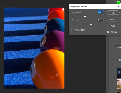
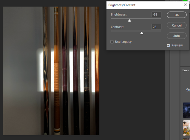
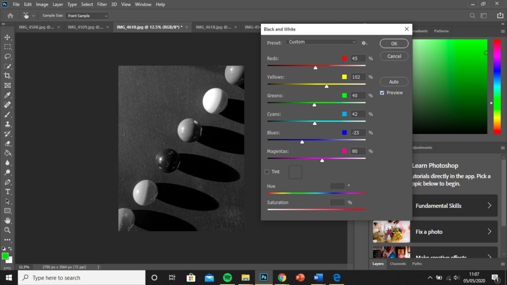
As I was converting the photo into black and white (to mirror the work of Alfred Renger-Patzsch), I wanted to focus primarily on creating a highly tonal and contrasting image. I started by decreasing brightness and increasing contrast within Photoshop to make each of the colours more striking. The more vibrant the colours were before conversion, the easier it was to create contrast.

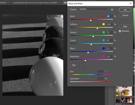
Using the black and white tool, I made the yellow-toned ball the lightest and chose to make the balls with red tones (orange and red balls) lighter than the blue and purple ones depicted in the middle third. This allowed me to make a focal point in the centre of there image as a place for the eye to return to each time.

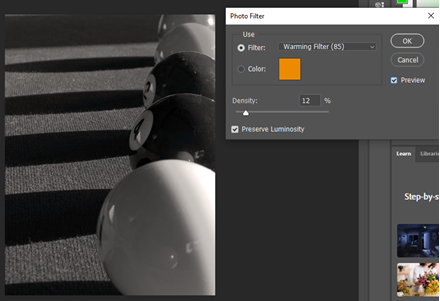
I finally used an orange, warming, photo filter at 12% to reduce the extreme cold and harshness of the image. The change is subtle but results in an image that’s much easier on the eye.

2-

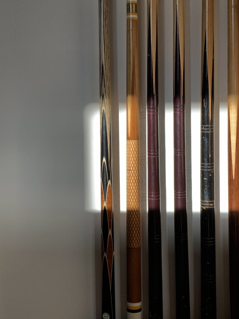
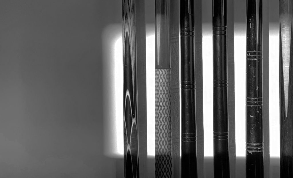
With this particular image, I aimed at focusing on the framing effect of the lighting. I decreased the brightness to amplify the current contrast between the natural lighting and the wall surrounding. It also created darker tones on the cues outside the ‘box’ of light. This allowed me to make the sections of the cues lighter where the light hits them- increasing the contrast in the image.

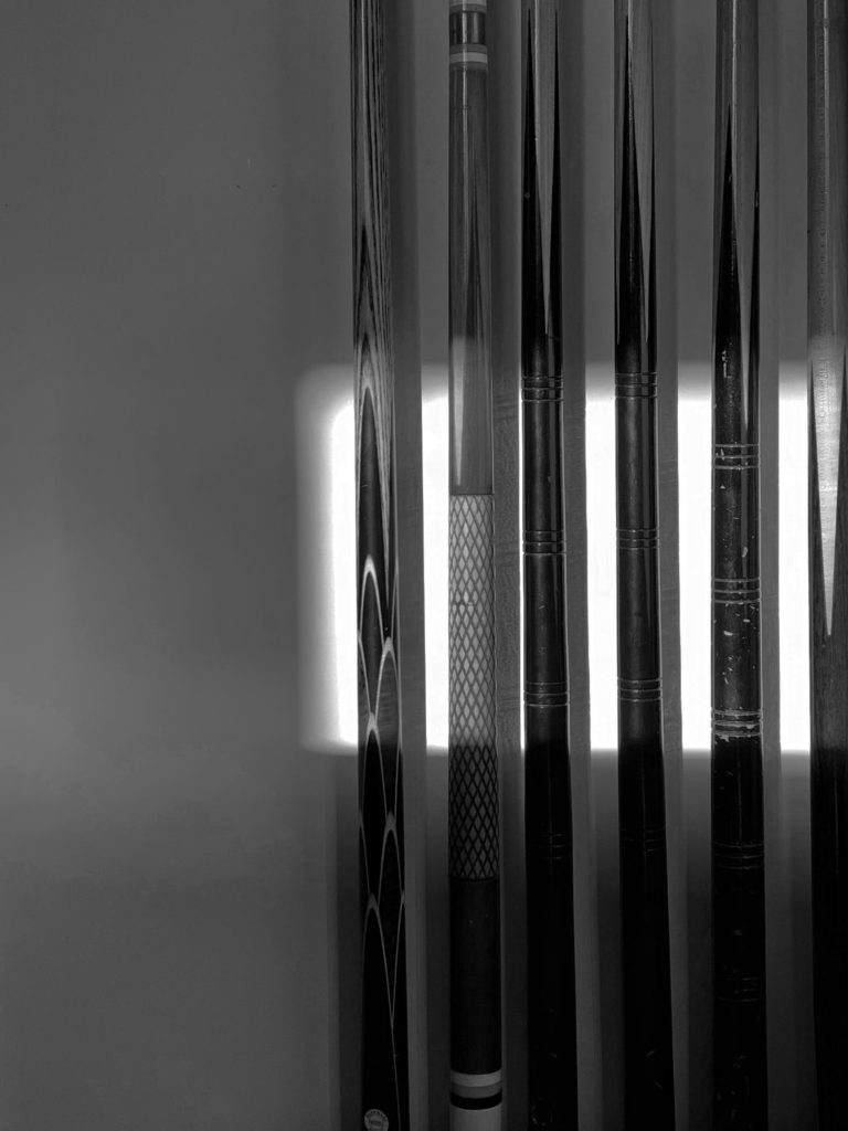
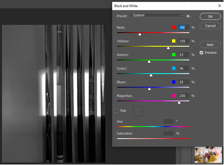
As the photo is a response to Renger-Patzsch, I converted it to black and white, focusing on the contrast outside of the box as well as within the box. I made the yellow tones (browns in the cues) and the magenta tones (reflection in the centre two cues) the lightest. This made the different textures and patterns more noticeable.

I also experimented with cropping, with the final outcome pictured below.

Cropping the image allowed for a more refined focus on the detailing of the pool cues. It also amplifies the effect of the negative space to the left of the cues. The natural lighting acts as a sort of ‘spotlight’ on the subject, additionally creating a highly tonal and contrasting image.

3-

I began by cropping the image, to ensure the frame started where the lineup of pool balls began. This gives a sense of perpetuity. It also allowed me to line them up in a complete diagonal.

The conversion to black and white created an image with a large tonal range. The positioning of the shadows can be interpreted in two ways: attached to the ball or belonging to the ball above. The second interpretation creates an abstract image, with the illusion of ‘floating’ balls.

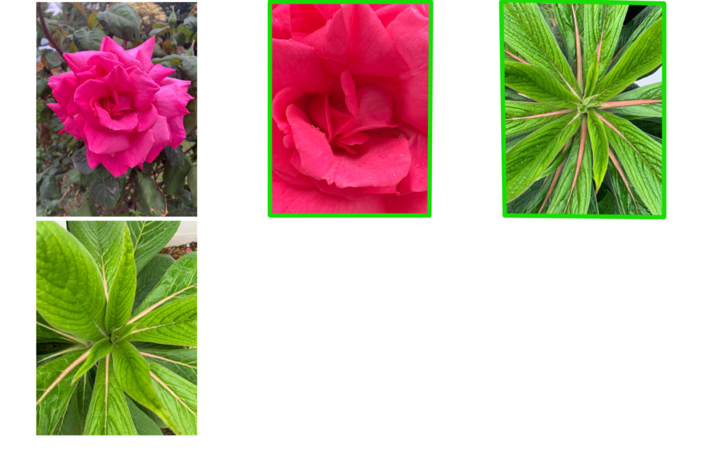
4-

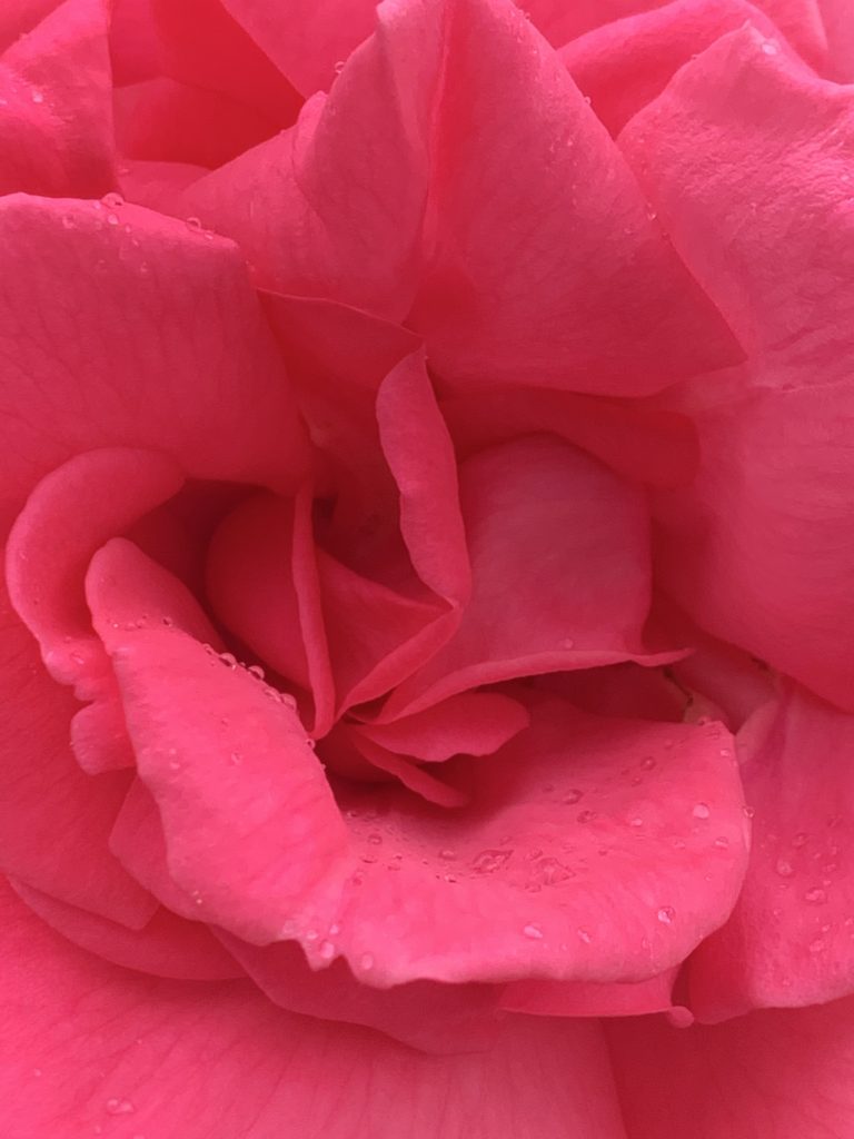
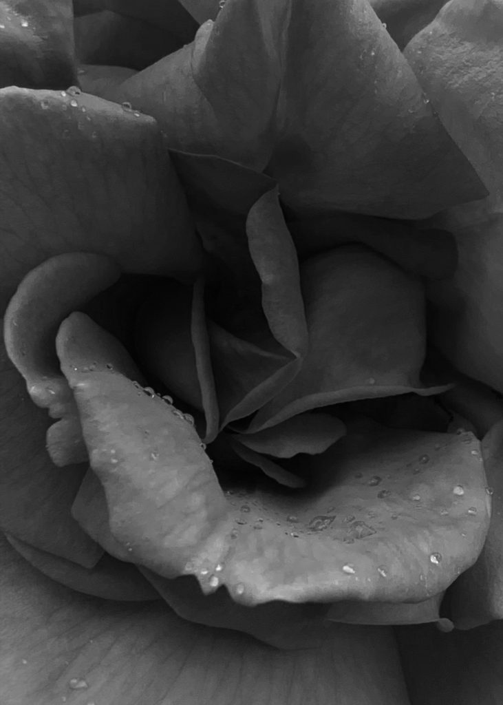
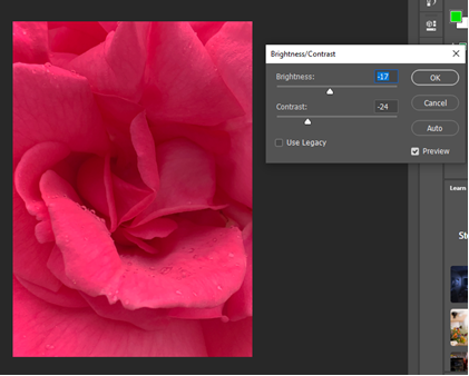
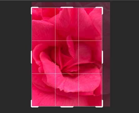
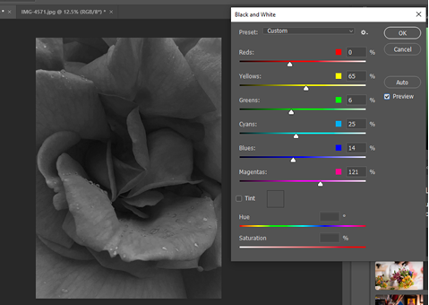
I began the editing process by using the crop tool to line the middle of the rose in the middle of the frame. I then decreased the brightness and contrast to isolate the petals. This was in preparation for the conversion to black and white.

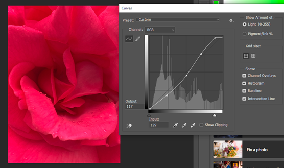
Having done this, I then used the curve tool in Photoshop to increase the vibrance as well as increase the shadows within the image. I converted the photo to black and white, increasing the darkness of red tones to amplify the shadows and increased the lightness of magenta tones to create a large tonal range.

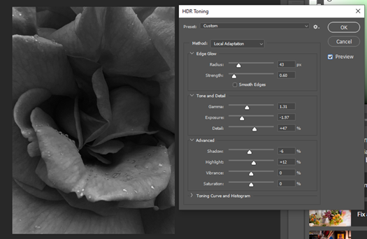
As a final step, I used HDR toning to increase the luminosity and clarity of the image. I heightened the detail to produce a more crisp image. As well as this, I increased the highlights to provide more contrast and increase the tonal range. It also aided in creating more depth within the image.

Final Outcomes:

Task 1: Response

Shoot Plan

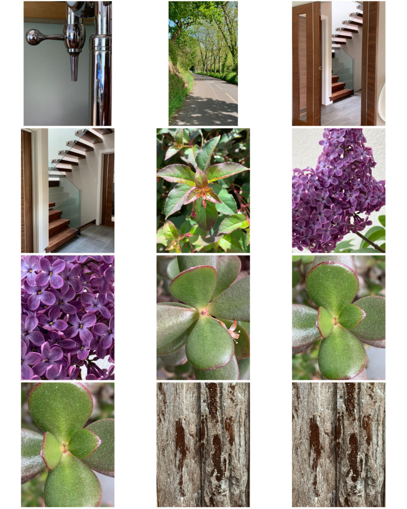
WHERE: I am going to go for a walk around the lanes near my house looking for patterns or interesting form in trees, flowers or building. I will also look for things in my house that may look different or a combination of things that look similar or interesting.

WHAT: This shoot is about trying to find interesting formations, or patterns in either natural forms or man made, like in the example I analysed there can be similarities in both. I am trying to find things that may usually be overlooked that can show a different perspective or show something that wouldn’t usually be explored in detail.

HOW: The only thing I will need on this shoot will be my camera with the kit lens as it can get a wider shot. I will also bring my 50mm 1.8 lens if i want to get a bit tighter in, or possibly get some more macro shots. I will primarily use a small aperture to get everything in focus and a fast shutter speed to have everything sharp. For indoor shots, I may use artificial light.

WHEN: Some point on an overcast day when there is plenty of light because it means of the day will be best because it will give a even soft light instead of harsh light like on a bright sunny day.

SHOOT 1: Contact Sheet

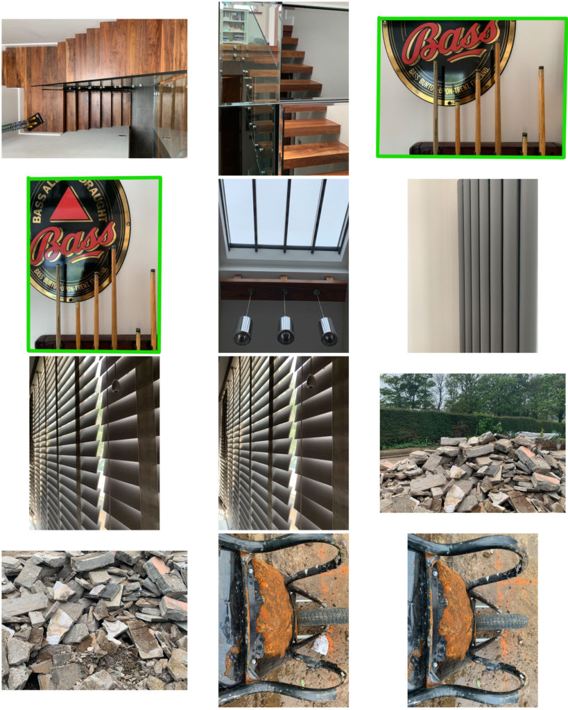
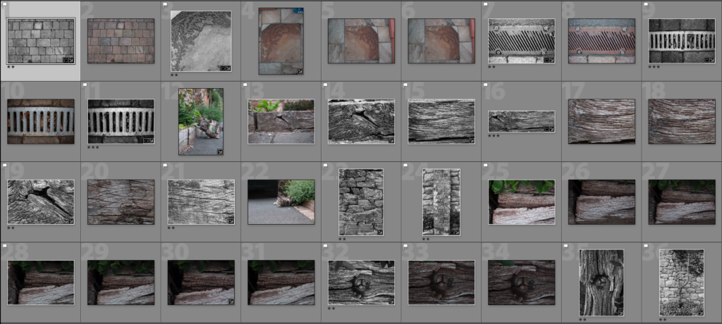
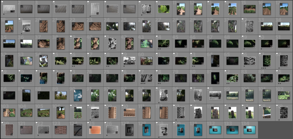
I walked around my yard and looked for patterns, I like the splits and knots in the wood sleepers. I also looked for man made formations. The Flagged photos are the good ones, the unflagged pictures are not wanted and the stared images are ones I have edited and exported.

SHOOT 1: Edits

SHOOT 2: Contact Sheet

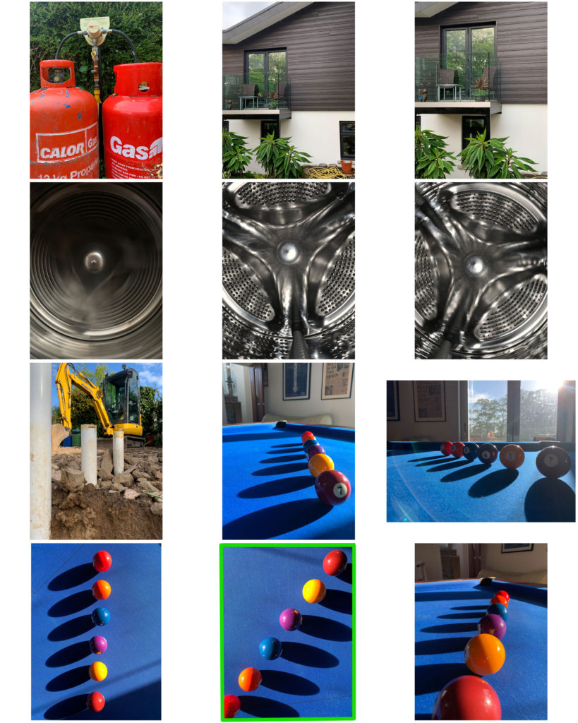
This time I walked around the lanes near my house, I was still looking for patterns in both nature and man produced. First I went through all the photos and pressed P on the keyboard to flag the good photos, this would eliminate the out of focus images or porley framed ones. Next I went through and started to make edits, I could then copy the settings and paste them on the flagged images. Once I had made micro adjustments to the photos I stared the ones I liked so I could then only bring up the ones I wanted and then export the stared ones.

SHOOT 2: Edits

Edit Process

Evaluation / Compare