Case Study
Luigi Ghirri was born in Scandiano, Italy 5th January 1943 and was an artist and photographer. His work gained a reputation around the world with a unique style and he became regarded as a pioneer of ‘contemporary photography and showing the relationship between reality and fiction. His work has been featured in numerous exhibitions and can be seen in museums around the world. He stated his career in the 70’s and published his his first series ‘Atlante’ in 1973. This series contained images from a geographical atlas and was trying to see a new perspective of landscapes. ‘Kodachrome’ was his second series from 1978 and feature cropped images of landscapes in a deadpan state which was meant to show little emotion. The photographs that I am studying for this task are from the series ‘Kodachrome’.

Analysis

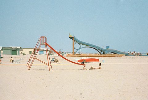
VISUAL: At first glance this image has a lot of colour, the red slide, blue sky, yellow sand, green building and many other small accents of colour. The focal point of the image is the red slide as it is the closest object to the lens and the shape of it leads my eyes to the top of the slide. The image is nicely exposed and there are not many harsh shadows. The images have a green tint to them but the colours are still vibrant.
TECHNICAL: This image was taken on film, this is evident because of the grain that can bee seen in the image. On digital cameras ‘noise’ or ‘grain’ can only be seen when the ISO is high which is only usually in low light situations. Also the image looks quite ‘flat’ by this I mean there is not a lot of contrast between the highlight, whites and shadows, blacks. Film often had this look where the whites are quite washed out and grey and the blacks looked quite raised. I imagine medium to fast shutter speed was used as the image is sharp and the photo was taken in the middle of the day when the sun is very bright so a fast shutter would have been needed. A small aperture was used as the whole picture is in focus.
CONTEXT/CONCEPT: This image along with most of the other images in the series uses a deadpan technique. Ghirri did this to make the images seem like they have no emotion. A deadpan technique is when the subject or landscape is taken from a straight on view, for example it looks like this image was taken at 90 degrees to the sea and so is straight on against the slides. Luigi’s use of this technique and hues of the image create a subtle emotional vibe from the images. The images can be described as having ‘a meticulously rich way of viewing the world’.
