Shoot Plan:
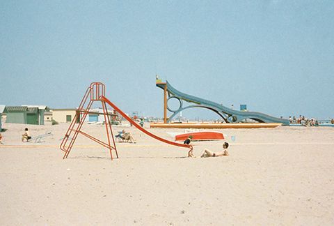
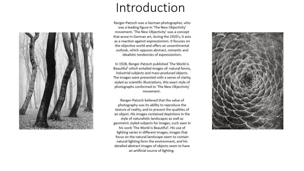
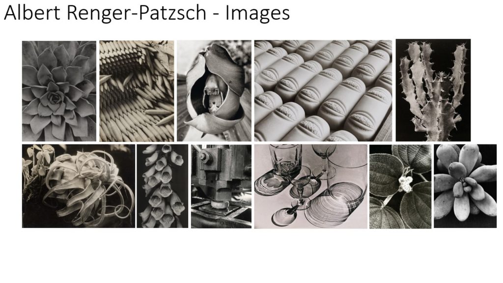
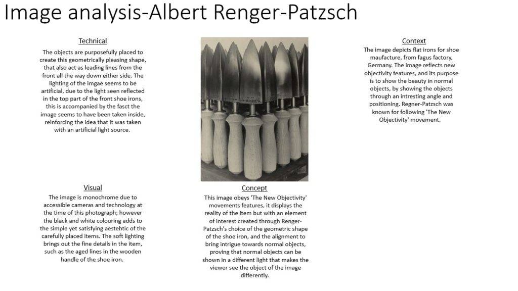
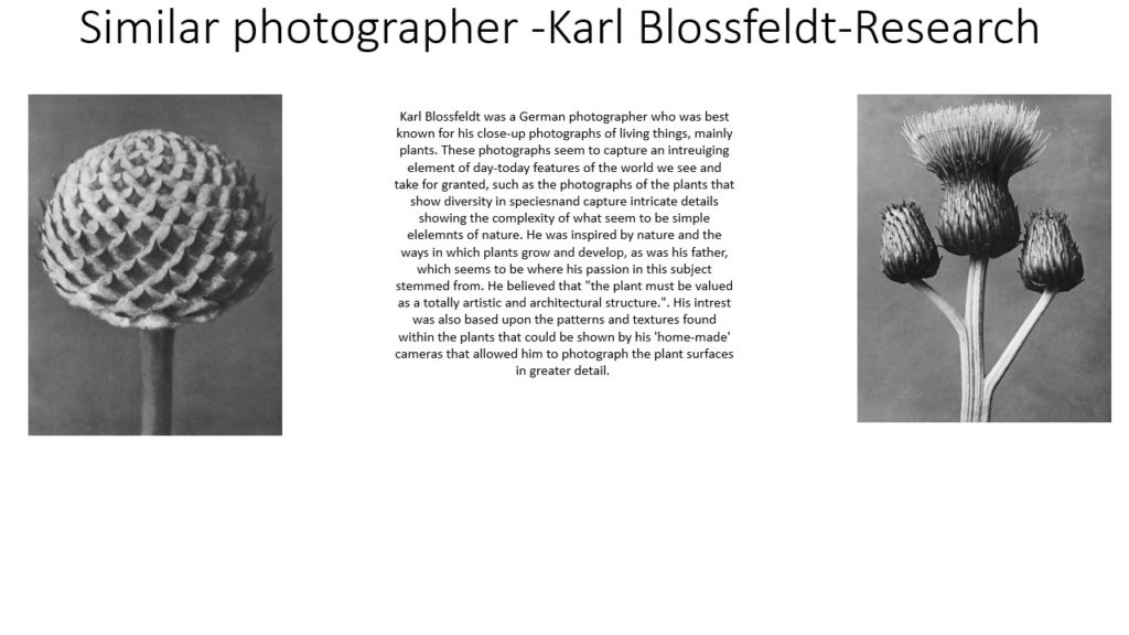
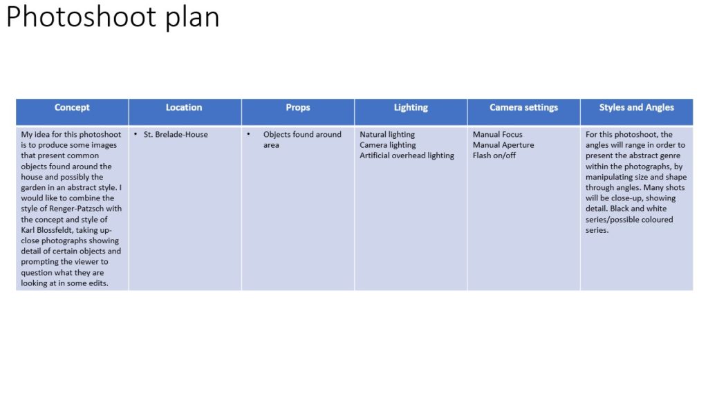
WHAT: This topic is about capturing subtleties and nuances, this means taking photos which have small details that make the images interesting. Whether is be some people in the distance doing something, or an object that is significant but is not huge in the frame. I am going to go out and look for compositions which contain small details within a big picture which help to tell a story. Luigi Ghirri’s images tend to show juxtaposition as well as they often have climbing frames or other objects on the beach that you wouldn’t usually find there.
WHERE/WHEN: I plan to go down to Greve de Lecq and St Ouen’s Bay in the middle of the day. I have chosen these locations as Luigi Ghirri shot a lot of his photos on the beach or near the sea. In his images the sky is blue and there are little or no clouds, therefore, I hope to be able to shoot on a day with no clouds. Especially down at St Ouen’s bay, there are a lot of run down buildings and the landscape is quite bland in color which will help to emphasize the colours from the buildings.
HOW/EQUIPMENT: Ghirri’s images would have all been shot on film, most likely 35mm film. To try and resemble the look of film to the best I can I am going to use a small aperture of at least f9 and ranging to f18. Wide aperture photography was not as popular during the time of using film and especially on landscape photos a wide aperture was used. Film often had ‘film grain’ on the images which is one of the tell tale signs of film photography. I could emulate this by using a high ISO but I would rather put in the artificial grain in lightroom as using a high ISO can ruin the image. I am going to use my Canon 70d with the kit lens as it will give me a good focal range from 18mm which is wide to 55mm which is more zoomed in. I will probably shoot most fotos at 24mm to eliminate lens distortion on the edges.
Contact Sheet:
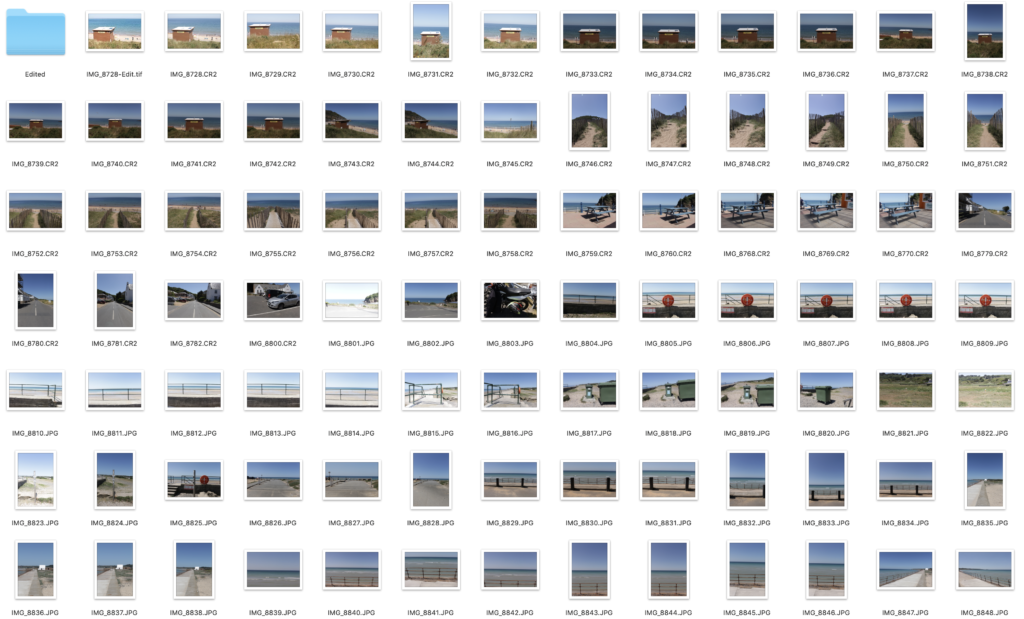
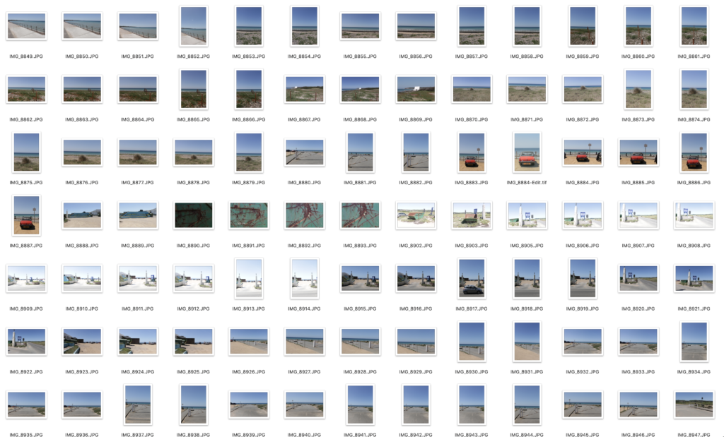
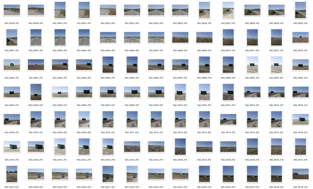
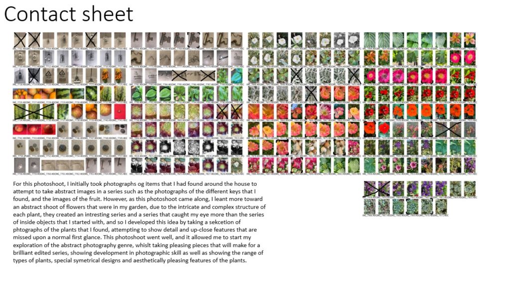
I took a lot of photos on this shoot as I wanted to have plenty of angles and orientations to choose from when editing. I went down to greve de lecq but that location was not as successful. I then made my way along St Ouen’s Bay looking for interesting compositions. I tried hard to make sure I exposed each shot well. This meant that all of these photos are possible good ones. However, this made the editing process harder as I had to choose between lots of good images.
Edit Process:
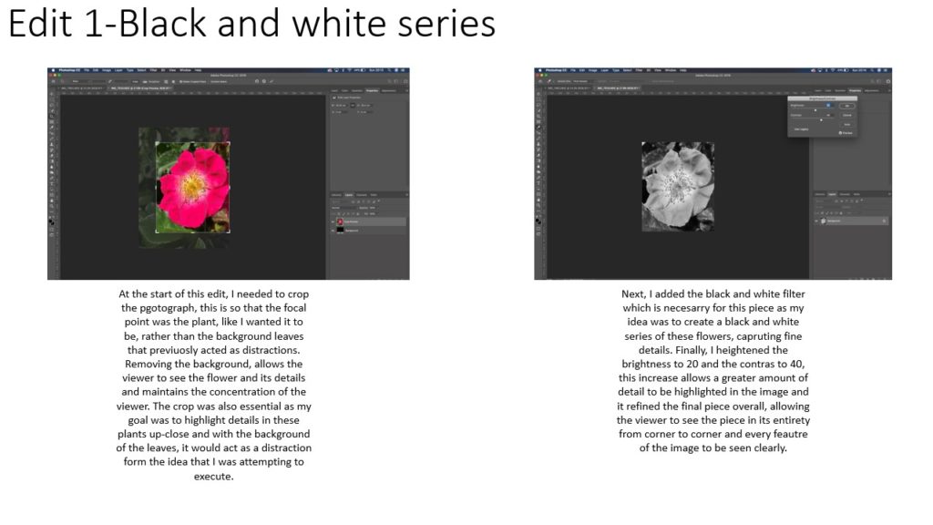
I began my going through all the images in lightroom and selecting the good ones, flagging them by pressing ‘P’. I editing my first images lifting the blacks and bringing down the whites to give the image a flat look. I gave it a green tint, added artificial grain and cropped it to correct the horizon line. I then made a preset of the edit so I could apply it to all the images. I then went back through all the images making smaller adjustments like exposure and basic correction to fine tune each image. I then rated the images I edited with 1 star and the best images with 2 stars. I then exported all the 2 star images with a low resolution preset I had made so they could be uploaded to the blog.
Edits:
Best Images:
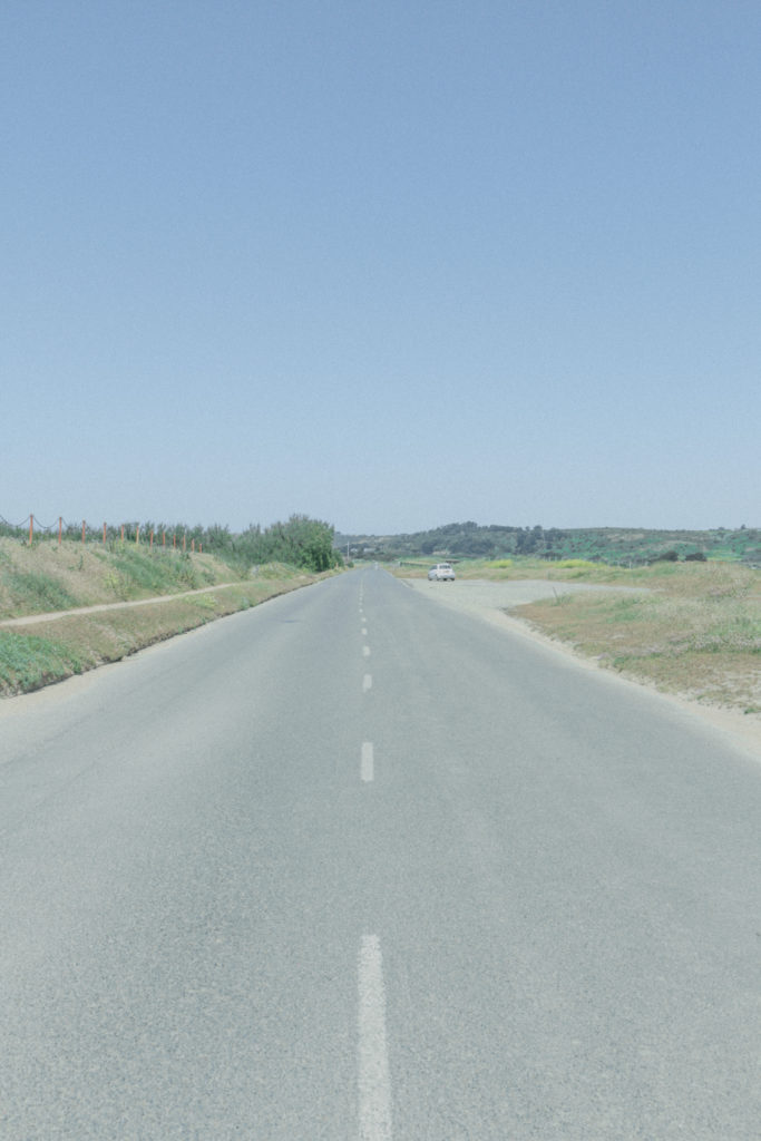
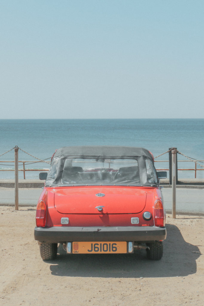
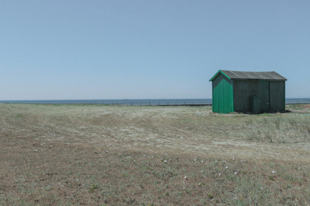
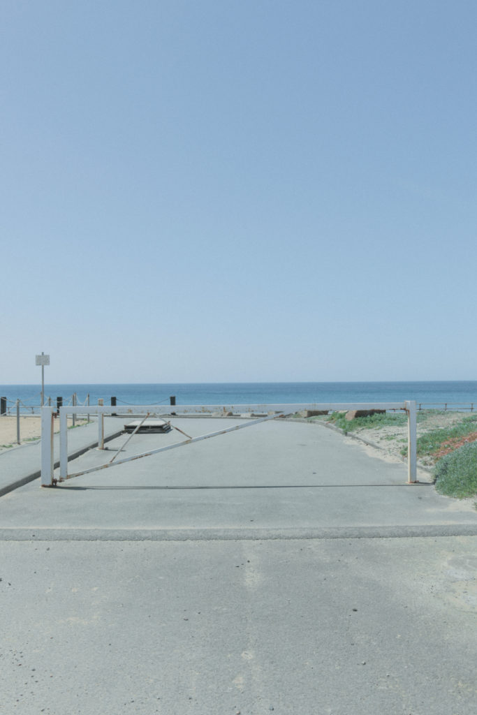
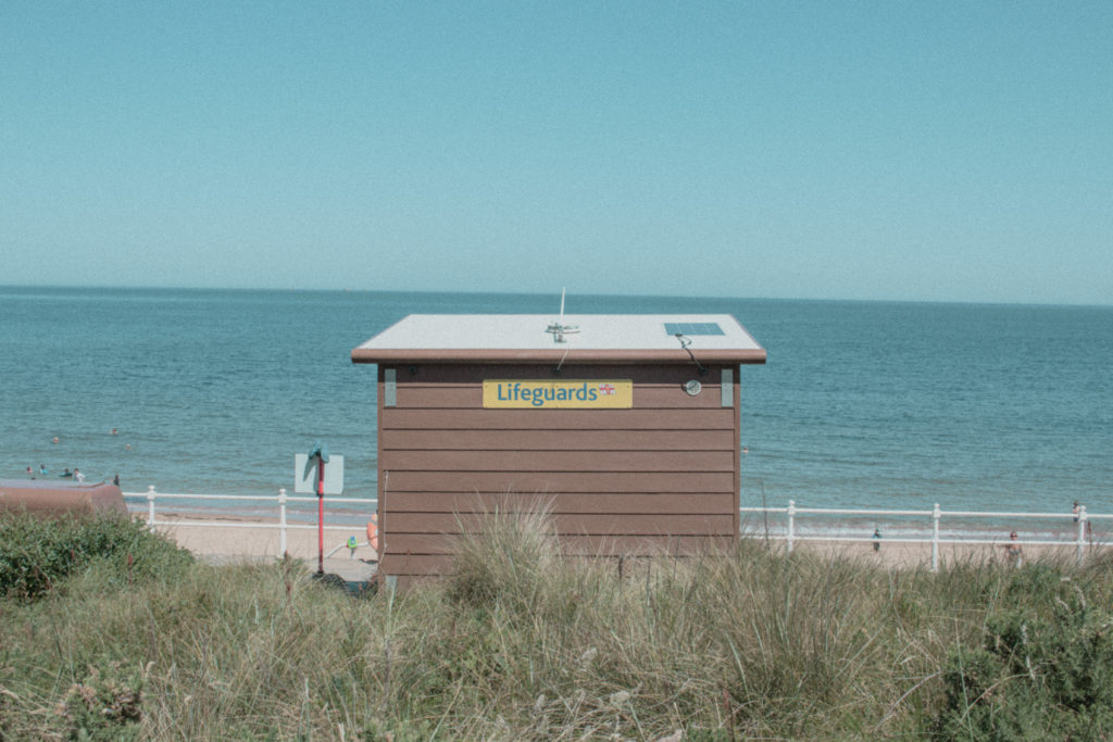
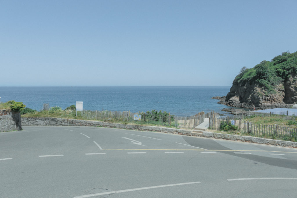
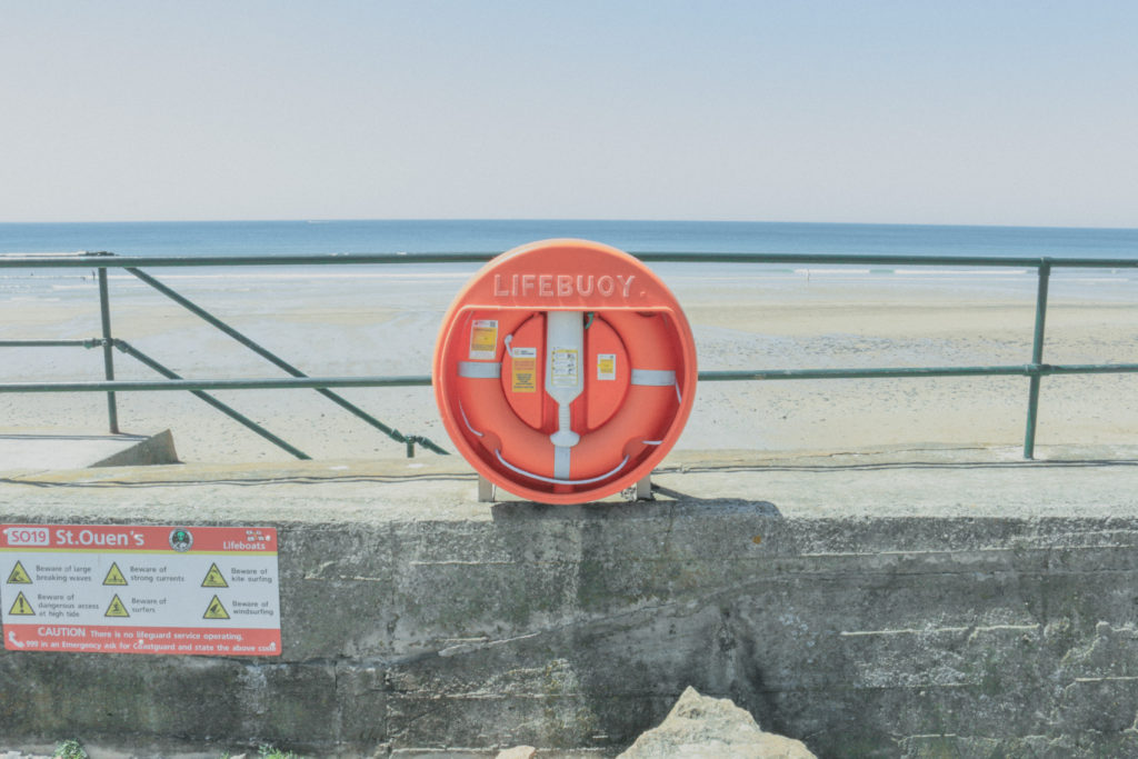
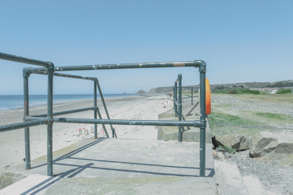
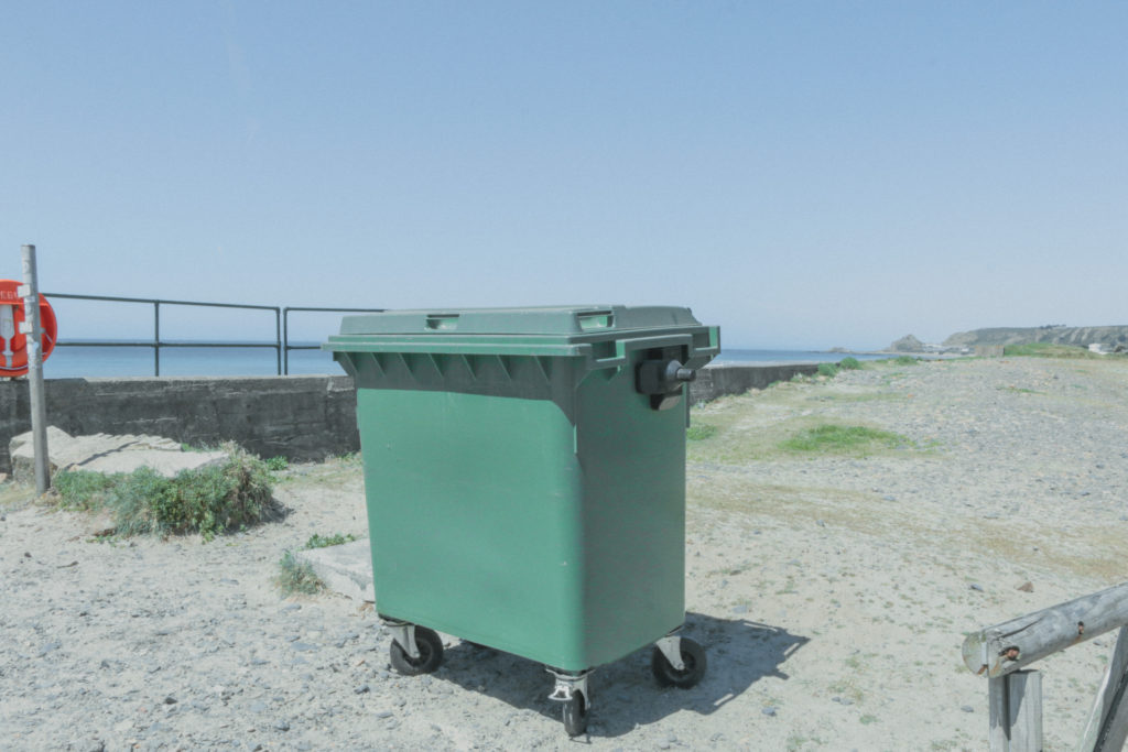
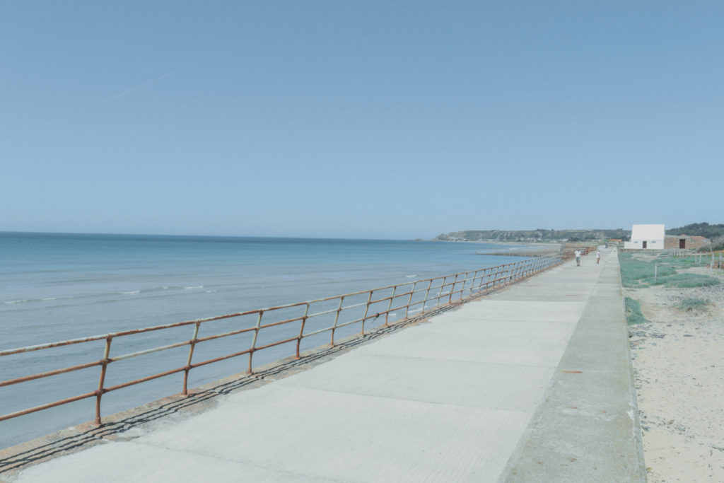
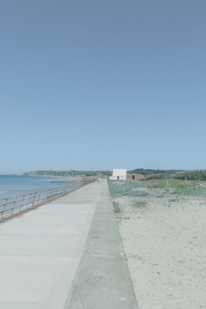
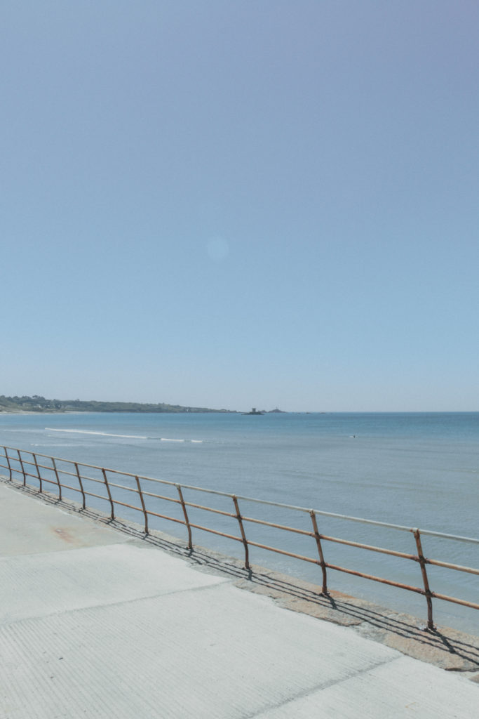
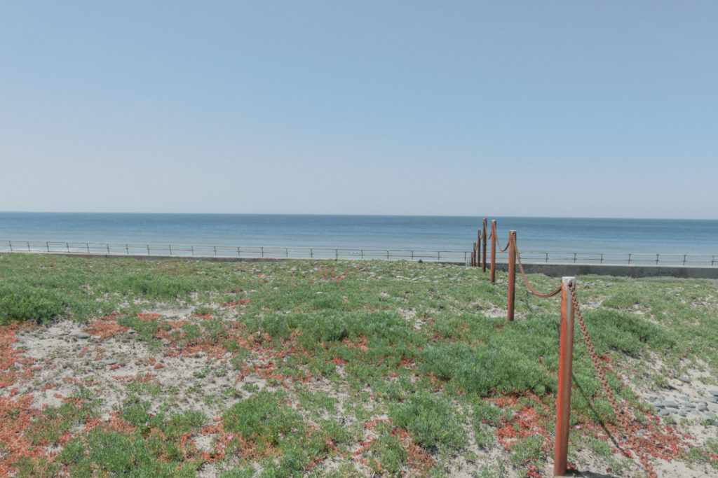
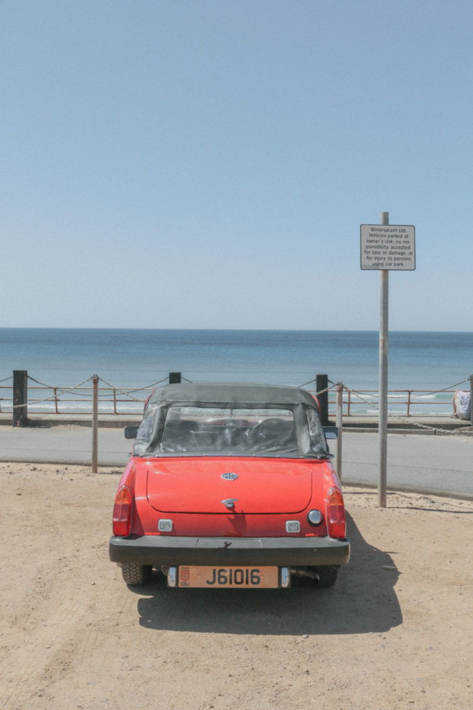
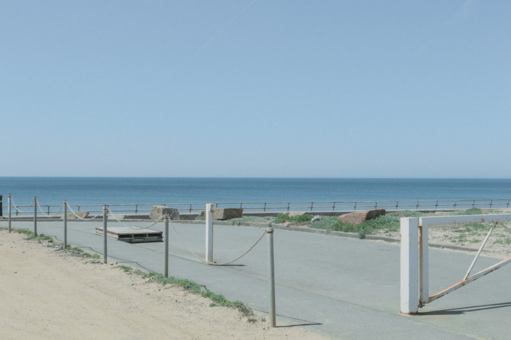
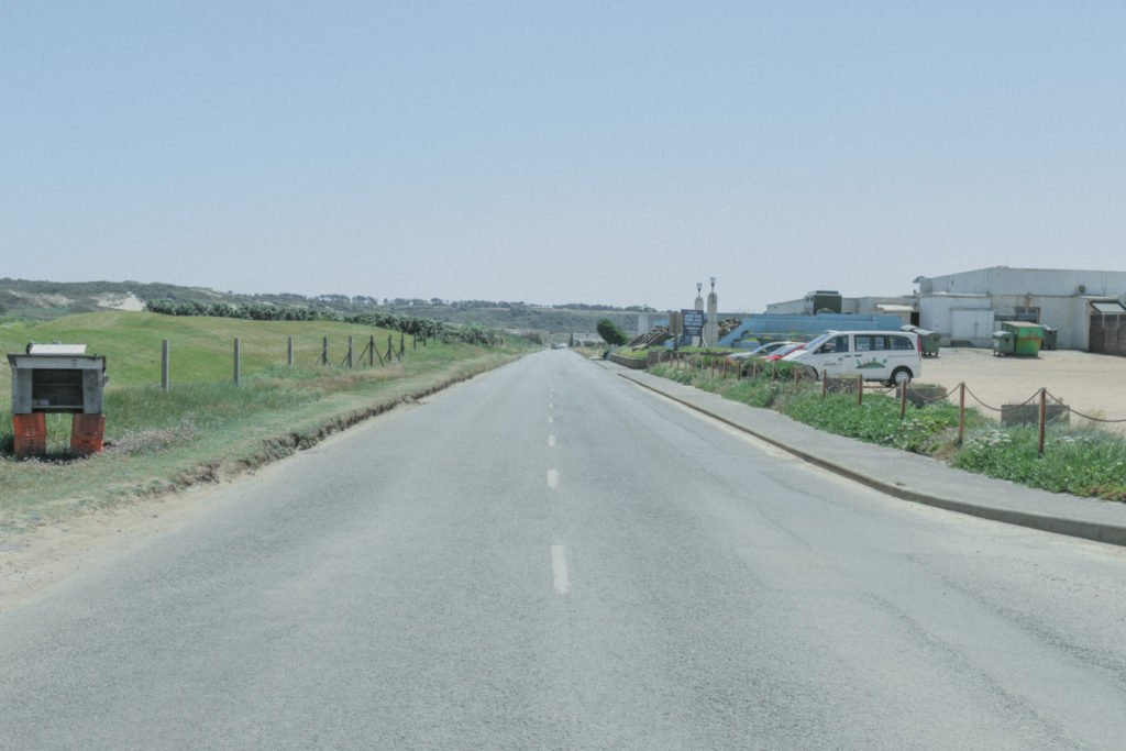
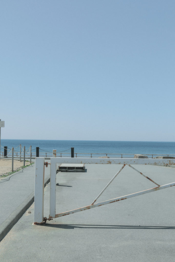
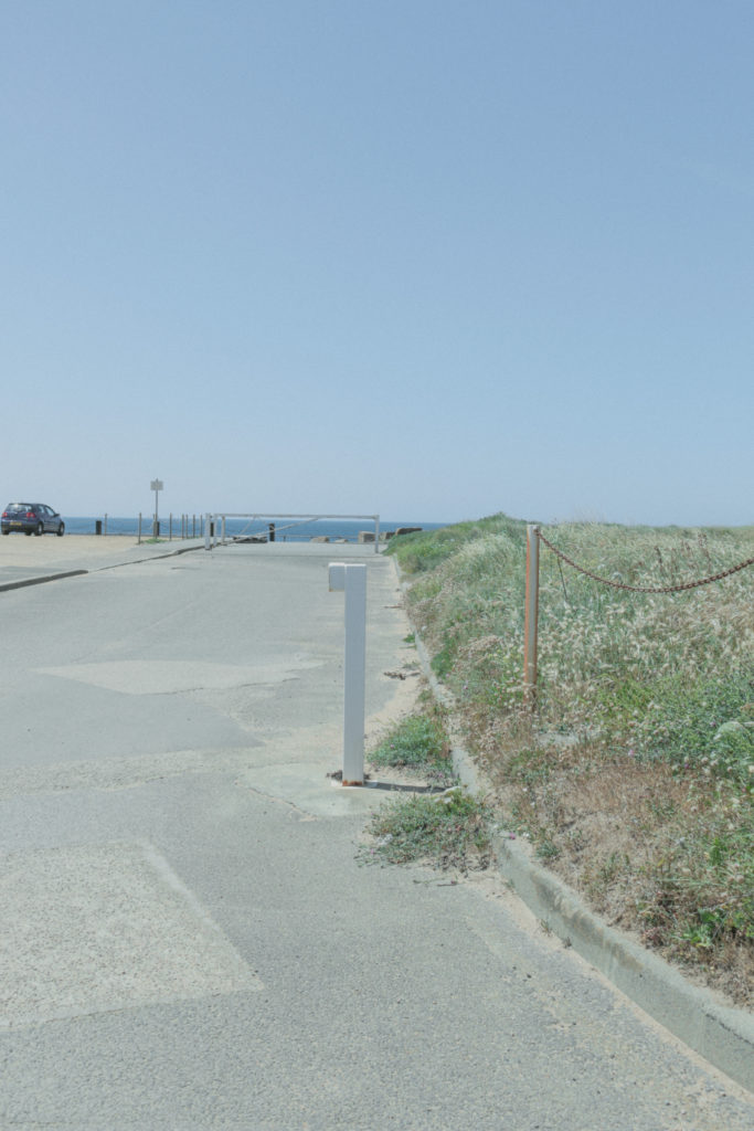
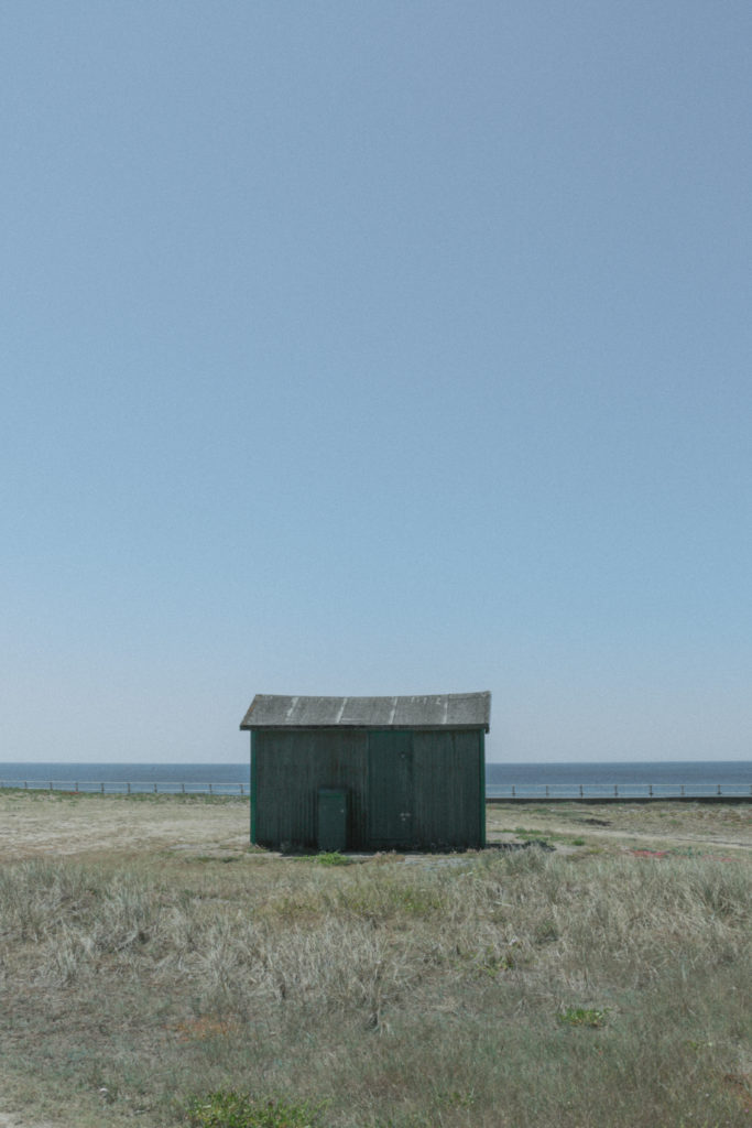
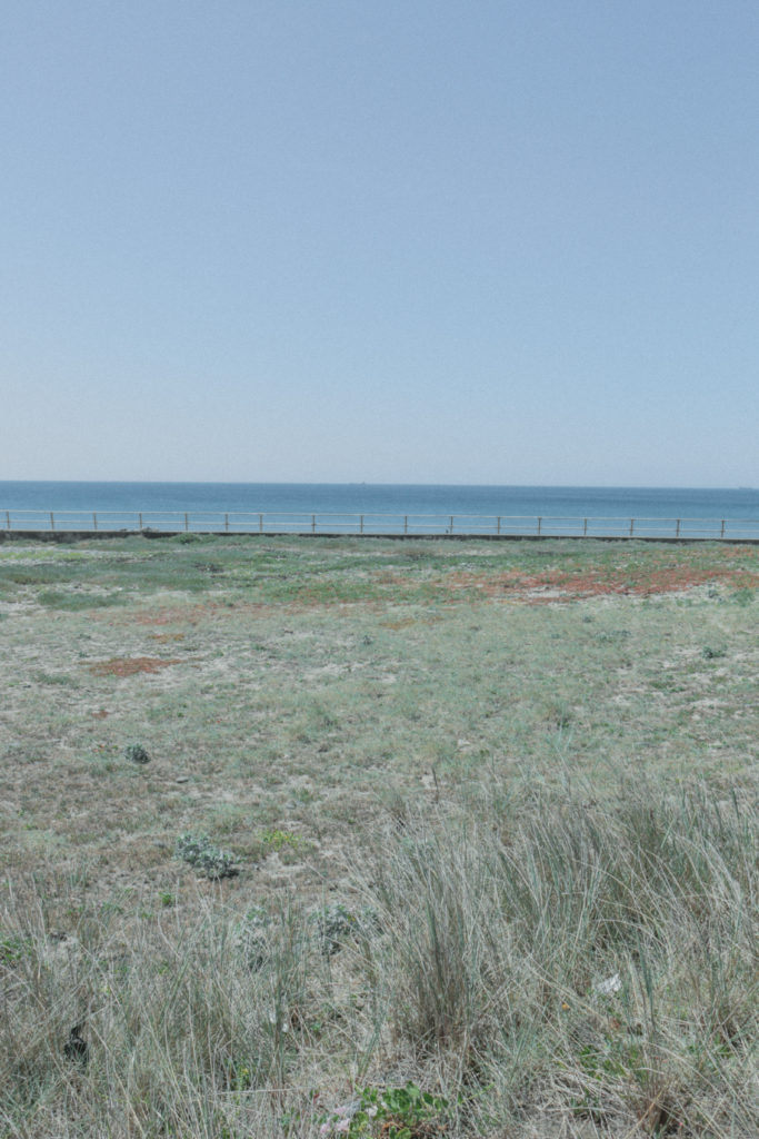
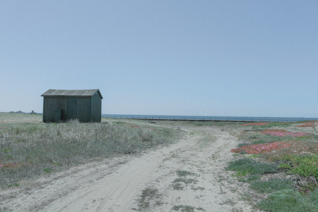
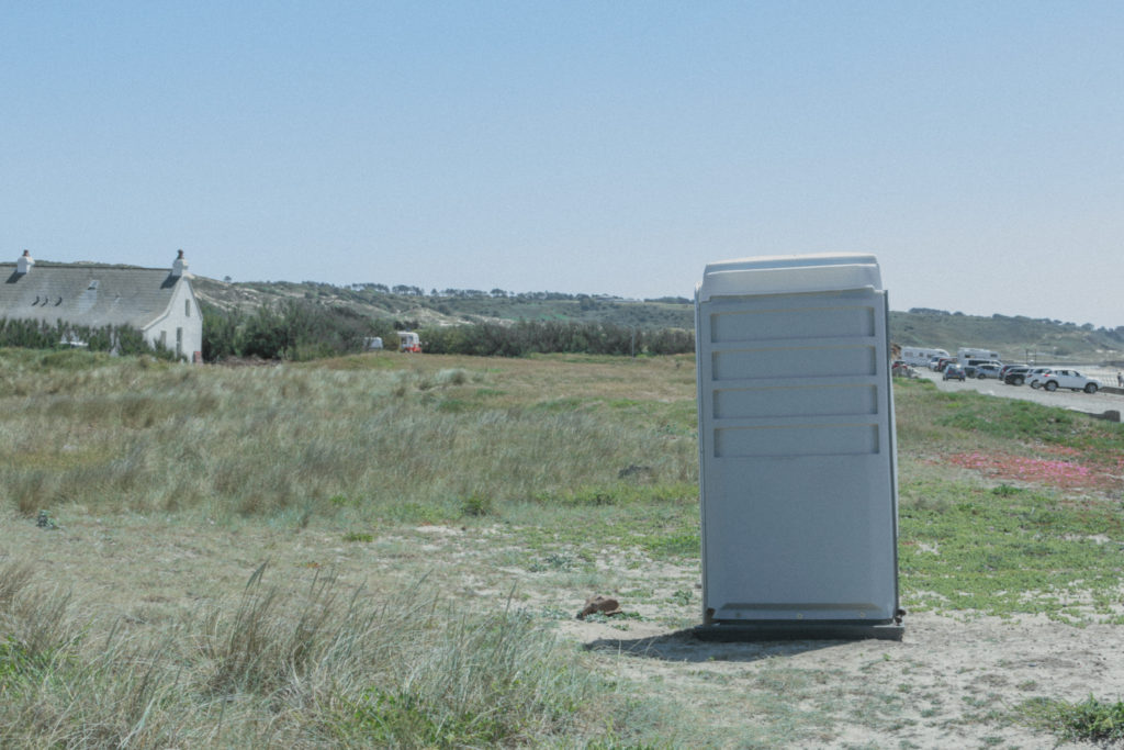
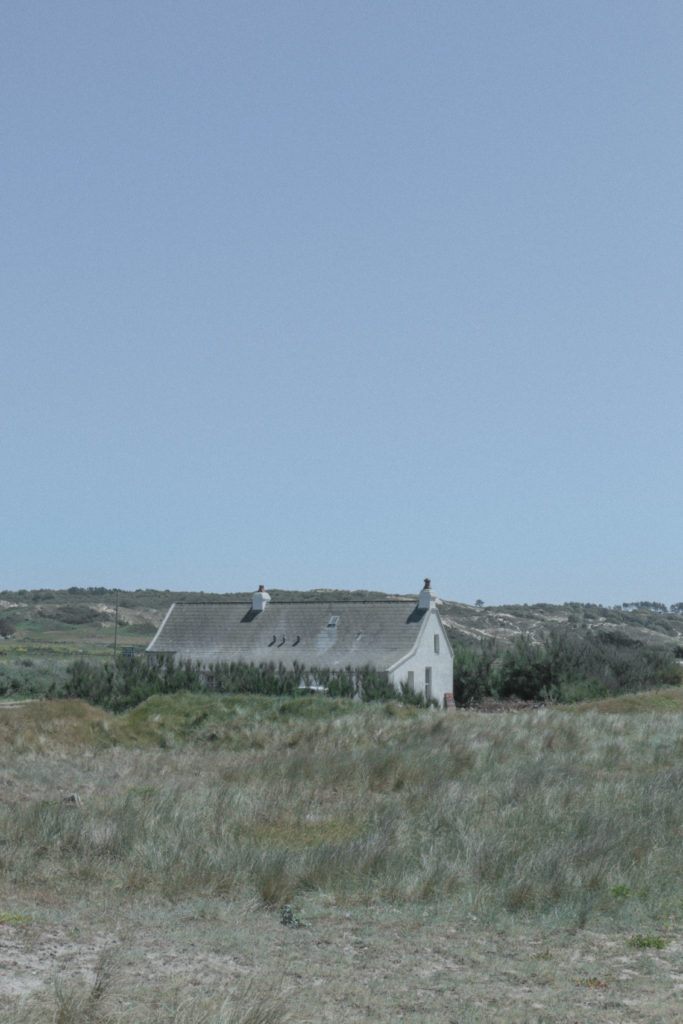
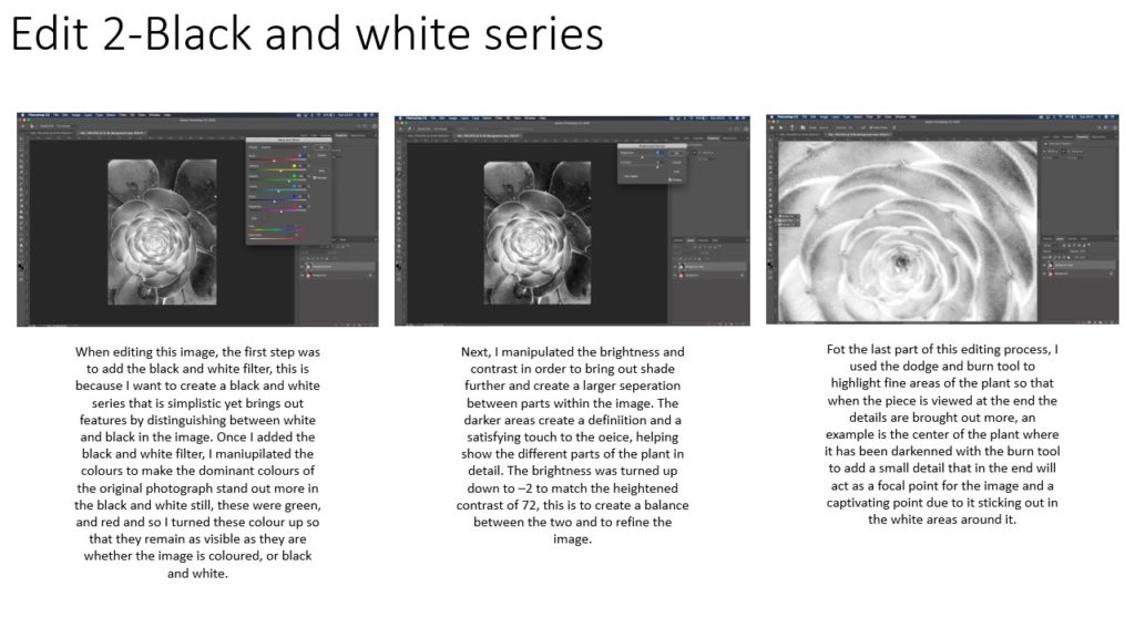
These are my favourite images because I took Ghirri’s style and made my own compositions. My images each contain subtle or naunces that make the scene different. For example there is a green shed in the middle of the sand dunes infront of the beach and on the empty coast road there is a small car parked in the distance.
Compare/ Evaluation:
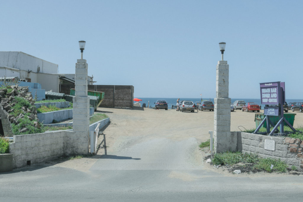
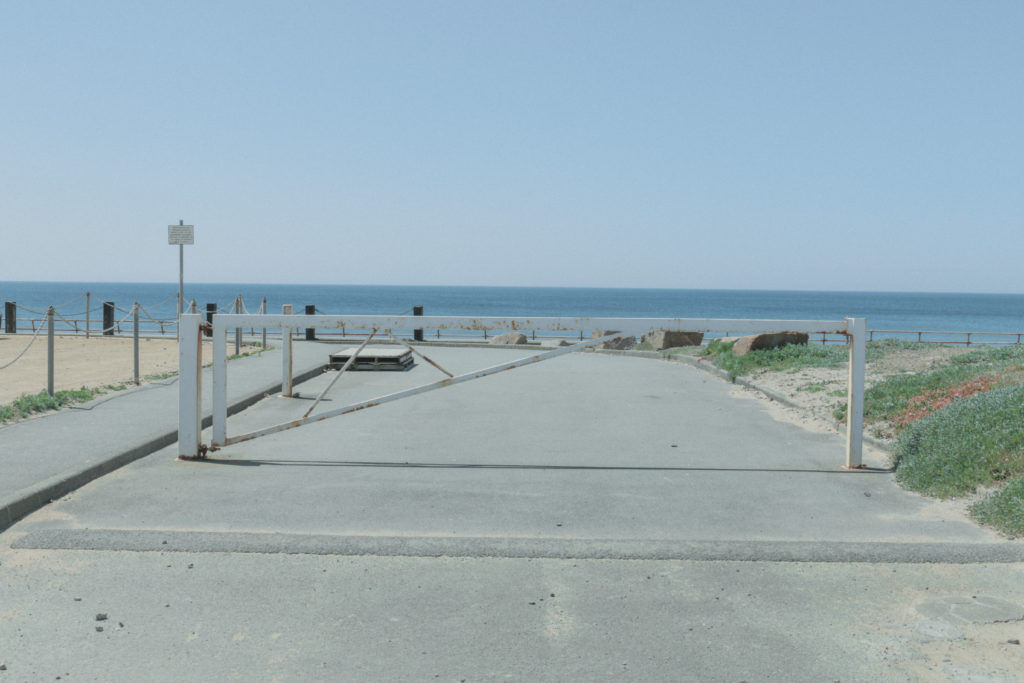
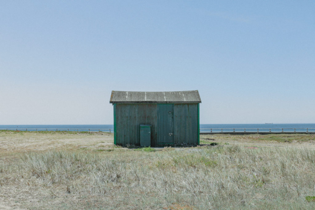
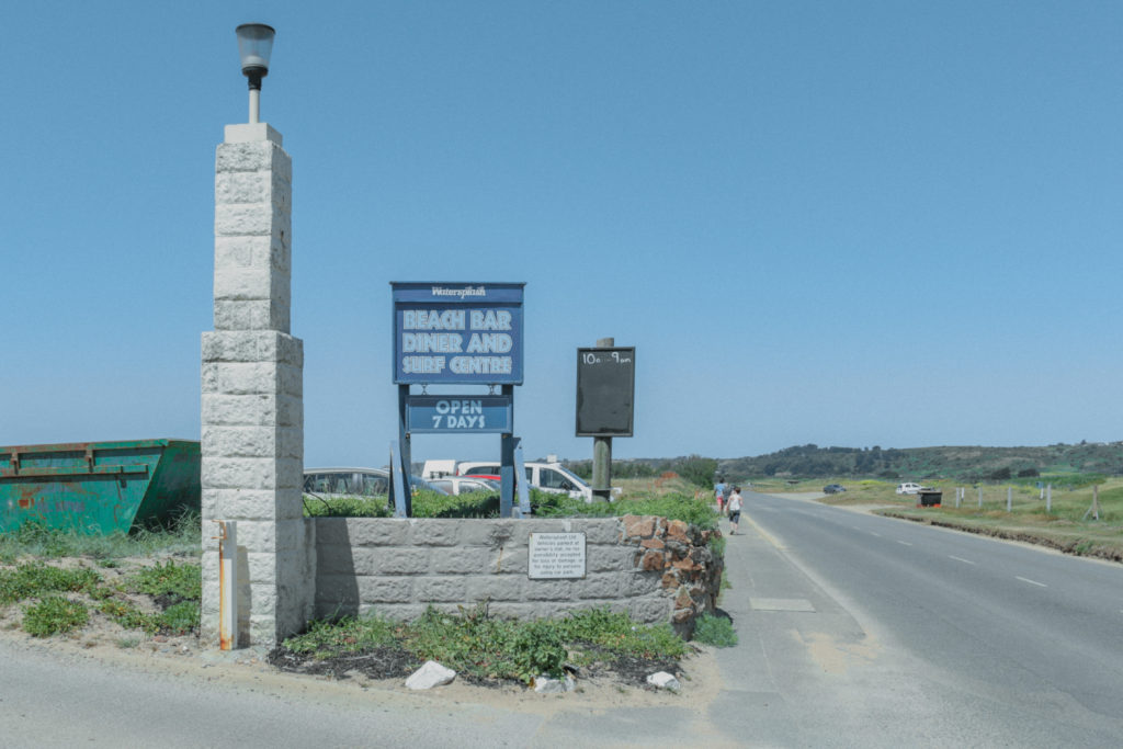
I think that these images best resemble the style of Luigi Ghirri. I edited them to have a ‘film’ look’, used a small aperture and tried to frame and compose the image so i didn’t include aspects that show the age of the image. I think this shoot was successful and I understand the topic of subtleties and naunces. To improve I think I could have got more creative and asked people to be models in m photos. I should have gone onto the beach to get the sand in shot aswell.


